Skip to content

Jasper Design System

Jasper's marketing system pairs a serif Feature 80px hero with deep navy text and borders, a saturated flame-orange CTA, and pastel jewel-tone feature cards. Tokens for React, Next.js, and AI coding tools.

Add shadcn.io to your AI agent. · Pro It installs blocks, icons and templates in your design system from a prompt, with Pro.

Set up MCP
Primary
#fa4028
Typeface
Feature
Shape
Sharp
Base radius
4px
Colors
18
Type tokens
12
Components
17
Spacing values
9

About

About Jasper DESIGN.md

Curated by Dov Azencot · Updated May 19, 2026 · Source jasper.ai (opens in a new tab)

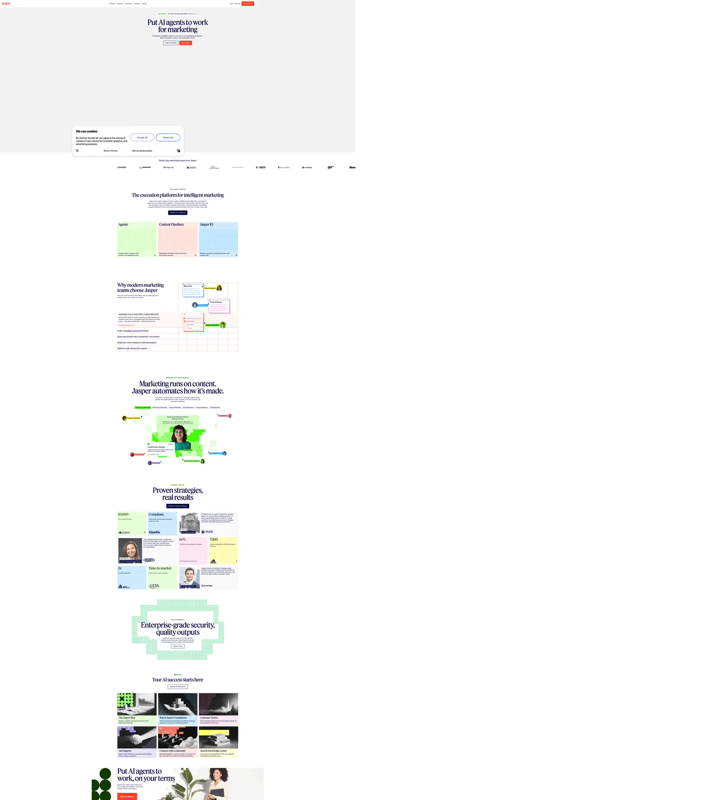
Jasper's marketing site inverts the AI-platform aesthetic that Anthropic, OpenAI, and Cohere converged on. Where those brands lean on near-black canvases with violet or indigo accents and weight-700 sans-serif headlines, Jasper paints itself on white with a deep-navy ink (#00063d), commits to the Feature serif at 80px weight 450 for the hero h1, and reserves a single saturated flame-orange (#fa4028) for the primary CTA pill. The headline "Put AI agents to work for marketing" sits in the navy serif against the white canvas, and beneath it sit two CTAs — flame-orange "Start Free Trial" and ink-bordered "Get a Demo." The serif display is the move: no enterprise-AI peer signs itself this way.

The DESIGN.md file packages the system into a machine-readable spec for React tooling. Inside: 18 colors tokens — the navy `--_theme---text` ink wired as both `--swatch--blue-800` and `--swatch--brand-text`, the flame-orange CTA color wired as `--_theme---button-primary--background`, the white canvas, and a pastel jewel-tone tier (mint `--swatch--green-300`, sky `--swatch--blue-300`, butter `--swatch--yellow-400`, pink `--swatch--flame-300`) used for flat-background feature cards below the fold; 12 typography tokens running Feature (a Georgia-related editorial serif wired as `--_typography---font--secondary-family`) for display and ABC ROM (wired as `--_typography---font--primary-family`) for body, both at the unusual weight 450; a 4px-or-2px radius scale; and 17 components definitions covering the flame CTA, the ink-outlined secondary, the pastel feature card, the dark-text testimonial card, and the Webflow 12-column container.

Feed this file to Claude, Cursor, or Copilot and it reproduces Jasper's specific moves: editorial serif Feature at the hero rather than weight-700 sans, ink-as-voltage where deep navy #00063d does the text and border work (and nothing else does), a single flame-orange CTA reserved for one primary action, and the pastel jewel-tone card backgrounds used as flat fills rather than gradients. The one move worth borrowing only if your product is genuinely editorial-content-adjacent is the Feature serif display — on a pure-developer-tools surface it would read as marketing-magazine rather than as software.

What makes it distinct

5

  1. Editorial serif heroFeature (a Georgia-related serif) at 80px / 450 with -2.4px tracking carries the display tier; no enterprise AI peer signs itself with a serif
  2. Ink-as-voltagedeep navy #00063d appears 1478 times as text (741) and border (732), the dominant brand-layer color, not a soft secondary
  3. Flame-orange CTA scarcity#fa4028 lives entirely on the primary button (18 occurrences, 4 bg + 5 text + 9 border) and nowhere else in the chrome
  4. Pastel feature cardssoft jewel-tones (mint #e6ffd9, sky #ceebff, butter #fffdd9, pink #ffe8e2) used as flat background fills rather than gradients
  5. Weight 450 across the boardboth Feature display and ABC ROM body run at the unusual 450 step, half a notch between regular and medium

jasper.ai

Live at jasper.ai

A snapshot of the brand in production. Scroll the frame to see the whole page.

Jasper's website at jasper.ai

Colors

18 colors

Jasper's system runs on #fa4028 as its primary voltage, used in 1 of 17 components. Type is set in Feature across 12 tokens from 14px to 80px, weights 450–500. Shape language is sharp — components average 3px corner radius, favoring crisp rectangles.

Brand & Accent

Sparing, CTA-only voltage · 7

Surface

Page and card backgrounds · 9

Text

Headlines, body, captions · 2

Typography

12 type tokens

Set in Feature across 12 tokens, from 14px to 80px, weights 450–500. Shown in its own stack: where the font isn't installed, the fallback the file names stands in.

  • display-xl80px · weight 450 · lh 80px · tracking -2.4pxThe quick brown fox jumps over the lazy dog
  • display-lg54px · weight 450 · lh 56.7px · tracking -1.62pxThe quick brown fox jumps over the lazy dog
  • display-md38px · weight 450 · lh 38px · tracking -0.76pxThe quick brown fox jumps over the lazy dog
  • heading-md28px · weight 450 · lh 30.8px · tracking -0.56pxThe quick brown fox jumps over the lazy dog
  • heading-sm24px · weight 450 · lh 26.4pxThe quick brown fox jumps over the lazy dog
  • body-lg18px · weight 450 · lh 21.6px · tracking -0.18pxThe quick brown fox jumps over the lazy dog
  • body-md16px · weight 450 · lh 22.4px · tracking -0.16pxThe quick brown fox jumps over the lazy dog
  • body-sm14px · weight 450 · lh 16.8px · tracking -0.14pxThe quick brown fox jumps over the lazy dog
  • body-strong18px · weight 500 · lh 21.6pxThe quick brown fox jumps over the lazy dog
  • button-md16px · weight 500 · lh 22.4px · tracking -0.16pxThe quick brown fox jumps over the lazy dog
  • serif-feature20px · weight 450 · lh 22px · tracking -0.2pxThe quick brown fox jumps over the lazy dog
  • mono-md16px · weight 450 · lh 22.4px · tracking -0.16pxThe quick brown fox jumps over the lazy dog

Layout

Radii and spacing

5 corner radii and 9 spacing values. Shape language: sharp.

Radii

  • none0px
  • xs2px
  • sm4px
  • lg8px
  • full9999px

Spacing

  • xs4px
  • sm6px
  • base8px
  • md10px
  • lg12px
  • xl16px
  • 2xl24px
  • 3xl32px
  • 4xl40px

Components

17 components

Each rendered from its tokens (color, type, radius, padding) on Jasper's own canvas.

  • Button Primary
    button-primaryButton Primary
  • Button Primary Hover
    button-primary-hoverButton Primary Hover
  • Button Secondary
    button-secondaryButton Secondary
  • Button Secondary Hover
    button-secondary-hoverButton Secondary Hover
  • Top Nav
    top-navTop Nav
  • Nav Link
    nav-linkNav Link
  • Hero Heading
    hero-headingHero Heading
  • Section Heading
    section-headingSection Heading
  • Body Paragraph
    body-paragraphBody Paragraph
  • Card Mint
    card-mintCard Mint
  • Card Sky
    card-skyCard Sky
  • Card Butter
    card-butterCard Butter
  • Card Pink
    card-pinkCard Pink
  • Card Soft
    card-softCard Soft
  • Testimonial Card
    testimonial-cardTestimonial Card
  • Logo Chip
    logo-chipLogo Chip
  • Footer
    footerFooter

In use

The system, in use

Jasper's tokens on the kind of product it builds.

Build something people actually use.

A short paragraph of marketing copy that previews how the brand's display tier and body tier read together. Two sentences is usually enough.

Get startedLearn more
Marketing heroHeadline, sub-copy, primary CTA — the universal homepage opener.
Reporting · 14 min read

The quiet collapse of an old idea

For decades the consensus held that the system would correct itself. Then it didn't. This is the inside story of what changed, told by the people who watched it unravel.

"Nobody noticed because the failure was indistinguishable from progress."

By Sam Reporter · Updated 2 hours ago

Editorial articleMagazine-style longform with display headline.

FAQ

Jasper design system FAQ

Common questions about Jasper's tokens, components, and how to use this DESIGN.md in your project.

Read next

Specs, directories, and component libraries that pair with this design system.

Use it

Use Jasper in your project

One machine-readable file. Drop it into Claude, Cursor, or any AI tool that reads DESIGN.md.

Download DESIGN.md
  1. Download the DESIGN.md

    One machine-readable file: every color, type, radius, spacing, and component token of Jasper.

  2. Feed it to your AI tool

    Drop it into Claude, Cursor, or GitHub Copilot. The agent writes React components and Tailwind classes that match Jasper's visual language.

  3. Reference the tokens directly

    Or paste the values into your Tailwind config, CSS variables, or component library: every color, size and radius is a quoted, ready-to-copy value.

Read the full DESIGN.md: overview, rationale, do’s and don’ts

Overview

Jasper's marketing site inverts the enterprise-AI convention. Editorial serif voltage: where Anthropic and OpenAI sign themselves with weight-700 sans-serif on near-black canvases and Cohere leans on a violet-indigo gradient mesh, Jasper paints itself on pure white with deep-navy ink ({colors.ink} — #00063d) and runs the Feature serif at 80px in weight 450 for the hero h1 — a register that reads closer to a print magazine spread than to an AI platform. The headline "Put AI agents to work for marketing" sits in this navy serif against the white canvas, with a saturated flame-orange ({colors.primary} — #fa4028) "Start Free Trial" pill paired with an ink-bordered "Get a Demo" secondary. No enterprise-AI peer in the directory signs itself with a serif.

Ink-as-voltage: the deep-navy #00063d isn't a text color in the conventional sense — it's the dominant brand-layer hex, occurring 1478 times across the captured page as 741 text + 732 border + 5 background. The system uses it as the load-bearing ink for every paragraph, every heading, every button border, every top-nav link, and every hairline beneath the fold. The flame-orange CTA, by contrast, carries just 18 occurrences and lives entirely on the primary button. Where Cloudflare paints its hero with a single saturated orange and Spline holds one cobalt in reserve, Jasper inverts the figure-ground: the ink is the brand voltage; the orange is the action voltage.

The below-fold rhythm is pastel jewel-tones as flat fills. Feature cards render in soft mint ({colors.surface-mint} — #e6ffd9), sky-blue ({colors.surface-sky} — #ceebff), butter-yellow ({colors.surface-butter} — #fffdd9), pink ({colors.surface-pink} — #ffe8e2), and lavender ({colors.surface-lavender} — #e7e3f7), each as a flat background fill — never as a gradient, never with a border, always with the navy ink as the text-on-card color. The pastels differentiate cards by category-color rather than by ladder; the effect reads as magazine-spread editorial layout rather than as SaaS feature-grid.

Key Characteristics:

  • Ink-as-voltage: {colors.ink} (#00063d) carries 1478 occurrences as both text (741) and border (732), the load-bearing brand color.
  • Single flame-orange CTA: {colors.primary} (#fa4028) lives entirely on the primary button — 18 captured occurrences, never elsewhere in the chrome.
  • Editorial Feature serif at the hero: 80px / 450 weight / -2.4px tracking. No enterprise-AI peer uses a serif at this scale.
  • Weight 450 across the system: both Feature display and ABC ROM body run at the unusual 450 step, half a notch between regular and medium.
  • Pastel jewel-tone feature cards as flat fills: mint, sky, butter, pink, lavender — each a single background color, no gradient, no border.
  • Tight radius scale: 4px (12 occurrences) and 2px (6 occurrences) only. There is no middle or large radius tier; cards read as sharp-cornered editorial panels.
  • Webflow 12-column container with --site--width: 90rem and clamp-based responsive site margins driving every grid.
  • Custom ABC ROM Mono carries the small label tier (6 captured occurrences) — used inside category-marker chips and inline-code samples.

Colors

Brand

  • Jasper Ink ({colors.ink} — #00063d): frequency 1478. Used as text (741), border (732), background (5). Wired as --_theme---text, --swatch--blue-800, --swatch--brand-text, and the border-default for the entire system. The load-bearing brand-layer color — carries every heading, paragraph, nav link, button border, and hairline. The hex is dark enough to read as black at a glance but contains enough cobalt-blue (#06 R / #06 G / #3d B) to register as navy when viewed against a saturated swatch.
  • Jasper Ink Hover ({colors.ink-hover} — #0011a7): wired as --swatch--blue-700, --_theme---button-tertiary--border-hover. The hover state for the tertiary button variant — a deeper saturated blue.
  • Flame Orange ({colors.primary} — #fa4028): frequency 18. Used as background (4), text (5), border (9). Wired as --_theme---button-primary--background, --swatch--flame-600, --_theme---selection--background. The single action voltage — lives entirely on the primary CTA pill and the text-selection highlight. Saturated coral-red leaning slightly orange.
  • Flame Hover ({colors.primary-hover} — #801a10): frequency 1. Wired as --_theme---button-primary--background-hover, --swatch--flame-700. The deep burgundy press-state for the primary CTA — a major drop in lightness rather than a saturation shift.
  • Flame Soft ({colors.primary-soft} — #fa7560): frequency 12. Wired as --swatch--flame-500. A coral-peach softer step used inside illustration accents below the fold.
  • Flame Tint ({colors.primary-tint} — #ffe8e2): the lightest flame step, used as a pale-coral background tint on a small subset of card surfaces.

Surface

  • Canvas ({colors.canvas} — #ffffff): frequency 485. Used as text (235), border (229), background (21). Wired as --_theme---background, --swatch--light-100. The page floor — pure white, not a cream tint.
  • Surface Soft ({colors.surface-soft} — #f2f2f3): wired as --swatch--light-200, --swatch--dark-100, --_theme---background-secondary. A barely-perceptible warm-grey tint used on alternate-band backgrounds.

Pastel Card Surfaces

  • Surface Mint ({colors.surface-mint} — #e6ffd9): frequency 7 — backgrounds only. Wired as --swatch--green-300. The soft-mint feature-card fill.
  • Surface Mint Deep ({colors.surface-mint-deep} — #d2ffc1): wired as --swatch--green-400. A deeper-mint variant for emphasis cards.
  • Surface Sky ({colors.surface-sky} — #ceebff): frequency 6 — backgrounds only. Wired as --swatch--blue-300. The soft-sky feature-card fill.
  • Surface Butter ({colors.surface-butter} — #fffdd9): frequency 2 — backgrounds only. Wired as --swatch--yellow-400. The pale-butter feature-card fill.
  • Surface Butter Deep ({colors.surface-butter-deep} — #fffbb7): wired as --swatch--yellow-500. A deeper-butter variant.
  • Surface Pink ({colors.surface-pink} — #ffe8e2): frequency 15. Wired as --swatch--flame-300, --swatch--pink-400, --swatch--dark-150. The pale-pink/coral feature-card fill.
  • Surface Lavender ({colors.surface-lavender} — #e7e3f7): frequency 3. Wired as --swatch--violet-400. The pale-lavender feature-card fill.

Accent

  • Accent Green ({colors.accent-green} — #45ff00): frequency 13. Used as text (5), background (3), border (5). Wired as --swatch--green-600. A saturated electric green used inside illustrations and one inline highlight chip.
  • Accent Green Deep ({colors.accent-green-deep} — #103a00): frequency 58. Used as text (29), border (29). Wired as --swatch--green-800. The deep-emerald counterpart used as ink-on-mint when text sits on the {colors.surface-mint} card surface.
  • Accent Pink Deep ({colors.accent-pink-deep} — #5a003c): frequency 21. Used as text (10), border (10), background (1). Wired as --swatch--pink-800. The deep-magenta counterpart used as ink-on-pink when text sits on {colors.surface-pink}.

Typography

Font Families

The system runs three custom families with a strict role split. Feature (Georgia, serif fallback) is an editorial serif wired as --_typography---font--secondary-family, carrying every display heading from 24px through 80px at weight 450. ABC ROM (Arial fallback) is a custom sans wired as --_typography---font--primary-family, carrying every body paragraph, nav link, and button label at 14-18px weight 450. ABC ROM Mono carries small uppercase labels and inline category markers. Fallback stacks walk to Georgia, sans-serif for the serif tier (the sans-serif last-resort is unusual for a serif fallback — most systems fall back to serif), and Arial, sans-serif for ABC ROM.

The Feature-plus-ABC-ROM pairing is the distinguishing move. Editorial serif display in an enterprise-AI category dominated by sans-serif systems is the one move no peer attempts; it gives every Jasper page a magazine-spread register that the body and nav extend in sans.

Hierarchy

TokenSizeWeightFamilyUse
{typography.display-xl}80px450FeatureHero h1 ("Put AI agents to work for marketing"), -2.4px tracking
{typography.display-lg}54px450FeatureBig section h2 ("The execution platform for intelligent marketing"), -1.62px tracking
{typography.display-md}38px450FeatureMid-section h3, -0.76px tracking
{typography.heading-md}28px450FeatureSub-section title, -0.56px tracking
{typography.heading-sm}24px450FeatureSmall h2 / card title ("Top-tier marketing teams trust Jasper")
{typography.body-lg}18px450ABC ROMHero sub-paragraph
{typography.body-md}16px450ABC ROMDefault running text (80 captured occurrences — dominant tier)
{typography.body-sm}14px450ABC ROMCaption rows, footnote text
{typography.body-strong}18px500ABC ROMEmphasized body label (the rare weight-500 step)
{typography.button-md}16px500ABC ROMPrimary and secondary button labels
{typography.serif-feature}20px450FeatureInline serif emphasis inside body copy, -0.2px tracking
{typography.mono-md}16px450ABC ROM MonoSmall uppercase labels, inline code

Principles

Weight 450 is the system's single voice. Both the Feature display tier and the ABC ROM body tier run at this half-step between regular (400) and medium (500), wired explicitly as --_typography---font--primary-regular: 450 and --_typography---font--secondary-regular: 450. The choice gives the serif Feature at 80px enough typographic muscle without crossing into the heaviness of 500, and gives the ABC ROM body a slightly more substantial reading register than 400.

Tracking is uniformly negative across the display tier: -2.4px on the 80px hero, -1.62px on the 54px h2, -0.76px on the 38px h3, -0.56px on the 28px sub-heading. The tighter-than-typical tracking is part of the editorial-magazine register — display headlines pull inward rather than letting the letterforms breathe.

Note on Font Substitutes

Feature is licensed; Source Serif Pro at the same display sizes is a free open substitute, or PT Serif for a slightly different x-height. ABC ROM is also licensed; Inter at weight 500 (the closest standard step to 450) is the closest open substitute. For ABC ROM Mono, IBM Plex Mono at weight 500 transfers cleanly. The weight-450 step is non-standard — most substitute typefaces will need to round to 500 or interpolate via a variable font.

Layout

Spacing System

  • Base unit: 8px — the dominant module on the page.
  • Tokens: {spacing.xs} 4px · {spacing.sm} 6px · {spacing.base} 8px · {spacing.md} 10px · {spacing.lg} 12px · {spacing.xl} 16px · {spacing.2xl} 24px · {spacing.3xl} 32px · {spacing.4xl} 40px.
  • Section padding (vertical): ~80-128px between major sections (the --_spacing---section-space--page-top: clamp(6.25rem, 8.75rem) and --_spacing---section-space--large: clamp(7rem, 11.25rem) set the rhythm).
  • Card internal padding: {spacing.3xl} (32px) on {component.card-mint}, {component.card-sky}, {component.card-butter}, {component.card-pink}, {component.card-soft}; {spacing.2xl} (24px) on the testimonial card.
  • Site margin: clamp(1rem, 2.5rem) wired as --site--margin — fluid-responsive from mobile to desktop.

Grid & Container

  • Max content width: --site--width: 90rem (1440px) with --container--main reducing it by twice the site-margin.
  • Column count: 12 (wired as --site--column-count), gutter 1rem, with --column-width--1 through --column-width--12 plus matching --column-margin--N variables — a Webflow column-grid driving every below-fold layout.
  • Hero: centered text + sub-paragraph + 2 CTAs stack, max-width ~720px.
  • Logo wall: 9-column monochrome row (Wayfair, Bose, Orange.eg, Bowes Group, INSP, Visa Cabra, Royal Caffles, Prudential, GE, Bare).
  • Feature card row: 3-column 1/3 split holding the pastel {component.card-mint} / {component.card-pink} / {component.card-sky} cards.

Rhythm

The page rhythm alternates between white editorial bands (hero, logo wall, full-width display sections) and pastel-card grids (the 3-up feature rows). Each pastel grid uses three different jewel-tone fills side-by-side so adjacent cards differ by category-color rather than by ladder-step. Section transitions are marked by uppercase Feature serif h2s rather than by background shifts, which keeps the page reading as one continuous editorial layout.

Elevation

The system has essentially no shadow tier. The captured page shows zero shadow occurrences in the structural color set — elevation is handled by tonal background fills and ink-only borders.

  • Flat (no shadow): hero, logo wall, body bands, pastel cards, footer — 99% of surfaces.
  • Pastel lift: the jewel-tone cards ({colors.surface-mint}, {colors.surface-sky}, {colors.surface-butter}, {colors.surface-pink}, {colors.surface-lavender}) sit on the white canvas with no border or shadow — the tint itself does the elevation work.
  • Ink hairline outlines: {colors.ink} (#00063d) carries 732 of the captured border occurrences — the dominant outline tone on the testimonial card and the secondary button. No grey hairlines anywhere; the system commits to ink borders.

Shapes

The radius scale is tight and binary: 2px or 4px, with one full-pill outlier.

  • {rounded.none} 0px — used on hero-section edges, the testimonial-card outline where the corner sits flush.
  • {rounded.xs} 2px (6 occurrences) — the inset detail on card edges, used as a subtle "card-within-card" indicator.
  • {rounded.sm} 4px (12 occurrences) — the dominant radius. Every primary button, secondary button, and feature card sits here.
  • {rounded.lg} 8px — wired as --radius--small: .5rem but rare in the captured render.
  • {rounded.full} 9999px — wired as --radius--round: 100vw but reserved for a small number of decorative chips; the dominant feel is sharp-cornered editorial.

There is no 12 / 16 / 20px middle radius tier. The system reads as editorial-magazine rather than as friendly-SaaS because feature cards never soften into rounded plumpness; the 4px radius is just enough to register as intentional rounding without abandoning the sharp-cornered editorial register.

Components

button-primary — The signature CTA. Flame-orange {colors.primary} (#fa4028) fill, white text, {rounded.sm} 4px radius, 12x24 padding, 44px height. "Start Free Trial" is the canonical instance. The flame-orange border matches the fill, so the button reads as a saturated block rather than as a stroked pill.

button-primary-hover — Background flips to deep burgundy {colors.primary-hover} (#801a10) — a major lightness drop rather than a saturation shift, with white text staying.

button-secondary — Transparent fill, ink {colors.ink} text, 1px ink border, {rounded.sm} 4px radius, 12x24 padding, 44px height. "Get a Demo" is the canonical instance, sitting beside the flame primary on the hero.

button-secondary-hover — Background fills to ink {colors.ink} with white text — the inverse of the resting state.

top-nav — White {colors.canvas} surface, 64px height. Jasper wordmark flush left, product-nav links (Platform, Solutions, Resources, Company, Pricing) center, "Log In / Free Trial / Get a Demo" cluster flush right.

nav-link — Transparent background, ink {colors.ink} text in {typography.body-md} (16px / 450 ABC ROM), 8x12 padding.

hero-heading — Ink {colors.ink} text, Feature 80px / 450 / -2.4px tracking. The editorial serif moment — the single largest typographic statement on the page.

section-heading — Ink text, Feature {typography.display-lg} (54px / 450 / -1.62px tracking). Used for "The execution platform for intelligent marketing", "Marketing runs on content. Jasper automates how it's made.", "Proven strategies, real results", "Enterprise-grade security, quality outputs".

body-paragraph — Default ABC ROM {typography.body-md} (16px / 450) in {colors.ink}. The workhorse paragraph style.

card-mint — Mint {colors.surface-mint} (#e6ffd9) fill, ink text, {rounded.xs} 2px radius, 32px padding. The mint feature card — holds the "Agents" use-case tile with ink-on-mint body copy.

card-sky — Sky {colors.surface-sky} (#ceebff) fill, ink text, same radius and padding. The sky-blue feature card — holds the "Jasper IQ" use-case tile.

card-butter — Butter {colors.surface-butter} (#fffdd9) fill, ink text, same dimensions. The pale-yellow feature card.

card-pink — Pink {colors.surface-pink} (#ffe8e2) fill, ink text, same dimensions. The coral feature card — holds the "Content Pipelines" tile.

card-soft — {colors.surface-soft} (#f2f2f3) fill, ink text, same radius and padding. The neutral-tint feature card used when the pastel-jewel row needs a quieter card.

testimonial-card — White {colors.canvas} fill, ink text, 1px ink border, {rounded.xs} 2px radius, 24px padding. Holds the customer quote rows ("What teams are saying" band) — four ink-outlined cards in a 2x2 grid.

logo-chip — Transparent fill, ink monochrome logo at uniform size. The customer-logo wall renders every mark in {colors.ink} at 40px height regardless of source brand color.

footer — Ink {colors.ink} fill, white text, 40x24 padding. The footer is the only band on the page that uses ink as a background fill rather than as text/border — a deliberate inversion that bookends the white body.

Do's and Don'ts

Do treat ink {colors.ink} (#00063d) as the brand voltage, not as a soft text color. The deep navy carries 1478 of the captured page's occurrences — pulling it back to a softer charcoal or rendering it as neutral grey strips the brand voltage out of every paragraph, every border, and every nav link.

Do reserve flame {colors.primary} (#fa4028) for the primary action. The system has exactly one rendered application of the flame — on the primary CTA pill. Multiplying it into nav-bar accents, inline-link colors, or card emphasis blocks dilutes the only chromatic action signal on the page.

Do use the pastel jewel-tone cards as flat fills with ink text — no gradient, no border, no shadow. The pastel surfaces are designed to read as magazine-spread feature pages; adding a gradient or a 1px outline turns each card into a SaaS-feature box and loses the editorial register.

Do run both display Feature and body ABC ROM at the same weight 450. The single-weight register is the system's typographic confidence move — mixing 400 body with 500 display (or vice versa) introduces a step the system explicitly avoids.

Don't swap the Feature display tier for a sans-serif. The serif at 80px is the single move that distinguishes Jasper from every other enterprise-AI marketing site; replacing it with Inter or General Sans at weight 700 turns the page into a generic SaaS hero and erases the brand's editorial register.

Don't use any of the deep jewel-tone hexes ({colors.accent-green-deep} #103a00, {colors.accent-pink-deep} #5a003c) as a primary CTA color or as a body-text color. These are designed as ink-on-pastel pairings — the deep emerald sits as text on the mint card, the deep magenta sits as text on the pink card. Using them as standalone brand voltages would compete with the flame.

Don't introduce a 12 / 16 / 24px middle radius tier. The system runs 12 captured 4px occurrences and 6 captured 2px occurrences with no middle step. Adding a softer card radius (8 or 12px) turns the pastel feature cards into friendly-SaaS boxes and loses the sharp-cornered editorial register.

Don't render the canvas as a warm cream or off-white. The system commits to pure {colors.canvas} (#ffffff) — the warm-cream variant that other brands lean on would muddy the contrast between the white canvas and the pastel jewel-tone cards. The whiteness is what makes the pastels read as deliberate category-color rather than as wash.

Known Gaps

  • Hover and focus states: documented for {component.button-primary-hover} and {component.button-secondary-hover} only; full state matrix (focus rings, disabled tints, error styling) is not captured from the marketing surface.
  • Form input states: the marketing site does not expose a rendered input field in the captured render; text-input chrome lives in the Jasper app at app.jasper.ai.
  • Dark mode: the captured marketing surface is light-only. The Jasper product app exposes a dark variant in its preference panel but it is not represented in this spec.
  • Motion: the hero block, the pastel feature-card grid, and the testimonial row all carry scroll-into-view animations and subtle hover transitions, but the spec captures end-state values only. Easing curves and timing live in the Webflow runtime.
  • Product surfaces: this DESIGN.md captures the marketing site only. The Jasper agent workspace (the "Studio" surface), the content-editor view, the brand-voice configuration, and the analytics dashboard carry their own token sets that are not represented here.
  • Webflow grid math: the column-width / column-margin system uses calc() expressions clamping against --site--width and --site--margin to produce a fluid-responsive 12-column grid. The expressions are too complex to translate cleanly to a Tailwind config — the spec captures the named tokens rather than the calc strings.
  • Extended pastel palette: beyond the five rendered pastels (mint, sky, butter, pink, lavender), the system declares --swatch--green-400, --swatch--yellow-500, --swatch--blue-400, --swatch--pink-500, --swatch--pink-600, --swatch--violet-500, --swatch--violet-600 as additional pastel + deeper steps; most appear in 1-3 captured occurrences only and are reserved for illustration accents rather than card backgrounds.

AI & LLM Platforms

More systems like this

More DESIGN.md files in AI & LLM Platforms.

Pricing

Build it with Pro

The DESIGN.md files are free. Pro adds 6,000+ blocks, premium templates and the MCP server, so your AI editor builds in your system for you.

4.9/5 out of 5 · 150+ reviewsfrom 150+ founders and developers.

Billed once a year in USD. Cancel anytime.

Individual

For personal projects & open source

$32instead of $49/mo

$389 billed yearly

  • How many people can use the license.Seats: 1 seat
  • Client work, SaaS products and anything you charge for.Commercial use: Personal & open source only
  • Production-ready React sections: hero, pricing, features, dashboards and more.Pro blocks: 6,000+ blocks
  • Complete multi-page sites you can ship as they are.Templates: All 14 templates
  • React icons from every major library, installable with one command.React icons: 294k+ icons
  • Presets that restyle every block, in light and dark.Themes: All 59 themes
  • Lets your AI editor search, preview and install blocks for you.MCP server: Basic usage
  • Priority requests are answered first.Support: Standard

Team

Most popular

For freelancers, agencies & startups

$66instead of $99/mo

$789 billed yearly · ≈ $13/dev/mo

Everything in Individual, plus

  • How many people can use the license.Seats: Up to 5 seats
  • Client work, SaaS products and anything you charge for.Commercial use: Included
  • Lets your AI editor search, preview and install blocks for you.MCP server: High usage
  • Priority requests are answered first.Support: Priority

Organization

For companies with larger teams

$132instead of $199/mo

$1,589 billed yearly

Everything in Team, plus

  • How many people can use the license.Seats: Unlimited seats
  • Lets your AI editor search, preview and install blocks for you.MCP server: Unlimited usage
  • Secure checkout via Stripe
  • Code lives in your repo
  • Keep what you've shipped if you cancel
  • License terms

Your system, built for you

Every block, template and icon, installed by your AI agent in your design system. The DESIGN.md files stay free.

Get Pro