Copy.ai Design System
Copy.ai's marketing site pairs an 88px ABC Normal hero with a deep purple gradient panel that breaks across the top half. Tokens for React, Next.js, and AI coding tools.
Add shadcn.io to your AI agent. · Pro It installs blocks, icons and templates in your design system from a prompt, with Pro.
Set up MCP- Primary
- #693edf
- Typeface
- Inter
- Shape
- Sharp
- Base radius
- 8px
- Colors
- 16
- Type tokens
- 13
- Components
- 16
- Spacing values
- 8
About
About Copy.ai DESIGN.md
Curated by Dov Azencot · Updated May 19, 2026 · Source copy.ai (opens in a new tab)
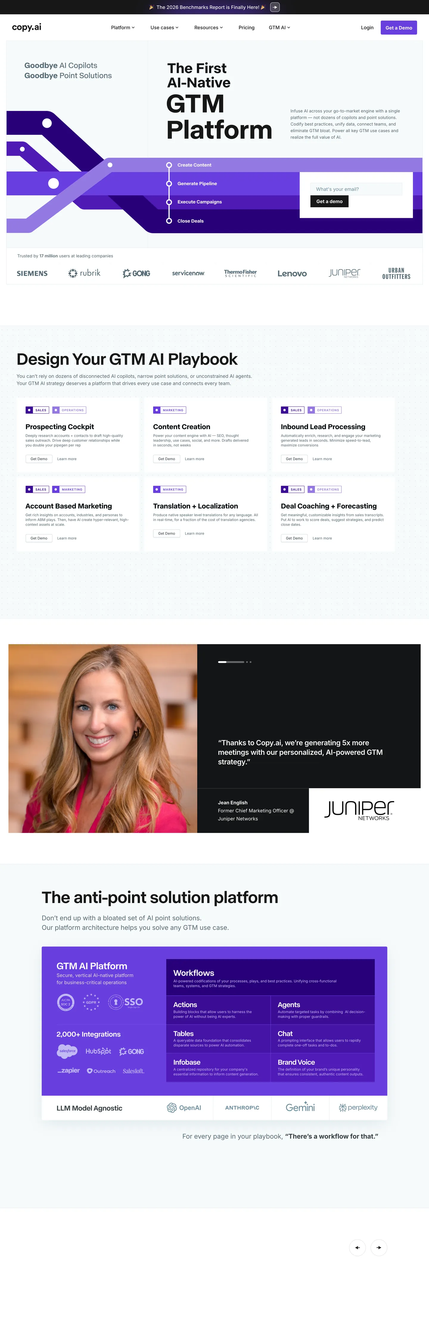
Copy.ai's marketing site stages its hero as a split between two surfaces — an editorial white slab on the left carrying an 88px ABC Normal display headline in graphite, and a deep indigo-to-mid-purple gradient slab on the right that holds a screenshot of the product UI in shadow. The two halves meet at a sharp diagonal rather than a soft fade. Where most AI platforms paint the entire hero as either flat-white or a gradient atmosphere, Copy.ai treats the gradient as a contained architectural panel that breaks across the top band and stops at the section boundary. The remaining page returns to near-white and runs in disciplined typography.
The DESIGN.md file packages the system into a machine-readable spec for React tooling. Inside: 16 colors tokens organized into a graphite text ladder (near-black at 720 occurrences, dim graphite at 22 occurrences, mid-gray-blue at 21), a single primary purple held in reserve for the CTA and the gradient stops, plus a small set of pastel structural tints inherited from the older Webflow theme. Typography is split into two voices — ABC Normal in weights 500 and 600 at sizes 24, 26, 48, 56, and 88px for every display tier, and Inter in weights 400-700 at 12, 14, and 16px for every body, nav, and label. Radii sit almost entirely at 4px across 14 of 17 captured corners; the only exceptions are two 50% avatars.
Feed this file to Claude or Cursor and it reproduces Copy.ai's specific moves: the 88px ABC Normal hero in graphite, the diagonal gradient panel running primary purple to deep indigo, the tight 4px corners, and the Inter body-paragraph tier at 14px in dim graphite. The token references resolve cleanly — the brand purple for the CTA fill, the graphite ink for headlines and body, the structural hairlines for dividers. One caveat: the gradient hero only works if you have a long marketing display sentence to anchor the white left half — applied to a short headline it leaves the gradient feeling decorative rather than structural.
What makes it distinct
5
- Gradient slab herothe right two-thirds of the above-fold band is a deep indigo to mid-purple gradient running from near-black to lavender, used as a structural container rather than an accent
- Two-typeface splitABC Normal at 24-88px in weights 500-600 carries every display tier, Inter at 12-16px in weights 400-500 carries every body, label, and nav surface
- Tight 4px cornersthe dominant radius is 4px across buttons, cards, and inputs; 50% appears only on the two avatar circles in the testimonial strip
- Editorial white below the foldonce past the gradient hero, every section returns to a near-white surface with graphite ink text and hairline gray dividers
- Purple held in reservethe saturated brand purple lives inside the hero gradient and the primary CTA fill, then disappears entirely below the fold
copy.ai
Live at copy.ai
A snapshot of the brand in production. Scroll the frame to see the whole page.
Colors
16 colors
Copy.ai's system runs on #693edf as its primary voltage, used in 1 of 16 components. Type is set in Inter across 13 tokens from 12px to 88px, weights 400–700. Shape language is sharp — components average 3px corner radius, favoring crisp rectangles.
Brand & Accent
Sparing, CTA-only voltage · 5
Surface
Page and card backgrounds · 2
Text
Headlines, body, captions · 6
Borders & Hairlines
Dividers, outlines, rules · 3
Typography
13 type tokens
Set in Inter across 13 tokens, from 12px to 88px, weights 400–700. Shown in its own stack: where the font isn't installed, the fallback the file names stands in.
- display-xl88px · weight 600 · lh 88pxThe quick brown fox jumps over the lazy dog
- display-lg56px · weight 500 · lh 66pxThe quick brown fox jumps over the lazy dog
- display-md48px · weight 600 · lh 48px · tracking 0.25pxThe quick brown fox jumps over the lazy dog
- heading-lg26px · weight 600 · lh 34px · tracking 0.25pxThe quick brown fox jumps over the lazy dog
- heading-md24px · weight 600 · lh 34pxThe quick brown fox jumps over the lazy dog
- heading-sm24px · weight 500 · lh 34px · tracking -0.48pxThe quick brown fox jumps over the lazy dog
- body-lg16px · weight 500 · lh 24pxThe quick brown fox jumps over the lazy dog
- body-md14px · weight 400 · lh 22pxThe quick brown fox jumps over the lazy dog
- body-bold16px · weight 700 · lh 24pxThe quick brown fox jumps over the lazy dog
- label-eyebrow12px · weight 500 · lh 24pxThe quick brown fox jumps over the lazy dog
- caption12px · weight 400 · lh 16pxThe quick brown fox jumps over the lazy dog
- button-md14px · weight 400 · lh 20pxThe quick brown fox jumps over the lazy dog
- nav-link14px · weight 400 · lh 20pxThe quick brown fox jumps over the lazy dog
Layout
Radii and spacing
5 corner radii and 8 spacing values. Shape language: sharp.
Radii
- none0px
- sm4px
- md8px
- full9999px
- circle50%
Spacing
- xs6px
- sm10px
- base16px
- md20px
- lg24px
- xl32px
- 2xl48px
- 3xl60px
Components
16 components
Each rendered from its tokens (color, type, radius, padding) on Copy.ai's own canvas.
- Hero Sectionhero-sectionHero Section
- Hero Headinghero-headingHero Heading
- Section Headingsection-headingSection Heading
- Split Statementsplit-statementSplit Statement
- Body Paragraphbody-paragraphBody Paragraph
- Body Paragraph Strongbody-paragraph-strongBody Paragraph Strong
- Label Eyebrowlabel-eyebrowLabel Eyebrow
- Button Primarybutton-primaryButton Primary
- Button Secondarybutton-secondaryButton Secondary
- Top Navtop-navTop Nav
- Nav Linknav-linkNav Link
- Gradient Panelgradient-panelGradient Panel
- Feature Cardfeature-cardFeature Card
- Testimonial Cardtestimonial-cardTestimonial Card
- Avatar Circleavatar-circleAvatar Circle
- Type here…text-inputText Input
In use
The system, in use
Copy.ai's tokens on the kind of product it builds.
Build something people actually use.
A short paragraph of marketing copy that previews how the brand's display tier and body tier read together. Two sentences is usually enough.
FAQ
Copy.ai design system FAQ
Common questions about Copy.ai's tokens, components, and how to use this DESIGN.md in your project.
Read next
Related reading
Specs, directories, and component libraries that pair with this design system.
- Browse all design systemsThe full directory of DESIGN.md files on shadcn.io, with live mockups for each.shadcn.io
- Copy.ai — official siteCopy.ai's public marketing site — the source of truth for the live tokens captured in this file.copy.ai (opens in a new tab)
- The DESIGN.md specificationGoogle Labs' open spec for machine-readable design system files — the format this page is built on.github.com (opens in a new tab)
Use it
Use Copy.ai in your project
One machine-readable file. Drop it into Claude, Cursor, or any AI tool that reads DESIGN.md.
Download the DESIGN.md
One machine-readable file: every color, type, radius, spacing, and component token of Copy.ai.
Feed it to your AI tool
Drop it into Claude, Cursor, or GitHub Copilot. The agent writes React components and Tailwind classes that match Copy.ai's visual language.
Reference the tokens directly
Or paste the values into your Tailwind config, CSS variables, or component library: every color, size and radius is a quoted, ready-to-copy value.
Read the full DESIGN.md: overview, rationale, do’s and don’ts
Overview
Copy.ai's marketing site stages its above-fold band as a split surface. Gradient slab hero. The left two-fifths is a pure-white editorial half carrying an 88px ABC Normal display headline in graphite ({colors.ink} — #171717); the right three-fifths is a deep indigo-to-mid-purple gradient slab anchored at {colors.primary-deeper} (#29007a) at the top, running through {colors.primary-mid} (#4514a6) in the body, ending near {colors.primary} (#693edf) at the bottom. The two halves meet at a sharp diagonal rather than a soft fade, and the gradient holds a product-UI screenshot in shadow. Where Jasper paints the entire hero with a flat purple wash and Writer sits on white-on-white with a single CTA accent, Copy.ai treats the gradient as a contained architectural panel that breaks across the top band and stops at the section boundary. Below the fold the page returns to near-white surfaces and the brand purple disappears.
The two-typeface split is the second structural move. ABC Normal — a contemporary grotesk that ships only on the marketing site — carries every display tier from 24px up to 88px in weights 500 and 600. Inter handles every body, label, eyebrow, and nav surface at 12-16px in weights 400-700. There is no overlap; ABC Normal never drops below 24px and Inter never climbs above 16px (the 22px and 24px Inter entries that appear in the extraction are isolated single-element renders). The display family does the magazine work; Inter does the running-text work.
The radius scale is binary-tight. 14 of 17 captured corners sit at 4px ({rounded.sm}) — buttons, cards, dropdown surfaces, the input field. The remaining three are split between an 8px outlier ({rounded.md}) and two 50% avatar circles ({rounded.circle}). There is no soft 12-16-24px middle tier the way consumer AI brands like Anthropic or ChatGPT use; Copy.ai reads closer to a business-software aesthetic.
Key Characteristics:
- Brand voltage
{colors.primary}(#693edf) is held in reserve almost entirely — appearing inside the hero gradient stops and as the CTA fill, then absent from the rest of the page. - Two-typeface split: ABC Normal at 24-88px in weights 500-600 for display, Inter at 12-16px in weights 400-700 for body and labels.
- Tight 4px (
{rounded.sm}) radius across 14 of 17 captured UI corners; 50% ({rounded.circle}) only on avatar surfaces. - Hero gradient runs from
{colors.primary-deeper}(#29007a) through{colors.primary-mid}(#4514a6) to{colors.primary}(#693edf) — three stops, contained inside a single architectural panel. - Graphite ink ladder:
{colors.ink}(#171717) at 720 occurrences for primary text,{colors.muted-blue}(#566b76) at 42 for body paragraphs,{colors.muted}(#5d5d5d) at 44 for secondary labels. - Editorial white canvas (
{colors.canvas}) below the fold — every section after the hero returns to pure white with hairline{colors.hairline}(#e0e0e0) dividers between cards. - Testimonial strip uses a near-black
{colors.ink-soft}(#222222) card with a graphite-frame photo on the left — the only dark-canvas moment outside the hero gradient.
Colors
Brand
- Primary Purple (
{colors.primary}— #693edf): frequency 2. Used as background (2). Wired in CSS as--colors--primary-purple. The brand voltage — fills the CTA "Get a Demo" button and serves as the light end-stop of the hero gradient. Rare on the captured page; the gradient does almost all the brand-purple work. - Primary Dark (
{colors.primary-dark}— #3b0d96): frequency 2 as background. A mid-stop in the hero gradient between the near-black indigo top and the mid-purple body. - Primary Deeper (
{colors.primary-deeper}— #29007a): frequency 1 as background. The top stop of the hero gradient — almost indigo, deep enough to anchor a near-black product screenshot in shadow. - Primary Mid (
{colors.primary-mid}— #4514a6): frequency 2 as background. A mid-stop in the gradient between deep and primary purple. - Primary Light (
{colors.primary-light}— #4f1bb7): frequency 2 as background. The lightest gradient stop before the brand voltage — a saturated mid-violet.
Text
- Ink (
{colors.ink}— #171717): frequency 720 — 361 as text, 350 as border, 9 as background. Wired as--colors--primary-black. The dominant text color across the entire page — display headlines, body paragraphs, button labels. Not pure black; a near-black graphite that softens the contrast slightly. - Ink Soft (
{colors.ink-soft}— #222222): frequency 31. The testimonial-card surface fill and a secondary text tone — slightly lighter than{colors.ink}. - Ink Graphite (
{colors.ink-graphite}— #364045): frequency 34 — 20 as text, 14 as border. A cool-toned graphite for tertiary text and divider strokes. - Muted Blue (
{colors.muted-blue}— #566b76): frequency 42 — 21 as text, 21 as border. The dominant body-paragraph color rendered by<p>elements at 14px / 400. Cool-toned, slightly desaturated. - Muted (
{colors.muted}— #5d5d5d): frequency 44 — 22 as text, 22 as border. Wired as--colors--grey,--old-swatches--subtext,--text-gray. Secondary label and caption text. - Nav Link (
{colors.nav-link}— #333333): frequency 4. The dedicated graphite for top-nav link labels — slightly lighter than{colors.ink}to read as secondary against the white nav surface.
Surface
- Canvas (
{colors.canvas}— #ffffff): frequency 112 — 37 as text, 40 as background, 33 as border. Wired as--colors--white,--colors--off-white,--colors--primary-gray-white. The dominant body surface; every section below the fold sits on it. - Surface Input (
{colors.surface-input}— #f6fafb): a near-white tint used as the text-input field fill, providing a barely-perceptible lift from the canvas.
Hairline
- Hairline (
{colors.hairline}— #e0e0e0): frequency 11 — 2 as text, 9 as border. Wired as--colors--borders-lite-grey. The dominant border tone for feature-card outlines and divider strokes. - Hairline Soft (
{colors.hairline-soft}— #ccd9e0): frequency 12 — 6 as border, 6 as shadow. A slightly cool-toned hairline used on the rare elevated dropdown surfaces. - Hairline Cool (
{colors.hairline-cool}— #e4edf1): frequency 3 — 2 as border, 1 as shadow. Wired as--old-swatches--light-blue. The input-field outline tone.
Typography
Font Families
The system runs a two-family split: ABC Normal for every display tier (24px and up) and Inter for every body, label, nav, and button surface (12-16px). ABC Normal is a contemporary grotesk that ships only on the marketing site; Inter is the open-source workhorse. Fallbacks walk to sans-serif on ABC Normal and inherit Inter's standard system stack.
The split is the distinguishing typographic move. Where competitors like Jasper run a single sans across all tiers and Writer leans on Söhne for display plus Inter for body, Copy.ai keeps the two voices strictly separated by size — ABC Normal owns 24px and up, Inter owns 16px and down, with no crossover.
Hierarchy
| Token | Size | Weight | Line Height | Use |
|---|---|---|---|---|
{typography.display-xl} | 88px | 600 | 88px | Hero h1 ("GTM Platform") |
{typography.display-lg} | 56px | 500 | 66px | Section h2 ("Design Your GTM AI Playbook", "The anti-point solution platform") |
{typography.display-md} | 48px | 600 | 48px | Split-panel emphasis statements |
{typography.heading-lg} | 26px | 600 | 34px | h3 sub-section titles |
{typography.heading-md} | 24px | 600 | 34px | h3 product-feature titles |
{typography.heading-sm} | 24px | 500 | 34px | h4 secondary feature titles |
{typography.body-lg} | 16px | 500 | 24px | Default running text — nav-anchored body |
{typography.body-md} | 14px | 400 | 22px | The workhorse body paragraph rendered by <p> elements |
{typography.body-bold} | 16px | 700 | 24px | Strong-emphasis inline text |
{typography.label-eyebrow} | 12px | 500 | 24px | Uppercase eyebrow labels above feature cells |
{typography.caption} | 12px | 400 | 16px | Metadata strips, customer-logo captions |
{typography.button-md} | 14px | 400 | 20px | Primary and secondary button labels |
{typography.nav-link} | 14px | 400 | 20px | Top-nav link labels |
Principles
Display weight tops out at 600 — the 88px hero h1 in ABC Normal at weight 600 is the loudest typographic moment on the page. Section h2s drop one weight step to 500 at 56px. Body and labels in Inter sit at weight 400; the uppercase eyebrow labels above feature cells use weight 500 to lift them above the running 400-weight body. There is no 800 or black weight anywhere in the system. The split-statement at 48px / 600 has 0.25px letter-spacing — a barely-perceptible loosening to compensate for the heavier weight at the smaller display size.
Note on Font Substitutes
ABC Normal is licensed and ships only on the marketing site. The closest open-source substitutes are Geist at weight 600 (Vercel's open-source sans) or Bricolage Grotesque at the same weights — both transfer cleanly at the 88px display tier. Inter is already open-source and is referenced as-is in the system stack; no substitute needed.
Layout
Spacing System
- Base unit: 4px, with 8px as the dominant module on smaller gaps and 20-32px on the larger ones.
- Tokens:
{spacing.xs}6px ·{spacing.sm}10px ·{spacing.base}16px ·{spacing.md}20px ·{spacing.lg}24px ·{spacing.xl}32px ·{spacing.2xl}48px ·{spacing.3xl}60px. - Section padding (vertical): ~60-80px between major sections on the white canvas.
- Card internal padding:
{spacing.lg}(24px) on testimonial and feature cards;{spacing.md}(20px) on the smaller feature cells in the playbook grid. - Hero padding: ~60px vertical on the gradient panel; the white half holds the headline with minimal horizontal padding because the display sentence does the work.
Grid & Container
- Max content width: ~1280px on the hero, ~1080px on the feature grid and editorial sections below the fold.
- Hero: asymmetric split at roughly 40/60 — the editorial white half on the left holds the 88px headline plus a 14px body lead and the primary CTA pair; the gradient panel on the right holds the product-UI screenshot.
- "Design Your GTM AI Playbook" grid: 3-column grid of feature cells with eyebrow labels, headings, and short body paragraphs, each separated by hairline rules.
- Testimonial strip: asymmetric 2-column split — a graphite-frame photo of a customer on the left and a near-black testimonial card on the right.
- "Anti-point solution platform": a single 1080px-wide card containing the gradient panel reproduced at smaller scale with a flat product UI overlay.
Rhythm
The page alternates between gradient hero and editorial body rather than holding a single tempo. The above-fold band is dense — gradient slab, product screenshot, headline, sub-paragraph, CTA pair. Section 2 (the playbook grid) is generous — three roomy cells with eyebrow labels and short paragraphs. The testimonial strip is dense again — photo plus dark card. The closing section is the most generous — a single split panel anchoring the brand voice in one card.
Elevation
The system has essentially no shadow tier. The captured page has a single pure-black shadow occurrence and 6 occurrences of {colors.hairline-soft} as shadow — almost all confined to barely-perceptible dropdown elevations. Hairline borders ({colors.hairline} and {colors.hairline-cool}) carry the work that shadows would carry on a typical SaaS page; depth comes from surface contrast (gradient over white, near-black testimonial card over white) rather than from layered elevation.
- Flat (no shadow): hero body, feature cells, testimonial cards, footer — 99% of surfaces.
- Gradient panel: the only surface with meaningful depth — three purple stops running from near-indigo at the top to mid-violet at the bottom inside a contained slab.
- Hairline outlines:
{colors.hairline}(#e0e0e0) marks card edges and dividers — the structural tone that does most of the elevation work.
Shapes
The radius scale is binary-tight: 4px everywhere except the avatar circles.
{rounded.none}0px — only on the input field and the gradient panel edge.{rounded.sm}4px — the dominant radius, on buttons, feature cards, testimonial cards, dropdown surfaces. 14 captured occurrences.{rounded.md}8px — a single outlier on one minor surface.{rounded.full}9999px — declared but not rendered on the marketing surface.{rounded.circle}50% — the two avatar circles in the testimonial strip; renders as a full circle on square avatar elements.
There is no 12 / 16 / 20px middle tier. The system commits to tight 4px corners across UI surfaces, which gives Copy.ai a business-software identity rather than the soft consumer-AI feel of brands using 16-24px radii. The pair of avatar circles is the only place the system goes round.
Components
hero-section — White canvas surface on the left half, gradient panel on the right. 60×32px padding. The structural container for the above-fold band.
hero-heading — Graphite {colors.ink} text on the white left half, ABC Normal 88px / 600. "GTM Platform" is the canonical instance — the loudest typographic moment on the page.
section-heading — Same graphite ink, ABC Normal 56px / 500. Used for "Design Your GTM AI Playbook", "The anti-point solution platform", "Reimagine your everyday work with AI".
split-statement — ABC Normal 48px / 600 with 0.25px tracking. Reserved for short editorial statements anchored to a single card.
body-paragraph — Inter 14px / 400, color {colors.muted-blue} (#566b76). The workhorse body paragraph rendered by <p> elements. Cool-toned graphite that reads softer than the headline ink.
body-paragraph-strong — Inter 16px / 700, graphite ink. Used for emphasis inside body copy and for short callout statements.
label-eyebrow — Inter 12px / 500 uppercase, graphite ink. The eyebrow label above feature cells ("STREAMLINE WORKFLOWS"). The only uppercase treatment in the system.
button-primary — The signature CTA. {colors.primary} (#693edf) fill, graphite text, {rounded.sm} 4px radius, 12×16px padding, 47px height. "Get a Demo" is the canonical instance. The brand purple lives almost exclusively here and in the hero gradient stops.
button-secondary — White {colors.canvas} fill, graphite text, 1px {colors.hairline} border, {rounded.sm} 4px radius, 12×16px padding, 47px height. Used for the secondary "Watch Demo" CTA paired beside the primary purple button.
top-nav — White surface, 64px height, with the wordmark flush left, product-nav links (Product, Customers, Resources, Pricing) center, and the right-aligned Login plus Get Demo cluster.
nav-link — Graphite {colors.nav-link} (#333333) text in {typography.nav-link} (Inter 14px / 400). No hover background visible on the captured surface.
gradient-panel — The right-half slab of the hero. Three stops running from {colors.primary-deeper} (#29007a) at the top through {colors.primary-dark} (#3b0d96) and {colors.primary-mid} (#4514a6) to {colors.primary} (#693edf) near the bottom. Holds a product-UI screenshot in shadow. 32px internal padding around the screenshot frame.
feature-card — White surface, 1px {colors.hairline} border, {rounded.sm} 4px radius, 20×24px padding. Holds the playbook grid cells — eyebrow label, h3 title, short body paragraph.
testimonial-card — Near-black {colors.ink-soft} (#222222) fill, white text, {rounded.sm} 4px radius, 24px padding. Sits beside the graphite-frame customer photo; the only dark-canvas moment outside the hero gradient.
avatar-circle — {rounded.circle} 50% radius, 40px height. The only round surface in the system; appears as the customer-photo crop in the testimonial strip.
text-input — {colors.surface-input} (#f6fafb) fill, graphite text, 1px {colors.hairline-cool} (#e4edf1) border, 0px radius (square corners), 42px height. The "Email" capture field in the hero CTA stack.
Do's and Don'ts
Do treat the gradient as a contained architectural slab. The hero gradient lives inside a single panel that breaks across the top band and stops at the section boundary — extending the gradient into a full-bleed atmospheric wash would lose the editorial-white left half that anchors the system.
Do keep ABC Normal above 24px and Inter at 16px and below. The two-typeface split is the structural typographic move; using Inter for an h2 or ABC Normal for body copy collapses the system into a single sans and destroys the magazine-versus-running-text distinction.
Do use {colors.muted-blue} (#566b76) for body paragraphs rendered by <p> elements. The dedicated cool-toned graphite is the workhorse body tone — 21 occurrences as text — and reads softer against the white canvas than the headline {colors.ink} would.
Do hold the brand purple in reserve. The {colors.primary} voltage fills only the CTA and the gradient end-stop; multiplying it into secondary accents (link text, icon fills, divider strokes) destroys the gradient-versus-graphite contrast that defines the page.
Don't use a {rounded.md} 8px or larger radius across UI surfaces. The system is committed to 4px ({rounded.sm}) on 14 of 17 captured corners; introducing a 12-16-24px middle tier softens the business-software identity into a consumer-AI feel.
Don't swap the hero gradient for a flat purple block. The three-stop gradient running from {colors.primary-deeper} (#29007a) through {colors.primary-mid} (#4514a6) to {colors.primary} (#693edf) is the brand's depth signal — flattening it to a single fill loses the architectural-slab quality and reads as a generic SaaS accent.
Don't use the brand purple {colors.primary} for body text or link color. Below the fold the purple disappears entirely; rendering inline links or paragraph emphasis in purple breaks the "voltage held in reserve" discipline and dilutes the CTA fill.
Don't introduce a third typeface tier. The ABC Normal + Inter split owns every text surface; adding a serif for pull quotes or a mono for code blocks would break the two-voice discipline that makes the magazine-versus-running-text contrast read.
Known Gaps
- Hover and focus states: the captured marketing surfaces show resting states only. The full hover, active, focus, and disabled matrix for the primary CTA and feature cards is not exposed.
- Form input error states: the email-capture
{component.text-input}carries the resting state; validation and error styling lives in the gated demo flow and is not captured. - Motion: the hero gradient appears static in the screenshot but may animate (gradient drift, parallax on scroll) in the live page; the spec captures end-state values only.
- Mobile layout: the captured surface is desktop-only at 1440px. The asymmetric 40/60 hero split likely stacks into a vertical pattern at narrower viewports, but the breakpoint values are not exposed in the marketing CSS.
- Old Webflow palette: the CSS still exposes
--old-swatches--*tokens — a light-sea-green primary, a teal accent, and a violet color-4 — from a previous theme; these are declared but never render on the captured page and are not included as primary tokens. - Product surfaces: this DESIGN.md captures the marketing site only. The Copy.ai workflow editor (
app.copy.ai) carries a separate token set for canvas, node, and connector styling that is not represented here.
AI & LLM Platforms
More systems like this
More DESIGN.md files in AI & LLM Platforms.
Pricing
Build it with Pro
The DESIGN.md files are free. Pro adds 6,000+ blocks, premium templates and the MCP server, so your AI editor builds in your system for you.
4.9/5 out of 5 · 150+ reviewsfrom 150+ founders and developers.
Billing
Billed once a year in USD. Cancel anytime.
- How many people can use the license.
- Client work, SaaS products and anything you charge for.
- Production-ready React sections: hero, pricing, features, dashboards and more.
- Complete multi-page sites you can ship as they are.
- React icons from every major library, installable with one command.
- Presets that restyle every block, in light and dark.
- Lets your AI editor search, preview and install blocks for you.
- Priority requests are answered first.
Individual
For personal projects & open source
$32instead of $49/mo
$389 billed yearly
- Seats: 1 seat
- Commercial use: Personal & open source only
- Pro blocks: 6,000+ blocks
- Templates: All 14 templates
- React icons: 294k+ icons
- Themes: All 59 themes
- MCP server: Basic usage
- Support: Standard
Team
Most popularFor freelancers, agencies & startups
$66instead of $99/mo
$789 billed yearly · ≈ $13/dev/mo
- Seats: Up to 5 seats
- Commercial use: Included
- Pro blocks: 6,000+ blocks
- Templates: All 14 templates
- React icons: 294k+ icons
- Themes: All 59 themes
- MCP server: High usage
- Support: Priority
Organization
For companies with larger teams
$132instead of $199/mo
$1,589 billed yearly
- Seats: Unlimited seats
- Commercial use: Included
- Pro blocks: 6,000+ blocks
- Templates: All 14 templates
- React icons: 294k+ icons
- Themes: All 59 themes
- MCP server: Unlimited usage
- Support: Priority
Billed once a year in USD. Cancel anytime.
Individual
For personal projects & open source
$32instead of $49/mo
$389 billed yearly
- How many people can use the license.Seats: 1 seat
- Client work, SaaS products and anything you charge for.Commercial use: Personal & open source only
- Production-ready React sections: hero, pricing, features, dashboards and more.Pro blocks: 6,000+ blocks
- Complete multi-page sites you can ship as they are.Templates: All 14 templates
- React icons from every major library, installable with one command.React icons: 294k+ icons
- Presets that restyle every block, in light and dark.Themes: All 59 themes
- Lets your AI editor search, preview and install blocks for you.MCP server: Basic usage
- Priority requests are answered first.Support: Standard
Team
Most popularFor freelancers, agencies & startups
$66instead of $99/mo
$789 billed yearly · ≈ $13/dev/mo
Everything in Individual, plus
- How many people can use the license.Seats: Up to 5 seats
- Client work, SaaS products and anything you charge for.Commercial use: Included
- Lets your AI editor search, preview and install blocks for you.MCP server: High usage
- Priority requests are answered first.Support: Priority
Organization
For companies with larger teams
$132instead of $199/mo
$1,589 billed yearly
Everything in Team, plus
- How many people can use the license.Seats: Unlimited seats
- Lets your AI editor search, preview and install blocks for you.MCP server: Unlimited usage
- Secure checkout via Stripe
- Code lives in your repo
- Keep what you've shipped if you cancel
- License terms
Your system, built for you
Every block, template and icon, installed by your AI agent in your design system. The DESIGN.md files stay free.