Mailchimp Design System
Mailchimp's design system as a DESIGN.md file. Yellow #ffe01b, Means Web serif, Graphik Web sans, 18 components. For React, Next.js, and AI tools.
Add shadcn.io to your AI agent. · Pro It installs blocks, icons and templates in your design system from a prompt, with Pro.
Set up MCP- Primary
- #ffe01b
- Typeface
- Graphik Web
- Shape
- Mixed
- Base radius
- 8px
- Colors
- 18
- Type tokens
- 12
- Components
- 18
- Spacing values
- 9
About
About Mailchimp DESIGN.md
Curated by Dov Azencot · Updated May 13, 2026 · Source mailchimp.com (opens in a new tab)
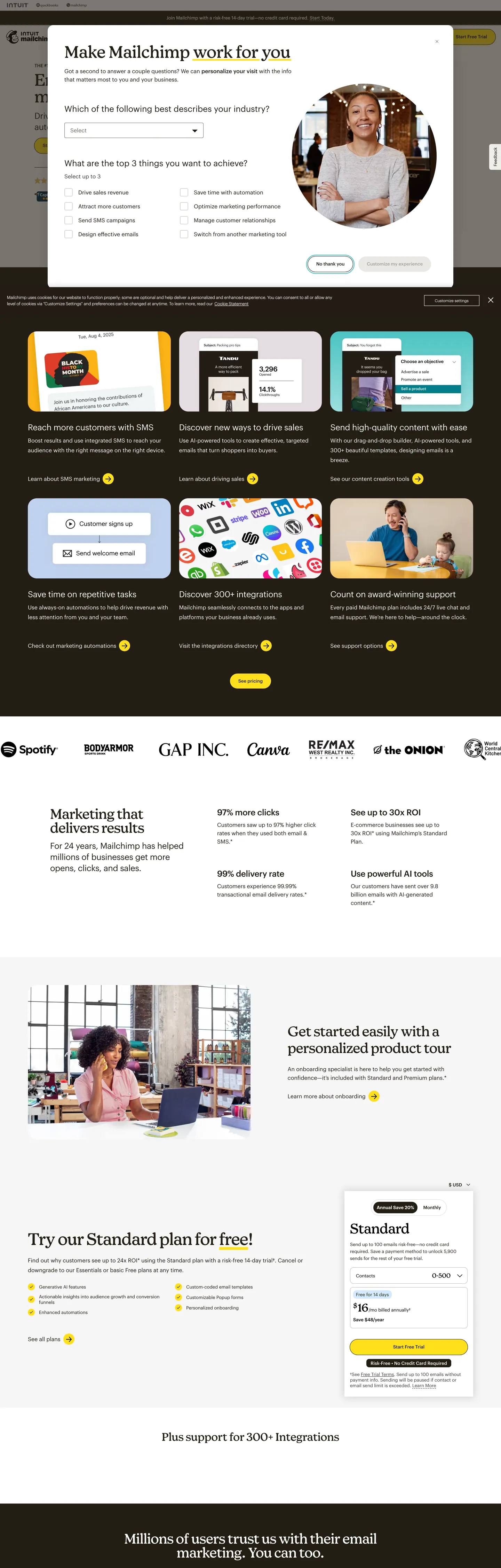
Mailchimp's marketing canvas is a warm off-white page (`#efeeea`) carrying Cavern brown ink (`#231e15`) — not black — and a single chromatic note, Mailchimp Yellow (`#ffe01b`), that surfaces in exactly two places: the bordered pill CTA fill and the page's text-selection highlight (`rgba(255,224,27,0.15)`). The hero opens with a Means Web serif headline ("Email & SMS marketing minus the learning curve.") set at 48px / weight 400 with -1px tracking, paired with Graphik Web sans for every supporting label, nav link, and pricing row. Where most marketing platforms recruit a saturated gradient or a screenshot-led hero, Mailchimp uses one yellow pill, one serif headline, and a generous warm-paper page floor to carry the whole opening band.
This DESIGN.md packages the spec into one machine-readable file. Inside: 18 colors tokens grouped into one brand voltage, the Cavern ink ladder, a soft off-white surface scale, plus a Teal accent (`#004e56`) used on inline link underlines and a pale Sky surface (`#d2ebff`) used on a single integration card; 12 typography tokens running Means Web serif from 48px hero down to 40px h2 and Graphik Web sans from 24px subhead down to 11px legal copy; 8 corner radii anchored on the 26px (2em) CTA pill and a 32px feature-card radius; 9 spacing tokens stepping on a 4px grid up to 96px section gutters; and 18 components covering the bordered pill primary, the pill-outline secondary, the Means Web hero headline, the dark testimonial band, the Standard pricing card, the integration tile, top nav, and footer. Format follows the Google Labs DESIGN.md spec.
Feed the file to Claude, Cursor, or Copilot and the agent will reproduce Mailchimp's restraint — Cavern over off-white, Yellow held for exactly one CTA per viewport, Means Web for h1/h2 and Graphik Web for everything else — instead of a generic shadcn theme. Reference the tokens directly inside Tailwind config, CSS variables, or your own component library. The discipline worth studying is the bordered-pill CTA: a 26px-radius button with a 1px Cavern stroke around a Yellow fill, the rare primary action that uses both color AND outline rather than picking one. It is what makes a Mailchimp button look like Mailchimp from across the page, even before you read the label.
What makes it distinct
5
- Single brand voltageMailchimp Yellow (`#ffe01b`) appears only on the pill CTA fill and the text-selection highlight, never as a body color
- Serif + sans pairingMeans Web serif carries every h1/h2 at weight 400, Graphik Web sans carries body, nav, and buttons
- Bordered pill CTA26px radius (2em) wrapped in a 1px Cavern (`#231e15`) stroke around the Yellow fill, unique to Mailchimp among email platforms
- Cavern brown ink`#231e15` rather than black, used 390 times across text and hairlines for a warmer page feel
- Means Web display tracks -1px at 48px and -0.5px at 40pxthe serif headlines pull tight while sans body stays at 0
mailchimp.com
Live at mailchimp.com
A snapshot of the brand in production. Scroll the frame to see the whole page.
Colors
18 colors
Mailchimp's system runs on #ffe01b as its primary voltage, used in 2 of 18 components. Type is set in Graphik Web across 12 tokens from 11px to 48px, weights 400–500. Shape language is mixed across 18 components, blending pills, soft rounds, and squarer corners.
Brand & Accent
Sparing, CTA-only voltage · 2
Surface
Page and card backgrounds · 5
Text
Headlines, body, captions · 7
Borders & Hairlines
Dividers, outlines, rules · 2
Other
Specialty colors · 2
Typography
12 type tokens
Set in Graphik Web across 12 tokens, from 11px to 48px, weights 400–500. Shown in its own stack: where the font isn't installed, the fallback the file names stands in.
- display-xl48px · weight 400 · lh 1 · tracking -1pxThe quick brown fox jumps over the lazy dog
- display-lg40px · weight 400 · lh 1 · tracking -0.5pxThe quick brown fox jumps over the lazy dog
- display-md48px · weight 400 · lh 1.17 · tracking 0pxThe quick brown fox jumps over the lazy dog
- subhead24px · weight 500 · lh 1.33 · tracking -0.32pxThe quick brown fox jumps over the lazy dog
- body-lg24px · weight 400 · lh 1.33 · tracking -0.32pxThe quick brown fox jumps over the lazy dog
- body-md16px · weight 400 · lh 1.5 · tracking 0pxThe quick brown fox jumps over the lazy dog
- body-sm13px · weight 400 · lh 1.35 · tracking 0pxThe quick brown fox jumps over the lazy dog
- button13px · weight 500 · lh 1.5 · tracking 0pxThe quick brown fox jumps over the lazy dog
- nav-link13px · weight 500 · lh 1.1 · tracking 0pxThe quick brown fox jumps over the lazy dog
- caption11px · weight 400 · lh 1.45 · tracking 0pxThe quick brown fox jumps over the lazy dog
- eyebrow13px · weight 500 · lh 1.25 · tracking 0pxThe quick brown fox jumps over the lazy dog
- legal11px · weight 400 · lh 1.45 · tracking 0pxThe quick brown fox jumps over the lazy dog
Layout
Radii and spacing
8 corner radii and 9 spacing values. Shape language: mixed.
Radii
- none0px
- xs3px
- sm4px
- md8px
- lg10px
- xl32px
- pill26px
- full9999px
Spacing
- xxs4px
- xs8px
- sm10px
- md16px
- lg24px
- xl40px
- xxl64px
- section80px
- hero96px
Components
18 components
Each rendered from its tokens (color, type, radius, padding) on Mailchimp's own canvas.
- Button Primarybutton-primaryButton Primary
- Button Primary Hoverbutton-primary-hoverButton Primary Hover
- Button Secondarybutton-secondaryButton Secondary
- Button Disabledbutton-disabledButton Disabled
- Link Inlinelink-inlineLink Inline
- Hero Headinghero-headingHero Heading
- Section Headingsection-headingSection Heading
- Top Navtop-navTop Nav
- Nav Linknav-linkNav Link
- Feature Cardfeature-cardFeature Card
- Integration Tileintegration-tileIntegration Tile
- Pricing Cardpricing-cardPricing Card
- Band Inverseband-inverseBand Inverse
- Testimonial Quotetestimonial-quoteTestimonial Quote
- Eyebrow Labeleyebrow-labelEyebrow Label
- Type here…text-inputText Input
- FooterfooterFooter
- Selection Highlightselection-highlightSelection Highlight
In use
The system, in use
Mailchimp's tokens on the kind of product it builds.
Build something people actually use.
A short paragraph of marketing copy that previews how the brand's display tier and body tier read together. Two sentences is usually enough.
FAQ
Mailchimp design system FAQ
Common questions about Mailchimp's tokens, components, and how to use this DESIGN.md in your project.
Read next
Related reading
Specs, directories, and component libraries that pair with this design system.
- Browse all design systemsThe full directory of DESIGN.md files on shadcn.io, with live mockups for each.shadcn.io
- Mailchimp — official siteMailchimp's email and SMS marketing platform, the source for every token in this spec.mailchimp.com (opens in a new tab)
- The DESIGN.md specificationGoogle Labs' open spec for machine-readable design system files — the format this page is built on.github.com (opens in a new tab)
Use it
Use Mailchimp in your project
One machine-readable file. Drop it into Claude, Cursor, or any AI tool that reads DESIGN.md.
Download the DESIGN.md
One machine-readable file: every color, type, radius, spacing, and component token of Mailchimp.
Feed it to your AI tool
Drop it into Claude, Cursor, or GitHub Copilot. The agent writes React components and Tailwind classes that match Mailchimp's visual language.
Reference the tokens directly
Or paste the values into your Tailwind config, CSS variables, or component library: every color, size and radius is a quoted, ready-to-copy value.
Read the full DESIGN.md: overview, rationale, do’s and don’ts
Overview
Mailchimp's marketing canvas is the rare email-platform surface that puts a serif headline next to a postage-stamp button. The page floor is a warm off-white ({colors.canvas} #efeeea), the ink is Cavern brown ({colors.ink} #231e15) rather than black, and the single chromatic note is Mailchimp Yellow ({colors.primary} #ffe01b) sitting inside a 1px Cavern stroke on the pill CTA. The hero opens with Means Web serif at 48px / weight 400 / -1px tracking — a confident editorial gesture in a category where competitors lean on bold sans display.
Bordered-pill voltage: where most SaaS platforms pick fill OR outline for the primary action, Mailchimp uses both. The button-primary is a 26px-radius pill with a Yellow fill, a 1px Cavern stroke, and Cavern text — three concurrent treatments that turn the button into something closer to a hand-rendered stamp than a flat fintech CTA. On hover the relationship inverts: Cavern fills, Yellow becomes the text, the stroke stays. It is the single move that makes a Mailchimp button recognizable from across the page, before the label is even legible.
Serif-and-sans pairing: Means Web serif carries every h1 and h2 (48px hero / -1px tracking, 40px h2 / -0.5px tracking, both at weight 400). Graphik Web sans carries every other tier — 24px subheads, 16px body, 13px nav and CTA labels, 11px legal copy, all at weight 400 or 500. Where Stripe pulls weight 300 across one family and Linear pulls a single sans at weight 500, Mailchimp pairs two families and lets the serif carry the personality while the sans handles every task that needs to be read at a glance.
Key Characteristics:
- Bordered pill CTA (
{rounded.pill}26px) with a Yellow fill AND a 1px Cavern stroke — the brand's signature action. - Means Web serif for h1/h2 only; Graphik Web sans for everything else — never mixed inside a single tier.
- Cavern brown ink (
{colors.ink}#231e15) rather than black — 390 occurrences across text, hairlines, and CTA strokes. - Mailchimp Yellow (
{colors.primary}#ffe01b) appears only on the pill fill and the text-selection highlight at 15% alpha — never as a section background. - Warm off-white canvas (
{colors.canvas}#efeeea) carries the page floor; white ({colors.surface-1}#ffffff) is reserved for cards and integration tiles. - Single inverse band — the testimonial section flips to
#231e15with white type, but no other component ships a dark variant. - Negative tracking is serif-only — Means Web pulls to -1px at 48px; Graphik Web body and labels stay at 0.
Colors
Mailchimp's palette is a single brand voltage on a warm-paper ladder. The 18 tokens fall into one brand color, an ink ladder, a surface ladder, and two narrow accents.
- Mailchimp Yellow (
#ffe01b) — frequency 13. Used as bg (11), gradient (2). The brand voltage. CSS variables--cta-background-colorand--selection-background-color(at 15% alpha) both point here. Scoped to the pill CTA fill and the page's text-selection highlight — nothing else. - Cavern (
#231e15) — frequency 390. Used as text (185), border (189), bg (8), shadow (8). The system primary. CSS variables--copy-color,--heading-color,--cta-text-color,--cta-stroke-color,--link-colorall resolve to this hex. Not black, not gray — a very dark warm brown that pairs with the off-white canvas to give the page a paper-stock quality. - Black (
#000000) — frequency 667. Used as text (340), border (326), shadow (1). High raw count but mostly inside iframes, embedded SVG illustrations, and third-party content. System-authored text resolves to Cavern, not black. - Off-white canvas (
#efeeea) — frequency 2. Used as bg (2). The page-floor color. The lower frequency reflects that it is applied via a singlebodyrule and inherits everywhere else. - White (
#ffffff) — frequency 94. Used as text (32), bg (25), border (32), shadow (3). The card surface — feature cards, the integration tile container, the standard pricing card all sit on white above the off-white canvas. - Surface-disabled (
#dbd9d2) — frequency 9. Used as bg (1), border (8).--cta-background-color-disabledlives here. The grayed-out pill state and a few card hairlines. - Ink-muted (
#403b3b) — frequency 19. Used as text (10), border (9). A secondary brown for less-emphasized labels and dividers inside cards. - Ink-subtle (
#555555) — frequency 2. Used as text (1), border (1). A tertiary gray reserved for disabled labels. - Ink-faint (
#bcbab6) — frequency 1. Used as border (1). A near-invisible hairline tone for inside-card subdividers. - Accent Teal (
#004e56) — frequency 106. Used as text (53), border (53). The single saturated chromatic note outside Yellow — appears on inline link underlines and on the testimonial cards' brand-color indicator. Not a primary action color. - Surface Sky (
#d2ebff) — frequency 1. Used as bg (1). The single pale-blue tile on the integration section. A one-off feature-card tint, not a system surface. - Surface Sand (
#e7b75f) — frequency 1. Used as bg (1). One warm gold integration tile. Same one-off role as the Sky tile.
Typography
Mailchimp runs two families, never blended within a tier. Means Web is the serif, used exclusively on h1 and h2; Graphik Web is the sans, used for every other word on the page.
Means Web carries the hero at 48px / weight 400 / 1 line-height / -1px tracking — a high-contrast serif by Commercial Type. The h2 step down sits at 40px / weight 400 / 1 line-height / -0.5px tracking. A third Means Web tier appears on inline em emphasis at 48px with weight 400 and 56px line-height. The serif is never set in weight 500 or above; the personality comes from the typeface itself, not the weight.
Graphik Web carries everything else — 24px subheads at weight 500 with -0.32px tracking, 16px body at weight 400 / 1.5 line-height, 13px nav links and CTA labels at weight 500 / 1.1 and 1.5 line-heights respectively, and 11px caption / legal copy at weight 400 with 1.45 line-height. Letter-spacing on every Graphik Web token stays at 0. Negative tracking is reserved for Means Web display and the 24px Graphik subhead; everything 16px and below lives at zero.
Restraint as signature: where most marketing platforms use a single sans across a 7-tier scale, Mailchimp uses two families across 12 tiers and confines the serif to two heading levels. The constraint is what makes the serif read as deliberate rather than decorative.
Layout
The page runs on a 4px spacing grid amplified by a heavy section gutter. The most-used token is {spacing.sm} 10px (38 occurrences), used as the inline gap between nav items, card-interior text rows, and inline icon-and-label pairs. {spacing.lg} 24px (15) handles card padding gaps and the standard between-paragraph rhythm. {spacing.xs} 8px (14) is the tight inter-element gap inside dense rows such as eyebrow + heading pairs.
Section padding lives at {spacing.section} 80px and {spacing.hero} 96px — Mailchimp ships these as --module-padding and --spacing-8 CSS variables, generated from a calc(80*.0625rem) pattern. Asymmetric padding rules show up too: 0px 40px 0px 0px and 0px 0px 0px 40px (9 and 8 occurrences) carry the offset alignment between a section's headline and its supporting copy. The CTA button itself ships at 12px 24px (8 occurrences) and is the only place where a non-grid padding value appears.
The site never uses a max-width wider than the standard 1280px column. There are no full-bleed gradient hero blocks; every section snaps to the same gutter, and the only visual transition between sections is a change of card surface (white card on off-white floor) rather than a band of color.
Elevation & Depth
Hairline-over-shadow: Mailchimp prefers a 1px Cavern (#231e15) border to a drop shadow. The CSS variable --cta-stroke-width resolves to calc(1*.0625rem) — a single px — and the pill CTA uses this stroke as its primary depth cue rather than a soft shadow. Cards lift off the off-white canvas via the {colors.canvas} → {colors.surface-1} contrast (off-white to white), not via Y-offset blur.
The one shadow value in the system is a faint rgba(35,30,21,0.05) cast — Cavern at 5% alpha — used on the feature-card hover state and the pricing card's subtle lift. Shadow color is Cavern, not gray; the brown tint carries through into the depth treatment so cards don't read as floating on a neutral atmosphere.
The single deep band is the testimonial section (band-inverse) at #231e15 with white type — a deliberate inverse moment rather than a global dark theme. Outside that band, every surface stays inside the #efeeea → #ffffff ladder.
Shapes
Pill-as-signature: the brand owns the 26px (2em) radius. The CSS variable --cta-border-radius resolves to 2em and is the most-used radius value on the page (17 occurrences). It applies to button-primary, button-secondary, and button-disabled — every interactive button is a pill at the same radius.
Cards step up to {rounded.xl} 32px (8 occurrences) — the feature card, the integration tile, and the pricing card all share the same generous corner. Inputs use {rounded.sm} 4px (10 occurrences) for a more compact rectangle that doesn't compete with the pill buttons. The {rounded.xs} 3px tier (9) appears on nav-link backgrounds and small inline chips. Circular elements (50%, 7 occurrences) handle the customer-logo dots in the testimonial row.
The system avoids both 9999px ultra-pill geometry on cards and 0px square corners on interactive elements. Every interactive surface is either 26px (CTA), 4px (input), or 3px (nav).
Components
The system documents 18 components, each anchored to declared tokens. Buttons and CTAs are the load-bearing identity; cards and bands carry the rhythm.
button-primary— the bordered pill CTA.{colors.primary}#ffe01bfill,{colors.ink}#231e15text, 1px{colors.ink}stroke, 26px radius,12px 24pxpadding, 44px height. The single move that makes a Mailchimp button look like Mailchimp.button-primary-hover— fill and text swap roles.{colors.ink}becomes the fill,{colors.primary}becomes the text, stroke stays Cavern.button-secondary— white fill, Cavern text, 1px Cavern stroke, same pill geometry. The neutral counterpart to the Yellow pill, used in secondary CTAs and form submit actions outside the hero.button-disabled—{colors.surface-disabled}#dbd9d2fill, ink-subtle text, no stroke contrast. The grayed-out pill state.link-inline— Cavern text underlined with the{colors.accent-teal}#004e56underline color. Body-size sans, no radius, no border.hero-heading— Means Web serif at 48px / weight 400 / -1px tracking, Cavern text on off-white canvas. The h1 of every section opener.section-heading— Means Web serif at 40px / weight 400 / -0.5px tracking. The h2 step-down used on testimonial section heads and "Recommended for your business."top-nav— white surface, 68px height (--iaGlobalNavHeight),0px 40pxhorizontal padding, Cavern nav-link labels at 13px / weight 500.nav-link— 46px hit area, 13px / weight 500 sans, Cavern text, transparent background, 3px hover-state radius.feature-card— white card on off-white canvas,{rounded.xl}32pxcorners,{spacing.xl}40pxpadding, 1px hairline border. The standard product-feature surface.integration-tile— same32pxradius as feature-card but uses one of the one-off surface tints ({colors.surface-sky}#d2ebffor{colors.surface-sand}#e7b75f) instead of white. Used inside the integration grid below the hero.pricing-card— white card,32pxradius, 40px padding, 1px hairline border. The Standard tier card on the pricing band.band-inverse— Cavern background, white text,80px 0pxsection padding. The single dark band in the system, used for the testimonial section.testimonial-quote— Means-Web-styled body-lg quote rendered on the inverse band, white text on Cavern.eyebrow-label— 13px / weight 500 sans, uppercase transform, Cavern text. The pre-headline kicker used above section heads.text-input— white fill, 1px Cavern stroke, 4px radius,12px 16pxpadding, 44px height. Mirrors button height for inline form rows.footer— off-white canvas, Cavern text at 11px caption tier,64px 40pxpadding, no radius.selection-highlight— Mailchimp Yellow at 15% alpha (rgba(255,224,27,0.15)) over Cavern text. The browser text-selection treatment, declared via--selection-background-color.
Do's and Don'ts
Do use the Yellow fill ONLY with a 1px Cavern stroke. A borderless #ffe01b pill loses the brand identity — the bordered-pill is the signature.
Do keep Means Web inside the h1/h2 tier. Setting body type in Means Web inverts the system; the serif's job is editorial display, not paragraph copy.
Do use {colors.ink} #231e15 Cavern for every text color, not #000000. Black appears in the extracted data only inside iframes and SVGs; the brand's authored text is always Cavern.
Do use the off-white {colors.canvas} #efeeea as the page floor; reserve white for cards and tiles. The off-white-to-white contrast is the system's depth cue.
Don't use the Yellow #ffe01b as a section background or large surface fill. It appears only on the pill CTA (width: 138px) and the text-selection highlight at 15% alpha. A full-band Yellow section breaks the rule that one Yellow pill per viewport carries the action.
Don't swap the 26px pill radius for 9999px ultra-pill or 8px rectangular geometry on the primary CTA. The CSS variable --cta-border-radius is fixed at 2em (26px at the default 13px font-size) — this exact radius is what makes the button read as Mailchimp rather than Stripe or Linear.
Don't pair Means Web with weight 500 or above. Every Means Web tier in the extracted typography array sits at weight 400; pushing the serif heavier turns it from editorial into generic display.
Don't use {colors.accent-teal} #004e56 as a primary action color. It is a link-underline accent (106 occurrences, all as text or border) — promoting it to a button background reads as a fintech color choice that competes with the Yellow pill.
Don't use Graphik Web with negative tracking below 24px. Letter-spacing for every Graphik tier 16px and below is 0; pulling the body type tight collapses the readable rhythm that supports the serif headlines.
Known Gaps
- Form-field error and validation states are not captured — the inspected page surfaces no input error styling beyond the focused Cavern stroke.
- The
text-inputcomponent is constructed from observed pricing-page form rows; the live signup form was not in the extracted snapshot. - Animation and transition timings were partially captured (
--iaGlobalNavTransition: opacity 0.2s cubic-bezier(0,0,0,1)) — a 200ms ease is the safe default elsewhere. - The two integration-tile tints (
{colors.surface-sky}and{colors.surface-sand}) appear once each on the home page; a broader pass across/featuresand/productswould likely surface additional tints. - Means Web and Graphik Web are licensed from Commercial Type; open-source substitutes (Tiempos Headline for the serif, Inter for the sans) preserve the proportions but not the personality.
- A dark theme is not documented because the marketing site does not ship one beyond the single
band-inversetestimonial section.
Marketing & CRM
More systems like this
More DESIGN.md files in Marketing & CRM.
Pricing
Build it with Pro
The DESIGN.md files are free. Pro adds 6,000+ blocks, premium templates and the MCP server, so your AI editor builds in your system for you.
4.9/5 out of 5 · 150+ reviewsfrom 150+ founders and developers.
Billing
Billed once a year in USD. Cancel anytime.
- How many people can use the license.
- Client work, SaaS products and anything you charge for.
- Production-ready React sections: hero, pricing, features, dashboards and more.
- Complete multi-page sites you can ship as they are.
- React icons from every major library, installable with one command.
- Presets that restyle every block, in light and dark.
- Lets your AI editor search, preview and install blocks for you.
- Priority requests are answered first.
Individual
For personal projects & open source
$32instead of $49/mo
$389 billed yearly
- Seats: 1 seat
- Commercial use: Personal & open source only
- Pro blocks: 6,000+ blocks
- Templates: All 14 templates
- React icons: 294k+ icons
- Themes: All 59 themes
- MCP server: Basic usage
- Support: Standard
Team
Most popularFor freelancers, agencies & startups
$66instead of $99/mo
$789 billed yearly · ≈ $13/dev/mo
- Seats: Up to 5 seats
- Commercial use: Included
- Pro blocks: 6,000+ blocks
- Templates: All 14 templates
- React icons: 294k+ icons
- Themes: All 59 themes
- MCP server: High usage
- Support: Priority
Organization
For companies with larger teams
$132instead of $199/mo
$1,589 billed yearly
- Seats: Unlimited seats
- Commercial use: Included
- Pro blocks: 6,000+ blocks
- Templates: All 14 templates
- React icons: 294k+ icons
- Themes: All 59 themes
- MCP server: Unlimited usage
- Support: Priority
Billed once a year in USD. Cancel anytime.
Individual
For personal projects & open source
$32instead of $49/mo
$389 billed yearly
- How many people can use the license.Seats: 1 seat
- Client work, SaaS products and anything you charge for.Commercial use: Personal & open source only
- Production-ready React sections: hero, pricing, features, dashboards and more.Pro blocks: 6,000+ blocks
- Complete multi-page sites you can ship as they are.Templates: All 14 templates
- React icons from every major library, installable with one command.React icons: 294k+ icons
- Presets that restyle every block, in light and dark.Themes: All 59 themes
- Lets your AI editor search, preview and install blocks for you.MCP server: Basic usage
- Priority requests are answered first.Support: Standard
Team
Most popularFor freelancers, agencies & startups
$66instead of $99/mo
$789 billed yearly · ≈ $13/dev/mo
Everything in Individual, plus
- How many people can use the license.Seats: Up to 5 seats
- Client work, SaaS products and anything you charge for.Commercial use: Included
- Lets your AI editor search, preview and install blocks for you.MCP server: High usage
- Priority requests are answered first.Support: Priority
Organization
For companies with larger teams
$132instead of $199/mo
$1,589 billed yearly
Everything in Team, plus
- How many people can use the license.Seats: Unlimited seats
- Lets your AI editor search, preview and install blocks for you.MCP server: Unlimited usage
- Secure checkout via Stripe
- Code lives in your repo
- Keep what you've shipped if you cancel
- License terms
Your system, built for you
Every block, template and icon, installed by your AI agent in your design system. The DESIGN.md files stay free.