Airtable Design System
Airtable's design system as a DESIGN.md file. Near-black #181d26, Haas Grotesk, 28 colors, 26 components. For React, Next.js, and AI.
Add shadcn.io to your AI agent. · Pro It installs blocks, icons and templates in your design system from a prompt, with Pro.
Set up MCP- Primary
- #181d26
- Typeface
- Haas
- Shape
- Mixed
- Base radius
- 10px
- Colors
- 28
- Type tokens
- 14
- Components
- 26
- Spacing values
- 8
About
About Airtable DESIGN.md
Curated by Dov Azencot · Updated May 12, 2026 · Source airtable.com (opens in a new tab)
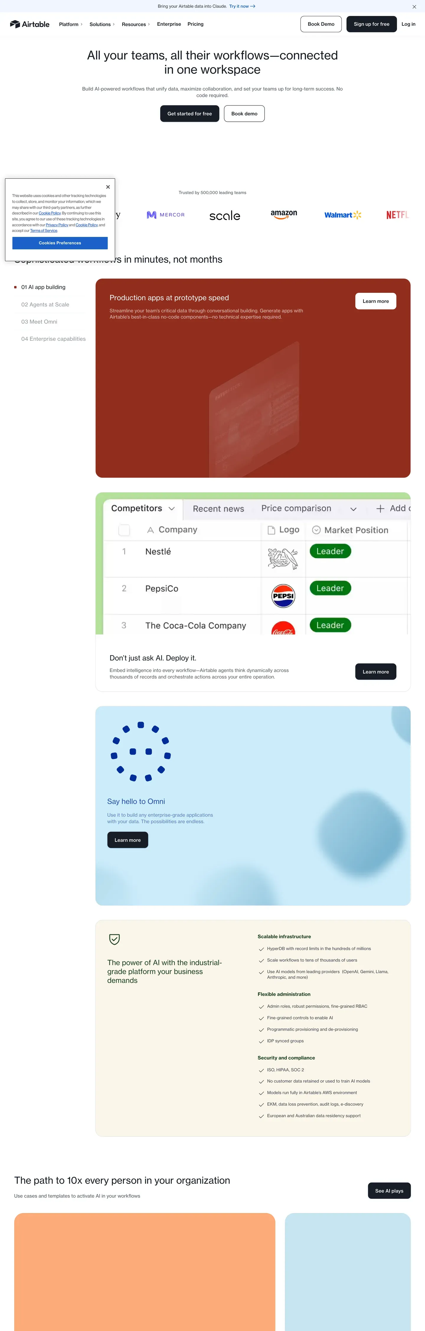
Airtable's marketing site reads like a quiet editorial magazine. The base atmosphere is white canvas, deep #181d26 ink, generous whitespace, and a single confident primary CTA — never a gradient backdrop, never an atmospheric mesh, never the busy aurora that's become the default SaaS template. Nothing fights for attention until a section needs to. Brand voltage doesn't come from accent walls; it comes from full-bleed signature cards in dark coral, deep forest green, navy, and cream that punctuate the long-scroll explainer pages every two or three screens.
This page captures Airtable's marketing system as a DESIGN.md file — Google Labs' open spec for machine-readable design tokens. Inside: 28 colors tokens covering brand, surface, text, signature cards, and a pricing sub-system; 14 typography tokens split between Haas Grotesk for the main editorial body and Inter Display at a custom 475 weight for the pricing surface; six radius tokens hierarchically assigned (12px CTAs, 10px cards, 6px inputs, pill for pricing only); and 26 components definitions covering buttons, signature surfaces, demo cards, pricing tiers, and the articles topic rail.
Drop the file into Claude, Cursor, GitHub Copilot, or any AI assistant that reads structured design tokens. The agent will produce React components and Tailwind classes that match Airtable's actual voice — sober editorial calm, not a generic SaaS template. Use it as a reference for design audits, a starting point for your own workflow product, or a teaching artifact for talking about restraint and the discipline of letting whitespace do the framing.
What makes it distinct
5
- Near-black primary#181d26 is the brand CTA, not the link blue (#1b61c9) hiding in the CSS variables
- Modest type weightsdisplay headlines stay at 400–500; weight is delegated to size and signature surface cards
- Signature surface cardsfull-bleed coral, forest, navy, and cream blocks punctuate long-scroll pages every two or three screens
- Pricing is its own dialectInter Display at weight 475 plus pill-shaped buttons that don't appear anywhere else
- White hero, full stopno gradient, no mesh, no atmospheric backdrop; whitespace and Haas do the framing
airtable.com
Live at airtable.com
A snapshot of the brand in production. Scroll the frame to see the whole page.
Colors
28 colors
Airtable's system runs on #181d26 as its primary voltage, used in 1 of 26 components. Type is set in Haas across 14 tokens from 13.12px to 48px, weights 400–600. Shape language is mixed across 26 components, blending pills, soft rounds, and squarer corners.
Brand & Accent
Sparing, CTA-only voltage · 2
Surface
Page and card backgrounds · 5
Text
Headlines, body, captions · 8
Borders & Hairlines
Dividers, outlines, rules · 4
Semantic
Status, errors, success, links · 3
Other
Specialty colors · 6
Typography
14 type tokens
Set in Haas across 14 tokens, from 13.12px to 48px, weights 400–600. Shown in its own stack: where the font isn't installed, the fallback the file names stands in.
- display-xl48px · weight 500 · lh 1.1The quick brown fox jumps over the lazy dog
- display-lg40px · weight 400 · lh 1.2The quick brown fox jumps over the lazy dog
- display-md32px · weight 400 · lh 1.2The quick brown fox jumps over the lazy dog
- title-lg24px · weight 400 · lh 1.35 · tracking 0.12pxThe quick brown fox jumps over the lazy dog
- title-md20px · weight 400 · lh 1.5The quick brown fox jumps over the lazy dog
- title-sm18px · weight 500 · lh 1.4The quick brown fox jumps over the lazy dog
- label-md16px · weight 500 · lh 1.4The quick brown fox jumps over the lazy dog
- button16px · weight 500 · lh 1.4The quick brown fox jumps over the lazy dog
- body-md14px · weight 400 · lh 1.25The quick brown fox jumps over the lazy dog
- caption14px · weight 500 · lh 1.35 · tracking 0.16pxThe quick brown fox jumps over the lazy dog
- legal13.12px · weight 600 · lh 1.2The quick brown fox jumps over the lazy dog
- pricing-display44.8px · weight 475 · lh 1.1The quick brown fox jumps over the lazy dog
- pricing-section28px · weight 475 · lh 1.2The quick brown fox jumps over the lazy dog
- pricing-card-title20px · weight 475 · lh 1.3The quick brown fox jumps over the lazy dog
Layout
Radii and spacing
6 corner radii and 8 spacing values. Shape language: mixed.
Radii
- xs2px
- sm6px
- md10px
- lg12px
- pill9999px
- full9999px
Spacing
- xxs4px
- xs8px
- sm12px
- md16px
- lg24px
- xl32px
- xxl48px
- section96px
Components
26 components
Each rendered from its tokens (color, type, radius, padding) on Airtable's own canvas.
- Button Primarybutton-primaryButton Primary
- Button Primary Activebutton-primary-activeButton Primary Active
- Button Secondarybutton-secondaryButton Secondary
- Button Secondary On Darkbutton-secondary-on-darkButton Secondary On Dark
- Button Legalbutton-legalButton Legal
- button-icon-circularButton Icon Circular
- Button Pricing Pillbutton-pricing-pillButton Pricing Pill
- Text Linktext-linkText Link
- Top Navtop-navTop Nav
- Hero Bandhero-bandHero Band
- Signature Coral Cardsignature-coral-cardSignature Coral Card
- Signature Forest Cardsignature-forest-cardSignature Forest Card
- Hero Card Darkhero-card-darkHero Card Dark
- Feature Card Tabbedfeature-card-tabbedFeature Card Tabbed
- Cream Callout Cardcream-callout-cardCream Callout Card
- Demo Grid Carddemo-grid-cardDemo Grid Card
- Logo Striplogo-stripLogo Strip
- Article Cardarticle-cardArticle Card
- Topic Filter Railtopic-filter-railTopic Filter Rail
- Type here…text-inputText Input
- Type here…text-input-focusText Input Focus
- Pricing Tier Cardpricing-tier-cardPricing Tier Card
- Pricing Tier Card Featuredpricing-tier-card-featuredPricing Tier Card Featured
- Pricing Comparison Rowpricing-comparison-rowPricing Comparison Row
- Cta Band Lightcta-band-lightCta Band Light
- FooterfooterFooter
In use
The system, in use
Airtable's tokens on the kind of product it builds.
Build something people actually use.
A short paragraph of marketing copy that previews how the brand's display tier and body tier read together. Two sentences is usually enough.
FAQ
Airtable design system FAQ
Common questions about Airtable's tokens, components, and how to use this DESIGN.md in your project.
Read next
Related reading
Specs, directories, and component libraries that pair with this design system.
Use it
Use Airtable in your project
One machine-readable file. Drop it into Claude, Cursor, or any AI tool that reads DESIGN.md.
Download the DESIGN.md
One machine-readable file: every color, type, radius, spacing, and component token of Airtable.
Feed it to your AI tool
Drop it into Claude, Cursor, or GitHub Copilot. The agent writes React components and Tailwind classes that match Airtable's visual language.
Reference the tokens directly
Or paste the values into your Tailwind config, CSS variables, or component library: every color, size and radius is a quoted, ready-to-copy value.
Read the full DESIGN.md: overview, rationale, do’s and don’ts
Overview
Airtable's marketing surfaces are quietly editorial. The base atmosphere is white canvas, dark ink type, generous whitespace, and a near-black pill CTA — nothing is fighting for attention until a section needs to. The brand voltage doesn't come from gradient washes or accent walls; it comes from full-bleed signature cards in {colors.signature-coral}, {colors.signature-forest}, and {colors.surface-dark} that punctuate long-scroll explainer pages every two or three screens. Between those signature bands, the page reads like a print magazine: a headline, supporting copy, a small image cluster, then breathing room.
Type voice is Haas Grotesk at modest weights (400 for display, 500 for sub-titles and buttons). Display headlines never go bolder than 500 — emphasis comes from size and color contrast, not from weight. Body copy stays at 14px / 400 throughout. The pricing surface runs its own dialect: Inter Display at unusual mid-weights (475 / 575) and pill-shaped buttons ({rounded.pill}) that don't appear on any other page — a deliberate sub-system signaling "this page is about commercial precision."
Key Characteristics:
- Primary CTA is
{colors.primary}(near-black ink) with white text and a{rounded.lg}(12px) corner — it reads as confident and final, never decorative. - Secondary CTA is a
{colors.canvas}button with{colors.ink}text and a hairline outline. The two together form Airtable's signature button pair. - Hero is white canvas. There is no atmospheric gradient, no mesh, no background flourish. The brand strength comes from the type and the buttons sitting in clean whitespace.
- Brand voltage lives in signature surface cards:
{colors.signature-coral},{colors.signature-forest}, and{colors.surface-dark}carry full-bleed product callouts every few screens. - Demo-card grids carry product UI fragments on
{colors.signature-peach},{colors.signature-mint},{colors.signature-cream}and other warm pastel surfaces. - Section rhythm: white canvas → coral signature card → white body → cream callout band → dark navy CTA → light gray CTA banner → footer. The canvas resets between every signature surface.
- Border radius is hierarchical:
{rounded.lg}(12px) for primary CTAs and large signature cards,{rounded.md}(10px) for content cards and demo grids,{rounded.sm}(6px) for inputs,{rounded.full}for icon buttons. Pricing buttons jump to{rounded.pill}to mark themselves as a separate dialect. - Vertical rhythm is
{spacing.section}(96px) between major bands — universal across every page.
Colors
Brand & Accent
- Primary (
{colors.primary}— #181d26): The dominant brand color. Used for the primary CTA background, h1/h2 display type, and the{component.surface-dark}band. Not "blue, then black" — black IS the primary throughout the marketing system. - Primary Active (
{colors.primary-active}— #0d1218): The press state on primary buttons.
Surface
- Canvas (
{colors.canvas}— #ffffff): The default page surface; the floor of every editorial body. - Surface Soft (
{colors.surface-soft}— #f8fafc): Tabbed feature cards and the featured pricing tier. - Surface Strong (
{colors.surface-strong}— #e0e2e6): The light gray "Start building with Airtable" CTA banner near the footer. - Surface Dark (
{colors.surface-dark}— #181d26): The dark navy CTA cards used mid-page (for example "The path to 10× every person in your organization"). - Surface Dark Elevated (
{colors.surface-dark-elevated}— #1d1f25): The articles-page hero base behind the rainbow-stripe overlay. - Hairline (
{colors.hairline}— #dddddd): The 1px border tone for input outlines, table dividers, secondary-button outlines.
Text
- Ink (
{colors.ink}— #181d26): The strongest text — h1/h2 display type and primary button text-on-light. Same hex as{colors.primary}because they are the same role expressed at type and button layers. - Body (
{colors.body}— #333840): The default running-text color. - Muted (
{colors.muted}— #41454d): Footer links, breadcrumbs, captions. - Border Strong (
{colors.border-strong}— #9297a0): The 1px outline color on disabled secondary buttons. - On Primary / On Dark (
{colors.on-primary}— #ffffff): The text color on primary buttons and dark surfaces.
Signature Card Surfaces
These are the colors that carry Airtable's brand voltage. They appear as full-bleed, full-card surfaces — never as accents on a small element.
- Coral (
{colors.signature-coral}— #aa2d00): The largest signature card on the homepage ("Production apps in prototype speed"). Full-bleed dark coral with white type. - Forest (
{colors.signature-forest}— #0a2e0e): A deep-green signature card used in the homepage demo-grid cluster. - Cream (
{colors.signature-cream}— #f5e9d4): The cream callout band ("The path to 10× every person in your organization") — a soft beige surface holding dark type and product UI fragments. - Peach (
{colors.signature-peach}— #fcab79), Mint ({colors.signature-mint}— #a8d8c4), Yellow ({colors.signature-yellow}— #f4d35e), Mustard ({colors.signature-mustard}— #d9a441): Demo-card surfaces that carry small product UI fragments inside the multi-card grid sections.
Semantic
- Link (
{colors.link}— #1b61c9): Inline body links and anchor text. Darker on press to{colors.link-active}(#1a3866). Despite the--theme_button-background-primaryCSS-variable name, this color is not the primary button color — it is the link color. - Info (
{colors.info}— #254fad) and Info Border ({colors.info-border}— #458fff): Inline info badges and focused-input outline. - Success (
{colors.success}— #006400) and Success Border ({colors.success-border}— #39bf45): Confirmation states.
Typography
Font Family
The system runs Haas / Haas Groot Disp (Airtable's licensed display + text type). Haas Groot Disp covers display sizes (h1 / h2); Haas Grotesk covers everything 24px and below. The fallback stack walks -apple-system, BlinkMacSystemFont, "Segoe UI", Roboto, Oxygen, Ubuntu, Cantarell, "Fira Sans", "Droid Sans", "Helvetica Neue", sans-serif.
The pricing surface runs a separate Inter Display stack at mid-weights (475 / 575) — a deliberate sub-system signaling commercial precision.
Hierarchy
| Token | Size | Weight | Line Height | Letter Spacing | Use |
|---|---|---|---|---|---|
{typography.display-xl} | 48px | 500 | 1.1 | 0 | Articles page h2 — second-tier editorial headline |
{typography.display-lg} | 40px | 400 | 1.2 | 0 | Homepage h1 hero |
{typography.display-md} | 32px | 400 | 1.2 | 0 | Platform-page h2 — feature-section headlines |
{typography.title-lg} | 24px | 400 | 1.35 | 0.12px | Section titles |
{typography.title-md} | 20px | 400 | 1.5 | 0 | Sub-section titles in tabbed feature cards |
{typography.title-sm} | 18px | 500 | 1.4 | 0 | Article-card titles |
{typography.label-md} | 16px | 500 | 1.4 | 0 | Demo-card titles, list labels |
{typography.button} | 16px | 500 | 1.4 | 0 | Standard CTA button labels |
{typography.body-md} | 14px | 400 | 1.25 | 0 | Body copy, footer links, top-nav items |
{typography.caption} | 14px | 500 | 1.35 | 0.16px | Light captions and meta text |
{typography.legal} | 13.12px | 600 | 1.2 | 0 | Cookie/legal CTA buttons |
{typography.pricing-display} | 44.8px | 475 | 1.1 | 0 | Pricing-page h1 |
{typography.pricing-section} | 28px | 475 | 1.2 | 0 | Pricing-page section heads |
{typography.pricing-card-title} | 20px | 475 | 1.3 | 0 | Pricing tier card plan name |
Principles
The Haas system prefers weight 400 for display sizes — a 40px h1 is not bold. Visual emphasis is delegated to size, color contrast, and the signature surface cards. Where the system does want weight, it pivots to 500 (sub-titles, buttons, article titles), never 600 or 700 in the editorial body. The only true bold (600) lives in {typography.legal} — a sign that boldness is reserved for terms-of-service surfaces, not marketing.
The pricing-page sub-system uses Inter Display at font-weight: 475 — a custom mid-weight between regular (400) and medium (500), shipped as a variable font.
Note on Font Substitutes
If Haas Groot Disp and Haas Grotesk are unavailable, Inter Display (variable) is the closest open-source substitute for both — adjust line-height down by ~5% to match Haas's tighter cap-height. For the pricing sub-system, use Inter Display directly. On macOS / iOS, system-ui is sufficient; on Windows, the chain falls through to Segoe UI, which is a usable but slightly cooler substitute.
Layout
Spacing System
- Base unit: 4px (all spacing snaps to 4-multiples).
- Tokens:
{spacing.xxs}4px ·{spacing.xs}8px ·{spacing.sm}12px ·{spacing.md}16px ·{spacing.lg}24px ·{spacing.xl}32px ·{spacing.xxl}48px ·{spacing.section}96px. - Section padding (vertical):
{spacing.section}(96px) is the universal vertical rhythm constant — every major editorial band on every page uses 96px top + 96px bottom internal padding. - Card internal padding:
{spacing.xl}(32px) for tabbed feature cards and pricing tier cards;{spacing.xxl}(48px) inside signature coral / forest / dark cards;{spacing.lg}(24px) for cream callouts and demo-grid cards. - Gutters:
{spacing.lg}(24px) between cards in 3-up grids;{spacing.md}(16px) inside denser logo strips and footer column gutters.
Grid & Container
- Max content width: ~1280px centered, with
{spacing.xxl}(48px) horizontal breathing room. - Editorial body: Single 8/12-column at large breakpoints, collapsing to single-column on mobile.
- Demo-card grids: 3 or 4 columns at desktop, 2 at tablet, 1 at mobile. Card sizes are deliberately uneven within the grid to dodge a uniform "spec sheet" feel.
- Logo strip: 6 monochrome partner logos in a single row at desktop; wraps to 3-up on mobile.
Whitespace Philosophy
Airtable uses whitespace as the dominant atmospheric tool. Hero sections sit in 96px+ of pure whitespace above and below the headline + sub-headline pair, with no decoration in that whitespace. The hero is intentionally calm — there is no gradient, no aurora, no atmospheric mesh behind the type. The system trusts whitespace alone to do the framing.
Elevation & Depth
| Level | Treatment | Use |
|---|---|---|
| Flat | No shadow, no border | Body sections, top nav, footer |
| Soft hairline | 1px {colors.hairline} border | Inputs, sub-nav rails, comparison-table dividers, secondary buttons |
| Button rest | Soft drop with subtle blue-tinted glow at low alpha | Primary CTA buttons (the blue tint is a holdover from the link color and reads as a faint accent under the dark button) |
| Button focus | Outer 2px blue ring at higher alpha | Keyboard focus state on primary buttons |
| Card flat | No shadow; relies on color contrast against the surface band | Signature coral / forest / dark cards, cream callouts, demo-grid cards |
The elevation philosophy is color-block first, shadow second. Shadows are minimal; depth is delegated to the contrast between white canvas and signature surface cards. There is no soft-glow / atmospheric-shadow / heavy-elevation language anywhere in the marketing system.
Decorative Depth
- Vertical rainbow stripes appear on the articles hero only — multi-color vertical bands sitting on
{colors.surface-dark-elevated}. This is a single-page treatment, not a system-wide signature. - Photography-as-depth in the demo-card grid: every card carries a real product UI screenshot or mockup, contributing depth through legible artifact density rather than decorative effects.
Shapes
Border Radius Scale
| Token | Value | Use |
|---|---|---|
{rounded.xs} | 2px | Cookie-consent and legal CTA buttons — system-required surfaces |
{rounded.sm} | 6px | Text inputs, small inline buttons |
{rounded.md} | 10px | Secondary content cards, article cards, cream callouts |
{rounded.lg} | 12px | Primary CTA buttons, signature surface cards, tabbed feature cards |
{rounded.pill} | 9999px | Pricing-page CTA buttons (sub-system only) |
{rounded.full} | 9999px / 50% | Circular icon buttons, avatar surfaces |
Photography Geometry
Product UI screenshots inside demo-card grids retain native aspect ratios (typically 4:3 or 16:10) and crop into {rounded.md} containers. Hero illustrations bleed full-width with no rounding. Article-card thumbnails use 16:9 with {rounded.md} corners. Avatars in testimonials use {rounded.full} (perfect circles). Pricing comparison table images stay rectangular with no rounding.
Components
No hover states documented. Per the global no-hover policy (Step 6), every component spec below documents only Default and Active/Pressed states. Variants live as separate entries in the
components:front matter.
top-nav — A 64px-tall white bar pinned to the top of every page. Airtable wordmark sits at left; primary horizontal menu (Platform, Solutions, Resources, Enterprise, Pricing) sits center-left in {typography.body-md}; the right cluster carries a "Book Demo" outline link, "Sign up for free" {component.button-primary}, and "Log In" text link. The nav stays light on every page — Airtable does not invert the nav over dark sections.
Buttons
button-primary — The signature primary CTA. Background {colors.primary} (near-black), text {colors.on-primary}, type {typography.button}, padding 16px × 24px, rounded {rounded.lg} (12px). This is the "Get started for free" / "Sign up for free" button visible on every hero. It reads as confident and final — not decorative — which is why the system uses it sparingly (one per viewport).
- Active state:
button-primary-activedarkens to{colors.primary-active}(#0d1218).
button-secondary — White outline button (e.g. "Book demo"). Background {colors.canvas}, text {colors.ink}, type {typography.button}, rounded {rounded.lg} (12px), 1px hairline outline. Sits next to {component.button-primary} as the "less-committed" choice.
button-secondary-on-dark — Same shape as {component.button-secondary} but used on signature coral / forest / dark surfaces. Background {colors.canvas}, text {colors.ink} — the white button stays white over dark surfaces because the system never inverts to a translucent on-dark style on the marketing site.
button-pricing-pill — The pricing-page CTA family. Background {colors.canvas}, text {colors.pricing-ink}, rounded {rounded.pill} (9999px), padding 12px × 24px. The only place pill-shape appears in the marketing system. Treat it as part of the pricing sub-system signaling.
button-legal — Cookie-consent and legal-banner CTAs. Background {colors.link}, text {colors.on-primary}, type {typography.legal} (13.12px / 600), rounded {rounded.xs} (2px), padding 12px × 10px. The 2px corner radius and 600 weight signal "this is a required system surface," not a designed brand surface.
button-icon-circular — 40px × 40px circular button with {colors.canvas} background, hairline border, and {colors.ink} icon. Used for carousel controls, "share", and "back" affordances.
text-link — Inline body links in {colors.link} (#1b61c9, the actual link blue). No underline by default. Type inherits {typography.body-md}.
Cards & Containers
hero-band — The full-page-width white-canvas hero. No surface card, no border, no shadow, no atmospheric gradient — just the headline, sub-headline, and primary + secondary button pair sitting in 96px of whitespace. Vertical padding {spacing.section} (96px).
signature-coral-card — The large full-bleed coral card on the homepage ("Production apps in prototype speed"). Background {colors.signature-coral} (#aa2d00, a dark coral / oxide red), text {colors.on-primary}, rounded {rounded.lg} (12px), internal padding {spacing.xxl} (48px). Carries an h2 in {typography.display-md}, supporting copy in {typography.body-md}, and {component.button-secondary-on-dark} as the CTA.
signature-forest-card — A deep green signature card ({colors.signature-forest} — #0a2e0e) used as a demo-grid sibling to the coral card on the homepage.
hero-card-dark — The dark navy mid-page CTA card (e.g. "The path to 10× every person in your organization"). Background {colors.surface-dark} (#181d26), text {colors.on-dark}, rounded {rounded.lg} (12px), internal padding {spacing.xxl} (48px). The same color as {colors.primary} because the system uses ink as both type color and signature dark surface.
feature-card-tabbed — Light-cream cards (e.g. the "Coke / Pelosi / Conde Nast / Time Inc" tabbed feature card on the homepage). Background {colors.surface-soft}, rounded {rounded.lg} (12px), internal padding {spacing.xl} (32px). Left rail carries vertically-stacked tab labels in {typography.title-md}; right pane shows the active tab's content (illustration + body copy + small CTA).
cream-callout-card — Beige callout cards ({colors.signature-cream}). Rounded {rounded.md} (10px), internal padding {spacing.lg} (24px). Carry product UI fragments or stat callouts — softer than the dark/coral signature cards but still a deliberate brand surface.
demo-grid-card — Used in multi-card grids that punctuate every page. Background {colors.canvas} or one of the demo-grid surfaces ({colors.signature-peach}, {colors.signature-mint}, {colors.signature-yellow}, {colors.signature-mustard}), rounded {rounded.md} (10px), internal padding {spacing.md} (16px). Each card frames a product UI fragment. Card heights vary deliberately to dodge a uniform "spec sheet" feel.
logo-strip — Horizontal monochrome partner-logo row (HBO, Netflix, Amazon, Time, Conde Nast). Logos render in {colors.muted}, surface is {colors.canvas}, vertical padding {spacing.xl} (32px). 6 logos at desktop, 3 at mobile.
article-card — The trending-stories grid on the articles page. Background {colors.canvas}, rounded {rounded.md} (10px), internal padding {spacing.md} (16px). Each card carries a colorful illustrated thumbnail (16:9), a small uppercase category tag, an {typography.title-sm} title, and a meta line. 3-up at desktop.
topic-filter-rail — The left rail on the articles page. 240px wide, {colors.canvas} background, {typography.body-md}, vertically grouped category headings ("Marketing", "Product", "Project management", "Operations") with sub-bullets. Active item carries a small numeric count badge.
Inputs & Forms
text-input — Standard text input. Background {colors.canvas}, text {colors.ink}, type {typography.body-md}, rounded {rounded.sm} (6px), padding 12px × 16px, height 44px. 1px hairline border in {colors.hairline}.
text-input-focus — Focus state. Border thickens or recolors to {colors.info-border}.
Pricing Sub-System
pricing-tier-card — Standard tier card. Background {colors.canvas}, text {colors.pricing-ink}, type {typography.pricing-card-title} for the plan name, rounded {rounded.md} (10px), internal padding {spacing.xl} (32px). Carries the plan name, a price block in {typography.pricing-display} (44.8px / 475), feature checklist, and a {component.button-pricing-pill} at the bottom.
pricing-tier-card-featured — The featured tier (typically "Team" or "Business"). Background shifts to {colors.surface-soft}. No accent border, no badge — the background tone shift is the only signal.
pricing-comparison-row — Each row of the long comparison table at the bottom of the pricing page. Labels in the left column; checkmarks or values across 4 plan columns. 12px vertical padding per row, hairline divider between rows.
Navigation Variants
footer — Light surface ({colors.canvas}), 6-column link list at desktop covering Platform / Solutions / Resources / Learn / Company sub-trees. Vertical padding {spacing.section} divided across upper link block and lower legal row. Type {typography.body-md}.
cta-band-light — The light gray "Start building with Airtable" CTA strip near the footer. Background {colors.surface-strong} (#e0e2e6), text {colors.ink}, rounded {rounded.lg} (12px), padding {spacing.xxl} (48px). Carries an h2 in {typography.display-md} and a {component.button-primary}.
Signature Components
Articles Vertical Rainbow Stripe Hero — The articles-page hero treatment. Multi-color vertical bands at varying widths sitting on {colors.surface-dark-elevated}. The h1 + sub-head + CTA cluster sits center-left on top of the stripes. This is a single-page hero treatment, not a system-wide signature — do not promote it to a multi-page pattern.
Do's and Don'ts
Do
- Keep
{component.button-primary}near-black. The brand's primary CTA is{colors.primary}, not the link blue. Mixing them up turns a confident hero into a confused one. - Reserve
{component.button-primary}for one primary action per viewport. The system is designed for scarcity at the brand-action layer. - Use
{component.button-secondary}(white with hairline outline) as the natural pair with{component.button-primary}. The two together form Airtable's signature button row. - Trust whitespace as the hero atmosphere. Hero bands are intentionally calm — no gradient, no mesh, no atmospheric backdrop. Going against this reads as off-brand.
- Use
{component.signature-coral-card},{component.signature-forest-card}, and{component.hero-card-dark}to break editorial monotony. These are the brand's voltage moments. - Keep
{component.demo-grid-card}heights uneven within a grid. Uniform heights feel like a spec sheet. - Treat the pricing surface as its own dialect: keep
{typography.pricing-display},{typography.pricing-card-title}, and{component.button-pricing-pill}together. Mixing them with Haas Grotesk button type breaks the sub-system's voice. - Anchor every editorial band with
{spacing.section}(96px) vertical padding.
Don't
- Don't make
{colors.link}(#1b61c9) the primary button color. It is the link color. The primary button is{colors.primary}(#181d26, near-black). Treating link-blue as the brand action is the most common mistake when reading Airtable's CSS variables. - Don't add a gradient backdrop to the hero. Airtable's hero is white, full stop. Mesh, aurora, spotlight gradients all read as "another SaaS template" — not Airtable.
- Don't bold display-weight type.
{typography.display-xl}and{typography.display-lg}are intentionally weight 400 / 500 — going to 700 reads as marketing-page-template. - Don't use
{rounded.pill}outside the pricing surface. It's a sub-system signal, not a general radius option. - Don't repeat the same surface mode in two consecutive bands. The editorial pacing depends on rhythm: white → signature card → white → cream → dark → white. Two whites in a row read as a typography blog.
- Don't add hover state styling beyond what the system already encodes. The system documents Default and Active/Pressed only.
- Don't introduce additional accent colors beyond the documented signature card palette. The system's voltage already uses coral, forest, dark navy, cream, peach, mint, yellow, and mustard.
Responsive Behavior
Breakpoints
| Name | Width | Key Changes |
|---|---|---|
| Mobile | < 768px | Single-column body; top nav collapses to hamburger; demo-grid drops to 1-up; signature cards stay full-bleed; logo strip wraps to 2 rows; footer collapses to single-column |
| Tablet | 768–1024px | 2-up demo-grid; top nav stays horizontal but tightens; cream-callout cards stack 2-up; pricing comparison table becomes horizontally scrollable |
| Desktop | 1024–1440px | 3-up demo-grid (and 4-up for tighter content); full top-nav with all menu items visible; pricing tier cards render 4-across |
| Wide | > 1440px | Same as Desktop with more outer breathing room; max content width caps at ~1280px and the page adds outer margin rather than scaling type up |
Touch Targets
{component.button-primary}and siblings render at 48 × 48px minimum (16px vertical padding + 16px line-height) — comfortably above WCAG AAA's 44 × 44.{component.button-icon-circular}is exactly 40 × 40px — slightly under WCAG's recommended 44, but the centered icon and dot-radius compensate visually.{component.text-input}height is 44px.
Collapsing Strategy
- Top nav collapses to a hamburger at < 768px; the menu opens as a full-screen sheet rather than a dropdown.
- Card grids reduce columns rather than scaling cards down.
- The
{component.feature-card-tabbed}re-stacks the tab rail above the content pane on mobile. - The pricing comparison table converts to horizontally-scrollable swipe at < 1024px; the four plan headers stay visible while body rows scroll.
Image Behavior
- Demo-card UI screenshots crop to fit their container rather than scaling up.
- Hero illustrations bleed full-width on mobile, losing horizontal margin.
- Signature card images (inside coral / forest / dark cards) compress to their card width without cropping.
Iteration Guide
- Focus on ONE component at a time. Reference its YAML key directly (
{component.button-primary},{component.signature-coral-card}). - When adding a new component, decide first which sub-system it belongs to: the main editorial system (Haas,
{rounded.lg}/{rounded.md}) or the pricing sub-system (Inter Display,{rounded.pill}). - Variants of an existing component (
-active,-disabled,-focus) live as separate entries incomponents:— never as nested state objects. - Use
{token.refs}everywhere prose mentions a color, a radius, a typography role, or a spacing value. Hex codes appear at most once next to the reference. - Never document hover. The system documents Default and Active/Pressed states only.
- Run
npx @google/design.md lint DESIGN.mdafter edits —broken-ref,contrast-ratio, andorphaned-tokenswarnings flag issues automatically. - When in doubt about emphasis: bigger type before bolder type, signature surface card before solid accent.
Known Gaps
- The exact hex values of pastel demo-grid surfaces (
{colors.signature-peach},{colors.signature-mint},{colors.signature-yellow},{colors.signature-mustard}) are inferred from screenshot pixel sampling. Some product launches may swap these surfaces seasonally. - Hover behavior across all components is not documented (per global no-hover policy).
- Animation and transition timings are not in scope.
- Form validation states beyond
text-input-focusare not extracted — error and success states for inputs would need a dedicated form page to confirm. - The pricing comparison table's checkmark glyph and column-divider widths are described structurally but not formalized as tokens.
- The CSS variable
--theme_button-background-primary: #1b61c9exists at:rootbut is not used as the primary CTA color anywhere on the marketing site. It maps to the link/info color role instead. Documented here so future extractions don't re-trip over the misleading variable name.
Workflow & No-code
More systems like this
More DESIGN.md files in Workflow & No-code.
Pricing
Build it with Pro
The DESIGN.md files are free. Pro adds 6,000+ blocks, premium templates and the MCP server, so your AI editor builds in your system for you.
4.9/5 out of 5 · 150+ reviewsfrom 150+ founders and developers.
Billing
Billed once a year in USD. Cancel anytime.
- How many people can use the license.
- Client work, SaaS products and anything you charge for.
- Production-ready React sections: hero, pricing, features, dashboards and more.
- Complete multi-page sites you can ship as they are.
- React icons from every major library, installable with one command.
- Presets that restyle every block, in light and dark.
- Lets your AI editor search, preview and install blocks for you.
- Priority requests are answered first.
Individual
For personal projects & open source
$32instead of $49/mo
$389 billed yearly
- Seats: 1 seat
- Commercial use: Personal & open source only
- Pro blocks: 6,000+ blocks
- Templates: All 14 templates
- React icons: 294k+ icons
- Themes: All 59 themes
- MCP server: Basic usage
- Support: Standard
Team
Most popularFor freelancers, agencies & startups
$66instead of $99/mo
$789 billed yearly · ≈ $13/dev/mo
- Seats: Up to 5 seats
- Commercial use: Included
- Pro blocks: 6,000+ blocks
- Templates: All 14 templates
- React icons: 294k+ icons
- Themes: All 59 themes
- MCP server: High usage
- Support: Priority
Organization
For companies with larger teams
$132instead of $199/mo
$1,589 billed yearly
- Seats: Unlimited seats
- Commercial use: Included
- Pro blocks: 6,000+ blocks
- Templates: All 14 templates
- React icons: 294k+ icons
- Themes: All 59 themes
- MCP server: Unlimited usage
- Support: Priority
Billed once a year in USD. Cancel anytime.
Individual
For personal projects & open source
$32instead of $49/mo
$389 billed yearly
- How many people can use the license.Seats: 1 seat
- Client work, SaaS products and anything you charge for.Commercial use: Personal & open source only
- Production-ready React sections: hero, pricing, features, dashboards and more.Pro blocks: 6,000+ blocks
- Complete multi-page sites you can ship as they are.Templates: All 14 templates
- React icons from every major library, installable with one command.React icons: 294k+ icons
- Presets that restyle every block, in light and dark.Themes: All 59 themes
- Lets your AI editor search, preview and install blocks for you.MCP server: Basic usage
- Priority requests are answered first.Support: Standard
Team
Most popularFor freelancers, agencies & startups
$66instead of $99/mo
$789 billed yearly · ≈ $13/dev/mo
Everything in Individual, plus
- How many people can use the license.Seats: Up to 5 seats
- Client work, SaaS products and anything you charge for.Commercial use: Included
- Lets your AI editor search, preview and install blocks for you.MCP server: High usage
- Priority requests are answered first.Support: Priority
Organization
For companies with larger teams
$132instead of $199/mo
$1,589 billed yearly
Everything in Team, plus
- How many people can use the license.Seats: Unlimited seats
- Lets your AI editor search, preview and install blocks for you.MCP server: Unlimited usage
- Secure checkout via Stripe
- Code lives in your repo
- Keep what you've shipped if you cancel
- License terms
Your system, built for you
Every block, template and icon, installed by your AI agent in your design system. The DESIGN.md files stay free.