Zapier Inspired Design System
Zapier's design language as a DESIGN.md file. Orange #ff4f00, cream #fffefb canvas, Degular Display + Inter, 29 components. For React, Next.js, and AI tools.
Add shadcn.io to your AI agent. · Pro It installs blocks, icons and templates in your design system from a prompt, with Pro.
Set up MCP- Primary
- #ff4f00
- Typeface
- Inter
- Shape
- Mixed
- Base radius
- 12px
- Colors
- 10
- Type tokens
- 16
- Components
- 29
- Spacing values
- 9
About
About Zapier Inspired DESIGN.md
Curated by Dov Azencot · Updated May 12, 2026 · Source zapier.com (opens in a new tab)
Zapier is the original "connect your apps" automation platform, and the marketing surface today reads as confidently mature rather than playfully startup. The brand pairs a warm-cream canvas at #fffefb with deep coffee ink at #201515 and one saturated orange CTA at #ff4f00. The temperature is the trick — every neutral leans slightly warm, none are cool grey, and the cream-not-white canvas is what carries the brand voice before a single word is read. Cards and buttons share a 12px radius, putting Zapier between the friendly-rounded and technical-square camps with a deliberate middle position.
This page packages the system into a single DESIGN.md file using the Google Labs open spec. Inside: 10 colors tokens covering the orange accent, four ink stops, three body greys, and two canvas surfaces; 17 typography styles split between Degular Display 500 for hero work and Inter 400–700 for everything else; 5 radius tokens; 9 spacing tokens on a 4px base unit running up to 64px section padding; and 29 components covering buttons, cards, pricing tiers, hero bands, eyebrows, badges, and a footer along with 11 auto-derived example surfaces.
Feed the file to Claude, Cursor, or GitHub Copilot, and the agent writes React components that respect the warm-cream temperature, the 12px middle radius, and the strict role separation between Degular hero work and Inter body work. Reference tokens directly — every hex, font, weight, and pixel is a quoted value you can drop into Tailwind config or CSS variables. The system is worth studying because it shows how a single saturated accent over a warm neutral ladder can carry a conversion-driven product without ever introducing a second chromatic voice.
What makes it distinct
5
- Single saturated CTAZapier Orange #ff4f00 carries every primary action; cream and coffee fill the rest of the palette
- Warm-cream canvas #fffefb instead of pure whitethe brand's defining temperature signal lives in the neutrals
- Two-face type systemDegular Display weight 500 for hero, Inter 400–700 for sub-display, body, buttons, eyebrows
- Universal 12px radiusbuttons and cards share rounded.md, sitting between friendly-pill and technical-square camps
- Coffee-ink #201515 replaces pure blackeven the darkest text carries brown warmth across every surface
zapier.com
Live at zapier.com
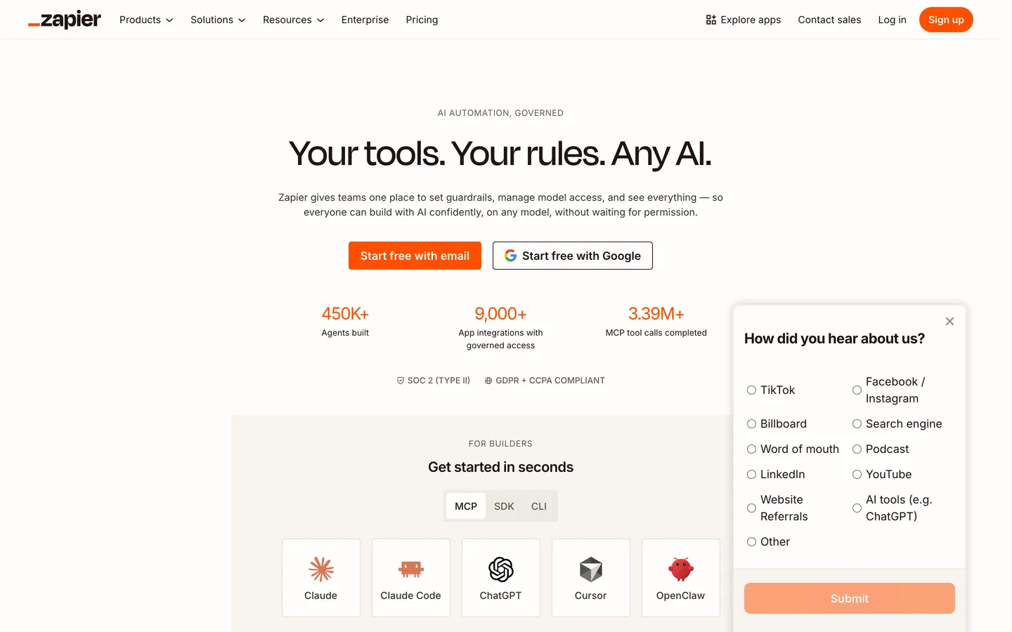
A snapshot of the brand in production. Scroll the frame to see the whole page.
Colors
10 colors
Zapier Inspired's system runs on #ff4f00 as its primary voltage, used in 2 of 29 components. Type is set in Inter across 16 tokens from 14px to 56px, weights 400–700. Shape language is mixed across 29 components, blending pills, soft rounds, and squarer corners.
Brand & Accent
Sparing, CTA-only voltage · 1
Surface
Page and card backgrounds · 2
Text
Headlines, body, captions · 6
Other
Specialty colors · 1
Typography
16 type tokens
Set in Inter across 16 tokens, from 14px to 56px, weights 400–700. Shown in its own stack: where the font isn't installed, the fallback the file names stands in.
- display-xl56px · weight 500 · lh 56pxThe quick brown fox jumps over the lazy dog
- display-lg48px · weight 500 · lh 48pxThe quick brown fox jumps over the lazy dog
- display-md32px · weight 500 · lh 36px · tracking 1pxThe quick brown fox jumps over the lazy dog
- display-sub-lg48px · weight 500 · lh 49.92pxThe quick brown fox jumps over the lazy dog
- display-sub-md32px · weight 400 · lh 40pxThe quick brown fox jumps over the lazy dog
- display-sub-sm24px · weight 600 · lh 30px · tracking -0.6pxThe quick brown fox jumps over the lazy dog
- display-xs20px · weight 700 · lh 25px · tracking -0.5pxThe quick brown fox jumps over the lazy dog
- body-lg20px · weight 400 · lh 30px · tracking -0.2pxThe quick brown fox jumps over the lazy dog
- body-md18px · weight 400 · lh 27pxThe quick brown fox jumps over the lazy dog
- body-md-strong18px · weight 600 · lh 27pxThe quick brown fox jumps over the lazy dog
- body-sm16px · weight 400 · lh 24pxThe quick brown fox jumps over the lazy dog
- body-sm-strong16px · weight 600 · lh 24pxThe quick brown fox jumps over the lazy dog
- caption14px · weight 400 · lh 21pxThe quick brown fox jumps over the lazy dog
- eyebrow-uppercase14px · weight 500 · lh 14px · tracking 1pxThe quick brown fox jumps over the lazy dog
- button-md18px · weight 600 · lh 27pxThe quick brown fox jumps over the lazy dog
- button-sm14.4px · weight 700 · lh 14.4px · tracking 0.144pxThe quick brown fox jumps over the lazy dog
Layout
Radii and spacing
5 corner radii and 9 spacing values. Shape language: mixed.
Radii
- none0px
- sm6px
- md12px
- pill9999px
- full9999px
Spacing
- xxs2px
- xs4px
- sm8px
- md12px
- lg16px
- xl24px
- 2xl32px
- 3xl48px
- 4xl64px
Components
29 components
Each rendered from its tokens (color, type, radius, padding) on Zapier's own canvas.
- Nav Barnav-barNav Bar
- Nav Linknav-linkNav Link
- Button Primarybutton-primaryButton Primary
- Button Secondarybutton-secondaryButton Secondary
- Button Tertiarybutton-tertiaryButton Tertiary
- Button Textbutton-textButton Text
- Type here…text-inputText Input
- Card Contentcard-contentCard Content
- Card Feature Creamcard-feature-creamCard Feature Cream
- Card Feature Darkcard-feature-darkCard Feature Dark
- Pricing Cardpricing-cardPricing Card
- Pricing Card Featuredpricing-card-featuredPricing Card Featured
- Hero Bandhero-bandHero Band
- Hero Band Darkhero-band-darkHero Band Dark
- Content Band Creamcontent-band-creamContent Band Cream
- Content Band Lightcontent-band-lightContent Band Light
- Eyebrow Uppercaseeyebrow-uppercaseEyebrow Uppercase
- Badge Pillbadge-pillBadge Pill
- FooterfooterFooter
- Ex Pricing Tierex-pricing-tierEx Pricing Tier
- Ex Pricing Tier Featuredex-pricing-tier-featuredEx Pricing Tier Featured
- Ex Product Selectorex-product-selectorEx Product Selector
- Ex Cart Drawerex-cart-drawerEx Cart Drawer
- Ex App Shell Rowex-app-shell-rowEx App Shell Row
- Ex Data Table Cellex-data-table-cellEx Data Table Cell
- Ex Auth Form Cardex-auth-form-cardEx Auth Form Card
- Ex Modal Cardex-modal-cardEx Modal Card
- Ex Empty State Cardex-empty-state-cardEx Empty State Card
- Ex Toastex-toastEx Toast
In use
The system, in use
Zapier's tokens on the kind of product it builds.
Build something people actually use.
A short paragraph of marketing copy that previews how the brand's display tier and body tier read together. Two sentences is usually enough.
FAQ
Zapier Inspired design system FAQ
Common questions about Zapier's tokens, components, and how to use this DESIGN.md in your project.
Read next
Related reading
Specs, directories, and component libraries that pair with this design system.
Use it
Use Zapier Inspired in your project
One machine-readable file. Drop it into Claude, Cursor, or any AI tool that reads DESIGN.md.
Download the DESIGN.md
One machine-readable file: every color, type, radius, spacing, and component token of Zapier Inspired.
Feed it to your AI tool
Drop it into Claude, Cursor, or GitHub Copilot. The agent writes React components and Tailwind classes that match Zapier Inspired's visual language.
Reference the tokens directly
Or paste the values into your Tailwind config, CSS variables, or component library: every color, size and radius is a quoted, ready-to-copy value.
Read the full DESIGN.md: overview, rationale, do’s and don’ts
Overview
Zapier is the original "connect your apps" workflow automation platform, and the marketing surface today reads as confidently mature. The brand pairs a warm-cream canvas ({colors.canvas} — #fffefb) with deep coffee ink ({colors.ink} — #201515) and a single saturated orange ({colors.primary} — #ff4f00) CTA. The warmth in the neutrals — slightly cream rather than pure white — is the brand's defining temperature signal.
Type carries the second voice. The proprietary Degular Display family carries hero displays at weight 500. The brand uses Inter for everything else — sub-displays, body, button, eyebrow. The two-face pairing reads as "the brand has its own typeface for the loud moments and uses the workhorse for the rest" — modest and unflashy.
Cards are universally {rounded.md} 12px. Buttons share the same 12px radius — not pills, not square. The brand sits between the friendly-rounded and the technical-square camps with a deliberate middle position.
Key Characteristics:
- A single primary CTA color (
{colors.primary}—#ff4f00) — saturated orange. The brand's conversion signature. - Warm-cream canvas (
{colors.canvas}—#fffefb) — not pure white. The temperature IS the brand voice. - Deep coffee ink (
{colors.ink}—#201515) — not pure black. Warmth carries through to text. - Proprietary Degular Display for hero-scale, Inter for everything else. Two-face system.
{rounded.md}12px for buttons and cards — the brand's middle-radius signature.- A muted cream / coffee neutral ladder —
{colors.canvas-soft}(#f8f4f0),{colors.mute}(#c5c0b1),{colors.body-mid}(#939084),{colors.body}(#605d52) — every neutral carries warmth, none are cool grey.
Known Gaps
- Semantic palette: the brand doesn't surface a separate status / validation palette on the marketing pages — error, success, and warning cues borrow from the ink + orange hierarchy rather than dedicated tokens.
- Elevation tiers: depth is captured as a flat / hairline / soft-card three-step ladder, but progressive shadow stops (sm / md / lg / xl) aren't documented. Cards rely on surface contrast against canvas rather than layered shadows.
- Hover and focus states: the spec captures resting colors, not pointer-down or keyboard-focus variants. Primary CTA hover, outline button focus rings, and text-input focus borders need to be inferred from the resting tokens.
- Sub-brand and dark mode: Zapier's product surface uses dark mode and a denser sidebar palette inside the app, but this spec captures only the public marketing surface — the product chrome is out of scope.
- Auto-derived examples: the
ex-*surfaces reference brand-native primitives but a handful of fields (e.g.,ex-toastelevation,ex-empty-state-cardcaption typography) carryTO_FILLmarkers that need an LLM judgment pass to resolve fully.
Workflow & No-code
More systems like this
More DESIGN.md files in Workflow & No-code.
Pricing
Build it with Pro
The DESIGN.md files are free. Pro adds 6,000+ blocks, premium templates and the MCP server, so your AI editor builds in your system for you.
4.9/5 out of 5 · 150+ reviewsfrom 150+ founders and developers.
Billing
Billed once a year in USD. Cancel anytime.
- How many people can use the license.
- Client work, SaaS products and anything you charge for.
- Production-ready React sections: hero, pricing, features, dashboards and more.
- Complete multi-page sites you can ship as they are.
- React icons from every major library, installable with one command.
- Presets that restyle every block, in light and dark.
- Lets your AI editor search, preview and install blocks for you.
- Priority requests are answered first.
Individual
For personal projects & open source
$32instead of $49/mo
$389 billed yearly
- Seats: 1 seat
- Commercial use: Personal & open source only
- Pro blocks: 6,000+ blocks
- Templates: All 14 templates
- React icons: 294k+ icons
- Themes: All 59 themes
- MCP server: Basic usage
- Support: Standard
Team
Most popularFor freelancers, agencies & startups
$66instead of $99/mo
$789 billed yearly · ≈ $13/dev/mo
- Seats: Up to 5 seats
- Commercial use: Included
- Pro blocks: 6,000+ blocks
- Templates: All 14 templates
- React icons: 294k+ icons
- Themes: All 59 themes
- MCP server: High usage
- Support: Priority
Organization
For companies with larger teams
$132instead of $199/mo
$1,589 billed yearly
- Seats: Unlimited seats
- Commercial use: Included
- Pro blocks: 6,000+ blocks
- Templates: All 14 templates
- React icons: 294k+ icons
- Themes: All 59 themes
- MCP server: Unlimited usage
- Support: Priority
Billed once a year in USD. Cancel anytime.
Individual
For personal projects & open source
$32instead of $49/mo
$389 billed yearly
- How many people can use the license.Seats: 1 seat
- Client work, SaaS products and anything you charge for.Commercial use: Personal & open source only
- Production-ready React sections: hero, pricing, features, dashboards and more.Pro blocks: 6,000+ blocks
- Complete multi-page sites you can ship as they are.Templates: All 14 templates
- React icons from every major library, installable with one command.React icons: 294k+ icons
- Presets that restyle every block, in light and dark.Themes: All 59 themes
- Lets your AI editor search, preview and install blocks for you.MCP server: Basic usage
- Priority requests are answered first.Support: Standard
Team
Most popularFor freelancers, agencies & startups
$66instead of $99/mo
$789 billed yearly · ≈ $13/dev/mo
Everything in Individual, plus
- How many people can use the license.Seats: Up to 5 seats
- Client work, SaaS products and anything you charge for.Commercial use: Included
- Lets your AI editor search, preview and install blocks for you.MCP server: High usage
- Priority requests are answered first.Support: Priority
Organization
For companies with larger teams
$132instead of $199/mo
$1,589 billed yearly
Everything in Team, plus
- How many people can use the license.Seats: Unlimited seats
- Lets your AI editor search, preview and install blocks for you.MCP server: Unlimited usage
- Secure checkout via Stripe
- Code lives in your repo
- Keep what you've shipped if you cancel
- License terms
Your system, built for you
Every block, template and icon, installed by your AI agent in your design system. The DESIGN.md files stay free.