Miro Design System
Miro's design system as a DESIGN.md file. Canary yellow #ffd02f, Roobert PRO, 48 components. For React, Next.js, and AI tools.
Add shadcn.io to your AI agent. · Pro It installs blocks, icons and templates in your design system from a prompt, with Pro.
Set up MCP- Primary
- #1c1c1e
- Typeface
- Roobert PRO
- Shape
- Soft
- Base radius
- 8px
- Colors
- 40
- Type tokens
- 18
- Components
- 48
- Spacing values
- 12
About
About Miro DESIGN.md
Curated by Dov Azencot · Updated May 12, 2026 · Source miro.com (opens in a new tab)
Miro's design system frames the AI-powered visual workspace through one of the most confident brand-voltage choices in B2B SaaS: a single canary yellow ("#ffd02f") wordmark perched on a stark white canvas, then refused as a CTA. The dominant action everywhere is a black pill — "#1c1c1e" filled at fully rounded corners — and the live product carries the visual weight through real Miro-board mockup illustrations with sticky notes, kanban columns, and mind maps. Pastel feature cards in rose, teal, coral, and mint echo the actual sticky-note tints from inside the whiteboard, so the marketing language and the product language reinforce one another instead of drifting apart.
This page packages the full token system into a single DESIGN.md file built on the Google Labs spec. Inside: 40 colors tokens grouped into brand, surface, text, and semantic families; 18 typography tokens running Roobert PRO from the 80px hero display through 11px uppercase micro labels; 12 spacing values from 4px to a 120px hero band; 9 rounded-corner steps culminating in a 9999px pill; and 48 components covering buttons, pricing cards, comparison tables, whiteboard mockups, FAQ accordions, badges, and the dark multi-column footer.
Feed the file to Claude, Cursor, or GitHub Copilot and the AI will reproduce Miro's specific restraint — black pills not yellow, pastel cards not gradients, real product UI not stock photography — rather than a generic shadcn theme. Reference the tokens directly when wiring Tailwind config or CSS variables. The system is worth studying for one specific discipline: how a brand can own a loud signature color (canary yellow at "#ffd02f") and still keep it out of every primary action, letting black do the work and saving the voltage for the wordmark and the sticky-note tints.
What makes it distinct
5
- Reserved brand voltagecanary yellow #ffd02f confined to the wordmark, promo strip, and yellow-tag chips, never a primary CTA
- Black-pill primary CTAs#1c1c1e on rounded.full carries every dominant action across marketing, pricing, and AI Workflows pages
- Pastel feature cards at 28px cornersrose #ffd8f4, teal #c3faf5, coral #ffc6c6, yellow #ffd02f echo the live sticky-note palette
- Roobert PRO across 18 type tokens80px hero down to 11px micro labels, single-family typography with no 700 weight
- Massive 4-tier pricing into 80-row comparison tableFree / Starter / Business (featured lavender #f5f3ff) / Enterprise (dark canvas)
miro.com
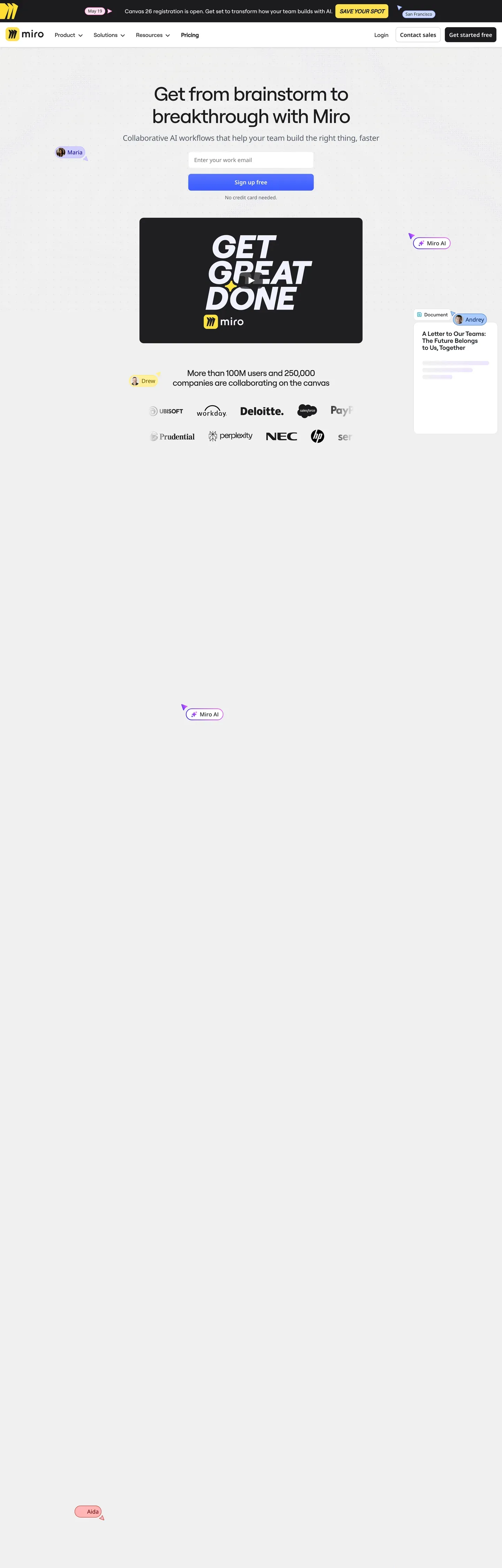
Live at miro.com
A snapshot of the brand in production. Scroll the frame to see the whole page.
Colors
40 colors
Miro's system runs on #1c1c1e as its primary voltage, used in 14 of 48 components. Type is set in Roobert PRO across 18 tokens from 11px to 80px, weights 400–600. Shape language is soft — components average 17px corner radius, with no sharp interactive edges.
Brand & Accent
Sparing, CTA-only voltage · 11
Surface
Page and card backgrounds · 5
Text
Headlines, body, captions · 6
Borders & Hairlines
Dividers, outlines, rules · 3
Semantic
Status, errors, success, links · 1
Other
Specialty colors · 14
Typography
18 type tokens
Set in Roobert PRO across 18 tokens, from 11px to 80px, weights 400–600. Shown in its own stack: where the font isn't installed, the fallback the file names stands in.
- hero-display80px · weight 500 · lh 1.05 · tracking -2pxThe quick brown fox jumps over the lazy dog
- display-lg60px · weight 500 · lh 1.1 · tracking -1.5pxThe quick brown fox jumps over the lazy dog
- heading-148px · weight 500 · lh 1.15 · tracking -1pxThe quick brown fox jumps over the lazy dog
- heading-236px · weight 500 · lh 1.2 · tracking -0.5pxThe quick brown fox jumps over the lazy dog
- heading-328px · weight 500 · lh 1.25The quick brown fox jumps over the lazy dog
- heading-422px · weight 500 · lh 1.3The quick brown fox jumps over the lazy dog
- heading-518px · weight 500 · lh 1.4The quick brown fox jumps over the lazy dog
- subtitle18px · weight 400 · lh 1.5The quick brown fox jumps over the lazy dog
- body-md16px · weight 400 · lh 1.5The quick brown fox jumps over the lazy dog
- body-md-medium16px · weight 500 · lh 1.5The quick brown fox jumps over the lazy dog
- body-sm14px · weight 400 · lh 1.5The quick brown fox jumps over the lazy dog
- body-sm-medium14px · weight 500 · lh 1.5The quick brown fox jumps over the lazy dog
- caption13px · weight 400 · lh 1.4The quick brown fox jumps over the lazy dog
- caption-bold13px · weight 600 · lh 1.4The quick brown fox jumps over the lazy dog
- micro12px · weight 500 · lh 1.4The quick brown fox jumps over the lazy dog
- micro-uppercase11px · weight 600 · lh 1.4 · tracking 0.5pxThe quick brown fox jumps over the lazy dog
- button-md14px · weight 500 · lh 1.3The quick brown fox jumps over the lazy dog
- stat-display64px · weight 500 · lh 1.1 · tracking -1.5pxThe quick brown fox jumps over the lazy dog
Layout
Radii and spacing
9 corner radii and 12 spacing values. Shape language: soft.
Radii
- xs4px
- sm6px
- md8px
- lg12px
- xl16px
- xxl20px
- xxxl28px
- feature32px
- full9999px
Spacing
- xxs4px
- xs8px
- sm12px
- md16px
- lg20px
- xl24px
- xxl32px
- xxxl40px
- section-sm48px
- section64px
- section-lg96px
- hero120px
Components
48 components
Each rendered from its tokens (color, type, radius, padding) on Miro's own canvas.
- Button Primarybutton-primaryButton Primary
- Button Primary Pressedbutton-primary-pressedButton Primary Pressed
- Button Primary Disabledbutton-primary-disabledButton Primary Disabled
- Button Yellowbutton-yellowButton Yellow
- Button Bluebutton-blueButton Blue
- Button Secondarybutton-secondaryButton Secondary
- Button On Darkbutton-on-darkButton On Dark
- Button Ghostbutton-ghostButton Ghost
- Button Linkbutton-linkButton Link
- button-icon-circularButton Icon Circular
- Card Basecard-baseCard Base
- Card Featurecard-featureCard Feature
- Card Feature Yellowcard-feature-yellowCard Feature Yellow
- Card Feature Coralcard-feature-coralCard Feature Coral
- Card Feature Tealcard-feature-tealCard Feature Teal
- Card Feature Rosecard-feature-roseCard Feature Rose
- Card Customer Storycard-customer-storyCard Customer Story
- Card Statcard-statCard Stat
- Pricing Cardpricing-cardPricing Card
- Pricing Card Featuredpricing-card-featuredPricing Card Featured
- Pricing Card Enterprisepricing-card-enterprisePricing Card Enterprise
- Type here…text-inputText Input
- Type here…text-input-focusedText Input Focused
- Search Pillsearch-pillSearch Pill
- Filter Dropdownfilter-dropdownFilter Dropdown
- Pill Tabpill-tabPill Tab
- Pill Tab Activepill-tab-activePill Tab Active
- Toggle Monthly Yearlytoggle-monthly-yearlyToggle Monthly Yearly
- Badge Promobadge-promoBadge Promo
- Badge Tag Yellowbadge-tag-yellowBadge Tag Yellow
- Badge Tag Purplebadge-tag-purpleBadge Tag Purple
- Badge Tag Coralbadge-tag-coralBadge Tag Coral
- Badge Successbadge-successBadge Success
- Badge Discountbadge-discountBadge Discount
- Promo Bannerpromo-bannerPromo Banner
- Comparison Tablecomparison-tableComparison Table
- Comparison Rowcomparison-rowComparison Row
- Template Cardtemplate-cardTemplate Card
- Whiteboard Mockupwhiteboard-mockupWhiteboard Mockup
- Faq Accordion Itemfaq-accordion-itemFaq Accordion Item
- Logo Wall Itemlogo-wall-itemLogo Wall Item
- Hero Band Marketinghero-band-marketingHero Band Marketing
- Cta Banner Darkcta-banner-darkCta Banner Dark
- Industry Tileindustry-tileIndustry Tile
- Capterra Badgecapterra-badgeCapterra Badge
- Footer Regionfooter-regionFooter Region
- Footer Linkfooter-linkFooter Link
- App Store Badgeapp-store-badgeApp Store Badge
In use
The system, in use
Miro's tokens on the kind of product it builds.
Build something people actually use.
A short paragraph of marketing copy that previews how the brand's display tier and body tier read together. Two sentences is usually enough.
FAQ
Miro design system FAQ
Common questions about Miro's tokens, components, and how to use this DESIGN.md in your project.
Read next
Related reading
Specs, directories, and component libraries that pair with this design system.
- Browse all design systemsThe full directory of DESIGN.md files on shadcn.io, with live mockups for each.shadcn.io
- Miro homepageLive reference for the canary-yellow wordmark, black-pill CTAs, and pastel feature card system in production.miro.com (opens in a new tab)
- The DESIGN.md specificationGoogle Labs' open spec for machine-readable design system files — the format this page is built on.github.com (opens in a new tab)
Use it
Use Miro in your project
One machine-readable file. Drop it into Claude, Cursor, or any AI tool that reads DESIGN.md.
Download the DESIGN.md
One machine-readable file: every color, type, radius, spacing, and component token of Miro.
Feed it to your AI tool
Drop it into Claude, Cursor, or GitHub Copilot. The agent writes React components and Tailwind classes that match Miro's visual language.
Reference the tokens directly
Or paste the values into your Tailwind config, CSS variables, or component library: every color, size and radius is a quoted, ready-to-copy value.
Read the full DESIGN.md: overview, rationale, do’s and don’ts
Overview
Miro positions itself as the AI-powered visual workspace through a confident, slightly playful brand voice. The homepage opens with a stark white canvas anchored by a small canary-yellow Miro wordmark in the top-left, a black-pill primary CTA "Get started free" and a secondary "Book a demo" outline pill — then dramatic real-Miro-board mockup imagery (sticky notes, kanban, mind maps) carries the visual weight. Across deeper surfaces, the system breaks open: pastel feature cards (rose, teal, coral, yellow) echo the actual sticky-note color palette of the live whiteboard product, and customer story cards reuse those tints to differentiate brand vignettes.
Roobert PRO — Miro's custom display face — anchors every typographic surface, from the 80px hero display down to 11px micro labels. The face's slightly rounded, geometric character pairs naturally with the playful product photography and the friendly product positioning. Black-pill primary buttons ({rounded.full}) dominate marketing CTAs; the brand color, signature canary yellow ({colors.brand-yellow}), is reserved for the wordmark, top promo banners, and "yellow tag" feature pills — never as a primary CTA. The 4-tier pricing comparison (Free / Starter / Business / Enterprise) leads into the densest surface in the system: a feature comparison table that runs ~80 rows deep across multiple section dividers.
Key Characteristics:
- Stark white canvas + Miro wordmark in canary yellow ({colors.brand-yellow}) as the recognizable opening signature
- Black-pill primary CTAs ({colors.primary} +
{rounded.full}) as the dominant interactive element - Pastel feature cards (yellow, rose, coral, teal, mint) that echo the actual sticky-note palette
- Roobert PRO across every UI surface; geometric, slightly rounded character
- Real Miro-board mockup imagery used as feature illustrations
- 4-tier pricing card grid + dense feature comparison table
- Massive dark footer ({colors.footer-bg}) with multi-column links + app-store badges
Known Gaps
- Specific dark-mode token values not surfaced
- Animation/transition timings not extracted; recommend 150–200ms ease
- Form validation success state not explicitly captured beyond defaults
- Sticky note color tints inside the actual whiteboard product are richer than what marketing surfaces capture
Productivity & SaaS
More systems like this
More DESIGN.md files in Productivity & SaaS.
Pricing
Build it with Pro
The DESIGN.md files are free. Pro adds 6,000+ blocks, premium templates and the MCP server, so your AI editor builds in your system for you.
4.9/5 out of 5 · 150+ reviewsfrom 150+ founders and developers.
Billing
Billed once a year in USD. Cancel anytime.
- How many people can use the license.
- Client work, SaaS products and anything you charge for.
- Production-ready React sections: hero, pricing, features, dashboards and more.
- Complete multi-page sites you can ship as they are.
- React icons from every major library, installable with one command.
- Presets that restyle every block, in light and dark.
- Lets your AI editor search, preview and install blocks for you.
- Priority requests are answered first.
Individual
For personal projects & open source
$32instead of $49/mo
$389 billed yearly
- Seats: 1 seat
- Commercial use: Personal & open source only
- Pro blocks: 6,000+ blocks
- Templates: All 14 templates
- React icons: 294k+ icons
- Themes: All 59 themes
- MCP server: Basic usage
- Support: Standard
Team
Most popularFor freelancers, agencies & startups
$66instead of $99/mo
$789 billed yearly · ≈ $13/dev/mo
- Seats: Up to 5 seats
- Commercial use: Included
- Pro blocks: 6,000+ blocks
- Templates: All 14 templates
- React icons: 294k+ icons
- Themes: All 59 themes
- MCP server: High usage
- Support: Priority
Organization
For companies with larger teams
$132instead of $199/mo
$1,589 billed yearly
- Seats: Unlimited seats
- Commercial use: Included
- Pro blocks: 6,000+ blocks
- Templates: All 14 templates
- React icons: 294k+ icons
- Themes: All 59 themes
- MCP server: Unlimited usage
- Support: Priority
Billed once a year in USD. Cancel anytime.
Individual
For personal projects & open source
$32instead of $49/mo
$389 billed yearly
- How many people can use the license.Seats: 1 seat
- Client work, SaaS products and anything you charge for.Commercial use: Personal & open source only
- Production-ready React sections: hero, pricing, features, dashboards and more.Pro blocks: 6,000+ blocks
- Complete multi-page sites you can ship as they are.Templates: All 14 templates
- React icons from every major library, installable with one command.React icons: 294k+ icons
- Presets that restyle every block, in light and dark.Themes: All 59 themes
- Lets your AI editor search, preview and install blocks for you.MCP server: Basic usage
- Priority requests are answered first.Support: Standard
Team
Most popularFor freelancers, agencies & startups
$66instead of $99/mo
$789 billed yearly · ≈ $13/dev/mo
Everything in Individual, plus
- How many people can use the license.Seats: Up to 5 seats
- Client work, SaaS products and anything you charge for.Commercial use: Included
- Lets your AI editor search, preview and install blocks for you.MCP server: High usage
- Priority requests are answered first.Support: Priority
Organization
For companies with larger teams
$132instead of $199/mo
$1,589 billed yearly
Everything in Team, plus
- How many people can use the license.Seats: Unlimited seats
- Lets your AI editor search, preview and install blocks for you.MCP server: Unlimited usage
- Secure checkout via Stripe
- Code lives in your repo
- Keep what you've shipped if you cancel
- License terms
Your system, built for you
Every block, template and icon, installed by your AI agent in your design system. The DESIGN.md files stay free.