Bear Design System
Bear's marketing system pairs two custom typefaces (Bear Sans and Bear Sans Headline) with a single coral-red accent on a pure white canvas. Colorful blobs reflect the app's theme library. Tokens for React, Next.js, and AI coding tools.
Add shadcn.io to your AI agent. · Pro It installs blocks, icons and templates in your design system from a prompt, with Pro.
Set up MCP- Primary
- #dd4c4f
- Typeface
- bearsans
- Shape
- Soft
- Base radius
- 16px
- Colors
- 13
- Type tokens
- 11
- Components
- 13
- Spacing values
- 9
About
About Bear DESIGN.md
Curated by Dov Azencot · Updated May 19, 2026 · Source bear.app (opens in a new tab)
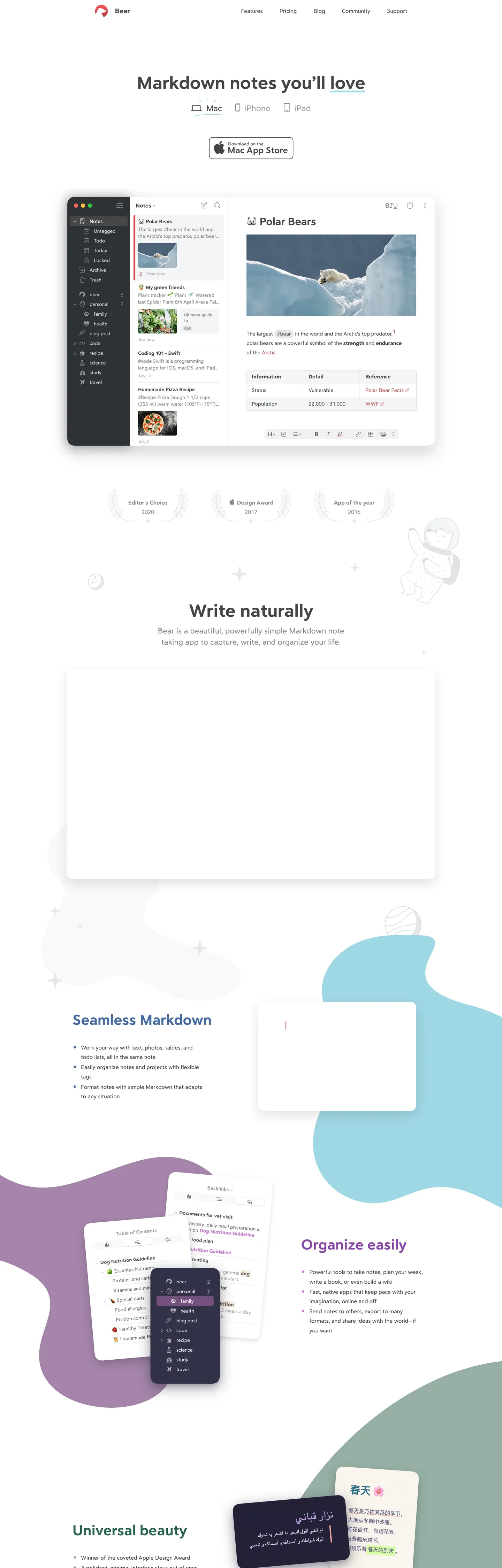
Bear's marketing page at bear.app announces itself with a single large headline — "Markdown notes you'll love" — in Bear Sans Headline, a custom typeface that sits somewhere between a geometric sans and a humanist text face. The letterforms have a slightly calligraphic warmth that San Francisco and Inter lack; the underline under "love" (the brand-accent coral red) is the only chromatic moment above the fold besides the bear mascot logo in the top-left corner. The hero is a Mac window mockup showing a note about polar bears, with a uncluttered white canvas, a sidebar with tag-based navigation, and a formatting toolbar. It reads less like a SaaS marketing page and more like a product screenshot in an Apple press kit.
Where Notion signals editor-grade power through an ink-black canvas and Apple Notes signals simplicity through white and blue, Bear occupies a third position: warm type on white, with the brand color so restrained it functions more like a watermark than an accent. The colorful blob shapes that float behind the mid-page screenshots — teal curves, purple amorphous patches, lilac arcs — are the only chromatic release in the system, and they reference the app's own theme library rather than any single brand color. Bear ships with over a dozen editor themes, and the marketing page suggests this plurality rather than asserting one.
Feed this file to an AI coding tool and it will reproduce Bear's specific signature: Bear Sans Headline for h1-h2 display at 51-42px in weight 400 (not bold — the custom family is drawn to read strongly at 400), Bear Sans for body at 16-22px, a single coral-red accent wired to exactly one interactive moment per section, and a pure-white canvas where the only warmth comes from the typeface itself. The design works because the custom typefaces carry the brand identity; without them, the system reads as generic white-page product marketing.
What makes it distinct
5
- Two custom typefacesBear Sans Headline at 51px for h1 and Bear Sans for body; both are proprietary, warm, and calligraphic compared to system-sans peers
- Single coral-red accentthe brand color at --accent-color appears on section heading links, the bear mascot icon, and navigation; never as a background fill in the hero
- Organic blob decorationteal, lavender, and lilac freeform shapes float behind app screenshots, signaling the app's multi-theme library without committing to a single background color
- White canvas, near-black inkthe page runs pure white with a charcoal ink at #444444 wired as --text-color; the warmth lives in the typeface, not the surface
- App Store badge as the only CTAno primary-button-style download CTA; Bear ships a single Apple-spec Mac App Store badge as the hero action
bear.app
Live at bear.app
A snapshot of the brand in production. Scroll the frame to see the whole page.
Colors
13 colors
Bear's system runs on #dd4c4f as its primary voltage, used in 1 of 13 components. Type is set in bearsans across 11 tokens from 12.8px to 51.2px, weights 400–700. Shape language is soft — components average 28px corner radius, with no sharp interactive edges.
Brand & Accent
Sparing, CTA-only voltage · 1
Surface
Page and card backgrounds · 3
Text
Headlines, body, captions · 2
Borders & Hairlines
Dividers, outlines, rules · 1
Other
Specialty colors · 6
Typography
11 type tokens
Set in bearsans across 11 tokens, from 12.8px to 51.2px, weights 400–700. Shown in its own stack: where the font isn't installed, the fallback the file names stands in.
- display-xl51.2px · weight 400 · lh 56.32pxThe quick brown fox jumps over the lazy dog
- display-lg41.6px · weight 400 · lh 45.76pxThe quick brown fox jumps over the lazy dog
- display-md30.4px · weight 400 · lh 33.44pxThe quick brown fox jumps over the lazy dog
- heading-lg24px · weight 400 · lh 27.2pxThe quick brown fox jumps over the lazy dog
- body-lg22.4px · weight 400 · lh 31.36pxThe quick brown fox jumps over the lazy dog
- body-md16px · weight 400 · lh 27.2pxThe quick brown fox jumps over the lazy dog
- body-strong16px · weight 700 · lh 27.2pxThe quick brown fox jumps over the lazy dog
- label-lg17.6px · weight 700 · lh 25.6pxThe quick brown fox jumps over the lazy dog
- label-sm12.8px · weight 700 · lh 17.92pxThe quick brown fox jumps over the lazy dog
- nav-link19.2px · weight 400 · lh 27.2pxThe quick brown fox jumps over the lazy dog
- input-text17.6px · weight 400 · lh 24pxThe quick brown fox jumps over the lazy dog
Layout
Radii and spacing
6 corner radii and 9 spacing values. Shape language: soft.
Radii
- none0px
- xs4px
- sm8px
- md16px
- lg40px
- full9999px
Spacing
- xs5px
- sm12px
- base16px
- md19px
- lg24px
- xl32px
- 2xl40px
- 3xl80px
- 4xl160px
Components
13 components
Each rendered from its tokens (color, type, radius, padding) on Bear's own canvas.
- Button Primarybutton-primaryButton Primary
- Button Secondarybutton-secondaryButton Secondary
- Top Navtop-navTop Nav
- Nav Linknav-linkNav Link
- Hero Headinghero-headingHero Heading
- Section Headingsection-headingSection Heading
- Body Paragraphbody-paragraphBody Paragraph
- Body Paragraph Mutedbody-paragraph-mutedBody Paragraph Muted
- CardcardCard
- Screenshot Framescreenshot-frameScreenshot Frame
- Type here…text-inputText Input
- Feature Listfeature-listFeature List
- FooterfooterFooter
In use
The system, in use
Bear's tokens on the kind of product it builds.
Build something people actually use.
A short paragraph of marketing copy that previews how the brand's display tier and body tier read together. Two sentences is usually enough.
FAQ
Bear design system FAQ
Common questions about Bear's tokens, components, and how to use this DESIGN.md in your project.
Read next
Related reading
Specs, directories, and component libraries that pair with this design system.
- Browse all design systemsThe full directory of DESIGN.md files on shadcn.io, with live mockups for each.shadcn.io
- Bear — official siteBear's public marketing site — the source of truth for the live tokens captured in this file.bear.app (opens in a new tab)
- The DESIGN.md specificationGoogle Labs' open spec for machine-readable design system files — the format this page is built on.github.com (opens in a new tab)
Use it
Use Bear in your project
One machine-readable file. Drop it into Claude, Cursor, or any AI tool that reads DESIGN.md.
Download the DESIGN.md
One machine-readable file: every color, type, radius, spacing, and component token of Bear.
Feed it to your AI tool
Drop it into Claude, Cursor, or GitHub Copilot. The agent writes React components and Tailwind classes that match Bear's visual language.
Reference the tokens directly
Or paste the values into your Tailwind config, CSS variables, or component library: every color, size and radius is a quoted, ready-to-copy value.
Read the full DESIGN.md: overview, rationale, do’s and don’ts
Overview
Bear's marketing site sits at the warmest end of the Mac-native notes-app spectrum. Calligraphic minimalism. Where Apple Notes uses system-blue and white, Notion uses inter-black and near-black, and Obsidian uses a deep purple-charcoal, Bear uses a coral-red accent so restrained it functions more as a signature than a color system, paired with two custom typefaces that carry the brand's warmth entirely through letterform rather than hue.
The hero headline — "Markdown notes you'll love" — runs Bear Sans Headline at 51px in weight 400. Not bold. The custom family is drawn strongly enough to anchor a 51px headline at regular weight; bumping to 700 would overwhelm the page. Below the h1 sits the Mac App Store badge (the only CTA above the fold), and then the product screenshot. Section headings below the fold ("Joinless Markdown", "Organize easily", "Universal beauty") render in the coral-red accent at 41.6px — the only place the brand color appears at scale, and the only non-neutral hue outside the decorative blob shapes.
The blobs are the other signature move. Teal freeform curves, lilac arcs, and purple patches float behind the feature screenshots as pure background decoration. They do not correspond to any CSS token in the brand chrome; they represent the app's multi-theme palette (Bear ships ~14 editor themes with distinct color sets). Compared to Notion (which uses no decoration), Craft (which uses geometric gradients), and Bear's closest peer Ulysses (which uses blue on white), Bear's blob decoration signals playfulness without committing to any single secondary color.
Key Characteristics:
- Bear Sans Headline for all display tiers (51px h1, 41.6px h2, 30.4px h3) at weight 400 — the custom family does not require bold to read strongly.
- Bear Sans for all body, label, and nav text — proprietary family wired to --text-font.
- Single coral-red accent (
{colors.primary}) wired to --accent-color; appears on the nav bear icon, section headings, and inline links — 28 total occurrences, never as a hero background. - Pure-white canvas (
{colors.canvas}) with charcoal ink ({colors.ink}— , --text-color) rather than pure black — the warmth is typographic, not surface-based. - Organic teal and purple blob shapes as mid-page decoration — background decoration only, no token counterpart.
- 40px dominant radius (
{rounded.lg}) on screenshot frames and feature cards — the Apple-native rounded-window aesthetic. - Generous line-height on body text: 27.2px on 16px type = 1.7× ratio, making paragraphs feel spacious and human.
- App Store badge as the sole hero CTA — no custom-designed primary button in the hero; the Apple badge is the download action.
Colors
Brand
- Coral Red (
{colors.primary}— ): frequency 28. Used as text (12), background (4), border (12). Wired to --accent-color. The single brand voltage — section heading links, bear mascot icon, inline text accents. Not used as a hero fill.
Surface
- Canvas (
{colors.canvas}— ): frequency 17 (6 text, 5 background, 6 border). Pure white — the page floor, card interiors, and the screenshot mat. Wired to --background-color. - Surface-1 (
{colors.surface-1}— ): frequency 3 as background. Slightly off-white — used as the light background behind secondary sections. Wired to --background-secondary-color. - Surface-2 (
{colors.surface-2}— ): declared as --background-tertiary-color but not rendered in the captured surface; reserved for tertiary background moments.
Text
- Ink (
{colors.ink}— ): frequency 609 (305 text, 304 border). The dominant text color — a warm charcoal, not pure black. Wired to --text-color. Runs the entire type system from headlines to captions. - Ink Muted (
{colors.ink-muted}— ): frequency 50 (25 text, 25 border). Secondary text for metadata, captions, and feature sub-labels. Wired to --text-secondary-color.
Hairlines
- Hairline (
{colors.hairline}— ): frequency 1 as border. The sole divider tone — used on the email input field and structural rules. Wired to --text-tertiary-color and --stroke-color.
Decoration (app-theme palette)
- Teal Mid (
{colors.teal-mid}— ): frequency 19 (14 text, 2 background, 2 gradient). The primary blob decoration tone — a mid-teal that appears in the section-background blobs and inside the app screenshots. - Teal Light (
{colors.teal-light}— ): frequency 24 as text. Lighter teal variant in the blob surfaces. - Theme Purple (
{colors.theme-purple}— ): frequency 2. Amethyst purple used in the lower-page blob decoration. - Theme Forest (
{colors.theme-forest}— ): frequency 2. Forest green appearing in the app-theme blob zone. - Theme Blue (
{colors.theme-blue}— ): frequency 2. Slate blue — appears as a section heading color variant for one h2 link. - Shadow (
{colors.shadow}— ): frequency 5 (3 as shadow ink). Pure black-with-alpha for drop shadows beneath screenshot frames.
Typography
Font Families
The system runs two proprietary Bear typefaces:
- Bear Sans Headline (
--heading-font: "bearsansheadline") — all display and heading surfaces. A custom sans-serif with calligraphic warmth; designed to read strongly at weight 400. - Bear Sans (
--text-font: "bearsans") — all body, label, nav, and button text. A companion sans that pairs warmth with legibility at 16-22px. - Roboto Mono (
--code-font: "roboto-mono") — code-style annotations inside the app screenshot (not visible in the marketing chrome directly, but declared).
Hierarchy
| Token | Size | Weight | Line Height | Use |
|---|---|---|---|---|
{typography.display-xl} | 51.2px | 400 | 56.32px | Hero h1 ("Markdown notes you'll love") |
{typography.display-lg} | 41.6px | 400 | 45.76px | Section h2 headings ("Joinless Markdown", "Organize easily") |
{typography.display-md} | 30.4px | 400 | 33.44px | Smaller h2 instances below the fold |
{typography.heading-lg} | 24px | 400 | 27.2px | Sub-section headings |
{typography.body-lg} | 22.4px | 400 | 31.36px | Feature sub-deks and lead paragraphs |
{typography.body-md} | 16px | 400 | 27.2px | Default body copy — dominant tier |
{typography.body-strong} | 16px | 700 | 27.2px | Bold inline body emphasis |
{typography.label-lg} | 17.6px | 700 | 25.6px | Feature list item labels |
{typography.label-sm} | 12.8px | 700 | 17.92px | Small bold labels, app-version tags |
{typography.nav-link} | 19.2px | 400 | 27.2px | Top-nav links |
{typography.input-text} | 17.6px | 400 | 24px | Input field text |
Principles
Display headings at weight 400 is the signature move. Bear Sans Headline is drawn with enough optical weight at regular that a 51px h1 needs no bold to anchor the page. The generous line-height on body text (27.2px on 16px type, a 1.7× ratio) gives the page breathing room that Apple Notes and Notion both lack. The type system has a single bold tier (weight 700) reserved for label callouts and inline emphasis; there is no 600 / semibold step.
Note on Font Substitutes
Both Bear typefaces are proprietary. For Bear Sans Headline at display sizes, Nunito or DM Sans in weight 400 approximates the humanist warmth, though neither fully matches the calligraphic quality. For Bear Sans at body sizes, Nunito or Inter at 400 transfers cleanly. The key is to preserve the 1.7× body line-height and avoid substitutes with tight spacing — the spaciousness is part of the identity.
Layout
Spacing System
- Base unit: spacing tokens cluster around 4-5px micro steps with 16-19px as the dominant module.
- Tokens:
{spacing.xs}5px ·{spacing.sm}12px ·{spacing.base}16px ·{spacing.md}19px ·{spacing.lg}24px ·{spacing.xl}32px ·{spacing.2xl}40px ·{spacing.3xl}80px ·{spacing.4xl}160px. - Section vertical padding: 80px and 160px between major sections — notably generous, allowing the blob shapes to breathe.
- Card internal padding:
{spacing.xl}(32px) on feature cards. - Body text indent: 19.2px left-indent on feature bullet lists — matches the body-md line-height, creating a column-inset list style.
Grid & Container
- Max content width: ~800px for the hero text and single-column editorial sections; screenshot containers expand to ~900px.
- Hero: centered single column — headline, platform selectors (Mac / iPhone / iPad chips), App Store badge.
- Feature sections: alternating 2-column layout — text column (feature heading + bullet list) on one side, screenshot on the other; blob shapes float freely behind.
- Awards bar: 3-column horizontal strip with Editor's Choice 2020, Apple Design Award 2017, App of the Year 2016.
Rhythm
The page alternates between white editorial (hero, headings, award strip) and decorated feature (blob-backed screenshot sections). The blob shapes mark section transitions without changing the underlying white canvas. Between major sections the spacing is 80-160px — unusually generous for a product marketing page, making it feel like a long-form read rather than a feature checklist.
Elevation
Bear's elevation system is minimal. Pure-white card surfaces on the white canvas require border treatment rather than shadow contrast. Screenshot frames use a 1px {colors.hairline} border and the {rounded.lg} 40px radius to read as distinct from the page; the only actual shadows (3 occurrences of black-with-alpha) appear beneath the floating Mac window mockup in the hero. No card shadow system exists in the marketing chrome.
- Flat (no shadow): the entire editorial surface — headers, body, awards, feature lists.
- Hairline-bordered:
{component.screenshot-frame}and{component.card}use a 1px{colors.hairline}border as their sole depth signal. - Photographic shadow: the Mac window in the hero carries its own 3-value black-with-alpha drop shadow.
Shapes
The dominant radius is 40px — the Bear-app window's rounding value:
{rounded.none}0px — inline text surfaces.{rounded.xs}4px — fine UI details inside screenshots.{rounded.sm}8px — the email input field; small interactive surfaces.{rounded.md}16px — mid-size feature cards.{rounded.lg}40px — the primary screenshot frame, large feature cards, and the bear mascot icon background.{rounded.full}9999px — fully circular elements.
The 40px tier is the signature. It is larger than most productivity tools (Notion uses 8-12px, Todoist uses 6-10px) but smaller than pill-shapes. The specific value matches the Bear Mac app's own window corner rounding — the marketing page frames the product at its own natural curvature.
Components
button-primary — The newsletter submit and feature CTA. Charcoal {colors.ink} fill, white text at {typography.body-md}, {rounded.lg} 40px radius, 12×24px padding, 44px height. Bear does not use the brand coral for button fills; ink on white is the button convention.
button-secondary — White {colors.canvas} fill, ink text, 1px hairline border, same radius and height. Alternative action style.
top-nav — Pure white canvas, 64px height, bear mascot icon (coral fill) flush left, nav links (Features / Pricing / Blog / Community / Support) right-aligned.
nav-link — Transparent background, charcoal ink at {typography.nav-link} (19.2px / 400), 8×16px padding. The nav links use the same size as body-adjacent text — larger than most nav systems.
hero-heading — Transparent background, charcoal ink at {typography.display-xl} (51.2px / 400). The h1 "Markdown notes you'll love" — the underscore beneath "love" is a coral-red text-decoration, not a separate element.
section-heading — Coral-red {colors.primary} text at {typography.display-lg} (41.6px / 400). The h2 section links ("Joinless Markdown", "Organize easily") — the only place the coral fills text at large scale.
body-paragraph — Charcoal ink at {typography.body-md} (16px / 400 / 27.2px line-height). Default body copy throughout; the generous line-height is the characteristic feel.
body-paragraph-muted — Muted {colors.ink-muted} at {typography.body-md}. Secondary captions and feature sub-labels.
card — White canvas fill, charcoal text, 1px hairline border, {rounded.lg} 40px radius, 32px padding. Feature content cards.
screenshot-frame — White canvas fill, 1px hairline border, {rounded.lg} 40px radius, 0 padding. The Mac and iPhone screenshot containers.
text-input — White canvas fill, charcoal text at {typography.input-text} (17.6px / 400), {rounded.sm} 8px radius, 17.6px horizontal padding, 44px height, hairline border. Newsletter email field.
feature-list — Transparent background, charcoal text at {typography.body-md}, 19.2px left-indent for the bullet list style.
footer — White canvas continuation, muted ink at {typography.label-sm}, 40×24px padding.
Do's and Don'ts
Do use Bear Sans Headline at weight 400 for every display heading. The custom family holds the 51px h1 without bold; adding weight 700 at large display sizes would over-darken the letterforms and lose the calligraphic warmth.
Do keep section headings in the coral-red accent. The {colors.primary} on section h2 links is the primary color moment in the system — appearing once per section, always as a section transition signal, never as a surface fill.
Do preserve the 27.2px line-height on 16px body text. The 1.7× ratio is the most distinctive layout characteristic of the Bear marketing page — it creates the spacious, writing-focused feel that distinguishes Bear from Notion and Apple Notes.
Do use blob shapes only as background decoration behind screenshots, and keep them in the teal-and-purple family that reflects the app's theme library. Introducing a load-bearing orange or yellow blob would conflict with the coral accent's scarcity.
Don't use the coral red ({colors.primary}) as a button background fill. Bear's buttons use charcoal fill on white; the coral is reserved for text links and icon accents only. A coral-filled primary button would read as conflicting with the Apple HIG convention the app follows.
Don't tighten the line-height to 1.5× or lower. The 1.7× body rhythm is load-bearing; standard content-dense 1.5× spacing would make the page feel like a SaaS product sheet rather than a notes app.
Don't add a second sans-serif family. Bear Sans and Bear Sans Headline are designed together; introducing Inter or Geist as a display or body substitute would break the tonal unity between headlines and body.
Don't use radius values below 8px on any prominent surface. The 40px window rounding defines the system; adding tight 4px borders elsewhere would create a visual conflict with the Mac-window identity.
Known Gaps
- Hover and active states: no hover treatment for nav links, section heading links, or the App Store badge is captured.
- Dark mode: Bear ships a dark editor theme, but the marketing page renders light-only. No dark-canvas token system is documented here.
- App theme palette: the teal and purple blob colors are signals of the app's theme library, not a complete palette. The full theme set (Mountain, Solarized, Cobalt, etc.) is not documented.
- Bear mascot illustration: the bear logo icon and the outline bear illustrations that appear in the lower-page sections are SVG art assets, not token-driven.
- Primary CTA button: the hero CTA is the Apple Mac App Store badge (a standardized asset), not a custom button component. The token system describes the newsletter submit button, which is a secondary action on the page.
- Roboto Mono: declared as the code font in --code-font but the marketing page does not render a code block; sizing and spacing for monospace content is not captured.
Productivity & SaaS
More systems like this
More DESIGN.md files in Productivity & SaaS.
Pricing
Build it with Pro
The DESIGN.md files are free. Pro adds 6,000+ blocks, premium templates and the MCP server, so your AI editor builds in your system for you.
4.9/5 out of 5 · 150+ reviewsfrom 150+ founders and developers.
Billing
Billed once a year in USD. Cancel anytime.
- How many people can use the license.
- Client work, SaaS products and anything you charge for.
- Production-ready React sections: hero, pricing, features, dashboards and more.
- Complete multi-page sites you can ship as they are.
- React icons from every major library, installable with one command.
- Presets that restyle every block, in light and dark.
- Lets your AI editor search, preview and install blocks for you.
- Priority requests are answered first.
Individual
For personal projects & open source
$32instead of $49/mo
$389 billed yearly
- Seats: 1 seat
- Commercial use: Personal & open source only
- Pro blocks: 6,000+ blocks
- Templates: All 14 templates
- React icons: 294k+ icons
- Themes: All 59 themes
- MCP server: Basic usage
- Support: Standard
Team
Most popularFor freelancers, agencies & startups
$66instead of $99/mo
$789 billed yearly · ≈ $13/dev/mo
- Seats: Up to 5 seats
- Commercial use: Included
- Pro blocks: 6,000+ blocks
- Templates: All 14 templates
- React icons: 294k+ icons
- Themes: All 59 themes
- MCP server: High usage
- Support: Priority
Organization
For companies with larger teams
$132instead of $199/mo
$1,589 billed yearly
- Seats: Unlimited seats
- Commercial use: Included
- Pro blocks: 6,000+ blocks
- Templates: All 14 templates
- React icons: 294k+ icons
- Themes: All 59 themes
- MCP server: Unlimited usage
- Support: Priority
Billed once a year in USD. Cancel anytime.
Individual
For personal projects & open source
$32instead of $49/mo
$389 billed yearly
- How many people can use the license.Seats: 1 seat
- Client work, SaaS products and anything you charge for.Commercial use: Personal & open source only
- Production-ready React sections: hero, pricing, features, dashboards and more.Pro blocks: 6,000+ blocks
- Complete multi-page sites you can ship as they are.Templates: All 14 templates
- React icons from every major library, installable with one command.React icons: 294k+ icons
- Presets that restyle every block, in light and dark.Themes: All 59 themes
- Lets your AI editor search, preview and install blocks for you.MCP server: Basic usage
- Priority requests are answered first.Support: Standard
Team
Most popularFor freelancers, agencies & startups
$66instead of $99/mo
$789 billed yearly · ≈ $13/dev/mo
Everything in Individual, plus
- How many people can use the license.Seats: Up to 5 seats
- Client work, SaaS products and anything you charge for.Commercial use: Included
- Lets your AI editor search, preview and install blocks for you.MCP server: High usage
- Priority requests are answered first.Support: Priority
Organization
For companies with larger teams
$132instead of $199/mo
$1,589 billed yearly
Everything in Team, plus
- How many people can use the license.Seats: Unlimited seats
- Lets your AI editor search, preview and install blocks for you.MCP server: Unlimited usage
- Secure checkout via Stripe
- Code lives in your repo
- Keep what you've shipped if you cancel
- License terms
Your system, built for you
Every block, template and icon, installed by your AI agent in your design system. The DESIGN.md files stay free.