Cal.com Design System
Cal.com's design system as a DESIGN.md file. Cal Sans display, Inter body, #111111 primary, 26 components. For React, Next.js, and AI tools.
Add shadcn.io to your AI agent. · Pro It installs blocks, icons and templates in your design system from a prompt, with Pro.
Set up MCP- Primary
- #111111
- Typeface
- Inter
- Shape
- Mixed
- Base radius
- 8px
- Colors
- 26
- Type tokens
- 13
- Components
- 26
- Spacing values
- 8
About
About Cal.com DESIGN.md
Curated by Dov Azencot · Updated May 12, 2026 · Source cal.com (opens in a new tab)
Cal.com's design system is built around a single editorial rhythm: white canvas, black CTA, Cal Sans headline, light-gray feature card, dark navy footer. There is no second brand color in mainline marketing — #3b82f6 appears so rarely it reads as accidental. The system trusts product chrome and confident typography over decorative accent.
This page packages all of that into one DESIGN.md file. Inside: 26 colors tokens, 13 type styles, 8 spacing values, 7 radius steps, and 26 components covering the top nav, search surface, feature grids, pricing tiers, testimonial cards, and the signature dark footer. Cal Sans is documented with Inter weight 600 at -0.04em letter-spacing as the public substitute.
Drop the file into Claude, Cursor, or GitHub Copilot. The agent will reproduce Cal.com's restraint — near-monochrome action layer, modest 600-weight display type, real product UI inside marketing cards — rather than a generic SaaS theme. Or paste the tokens directly into Tailwind config and reference the components by name.
What makes it distinct
5
- Near-monochrome action layer#111111 primary CTAs with #3b82f6 used only sparingly on inline links and a single customer-story badge
- Cal Sans display at weight 600negative letter-spacing from -0.5px to -2px gives every headline its geometric, slightly condensed voice
- Product UI fragments embedded inlinecalendar widgets and schedule pickers sit inside marketing cards rather than illustrated mockups
- Single dark surface#101010 footer closes every page, and the featured pricing tier inverts to the same near-black for emphasis
- Hierarchical radius scale8px buttons, 12px content cards, 16px hero mockup, pill 9999px for nav-pill-group and badges
cal.com
Live at cal.com
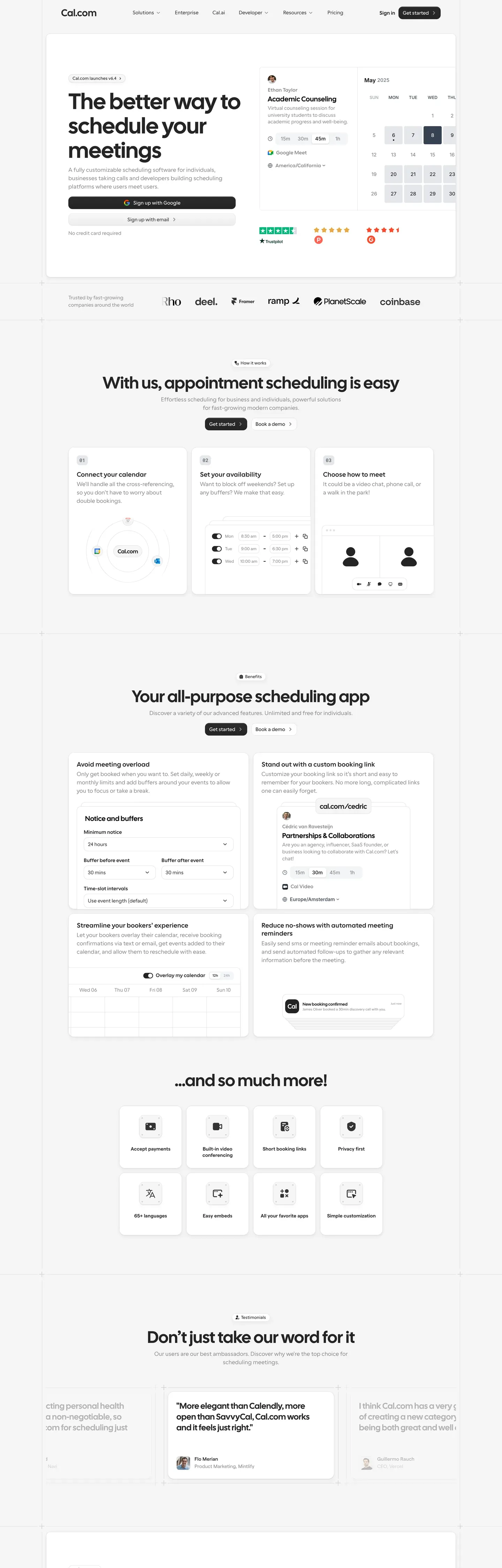
A snapshot of the brand in production. Scroll the frame to see the whole page.
Colors
26 colors
Cal.com's system runs on #111111 as its primary voltage, used in 1 of 26 components. Type is set in Inter across 13 tokens from 13px to 64px, weights 400–600. Shape language is mixed across 26 components, blending pills, soft rounds, and squarer corners.
Brand & Accent
Sparing, CTA-only voltage · 4
Surface
Page and card backgrounds · 6
Text
Headlines, body, captions · 8
Borders & Hairlines
Dividers, outlines, rules · 2
Semantic
Status, errors, success, links · 3
Other
Specialty colors · 3
Typography
13 type tokens
Set in Inter across 13 tokens, from 13px to 64px, weights 400–600. Shown in its own stack: where the font isn't installed, the fallback the file names stands in.
- display-xl64px · weight 600 · lh 1.05 · tracking -2pxThe quick brown fox jumps over the lazy dog
- display-lg48px · weight 600 · lh 1.1 · tracking -1.5pxThe quick brown fox jumps over the lazy dog
- display-md36px · weight 600 · lh 1.15 · tracking -1pxThe quick brown fox jumps over the lazy dog
- display-sm28px · weight 600 · lh 1.2 · tracking -0.5pxThe quick brown fox jumps over the lazy dog
- title-lg22px · weight 600 · lh 1.3 · tracking -0.3pxThe quick brown fox jumps over the lazy dog
- title-md18px · weight 600 · lh 1.4The quick brown fox jumps over the lazy dog
- title-sm16px · weight 600 · lh 1.4The quick brown fox jumps over the lazy dog
- body-md16px · weight 400 · lh 1.5The quick brown fox jumps over the lazy dog
- body-sm14px · weight 400 · lh 1.5The quick brown fox jumps over the lazy dog
- caption13px · weight 500 · lh 1.4The quick brown fox jumps over the lazy dog
- code14px · weight 400 · lh 1.5The quick brown fox jumps over the lazy dog
- button14px · weight 600 · lh 1The quick brown fox jumps over the lazy dog
- nav-link14px · weight 500 · lh 1.4The quick brown fox jumps over the lazy dog
Layout
Radii and spacing
7 corner radii and 8 spacing values. Shape language: mixed.
Radii
- xs4px
- sm6px
- md8px
- lg12px
- xl16px
- pill9999px
- full9999px
Spacing
- xxs4px
- xs8px
- sm12px
- md16px
- lg24px
- xl32px
- xxl48px
- section96px
Components
26 components
Each rendered from its tokens (color, type, radius, padding) on Cal.com's own canvas.
- Button Primarybutton-primaryButton Primary
- Button Primary Activebutton-primary-activeButton Primary Active
- Button Primary Disabledbutton-primary-disabledButton Primary Disabled
- Button Secondarybutton-secondaryButton Secondary
- button-icon-circularButton Icon Circular
- Button Text Linkbutton-text-linkButton Text Link
- Text Linktext-linkText Link
- Top Navtop-navTop Nav
- Nav Pill Groupnav-pill-groupNav Pill Group
- Hero Bandhero-bandHero Band
- Hero App Mockup Cardhero-app-mockup-cardHero App Mockup Card
- Feature Cardfeature-cardFeature Card
- Feature Icon Cardfeature-icon-cardFeature Icon Card
- Product Mockup Cardproduct-mockup-cardProduct Mockup Card
- Testimonial Cardtestimonial-cardTestimonial Card
- Pricing Tier Cardpricing-tier-cardPricing Tier Card
- Pricing Tier Card Featuredpricing-tier-card-featuredPricing Tier Card Featured
- Type here…text-inputText Input
- Type here…text-input-focusedText Input Focused
- Category Tabcategory-tabCategory Tab
- Category Tab Activecategory-tab-activeCategory Tab Active
- Avatar Circleavatar-circleAvatar Circle
- Badge Pillbadge-pillBadge Pill
- Rating Starsrating-starsRating Stars
- Cta Band Lightcta-band-lightCta Band Light
- FooterfooterFooter
In use
The system, in use
Cal.com's tokens on the kind of product it builds.
Build something people actually use.
A short paragraph of marketing copy that previews how the brand's display tier and body tier read together. Two sentences is usually enough.
FAQ
Cal.com design system FAQ
Common questions about Cal.com's tokens, components, and how to use this DESIGN.md in your project.
Read next
Related reading
Specs, directories, and component libraries that pair with this design system.
Use it
Use Cal.com in your project
One machine-readable file. Drop it into Claude, Cursor, or any AI tool that reads DESIGN.md.
Download the DESIGN.md
One machine-readable file: every color, type, radius, spacing, and component token of Cal.com.
Feed it to your AI tool
Drop it into Claude, Cursor, or GitHub Copilot. The agent writes React components and Tailwind classes that match Cal.com's visual language.
Reference the tokens directly
Or paste the values into your Tailwind config, CSS variables, or component library: every color, size and radius is a quoted, ready-to-copy value.
Read the full DESIGN.md: overview, rationale, do’s and don’ts
Overview
Cal.com's marketing surface is a clean, friendly modern-SaaS interface — white canvas ({colors.canvas} — #ffffff) with black primary CTAs ({colors.primary} — #111111), custom Cal Sans display typography, and {colors.surface-card} (#f5f5f5) light-gray cards holding product UI fragments. The system reads as confidently engineered without trying to impress — every band has clear hierarchy, generous whitespace, and a single primary action.
Type voice splits cleanly into two roles: Cal Sans (the brand's custom geometric display face — used for h1, h2, h3, and hero headlines) and Inter (used for everything else — body, buttons, nav, captions). Cal Sans uses weight 600 with negative letter-spacing (-0.5px to -2px depending on size) — it feels modern, slightly condensed, distinctly Cal.com.
Component voltage comes from product UI fragments shown directly inside cards — calendar widgets, scheduling forms, automation diagrams, integration tiles. Cal.com doesn't paint marketing illustrations of the product; it shows the actual product chrome at small scale embedded in the marketing flow.
The footer flips to {colors.surface-dark} (#101010) — a deep near-black that visually closes every long-scroll page. The footer is the only dark surface in the system; everything above stays white-with-light-gray-cards.
Key Characteristics:
- White canvas with black primary CTA (
{colors.primary}— #111111). Buttons are{rounded.md}(8px) with confident weight-600 labels. Standard friendly-SaaS button. - Custom
Cal Sansdisplay typeface for headlines (substituted with Inter weight 600 here). Negative letter-spacing on display sizes — geometric, precise, slightly condensed. - Light-gray card surfaces (
{colors.surface-card}— #f5f5f5) for feature cards, testimonials, and pricing tiers (non-featured). The featured pricing tier flips to{colors.surface-dark}(the only dark card on light pages). - Product UI fragments embedded directly in cards — Cal.com shows real schedule pickers, calendar widgets, integration grids inside its marketing cards. Brand voltage from real product chrome at small scale.
- Nav-pill-group (
{component.nav-pill-group}) — a small pill-radius wrapper around grouped nav segments (e.g., the sub-nav switcher between product views). The pill wrapper is one of the system's signature interactive components. - Avatars are circular (
{rounded.full}), 36px diameter, used in testimonial rows and team-listing surfaces. - Footer is dark navy (
{colors.surface-dark}— #101010) with light text ({colors.on-dark-soft}— #a1a1aa). The dark footer closes every page even though the body above is white. - Spacing rhythm is
{spacing.section}(96px) between major bands — tight enough to feel modern-SaaS but generous enough to breathe. - Border radius is hierarchical:
{rounded.md}(8px) for buttons + inputs,{rounded.lg}(12px) for content cards,{rounded.xl}(16px) for the hero app-mockup container,{rounded.pill}for nav-pill-group + badges,{rounded.full}for avatars + icon buttons.
Colors
Brand & Accent
- Primary (
{colors.primary}— #111111): The dominant action color. All primary CTAs, h1/h2 display type. Press state shifts to{colors.primary-active}(#242424). - Brand Accent (
{colors.brand-accent}— #3b82f6): Used sparely on inline links and on a small badge / "Customer story" highlight. Cal.com is a near-monochrome brand — the blue appears rarely. - Badge Pastels — A small pastel set for category badges and avatar fills:
{colors.badge-orange}(#fb923c),{colors.badge-pink}(#ec4899),{colors.badge-violet}(#8b5cf6),{colors.badge-emerald}(#34d399). These appear on tag pills and small accent moments inside product UI fragments — never on hero CTAs.
Surface
- Canvas (
{colors.canvas}— #ffffff): The default page floor. - Surface Soft (
{colors.surface-soft}— #f8f9fa): Nav-pill-group background, very-soft section dividers. - Surface Card (
{colors.surface-card}— #f5f5f5): Feature cards, testimonial cards, badge pills, default avatar fills. - Surface Strong (
{colors.surface-strong}— #e5e7eb): Hairline border alternative; disabled button background. - Surface Dark (
{colors.surface-dark}— #101010): The footer background — the only dark surface on every page. Also used for the featured pricing tier card. - Surface Dark Elevated (
{colors.surface-dark-elevated}— #1a1a1a): Used for nested cards inside the dark footer or featured pricing card. - Hairline (
{colors.hairline}— #e5e7eb): The 1px border tone on light surfaces. Used on input borders, table dividers, content card outlines (sometimes). - Hairline Soft (
{colors.hairline-soft}— #f3f4f6): A barely-visible divider used between sections that share the white canvas.
Text
- Ink (
{colors.ink}— #111111): All headlines and primary text. - Body (
{colors.body}— #374151): Default running-text color. - Muted (
{colors.muted}— #6b7280): Secondary text — sub-headings, breadcrumbs, footer body. - Muted Soft (
{colors.muted-soft}— #898989): Tertiary text — captions, fine-print, copyright lines. - On Primary / On Dark (
{colors.on-primary}/{colors.on-dark}— #ffffff): Text on primary buttons and dark footer. - On Dark Soft (
{colors.on-dark-soft}— #a1a1aa): Footer body text — slightly muted white for the link rows.
Semantic
- Success (
{colors.success}— #10b981): Confirmation states, success badges in product UI. - Warning (
{colors.warning}— #f59e0b): Warning callouts. - Error (
{colors.error}— #ef4444): Validation errors.
Typography
Font Family
The system runs Cal Sans for display + brand wordmark and Inter for everything else. Cal Sans is Cal.com's custom geometric display typeface — slightly condensed, weight 600, negative letter-spacing. Inter handles body, buttons, navigation, captions, and tabular code blocks. The fallback stack walks -apple-system, BlinkMacSystemFont, "Segoe UI", Roboto, sans-serif for both families.
The split is functional:
- Cal Sans (display, 600 weight, -0.5 to -2px tracking) — h1, h2, h3
- Inter (body + UI, 400-600 weight, 0 letter-spacing) — paragraphs, labels, buttons, nav
Hierarchy
| Token | Size | Weight | Line Height | Letter Spacing | Use |
|---|---|---|---|---|---|
{typography.display-xl} | 64px | 600 | 1.05 | -2px | Homepage h1 ("The better way to schedule your meetings") — Cal Sans |
{typography.display-lg} | 48px | 600 | 1.1 | -1.5px | Section heads ("Your all-purpose scheduling app") — Cal Sans |
{typography.display-md} | 36px | 600 | 1.15 | -1px | Sub-section heads, card titles — Cal Sans |
{typography.display-sm} | 28px | 600 | 1.2 | -0.5px | CTA-band heads, pricing tier prices — Cal Sans |
{typography.title-lg} | 22px | 600 | 1.3 | -0.3px | Pricing plan names — Inter |
{typography.title-md} | 18px | 600 | 1.4 | 0 | Feature card titles, intro paragraphs |
{typography.title-sm} | 16px | 600 | 1.4 | 0 | Small card titles, list labels |
{typography.body-md} | 16px | 400 | 1.5 | 0 | Default running-text |
{typography.body-sm} | 14px | 400 | 1.5 | 0 | Footer body, fine-print |
{typography.caption} | 13px | 500 | 1.4 | 0 | Badge labels, captions |
{typography.code} | 14px | 400 | 1.5 | 0 | Code snippets, API examples — JetBrains Mono |
{typography.button} | 14px | 600 | 1.0 | 0 | Standard button labels |
{typography.nav-link} | 14px | 500 | 1.4 | 0 | Top-nav menu items |
Principles
Cal Sans is the brand voice — every display headline uses it. Inter handles the supporting type. The boundary is strict: never put body copy in Cal Sans, never put a display headline in Inter. Cal Sans without negative letter-spacing reads as off-brand — the -0.5 to -2px tracking is part of the voice.
Display weight stays at 600 across all sizes — never 700, never 500. The middle weight is what makes Cal Sans feel modern and confident without becoming bombastic.
Note on Font Substitutes
If Cal Sans is unavailable, Inter at weight 600 with -0.04em letter-spacing is a usable approximation. The geometric character of Cal Sans differs from Inter's humanist forms, but the substitution preserves the weight + tracking signature. Manrope at weight 700 is another close alternative.
Layout
Spacing System
- Base unit: 4px.
- Tokens:
{spacing.xxs}4px ·{spacing.xs}8px ·{spacing.sm}12px ·{spacing.md}16px ·{spacing.lg}24px ·{spacing.xl}32px ·{spacing.xxl}48px ·{spacing.section}96px. - Section padding:
{spacing.section}(96px) — the universal vertical rhythm between editorial bands. - Card internal padding:
{spacing.xl}(32px) for feature cards and pricing tier cards;{spacing.lg}(24px) for testimonial and product-mockup cards. - Gutters:
{spacing.lg}(24px) between cards in 3-up grids;{spacing.md}(16px) inside footer columns.
Grid & Container
- Max content width: ~1200px centered on marketing pages.
- Editorial body: Single 12-column grid; hero band often uses 7/5 split (h1 left, app mockup card right).
- Feature card grids: 3-up at desktop, 2-up at tablet, 1-up at mobile.
- Pricing grid: 4-up at desktop, 2-up at tablet, 1-up at mobile.
- Footer: 4-column link list at desktop, wrapping to 2-up at tablet, 1-up at mobile.
Whitespace Philosophy
Cal.com uses generous but not excessive whitespace — section padding sits at 96px (modern-SaaS standard), and card internal padding stays at 32px. The rhythm is calibrated for fast scanning: every band has a single h1 + h2 + supporting cards, never densely packed lists. The result reads as confident-not-shouting.
Elevation & Depth
| Level | Treatment | Use |
|---|---|---|
| Flat | No shadow, no border | Body sections, top nav, hero bands |
| Soft hairline | 1px {colors.hairline} border | Inputs, table dividers, occasionally on cards |
| Card surface | {colors.surface-card} background — no shadow | Feature cards, testimonials |
| Subtle drop shadow | Faint shadow at low alpha | Pricing tier cards, hover-elevated states (the system uses 0 1px 2px rgba(0,0,0,0.05) and 0 4px 12px rgba(0,0,0,0.08)) |
| Featured tier | {colors.surface-dark} background, no shadow needed | The featured pricing tier inverts to dark surface — color contrast does the elevation work |
The elevation philosophy is soft and modern — small drop shadows on elevated cards, color-block contrast for emphasis. No heavy shadows, no neumorphism, no glassmorphism.
Decorative Depth
- Calendar widgets and product UI fragments embedded inside marketing cards carry their own internal shadows from the product UI itself — these are not system tokens, they're product chrome shown as content.
- Avatar circles in testimonial sections sometimes carry pastel fill colors (
{colors.badge-orange},{colors.badge-pink}, etc.) — adds a small chromatic flourish without breaking the monochrome brand voice.
Shapes
Border Radius Scale
| Token | Value | Use |
|---|---|---|
{rounded.xs} | 4px | Almost no use — reserved for badge accents |
{rounded.sm} | 6px | Small inline buttons, dropdown items |
{rounded.md} | 8px | Standard CTA buttons, text inputs, category tabs |
{rounded.lg} | 12px | Content cards (feature cards, testimonial cards, pricing tier cards) |
{rounded.xl} | 16px | Hero app-mockup card (a slightly larger radius for the marquee component) |
{rounded.pill} | 9999px | Nav-pill-group, badge pills |
{rounded.full} | 9999px / 50% | Avatars, icon buttons |
Photography Geometry
Avatar photos use {rounded.full} (perfect circles) at 36px or 40px. Product UI fragments inside marketing cards retain their native chrome (which often has its own internal radii — e.g., calendar grid cells, button rows). Hero illustration zones use 16:9 or 4:3 ratios with {rounded.xl} corners.
Components
Top Navigation
top-nav — White nav bar pinned to the top of every page. 64px tall, {colors.canvas} background. Carries the Cal.com wordmark + logo at left (the lowercase "Cal.com" with the brand circle), primary horizontal menu (Product, Solutions, Resources, Pricing, Enterprise) center, right-side cluster with "Sign in" text-link, "Sign up free" {component.button-primary}, and a sometimes-visible language selector. Menu items in {typography.nav-link} (Inter 14px / 500).
nav-pill-group — A small pill-radius wrapper around 2-3 sub-nav segments (e.g., the product-mode switcher between "Personal" / "Teams" / "Enterprise"). Background {colors.surface-soft} with internal padding 6px, rounded {rounded.pill}. Active segment renders as a white-canvas pill with a subtle drop shadow inside the wrapper. The pill-in-pill treatment is one of Cal.com's signature interactive components.
Buttons
button-primary — The signature primary CTA. Background {colors.primary} (#111111), text {colors.on-primary}, type {typography.button} (Inter 14px / 600), padding 12px × 20px, height 40px, rounded {rounded.md} (8px). Active state button-primary-active shifts to {colors.primary-active} (#242424).
button-secondary — White button with hairline outline. Background {colors.canvas}, text {colors.ink}, 1px hairline border, same padding + height + radius as primary.
button-icon-circular — 36 × 36px circular icon button. Background {colors.canvas}, hairline border, ink-color icon. Used for share, "view more", carousel arrows.
button-text-link — Inline text button, no background. Used for "Sign in" in the top nav and inline CTA links inside cards.
text-link — Inline body links in {colors.ink} (the brand keeps inline links monochrome). Underlined on hover (not documented per the no-hover policy, but mentioned for context).
Cards & Containers
hero-band — White-canvas hero with a 7-5 grid: h1 + sub-headline + button row on the left, {component.hero-app-mockup-card} on the right. Vertical padding {spacing.section} (96px).
hero-app-mockup-card — A larger product-UI mockup card showing the actual Cal.com booking widget with calendar grid, time slots, and a primary "Confirm" button inside. Background {colors.canvas}, 1px hairline border, rounded {rounded.xl} (16px), subtle drop shadow. Used as the hero's right-side artifact.
feature-card — Used in 3-up feature grids ("With us, appointment scheduling is easy"). Background {colors.surface-card} (#f5f5f5), rounded {rounded.lg} (12px), internal padding {spacing.xl} (32px). Carries a small icon at top, an {typography.title-md} headline, and a body description in {typography.body-md}.
feature-icon-card — A simpler card variant used in 4-up feature grids on lower-density bands. Background {colors.canvas} with hairline border, rounded {rounded.lg}, padding {spacing.lg} (24px). Carries a small icon, {typography.title-sm} title, short description.
product-mockup-card — A card showing actual Cal.com product UI fragments (workflow editor, calendar grid, integration grid, automation flow). Background {colors.canvas}, rounded {rounded.lg}, padding {spacing.lg} (24px). The product UI inside has its own internal chrome — these cards display the product, they don't decorate around it.
testimonial-card — Used in customer-quote grids. Background {colors.surface-card}, rounded {rounded.lg}, padding {spacing.lg} (24px). Top row carries a {component.avatar-circle} + name + role; below sits the testimonial quote in {typography.body-md}.
pricing-tier-card — Standard tier card. Background {colors.canvas}, rounded {rounded.lg}, padding {spacing.xl} (32px). Carries the plan name in {typography.title-lg}, price in {typography.display-sm}, feature checklist in {typography.body-md}, and a {component.button-primary} at the bottom.
pricing-tier-card-featured — The featured tier (typically "Teams"). Background flips to {colors.surface-dark} (#101010), text inverts to {colors.on-dark}. The dark surface IS the featured-tier signal — no accent border, no badge, no scale shift.
Inputs & Forms
text-input — Standard text input. Background {colors.canvas}, text {colors.ink}, type {typography.body-md}, rounded {rounded.md} (8px), padding 10px × 14px, height 40px. 1px hairline border in {colors.hairline}.
text-input-focused — Focus state. Border thickens or shifts to {colors.ink} for emphasis.
Tags / Badges
badge-pill — Small pill label used for category tags ("Product", "Article", "New") and pastel-fill avatar substitutes. Background {colors.surface-card} or one of the badge pastels ({colors.badge-orange}, {colors.badge-pink}, etc.), text {colors.ink}, type {typography.caption} (13px / 500), rounded {rounded.pill}, padding 4px × 12px.
avatar-circle — 36px diameter, rounded {rounded.full}. Either holds a photo or a pastel fill with initials in {typography.caption}.
rating-stars — Inline star rating in {colors.badge-orange} (#fb923c). Used near testimonial avatars to display a 5-star satisfaction score.
Tab / Filter
category-tab + category-tab-active — Used inside the nav-pill-group. Inactive: transparent background, {colors.muted} text. Active: {colors.canvas} background, {colors.ink} text, subtle drop shadow inside the pill-group wrapper. Padding 8px × 14px, rounded {rounded.md}.
CTA / Footer
cta-band-light — A pre-footer "Smarter, simpler scheduling" CTA card. Background {colors.surface-card}, rounded {rounded.lg}, padding {spacing.xxl} (48px). Carries an h2 in {typography.display-sm}, a sub-line, and a {component.button-primary} centered.
footer — Dark navy footer that closes every page. Background {colors.surface-dark} (#101010), text {colors.on-dark-soft}. 4-column link list at desktop covering Product / Solutions / Company / Resources. Vertical padding 64px. The Cal.com wordmark sits at the top-left in {colors.on-dark}. The footer is the only dark surface on every page — the deliberate inversion visually closes the page.
Do's and Don'ts
Do
- Reserve
{colors.primary}(#111111) for primary CTAs and h1/h2 type. Cal.com's button is near-black, not blue. - Use Cal Sans for every display headline. Pair with Inter body. Never blur the boundary.
- Apply negative letter-spacing on display sizes (-0.5 to -2px). Cal Sans without it reads as off-brand.
- Use
{component.feature-card}(light gray) and{component.product-mockup-card}(white with chrome) deliberately — the gray cards signal "abstract feature claim", white cards signal "look at the actual product". - Embed real product UI fragments inside marketing cards. Don't paint marketing illustrations of the product when you can show the product itself.
- Keep avatar circles at 36px, perfect circles, sometimes with pastel fills. Avatars are the only place where badge pastels appear.
- Use
{component.nav-pill-group}for grouped sub-nav segments. The pill-in-pill treatment is signature. - End every page with the dark footer. The light-to-dark transition is part of the editorial rhythm.
Don't
- Don't use accent colors (
{colors.brand-accent}, badge pastels) on primary CTAs. The system is monochrome at the action layer. - Don't bold display weight beyond 600. Cal Sans at 700 reads as bombastic.
- Don't use rounded radius beyond
{rounded.xl}(16px) on cards. Larger radii read as consumer-app, not professional booking software. - Don't put dark surface cards anywhere except the footer and the featured pricing tier. The dark surface is a deliberate, scarce signal.
- Don't repeat the same surface mode in two consecutive bands. Cal.com's pacing alternates white → light-gray → white → product-mockup-card → white → dark-footer.
- Don't add hover state styling beyond what the system already encodes — primary darkens on press; nothing else changes.
Responsive Behavior
Breakpoints
| Name | Width | Key Changes |
|---|---|---|
| Mobile | < 768px | Hamburger nav; hero h1 64→32px; hero-app-mockup-card stacks below content; feature grids 1-up; pricing 1-up; footer 4 cols → 1 |
| Tablet | 768–1024px | Top nav stays horizontal but tightens; nav-pill-group wraps; feature cards 2-up; pricing 2-up |
| Desktop | 1024–1440px | Full top-nav with all menu items; 3-up feature cards; 4-up pricing tiers |
| Wide | > 1440px | Same as desktop with more outer breathing room; max content width caps at 1200px |
Touch Targets
{component.button-primary}at minimum 40 × 40px.{component.button-icon-circular}at exactly 36 × 36 — slightly under WCAG's 44 × 44 but the centered icon and full-circle silhouette compensate.{component.text-input}height is 40px.{component.category-tab}rendered inside nav-pill-group has 8 × 14 padding; effective tap area meets 44px+ with the surrounding pill.
Collapsing Strategy
- Top nav collapses to hamburger at < 768px; menu opens as a full-screen sheet.
- Hero band's 7-5 grid collapses to single-column on mobile — h1 + sub-head + buttons first, then the app-mockup card below.
- Feature grids reduce columns rather than scaling cards down.
- Pricing tier cards collapse 4 → 2 → 1; featured-tier dark surface stays visually distinct at every breakpoint.
- Nav-pill-group wraps to multi-row on tablet if the segments don't fit horizontally.
- Avatar + testimonial card layouts stay grid-aligned at every breakpoint.
Image Behavior
- Product UI fragments inside cards retain native aspect ratios; the cards themselves resize.
- Avatar photos crop to circles at every breakpoint.
- Hero app-mockup card scales proportionally on mobile — the calendar grid stays legible.
Iteration Guide
- Focus on ONE component at a time. Reference its YAML key directly (
{component.feature-card},{component.pricing-tier-card-featured}). - Variants of an existing component (
-active,-disabled,-focused) live as separate entries incomponents:. - Use
{token.refs}everywhere — never inline hex. - Never document hover. Default and Active/Pressed states only.
- Display headlines stay Cal Sans 600 with negative letter-spacing. Body stays Inter 400. The trinity does not blur.
- The dark footer is the only dark surface on most pages. Don't add other dark cards casually.
- When in doubt about emphasis: bigger Cal Sans before bolder Cal Sans.
Known Gaps
- The dembrandt frequency analyzer captured
Buttons: 0 variants— Cal.com renders most CTAs as styled<a>link elements rather than<button>tags, which dembrandt's button selector doesn't capture. Button styles are documented from screenshot ground-truth + standard Cal Sans / Inter baselines. - Cal Sans is licensed to Cal.com and not available as a public web font; substitutes are documented in the typography section.
- The badge pastel set (orange / pink / violet / emerald) is documented from observed avatar fill colors; exact hex values may shift seasonally.
- Animation and transition timings (calendar slot picker, schedule confirmation, integration grid hover-reveal) are not in scope.
- Form validation states beyond
{component.text-input-focused}are not extracted — error / success states would need a sign-up or booking flow to confirm. - The actual booking widget surface (cal.com/{username}) is the product, not a marketing surface; its spec is out of scope.
- Avatar photos in testimonial sections sometimes carry pastel circular fills with initials instead of photographs; both treatments coexist on the same page.
Productivity & SaaS
More systems like this
More DESIGN.md files in Productivity & SaaS.
Pricing
Build it with Pro
The DESIGN.md files are free. Pro adds 6,000+ blocks, premium templates and the MCP server, so your AI editor builds in your system for you.
4.9/5 out of 5 · 150+ reviewsfrom 150+ founders and developers.
Billing
Billed once a year in USD. Cancel anytime.
- How many people can use the license.
- Client work, SaaS products and anything you charge for.
- Production-ready React sections: hero, pricing, features, dashboards and more.
- Complete multi-page sites you can ship as they are.
- React icons from every major library, installable with one command.
- Presets that restyle every block, in light and dark.
- Lets your AI editor search, preview and install blocks for you.
- Priority requests are answered first.
Individual
For personal projects & open source
$32instead of $49/mo
$389 billed yearly
- Seats: 1 seat
- Commercial use: Personal & open source only
- Pro blocks: 6,000+ blocks
- Templates: All 14 templates
- React icons: 294k+ icons
- Themes: All 59 themes
- MCP server: Basic usage
- Support: Standard
Team
Most popularFor freelancers, agencies & startups
$66instead of $99/mo
$789 billed yearly · ≈ $13/dev/mo
- Seats: Up to 5 seats
- Commercial use: Included
- Pro blocks: 6,000+ blocks
- Templates: All 14 templates
- React icons: 294k+ icons
- Themes: All 59 themes
- MCP server: High usage
- Support: Priority
Organization
For companies with larger teams
$132instead of $199/mo
$1,589 billed yearly
- Seats: Unlimited seats
- Commercial use: Included
- Pro blocks: 6,000+ blocks
- Templates: All 14 templates
- React icons: 294k+ icons
- Themes: All 59 themes
- MCP server: Unlimited usage
- Support: Priority
Billed once a year in USD. Cancel anytime.
Individual
For personal projects & open source
$32instead of $49/mo
$389 billed yearly
- How many people can use the license.Seats: 1 seat
- Client work, SaaS products and anything you charge for.Commercial use: Personal & open source only
- Production-ready React sections: hero, pricing, features, dashboards and more.Pro blocks: 6,000+ blocks
- Complete multi-page sites you can ship as they are.Templates: All 14 templates
- React icons from every major library, installable with one command.React icons: 294k+ icons
- Presets that restyle every block, in light and dark.Themes: All 59 themes
- Lets your AI editor search, preview and install blocks for you.MCP server: Basic usage
- Priority requests are answered first.Support: Standard
Team
Most popularFor freelancers, agencies & startups
$66instead of $99/mo
$789 billed yearly · ≈ $13/dev/mo
Everything in Individual, plus
- How many people can use the license.Seats: Up to 5 seats
- Client work, SaaS products and anything you charge for.Commercial use: Included
- Lets your AI editor search, preview and install blocks for you.MCP server: High usage
- Priority requests are answered first.Support: Priority
Organization
For companies with larger teams
$132instead of $199/mo
$1,589 billed yearly
Everything in Team, plus
- How many people can use the license.Seats: Unlimited seats
- Lets your AI editor search, preview and install blocks for you.MCP server: Unlimited usage
- Secure checkout via Stripe
- Code lives in your repo
- Keep what you've shipped if you cancel
- License terms
Your system, built for you
Every block, template and icon, installed by your AI agent in your design system. The DESIGN.md files stay free.