Amie Design System
Amie's marketing system is gray Inter chrome with a single sky-blue pill CTA — the product's pastel calendar blocks carry every chromatic moment. Tokens for React, Next.js, and AI coding tools.
Add shadcn.io to your AI agent. · Pro It installs blocks, icons and templates in your design system from a prompt, with Pro.
Set up MCP- Primary
- #11a8ff
- Typeface
- Inter
- Shape
- Mixed
- Base radius
- 8px
- Colors
- 16
- Type tokens
- 11
- Components
- 13
- Spacing values
- 8
About
About Amie DESIGN.md
Curated by Dov Azencot · Updated May 18, 2026 · Source amie.so (opens in a new tab)
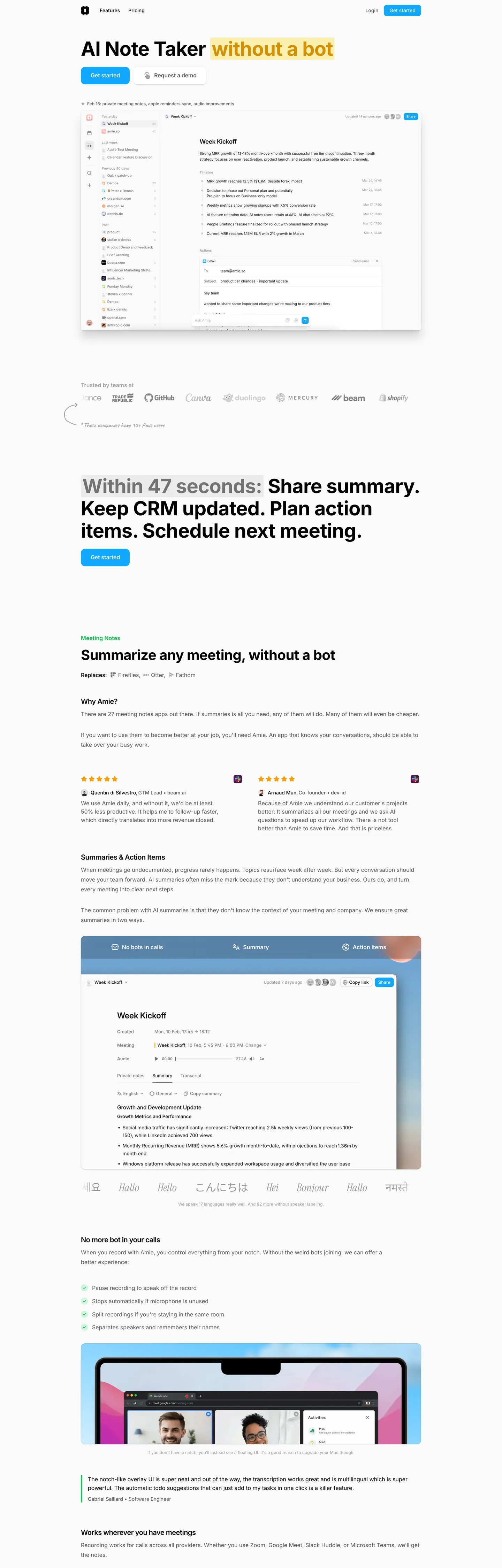
Amie's marketing site does something most calendar brands wouldn't dare: it renders the entire above-fold chrome in grayscale. The hero headline reads "AI Note Taker without a bot" with the second half wrapped in a soft yellow highlight; below it sit two buttons, only one of which is colored — a sky-blue pill carrying "Get started," paired with a transparent "Request a demo" sibling. Where Notion paints its hero with friendly multi-color object photography and Calendly leans on a saturated marine-blue chrome, Amie keeps the marketing surface almost entirely neutral and lets the product screenshots underneath do every chromatic job. The hand-drawn salmon-pink scribble arrow looping under the wordmark is the brand's only decorative moment in the page header itself.
The DESIGN.md file packages the system into a machine-readable spec for React tooling. Inside: 16 colors tokens — one sky-blue brand voltage, one salmon hand-drawn accent, four pastel event-block hues borrowed from the product, plus the grayscale chrome ladder; 11 typography tokens running Inter from a 56px / 700 display down to a 12px / 400 caption; 6 corner-radius tokens centered on 8px with a full-pill option for CTAs; 8 spacing values on a 4px base; and 13 components definitions covering the sky-blue pill primary button, the transparent secondary, the hairline-bordered cards, the calendar event blocks, and the inbox-style task rows.
Feed this file to an AI coding tool and it reproduces Amie's specific moves: grayscale Inter chrome on near-white, sky-blue voltage held to a single CTA above the fold, hand-drawn scribble decorations in salmon pink, and the pastel event-block palette reserved for the product canvas. The one move worth borrowing only if your product has a colorful canvas of its own: refuse to put any of those product colors into the marketing chrome. Amie gets away with the restraint because the screenshots beneath the fold are bright enough to carry it — most landing pages need to paint the chrome itself.
What makes it distinct
5
- Product-as-palettethe marketing chrome is monochrome Inter on near-white, while pastel event blocks (mint, pink, lavender, sky, sun) saturate the calendar screenshots
- Single sky-blue voltagethe brand hex appears just twice in the captured page, both as the pill CTA fill, the only saturated marketing element above the fold
- Hand-drawn salmon underlinethe loop-scribbled arrow under the headline is the brand's playfulness signal, rendered in the same salmon pink as the wordmark dot
- Inter across every tierdisplay at 40-56px in weight 700, body at 16px in weight 400, button labels at 14px in weight 500, no second family
- 8px default rounding plus full pillcards at 12px, buttons at full pill, the calendar event blocks at 8px; no sharp 0-2px corners anywhere
amie.so
Live at amie.so
A snapshot of the brand in production. Scroll the frame to see the whole page.
Colors
16 colors
Amie's system runs on #11a8ff as its primary voltage, used in 1 of 13 components. Type is set in Inter across 11 tokens from 12px to 56px, weights 400–700. Shape language is mixed across 13 components, blending pills, soft rounds, and squarer corners.
Brand & Accent
Sparing, CTA-only voltage · 4
Surface
Page and card backgrounds · 2
Text
Headlines, body, captions · 4
Borders & Hairlines
Dividers, outlines, rules · 1
Semantic
Status, errors, success, links · 2
Other
Specialty colors · 3
Typography
11 type tokens
Set in Inter across 11 tokens, from 12px to 56px, weights 400–700. Shown in its own stack: where the font isn't installed, the fallback the file names stands in.
- display-xl56px · weight 700 · lh 64px · tracking -0.7pxThe quick brown fox jumps over the lazy dog
- display-lg40px · weight 700 · lh 54.4px · tracking -0.5pxThe quick brown fox jumps over the lazy dog
- heading-md20px · weight 600 · lh 28px · tracking -0.5pxThe quick brown fox jumps over the lazy dog
- heading-sm16px · weight 600 · lh 28px · tracking -0.003pxThe quick brown fox jumps over the lazy dog
- body-lg16px · weight 400 · lh 28px · tracking -0.003pxThe quick brown fox jumps over the lazy dog
- body-md14px · weight 400 · lh 20px · tracking -0.003pxThe quick brown fox jumps over the lazy dog
- body-sm13px · weight 400 · lh 19.5px · tracking -0.003pxThe quick brown fox jumps over the lazy dog
- label-md14px · weight 500 · lh 20px · tracking -0.003pxThe quick brown fox jumps over the lazy dog
- caption12px · weight 400 · lh 15.84px · tracking -0.003pxThe quick brown fox jumps over the lazy dog
- button-md14px · weight 500 · lh 20px · tracking -0.003pxThe quick brown fox jumps over the lazy dog
- nav-link16px · weight 400 · lh 28px · tracking -0.003pxThe quick brown fox jumps over the lazy dog
Layout
Radii and spacing
7 corner radii and 8 spacing values. Shape language: mixed.
Radii
- none0px
- xs4px
- sm6px
- md8px
- lg12px
- xl32px
- full9999px
Spacing
- xs4px
- sm8px
- md12px
- base16px
- lg20px
- xl24px
- 2xl32px
- 3xl48px
Components
13 components
Each rendered from its tokens (color, type, radius, padding) on Amie's own canvas.
- Button Primarybutton-primaryButton Primary
- Button Secondarybutton-secondaryButton Secondary
- Top Navtop-navTop Nav
- Nav Linknav-linkNav Link
- Hero Headinghero-headingHero Heading
- Section Headingsection-headingSection Heading
- Sub Headingsub-headingSub Heading
- Body Paragraphbody-paragraphBody Paragraph
- Inline Highlightinline-highlightInline Highlight
- CardcardCard
- Event Block Mintevent-block-mintEvent Block Mint
- Event Block Skyevent-block-skyEvent Block Sky
- Type here…text-inputText Input
In use
The system, in use
Amie's tokens on the kind of product it builds.
Build something people actually use.
A short paragraph of marketing copy that previews how the brand's display tier and body tier read together. Two sentences is usually enough.
FAQ
Amie design system FAQ
Common questions about Amie's tokens, components, and how to use this DESIGN.md in your project.
Read next
Related reading
Specs, directories, and component libraries that pair with this design system.
- Browse all design systemsThe full directory of DESIGN.md files on shadcn.io, with live mockups for each.shadcn.io
- Amie — official siteAmie's public marketing site — the source of truth for the live tokens captured in this file.amie.so (opens in a new tab)
- The DESIGN.md specificationGoogle Labs' open spec for machine-readable design system files — the format this page is built on.github.com (opens in a new tab)
Use it
Use Amie in your project
One machine-readable file. Drop it into Claude, Cursor, or any AI tool that reads DESIGN.md.
Download the DESIGN.md
One machine-readable file: every color, type, radius, spacing, and component token of Amie.
Feed it to your AI tool
Drop it into Claude, Cursor, or GitHub Copilot. The agent writes React components and Tailwind classes that match Amie's visual language.
Reference the tokens directly
Or paste the values into your Tailwind config, CSS variables, or component library: every color, size and radius is a quoted, ready-to-copy value.
Read the full DESIGN.md: overview, rationale, do’s and don’ts
Overview
Amie's marketing site does something most calendar brands wouldn't try. Product-as-palette. The chrome above the fold is rendered almost entirely in grayscale Inter on a near-white canvas — even the section displays below the hero ("Within 47 seconds: Share summary. Keep CRM updated. Plan action items. Schedule next meeting.") sit in muted gray ink with a single yellow inline highlight wrapped around the time phrase. Where Notion paints its hero with multi-color object photography and Calendly leans on a saturated marine-blue chrome, Amie holds chromatic restraint in the brand surface and lets the product screenshots underneath carry every saturated moment — the pastel event blocks tile the calendar grid in mint, salmon, sky, sun yellow, and lavender, but none of those colors appear in the marketing chrome itself.
The single chromatic move above the fold is the sky-blue pill carrying "Get started" — {colors.primary} (#11a8ff) used twice on the captured page, both as the background of the primary button. Its sibling "Request a demo" is transparent with the same dimensions. The hand-drawn salmon-pink scribble looping under the "without a bot" half of the hero headline is the brand's one playfulness signal — {colors.accent-pink} (#f6a6a6), the same warm tone used for the small dot under the wordmark in the upper-left corner.
Typography is Inter across every tier — display at 56px / 700 with -0.7px tracking on the hero, 40px / 700 for the section displays, 20px / 600 for sub-section titles, 16px / 400 for the body paragraphs that fill the long-form editorial rows. There is no second family. The hero h1 at 56px / 700 is the loudest typographic moment in the system — heavier than Spline or Stripe would use at the same size, but the surrounding chrome is so muted that the weight reads as confident rather than shouted.
Key Characteristics:
- Grayscale Inter chrome on near-white canvas (
{colors.canvas}— #ffffff) — the marketing surface refuses to carry product color. - Single sky-blue voltage (
{colors.primary}— #11a8ff) reserved for the primary pill CTA above the fold. Two captured occurrences, both as background fill. - Hand-drawn salmon-pink scribble (
{colors.accent-pink}— #f6a6a6) underlines the second half of the hero headline — the brand's only decorative chrome move. - Sun-yellow inline highlight (
{colors.highlight-yellow}— #ffd700) wraps the time-phrase in the section display, reading as a marker-pen emphasis rather than a UI background. - Pastel event-block palette (mint, salmon, sky, sun, lavender) appears only inside product screenshots — never as marketing chrome.
- 8px default radius with a full-pill option for CTAs and a 12px tier for cards; no sharp 0-2px corners anywhere.
- Hairline cards on
{colors.hairline}(#cdcdcd) borders — the dominant structural color, present 565 times in the captured page, almost entirely as borders. - Inter Fallback is wired as the secondary stack, metric-matched so the swap is invisible during font load.
Colors
Brand
- Sky Primary (
{colors.primary}— #11a8ff): frequency 12. Used as text (3), bg (8), gradient (1). The single brand voltage — fills the pill CTA above the fold, the event-block sky-blue tint in calendar screenshots, and inline link accents. Maps to the blue-500 token in the page CSS. - Sky Soft (
{colors.primary-soft}— #cfeeff): frequency 3. Used as background. The pale-sky tint applied to product event blocks; not used in marketing chrome. - Sky Deep (
{colors.primary-deep}— #2c76a0): frequency 2. Used as text. The deep-sky tone used for high-contrast text inside sky-tinted event blocks. - Hand-drawn Salmon (
{colors.accent-pink}— #f6a6a6): captured as the amie-pink CSS custom property. The hand-drawn scribble arrow under the hero headline and the small dot under the wordmark. The brand's single playfulness signal. - Highlight Yellow (
{colors.highlight-yellow}— #ffd700): frequency 1. Used as background. The marker-pen inline highlight wrapping the time phrase in the section display; not a standalone color anywhere else.
Event Blocks (product surface)
- Event Mint (
{colors.event-mint}— #ccf4da): frequency 4. Used as background. The mint-green event-block tint in calendar screenshots — one of the user-assignable event colors. - Event Purple (
{colors.event-purple}— #a050ff): frequency 2. Used as text and border in product event chips. Maps to the purple-500 token. - Event Success (
{colors.event-success}— #01ca45): frequency 2. Used as text and border. The green chip color for completed tasks and confirmed meetings. - Event Warning (
{colors.event-warning}— #fe6600): frequency 1. Used as text. The orange tone for delayed or warning states in the product surface.
Surface
- Canvas (
{colors.canvas}— #ffffff): frequency 52. The page floor and card surfaces — pure white. There is no off-white tier in the marketing chrome. - Surface-1 (
{colors.surface-1}— #ebebeb): frequency 5. The very-light gray used as a subtle alternative surface on inbox-style rows and section dividers below the fold.
Text
- Ink (
{colors.ink}— #000000): frequency 485 — 406 as text, the dominant text color. Pure black, used for the hero h1, nav labels, section displays, and primary body emphasis. Amie does not soften ink the way many friendly-productivity systems do. - Ink Soft (
{colors.ink-soft}— #262626): wired as the foreground custom property. A near-black tone for content inside product event blocks where pure black would read too heavy against the pastel fill. - Ink Muted (
{colors.ink-muted}— #5c5c5c): frequency 71 — entirely as text. The secondary running-text tone used in body paragraphs below the fold. Wired as the secondary CSS variable. - Ink Faint (
{colors.ink-faint}— #a0a0a0): frequency 23 — entirely as text. The tertiary tone used for metadata, timestamps, and footnote rows. Wired as the tertiary CSS variable.
Hairlines
- Hairline (
{colors.hairline}— #cdcdcd): frequency 565 — 557 as border, 7 as bg, 1 as text. The dominant structural color, used for card outlines, section dividers, input field borders, and the calendar grid lines. The system is essentially mono-hairline.
Typography
Font Family
The system runs Inter for every typographic tier, with Inter Fallback as the metric-matched secondary stack and system-ui, sans-serif as the safety net. There is no separate display family, serif, or monospace voice anywhere on the captured page; one variable-weight sans does the entire job. The font is loaded via Google Fonts in the page head and applied to every text-bearing element through the body inheritance chain.
Hierarchy
| Token | Size | Weight | Line Height | Use |
|---|---|---|---|---|
{typography.display-xl} | 56px | 700 | 64px | Hero h1 ("AI Note Taker without a bot") |
{typography.display-lg} | 40px | 700 | 54.4px | Section displays ("Within 47 seconds…") |
{typography.heading-md} | 20px | 600 | 28px | Sub-section titles ("Summarize any meeting, without a bot") |
{typography.heading-sm} | 16px | 600 | 28px | Card titles and small headings |
{typography.body-lg} | 16px | 400 | 28px | Default running text in editorial body paragraphs |
{typography.body-md} | 14px | 400 | 20px | Compact body text inside cards and inboxes |
{typography.body-sm} | 13px | 400 | 19.5px | Caption rows beneath event blocks and metadata |
{typography.label-md} | 14px | 500 | 20px | Button labels, nav-link emphasis, small chip text |
{typography.caption} | 12px | 400 | 15.84px | Timestamps, footnotes, very small labels |
{typography.button-md} | 14px | 500 | 20px | Primary and secondary button labels |
{typography.nav-link} | 16px | 400 | 28px | Top-nav link labels |
Principles
Display weight is 700 — heavier than Spline (500), Stripe (300), or Cloudflare (500) would use at the same size, but the surrounding marketing chrome is so muted that the weight reads as friendly confidence rather than a SaaS shout. Body and headings share Inter at modest weights (400 / 500 / 600), with weight 700 reserved for the two largest display moments above and below the fold. Negative letter-spacing (-0.5px to -0.7px) tightens the display tier; the body tier sits at -0.003px, an effectively zero tracking value that hints at the system's preference for tight typographic rhythm without making the body letters touch.
Note on Font Substitutes
Inter is free and open-source via Google Fonts. No substitution is required. If you cannot self-host Inter, the system stack system-ui, -apple-system, sans-serif will fall back to the host operating system's native UI sans — San Francisco on macOS / iOS, Segoe UI on Windows, Roboto on Android. The metric-matched Inter Fallback stack the page declares is automatically generated by the Next.js font loader and is invisible to end users.
Layout
Spacing System
- Base unit: 4px, with 8px as the dominant module — the 8px gap appears 57 times in the captured page.
- Tokens:
{spacing.xs}4px ·{spacing.sm}8px ·{spacing.md}12px ·{spacing.base}16px ·{spacing.lg}20px ·{spacing.xl}24px ·{spacing.2xl}32px ·{spacing.3xl}48px. - Section padding (vertical): ~192px between major hero-and-feature bands — the largest single padding value in the captured CSS.
- Card internal padding:
{spacing.base}(16px) for the editorial cards and event-block popovers. - Button padding: 6×16 for the primary and secondary pill CTAs; 12×28 for the larger header buttons.
Grid & Container
- Max content width: ~720px on the hero headline + sub-paragraph stack, expanding to ~960px on the full-width product screenshots.
- Hero: centered headline with the hand-drawn scribble arrow looping under the second half, two pill CTAs centered below.
- Feature rows: alternating left-image / right-text rows with the product screenshot doing the visual labor and the text held in a narrow column to the side.
- Inbox-style sections: vertical stack of rows with hairline-bordered cards inset on a near-white surface.
Rhythm
The page alternates between near-empty marketing bands (hero, section displays, transition rows) and dense product screenshots (calendar grids, inbox lists, meeting note panes). The empty bands carry typography only; the dense bands carry the brand's chromatic personality. The result is a strong vertical accordion — wide breathing between bands, packed content inside each product screenshot.
Elevation
The system has essentially no shadow tier outside the product surface. The CSS declares two shadow variables (--shadow-wysiwyg-inner at 4% black opacity, --shadow-wysiwyg-outer at 12% black opacity) but they are scoped to the WYSIWYG editor inside the product, not to the marketing chrome. The marketing cards and event blocks lift off the page floor by hairline borders alone — {colors.hairline} (#cdcdcd) at 1px is the only elevation device on the brand surface.
- Flat (no shadow): hero, section displays, editorial body — the entire marketing chrome.
- Hairline lift: cards, inbox rows, calendar grid cells all use a single 1px
{colors.hairline}border to mark their boundaries. - Product elevation: the WYSIWYG editor inside the screenshots carries a soft black-alpha shadow, but only inside the product canvas — never in brand chrome.
Shapes
The radius scale is soft-default plus full pill:
{rounded.none}0px — only on flush-edged calendar grid cells inside the product.{rounded.xs}4px — small UI surfaces (inline highlight wrap, tag chips).{rounded.sm}6px — secondary buttons in tight spaces.{rounded.md}8px — the dominant radius, used for the primary button, event blocks, and most card corners. Appears 25 times in the captured page.{rounded.lg}12px — cards and larger surfaces. Appears 29 times — the most-used radius value.{rounded.xl}32px — large hero illustration containers and the rounded-rectangle full-width screenshot frames.{rounded.full}9999px — pill CTAs (17 captured occurrences), avatar circles, and the round category chips beneath the hero.
There is no sharp 0-2px tier in the marketing chrome. Even the smallest UI surfaces start at 4-6px. The combination of 8px default and full pill is what gives the system its softness without tipping into the cushy 24-32px rounding that more playful productivity brands use.
Components
button-primary — The signature CTA. Sky-blue {colors.primary} fill, white text, {rounded.md} 8px radius, 6×16 padding, 32px height. "Get started" is the canonical instance, sitting next to the transparent "Request a demo" sibling beneath the hero headline.
button-secondary — Transparent fill with black text and a 1px hairline border. {rounded.md} radius, same 6×16 padding and 32px height as the primary, giving the two CTAs identical silhouette.
top-nav — White {colors.canvas} surface with the wordmark + salmon dot on the left, "Features / Pricing" links in the center, "Login" link and a sky-blue "Get started" pill on the right. No background fill or shadow, no bottom border — the nav blends into the page floor.
nav-link — Transparent background, black text in {typography.nav-link}, 6×12 padding. The smallest nav surfaces in the system.
hero-heading — Black text on the transparent canvas, {typography.display-xl} (56px / 700). The hand-drawn salmon scribble loops under the trailing portion of the heading; the underline is an inline SVG, not a CSS pseudo-element.
section-heading — Muted gray text at {typography.display-lg} (40px / 700) for the section displays beneath the hero — color desaturated to keep the section displays subordinate to the hero h1.
sub-heading — Black text at {typography.heading-md} (20px / 600) for sub-section titles like "Summarize any meeting, without a bot" and "No more bot in your calls."
body-paragraph — Muted ink ({colors.ink-muted}) running text at {typography.body-lg} (16px / 400). The editorial body style used for long-form sections under the fold.
inline-highlight — The sun-yellow {colors.highlight-yellow} background wrapping the time phrase in the section display ("Within 47 seconds"). Reads as a marker-pen emphasis rather than a UI element; uses {rounded.xs} 4px and 0×4 horizontal padding.
card — White {colors.canvas} surface, 1px hairline border, {rounded.lg} 12px radius, 16px internal padding. The default content card on the marketing surface; holds editorial body text, testimonials, and feature explanations.
event-block-mint / event-block-sky — Pastel-filled event blocks borrowed from the product surface. Both use {rounded.md} 8px radius and 4×8 padding; the mint variant uses {colors.event-mint} fill with soft-ink text, the sky variant uses {colors.primary-soft} fill with deep-sky text. Shown in marketing only via product screenshots.
text-input — White surface, black text, 1px hairline border, {rounded.md} 8px radius, 8×12 padding, 36px height. Form fields in the inbox-style task rows.
Do's and Don'ts
Do keep the sky-blue voltage to exactly one moment above the fold. The system has a single chromatic brand element on the marketing surface (the "Get started" pill); multiplying it into multiple sky-blue elements would dilute the only chromatic marketing signal on the page.
Do let the product screenshots carry every saturated color — mint, salmon, sky, sun yellow, lavender — and refuse to lift those colors into the marketing chrome. The product-as-palette move is what makes the chrome read as the brand and the screenshots read as the product; mixing the two collapses the distinction.
Do use Inter at weight 700 for the display tier even though it is heavier than the dev-tools convention. The surrounding chrome is muted enough that 700 reads as friendly confidence; dropping to 500 would lose the editorial weight that the headline carries.
Do render the hand-drawn salmon-pink scribble ({colors.accent-pink} — #f6a6a6) as an inline SVG, not a CSS underline. The scribble is a loop-arrow, not a straight line, and the warmth of the salmon hue is critical to reading the mark as friendly rather than corrective.
Don't use {colors.event-mint}, {colors.event-purple}, {colors.event-success}, or {colors.event-warning} anywhere in marketing chrome. They are product event-block tints (the user-assignable color palette inside the calendar), not brand accents. Using them on a CTA or section header would read as random secondary colors and break the product-as-palette discipline.
Don't use {colors.hairline} (#cdcdcd) as a background fill or text color — it is a border-only token (557 of 565 captured occurrences are borders). For a light surface, use {colors.canvas} or {colors.surface-1} instead.
Don't swap {colors.canvas} from pure #ffffff to a warmer off-white. The system explicitly uses pure white as the page floor; warming it toward cream would compete with the salmon-pink hand-drawn accent and muddy the only warm color in the brand chrome.
Don't add a sharp 0-2px corner radius tier. The system's default is 8px with a full pill option; introducing 2px or 0px would feel borrowed from a dev-tools system (Vercel, Linear) rather than from Amie's softer productivity identity.
Known Gaps
- Hover, focus, and disabled states: the captured surfaces carry resting states only. The full state matrix for the primary pill, secondary button, and text input is not exposed in the marketing chrome.
- Dark mode: the captured page is light-only. A dark variant exists inside the product editor (the CSS declares gray tokens up to gray-950 and night-mode shadow variables) but is not represented here.
- Form validation states: the inbox-style task input carries its resting style; error / success / loading states live inside the product and are not exposed in marketing.
- Motion: the hero scribble may animate on load (loop-trace SVG draw) but the spec captures end-state values only. Animation timing, easing, and stagger live in the live product surface.
- Mobile / responsive tokens: the captured page is the desktop render. Tablet and mobile breakpoints likely shift the display sizes downward but are not represented in the extracted token list.
- Product surfaces: this DESIGN.md captures the marketing site only. The Amie product (the calendar, inbox, and meeting-notes app) carries a much richer token system — the CSS exposes per-event-color custom-property families across blue, green, pink, purple, lime, rose, amber, indigo, fuchsia, teal, cyan — that is not represented here.
- Wordmark + scribble vector source: the marks are rendered as inline SVG inside the page but the source vectors are not part of the design-token surface.
Productivity & SaaS
More systems like this
More DESIGN.md files in Productivity & SaaS.
Pricing
Build it with Pro
The DESIGN.md files are free. Pro adds 6,000+ blocks, premium templates and the MCP server, so your AI editor builds in your system for you.
4.9/5 out of 5 · 150+ reviewsfrom 150+ founders and developers.
Billing
Billed once a year in USD. Cancel anytime.
- How many people can use the license.
- Client work, SaaS products and anything you charge for.
- Production-ready React sections: hero, pricing, features, dashboards and more.
- Complete multi-page sites you can ship as they are.
- React icons from every major library, installable with one command.
- Presets that restyle every block, in light and dark.
- Lets your AI editor search, preview and install blocks for you.
- Priority requests are answered first.
Individual
For personal projects & open source
$32instead of $49/mo
$389 billed yearly
- Seats: 1 seat
- Commercial use: Personal & open source only
- Pro blocks: 6,000+ blocks
- Templates: All 14 templates
- React icons: 294k+ icons
- Themes: All 59 themes
- MCP server: Basic usage
- Support: Standard
Team
Most popularFor freelancers, agencies & startups
$66instead of $99/mo
$789 billed yearly · ≈ $13/dev/mo
- Seats: Up to 5 seats
- Commercial use: Included
- Pro blocks: 6,000+ blocks
- Templates: All 14 templates
- React icons: 294k+ icons
- Themes: All 59 themes
- MCP server: High usage
- Support: Priority
Organization
For companies with larger teams
$132instead of $199/mo
$1,589 billed yearly
- Seats: Unlimited seats
- Commercial use: Included
- Pro blocks: 6,000+ blocks
- Templates: All 14 templates
- React icons: 294k+ icons
- Themes: All 59 themes
- MCP server: Unlimited usage
- Support: Priority
Billed once a year in USD. Cancel anytime.
Individual
For personal projects & open source
$32instead of $49/mo
$389 billed yearly
- How many people can use the license.Seats: 1 seat
- Client work, SaaS products and anything you charge for.Commercial use: Personal & open source only
- Production-ready React sections: hero, pricing, features, dashboards and more.Pro blocks: 6,000+ blocks
- Complete multi-page sites you can ship as they are.Templates: All 14 templates
- React icons from every major library, installable with one command.React icons: 294k+ icons
- Presets that restyle every block, in light and dark.Themes: All 59 themes
- Lets your AI editor search, preview and install blocks for you.MCP server: Basic usage
- Priority requests are answered first.Support: Standard
Team
Most popularFor freelancers, agencies & startups
$66instead of $99/mo
$789 billed yearly · ≈ $13/dev/mo
Everything in Individual, plus
- How many people can use the license.Seats: Up to 5 seats
- Client work, SaaS products and anything you charge for.Commercial use: Included
- Lets your AI editor search, preview and install blocks for you.MCP server: High usage
- Priority requests are answered first.Support: Priority
Organization
For companies with larger teams
$132instead of $199/mo
$1,589 billed yearly
Everything in Team, plus
- How many people can use the license.Seats: Unlimited seats
- Lets your AI editor search, preview and install blocks for you.MCP server: Unlimited usage
- Secure checkout via Stripe
- Code lives in your repo
- Keep what you've shipped if you cancel
- License terms
Your system, built for you
Every block, template and icon, installed by your AI agent in your design system. The DESIGN.md files stay free.