Anytype Design System
Anytype's marketing system pairs Inter at weight 300 with the display serif Riccionets for a literary-editorial hero on a white-to-pastel gradient canvas. Tokens for React, Next.js, and AI coding tools.
Add shadcn.io to your AI agent. · Pro It installs blocks, icons and templates in your design system from a prompt, with Pro.
Set up MCP- Primary
- #808080
- Typeface
- inter
- Shape
- Mixed
- Base radius
- 16px
- Colors
- 14
- Type tokens
- 12
- Components
- 14
- Spacing values
- 8
About
About Anytype DESIGN.md
Curated by Dov Azencot · Updated May 19, 2026 · Source anytype.io (opens in a new tab)
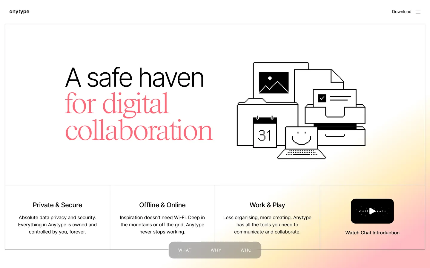
Anytype's hero does something typographically uncommon for a productivity SaaS: it splits a single headline between two typefaces mid-sentence. "A safe haven" renders in Inter at weight 300 — quiet, almost whispery — and then "for digital collaboration" drops to a second line in Riccionets, a display serif with bracketed serifs and editorial proportions, at 96px. The effect reads like a magazine cover that was interrupted by a product launch. No other element on the page uses Riccionets. It exists solely for that one emotional statement, then vanishes.
The color story is equally restrained. Where Notion uses cobalt blue for CTAs and linear uses violet for every interactive surface, Anytype keeps the entire chrome in jet black and white. The only chromatic signal is a mint-teal (#3cd9b3) accent used four times as text — once in a testimonial quote mark, once in a small label — and a pastel gradient that bleeds across the lower half of the hero area, mixing warm cream (#ffedbe), mint (#cdffea), sky blue (#b9eeff), and lavender (#e7d4ff). These gradient stops appear only as background fills; they never reach the text layer. Button-primary on this system is black ink on white canvas with a hairline border — the same disciplined move Arc uses, where the product's sophistication is trusted to carry the brand.
The pixel-art illustration in the hero is the third signal worth noting: a 1-bit black-and-white set of workspace objects (desktop monitor, calendar showing "31," folder stack, smiley-face terminal, document cards) rendered in the style of early Macintosh system icons. The choice signals handcraft and historical computing nostalgia — the opposite of the glass-morphism gradients most productivity apps use. Paired with the literary serif and the data-sovereignty copy, it positions Anytype not as a Notion competitor but as a philosophical counterweight to cloud-first tools.
What makes it distinct
5
- Serif-sans headline splitthe hero breaks mid-phrase from Inter weight 300 to Riccionets at 96px, giving the emotional line a display-serif voice distinct from the data-privacy prose beneath
- No chromatic primarythe palette is structural neutral; button-primary uses ink on canvas with a hairline border, the same pattern Patagonia and Arc use when brand restraint is the identity
- Pastel gradient canvasa cream-to-mint-to-lavender gradient bleeds across the lower half of the above-fold area, the only chromatic move in the marketing system
- Pixel-art illustration stylethe hero illustration uses 1-bit black-and-white pixel art (desktop, calendar, folder, smiley face), contrasting the soft gradient behind it
- Uppercase tracking label14px Inter at 1px letter-spacing in uppercase doubles as section navigation (WHAT / WHY / WHO pill row) and category labels
anytype.io
Live at anytype.io
A snapshot of the brand in production. Scroll the frame to see the whole page.
Colors
14 colors
Anytype's system anchors on #808080 (ink-subtle) as its primary color. Type is set in inter across 12 tokens from 14px to 96px, weights 300–500. Shape language is mixed across 14 components, blending pills, soft rounds, and squarer corners.
Surface
Page and card backgrounds · 2
Text
Headlines, body, captions · 4
Borders & Hairlines
Dividers, outlines, rules · 1
Other
Specialty colors · 7
Typography
12 type tokens
Set in inter across 12 tokens, from 14px to 96px, weights 300–500. Shown in its own stack: where the font isn't installed, the fallback the file names stands in.
- display-xl96px · weight 400 · lh 90px · tracking -2.4pxThe quick brown fox jumps over the lazy dog
- display-lg88px · weight 400 · lh 76px · tracking -2.4pxThe quick brown fox jumps over the lazy dog
- display-md88px · weight 300 · lh 90px · tracking -5.2pxThe quick brown fox jumps over the lazy dog
- heading-lg48px · weight 500 · lh 48px · tracking -2.4pxThe quick brown fox jumps over the lazy dog
- heading-md36px · weight 500 · lh 40px · tracking -1.6pxThe quick brown fox jumps over the lazy dog
- heading-sm28px · weight 500 · lh 32px · tracking -0.64pxThe quick brown fox jumps over the lazy dog
- subheading22px · weight 500 · lh 28px · tracking -0.48pxThe quick brown fox jumps over the lazy dog
- body-lg18px · weight 300 · lh 26px · tracking -0.28pxThe quick brown fox jumps over the lazy dog
- body-md16px · weight 400 · lh 24px · tracking -0.2pxThe quick brown fox jumps over the lazy dog
- body-sm14px · weight 400 · lh 20px · tracking -0.12pxThe quick brown fox jumps over the lazy dog
- label-caps14px · weight 400 · lh 20px · tracking 1pxThe quick brown fox jumps over the lazy dog
- button-md16px · weight 500 · lh 24px · tracking -0.2pxThe quick brown fox jumps over the lazy dog
Layout
Radii and spacing
3 corner radii and 8 spacing values. Shape language: mixed.
Radii
- none0px
- md16px
- pill9999px
Spacing
- xs4px
- sm14px
- md16px
- base22px
- lg24px
- xl32px
- 2xl44px
- 3xl80px
Components
14 components
Each rendered from its tokens (color, type, radius, padding) on Anytype's own canvas.
- Button Primarybutton-primaryButton Primary
- Button Secondarybutton-secondaryButton Secondary
- Top Navtop-navTop Nav
- Nav Linknav-linkNav Link
- Hero Headinghero-headingHero Heading
- Hero Heading Serifhero-heading-serifHero Heading Serif
- Body Paragraphbody-paragraphBody Paragraph
- Body Paragraph Darkbody-paragraph-darkBody Paragraph Dark
- Section Headingsection-headingSection Heading
- CardcardCard
- Feature Labelfeature-labelFeature Label
- Nav Pillnav-pillNav Pill
- Type here…text-inputText Input
- FooterfooterFooter
In use
The system, in use
Anytype's tokens on the kind of product it builds.
Build something people actually use.
A short paragraph of marketing copy that previews how the brand's display tier and body tier read together. Two sentences is usually enough.
FAQ
Anytype design system FAQ
Common questions about Anytype's tokens, components, and how to use this DESIGN.md in your project.
Read next
Related reading
Specs, directories, and component libraries that pair with this design system.
- Browse all design systemsThe full directory of DESIGN.md files on shadcn.io, with live mockups for each.shadcn.io
- Anytype — official siteAnytype's public marketing site — the source of truth for the live tokens captured in this file.anytype.io (opens in a new tab)
- The DESIGN.md specificationGoogle Labs' open spec for machine-readable design system files — the format this page is built on.github.com (opens in a new tab)
Use it
Use Anytype in your project
One machine-readable file. Drop it into Claude, Cursor, or any AI tool that reads DESIGN.md.
Download the DESIGN.md
One machine-readable file: every color, type, radius, spacing, and component token of Anytype.
Feed it to your AI tool
Drop it into Claude, Cursor, or GitHub Copilot. The agent writes React components and Tailwind classes that match Anytype's visual language.
Reference the tokens directly
Or paste the values into your Tailwind config, CSS variables, or component library: every color, size and radius is a quoted, ready-to-copy value.
Read the full DESIGN.md: overview, rationale, do’s and don’ts
Overview
Anytype's hero does something rare among productivity tools: it commits to typographic voice as the primary brand signal. Serif-sans editorial split. The headline breaks mid-sentence between Inter at weight 300 and Riccionets — a display serif with bracketed letterforms — giving the second half of the phrase a literary presence that no competing workspace tool (Notion, Coda, Craft, Obsidian) attempts. The rest of the system is almost aggressively quiet: black, white, and a pastel gradient.
This quietness is the argument. Where Notion uses cobalt-blue CTAs and Linear uses violet-graphite as a surface layer, Anytype offers no chromatic brand signal at all. Button-primary is ink on white canvas with a hairline border, the same move Arc and Patagonia make when they want the product to speak before the brand does.
Key Characteristics:
- Serif-sans headline split: Inter weight 300 for the first clause, Riccionets at 96px for the emotional second clause — Riccionets appears nowhere else on the page.
- Zero chromatic brand primary: no color with brand-layer status and usage above 5; the closest accent is mint-teal (#3cd9b3) at 5 total occurrences.
- Pastel gradient backdrop: warm cream, rose, mint, sky blue, and lavender gradient fills bleed across the lower hero, never touching the text layer.
- 1-bit pixel-art illustration: black-and-white Macintosh-era workspace icons (desktop, calendar, folder) contrast the soft gradient and position Anytype against cloud-first tools visually.
- Uppercase tracking labels at 1px letter-spacing serve as section navigation pills (WHAT / WHY / WHO) — the system's only typographic uppercase treatment.
- Pill rounding dominates: the nav pills and CTA buttons use full-pill radius; feature grid cards have zero rounding.
- Weight 300 body copy: lighter than any competing workspace brand; signals deliberateness over density.
Colors
Structural
- Ink (
{colors.ink}— #000000): frequency 169. Used as text (88), bg (7), border (74). The dominant canvas color and the only text tone above the fold — pure black against a white surface, unmodulated by alpha. - Canvas (
{colors.canvas}— #ffffff): frequency 306. Used as text (162), bg (4), border (139). The page floor; also used for text on dark surfaces and as the headline background. - Ink-muted (
{colors.ink-muted}— #5b5b5b): frequency 33. Used as border (33). Mid-gray for dividers and secondary borders. - Surface-1 (
{colors.surface-1}— #3c3c3c): frequency 8. Used as bg (1), border (7). Dark surface for the nav pill (WHAT / WHY / WHO) — the system's only elevated surface. - Ink-subtle (
{colors.ink-subtle}— #808080): frequency 10. Used as text (5), border (5). Tertiary label color. - Ink-faint (
{colors.ink-faint}— #666666): frequency 4. Used as text (2), border (2). Quaternary subtle text.
Accent
- Mint-teal (
{colors.mint-teal}— #3cd9b3): frequency 5. Used as text (4), border (1). The only chromatic signal on the marketing surface. Appears in testimonial quote marks and a single inline label — a trace accent rather than a brand primary.
Gradient stops (hero background only)
- Gradient-cream (
{colors.gradient-cream}— #ffedbe): gradient fill only, frequency 1. Warm cream stop in the lower-hero gradient. - Gradient-rose (
{colors.gradient-rose}— #ffbcc3): gradient fill only, frequency 1. Pale rose stop. - Gradient-mint (
{colors.gradient-mint}— #cdffea): gradient fill only, frequency 1. Mint green stop. - Gradient-sky (
{colors.gradient-sky}— #b9eeff): gradient fill only, frequency 1. Sky blue stop. - Gradient-lavender (
{colors.gradient-lavender}— #e7d4ff): gradient fill only, frequency 1. Pale lavender stop. - Gradient-lime (
{colors.gradient-lime}— #f1ffc9): gradient fill only, frequency 1. Chartreuse stop at the far end of the gradient.
Typography
Font Families
The system runs two families: Inter (wired as --font-primary: "inter", Helvetica, sans-serif) as the functional voice for every surface, and Riccionets (wired as --font-secondary: "riccionets", Helvetica, sans-serif) as the display serif reserved for the hero headline's emotional second clause.
Hierarchy
| Token | Size | Weight | Line Height | Letter-Spacing | Use |
|---|---|---|---|---|---|
{typography.display-xl} | 96px | 400 | 90px | -2.4px | Riccionets hero serif line |
{typography.display-lg} | 88px | 400 | 76px | -2.4px | Riccionets alternate display |
{typography.display-md} | 88px | 300 | 90px | -5.2px | Inter super-display (ultra-light) |
{typography.heading-lg} | 48px | 500 | 48px | -2.4px | Section h2 |
{typography.heading-md} | 36px | 500 | 40px | -1.6px | Sub-section headings |
{typography.heading-sm} | 28px | 500 | 32px | -0.64px | Card headings |
{typography.subheading} | 22px | 500 | 28px | -0.48px | UI panel titles |
{typography.body-lg} | 18px | 300 | 26px | -0.28px | Hero body and testimonials |
{typography.body-md} | 16px | 400 | 24px | -0.2px | Default running text |
{typography.body-sm} | 14px | 400 | 20px | -0.12px | Nav links and secondary text |
{typography.label-caps} | 14px | 400 | 20px | 1px | Uppercase section labels (WHAT / WHY / WHO) |
{typography.button-md} | 16px | 500 | 24px | -0.2px | CTA button label |
Principles
The heaviest weight anywhere on the page is 500 — used for headings and button labels. Body copy at weight 300 is intentionally lighter than most workspace brands, creating a reading texture closer to a newspaper opinion column than a SaaS feature grid. The -5.2px letter-spacing on the 80-88px Inter super-display tier is the most extreme tracking in the system — compress, then release at the Riccionets serif line above.
Note on Font Substitutes
Riccionets is a proprietary display serif. The closest open-source substitute with bracketed serifs and editorial proportions at 96px display scale is Playfair Display (weight 400) or Cormorant Garamond. For the Inter body, Inter is already open-source.
Layout
Spacing System
- Base unit: 4px, with 16px as the dominant page module.
- Tokens:
{spacing.xs}4px ·{spacing.sm}14px ·{spacing.md}16px ·{spacing.base}22px ·{spacing.lg}24px ·{spacing.xl}32px ·{spacing.2xl}44px ·{spacing.3xl}80px. - Section padding (vertical): ~80px between major sections.
- Card internal padding: 40px top, 32px sides, 62px bottom — deliberate asymmetry that creates breathing room at the base of the feature cards.
- Nav padding: 0px vertical, 16px horizontal — flush to the top edge.
Grid & Container
- Max content width: ~1200px, with a two-column split above the fold (headline left, pixel-art illustration right).
- Feature grid: 4-column row below the fold (Private & Secure / Offline & Online / Work & Play / video thumbnail), each divided by a full-height hairline border.
- Hero: white canvas with the gradient bleeding in from the lower right; headline floats left-aligned with generous top padding.
Rhythm
The page alternates between the editorial headline area (white canvas, serif moment, large negative tracking) and the feature grid area (hairline dividers, functional sans, weight 500 labels). There is no gradient transition between zones — the hero area ends abruptly at the hairline border above the feature grid.
Elevation
The system uses essentially no shadow tier. Elevation is achieved through a single mechanism: the nav pill ({colors.surface-1} — dark charcoal #3c3c3c on white) creates the only tonal lift on the page. Feature cards use hairline borders rather than shadows or background fills to delineate edges.
- Flat (no shadow): all body surfaces, hero, footer.
- Tonal lift:
{colors.surface-1}dark pill on{colors.canvas}white — used only for the section navigation (WHAT / WHY / WHO) row. - Hairline borders: feature grid cards use 1px black borders as dividers; there is no card background differentiation.
Shapes
The radius philosophy is binary:
{rounded.none}0px — feature grid cards and structural dividers; the system's sharp moment.{rounded.md}16px — text inputs and form fields.{rounded.pill}9999px — CTA buttons and the WHAT / WHY / WHO nav pills.
There is no intermediate rounding tier. The contrast between sharp feature cards and fully-rounded CTAs is intentional — the product grid is functional, the call-to-action is human-scaled.
Components
button-primary — Ink-black {colors.ink} fill, white text, {rounded.pill} radius, 10x16 padding, 44px height. There is no chromatic primary to fill here; the CTA's authority comes from contrast and the pill shape, not color.
button-secondary — Transparent fill, black text, 1px black hairline border, {rounded.pill} radius. Used for "Log in" and secondary download CTAs.
top-nav — White canvas, black text, 0px vertical padding, 16px horizontal padding, 44px height. The Anytype wordmark sits flush left; "Download" and a hamburger icon sit flush right — no center-aligned nav links, which is unusual for a SaaS marketing site.
nav-link — Transparent, black text at {typography.body-sm}, 10x0 padding. The only nav links are the top-right "Download" text.
hero-heading — Black text on transparent, {typography.display-xl} (96px Riccionets). Zero horizontal padding; the serif headline sits flush left with no safe zone.
hero-heading-serif — The split-voice version: the first clause uses Inter weight 300 at matching scale, then the second clause drops to Riccionets. Both share the display-xl token scale.
body-paragraph — White text (for the testimonial dark card surface) at {typography.body-lg} (18px / weight 300). The below-fold testimonials invert to a black or near-black card.
body-paragraph-dark — Black text at {typography.body-md} for feature grid descriptions under each column heading.
section-heading — Black text, {typography.heading-lg} (48px / 500), used for section h2 labels like "Private & Secure" inside the feature columns.
card — White canvas fill, black text, zero radius, 1px black hairline border. Asymmetric padding: 40px top / 32px sides / 62px bottom. Used for the 4-column feature grid below the fold.
feature-label — Black text, {typography.body-sm} at weight 500. The bolded label above each feature description in the 4-column grid.
nav-pill — Dark charcoal {colors.surface-1} fill, white text at {typography.label-caps} (14px / uppercase / 1px tracking), {rounded.pill} radius. The WHAT / WHY / WHO section-navigation row.
text-input — White canvas fill, black text, {rounded.md} 16px radius, 1px black border, 16px padding. Used for any inline form fields.
footer — White canvas, ink-muted text at {typography.body-sm}, 52x20x48 padding (top / sides / bottom). Continuous with the page canvas — no surface lift.
Do's and Don'ts
Do use Riccionets (or an editorial serif substitute) exclusively for the headline's emotional clause. The rule is one voice per role — the functional product copy stays in Inter; only the brand statement gets the serif.
Do keep body weight at 300 for paragraph and testimonial copy. The lighter weight is load-bearing: it creates reading texture that separates Anytype from grid-heavy SaaS docs tools without requiring a second font.
Do use {rounded.pill} on all interactive surfaces (buttons, nav pills) and {rounded.none} on all content cards. The binary contrast between round-interactive and sharp-structural is the system's shape language.
Do limit mint-teal ({colors.mint-teal} — #3cd9b3) to trace use — at most 5 occurrences, as in the extraction. Expanding it to fill buttons or card borders would transform a trace accent into a brand primary, which is not what the system does.
Don't add a chromatic primary color to the button-primary component. The ink-on-white button with a hairline border is deliberate — introducing a color fill (cobalt, violet, teal) would signal that the brand color is doing the persuasion, which undercuts the data-sovereignty positioning.
Don't use gradient stops ({colors.gradient-cream} through {colors.gradient-lavender}) as text or border colors. They live exclusively in background fills. Applying them as text would destroy the ink-black / white contrast discipline the rest of the system depends on.
Don't apply the -5.2px letter-spacing from {typography.display-md} to any size below 80px. Extreme negative tracking at body size reads as broken text; it only resolves at large display scale where inter-letter distances remain legible.
Don't use uppercase {typography.label-caps} for body-length copy. The 1px positive tracking is calibrated for 3-6 character labels (WHAT / WHY / WHO); at paragraph length it reads as shouting.
Known Gaps
- Primary CTA hover state: the ink-on-white button's hover behavior is not captured. Common practice would be an ink-muted fill or a border-only inverse, but the captured surface does not confirm either.
- Dark surfaces: the testimonial section appears to use a dark or near-black card, but the extraction captures body text color as white — the card background value is not confirmed.
- Gradient position and timing: the pastel gradient appears to fade in on scroll or be positioned absolutely in the lower-right of the hero; exact positioning, z-index, and any scroll parallax are not captured.
- Mobile type scale: the extraction reflects desktop sizes. Riccionets at 96px would require significant downscaling on mobile; the responsive breakpoints are not represented here.
- Riccionets character set: the extraction confirms the family name but not the weight range, style variants, or language coverage of the Riccionets typeface.
- Form states: text-input error, focus, and disabled states are not captured from the marketing surface.
- Animation: the hero pixel-art illustration and gradient may animate on load; the spec captures static end-state values only.
Productivity & SaaS
More systems like this
More DESIGN.md files in Productivity & SaaS.
Pricing
Build it with Pro
The DESIGN.md files are free. Pro adds 6,000+ blocks, premium templates and the MCP server, so your AI editor builds in your system for you.
4.9/5 out of 5 · 150+ reviewsfrom 150+ founders and developers.
Billing
Billed once a year in USD. Cancel anytime.
- How many people can use the license.
- Client work, SaaS products and anything you charge for.
- Production-ready React sections: hero, pricing, features, dashboards and more.
- Complete multi-page sites you can ship as they are.
- React icons from every major library, installable with one command.
- Presets that restyle every block, in light and dark.
- Lets your AI editor search, preview and install blocks for you.
- Priority requests are answered first.
Individual
For personal projects & open source
$32instead of $49/mo
$389 billed yearly
- Seats: 1 seat
- Commercial use: Personal & open source only
- Pro blocks: 6,000+ blocks
- Templates: All 14 templates
- React icons: 294k+ icons
- Themes: All 59 themes
- MCP server: Basic usage
- Support: Standard
Team
Most popularFor freelancers, agencies & startups
$66instead of $99/mo
$789 billed yearly · ≈ $13/dev/mo
- Seats: Up to 5 seats
- Commercial use: Included
- Pro blocks: 6,000+ blocks
- Templates: All 14 templates
- React icons: 294k+ icons
- Themes: All 59 themes
- MCP server: High usage
- Support: Priority
Organization
For companies with larger teams
$132instead of $199/mo
$1,589 billed yearly
- Seats: Unlimited seats
- Commercial use: Included
- Pro blocks: 6,000+ blocks
- Templates: All 14 templates
- React icons: 294k+ icons
- Themes: All 59 themes
- MCP server: Unlimited usage
- Support: Priority
Billed once a year in USD. Cancel anytime.
Individual
For personal projects & open source
$32instead of $49/mo
$389 billed yearly
- How many people can use the license.Seats: 1 seat
- Client work, SaaS products and anything you charge for.Commercial use: Personal & open source only
- Production-ready React sections: hero, pricing, features, dashboards and more.Pro blocks: 6,000+ blocks
- Complete multi-page sites you can ship as they are.Templates: All 14 templates
- React icons from every major library, installable with one command.React icons: 294k+ icons
- Presets that restyle every block, in light and dark.Themes: All 59 themes
- Lets your AI editor search, preview and install blocks for you.MCP server: Basic usage
- Priority requests are answered first.Support: Standard
Team
Most popularFor freelancers, agencies & startups
$66instead of $99/mo
$789 billed yearly · ≈ $13/dev/mo
Everything in Individual, plus
- How many people can use the license.Seats: Up to 5 seats
- Client work, SaaS products and anything you charge for.Commercial use: Included
- Lets your AI editor search, preview and install blocks for you.MCP server: High usage
- Priority requests are answered first.Support: Priority
Organization
For companies with larger teams
$132instead of $199/mo
$1,589 billed yearly
Everything in Team, plus
- How many people can use the license.Seats: Unlimited seats
- Lets your AI editor search, preview and install blocks for you.MCP server: Unlimited usage
- Secure checkout via Stripe
- Code lives in your repo
- Keep what you've shipped if you cancel
- License terms
Your system, built for you
Every block, template and icon, installed by your AI agent in your design system. The DESIGN.md files stay free.