Webflow Inspired Design System
Webflow's design system as a DESIGN.md file. Ink black #080808, WF Visual Sans, 19 colors, 16 type styles, 30+ components. For React, Next.js, and AI tools.
Add shadcn.io to your AI agent. · Pro It installs blocks, icons and templates in your design system from a prompt, with Pro.
Set up MCP- Primary
- #080808
- Typeface
- WF Visual Sans Variable
- Shape
- Mixed
- Base radius
- 8px
- Colors
- 19
- Type tokens
- 16
- Components
- 31
- Spacing values
- 8
About
About Webflow Inspired DESIGN.md
Curated by Dov Azencot · Updated May 12, 2026 · Source webflow.com (opens in a new tab)
Webflow's design system reads as a confident professional product, not a tech startup. The default page is a generous white canvas with one decisive ink colour — `#080808` near-black — carrying every primary CTA, every heading, and every wordmark. Around that restrained primary, the brand layers a five-stop chromatic accent palette (purple `#7a3dff`, pink `#ed52cb`, blue `#3b89ff`, orange `#ff6b00`, green `#00d722`) that maps directly to product categories: design, animation, SEO, hosting, ecommerce. These accents appear as full-card surface fills inside the category grid, never as button backgrounds. The proprietary WF Visual Sans family handles every typographic role at weights 500 and 600, with negative tracking on display sizes giving the hero its tight, engineered voice.
This page captures the system in a single DESIGN.md file built to the Google Labs open specification. Inside: 19 colour tokens (one primary, nine chromatic accents, four text roles, hairlines and canvas), 16 type styles all running WF Visual Sans Variable with Inconsolata as the documented mono fallback, an 8-step spacing scale from 2px to 32px, a five-step radius scale capped at 8px for cards, and 30+ component recipes spanning buttons, cards, hero bands, the five chromatic category cards, badges, inputs, and a kit-mirror block of 10 illustrative example surfaces.
Feed the file to Claude, Cursor, or GitHub Copilot and the AI produces React components that respect Webflow's discipline — `#080808` CTAs, 4px button corners, the 600 weight ceiling — rather than a generic shadcn theme. The tokens drop straight into Tailwind config or CSS variables. The system is worth studying for one reason: it shows how a brand can be visually distinctive without raising any individual element's voice. The chromatic palette does the heavy lifting on surfaces; the primary stays quiet on actions; the type never climbs past semibold. Restraint as a strategy.
What makes it distinct
5
- Two-colour conversion hierarchyevery primary CTA is `#080808` near-black, never one of the five chromatic accents
- Five-stop category palette`#7a3dff` purple, `#ed52cb` pink, `#3b89ff` blue, `#ff6b00` orange, `#00d722` green as full surface fills
- Weight ceiling at 600proprietary WF Visual Sans Variable carries every display and body role, never heavier than semibold
- Tight 4px button radiusthe brand's canonical `{rounded.sm}` geometry; pill CTAs do not exist in the system
- Hero display at 80px / 600 with -0.8px trackingconfident kerning rather than billboard weight
webflow.com
Live at webflow.com
A snapshot of the brand in production. Scroll the frame to see the whole page.
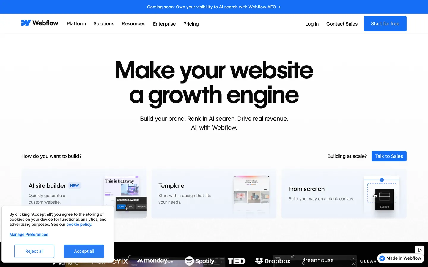
Colors
19 colors
Webflow Inspired's system runs on #080808 as its primary voltage, used in 5 of 31 components. Type is set in WF Visual Sans Variable across 16 tokens from 12px to 80px, weights 400–600. Shape language is mixed across 31 components, blending pills, soft rounds, and squarer corners.
Brand & Accent
Sparing, CTA-only voltage · 10
Surface
Page and card backgrounds · 1
Text
Headlines, body, captions · 5
Borders & Hairlines
Dividers, outlines, rules · 1
Other
Specialty colors · 2
Typography
16 type tokens
Set in WF Visual Sans Variable across 16 tokens, from 12px to 80px, weights 400–600. Shown in its own stack: where the font isn't installed, the fallback the file names stands in.
- display-xxl80px · weight 600 · lh 83.2px · tracking -0.8pxThe quick brown fox jumps over the lazy dog
- display-xl56px · weight 600 · lh 58.24pxThe quick brown fox jumps over the lazy dog
- display-lg44.8px · weight 600 · lh 46.6pxThe quick brown fox jumps over the lazy dog
- display-md32px · weight 500 · lh 41.6pxThe quick brown fox jumps over the lazy dog
- display-sm24px · weight 500 · lh 31.2pxThe quick brown fox jumps over the lazy dog
- display-xs20px · weight 500 · lh 28pxThe quick brown fox jumps over the lazy dog
- eyebrow-uppercase15px · weight 500 · lh 19.5px · tracking 1.5pxThe quick brown fox jumps over the lazy dog
- eyebrow-uppercase-sm12px · weight 500 · lh 12px · tracking 0.6pxThe quick brown fox jumps over the lazy dog
- body-lg28.8px · weight 400 · lh 46.08px · tracking -0.288pxThe quick brown fox jumps over the lazy dog
- body-md16px · weight 400 · lh 25.6px · tracking -0.16pxThe quick brown fox jumps over the lazy dog
- body-md-strong16px · weight 500 · lh 25.6px · tracking -0.16pxThe quick brown fox jumps over the lazy dog
- body-sm14px · weight 400 · lh 22.4pxThe quick brown fox jumps over the lazy dog
- body-sm-strong14px · weight 500 · lh 22.4pxThe quick brown fox jumps over the lazy dog
- caption12.8px · weight 550 · lh 15.36pxThe quick brown fox jumps over the lazy dog
- caption-mono12px · weight 400 · lh 18pxThe quick brown fox jumps over the lazy dog
- button-md16px · weight 500 · lh 25.6px · tracking -0.16pxThe quick brown fox jumps over the lazy dog
Layout
Radii and spacing
5 corner radii and 8 spacing values. Shape language: mixed.
Radii
- none0px
- xs2px
- sm4px
- md8px
- full9999px
Spacing
- xxs2px
- xs4px
- sm8px
- md12px
- lg16px
- xl20px
- 2xl24px
- 3xl32px
Components
31 components
Each rendered from its tokens (color, type, radius, padding) on Webflow's own canvas.
- Nav Barnav-barNav Bar
- Nav Linknav-linkNav Link
- Button Primarybutton-primaryButton Primary
- Button Secondarybutton-secondaryButton Secondary
- Button Text Arrowbutton-text-arrowButton Text Arrow
- button-icon-circularButton Icon Circular
- Type here…text-inputText Input
- Badge Infobadge-infoBadge Info
- Badge Info Softbadge-info-softBadge Info Soft
- Card Featurecard-featureCard Feature
- Card Feature Darkcard-feature-darkCard Feature Dark
- Card Pricingcard-pricingCard Pricing
- Hero Bandhero-bandHero Band
- Hero Band Darkhero-band-darkHero Band Dark
- Content Bandcontent-bandContent Band
- Category Card Purplecategory-card-purpleCategory Card Purple
- Category Card Bluecategory-card-blueCategory Card Blue
- Category Card Orangecategory-card-orangeCategory Card Orange
- Category Card Greencategory-card-greenCategory Card Green
- Category Card Pinkcategory-card-pinkCategory Card Pink
- FooterfooterFooter
- Ex Pricing Tierex-pricing-tierEx Pricing Tier
- Ex Pricing Tier Featuredex-pricing-tier-featuredEx Pricing Tier Featured
- Ex Product Selectorex-product-selectorEx Product Selector
- Ex Cart Drawerex-cart-drawerEx Cart Drawer
- Ex App Shell Rowex-app-shell-rowEx App Shell Row
- Ex Data Table Cellex-data-table-cellEx Data Table Cell
- Ex Auth Form Cardex-auth-form-cardEx Auth Form Card
- Ex Modal Cardex-modal-cardEx Modal Card
- Ex Empty State Cardex-empty-state-cardEx Empty State Card
- Ex Toastex-toastEx Toast
In use
The system, in use
Webflow's tokens on the kind of product it builds.
Build something people actually use.
A short paragraph of marketing copy that previews how the brand's display tier and body tier read together. Two sentences is usually enough.
FAQ
Webflow Inspired design system FAQ
Common questions about Webflow's tokens, components, and how to use this DESIGN.md in your project.
Read next
Related reading
Specs, directories, and component libraries that pair with this design system.
Use it
Use Webflow Inspired in your project
One machine-readable file. Drop it into Claude, Cursor, or any AI tool that reads DESIGN.md.
Download the DESIGN.md
One machine-readable file: every color, type, radius, spacing, and component token of Webflow Inspired.
Feed it to your AI tool
Drop it into Claude, Cursor, or GitHub Copilot. The agent writes React components and Tailwind classes that match Webflow Inspired's visual language.
Reference the tokens directly
Or paste the values into your Tailwind config, CSS variables, or component library: every color, size and radius is a quoted, ready-to-copy value.
Read the full DESIGN.md: overview, rationale, do’s and don’ts
Overview
Webflow positions itself as the visual web development platform — the marketing surface reads as a confident professional product, not a tech startup. The default page is a generous white canvas ({colors.canvas} — #ffffff) with a deep near-black {colors.primary} (#080808) for the brand's primary CTA, typography, and ink. Around this restrained primary, the brand layers a five-stop chromatic accent system — {colors.accent-purple} #7a3dff, {colors.accent-pink} #ed52cb, {colors.accent-blue} #3b89ff, {colors.accent-orange} #ff6b00, {colors.accent-green} #00d722 — each mapped to one of the platform's product categories (design, CMS, hosting, ecommerce, etc.). These accents appear as full-card fills inside the product-category grid, not as button colours; the brand's primary CTA stays near-black.
Type carries the second decisive voice. The proprietary WF Visual Sans Variable family carries every display, body, and label role at weight 500 / 600 — the brand never goes heavier than semibold, never lighter than regular. Hero display sits at 80 px / weight 600 / -0.8 px tracking — confident but not shouting. Uppercase eyebrows in 15 px weight 500 with 1.5 px positive tracking mark every section header.
The shape system is restrained. Buttons take a tight {rounded.sm} 4 px radius — neither pill nor square; the brand reads as engineered. Cards step up to {rounded.md} 8 px. Pill ({rounded.full} 9999 px) is reserved for circular icon containers. Layered drop-shadows on featured cards add modest elevation but never feel material-heavy.
Key Characteristics:
- A two-colour conversion hierarchy —
{colors.primary}(#080808) near-black for every primary CTA, white-on-hairline for every secondary. Chromatic accents are used as full surface fills on category cards, never as button backgrounds. - The brand's signature is its five-stop chromatic category palette: purple
#7a3dff/ pink#ed52cb/ blue#3b89ff/ orange#ff6b00/ green#00d722, each tied to a product surface. Used at full saturation as card fills. - Hero typography at 80 px weight 600 with
-0.8 pxtracking — restrained, confident, never billboard-loud. - WF Visual Sans Variable is the single family; the brand uses no separate sans for body / display. WFVisualSans-Mono / Inconsolata appears only for technical captions.
- Tight
{rounded.sm}4 px button geometry; cards at{rounded.md}8 px. The brand never uses pill CTAs. - Layered multi-offset drop-shadows on featured cards — the brand's only elevation cue.
Colors
Brand & Accent
- Ink Black (
{colors.primary}—#080808): The brand's primary conversion colour. Every primary CTA, every heading, every wordmark. Deeper than pure black to read as branded. - Accent Purple (
{colors.accent-purple}—#7a3dff): One of the five chromatic category accents — used for design / build product surfaces. - Accent Pink (
{colors.accent-pink}—#ed52cb): Magenta accent — used for animation / interaction product surfaces. - Accent Blue (
{colors.accent-blue}—#3b89ff): Bright cyan-blue — used for SEO / analytics product surfaces. - Accent Blue Deep (
{colors.accent-blue-deep}—#006acc): The deeper blue used for emphasis links. - Accent Blue Info (
{colors.accent-blue-info}—#146ef5): The badge-info blue. - Accent Orange (
{colors.accent-orange}—#ff6b00): Used for hosting / infrastructure product surfaces. - Accent Green (
{colors.accent-green}—#00d722): Used for ecommerce / status-success surfaces. - Accent Yellow (
{colors.accent-yellow}—#ffae13): Used for warning / collaboration product surfaces. - Accent Red (
{colors.accent-red}—#ee1d36): Used for error / destructive states.
Surface
- Canvas (
{colors.canvas}—#ffffff): The default page background. - Hairline (
{colors.hairline}—#d8d8d8): 1 px solid borders — input borders, card chrome, divider lines.
Text
- Ink (
{colors.ink}—#080808): Default text and headings. - Ink Strong (
{colors.ink-strong}—#222222): Near-black emphasis. - Body (
{colors.body}—#363636): Default body paragraph color. - Body Mid (
{colors.body-mid}—#5a5a5a): Mid-emphasis secondary text — footer lines, captions. - Mute (
{colors.mute}—#898989): Lower-priority text. - Mute Soft (
{colors.mute-soft}—#ababab): The lightest text role — placeholder text, fine print.
Semantic
- Info Blue (
{colors.accent-blue-info}—#146ef5): Info badge / notification. - Success Green (
{colors.accent-green}—#00d722): Success indicators. - Warning Yellow (
{colors.accent-yellow}—#ffae13): Warning states. - Error Red (
{colors.accent-red}—#ee1d36): Validation / destructive.
Typography
Font Family
A single proprietary family carries every typographic role: WF Visual Sans Variable (with Arial system fallback). Weights 400 / 500 / 550 / 600 are present; the brand never uses 700 / 800 / 900. A monospace variant — WFVisualSans-Mono with Inconsolata fallback — handles rare technical caption moments and code-style labels. OpenType features "ss02", "ss10", "zero" are enabled in the mono variant for the styled zero glyph.
Hierarchy
| Token | Size | Weight | Line Height | Letter Spacing | Use |
|---|---|---|---|---|---|
{typography.display-xxl} | 80px | 600 | 83.2px | -0.8px | Hero headline. |
{typography.display-xl} | 56px | 600 | 58.24px | 0 | Sub-hero displays. |
{typography.display-lg} | 44.8px | 600 | 46.6px | 0 | Section headlines. |
{typography.display-md} | 32px | 500 | 41.6px | 0 | Card-cluster headlines. |
{typography.display-sm} | 24px | 500 | 31.2px | 0 | Sub-section displays. |
{typography.display-xs} | 20px | 500 | 28px | 0 | Inline display micro-headings. |
{typography.eyebrow-uppercase} | 15px | 500 | 19.5px | 1.5px | UPPERCASE eyebrow tags above sections. |
{typography.eyebrow-uppercase-sm} | 12px | 500 | 12px | 0.6px | Small uppercase metadata. |
{typography.body-lg} | 28.8px | 400 | 46.08px | -0.288px | Lead paragraphs. |
{typography.body-md} | 16px | 400 | 25.6px | -0.16px | Default body. |
{typography.body-md-strong} | 16px | 500 | 25.6px | -0.16px | Bolded inline body. |
{typography.body-sm} | 14px | 400 | 22.4px | 0 | Secondary body. |
{typography.body-sm-strong} | 14px | 500 | 22.4px | 0 | Bold caption / nav-link. |
{typography.caption} | 12.8px | 550 | 15.36px | 0 | Badge labels (the brand's signature 550 weight). |
{typography.caption-mono} | 12px | 400 | 18px | 0 | Mono code captions. |
{typography.button-md} | 16px | 500 | 25.6px | -0.16px | Button labels. |
Principles
- Weight ceiling at 600. The brand never uses 700+. Confident, not loud.
- Negative tracking at display sizes.
-0.8 pxat 80 px, scaling through. Tight kerning is part of the voice. - Uppercase eyebrows mark every section. 15 px / weight 500 /
1.5 pxpositive tracking is the brand's signature label style. - Single family across the system. No separate display vs body face. The variable axes do the work.
Note on Font Substitutes
WF Visual Sans Variable is proprietary. Open-source substitutes:
- Display + body — Inter weights 400 / 500 / 600 with
font-feature-settings: "ss01"enabled is the closest stylistic match. - Mono — Inconsolata (the documented fallback) or DM Mono.
Layout
Spacing System
- Base unit: 4 px (with frequent 0.4 / 0.8 sub-multiples for fine padding).
- Tokens:
{spacing.xxs}2 px ·{spacing.xs}4 px ·{spacing.sm}8 px ·{spacing.md}12 px ·{spacing.lg}16 px ·{spacing.xl}20 px ·{spacing.2xl}24 px ·{spacing.3xl}32 px. - Section padding: hero / content bands use
{spacing.3xl}32 px gutters with generous vertical spacing. - Card interior padding: feature and pricing cards sit at
{spacing.3xl}32 px.
Grid & Container
- Marketing container is wide (effectively edge-to-edge with
{spacing.3xl}gutters). - Category card grid: 2 / 3-up at desktop with mixed sizing (some larger feature cards span 2 columns).
- Pricing tier grid: 3-up at desktop, 1-up at mobile.
Responsive Strategy
Breakpoints
| Name | Width | Key Changes |
|---|---|---|
| Mobile | < 479px | Hero stacks; all grids 1-up. |
| Mobile-Large | 479–767px | Same as Mobile. |
| Tablet | 768–991px | 2-up grids. |
| Desktop | ≥ 992px | Full multi-up grids. |
Touch Targets
Buttons render at ~44 px (12 px vertical padding + 25.6 px line-height). WCAG AAA met.
Collapsing Strategy
- Nav: full link row at desktop. Hamburger at mobile.
- Category card grid: 2 / 3 / 4-up at desktop, drops to 1-up at mobile.
- Pricing tier: 3 / 4-up at desktop, 1-up at mobile.
Image Behavior
- Category cards: full-bleed solid colour fills (no photography).
- Product screenshots: 16:9 inside
{rounded.md}card chrome. - No portrait imagery in the marketing surface.
Elevation & Depth
| Level | Treatment | Use |
|---|---|---|
| Level 0 — Flat | No shadow, no border. | Default bands. |
| Level 1 — Hairline | 1 px solid {colors.hairline} border on {colors.canvas}. | Default card chrome and input borders. |
| Level 2 — Layered Drop | Multi-stop layered shadow with subtle warm offsets — 0 84px 24px rgba(0,0,0,0), 0 54px 22px rgba(0,0,0,0.01), 0 30px 18px rgba(0,0,0,0.04), 0 13px 13px rgba(0,0,0,0.08), 0 3px 7px rgba(0,0,0,0.09). | Featured cards needing visible lift. |
| Level 3 — Layered Drop Strong | Deeper version of Level 2 with 0.12 final offset opacity. | Pricing / modal-level emphasis. |
| Level 4 — Heavy Modal | Extremely heavy multi-stop — 0 24px 24px rgba(0,0,0,0.26), 0 6px 13px rgba(0,0,0,0.29) final stops. | Modal / dialog surfaces. |
Decorative Depth
- The chromatic category cards (full-saturation purple
#7a3dff/ pink#ed52cb/ blue#3b89ff/ orange#ff6b00/ green#00d722fills) provide visual depth through pure colour contrast against the white canvas. - Layered shadow recipes are the brand's only true atmospheric effect — they're 5-stop drop-shadow stacks with very low individual opacities.
Shapes
Border Radius Scale
| Token | Value | Use |
|---|---|---|
{rounded.none} | 0px | Full-bleed bands. |
{rounded.xs} | 2px | Tight inline pills. |
{rounded.sm} | 4px | The brand's canonical button + badge + small-element radius. |
{rounded.md} | 8px | Card chrome and feature / category cards. |
{rounded.full} | 9999px | Circular icon containers only. |
Components
Buttons
button-primary — the canonical near-black CTA.
- Background
{colors.primary}(#080808), text{colors.on-primary}white, label{typography.button-md}(16 px weight 500), padding{spacing.md} {spacing.xl}, shape{rounded.sm}4 px.
button-secondary — the white outline CTA.
- Background
{colors.canvas}, text{colors.ink}, 1 px solid{colors.hairline}border, same typography + padding + shape.
button-text-arrow — the underlined text-link CTA with arrow used in long-form sections.
- Background
{colors.canvas}, text{colors.ink}, no border, body in{typography.button-md}, padding{spacing.xl}0.
button-icon-circular — the circular icon button for carousel controls.
- Background
{colors.canvas}, ink icon, shape{rounded.full}.
Cards & Containers
card-feature — the canonical feature card on canvas.
- Background
{colors.canvas}, text{colors.ink}, 1 px solid{colors.hairline}, padding{spacing.3xl}, shape{rounded.md}. Often elevated to Level 2 shadow when featured.
card-feature-dark — the polarity-flipped feature card on near-black.
- Background
{colors.primary}(#080808), text{colors.on-primary}, padding{spacing.3xl}, shape{rounded.md}.
card-pricing — the pricing-tier card.
- Background
{colors.canvas}, text{colors.ink}, hairline border, padding{spacing.3xl}, shape{rounded.md}. Layered shadow on the featured tier.
Inputs & Forms
text-input — the canonical text input.
- Background
{colors.canvas}, text{colors.ink}, 1 px solid{colors.hairline}, body in{typography.body-md}, padding{spacing.md} {spacing.lg}, shape{rounded.sm}.
Navigation
nav-bar — the sticky top nav.
- Background
{colors.canvas}, text{colors.ink}, padding{spacing.lg} {spacing.3xl}.
nav-link — link items inside nav-bar.
- Text
{colors.ink}, set in{typography.body-sm-strong}.
footer — the footer band.
- Background
{colors.canvas}, text{colors.body-mid}(#5a5a5a), padding{spacing.3xl} {spacing.3xl}. Body in{typography.body-sm}.
Signature Components
hero-band — the white hero band.
- Background
{colors.canvas}, text{colors.ink}, padding{spacing.3xl} {spacing.3xl}. Headline in{typography.display-xxl}(80 px weight 600).
hero-band-dark — the polarity-flipped near-black hero band (used on some campaign pages).
- Background
{colors.primary}(#080808), text{colors.on-primary}, same padding / headline scale.
content-band — the standard content band on canvas.
- Background
{colors.canvas}, text{colors.ink}, padding{spacing.3xl} {spacing.3xl}. Section headline in{typography.display-lg}.
category-card-purple — full-fill purple category card.
- Background
{colors.accent-purple}(#7a3dff), text white, padding{spacing.3xl}, shape{rounded.md}.
category-card-pink — full-fill pink category card.
- Background
{colors.accent-pink}(#ed52cb), text white, padding{spacing.3xl}, shape{rounded.md}.
category-card-blue — full-fill blue category card.
- Background
{colors.accent-blue}(#3b89ff), text white, padding{spacing.3xl}, shape{rounded.md}.
category-card-orange — full-fill orange category card.
- Background
{colors.accent-orange}(#ff6b00), text white, padding{spacing.3xl}, shape{rounded.md}.
category-card-green — full-fill green category card (uses ink text for legibility against the lighter green).
- Background
{colors.accent-green}(#00d722), text{colors.primary}(#080808ink), padding{spacing.3xl}, shape{rounded.md}.
badge-info + badge-info-soft — info badges in solid blue or soft outline.
- Filled: bg
{colors.accent-blue-info}(#146ef5) text white. Soft: bg canvas, text{colors.accent-blue-info}. Both at{typography.caption}(12.8 px weight 550) — the brand's signature 550-weight caption.
Examples (illustrative)
Auto-derived kit-mirror demonstration surfaces (
scripts/derive-examples-block.mjs). Eachex-*entry references brand-native primitives so downstream consumers (/preview-design,/generate-kit) re-skin the same 10 surfaces consistently.TO_FILLmarkers indicate missing primitives — resolve in the LLM judgment pass.
ex-pricing-tier — Default Pricing tier card. Re-uses feature-card chrome with brand canvas-soft surface.
- Properties:
backgroundColor,textColor,borderColor,rounded,padding
ex-pricing-tier-featured — Featured/highlighted tier — polarity-flipped surface (dark fill + light text in light mode, light fill + dark text in dark mode).
- Properties:
backgroundColor,textColor,rounded,padding
ex-product-selector — What's Included summary card — re-purposed for SaaS / B2B verticals (NOT a literal product gallery).
- Properties:
backgroundColor,rounded,padding
ex-cart-drawer — Subscription summary — re-purposed for SaaS / B2B (line items per add-on, not literal cart).
- Properties:
backgroundColor,rounded,padding,item-divider
ex-app-shell-row — Sidebar nav row inside the App Shell example. Active state uses brand primary as the indicator.
- Properties:
backgroundColor,activeIndicator,rounded,padding
ex-data-table-cell — Default data-table th + td chrome. Header uses mono-caps eyebrow typography; body uses body-sm.
- Properties:
headerBackground,headerTypography,bodyTypography,cellPadding,rowBorder
ex-auth-form-card — Sign-in / sign-up card. Re-uses feature-card chrome with text-input primitives inside.
- Properties:
backgroundColor,rounded,padding
ex-modal-card — Modal dialog surface — same chrome as feature-card with elevated shadow.
- Properties:
backgroundColor,rounded,padding
ex-empty-state-card — Empty-state illustration frame.
- Properties:
backgroundColor,rounded,padding,captionTypography
ex-toast — Toast notification surface — feature-card shape + medium shadow.
- Properties:
backgroundColor,rounded,padding,typography
Do's and Don'ts
Do
- Reserve
{colors.primary}(#080808) for every primary CTA, every heading, and every wordmark. Near-black is the conversion colour. - Use the five chromatic accents (purple
#7a3dff/ pink#ed52cb/ blue#3b89ff/ orange#ff6b00/ green#00d722) as full-fill category cards, NOT as button backgrounds. - Set hero headlines in
{typography.display-xxl}weight 600 with-0.8 pxtracking. - Pair the proprietary WF Visual Sans family across every typographic role.
- Use
{rounded.sm}4 px for buttons,{rounded.md}8 px for cards. The brand never uses pill CTAs. - Use layered multi-stop drop-shadows on featured cards — the brand's distinctive elevation recipe.
Don't
- Don't promote button-medium weight to 700+. The brand's weight ceiling is 600.
- Don't use chromatic accents as button backgrounds. They're surface fills, not actions.
- Don't render CTAs as pills. The brand's button geometry is tight 4 px rectangle.
- Don't introduce a sixth accent colour. The 5-stop palette is the system.
Known Gaps
- Hover state colours: not documented in the captured surfaces — the brand uses subtle layered-shadow lifts on featured cards, but precise per-state colour shifts on buttons and nav links don't extract reliably.
- Focus rings: the system uses some form of focus indicator (likely a 2 px outline at
{colors.accent-blue-info}), but exact ring colour, offset, and width were not captured. - Loading / skeleton states: not visible in the marketing surfaces sampled.
- Form input error states: error colour (
{colors.accent-red}#ee1d36) is documented as a token, but the full input outline + helper-text combination on validation failure was not extracted. - Editor / Designer UI: Webflow's actual visual builder (Designer canvas, panels, contextual menus) lives behind auth and uses a denser, darker chrome distinct from the marketing surface — not captured here.
ex-*example surfaces: the 10 illustrative example components at the bottom of the spec are auto-derived kit-mirror references for downstream/preview-designand/generate-kitconsumers, not pixel-extracted production surfaces. Resolve anyTO_FILLmarkers in the LLM judgment pass.
Workflow & No-code
More systems like this
More DESIGN.md files in Workflow & No-code.
Pricing
Build it with Pro
The DESIGN.md files are free. Pro adds 6,000+ blocks, premium templates and the MCP server, so your AI editor builds in your system for you.
4.9/5 out of 5 · 150+ reviewsfrom 150+ founders and developers.
Billing
Billed once a year in USD. Cancel anytime.
- How many people can use the license.
- Client work, SaaS products and anything you charge for.
- Production-ready React sections: hero, pricing, features, dashboards and more.
- Complete multi-page sites you can ship as they are.
- React icons from every major library, installable with one command.
- Presets that restyle every block, in light and dark.
- Lets your AI editor search, preview and install blocks for you.
- Priority requests are answered first.
Individual
For personal projects & open source
$32instead of $49/mo
$389 billed yearly
- Seats: 1 seat
- Commercial use: Personal & open source only
- Pro blocks: 6,000+ blocks
- Templates: All 14 templates
- React icons: 294k+ icons
- Themes: All 59 themes
- MCP server: Basic usage
- Support: Standard
Team
Most popularFor freelancers, agencies & startups
$66instead of $99/mo
$789 billed yearly · ≈ $13/dev/mo
- Seats: Up to 5 seats
- Commercial use: Included
- Pro blocks: 6,000+ blocks
- Templates: All 14 templates
- React icons: 294k+ icons
- Themes: All 59 themes
- MCP server: High usage
- Support: Priority
Organization
For companies with larger teams
$132instead of $199/mo
$1,589 billed yearly
- Seats: Unlimited seats
- Commercial use: Included
- Pro blocks: 6,000+ blocks
- Templates: All 14 templates
- React icons: 294k+ icons
- Themes: All 59 themes
- MCP server: Unlimited usage
- Support: Priority
Billed once a year in USD. Cancel anytime.
Individual
For personal projects & open source
$32instead of $49/mo
$389 billed yearly
- How many people can use the license.Seats: 1 seat
- Client work, SaaS products and anything you charge for.Commercial use: Personal & open source only
- Production-ready React sections: hero, pricing, features, dashboards and more.Pro blocks: 6,000+ blocks
- Complete multi-page sites you can ship as they are.Templates: All 14 templates
- React icons from every major library, installable with one command.React icons: 294k+ icons
- Presets that restyle every block, in light and dark.Themes: All 59 themes
- Lets your AI editor search, preview and install blocks for you.MCP server: Basic usage
- Priority requests are answered first.Support: Standard
Team
Most popularFor freelancers, agencies & startups
$66instead of $99/mo
$789 billed yearly · ≈ $13/dev/mo
Everything in Individual, plus
- How many people can use the license.Seats: Up to 5 seats
- Client work, SaaS products and anything you charge for.Commercial use: Included
- Lets your AI editor search, preview and install blocks for you.MCP server: High usage
- Priority requests are answered first.Support: Priority
Organization
For companies with larger teams
$132instead of $199/mo
$1,589 billed yearly
Everything in Team, plus
- How many people can use the license.Seats: Unlimited seats
- Lets your AI editor search, preview and install blocks for you.MCP server: Unlimited usage
- Secure checkout via Stripe
- Code lives in your repo
- Keep what you've shipped if you cancel
- License terms
Your system, built for you
Every block, template and icon, installed by your AI agent in your design system. The DESIGN.md files stay free.