Coda Design System
Coda's design system as a DESIGN.md file. Peach hero #fbf7f5, near-black #212121 CTA, Calibre-R display, Inter body, 21 components for React + AI tools.
Add shadcn.io to your AI agent. · Pro It installs blocks, icons and templates in your design system from a prompt, with Pro.
Set up MCP- Primary
- #fbf7f5
- Typeface
- Inter
- Shape
- Mixed
- Base radius
- 8px
- Colors
- 25
- Type tokens
- 13
- Components
- 21
- Spacing values
- 10
About
About Coda DESIGN.md
Curated by Dov Azencot · Updated May 13, 2026 · Source coda.io (opens in a new tab)
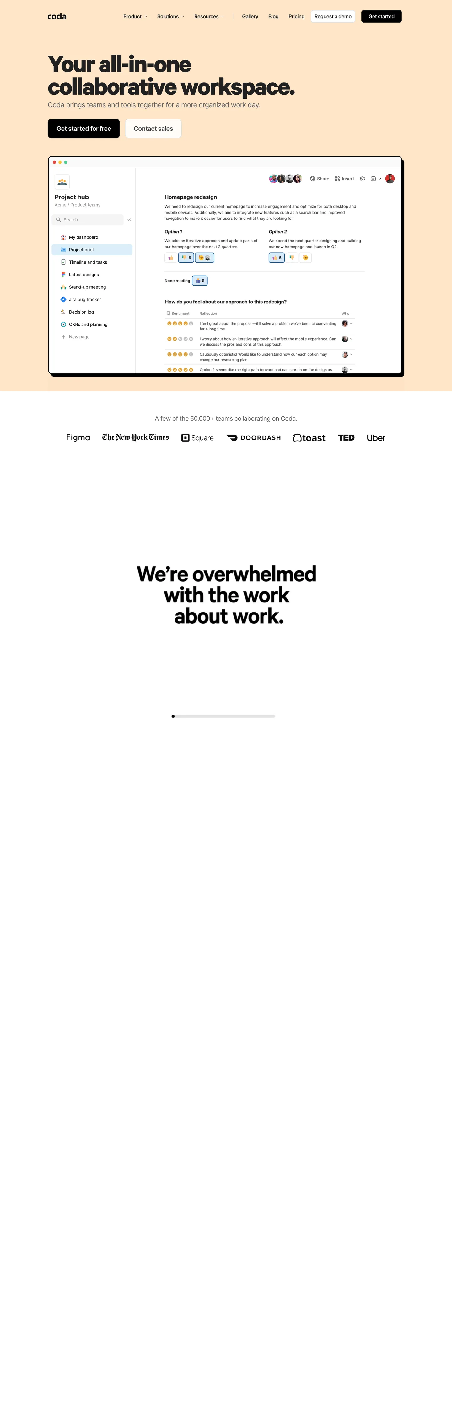
Coda's homepage is the warmest workspace canvas in the directory. The hero sits on a peach band ("#fbf7f5") that holds the full above-the-fold composition — wordmark, six-item Inter nav, a 72px Calibre-R headline at -3.24px tracking, a 22px Inter sub-head, and a near-black "Get started for free" pill paired with a white "Contact sales" rectangle. The cream backdrop is the brand voltage. Where Notion runs deep navy, Airtable runs pure white, and Linear runs canvas dark, Coda runs an off-white peach with a black CTA — a tonal split that survives across the page until the canvas resets below the logo wall.
This DESIGN.md captures the system as a single Google Labs spec file. Inside: 25 colors tokens grouped into the peach hero band, two near-black inks ("#212121", "#000000"), a graded gray scale ("#444444", "#666666", "#8e8e8e", "#e0e0e0"), the amber accent ("#f8ad40"), and a 14-entry Korbit chart-color palette pulled from the live "--kr-*" CSS variables — red, yellow, blue, green, purple, pink, orange each with chartprimary, medium, light, and gradient stops; 13 typography tokens covering Calibre-R from 72px hero down to 38px h2 with a Tiempos-Headline serif callout, and Inter from 22px lede down to 10px micro-uppercase; five corner radii (8px buttons, 12px cards, 44px pill orbs); ten spacing tokens; and 21 components definitions spanning the peach hero band, button pair, top-nav, the embedded Project Hub workspace mockup card, the logo wall, the reaction-chip cluster, and the dark "We're overwhelmed with the work about work" CTA panel.
A working developer feeds this file to Claude, Cursor, or Copilot and gets components that match Coda's specific posture — peach band hero instead of generic white, 8px-rectangle pills instead of the consumer pill default, the Korbit chart palette reserved to in-product chips, and Calibre-R density at the headline tier — rather than the default shadcn theme. Every hex, every font, every radius is quoted ready to paste into Tailwind config, CSS variables, or your own primitives. The system is worth studying because it answers a single question the all-in-one-workspace category rarely answers: how do you brand the canvas without painting it?
What makes it distinct
5
- Peach hero band#fbf7f5 fills the entire above-the-fold canvas, not white, separating Coda from the white-hero Notion-Airtable-Linear default
- Dual-typeface splitCalibre-R 700 carries 38-72px display; Inter 400-600 carries every 14-22px nav, body, and button label
- Korbit chart palette as in-product voltageseven hue pairs (red, yellow, blue, green, purple, pink, orange) reserved for chips, reactions, and the live workspace mockup, never the page chrome
- Near-black #212121 doing double dutyprimary CTA fill and h1/h2 ink share the same hex, the Notion-Airtable move
- 72px hero display at -3.24px trackingthe tightest cap-height-to-tracking ratio in the directory; signals 'all-in-one workspace' density
coda.io
Live at coda.io
A snapshot of the brand in production. Scroll the frame to see the whole page.
Colors
25 colors
Coda's system runs on #fbf7f5 as its primary voltage, used in 2 of 21 components. Type is set in Inter across 13 tokens from 10px to 72px, weights 300–700. Shape language is mixed across 21 components, blending pills, soft rounds, and squarer corners.
Brand & Accent
Sparing, CTA-only voltage · 3
Surface
Page and card backgrounds · 2
Text
Headlines, body, captions · 8
Borders & Hairlines
Dividers, outlines, rules · 1
Other
Specialty colors · 11
Typography
13 type tokens
Set in Inter across 13 tokens, from 10px to 72px, weights 300–700. Shown in its own stack: where the font isn't installed, the fallback the file names stands in.
- hero-display72px · weight 700 · lh 72px · tracking -3.24pxThe quick brown fox jumps over the lazy dog
- display-lg52px · weight 700 · lh 57.2px · tracking -1.82pxThe quick brown fox jumps over the lazy dog
- display-md38px · weight 700 · lh 41.8px · tracking -0.95pxThe quick brown fox jumps over the lazy dog
- serif-callout38px · weight 300 · lh 52px · tracking -0.38pxThe quick brown fox jumps over the lazy dog
- subtitle-lg22px · weight 400 · lh 34px · tracking -0.66pxThe quick brown fox jumps over the lazy dog
- body-lg20px · weight 400 · lh 30px · tracking -0.6pxThe quick brown fox jumps over the lazy dog
- title-lg20px · weight 600 · lh 30px · tracking -0.6pxThe quick brown fox jumps over the lazy dog
- body-md16px · weight 400 · lh 24px · tracking -0.48pxThe quick brown fox jumps over the lazy dog
- body-md-strong16px · weight 600 · lh 24px · tracking -0.48pxThe quick brown fox jumps over the lazy dog
- nav-link14px · weight 400 · lh 20px · tracking -0.14pxThe quick brown fox jumps over the lazy dog
- caption14px · weight 400 · lh 20px · tracking -0.42pxThe quick brown fox jumps over the lazy dog
- button-md16px · weight 600 · lh 22px · tracking -0.48pxThe quick brown fox jumps over the lazy dog
- micro-uppercase10px · weight 700 · lh 12px · tracking 0.1pxThe quick brown fox jumps over the lazy dog
Layout
Radii and spacing
6 corner radii and 10 spacing values. Shape language: mixed.
Radii
- none0px
- sm4px
- md8px
- lg12px
- xl44px
- workspace9.6px
Spacing
- xxs4px
- xs8px
- sm12px
- md16px
- lg20px
- xl24px
- xxl32px
- section-sm40px
- section72px
- gutter0px 32px
Components
21 components
Each rendered from its tokens (color, type, radius, padding) on Coda's own canvas.
- Hero Bandhero-bandHero Band
- Top Navtop-navTop Nav
- Button Primarybutton-primaryButton Primary
- Button Primary Pinnedbutton-primary-pinnedButton Primary Pinned
- Button Secondarybutton-secondaryButton Secondary
- Button Nav Ghostbutton-nav-ghostButton Nav Ghost
- Text Linktext-linkText Link
- Workspace Mockup Cardworkspace-mockup-cardWorkspace Mockup Card
- Workspace Sidebarworkspace-sidebarWorkspace Sidebar
- Workspace Page Activeworkspace-page-activeWorkspace Page Active
- Reaction Chipreaction-chipReaction Chip
- Reaction Chip Amberreaction-chip-amberReaction Chip Amber
- Status Chip Bluestatus-chip-blueStatus Chip Blue
- Status Chip Greenstatus-chip-greenStatus Chip Green
- Status Chip Pinkstatus-chip-pinkStatus Chip Pink
- Logo Walllogo-wallLogo Wall
- Cta Band Darkcta-band-darkCta Band Dark
- Testimonial Quotetestimonial-quoteTestimonial Quote
- Serif Pull Quoteserif-pull-quoteSerif Pull Quote
- Type here…text-inputText Input
- Footer Linkfooter-linkFooter Link
In use
The system, in use
Coda's tokens on the kind of product it builds.
Build something people actually use.
A short paragraph of marketing copy that previews how the brand's display tier and body tier read together. Two sentences is usually enough.
FAQ
Coda design system FAQ
Common questions about Coda's tokens, components, and how to use this DESIGN.md in your project.
Read next
Related reading
Specs, directories, and component libraries that pair with this design system.
- Browse all design systemsThe full directory of DESIGN.md files on shadcn.io, with live mockups for each.shadcn.io
- Coda — official siteThe all-in-one collaborative workspace combining docs, spreadsheets, applications, and AI.coda.io (opens in a new tab)
- The DESIGN.md specificationGoogle Labs' open spec for machine-readable design system files.github.com (opens in a new tab)
Use it
Use Coda in your project
One machine-readable file. Drop it into Claude, Cursor, or any AI tool that reads DESIGN.md.
Download the DESIGN.md
One machine-readable file: every color, type, radius, spacing, and component token of Coda.
Feed it to your AI tool
Drop it into Claude, Cursor, or GitHub Copilot. The agent writes React components and Tailwind classes that match Coda's visual language.
Reference the tokens directly
Or paste the values into your Tailwind config, CSS variables, or component library: every color, size and radius is a quoted, ready-to-copy value.
Read the full DESIGN.md: overview, rationale, do’s and don’ts
Overview
Coda's marketing surface is the warmest workspace canvas in the directory. The above-the-fold composition sits on a peach band ("#fbf7f5") rather than white, white, or dark — the choice is visible in --header-background-rbga and survives across the full hero region until the canvas resets below the partner logo wall. The headline runs Calibre-R at 72px / 700 / -3.24px letter-spacing, the tightest cap-height-to-tracking ratio in the directory, paired with a 22px Inter sub-head at -0.66px tracking. The dominant action is a near-black "#212121" pill rectangle at 8px radius — the same hex as h1 and h2 display ink, the Notion-Airtable move where primary and ink share a role.
Canvas-as-voltage: Where most workspace SaaS brands paint atmosphere on a white canvas — Notion's navy band, Airtable's coral signature card, Linear's surface ladder — Coda paints the canvas itself. The peach hero is the brand voltage. There is no gradient mesh, no atmospheric backdrop, no accent wall; the cream tint and the black pill do the entire framing job. The amber accent ("#f8ad40") appears only twice on the captured page, both as chip backgrounds inside the embedded Project Hub mockup. The amber is in-product chrome, not page chrome.
Below the hero, the page pins a real Project Hub workspace mockup card with a 9.6px radius, a hairline outline, and a soft 24px drop shadow — the same move Notion runs with the "Ramp HQ" kanban card, but smaller and pinned tighter to the headline. Inside the mockup the Korbit chart palette finally appears: blue page-active highlight, yellow reaction emoji ringed at 44px pill radius, pink status chips, green sentiment dots. Below the mockup sits the partner logo wall (Figma, NYT, Square, DoorDash, toast, TED, Uber) and a dark CTA band carrying a 52px Calibre-R display headline ("We're overwhelmed with the work about work.") in white on near-black ("#212121"). The page rhythm is peach hero → white logo wall → dark CTA band → white body — three canvas surfaces, never repeating.
Key Characteristics:
- Peach hero band ("#fbf7f5") instead of white — the brand-voltage tonal choice that separates Coda from the white-hero workspace default
- Near-black ("#212121") doing double duty as primary CTA fill and h1/h2 display ink
- Dual-typeface split — Calibre-R 700 carries 38-72px display, Inter 400/600 carries every 14-22px nav, body, and button label
- 72px hero headline at -3.24px tracking — the most aggressive negative-tracking move in the directory
- Korbit "--kr-*" chart palette (seven hues × four stops = 28 chart variables) reserved to in-product chips and emoji, never page chrome
- 8px-rectangle buttons rather than full pills — sober-editorial geometry, NOT consumer-app pill UI
- Embedded Project Hub workspace mockup card pinned tight under the hero at 9.6px radius
- One Tiempos-Headline serif callout at 38px / 300 — a single editorial pull-quote moment in an otherwise sans system
- Dark "We're overwhelmed with the work about work." CTA band at 52px Calibre-R 700 on near-black
Colors
Hero Canvas & Surface
- Hero Canvas (
{colors.hero-canvas}— "#fbf7f5") — frequency 18 as bg. Used as bg (18), text (11), border (11). The peach band that fills the entire above-the-fold composition. Coda's load-bearing brand surface — clustered from three near-white variants the extractor merged into one perceptual token, with the warm-leaning mean as the representative. - Canvas (
{colors.canvas}— "#ffffff") — same cluster, used for the logo wall, the workspace mockup body, and the footer band where the canvas resets. The cool floor between the peach hero and the dark CTA. - Hairline (
{colors.hairline}— "#e0e0e0") — frequency 11. Used as border (6), shadow (5). The 1px outline tone for the workspace mockup card, the secondary button, and the text input. Never appears as bg.
Ink & Text
- Ink (
{colors.ink}— "#212121") — frequency 1012, the page's dominant token by a 20× margin over second place. Used as text (510), border (491), shadow (11). The h1/h2 display color, primary CTA fill, and the dark CTA band. Coda's load-bearing brand voltage hides in a near-black that the eye reads as black — the warm-tinged off-black is the work. - Ink Deep (
{colors.ink-deep}— "#000000") — frequency 45. Used as shadow (24), bg (11), border (9). Reserved for the workspace mockup's outer shadow stack and the bottom-bar pin on the homepage's pinned-CTA variant. True black appears more in shadow than fill — the brand prefers "#212121" for fills. - Text Body (
{colors.text-body}— "#444444") — frequency 8. Used as text (4), border (4). The secondary running-text tone underneath display headlines. - Text Muted (
{colors.text-muted}— "#666666") — frequency 28. Used as text (14), border (14). The default body copy, sub-head, and partner-logo wall color. - Text Soft (
{colors.text-soft}— "#8e8e8e") — frequency 46. Used as text (23), border (23). Captions, footer links, breadcrumb labels.
Accents (in-product, not chrome)
- Accent Amber (
{colors.accent-amber}— "#f8ad40") — frequency 2, both as bg, the only "brand" layer in the extraction. Reserved for two chip backgrounds inside the embedded Project Hub mockup. Not a page-chrome color — narrate the absence as a design decision. - Accent Blue (
{colors.accent-blue}— "#1981c1") — frequency 4. Used as text (2), border (2). Inline link color, used sparingly inside the workspace mockup. - Accent Orange (
{colors.accent-orange}— "#ee5a29") — frequency 4. Used as text (2), border (2). The reaction-emoji accent and the "alert" tag inside the workspace mockup. - Surface Cool (
{colors.surface-cool}— "#dbeefa") — frequency 2 as bg. The pale blue background of the active sidebar item ("Project brief") inside the mockup.
Korbit Chart Palette (in-product chips, reactions, calendar tags)
Seven hue families exposed at :root through 28 --kr-* variables — chartprimary / medium / light / gradient stops. Use these for chips and reactions, never page chrome.
- Korbit Red (
{colors.kr-red}— "#a91e1e"), Yellow ({colors.kr-yellow}— "#e4a709"), Blue ({colors.kr-blue}— "#0f58bd"), Green ({colors.kr-green}— "#187b34"), Purple ({colors.kr-purple}— "#6e21ba"), Pink ({colors.kr-pink}— "#a12b86"), Orange ({colors.kr-orange}— "#c45b1c"). These are the saturated chartprimary stops — body color for chip text and chart legend dots. - Light tints (
{colors.kr-yellow-light}— "#fdf3d8",{colors.kr-blue-light}— "#dbedfd",{colors.kr-green-light}— "#e2f8e8",{colors.kr-pink-light}— "#f8e7f3",{colors.kr-red-light}— "#ffdcdc"). These are the chip-fill backgrounds — the saturated counterpart provides the text or border.
Typography
Coda runs a dual-typeface split. Calibre-R carries the entire display tier — 72px hero h1, 52px marketing h2, 38px sub-section h3 — all at weight 700 with aggressive negative tracking (-3.24px, -1.82px, -0.95px). Inter carries everything from the 22px lede down to the 10px micro-uppercase, mostly at weight 400 with weight 600 for buttons and titles. A single Tiempos-Headline serif appears once on the page at 38px / 300 / -0.38px tracking — a deliberate editorial pull-quote moment in an otherwise sans-only system.
Weight as restraint: The display tier sits at weight 700 (heavier than Airtable's 400-500 modest weights) but the tracking is what does the work — -3.24px at 72px is the directory's tightest negative letter-spacing. Density signals "all-in-one workspace" rather than marketing-page bravado. Body sits at 16px / 400 / -0.48px tracking — same Inter tightening philosophy as the display tier, scaled.
| Token | Family | Size | Weight | Tracking |
|---|---|---|---|---|
{typography.hero-display} | Calibre-R | 72px | 700 | -3.24px |
{typography.display-lg} | Calibre-R | 52px | 700 | -1.82px |
{typography.display-md} | Calibre-R | 38px | 700 | -0.95px |
{typography.serif-callout} | Tiempos-Headline | 38px | 300 | -0.38px |
{typography.subtitle-lg} | Inter | 22px | 400 | -0.66px |
{typography.title-lg} | Inter | 20px | 600 | -0.6px |
{typography.body-lg} | Inter | 20px | 400 | -0.6px |
{typography.body-md} | Inter | 16px | 400 | -0.48px |
{typography.button-md} | Inter | 16px | 600 | -0.48px |
{typography.body-md-strong} | Inter | 16px | 600 | -0.48px |
{typography.nav-link} | Inter | 14px | 400 | -0.14px |
{typography.caption} | Inter | 14px | 400 | -0.42px |
{typography.micro-uppercase} | Inter | 10px | 700 | +0.1px |
Font Substitutes
If Calibre-R isn't licensed, Inter Display at the same sizes with weight 700 and -3% letter-spacing is the closest open-source substitute — proportions transfer with minor cap-height tuning. The body Inter stack is already open-source. For the single Tiempos-Headline callout, Source Serif Pro at weight 300 or Spectral at weight 300 substitute acceptably.
Layout
Spacing System
- Base unit: 4px. All spacing tokens snap to 4-multiples.
- Tokens:
{spacing.xxs}4px ·{spacing.xs}8px ·{spacing.sm}12px ·{spacing.md}16px ·{spacing.lg}20px ·{spacing.xl}24px ·{spacing.xxl}32px ·{spacing.section-sm}40px ·{spacing.section}72px. - Section padding (vertical):
{spacing.section}(72px) is the dominant vertical rhythm constant — appears as72px 0pxon 9 distinct sections in the extraction. This is the editorial pacing tempo. - Horizontal gutter:
0px 32pxcarries the page outer padding through 12 distinct elements — the page never narrows below 32px on either edge. - Button padding:
8px 20pxis the universal pinned-CTA padding (appears 12 times);8px 12pxis the ghost-button padding (5 times).
Grid & Container
- Max content width: ~1280px centered, with
{spacing.xxl}(32px) horizontal breathing room. - Hero composition: Single-column above the workspace mockup. The mockup card is pinned tight (40px gap) under the headline + sub-head + button pair.
- Logo wall: Seven monochrome partner logos in a single horizontal row at desktop — Figma, NYT, Square, DoorDash, toast, TED, Uber — wraps to 3-up on mobile.
Whitespace Philosophy
Coda trusts the peach canvas to do framing. There is no atmospheric gradient, no mesh, no decorative shape behind the headline. The space above the headline (40px to top-nav) is tighter than Airtable's whitespace-as-atmosphere posture but looser than Linear's surface-ladder density — a middle posture that puts the workspace mockup card visibly higher on the page.
Elevation & Depth
| Level | Treatment | Use |
|---|---|---|
| Flat | No shadow, no border | Hero band, dark CTA band, logo wall |
| Hairline | 1px {colors.hairline} border | Workspace sidebar divider, text input, secondary button |
| Card flat | 1px {colors.hairline} border, no shadow | Status chips, calendar tags |
| Card lifted | 1px {colors.hairline} border + 24px diffuse drop shadow rgba(0,0,0,0.08) | Workspace mockup card pinned under the hero |
| Pill ring | 1px saturated stop in chart palette | Yellow reaction chip at {rounded.xl} (44px) ring |
The elevation philosophy is canvas-tone first, shadow second. Shadows appear only on the embedded workspace mockup — every other surface on the captured page is flat. Where Notion floats a 24px diffuse shadow under its hero mockup card to lift it out of the navy band, Coda runs the same move at lower alpha (0.08) because the peach canvas is already lighter than navy — the mockup lifts with less effort.
Shapes
Border Radius Scale
| Token | Value | Use |
|---|---|---|
{rounded.none} | 0px | Hero band, dark CTA band, page sections — full-bleed surfaces |
{rounded.sm} | 4px | Active sidebar item, status chips, inline pills inside the workspace mockup |
{rounded.md} | 8px | All marketing buttons, the text input, the ghost nav button — Coda's universal interactive radius |
{rounded.lg} | 12px | Cards, callouts, the secondary-tier surfaces |
{rounded.workspace} | 9.6px | The embedded Project Hub workspace mockup — Coda's internal app radius leaks out by one card |
{rounded.xl} | 44px | The reaction-emoji chip with the yellow ring — the only "pill" geometry on the page |
The 8px universal button radius is what separates Coda from full-pill consumer-app brands (Linear, Stripe) and from full-rectangle editorial brands (Airtable). The 9.6px workspace radius is a tell — it's the Coda app's internal card radius leaking into the marketing site through the embedded Project Hub mockup, not a separate marketing decision.
Components
Reference all components by their YAML key (
{component.button-primary},{component.workspace-mockup-card}). Variants live as separate entries incomponents:, not nested state objects.
{component.hero-band} — The peach above-the-fold band. Background {colors.hero-canvas}, text {colors.ink}, typography {typography.hero-display}. Fills the entire hero region from top-nav to the partner-logo wall. No gradient, no atmospheric shape.
{component.top-nav} — A 64px wordmark + 6-item Inter nav (Product, Solutions, Resources, Gallery, Blog, Pricing) sitting on the peach band — the nav inherits the hero canvas color, not white. Right cluster carries a {component.button-secondary} "Request a demo" and a {component.button-primary-pinned} "Get started".
{component.button-primary} — The "Get started" CTA. Background {colors.ink-deep} ("#000000"), text {colors.on-ink}, typography {typography.button-md}, rounded {rounded.md} (8px), padding 8px 12px, height 40px. Sits in the top-right of the nav.
{component.button-primary-pinned} — The full-width "Get started for free" in the hero composition. Background {colors.ink} ("#212121"), same typography and radius as {component.button-primary}, padding 8px 20px (wider horizontal). The two CTAs use different blacks — #000000 for the nav-pinned variant, #212121 for the hero variant.
{component.button-secondary} — The white "Contact sales" rectangle paired with {component.button-primary-pinned} in the hero. Background {colors.canvas}, text {colors.ink}, rounded {rounded.md} (8px), 1px hairline border. Reads as the less-committed pair to the black primary.
{component.button-nav-ghost} — The transparent Inter nav-link buttons in the top-nav (Product, Solutions, Resources, Gallery, Blog, Pricing). No border, no fill — just {typography.nav-link} (14px / 400) text on the peach band.
{component.text-link} — Inline {colors.accent-blue} ("#1981c1") link, body copy weight. Used sparingly — most page CTAs go through {component.button-primary}-family components.
{component.workspace-mockup-card} — The embedded Project Hub mockup pinned 40px under the hero. Background {colors.canvas}, rounded {rounded.workspace} (9.6px), 1px hairline border, 24px diffuse drop shadow rgba(0,0,0,0.08). Carries the full app composition: macOS dot bar, sidebar, page-list, and an emoji-reaction sentiment grid.
{component.workspace-sidebar} — Left-rail inside the mockup. Background {colors.canvas}, text {colors.text-body}, typography {typography.body-md}, 1px right hairline divider. Renders nine page-list items grouped under a "Project hub / Acme / Product teams" header.
{component.workspace-page-active} — The active sidebar item ("Project brief"). Background {colors.surface-cool} ("#dbeefa"), text {colors.ink}, typography {typography.body-md-strong} (16px / 600), rounded {rounded.sm} (4px), padding 4px 8px. Only the active page gets the cool blue background — every other page sits transparent.
{component.reaction-chip} — The yellow-ringed reaction emoji chip ("Done reading 5"). Background {colors.kr-yellow-light}, text {colors.kr-yellow}, rounded {rounded.xl} (44px) — the only fully-pill component on the page — with a 1px ring in the saturated yellow. Appears inside the workspace mockup, never on page chrome.
{component.reaction-chip-amber} — The amber "Option 1 / Option 2" tag inside the sentiment grid. Background {colors.accent-amber} ("#f8ad40"), text {colors.ink}, typography {typography.micro-uppercase} (10px / 700 / uppercase). Two appearances total — the only place the amber accent appears on the entire page.
{component.status-chip-blue} — The blue page-status chip inside the workspace mockup. Background {colors.kr-blue-light}, text {colors.kr-blue}, rounded {rounded.sm} (4px). Used for "Done reading" markers and similar in-document status.
{component.status-chip-green} — The green sentiment dot. Background {colors.kr-green-light}, text {colors.kr-green}, rounded {rounded.sm} (4px). The "all-positive" sentiment marker in the response table.
{component.status-chip-pink} — The pink emoji-reaction tag. Background {colors.kr-pink-light}, text {colors.kr-pink}, rounded {rounded.sm} (4px). One of seven Korbit hues — never use it as page chrome.
{component.logo-wall} — The seven-logo partner row below the hero mockup. Background {colors.canvas} ("#ffffff" — the canvas resets here from the peach hero), text {colors.text-muted}, typography {typography.body-md}, vertical padding 40px. The reset to white is what marks "hero is over."
{component.cta-band-dark} — The "We're overwhelmed with the work about work." panel below the logo wall. Background {colors.ink} ("#212121"), text {colors.on-ink}, typography {typography.display-lg} (52px / 700 Calibre-R), full-bleed at 72px vertical padding. The dark band echoes the dark CTA pill — the same near-black surface promoted from button to band.
{component.testimonial-quote} — The Bloomberg-Beta partner testimonial centered on white below the dark CTA band. Typography {typography.display-md} (38px / 700 Calibre-R). No surface card — just a centered headline on the canvas.
{component.serif-pull-quote} — The one-off Tiempos-Headline serif callout at 38px / 300. Used once on the page for editorial color — a pull-quote moment in an otherwise sans-only system. Don't promote to a recurring pattern.
{component.text-input} — Standard 40px text input. Background {colors.canvas}, text {colors.ink}, typography {typography.body-md}, rounded {rounded.md} (8px), 1px hairline border. Same geometry as {component.button-primary} to keep form rows visually paired with their CTA.
{component.footer-link} — Transparent footer links in {colors.text-muted}, typography {typography.caption} (14px / 400). Sit in the multi-column footer below the dark CTA band.
Do's and Don'ts
Do
- Keep
{component.hero-band}peach ({colors.hero-canvas}). White-canvas heroes read as Airtable or Notion; the peach is what makes the page Coda. - Use
{colors.ink}("#212121") for the primary CTA fill, NOT{colors.ink-deep}("#000000"). The two near-blacks have different roles —#212121for hero CTAs and display ink,#000000for nav-pinned variants and shadow stacks. - Pin the
{component.workspace-mockup-card}tight to the hero with a 40px gap. The card is the brand's "show what this product is" move — don't push it below the fold. - Reserve the Korbit
--kr-*palette ({colors.kr-yellow},{colors.kr-blue},{colors.kr-green},{colors.kr-pink}, etc.) for in-product chips, reactions, and calendar tags. Page chrome is peach + black + gray. - Use
{typography.hero-display}at -3.24px tracking exactly. The density is the design — slackening the tracking to -1px loses the workspace identity. - Use
{rounded.md}(8px) for every interactive surface on the marketing page. The 9.6px{rounded.workspace}is the embedded app's radius — it leaks out only via the mockup card.
Don't
- Don't use
{colors.accent-amber}("#f8ad40") as page chrome. The extraction shows two appearances total, both as chip backgrounds inside the workspace mockup. Promoting it to a hero accent reads as a Stripe-style brand pivot Coda has not made. - Don't paint the hero canvas pure white. The peach band is the brand voltage; resetting to white above the logo wall is wrong, and resetting to peach below the logo wall is wrong too. The hero is peach, the body is white, the CTA band is near-black — three canvas surfaces, no repeats.
- Don't promote
{component.serif-pull-quote}to a recurring pattern. Tiempos-Headline appears once on the captured page — a single editorial moment. Repeating it across sections breaks the sans-only system. - Don't use
{rounded.xl}(44px) as a button radius. The 44px pill is reserved for the yellow reaction-chip ring inside the mockup. Marketing buttons stay at 8px rectangles — switching to a full pill reads as Stripe or Linear, not Coda. - Don't bold the body Inter text. Body sits at 16px / 400 / -0.48px tracking. Going to 600 reads as a banner, not body copy. Weight 600 is reserved for button labels and the active sidebar item (
{typography.body-md-strong}). - Don't add a gradient backdrop behind
{component.hero-band}. The peach is flat — adding a mesh or aurora behind it reads as "another SaaS template" and erases the canvas-as-voltage identity. - Don't substitute Inter for Calibre-R at the display tier without lowering letter-spacing by 3%. Calibre-R's cap-height is wider than Inter's; copying the -3.24px tracking onto Inter Display at 72px produces collisions at "th", "rd", and "ll" pairings.
Known Gaps
- The captured screenshot's lower half is mostly empty whitespace — Coda's homepage uses IntersectionObserver-driven lazy-loaded sections below the dark CTA band, and the lazy-load region did not materialize during the 4500px capture. The DESIGN.md captures the hero, logo wall, dark CTA band, and the embedded Project Hub workspace mockup with high confidence; sections below those are not in scope.
- The Korbit "--kr-*" CSS variables expose chartprimary, medium, light, gradient, and dark stops for seven hues. This DESIGN.md surfaces the chartprimary and light tints — the medium / gradient / dark stops are extractable from the cssVariables block in
/tmp/design-extract/coda.jsonif you need the full palette. - Hover and active states are not documented (per the global no-hover policy). The captured page renders only Default states.
- Animation and transition timings are not in scope; 150-200ms ease is a safe default for button presses.
- The pricing-page sub-system is not captured here — the Pricing nav item links to a separate surface with its own tier-card and toggle dialect.
- Dark-mode token values are not documented. The captured page is light-only; the workspace mockup carries no dark-theme variant on the marketing surface.
Productivity & SaaS
More systems like this
More DESIGN.md files in Productivity & SaaS.
Pricing
Build it with Pro
The DESIGN.md files are free. Pro adds 6,000+ blocks, premium templates and the MCP server, so your AI editor builds in your system for you.
4.9/5 out of 5 · 150+ reviewsfrom 150+ founders and developers.
Billing
Billed once a year in USD. Cancel anytime.
- How many people can use the license.
- Client work, SaaS products and anything you charge for.
- Production-ready React sections: hero, pricing, features, dashboards and more.
- Complete multi-page sites you can ship as they are.
- React icons from every major library, installable with one command.
- Presets that restyle every block, in light and dark.
- Lets your AI editor search, preview and install blocks for you.
- Priority requests are answered first.
Individual
For personal projects & open source
$32instead of $49/mo
$389 billed yearly
- Seats: 1 seat
- Commercial use: Personal & open source only
- Pro blocks: 6,000+ blocks
- Templates: All 14 templates
- React icons: 294k+ icons
- Themes: All 59 themes
- MCP server: Basic usage
- Support: Standard
Team
Most popularFor freelancers, agencies & startups
$66instead of $99/mo
$789 billed yearly · ≈ $13/dev/mo
- Seats: Up to 5 seats
- Commercial use: Included
- Pro blocks: 6,000+ blocks
- Templates: All 14 templates
- React icons: 294k+ icons
- Themes: All 59 themes
- MCP server: High usage
- Support: Priority
Organization
For companies with larger teams
$132instead of $199/mo
$1,589 billed yearly
- Seats: Unlimited seats
- Commercial use: Included
- Pro blocks: 6,000+ blocks
- Templates: All 14 templates
- React icons: 294k+ icons
- Themes: All 59 themes
- MCP server: Unlimited usage
- Support: Priority
Billed once a year in USD. Cancel anytime.
Individual
For personal projects & open source
$32instead of $49/mo
$389 billed yearly
- How many people can use the license.Seats: 1 seat
- Client work, SaaS products and anything you charge for.Commercial use: Personal & open source only
- Production-ready React sections: hero, pricing, features, dashboards and more.Pro blocks: 6,000+ blocks
- Complete multi-page sites you can ship as they are.Templates: All 14 templates
- React icons from every major library, installable with one command.React icons: 294k+ icons
- Presets that restyle every block, in light and dark.Themes: All 59 themes
- Lets your AI editor search, preview and install blocks for you.MCP server: Basic usage
- Priority requests are answered first.Support: Standard
Team
Most popularFor freelancers, agencies & startups
$66instead of $99/mo
$789 billed yearly · ≈ $13/dev/mo
Everything in Individual, plus
- How many people can use the license.Seats: Up to 5 seats
- Client work, SaaS products and anything you charge for.Commercial use: Included
- Lets your AI editor search, preview and install blocks for you.MCP server: High usage
- Priority requests are answered first.Support: Priority
Organization
For companies with larger teams
$132instead of $199/mo
$1,589 billed yearly
Everything in Team, plus
- How many people can use the license.Seats: Unlimited seats
- Lets your AI editor search, preview and install blocks for you.MCP server: Unlimited usage
- Secure checkout via Stripe
- Code lives in your repo
- Keep what you've shipped if you cancel
- License terms
Your system, built for you
Every block, template and icon, installed by your AI agent in your design system. The DESIGN.md files stay free.