Squarespace Design System
Squarespace's design system as a DESIGN.md file. Clarkson + Clarkson Serif, 18 colors, 9 type styles, 19 components. For React, Next.js, and AI tools.
Add shadcn.io to your AI agent. · Pro It installs blocks, icons and templates in your design system from a prompt, with Pro.
Set up MCP- Primary
- #000000
- Typeface
- Clarkson
- Shape
- Soft
- Base radius
- 8px
- Colors
- 18
- Type tokens
- 9
- Components
- 19
- Spacing values
- 9
About
About Squarespace DESIGN.md
Curated by Dov Azencot · Updated May 13, 2026 · Source squarespace.com (opens in a new tab)
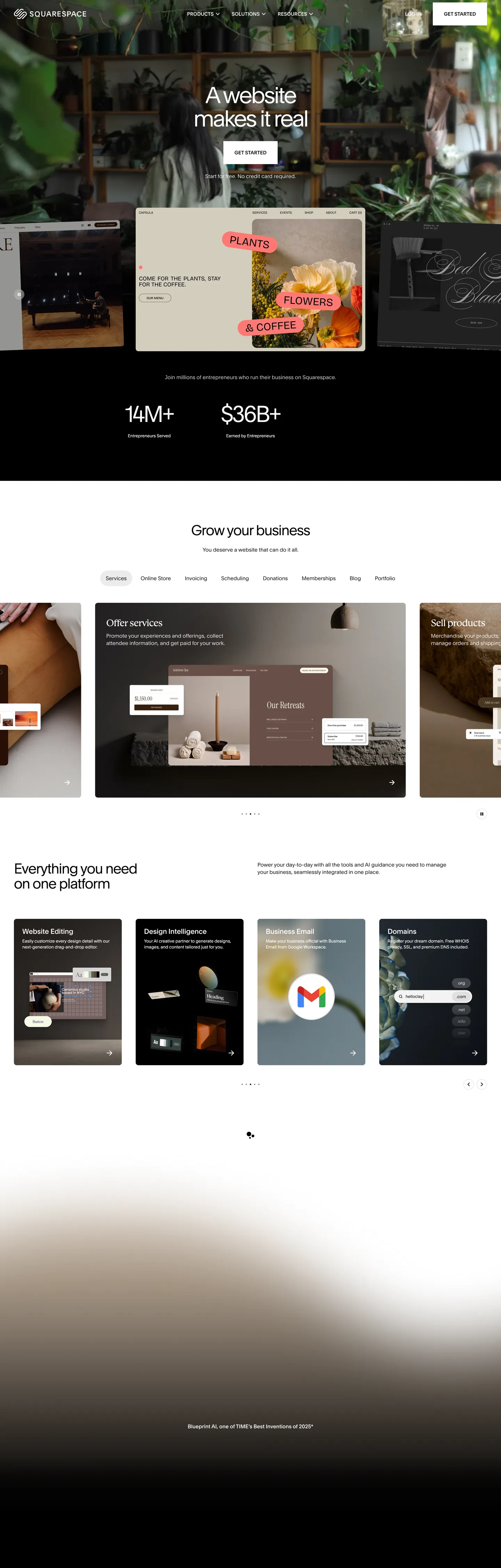
Squarespace's marketing canvas is editorial before it is technical. The page opens on a photographic dark band — plants, vases, a wooden shelf — with the hero "A website makes it real" set in Clarkson at 64px weight 300, the lightest weight available on the page, kerned tight to `-3.84px`. Below the hero, the canvas flips to pure white, and from there every band is either pure `#ffffff` or pure `#000000` with photographic content carrying the chromatic load. The Squarespace marketing brand owns almost no chromatic chrome of its own: the page's 989 white hits and 839 black hits account for the overwhelming majority of color usage, and the only true accent hexes — `#88bcd8` cool sky and `#f3ffc1` warm citrus — appear exclusively inside footer linear-gradients. This is a brand that lets customer content provide every color, and reserves its own CSS for layout, type, and contrast.
This page packages the system into a single DESIGN.md file built on the Google Labs open spec. Inside: 18 colors tokens grouped into surface, ink, hairline, gradient anchor, and inherited semantic roles; 9 type styles all running the proprietary `Clarkson` and `Clarkson Serif` families with 12px–64px sizes and weights 300 / 400 / 500; 5 radius tokens with the twin-chassis pattern (8px rectangle, 100px pill, plus 0 / 30px / 50% utility); 9 spacing increments on a tight 4px grid leaning on 8 / 12 / 16 / 24 / 32 / 40px steps; and 19 components recipes covering buttons, top nav, cards, inputs, hero bands, footer gradient surface, and the editorial italic h3 break. Every token is a quoted string ready to paste into Tailwind config or CSS variables.
Feed the file to Claude, Cursor, or GitHub Copilot and the agent reproduces Squarespace's discipline — the 8px-radius rectangle CTA, the 100px pill secondary, the weight-300 hero, the serif italic h3 — instead of a generic monochrome shadcn theme. The system is worth studying because it inverts the no-code category's normal voice. Where most no-code builders (Webflow, Framer, Wix) lean on chromatic category palettes or gradient atmosphere as primary chrome, Squarespace treats its own CSS as a frame for someone else's photography — black hairlines, white surfaces, one editorial typeface, and a single italic serif accent. The brand confidence is in restraint.
What makes it distinct
5
- Two-hex chromepure `#000000` and pure `#ffffff` carry 1828 of the page's ~18 colors hits between them, with 0 grey midtones in the page's CSS variables
- Display weight at 30064px Clarkson hero pulled to `-3.84px` letter-spacing, the lightest weight on the page rather than the heaviest
- Serif italic as accent`Clarkson Serif` at 26px weight 400 with `-0.52px` tracking is the system's only italic moment, used inside section h3 breaks
- Gradient-only color`#88bcd8` cool sky and `#f3ffc1` warm citrus exist exclusively inside footer linear-gradients, never as fills, borders, or text
- Twin radius chassis8px (38 hits, card / input / button-primary) sits beside 100px pill (10 hits, secondary CTA / chip), with nothing between them
squarespace.com
Live at squarespace.com
A snapshot of the brand in production. Scroll the frame to see the whole page.
Colors
18 colors
Squarespace's system anchors on #000000 (primary) as its primary color. Type is set in Clarkson across 9 tokens from 12px to 64px, weights 300–500. Shape language is soft — components average 39px corner radius, with no sharp interactive edges.
Brand & Accent
Sparing, CTA-only voltage · 1
Surface
Page and card backgrounds · 4
Text
Headlines, body, captions · 7
Borders & Hairlines
Dividers, outlines, rules · 3
Other
Specialty colors · 3
Typography
9 type tokens
Set in Clarkson across 9 tokens, from 12px to 64px, weights 300–500. Shown in its own stack: where the font isn't installed, the fallback the file names stands in.
- display-xl64px · weight 300 · lh 66.56px · tracking -3.84pxThe quick brown fox jumps over the lazy dog
- display-lg40px · weight 400 · lh 43.2px · tracking -1.6pxThe quick brown fox jumps over the lazy dog
- heading-serif-md26px · weight 400 · lh 28.08px · tracking -0.52pxThe quick brown fox jumps over the lazy dog
- heading-sans-md26px · weight 400 · lh 28.08px · tracking -0.52pxThe quick brown fox jumps over the lazy dog
- heading-sm20px · weight 500 · lh 24px · tracking -0.2pxThe quick brown fox jumps over the lazy dog
- body-md15px · weight 400 · lh 21px · tracking -0.015pxThe quick brown fox jumps over the lazy dog
- body-sm13px · weight 400 · lh 18.2pxThe quick brown fox jumps over the lazy dog
- caption12px · weight 400 · lh 16.8pxThe quick brown fox jumps over the lazy dog
- eyebrow-uppercase14px · weight 500 · lh 14pxThe quick brown fox jumps over the lazy dog
Layout
Radii and spacing
5 corner radii and 9 spacing values. Shape language: soft.
Radii
- none0px
- md8px
- lg30px
- full100px
- circle50%
Spacing
- xs4px
- sm8px
- md12px
- base16px
- lg24px
- xl32px
- 2xl40px
- 3xl80px
- 4xl120px
Components
19 components
Each rendered from its tokens (color, type, radius, padding) on Squarespace's own canvas.
- Top Navtop-navTop Nav
- Nav Linknav-linkNav Link
- Button Primarybutton-primaryButton Primary
- Button Primary On Darkbutton-primary-on-darkButton Primary On Dark
- Button Secondary Pillbutton-secondary-pillButton Secondary Pill
- Chip Pillchip-pillChip Pill
- Type here…text-inputText Input
- Hero Band Darkhero-band-darkHero Band Dark
- Hero Band Lighthero-band-lightHero Band Light
- Metric Bandmetric-bandMetric Band
- Card Templatecard-templateCard Template
- Card Feature Darkcard-feature-darkCard Feature Dark
- Card Photocard-photoCard Photo
- Italic H3 Breakitalic-h3-breakItalic H3 Break
- Eyebrow Tageyebrow-tagEyebrow Tag
- Category Tabcategory-tabCategory Tab
- FooterfooterFooter
- Footer Gradient Bandfooter-gradient-bandFooter Gradient Band
- Link Inlinelink-inlineLink Inline
In use
The system, in use
Squarespace's tokens on the kind of product it builds.
Build something people actually use.
A short paragraph of marketing copy that previews how the brand's display tier and body tier read together. Two sentences is usually enough.
FAQ
Squarespace design system FAQ
Common questions about Squarespace's tokens, components, and how to use this DESIGN.md in your project.
Read next
Related reading
Specs, directories, and component libraries that pair with this design system.
- Browse all design systemsThe full directory of DESIGN.md files on shadcn.io, with live mockups for each.shadcn.io
- Squarespace — official siteThe live marketing surface this spec was extracted from — see the photographic hero, the dark gradient footer, and the serif italic h3 in motion.squarespace.com (opens in a new tab)
- The DESIGN.md specificationGoogle Labs' open spec for machine-readable design system files — the format this page is built on.github.com (opens in a new tab)
Use it
Use Squarespace in your project
One machine-readable file. Drop it into Claude, Cursor, or any AI tool that reads DESIGN.md.
Download the DESIGN.md
One machine-readable file: every color, type, radius, spacing, and component token of Squarespace.
Feed it to your AI tool
Drop it into Claude, Cursor, or GitHub Copilot. The agent writes React components and Tailwind classes that match Squarespace's visual language.
Reference the tokens directly
Or paste the values into your Tailwind config, CSS variables, or component library: every color, size and radius is a quoted, ready-to-copy value.
Read the full DESIGN.md: overview, rationale, do’s and don’ts
Overview
Squarespace's marketing canvas is editorial before it is technical. The page opens on a photographic dark band — plants, ceramic vases, a wooden shelf — with the hero "A website makes it real" set in {typography.display-xl} (64px Clarkson weight 300, the lightest weight available on the page), kerned tight to -3.84px. Below the hero, the canvas flips to pure {colors.canvas} (#ffffff), and from there every band alternates between white and pure black, with photographic content carrying the chromatic load.
Whispered chromatic restraint: the Squarespace marketing brand owns almost no chromatic chrome of its own. Pure #ffffff registers 989 hits across the page; pure #000000 registers 839. Together those two hexes carry 1828 of the page's ~1990 total color hits. The only chromatic hexes that exist as CSS declarations — #88bcd8 cool sky and #f3ffc1 warm citrus — appear exclusively inside footer linear-gradient(...) stops, contributing 2 hits each. Where most no-code builders (Webflow with its five-stop category palette, Framer with its gradient spotlight cards, Wix with its electric-cobalt CTA) carry their brand through chromatic chrome, Squarespace reserves its CSS for type, layout, and contrast — and lets customer photography provide every color.
The shape system runs on a twin-chassis pattern. Primary CTAs and text inputs sit at {rounded.md} 8px (38 page hits). Secondary CTAs and category chips sit at {rounded.full} 100px (10 hits). There is nothing between them — no 4px utility radius, no 12px or 16px intermediate. Every interactive surface on the page is either a tight 8px rectangle or a full 100px pill. Typography pairs Clarkson (geometric sans) at weights 300 / 400 / 500 with one italic serif moment — Clarkson Serif at 26px weight 400, -0.52px tracking — that lives inside h3 editorial breaks and nowhere else.
Key Characteristics:
- Two-hex chrome carrying 1828 of ~1990 color hits —
{colors.canvas}(#ffffff) and{colors.ink}(#000000) do the structural work, with photography providing every chromatic moment. - Weight 300 as hero signature —
{typography.display-xl}at 64px / weight 300 /-3.84pxtracking inverts the convention of bold display. - Twin-radius chassis —
{rounded.md}8px (38 hits) for primary CTAs and inputs,{rounded.full}100px (10 hits) for secondary CTAs and chips, with nothing between. - Serif italic as accent —
Clarkson Serifat 26px weight 400 with-0.52pxtracking is the system's only italic moment, scoped to h3 editorial breaks. - Gradient-only color —
{colors.gradient-sky}#88bcd8and{colors.gradient-citrus}#f3ffc1exist exclusively inside footer linear-gradients.
Colors
Brand
- Ink Black (
{colors.ink}—#000000) — frequency 839. Used as text (405), border (402), background (20), gradient (12). The brand's structural voltage. Carries every primary CTA fill, every dark hero band, every body heading, every footer surface. - Canvas White (
{colors.canvas}—#ffffff) — frequency 989. Used as text (427), border (426), background (12), gradient (124). The dominant surface and the on-dark text color. The 124 gradient hits anchor white-to-color transitions inside hero photo overlays.
Surface
- Ink Deep (
{colors.ink-deep}—#2f2f2f) — frequency 9. Used as background (9). A dark grey lift, scoped to the page's middle "Grow your business" metric band where the surface needs to read as separate from pure black footer chrome. - Hairline (
{colors.hairline}—#dddddd) — frequency 7. Used as border (4), background (2), text (1). The 1px input border and the divider line between footer columns.
Text
- Ink Mute (
{colors.ink-mute}—#898989) — frequency 140. Used as text (70), border (70). The mid-grey caption and the divider tone underneath body paragraphs. - Ink Mid (
{colors.ink-mid}—#5a5a5a) — declared as--color-gray-03on:rootfor grey body type — does not render at the captured surface but is reserved as a documented role for secondary copy.
Gradient Anchors
- Gradient Sky (
{colors.gradient-sky}—#88bcd8) — frequency 2. Used as gradient (2) only. The cool half of the footer's signature gradient band. Never appears as a fill, border, or text color anywhere else on the page. - Gradient Citrus (
{colors.gradient-citrus}—#f3ffc1) — frequency 2. Used as gradient (2) only. The warm half of the footer gradient. Same scoping rule — gradients only.
Semantic
- Link Blue (
{colors.link-blue}—#0072f0) — declared as--color-blueon:root. Reserved for inline links and the focus-ring outline on text inputs.
Typography
Font Family
A two-family system: Clarkson (the proprietary geometric sans with weights 300 / 400 / 500) and Clarkson Serif (the matching transitional serif at weight 400). Both fall back to Helvetica then sans-serif. Open-source substitutes: Inter weights 300 / 400 / 500 for the sans, Source Serif Pro or Fraunces weight 400 for the serif.
Hierarchy
| Token | Size | Weight | Line Height | Letter Spacing | Use |
|---|---|---|---|---|---|
{typography.display-xl} | 64px | 300 | 66.56px | -3.84px | Hero headline. |
{typography.display-lg} | 40px | 400 | 43.2px | -1.6px | Section h2. |
{typography.heading-serif-md} | 26px | 400 | 28.08px | -0.52px | Italic serif h3 break. |
{typography.heading-sans-md} | 26px | 400 | 28.08px | -0.52px | Sans h3 (paired with serif variant). |
{typography.heading-sm} | 20px | 500 | 24px | -0.2px | Card-cluster h3. |
{typography.body-md} | 15px | 400 | 21px | -0.015px | Default body paragraph. |
{typography.body-sm} | 13px | 400 | 18.2px | 0 | Caption / metadata. |
{typography.caption} | 12px | 400 | 16.8px | 0 | Fine-print rows. |
{typography.eyebrow-uppercase} | 14px | 500 | 14px | 0 | UPPERCASE eyebrow tags. |
Principles
- Weight 300 as hero signature. The 64px display sits at weight 300 — the lightest weight on the page, never the heaviest. Where most no-code marketing sites command attention at weight 600+, Squarespace asserts authority at weight 300 with extreme negative tracking.
- Negative tracking scales with size.
-3.84pxat 64px,-1.6pxat 40px,-0.52pxat 26px,-0.015pxat 15px. The brand's voice is kerned tight, not airy. - Single serif moment. The 26px
Clarkson Serifitalic-leaning h3 break is the only typeface deviation in the system. Used inside section editorial copy, never inside cards or nav. - No bold display. Weight 500 caps out at 20px headings; weight 400 is the default everywhere; weight 300 owns the hero only. The brand never goes 600+.
Layout
Spacing System
- Base unit: 4px, with heavy weighting on 8 / 12 / 16 / 24 / 32 / 40px multiples (the top six extracted spacing values).
- Tokens:
{spacing.xs}4px ·{spacing.sm}8px ·{spacing.md}12px ·{spacing.base}16px ·{spacing.lg}24px ·{spacing.xl}32px ·{spacing.2xl}40px ·{spacing.3xl}80px ·{spacing.4xl}120px. - Section padding: hero / content bands use generous
{spacing.4xl}120px vertical inside a{spacing.2xl}40px horizontal gutter. - Card interior padding: template-grid cards sit at
{spacing.lg}24px; feature cards step up to{spacing.xl}32px.
Grid & Container
- Marketing container uses a 12-column grid via the CSS variable
--grid-column-width: calc((100vw - 520px) / 12). - Grid gutter:
--grid-gutter-width: 40px. - Top nav height:
--global-nav-height: 80px. - Promo banner height (when present):
--promo-banner-height: 40px.
Responsive Strategy
| Breakpoint | Treatment |
|---|---|
| Mobile (< 768px) | Hero stacks; grids drop to 1-up. |
| Tablet (768–1024px) | 2-up grids. |
| Desktop (≥ 1024px) | Full multi-up template grid; hero retains 64px display. |
Touch Targets
Primary buttons render at 44px tall (12px vertical padding + 21px line-height). Text inputs render at 62px tall. WCAG AA met.
Elevation & Depth
| Level | Treatment | Use |
|---|---|---|
| Level 0 — Flat | No shadow, no border. | Default bands and the photographic hero. |
| Level 1 — Hairline | 1px {colors.hairline} (#dddddd) stroke on {colors.canvas}. | Template cards, input borders, footer column dividers. |
| Level 2 — Inverse Surface | Pure-black {colors.canvas-inverse} (#000000) fill against the white page. | The "Grow your business" metric band and the feature-card-dark surfaces. |
| Level 3 — Gradient Atmosphere | Linear gradients composed of {colors.gradient-sky} (#88bcd8) and {colors.gradient-citrus} (#f3ffc1). | Footer bottom band only. |
Squarespace's marketing surface does not use drop-shadow elevation. Lift is signalled through pure-color polarity (white → black, black → gradient) rather than through box-shadow recipes.
Shapes
Border Radius Scale
| Token | Value | Use |
|---|---|---|
{rounded.none} | 0px | Full-bleed bands. |
{rounded.md} | 8px | The canonical button / input / card chassis (38 page hits). |
{rounded.lg} | 30px | Larger photo card containers. |
{rounded.full} | 100px | Pill secondary CTAs, category chips (10 page hits). |
{rounded.circle} | 50% | Avatar / icon circles. |
The twin-chassis pattern (8px vs 100px, with nothing between) is the radius system's signature.
Components
Buttons
button-primary — the canonical 8px-radius rectangle CTA.
- Background
{colors.ink}(#000000), text{colors.on-ink}white, label{typography.body-md}(15px weight 400), padding{spacing.md} {spacing.lg}, shape{rounded.md}8px, height 44px.
button-primary-on-dark — the polarity-flipped CTA on the dark hero band.
- Background
{colors.canvas}(#ffffff), text{colors.ink}, same typography, padding, shape, height.
button-secondary-pill — the pill outline secondary.
- Background
{colors.canvas}, text{colors.ink}, 1px{colors.ink}stroke, shape{rounded.full}100px.
chip-pill — the rounded chip used in category rows.
- Background
{colors.canvas}, text{colors.ink}, 1px{colors.hairline}stroke, body in{typography.body-sm}, shape{rounded.full}.
Cards & Containers
card-template — the canonical template grid card.
- Background
{colors.canvas}, text{colors.ink}, 1px{colors.hairline}stroke, padding{spacing.lg}24px, shape{rounded.md}8px.
card-feature-dark — the polarity-flipped feature card on near-black.
- Background
{colors.canvas-inverse}(#000000), text{colors.on-primary}white, padding{spacing.xl}32px, shape{rounded.md}8px.
card-photo — a full-bleed photographic card with no internal padding.
- Background
{colors.canvas}, image fills the card chrome, shape{rounded.md}8px.
Inputs & Forms
text-input — the 62px-tall text input from the hero email-capture form.
- Background
{colors.canvas}, text{colors.ink}, 1px{colors.hairline}stroke, body in{typography.body-md}, shape{rounded.md}8px, padding{spacing.md} {spacing.base}, height 62px.
Navigation
top-nav — the 80px sticky top nav.
- Background
{colors.canvas}, text{colors.ink}, 1px bottom{colors.hairline}, padding{spacing.base} {spacing.2xl}.
nav-link — link items inside top-nav.
- Text
{colors.ink}, body in{typography.body-md}, padding{spacing.sm} {spacing.md}.
category-tab — the pill-shaped tab used in the template-category row above the grid.
- Background
{colors.canvas}, text{colors.ink}, 1px{colors.hairline}stroke, shape{rounded.full}100px.
Signature Components
hero-band-dark — the photographic dark hero with weight-300 64px display.
- Background
{colors.canvas-inverse}, text{colors.on-primary}, headline in{typography.display-xl}, padding{spacing.4xl} {spacing.2xl}.
hero-band-light — the white "Grow your business" band.
- Background
{colors.canvas}, text{colors.ink}, headline in{typography.display-lg}(40px weight 400), padding{spacing.4xl} {spacing.2xl}.
metric-band — the inverse-canvas band carrying the 14M+ / $36B+ metric statistics.
- Background
{colors.canvas-inverse}, text{colors.on-primary}, metrics in{typography.display-xl}(64px weight 300), padding{spacing.3xl} {spacing.2xl}.
italic-h3-break — the serif italic h3 editorial break.
- Background
{colors.canvas}, text{colors.ink}, type{typography.heading-serif-md}(Clarkson Serif26px weight 400,-0.52pxtracking), padding{spacing.lg}0. The system's only italic moment.
eyebrow-tag — the small uppercase eyebrow above section headlines.
- Background
{colors.canvas}, text{colors.ink-mid}, type{typography.eyebrow-uppercase}(14px weight 500, uppercase), padding{spacing.xs} {spacing.sm}.
footer — the pure-black footer above the gradient band.
- Background
{colors.canvas-inverse}, text{colors.on-primary}, body in{typography.body-sm}, padding{spacing.4xl} {spacing.2xl}.
footer-gradient-band — the page's only chromatic atmosphere.
- Background
{colors.gradient-sky}(#88bcd8) fading to{colors.gradient-citrus}(#f3ffc1), text{colors.ink}, headline in{typography.display-lg}, padding{spacing.4xl} {spacing.2xl}.
link-inline — the inline blue text link.
- Background
{colors.canvas}, text{colors.link-blue}(#0072f0), body in{typography.body-md}.
Do's and Don'ts
Do
- Reserve
{colors.ink}(#000000) for every primary CTA fill, every body heading, and every footer surface. The brand's structural voltage is pure black. - Set the hero headline in
{typography.display-xl}at weight 300 with-3.84pxtracking. The lightest weight is the loudest moment. - Pair the 8px-radius rectangle CTA with the 100px-radius pill secondary. Nothing in between.
- Use
{typography.heading-serif-md}(Clarkson Serif26px italic) only inside h3 editorial breaks — never inside nav, cards, or buttons. - Reserve the two gradient hexes (
{colors.gradient-sky}and{colors.gradient-citrus}) for the footer band linear-gradient stops only.
Don't
- Don't promote the hero display to weight 400 or 500. The brand's hero signature is weight 300 at 64px with
-3.84pxtracking — bumping the weight kills the editorial voice. - Don't fill
button-primarywith#0072f0link blue. Blue is reserved for inline text links only; primary CTAs are pure#000000. - Don't use
#88bcd8or#f3ffc1as flat fills, border colors, or text. Both register zero text / bg / border hits on the entire page — they exist only as gradient stops in the footer band. - Don't introduce a 4px or 12px button radius. The system's chassis is binary — 8px rectangle or 100px pill — and intermediate radii break the silhouette.
- Don't add
box-shadowelevation to template cards. The brand signals lift through hairline borders and inverse-canvas polarity, not drop-shadows.
Known Gaps
- Hover states:
nav-link,button-primary, andcard-templatehover styling uses subtle background-shifts that don't extract reliably from a static screenshot — not documented here. - Focus rings: the system uses some form of focus indicator (likely a 2px outline at
{colors.focus-ring}#0072f0), but exact ring offset and width were not captured. - Form validation states: the captured surface does not render error / success input states — no red or green token surfaces in the marketing CSS.
- Template thumbnails: Squarespace's template gallery uses customer photography to provide chromatic atmosphere; those thumbnails are imagery rather than CSS tokens and are not part of this spec.
- Product UI: the Squarespace editor (the actual no-code builder) lives behind auth and uses a denser chrome distinct from the marketing surface — not captured here.
- Promo banner:
--promo-banner-height: 40pxis declared on:rootbut no promo banner renders in the captured surface, so its background, type, and CTA chrome are not documented.
Workflow & No-code
More systems like this
More DESIGN.md files in Workflow & No-code.
Pricing
Build it with Pro
The DESIGN.md files are free. Pro adds 6,000+ blocks, premium templates and the MCP server, so your AI editor builds in your system for you.
4.9/5 out of 5 · 150+ reviewsfrom 150+ founders and developers.
Billing
Billed once a year in USD. Cancel anytime.
- How many people can use the license.
- Client work, SaaS products and anything you charge for.
- Production-ready React sections: hero, pricing, features, dashboards and more.
- Complete multi-page sites you can ship as they are.
- React icons from every major library, installable with one command.
- Presets that restyle every block, in light and dark.
- Lets your AI editor search, preview and install blocks for you.
- Priority requests are answered first.
Individual
For personal projects & open source
$32instead of $49/mo
$389 billed yearly
- Seats: 1 seat
- Commercial use: Personal & open source only
- Pro blocks: 6,000+ blocks
- Templates: All 14 templates
- React icons: 294k+ icons
- Themes: All 59 themes
- MCP server: Basic usage
- Support: Standard
Team
Most popularFor freelancers, agencies & startups
$66instead of $99/mo
$789 billed yearly · ≈ $13/dev/mo
- Seats: Up to 5 seats
- Commercial use: Included
- Pro blocks: 6,000+ blocks
- Templates: All 14 templates
- React icons: 294k+ icons
- Themes: All 59 themes
- MCP server: High usage
- Support: Priority
Organization
For companies with larger teams
$132instead of $199/mo
$1,589 billed yearly
- Seats: Unlimited seats
- Commercial use: Included
- Pro blocks: 6,000+ blocks
- Templates: All 14 templates
- React icons: 294k+ icons
- Themes: All 59 themes
- MCP server: Unlimited usage
- Support: Priority
Billed once a year in USD. Cancel anytime.
Individual
For personal projects & open source
$32instead of $49/mo
$389 billed yearly
- How many people can use the license.Seats: 1 seat
- Client work, SaaS products and anything you charge for.Commercial use: Personal & open source only
- Production-ready React sections: hero, pricing, features, dashboards and more.Pro blocks: 6,000+ blocks
- Complete multi-page sites you can ship as they are.Templates: All 14 templates
- React icons from every major library, installable with one command.React icons: 294k+ icons
- Presets that restyle every block, in light and dark.Themes: All 59 themes
- Lets your AI editor search, preview and install blocks for you.MCP server: Basic usage
- Priority requests are answered first.Support: Standard
Team
Most popularFor freelancers, agencies & startups
$66instead of $99/mo
$789 billed yearly · ≈ $13/dev/mo
Everything in Individual, plus
- How many people can use the license.Seats: Up to 5 seats
- Client work, SaaS products and anything you charge for.Commercial use: Included
- Lets your AI editor search, preview and install blocks for you.MCP server: High usage
- Priority requests are answered first.Support: Priority
Organization
For companies with larger teams
$132instead of $199/mo
$1,589 billed yearly
Everything in Team, plus
- How many people can use the license.Seats: Unlimited seats
- Lets your AI editor search, preview and install blocks for you.MCP server: Unlimited usage
- Secure checkout via Stripe
- Code lives in your repo
- Keep what you've shipped if you cancel
- License terms
Your system, built for you
Every block, template and icon, installed by your AI agent in your design system. The DESIGN.md files stay free.