Prefect Design System
Prefect's marketing system pairs a cosmic-black hero with the Horizon multi-stop gradient (cobalt to sunset pink) and a white body canvas with #0d1117 code cards. Articulat CF display, Geist body, Aeonik Mono labels. Tokens for React, Next.js, and AI tools.
Add shadcn.io to your AI agent. · Pro It installs blocks, icons and templates in your design system from a prompt, with Pro.
Set up MCP- Primary
- #06000e
- Typeface
- Geist
- Shape
- Mixed
- Base radius
- 6px
- Colors
- 17
- Type tokens
- 13
- Components
- 17
- Spacing values
- 9
About
About Prefect DESIGN.md
Curated by Dov Azencot · Updated May 19, 2026 · Source prefect.io (opens in a new tab)
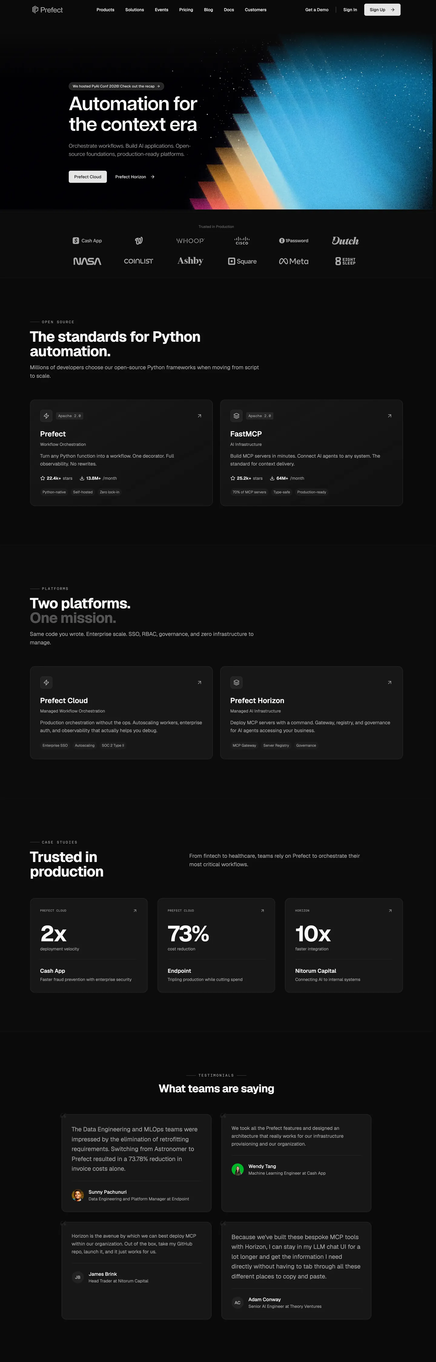
Prefect's marketing site signs itself with a single design move no peer in the data-orchestration category attempts: an eight-stop diagonal gradient called Horizon that fills the right half of the hero. The stripe walks from cosmic-black at the top-left through cobalt blue, cyan, sky-blue, tan, peach, sunset orange and finally hot pink at the bottom-right — a continuous color trace that resembles a sunset compressed into a diagonal vector rather than the photographic-gradient mesh Stripe or Linear lean on. The headline "Automation for the context era" sits in white Articulat CF 64px weight 600 against the dark left half, and the gradient hangs to the right as the only chromatic statement above the fold.
The DESIGN.md file packages the system into a machine-readable spec for React tooling. Inside: 17 colors tokens — the eight Horizon gradient stops wired as `--horizon-*` CSS variables, a "Sunset Stripe" extension palette of seven darker browns and steels (`--sunset-stripe-*`), the GitHub-dark code-card tier (#0d1117 body, #30363d border, #e6edf3 text), and the structural ink-on-white tones for the below-fold body. The typography group declares 13 tokens across three families — Articulat CF for the 64px display tier, Geist for body and nav, Aeonik Mono for uppercase 12px section labels with 2.4px tracking. 17 components definitions cover the dark-hero CTA, the white below-fold card, the dark code block, the testimonial tile, the stat-number cell, and the category-label strip.
Feed this file to Claude, Cursor, or another AI coding tool and it reproduces Prefect's specific moves: the two-canvas page split (dark hero, white body) rather than a single-canvas dark or light system, the Horizon gradient as the brand voltage instead of a single accent hex, the GitHub-dark code-card treatment used as-is (an industry-standard borrowed for readability rather than re-themed), and the Aeonik-Mono uppercase small-caps label tier that does the section-marking work most brands hand to a sans label. The one move worth borrowing only if your product story is genuinely multi-stage is the gradient itself — on a single-product surface it reads as decorative.
What makes it distinct
5
- Horizon gradienteight-stop diagonal from #06000e cosmic-black through cobalt, cyan, sky, tan, peach, sunset orange to pink, filling the entire right edge of the hero
- Two-canvas pagedark hero #06000e cuts to a white below-fold body, the two surfaces meeting at the logo wall with no atmospheric blend
- Three-family typographic splitArticulat CF for the 64px display, Geist for body, Aeonik Mono for uppercase 12px small-caps labels with 2.4px tracking
- Cosmic-black canvas`--horizon-dark` #06000e is darker than pure #000000 in OKLCH (10% lightness with violet undertone), reserved exclusively for the hero band
- GitHub-dark code cards#0d1117 code blocks with #30363d borders match the GitHub-dark editor palette; not a Prefect token, an industry-standard borrowed for readability
prefect.io
Live at prefect.io
A snapshot of the brand in production. Scroll the frame to see the whole page.
Colors
17 colors
Prefect's system runs on #06000e as its primary voltage, used in 4 of 17 components. Type is set in Geist across 13 tokens from 10px to 72px, weights 400–700. Shape language is mixed across 17 components, blending pills, soft rounds, and squarer corners.
Surface
Page and card backgrounds · 1
Text
Headlines, body, captions · 10
Borders & Hairlines
Dividers, outlines, rules · 1
Other
Specialty colors · 5
Typography
13 type tokens
Set in Geist across 13 tokens, from 10px to 72px, weights 400–700. Shown in its own stack: where the font isn't installed, the fallback the file names stands in.
- display-xl64px · weight 600 · lh 67.84px · tracking -1.408pxThe quick brown fox jumps over the lazy dog
- display-mega72px · weight 700 · lh 72px · tracking -3.6pxThe quick brown fox jumps over the lazy dog
- display-lg48px · weight 700 · lh 48px · tracking -1.2pxThe quick brown fox jumps over the lazy dog
- heading-md24px · weight 600 · lh 32pxThe quick brown fox jumps over the lazy dog
- heading-sm18px · weight 600 · lh 28pxThe quick brown fox jumps over the lazy dog
- body-lg18px · weight 400 · lh 27.2pxThe quick brown fox jumps over the lazy dog
- body-md16px · weight 400 · lh 26pxThe quick brown fox jumps over the lazy dog
- body-sm14px · weight 400 · lh 20pxThe quick brown fox jumps over the lazy dog
- caption12px · weight 400 · lh 16pxThe quick brown fox jumps over the lazy dog
- button-md14px · weight 500 · lh 20pxThe quick brown fox jumps over the lazy dog
- nav-link16px · weight 400 · lh 24pxThe quick brown fox jumps over the lazy dog
- mono-caps12px · weight 400 · lh 16px · tracking 2.4pxThe quick brown fox jumps over the lazy dog
- mono-caps-sm10px · weight 400 · lh 15px · tracking 0.5pxThe quick brown fox jumps over the lazy dog
Layout
Radii and spacing
6 corner radii and 9 spacing values. Shape language: mixed.
Radii
- none0px
- sm4px
- md6px
- lg8px
- xl16px
- full9999px
Spacing
- xs4px
- sm6px
- base8px
- md12px
- lg16px
- xl24px
- 2xl32px
- 3xl64px
- 4xl128px
Components
17 components
Each rendered from its tokens (color, type, radius, padding) on Prefect's own canvas.
- Hero Sectionhero-sectionHero Section
- Hero Headinghero-headingHero Heading
- Hero Paragraphhero-paragraphHero Paragraph
- Section Headingsection-headingSection Heading
- Stat Numberstat-numberStat Number
- Body Paragraphbody-paragraphBody Paragraph
- Mono Captionmono-captionMono Caption
- Button Primarybutton-primaryButton Primary
- Button Secondarybutton-secondaryButton Secondary
- Top Navtop-navTop Nav
- Nav Linknav-linkNav Link
- Card Darkcard-darkCard Dark
- Card Platformcard-platformCard Platform
- Code Blockcode-blockCode Block
- Testimonial Cardtestimonial-cardTestimonial Card
- Stat Cellstat-cellStat Cell
- FooterfooterFooter
In use
The system, in use
Prefect's tokens on the kind of product it builds.
Build something people actually use.
A short paragraph of marketing copy that previews how the brand's display tier and body tier read together. Two sentences is usually enough.
FAQ
Prefect design system FAQ
Common questions about Prefect's tokens, components, and how to use this DESIGN.md in your project.
Read next
Related reading
Specs, directories, and component libraries that pair with this design system.
- Browse all design systemsThe full directory of DESIGN.md files on shadcn.io, with live mockups for each.shadcn.io
- Prefect — official sitePrefect's public marketing site — the source of truth for the live tokens captured in this file.prefect.io (opens in a new tab)
- The DESIGN.md specificationGoogle Labs' open spec for machine-readable design system files — the format this page is built on.github.com (opens in a new tab)
Use it
Use Prefect in your project
One machine-readable file. Drop it into Claude, Cursor, or any AI tool that reads DESIGN.md.
Download the DESIGN.md
One machine-readable file: every color, type, radius, spacing, and component token of Prefect.
Feed it to your AI tool
Drop it into Claude, Cursor, or GitHub Copilot. The agent writes React components and Tailwind classes that match Prefect's visual language.
Reference the tokens directly
Or paste the values into your Tailwind config, CSS variables, or component library: every color, size and radius is a quoted, ready-to-copy value.
Read the full DESIGN.md: overview, rationale, do’s and don’ts
Overview
Prefect's marketing site does what no other workflow-orchestration brand attempts. Horizon-as-signature: the hero opens on a cosmic-black canvas ({colors.horizon-dark} — #06000e) sliced by a diagonal eight-stop gradient that walks cobalt #2084ab through cyan #47b6e3, sky-blue #8adeff, tan #facd96, peach #feb255, sunset orange #fe9655 and ends in hot pink #ff4bbd. The whole gradient is wired into a single CSS variable --horizon-gradient, applied to the right half of the hero band as the brand statement. Where Airflow signs itself with a single magenta accent and Dagster commits to a violet-and-black duotone, Prefect runs a continuous color trace that resembles a sunset compressed into a vector — the only data-orchestration site in the directory that uses a multi-stop gradient rather than a single hex as its voltage.
The page is structurally a two-canvas split. The hero band is cosmic-black; the entire below-fold body resets to pure white, with {colors.code-bg} (#0d1117) cards lifted against it. The two surfaces meet at the logo wall ("Cash App, WHOOP, Coinist, Ashby, Square, Meta, NASA, Dutch, Brave") with no atmospheric blend or gradient transition — the canvas just flips. This is the inverse of the dev-tools convention where dark canvas runs the entire page (Linear, Vercel, Railway); Prefect commits to dark hero plus light body, which lets the Horizon gradient read as a single statement rather than as ambient chrome.
The typographic move is a three-family role split. Articulat CF carries the 64px hero h1 at weight 600 with -1.408px tracking — wired as --font-sans, this is the editorial-magazine register that does the loud-display work. Geist carries every body paragraph, nav link, and h2 below the fold at weights 400-700, and Aeonik Mono (--font-mono) carries the small-caps section labels at 10-12px with 2.4px tracking and uppercase transform. Where most data-platform brands run a single sans family, Prefect's split gives the small-caps labels ("APPS PLATFORM", "PLATFORM", "CASE STUDIES", "TESTIMONIALS") a distinct typographic voice that signals architecture-document rather than marketing-page.
Key Characteristics:
- Horizon gradient as voltage —
--horizon-gradientwalks 8 stops from cosmic-black through cobalt, cyan, sky, tan, peach, sunset orange to hot pink in a single CSS variable; applied to the right half of the hero band as the brand's only chromatic statement. - Two-canvas page split —
{colors.horizon-dark}(#06000e) hero plus{colors.canvas}(#ffffff) body, with the seam at the logo wall and no atmospheric transition. - GitHub-dark code cards —
{colors.code-bg}(#0d1117) with{colors.code-border}(#30363d) and{colors.code-text}(#e6edf3) borrowed verbatim from the GitHub-dark editor palette. - Three-family typographic split — Articulat CF for 64px display, Geist for body and nav (12-72px), Aeonik Mono for uppercase 12px small-caps labels.
- Editorial-mega stat numbers — homepage stats ("2x", "73%", "10x") render in Geist weight 700 at 72px with -3.6px tracking, the tightest tracking on the page.
- Custom "Sunset Stripe" extension palette — six darker browns and steels (
--sunset-stripe-blue-greythrough--sunset-stripe-yellow-accent) wired as CSS vars but absent from the rendered marketing surface. - Generous radius scale —
{rounded.xl}(16px) on every card,{rounded.lg}(8px) on code blocks,{rounded.md}(6px) on buttons; full pill exists but is reserved for tag chips. - 8px base spacing unit; section padding sits at 128px on the hero band, 64px on below-fold bands.
Colors
Horizon Gradient (the brand voltage)
- Horizon Dark (
{colors.horizon-dark}— #06000e): the cosmic-black floor of the gradient and the hero-band canvas. Wired as--horizon-dark. OKLCH 10% lightness with a violet undertone — darker and more saturated than pure black, which is why the gradient's cobalt-blue stop reads as a sunrise emerging from a night sky rather than from charcoal. - Horizon Blue Dark (
{colors.horizon-blue-dark}— #2084ab): the load-bearing cobalt center of the gradient. Wired as--horizon-blue-dark. The closest thing Prefect has to a single brand voltage — Prefect Cloud chrome borrows this hex as its primary in product surfaces. - Horizon Blue Mid (
{colors.horizon-blue-mid}— #47b6e3): the cyan mid-tone in the gradient stack. - Horizon Blue Light (
{colors.horizon-blue-light}— #8adeff): the sky-blue stop. Used in product diagrams as the color of "ingress" or "data-in" nodes. - Horizon Tan (
{colors.horizon-tan}— #facd96): the warm-transition stop. The gradient changes from blue to orange through this tan band. - Horizon Orange (
{colors.horizon-orange}— #feb255): the peach stop in the gradient. - Horizon Orange Dark (
{colors.horizon-orange-dark}— #fe9655): the saturated sunset-orange stop, second-from-bottom in the gradient stack. - Horizon Pink (
{colors.horizon-pink}— #ff4bbd): the hot-pink final stop. Wired as--horizon-pinkand used in product surfaces as the Horizon AI infrastructure brand's primary.
Sunset Stripe Extension (declared, mostly absent)
- Sunset Yellow (
{colors.sunset-yellow}— #fbbf24): wired as--sunset-stripe-yellow-accent. Declared as a brand-tier accent in CSS but absent from the captured marketing render. - Sunset Burnt Orange (
{colors.sunset-burnt-orange}— #c46007): wired as--sunset-stripe-burnt-orange. Same — declared, absent on the page.
Surface
- Canvas (
{colors.canvas}— #ffffff): pure white, the below-fold body floor. Wired as--background. Carries every section from the logo wall down to the footer. - Ink (
{colors.ink}— #000000): pure black, the dominant text tone on the white below-fold body. Wired as--color-black. Used for section headlines, body paragraphs, and stat numbers.
Code Card Tier (GitHub-dark, borrowed)
- Code Background (
{colors.code-bg}— #0d1117): the dark surface for every code block and feature card below the fold. Wired as--code-bg. Borrowed verbatim from the GitHub-dark editor palette so developers reading Prefect's Python flow examples don't need to recalibrate. - Code Header (
{colors.code-header}— #161b22): one step lighter than the code body, used as the code-block header strip. Wired as--code-header, also--primaryin the shadcn convention. - Code Border (
{colors.code-border}— #30363d): the hairline outline around every dark card and code block. Wired as--code-border. - Code Text (
{colors.code-text}— #e6edf3): the bright text on the code-card surface. Wired as--code-text. - Code Line Number (
{colors.code-line-number}— #5b7c88): the muted line-number gutter color. Wired as--code-line-number.
Typography
Font Families
The system runs three voices with a strict role split. Articulat CF carries the 64px hero h1 — wired as --font-sans, the editorial-magazine register. Geist carries every body paragraph, nav link, h2 below the fold, and the editorial-mega stat numbers at 72px weight 700 — declared as the secondary sans. Aeonik Mono carries every uppercase small-caps section label at 10-12px with 2.4px tracking — wired as --font-mono. Fallback stacks walk system-ui, sans-serif for the sans tier and ui-monospace, monospace for mono.
The pairing is the distinguishing move. Articulat CF + Geist gives two different sans-serif voices for display and body without the homogenized feel of a single-family system, and the Aeonik Mono label tier signals "architecture document" rather than "marketing page."
Hierarchy
| Token | Size | Weight | Family | Use |
|---|---|---|---|---|
{typography.display-xl} | 64px | 600 | Articulat CF | Hero h1 ("Automation for the context era"), -1.408px tracking |
{typography.display-mega} | 72px | 700 | Geist | Stat numbers ("2x", "73%", "10x"), -3.6px tracking |
{typography.display-lg} | 48px | 700 | Geist | Section h2 ("The standards for Python automation", "Two platforms. One mission.") |
{typography.heading-md} | 24px | 600 | Geist | h3 / card titles ("Prefect Cloud", "Prefect Horizon") |
{typography.heading-sm} | 18px | 600 | Geist | Small headings, h4 |
{typography.body-lg} | 18px | 400 | Articulat CF | Hero sub-paragraph |
{typography.body-md} | 16px | 400 | Geist | Default running text, blockquote |
{typography.body-sm} | 14px | 400 | Geist | Caption rows, secondary copy |
{typography.caption} | 12px | 400 | Geist | Metadata, dates, small labels |
{typography.button-md} | 14px | 500 | Geist | CTA and button labels |
{typography.nav-link} | 16px | 400 | Geist | Top-nav link labels |
{typography.mono-caps} | 12px | 400 | Aeonik Mono | Uppercase section labels, 2.4px tracking ("APPS PLATFORM", "TESTIMONIALS") |
{typography.mono-caps-sm} | 10px | 400 | Aeonik Mono | Smaller uppercase labels, 0.5px tracking |
Principles
The hero h1 sits at Articulat CF 64px weight 600, but the loudest typographic moment on the page is the 72px Geist weight 700 stat numbers — the "2x" / "73%" / "10x" cells in the "Trusted in production" band. Tracking tightens from -1.408px on the hero to -3.6px on the stat numbers, a deliberate move that gives the numerical claims more typographic muscle than the headline.
The Aeonik Mono small-caps tier does the section-marking work most brands hand to a sans label. Every band on the page opens with an uppercase 12px Aeonik Mono label ("APPS PLATFORM", "PLATFORMS", "CASE STUDIES", "TESTIMONIALS") with 2.4px tracking — the tracking is wide enough that the labels read as architecture diagrams' section headers rather than as copy.
Note on Font Substitutes
Articulat CF is licensed; Inter at the same weights with slightly tighter tracking (-1.5%) is the closest open substitute for the 64px display tier. Geist is open-source — Vercel ships it free. For the Aeonik Mono tier, JetBrains Mono or IBM Plex Mono transfer cleanly at 12px with 2.4px tracking; the uppercase transform plus tracking is the dominant signal, not the specific monospace cap shape.
Layout
Spacing System
- Base unit: 8px (51 captured occurrences) — the dominant gap value.
- Tokens:
{spacing.xs}4px ·{spacing.sm}6px ·{spacing.base}8px ·{spacing.md}12px ·{spacing.lg}16px ·{spacing.xl}24px ·{spacing.2xl}32px ·{spacing.3xl}64px ·{spacing.4xl}128px. - Section padding (vertical): 128px on the hero band, 64px on below-fold bands.
- Card internal padding:
{spacing.xl}(24px) on{component.card-dark}and{component.testimonial-card};{spacing.2xl}(32px) on the larger{component.card-platform}. - Top-nav padding: 12px vertical, 24px horizontal.
Grid & Container
- Max content width: ~1080px on the hero text block, ~1280px on the card grids and logo wall.
- Hero: 50/50 split — left half holds the headline + sub-paragraph + 2 CTAs, right half holds the Horizon-gradient illustration block.
- Below-fold platform row: 2-column 50/50 split pairing the "Prefect Cloud" card with the "Prefect Horizon" card.
- Stats band: 3-column ("2x" / "73%" / "10x") with each cell in a dark
{component.stat-cell}card. - Testimonials band: 2-column 2-row grid of 4 dark testimonial cards.
Rhythm
The page alternates between chromatic (the hero with its Horizon gradient) and monochromatic (every below-fold band on white with {colors.code-bg} dark cards). The chromatic budget is spent entirely in the hero — below the fold the page never uses a brand-tier color again. Section transitions happen via uppercase Aeonik Mono labels rather than via background shifts; the rhythm is documentation-page rather than scrollytelling.
Elevation
The system has essentially no shadow tier. The captured page shows zero shadow occurrences in the structural color set — elevation is carried entirely by surface contrast.
- Flat (no shadow): hero, body bands, footer — 99% of surfaces.
- Tonal lift:
{colors.code-bg}(#0d1117) dark cards sit on the white{colors.canvas}(#ffffff) — the high lightness contrast (94 OKLCH points apart) reads as elevation without any shadow being drawn. - Hairline outlines:
{colors.code-border}(#30363d) carries the card-edge work, borrowed verbatim from GitHub-dark.
Shapes
The radius scale is generous + pill:
{rounded.none}0px — only on the hero-section edge.{rounded.sm}4px (2 occurrences) — rare, used on a couple of small UI surfaces.{rounded.md}6px (14 occurrences) — buttons, secondary chips.{rounded.lg}8px (4 occurrences) — code blocks.{rounded.xl}16px (11 occurrences) — every card surface ({component.card-dark},{component.card-platform},{component.testimonial-card},{component.stat-cell}).{rounded.full}9999px (20 occurrences via the extracted3.35544e+07pxrendering) — tag chips and the Aeonik Mono small-caps label badges.
The 16px card radius is the dominant surface tone. Generous rounding on dark cards against the white body gives the below-fold rhythm a softer, document-like feel rather than the sharp-cornered terminal-panel register that Trigger.dev or Linear lean on.
Components
hero-section — Full-bleed {colors.horizon-dark} (#06000e) canvas, 128x24px padding. Houses the left-side headline stack and the right-side Horizon-gradient illustration block.
hero-heading — White {colors.canvas} text on the dark canvas, Articulat CF 64px / 600 / -1.408px tracking. The display tier.
hero-paragraph — White text at {typography.body-lg} Articulat CF 18px / 400 / 27.2px line-height. The sub-paragraph beneath the headline.
section-heading — {colors.ink} text on the white below-fold canvas, Geist 48px / 700 / -1.2px tracking. Used for "The standards for Python automation", "Two platforms. One mission.", "Trusted in production", "What teams are saying".
stat-number — Geist 72px / 700 / -3.6px tracking. The "2x", "73%", "10x" stat-cell values — the tightest tracking on the page.
body-paragraph — Default Geist {typography.body-md} (16px / 400 / 26px line-height) in {colors.ink}. The workhorse paragraph style.
mono-caption — Aeonik Mono {typography.mono-caps} (12px / 400) with uppercase transform and 2.4px tracking. Used for "APPS PLATFORM", "PLATFORMS", "CASE STUDIES", "TESTIMONIALS" section labels.
button-primary — White {colors.canvas} fill on the dark hero, {colors.horizon-dark} text, {rounded.md} 6px radius, 8x16 padding, 40px height. "Prefect Cloud" is the canonical instance.
button-secondary — Transparent fill, white text, 1px white border, same radius and dimensions. "Prefect Horizon" is the secondary CTA on the hero.
top-nav — {colors.horizon-dark} surface, 64px height, white wordmark flush left, product-nav links (Platform, Solutions, Events, Pricing, Blog, Docs, Customers) center, "Get a Demo / Sign In / Sign Up" cluster flush right.
nav-link — Transparent background, white text in {typography.nav-link} (16px / 400), 6x12 padding.
card-dark — {colors.code-bg} (#0d1117) fill, white text, {rounded.xl} 16px radius, 24px padding, 1px {colors.code-border} outline. The default content card on the white body.
card-platform — Same {colors.code-bg} fill, {rounded.xl} 16px radius, 32px padding (more generous than card-dark). The two big platform cards ("Prefect Cloud", "Prefect Horizon") use this variant.
code-block — {colors.code-bg} fill, {colors.code-text} (#e6edf3) text, {rounded.lg} 8px radius, 16px padding. Holds Python flow examples with {colors.code-line-number} (#5b7c88) gutter numbers and {colors.code-header} (#161b22) top strip.
testimonial-card — {colors.code-bg} fill, white text, {rounded.xl} 16px radius, 24px padding. Used in the 2x2 testimonial grid.
stat-cell — {colors.code-bg} fill, white text, {rounded.xl} 16px radius, 24px padding. Holds the {component.stat-number} 72px value plus a small caption row ("Cash App / Faster fraud prevention with enterprise security").
footer — {colors.horizon-dark} fill, white text, 64x24 padding. Returns to the cosmic-black canvas — the dark hero and dark footer bookend the white below-fold body.
Do's and Don'ts
Do treat the Horizon gradient as a single hero moment. The system has exactly one rendered application of the eight-stop gradient — on the right half of the hero band. Repeating it across multiple sections would dilute the only chromatic statement on the page and make the gradient feel decorative rather than load-bearing.
Do use {colors.code-bg} (#0d1117) for every dark card on the white body. The GitHub-dark code-card treatment is borrowed verbatim; reskinning it to a Prefect-purple or a custom dark palette forces the reader to recalibrate when reading the Python flow examples.
Do keep section labels in Aeonik Mono uppercase at 12px with 2.4px tracking. The small-caps mono tier is the system's architecture-document signal — replacing it with a sans uppercase label flattens the page into a generic SaaS rhythm.
Do run the stat-number cells at Geist 72px / 700 with -3.6px tracking. The tighter tracking on the numerical claims is the loudest typographic moment on the page; softening it to -1px or weight 600 reads as hedging.
Don't use the Horizon gradient as a background fill behind a card or behind a section heading. The gradient is a chromatic statement in the hero and only the hero; using it as ambient chrome anywhere else turns the brand mark into wallpaper.
Don't render any below-fold card on a custom dark color other than {colors.code-bg} (#0d1117). The system commits to GitHub-dark as the dark-card surface; deviating to a Prefect-specific dark (e.g., a deep cobalt-tinged near-black) breaks the borrowed-readability contract with developers.
Don't sample individual Horizon gradient stops as standalone accents on the marketing chrome. The stops are designed to read as a sequence — using {colors.horizon-pink} alone as a CTA fill on a card pulls one tile out of the sunset and makes it read as a random pink rather than as the gradient's terminal point.
Don't mix the Articulat CF display with the Geist display in the same band. The hero h1 is Articulat CF and the below-fold section h2s are Geist — the seam is at the canvas flip. Putting an Articulat CF h2 on the white body would smudge the typographic role split that does the editorial-magazine vs. documentation register signal.
Known Gaps
- Sunset Stripe palette: an extension family of seven darker brown / steel-blue hexes wired as
--sunset-stripe-blue-grey,--sunset-stripe-ocean-blue,--sunset-stripe-grey-blue,--sunset-stripe-golden-orange,--sunset-stripe-steel-blue,--sunset-stripe-tan, and--sunset-stripe-deep-blueis declared in CSS but absent from the captured marketing render; intended use lives in product surfaces or alternate brand applications. - Hover and focus states: the captured marketing surface shows resting states only. Focus rings, disabled tints, error states — all live in the Prefect Cloud product app rather than on the marketing site.
- Form input: the marketing site has no rendered input field;
text-inputis not captured here. The input chrome lives in the auth flow and the Prefect Cloud dashboard. - Light mode for code cards: the GitHub-dark code-card treatment is the only theme exposed on the marketing surface. A light-mode code-card variant exists in the docs site (
docs.prefect.io) but is not represented here. - Motion: the Horizon gradient is static in the captured render but the page has subtle scroll-into-view animations on the platform-card row and the stat cells. Easing curves, stagger timing, and the parallax depth on the hero illustration live in the React runtime, not in the spec.
- Product surfaces: this DESIGN.md captures the marketing site only. The Prefect Cloud dashboard, flow-run detail view, and worker-management surfaces carry a richer token set — run-status colors, task-state badges, log-level chrome — that is not represented here.
- Horizon AI infrastructure sub-brand: the Horizon product (the pink-tier of the gradient) has its own sub-marketing surface at
prefect.io/horizonwith deeper pink/violet chrome; this DESIGN.md captures the top-level brand only.
Workflow & No-code
More systems like this
More DESIGN.md files in Workflow & No-code.
Pricing
Build it with Pro
The DESIGN.md files are free. Pro adds 6,000+ blocks, premium templates and the MCP server, so your AI editor builds in your system for you.
4.9/5 out of 5 · 150+ reviewsfrom 150+ founders and developers.
Billing
Billed once a year in USD. Cancel anytime.
- How many people can use the license.
- Client work, SaaS products and anything you charge for.
- Production-ready React sections: hero, pricing, features, dashboards and more.
- Complete multi-page sites you can ship as they are.
- React icons from every major library, installable with one command.
- Presets that restyle every block, in light and dark.
- Lets your AI editor search, preview and install blocks for you.
- Priority requests are answered first.
Individual
For personal projects & open source
$32instead of $49/mo
$389 billed yearly
- Seats: 1 seat
- Commercial use: Personal & open source only
- Pro blocks: 6,000+ blocks
- Templates: All 14 templates
- React icons: 294k+ icons
- Themes: All 59 themes
- MCP server: Basic usage
- Support: Standard
Team
Most popularFor freelancers, agencies & startups
$66instead of $99/mo
$789 billed yearly · ≈ $13/dev/mo
- Seats: Up to 5 seats
- Commercial use: Included
- Pro blocks: 6,000+ blocks
- Templates: All 14 templates
- React icons: 294k+ icons
- Themes: All 59 themes
- MCP server: High usage
- Support: Priority
Organization
For companies with larger teams
$132instead of $199/mo
$1,589 billed yearly
- Seats: Unlimited seats
- Commercial use: Included
- Pro blocks: 6,000+ blocks
- Templates: All 14 templates
- React icons: 294k+ icons
- Themes: All 59 themes
- MCP server: Unlimited usage
- Support: Priority
Billed once a year in USD. Cancel anytime.
Individual
For personal projects & open source
$32instead of $49/mo
$389 billed yearly
- How many people can use the license.Seats: 1 seat
- Client work, SaaS products and anything you charge for.Commercial use: Personal & open source only
- Production-ready React sections: hero, pricing, features, dashboards and more.Pro blocks: 6,000+ blocks
- Complete multi-page sites you can ship as they are.Templates: All 14 templates
- React icons from every major library, installable with one command.React icons: 294k+ icons
- Presets that restyle every block, in light and dark.Themes: All 59 themes
- Lets your AI editor search, preview and install blocks for you.MCP server: Basic usage
- Priority requests are answered first.Support: Standard
Team
Most popularFor freelancers, agencies & startups
$66instead of $99/mo
$789 billed yearly · ≈ $13/dev/mo
Everything in Individual, plus
- How many people can use the license.Seats: Up to 5 seats
- Client work, SaaS products and anything you charge for.Commercial use: Included
- Lets your AI editor search, preview and install blocks for you.MCP server: High usage
- Priority requests are answered first.Support: Priority
Organization
For companies with larger teams
$132instead of $199/mo
$1,589 billed yearly
Everything in Team, plus
- How many people can use the license.Seats: Unlimited seats
- Lets your AI editor search, preview and install blocks for you.MCP server: Unlimited usage
- Secure checkout via Stripe
- Code lives in your repo
- Keep what you've shipped if you cancel
- License terms
Your system, built for you
Every block, template and icon, installed by your AI agent in your design system. The DESIGN.md files stay free.