Trello Design System
Trello's design system as a DESIGN.md file. Charlie Display, brand blue #0065ff CTA, navy ink #091e42, 20 components — for React, Next.js, and AI tools.
Add shadcn.io to your AI agent. · Pro It installs blocks, icons and templates in your design system from a prompt, with Pro.
Set up MCP- Primary
- #0065ff
- Typeface
- Charlie Display
- Shape
- Sharp
- Base radius
- 8px
- Colors
- 19
- Type tokens
- 12
- Components
- 20
- Spacing values
- 9
About
About Trello DESIGN.md
Curated by Dov Azencot · Updated May 13, 2026 · Source trello.com (opens in a new tab)
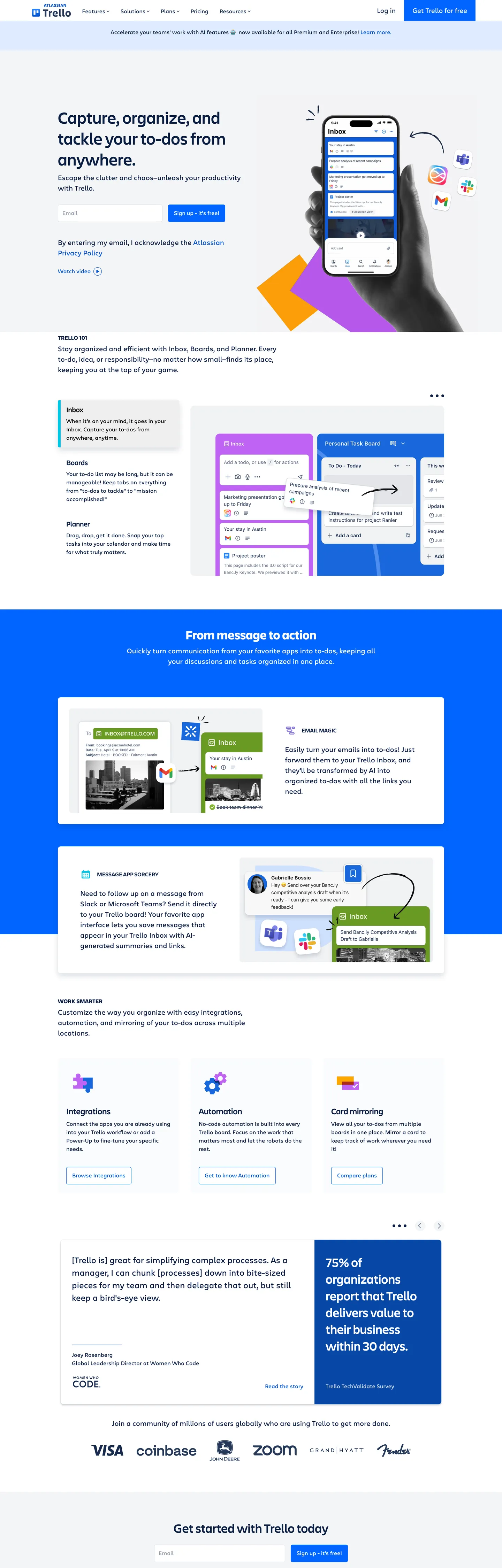
Trello's homepage is the rare Atlassian-owned marketing surface that ships a square primary CTA — a `60px`-tall blue rectangle at `0px` border-radius reading "Get Trello for free", set against form inputs at `4.8px` and feature cards at `8px`. The voltage behind the rectangle is `#0065ff`, distinct from the older Trello Blue (`#0052cc`) that still carries link text and from the Atlassian blue family that lives in Jira. The canvas is white (`#ffffff`); ink commits to a deep navy (`#091e42`) that lands as text or border 423 times across the captured DOM — the page's load-bearing chromatic event after the CTA. Where most productivity homepages soften their primary action with a pill or a `12px` corner, Trello hard-cuts the rectangle.
The DESIGN.md file packages 19 colors tokens, 12 typography styles, 5 corner radii, 9 spacing values, and 20 components. Colors split into ink grades (`#091e42` deep navy, `#172b4d` Atlaskit N900, `#000000` true black for icon strokes), surfaces (`#ffffff` canvas, `#f4f5f7` neutral pane, `#deebff` selected-blue tint), brand voltage (`#0065ff` CTA, `#0747a6` pressed, `#0052cc` link), and a mockup accent family (`#8777d9` purple, `#00c7e5` teal) pulled from the Inbox-Boards-Planner UI illustrations. The format follows the Google Labs DESIGN.md spec — token references like `{colors.brand-cta}` and `{typography.display-lg}` that designers and AI agents can both parse without a translation layer.
Feed the file to Claude, Cursor, or GitHub Copilot and the agent reproduces Trello's specific gate: a white canvas, navy headlines, Charlie Display weight 500 at the top, Charlie Text weight 400 below, and one square blue rectangle per fold. Reference the tokens directly inside Tailwind config, CSS variables, or paste the component block into a brand audit. The discipline worth studying is the refusal of pill geometry — Trello keeps Atlassian's typography and ink palette but inverts the radius convention so the CTA reads as a board card, not a chip. The square is the signal.
What makes it distinct
5
- Square-cornered primary CTA`#0065ff` rectangle at 0px radius against 4.8px inputs and 8px cards
- Navy ink dominance`#091e42` carries 423 text-and-border occurrences across the page
- Two voltages in tensionnew `#0065ff` brand blue for the CTA, legacy `#0052cc` Trello Blue for link text
- Atlassian-owned typographyCharlie Display 48px weight 500 hero, Charlie Text 19.2px weight 400 buttons
- Decorative accent palette in mockups`#8777d9` purple, `#00c7e5` teal, `#deebff` pale-blue inside Inbox-Boards-Planner illustrations
trello.com
Live at trello.com
A snapshot of the brand in production. Scroll the frame to see the whole page.
Colors
19 colors
Trello's system runs on #0065ff as its primary voltage, used in 3 of 20 components. Type is set in Charlie Display across 12 tokens from 12px to 48px, weights 400–700. Shape language is sharp — components average 2px corner radius, favoring crisp rectangles.
Brand & Accent
Sparing, CTA-only voltage · 5
Surface
Page and card backgrounds · 3
Text
Headlines, body, captions · 3
Borders & Hairlines
Dividers, outlines, rules · 1
Other
Specialty colors · 7
Typography
12 type tokens
Set in Charlie Display across 12 tokens, from 12px to 48px, weights 400–700. Shown in its own stack: where the font isn't installed, the fallback the file names stands in.
- display-lg48px · weight 500 · lh 1.25The quick brown fox jumps over the lazy dog
- display-md36px · weight 500 · lh 1.33The quick brown fox jumps over the lazy dog
- display-md-strong36px · weight 700 · lh 1.33The quick brown fox jumps over the lazy dog
- display-sm24px · weight 500 · lh 1.33The quick brown fox jumps over the lazy dog
- heading-md20px · weight 500 · lh 1.2The quick brown fox jumps over the lazy dog
- eyebrow16px · weight 500 · lh 1.25 · tracking 0.5pxThe quick brown fox jumps over the lazy dog
- body-lg24px · weight 400 · lh 1.5The quick brown fox jumps over the lazy dog
- body-md20px · weight 400 · lh 1.5The quick brown fox jumps over the lazy dog
- body-sm16px · weight 400 · lh 1.5The quick brown fox jumps over the lazy dog
- button-md19.2px · weight 400 · lh 1.5The quick brown fox jumps over the lazy dog
- caption12px · weight 400 · lh 1.5The quick brown fox jumps over the lazy dog
- legal12px · weight 400 · lh 1.33The quick brown fox jumps over the lazy dog
Layout
Radii and spacing
5 corner radii and 9 spacing values. Shape language: sharp.
Radii
- none0px
- xs4px
- sm4.8px
- md8px
- circle50%
Spacing
- xxs4px
- xs8px
- sm12px
- md16px
- lg20px
- xl24px
- xxl32px
- section40px
- band52px
Components
20 components
Each rendered from its tokens (color, type, radius, padding) on Trello's own canvas.
- Button Primarybutton-primaryButton Primary
- Button Primary Hoverbutton-primary-hoverButton Primary Hover
- Button Secondarybutton-secondaryButton Secondary
- Button On Darkbutton-on-darkButton On Dark
- Top Navtop-navTop Nav
- Nav Linknav-linkNav Link
- Hero Headinghero-headingHero Heading
- Section Heading Darksection-heading-darkSection Heading Dark
- Type here…text-inputText Input
- Type here…text-input-focusedText Input Focused
- Feature Cardfeature-cardFeature Card
- Feature Card Tint Selectedfeature-card-tint-selectedFeature Card Tint Selected
- Feature Card Tint Purplefeature-card-tint-purpleFeature Card Tint Purple
- Band Dark Blueband-dark-blueBand Dark Blue
- Band Neutralband-neutralBand Neutral
- Chip Statuschip-statusChip Status
- List Cardlist-cardList Card
- AvataravatarAvatar
- DividerdividerDivider
- FooterfooterFooter
In use
The system, in use
Trello's tokens on the kind of product it builds.
Build something people actually use.
A short paragraph of marketing copy that previews how the brand's display tier and body tier read together. Two sentences is usually enough.
FAQ
Trello design system FAQ
Common questions about Trello's tokens, components, and how to use this DESIGN.md in your project.
Read next
Related reading
Specs, directories, and component libraries that pair with this design system.
- Browse all design systemsThe full directory of DESIGN.md files on shadcn.io, with live mockups for each.shadcn.io
- Trello — official siteThe Atlassian-owned visual project-management product the design system documents.trello.com (opens in a new tab)
- The DESIGN.md specificationGoogle Labs' open spec for machine-readable design system files.github.com (opens in a new tab)
Use it
Use Trello in your project
One machine-readable file. Drop it into Claude, Cursor, or any AI tool that reads DESIGN.md.
Download the DESIGN.md
One machine-readable file: every color, type, radius, spacing, and component token of Trello.
Feed it to your AI tool
Drop it into Claude, Cursor, or GitHub Copilot. The agent writes React components and Tailwind classes that match Trello's visual language.
Reference the tokens directly
Or paste the values into your Tailwind config, CSS variables, or component library: every color, size and radius is a quoted, ready-to-copy value.
Read the full DESIGN.md: overview, rationale, do’s and don’ts
Overview
Trello's marketing surface is the rare Atlassian-owned site that breaks the parent's pill convention — the primary CTA "Get Trello for free" renders as a 60px-tall blue rectangle at 0px border-radius against #0065ff, sitting on a white canvas (#ffffff) anchored on deep navy ink (#091e42). Where Atlassian's homepage gates the Jira action through a 10000px pill, Trello hard-cuts the same component class into a square. The shape is the brand.
Square-as-card geometry: Trello's primary CTA refuses the pill, the rounded-rect, and the chip — it commits to 0px radius. The decision reads as a kanban move: every Trello card on the live product is a flat-edged document, and the marketing CTA inherits the same silhouette. Form inputs step up to 4.8px (the dominant radius in the extraction, 13 occurrences), feature cards round to 8px, and avatars use 50%. The 0px → 4.8px → 8px → 50% radius ladder gates radius by component role, and the primary action sits at the bottom rung — the most flat-edged, the most card-like.
The typography pairing is inherited from Atlassian: Charlie Display at weight 500 (48px hero h1, 36px section h2, 24px h3) and Charlie Text at weight 400 (16-24px body, 19.2px buttons, 12px captions). The fallback chain is the long Atlaskit native stack — -apple-system, BlinkMacSystemFont, Segoe UI, Roboto, Oxygen, Ubuntu, Fira Sans, Droid Sans, Helvetica Neue, sans-serif. Where most workspace-tool marketing sites license a humanist sans like Inter or Söhne and bolt their own weight strategy on top, Trello leans entirely on Charlie's weight 500 display ceiling — there is no weight 700 in the hero hierarchy. Only a single strong tag at 36px weight 700 (count 1 in the extraction) breaks the pattern, used inside a stat callout.
Color discipline runs two voltages in tension. The newer brand blue #0065ff (CSS variable --color-B300-rgb at RGB 0,101,255) fills the primary CTA — only 9 occurrences across the captured DOM, but every one of them is load-bearing. The legacy Trello Blue #0052cc (Atlaskit N300, count 25) carries link text and underlined anchors — outnumbering the CTA voltage by three to one, but never appearing as a background. Both blues coexist because Trello has not migrated link styling to the refreshed brand voltage yet — a token-migration tell that documents the design system mid-transition.
Key Characteristics:
- Square primary CTA (
0pxradius) at#0065ffagainst4.8pxinputs and8pxfeature cards. - Two blue voltages —
#0065fffor CTA backgrounds,#0052ccfor legacy link text. - Charlie Display weight 500 ceiling — no weight 700 in the hero hierarchy.
- Navy ink
#091e42carries 423 text-and-border occurrences across the page. - Decorative accents (
#8777d9,#00c7e5,#deebff) live only inside the Inbox-Boards-Planner UI mockups, never as section backgrounds. - A single dark-blue band at
#0065ffcarries the "From message to action" section — the same hex as the CTA, here at section scale.
Colors
- Brand CTA blue (
#0065ff) — frequency 9. Used as bg (4), border (5). The--color-B300-rgbtoken (RGB 0,101,255). Reserved for the primary CTA rectangle and the single dark-blue band ("From message to action") — the page's load-bearing brand voltage. - Brand CTA deep (
#0747a6) — frequency 3. Used as bg (3). The pressed-state and--color-N300-rgbAtlaskit fill. Never appears at rest, only on hover and active. - Legacy Trello Blue (
#0052cc) — frequency 25. Used as text (14), border (11). The older brand blue Trello carried before the#0065ffrefresh. Still load-bearing for inline link text and anchor borders — outnumbers the CTA voltage 3-to-1. - Deep navy ink (
#091e42) — frequency 423. Used as text (204), border (204), bg (6), shadow (9). The--color-N600-rgbvalue (RGB 9,30,66). The page's dominant ink — every headline, paragraph, and most border outlines. - Mid navy (
#172b4d) — frequency 15. Used as text (6), bg (2), border (7). The--color-N900-rgbvalue (RGB 23,43,77). Used for accent headlines and the "From message to action" callouts inside the dark band. - True black (
#000000) — frequency 16. Used as text (9), border (7). Reserved for icon strokes inside form inputs and high-contrast labels — never for body type. - Canvas white (
#ffffff) — frequency 186. Used as text (87), bg (15), border (84). The default surface and inverse-ink color on the#0065ffband. - Surface neutral (
#f4f5f7) — frequency 3. Used as bg (3). The--color-N20-rgbvalue (RGB 244,245,247). The pale pane behind list-card mockups and the "About" content frame. - Surface selected (
#deebff) — frequency 2. Used as bg (2). The--color-B50-rgbpale-blue tint (RGB 222,235,255). Reserved for selected list cards and chip backgrounds inside the Boards mockup. - Hairline (
#dfe1e6) — frequency 2. Used as border (2). The--color-N40-rgbvalue (RGB 223,225,230). The default border on text inputs and feature card outlines. - Accent purple (
#8777d9) — frequency 2. Used as text (1), border (1). The--color-P200-rgbfamily (RGB 153,76,255 base). Appears only inside the Planner UI mockup illustration — never as a marketing surface. - Accent teal (
#00c7e5) — frequency 2. Used as text (1), border (1). The--color-T200-rgbvalue (RGB 0,199,229). Inside the Inbox mockup illustration only.
Typography
Two Atlassian-licensed families, no third — the same pairing that ships across Jira, Confluence, and the Atlassian marketing site. Charlie Display carries display and section heads at weight 500: hero h1 at 48px line-height 60px, h2 at 36px line-height 48px, h3 at 24px line-height 32px. The ceiling stays at weight 500 — there is no weight 600 or 700 in the hero hierarchy, with one strong tag at 36px weight 700 (count 1) the only exception, used inside a stat callout band.
Charlie Text covers body, nav, buttons, and captions at weight 400. Body type sits at 16px line-height 24px (count 37, the dominant signature); subhead body steps up to 20px line-height 30px. The CTA button uses a distinctive 19.2px size with line-height 28.8px — the only signature at that exact pixel that doesn't round to an even number, a tell that the Atlaskit token sheet computes button type as 1.2rem against a base 16px root.
Eyebrow labels and section overlines use Charlie Display at 16px weight 500 with textTransform: uppercase — the only place uppercase appears in the type hierarchy. Letter-spacing is normal (zero) across every signature in the extraction — Trello relies on size jumps and weight contrast rather than tracking to mark hierarchy. The fallback chain (-apple-system, BlinkMacSystemFont, Segoe UI, Roboto, Oxygen, Ubuntu, Fira Sans, Droid Sans, Helvetica Neue, sans-serif) is identical to the Atlaskit --atlassian-recommended-system-fonts value. Inter at weight 500 for display and 400 for body is the closest open substitute.
Layout
The grid centers on a content frame near 1168px with side gutters that step to 32px on the dark-blue band and 40px inside the major sections (the 40px 32px padding pattern appears 6 times in the extracted spacing histogram). Sections stack vertically with 52px of top-padding between major bands (52px 0px 0px, count 3) — narrower vertical rhythm than Atlassian's 64px+136px scheme, which tracks with Trello's denser content surface.
Inside sections, content blocks use 24px between heading and supporting copy, 16px between sibling cards, and 8px for micro-spacing inside list-card stacks. The hero uses left-aligned type at roughly 538px width — narrower than the 968px Atlassian hero — paired with a hand-held mobile mockup illustration on the right. Below the fold, three-tile feature grids replace the split; tiles run at equal width with 16px gutters and 20px 16px 16px internal padding (count 5).
Elevation & Depth
Trello commits to hairline + surface contrast for elevation, never drop shadows. Cards on the white canvas use a 1px #dfe1e6 border to lift off; cards on the #f4f5f7 neutral pane use no border, letting the surface contrast carry the lift. The deep navy ink (#091e42) shows up 9 times as a shadow color in the extraction, but those are box-shadow overlays on form-input focus states, not floating card surfaces.
The Atlaskit token sheet ships --ds-shadow-overlay and --ds-shadow-raised properties for product UI, but the Trello marketing surface does not import or apply them above the fold. Elevation is binary: hairline-bordered card on canvas, or borderless card on the neutral surface. The single dark-blue band (#0065ff) functions as a third elevation tier — full-bleed color that anchors the "From message to action" section and reverses contrast against white floating mockup cards inside it.
Shapes
A four-tier radius language gated by component role: 0px (rectangle) on the primary CTA, secondary CTA, navigation, and hero band; 4.8px (the dominant input radius, 13 occurrences) on form fields and search inputs; 8px (count 8) on feature cards, list cards, and inset content tiles; 50% on avatars and brand-logo circles. A small register at 4px (count 6) covers chip badges and inline status tags.
The 0px → 4.8px → 8px → 50% ladder gates radius by interaction class. Interactive primary surfaces (CTA, nav, sections) sit at the flat-edged bottom rung. Engineered-control surfaces (inputs, search) sit at 4.8px — a fractional pixel that reads as soft but engineered. Content cards step up to 8px for the rounded-rect register, and circular shapes are reserved for human-figure objects (avatars, brand marks). Trello deliberately avoids the mid-range 12-20px register that Notion uses for its feature cards — the gap between 8px and 50% signals which components contain content and which contain identity.
Components
button-primary— brand-blue (#0065ff) fill, white text, Charlie Text 19.2px weight 400,0pxradius, padding8px 24px, height60px. The signature square CTA — one per fold.button-primary-hover— same geometry, fill shifts to#0747a6(the deep-blue pressed value).button-secondary— white fill, navy ink text, 1px#dfe1e6hairline border, same0pxradius — pairs alongside primary as the muted alternative.button-on-dark— white rectangle with navy ink text, used on the#0065ffband.top-nav— white canvas, navy ink text, Charlie Text 16px,60pxheight with0 16pxhorizontal padding.nav-link— flat 44px height, no border, ink at default and#0052ccon hover.hero-heading— Charlie Display 48px weight 500 line-height60px, no padding, sits left-aligned at538pxwidth.section-heading-dark— Charlie Display 36px weight 500 white text on the#0065ffband.text-input— white canvas, true-black text, 1px#dfe1e6border,4.8pxradius, padding11.2px 12px 12.8px, height50px.text-input-focused— border switches to 2px#0065ff— the only place the brand CTA blue appears outside of a button.feature-card— white canvas, 1px#dfe1e6hairline,8pxradius,20px 16px 16pxpadding — the workhorse content tile.feature-card-tint-selected— pale-blue (#deebff) fill, navy ink text — represents the "selected" state on list cards inside the Boards mockup.feature-card-tint-purple— accent-purple (#8777d9) fill, white text — reserved for the single Planner-mockup tile in the feature grid.band-dark-blue—#0065fffill, white text,40px 32pxpadding — the "From message to action" section anchor.band-neutral—#f4f5f7fill, navy ink text — the "About Us" content frame.chip-status— pale-blue (#deebff) fill, legacy-blue (#0052cc) text, pill-shape via4pxradius — the "On Demand Now Available" announcement chip.list-card— neutral-surface fill,8pxradius,16px 16px 16px 24pxasymmetric padding — the kanban list-card mockup inside the Boards illustration.avatar— neutral-surface fill, 32px circle (50%radius) — user-figure objects only.divider— 1px hairline at#dfe1e6— section breaks above the footer.footer— white canvas, navy ink text, Charlie Text 12px caption sizing,32px 32pxpadding.
Do's and Don'ts
Do use #0065ff ({colors.brand-cta}) exclusively for the primary CTA, the section-anchor band, and the focused-input border. The hex shows up as a background 4 times and as a border 5 times in the page — never as a text color. If you reach for it as link text, you've crossed into legacy-blue (#0052cc) territory instead.
Do stack hierarchy through size, not weight. Display drops 48 → 36 → 24 → 20 with weight 500 at every tier and weight 400 by body. Add a weight 600 or 700 inside the hero hierarchy and the page reads as a fintech marketing one-pager, not a kanban workspace surface.
Don't round the primary CTA. The 0px radius is the brand's load-bearing geometric decision — every Trello card on the live product is a flat-edged document, and the marketing CTA inherits the silhouette. Switching to {rounded.md} (8px) or {rounded.sm} (4.8px) collapses the gate that separates Trello from the rest of the Atlassian portfolio.
Don't use #0052cc for the primary CTA fill. The legacy Trello Blue is a text and border color (14 text occurrences, 11 border) bound to link semantics — using it as a button background reads as a downgrade to pre-refresh chrome. Reserve it for inline links, anchored copy, and underlined navigation.
Don't mix the mockup accent palette (#8777d9, #00c7e5, #deebff) with the brand-blue voltage in the same marketing component. The accent hexes live inside Inbox-Boards-Planner UI illustrations only — pulling them into section chrome breaks the semantic gate Trello maintains between product mockup atmosphere and marketing surface.
Don't swap Charlie Display for Charlie Text on the hero h1. Charlie Display at 48px weight 500 holds a tight 60px line-height (1.25 ratio); Charlie Text at the same size opens the leading and breaks the engineered density of "Capture, organize, and tackle your to-dos from anywhere."
Known Gaps
- Dark-mode tokens — the Trello product app ships a dark theme, but the marketing surface stays light. This DESIGN.md captures the marketing track only.
- Motion and animation timings — Trello uses entrance animations on the mobile-mockup illustration and the dark-band reveal; durations and easings are not exposed via the Atlaskit
--ds-*properties on:root. - Charlie Display and Charlie Text are Atlassian-licensed — Inter at weight 500/400 is the closest open substitute. The
--bxp-charlie-display-font-familyand--bxp-charlie-text-font-familyvariables resolve through the BXP (Brand Experience Platform) Atlassian shared stylesheet. - The 86
--color-*-rgbvariables include the full Atlaskit ramp (N0-N900, B50-B500, R50-R500, G50-G500, M50-M500, O50-O500, P50-P500, T50-T500, Y50-Y500) — most don't paint pixels above the fold but ship to:rootbecause the page imports the full token sheet. - The
--color-trelloblue-rgblegacy value (0,121,191) is resolved on:rootfor backwards compatibility but no element in the captured DOM resolves through it — the older Trello product-blue is no longer load-bearing on the marketing surface.
Project Management
More systems like this
More DESIGN.md files in Project Management.
Pricing
Build it with Pro
The DESIGN.md files are free. Pro adds 6,000+ blocks, premium templates and the MCP server, so your AI editor builds in your system for you.
4.9/5 out of 5 · 150+ reviewsfrom 150+ founders and developers.
Billing
Billed once a year in USD. Cancel anytime.
- How many people can use the license.
- Client work, SaaS products and anything you charge for.
- Production-ready React sections: hero, pricing, features, dashboards and more.
- Complete multi-page sites you can ship as they are.
- React icons from every major library, installable with one command.
- Presets that restyle every block, in light and dark.
- Lets your AI editor search, preview and install blocks for you.
- Priority requests are answered first.
Individual
For personal projects & open source
$32instead of $49/mo
$389 billed yearly
- Seats: 1 seat
- Commercial use: Personal & open source only
- Pro blocks: 6,000+ blocks
- Templates: All 14 templates
- React icons: 294k+ icons
- Themes: All 59 themes
- MCP server: Basic usage
- Support: Standard
Team
Most popularFor freelancers, agencies & startups
$66instead of $99/mo
$789 billed yearly · ≈ $13/dev/mo
- Seats: Up to 5 seats
- Commercial use: Included
- Pro blocks: 6,000+ blocks
- Templates: All 14 templates
- React icons: 294k+ icons
- Themes: All 59 themes
- MCP server: High usage
- Support: Priority
Organization
For companies with larger teams
$132instead of $199/mo
$1,589 billed yearly
- Seats: Unlimited seats
- Commercial use: Included
- Pro blocks: 6,000+ blocks
- Templates: All 14 templates
- React icons: 294k+ icons
- Themes: All 59 themes
- MCP server: Unlimited usage
- Support: Priority
Billed once a year in USD. Cancel anytime.
Individual
For personal projects & open source
$32instead of $49/mo
$389 billed yearly
- How many people can use the license.Seats: 1 seat
- Client work, SaaS products and anything you charge for.Commercial use: Personal & open source only
- Production-ready React sections: hero, pricing, features, dashboards and more.Pro blocks: 6,000+ blocks
- Complete multi-page sites you can ship as they are.Templates: All 14 templates
- React icons from every major library, installable with one command.React icons: 294k+ icons
- Presets that restyle every block, in light and dark.Themes: All 59 themes
- Lets your AI editor search, preview and install blocks for you.MCP server: Basic usage
- Priority requests are answered first.Support: Standard
Team
Most popularFor freelancers, agencies & startups
$66instead of $99/mo
$789 billed yearly · ≈ $13/dev/mo
Everything in Individual, plus
- How many people can use the license.Seats: Up to 5 seats
- Client work, SaaS products and anything you charge for.Commercial use: Included
- Lets your AI editor search, preview and install blocks for you.MCP server: High usage
- Priority requests are answered first.Support: Priority
Organization
For companies with larger teams
$132instead of $199/mo
$1,589 billed yearly
Everything in Team, plus
- How many people can use the license.Seats: Unlimited seats
- Lets your AI editor search, preview and install blocks for you.MCP server: Unlimited usage
- Secure checkout via Stripe
- Code lives in your repo
- Keep what you've shipped if you cancel
- License terms
Your system, built for you
Every block, template and icon, installed by your AI agent in your design system. The DESIGN.md files stay free.