Todoist Design System
Todoist's design system as a DESIGN.md file. Red #e34432 CTA, warm-black #25221e ink, Graphik + Inter, 19 components — for React, Next.js, and AI tools.
Add shadcn.io to your AI agent. · Pro It installs blocks, icons and templates in your design system from a prompt, with Pro.
Set up MCP- Primary
- #e34432
- Typeface
- Inter
- Shape
- Mixed
- Base radius
- 8px
- Colors
- 22
- Type tokens
- 11
- Components
- 19
- Spacing values
- 9
About
About Todoist DESIGN.md
Curated by Dov Azencot · Updated May 13, 2026 · Source todoist.com (opens in a new tab)
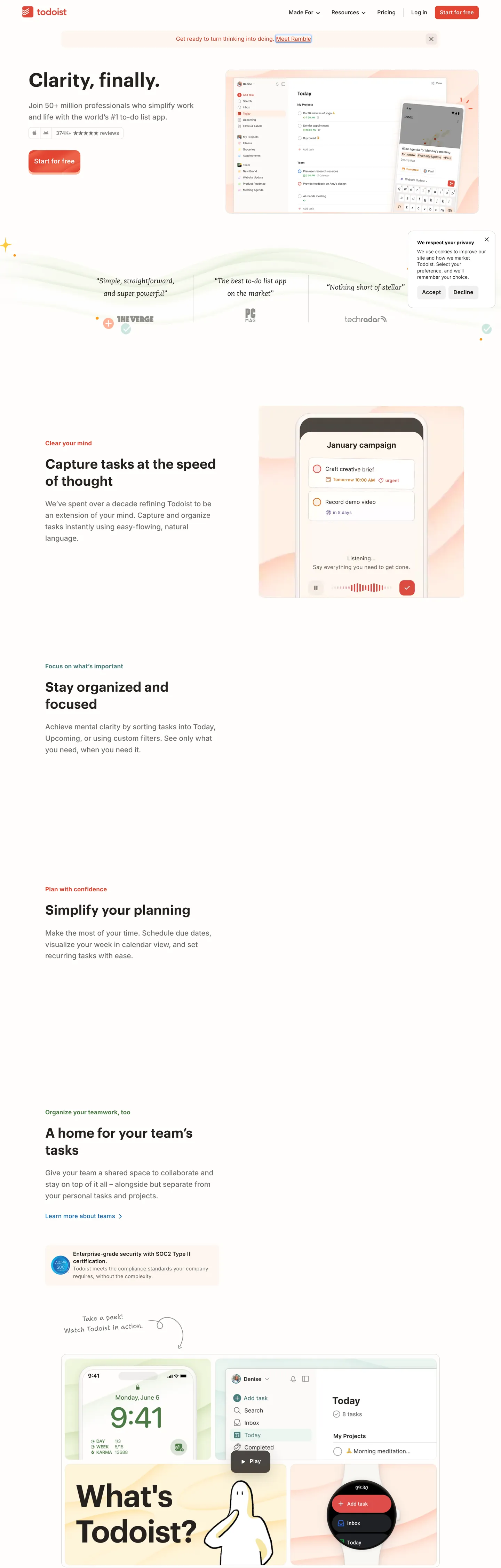
Todoist's marketing system reads like a warm paper notebook, not a SaaS landing page. The hero opens with "Clarity, finally." set in Graphik 600 at 55px with -0.55px tracking, sitting on an off-white canvas decorated with a wavy line doodle and pastel sparkles. The only chromatic voltage on the page is the Todoist Red ("#e34432") burning inside one pill button — "Start for free" — and a thin progress dot on the announcement bar above. Everything else (every headline, every body sentence, every 1px hairline, every checkbox outline) is rendered in the same warm-black ink "#25221e", a near-black that leans olive-brown rather than blue-gray.
This DESIGN.md packages the whole spec into one machine-readable file. Inside: 22 colors tokens covering the warm-black ink scale, the Todoist Red press states, the four pastel tile tints (peach, mint, butter, sky), and the supporting semantic colors for the in-product priority dots; 9 typography tokens split across Graphik (display 38–55px) and Inter (body 12–18px at the unusual weight 475), with a Caecilia serif for testimonial quotes and a hand-drawn Shantell Sans for margin doodles; 6 corner radii anchored on the dominant 8px; 9 spacing steps from 4px to 64px; and 19 components covering the red primary CTA, the secondary outline button, the announcement bar, the testimonial slab, the pastel feature tile grid, the FAB, and the task-row checkbox. Format follows the Google Labs DESIGN.md spec.
A working React developer feeds this file to Claude, Cursor, or Copilot and gets components that match Todoist's discipline — warm-black hairlines instead of a Tailwind gray scale, one red CTA per fold, body text at weight 475 rather than 400, illustration-led pastel tiles instead of gradient cards — instead of a generic shadcn theme. Reference the tokens directly inside Tailwind config, CSS variables, or your own component library. The system is worth studying for one reason: it proves that a productivity brand can hold restraint and warmth at the same time — Linear holds restraint on a black canvas, Notion holds warmth with purple pills; Todoist holds both at once with a notebook-paper canvas and a single red button.
What makes it distinct
5
- Warm-black ink ("#25221e") carries text AND every hairline421 text uses, 417 border uses, no separate gray scale
- Single-CTA disciplineTodoist Red ("#e34432") is the only brand voltage, paired with a darker red ("#cf3520") for hover and press
- Two-typeface splitGraphik 600 for display at -0.55px tracking, Inter at weight 475 for body (heavier than the 400 default)
- 8px radius dominant (33 uses)buttons, pills, and tiles all share the same corner; pills are reserved for chips and the FAB
- Hand-drawn Shantell Sans script in the marginsTodoist signs its illustrations like a notebook, not a marketing site
todoist.com
Live at todoist.com
A snapshot of the brand in production. Scroll the frame to see the whole page.
Colors
22 colors
Todoist's system runs on #e34432 as its primary voltage, used in 3 of 19 components. Type is set in Inter across 11 tokens from 12px to 55px, weights 400–600. Shape language is mixed across 19 components, blending pills, soft rounds, and squarer corners.
Brand & Accent
Sparing, CTA-only voltage · 3
Surface
Page and card backgrounds · 6
Text
Headlines, body, captions · 6
Borders & Hairlines
Dividers, outlines, rules · 2
Semantic
Status, errors, success, links · 5
Typography
11 type tokens
Set in Inter across 11 tokens, from 12px to 55px, weights 400–600. Shown in its own stack: where the font isn't installed, the fallback the file names stands in.
- display-hero55px · weight 600 · lh 1.15 · tracking -0.55pxThe quick brown fox jumps over the lazy dog
- display-lg44px · weight 600 · lh 1.15 · tracking -0.44pxThe quick brown fox jumps over the lazy dog
- display-md38px · weight 600 · lh 1.28 · tracking -0.19pxThe quick brown fox jumps over the lazy dog
- heading-md22px · weight 600 · lh 1.28The quick brown fox jumps over the lazy dog
- body-lg18px · weight 475 · lh 1.75 · tracking 0.09pxThe quick brown fox jumps over the lazy dog
- body-md16px · weight 400 · lh 1.6 · tracking 0.16pxThe quick brown fox jumps over the lazy dog
- body-sm14.5px · weight 475 · lh 1.5 · tracking 0.18pxThe quick brown fox jumps over the lazy dog
- button-md15.5px · weight 600 · lh 1.35 · tracking 0.155pxThe quick brown fox jumps over the lazy dog
- caption12px · weight 500 · lh 1.5 · tracking 0.3pxThe quick brown fox jumps over the lazy dog
- testimonial-serif20px · weight 400 · lh 1.8The quick brown fox jumps over the lazy dog
- doodle-script19px · weight 400 · lh 1.6 · tracking 0.19pxThe quick brown fox jumps over the lazy dog
Layout
Radii and spacing
6 corner radii and 9 spacing values. Shape language: mixed.
Radii
- none0px
- sm4px
- md8px
- lg10px
- xl15px
- full9999px
Spacing
- xxs4px
- xs8px
- sm12px
- md16px
- lg20px
- xl24px
- xxl32px
- section-sm48px
- section64px
Components
19 components
Each rendered from its tokens (color, type, radius, padding) on Todoist's own canvas.
- Button Primarybutton-primaryButton Primary
- Button Primary Hoverbutton-primary-hoverButton Primary Hover
- Button Primary Pressedbutton-primary-pressedButton Primary Pressed
- Button Secondarybutton-secondaryButton Secondary
- Button Ghostbutton-ghostButton Ghost
- Top Navtop-navTop Nav
- Announcement Barannouncement-barAnnouncement Bar
- Card Feature Peachcard-feature-peachCard Feature Peach
- Card Feature Mintcard-feature-mintCard Feature Mint
- Card Feature Buttercard-feature-butterCard Feature Butter
- Card Feature Skycard-feature-skyCard Feature Sky
- Card Basecard-baseCard Base
- Testimonial Quotetestimonial-quoteTestimonial Quote
- Type here…text-inputText Input
- Type here…text-input-focusedText Input Focused
- Checkbox Circlecheckbox-circleCheckbox Circle
- Fab Add Taskfab-add-taskFab Add Task
- Priority Dot Redpriority-dot-redPriority Dot Red
- Badge Metabadge-metaBadge Meta
In use
The system, in use
Todoist's tokens on the kind of product it builds.
Build something people actually use.
A short paragraph of marketing copy that previews how the brand's display tier and body tier read together. Two sentences is usually enough.
FAQ
Todoist design system FAQ
Common questions about Todoist's tokens, components, and how to use this DESIGN.md in your project.
Read next
Related reading
Specs, directories, and component libraries that pair with this design system.
- Browse all design systemsThe full directory of DESIGN.md files on shadcn.io, with live mockups for each.shadcn.io
- Todoist — official siteThe task manager and to-do list app this DESIGN.md was extracted from.todoist.com (opens in a new tab)
- The DESIGN.md specificationGoogle Labs' open spec for machine-readable design system files.github.com (opens in a new tab)
Use it
Use Todoist in your project
One machine-readable file. Drop it into Claude, Cursor, or any AI tool that reads DESIGN.md.
Download the DESIGN.md
One machine-readable file: every color, type, radius, spacing, and component token of Todoist.
Feed it to your AI tool
Drop it into Claude, Cursor, or GitHub Copilot. The agent writes React components and Tailwind classes that match Todoist's visual language.
Reference the tokens directly
Or paste the values into your Tailwind config, CSS variables, or component library: every color, size and radius is a quoted, ready-to-copy value.
Read the full DESIGN.md: overview, rationale, do’s and don’ts
Overview
Todoist's marketing chrome is a notebook-paper system, not a SaaS landing page — the canvas is an off-white "#ffffff" decorated with hand-drawn wavy-line doodles and pastel sparkle marks in the margins, and the only chromatic action on the page is a single red pill ("#e34432") burning at the top-right and again at the end of the hero. Set in Graphik 600 at 55px with -0.55px tracking, the headline "Clarity, finally." sits over the doodle without competing with it.
The single chromatic accent is Todoist Red {colors.primary} ("#e34432") — declared under the --color-td-primary CSS variable and used on exactly two surfaces above the fold: the "Start for free" CTA pill and a small dot inside the announcement bar. Hover transitions to {colors.primary-hover} ("#ee5244") and pressed state lands on {colors.primary-pressed} ("#cf3520"). Todoist holds the red back from body text, hairlines, and large surfaces — the rest of the system runs on a single warm-black ink (#25221e) that does double duty as text AND as every 1px border.
Warm-black duality: The extracted CSS maps "#25221e" to 38 distinct variable names — --display-onlight-primary, --ui-border, --field-outline-border-idle, --card-border-onhover, and so on — and the same hex appears 853 times across the page (421 as text, 417 as border). Where most SaaS systems separate the text token from the hairline token with a 10-step gray scale, Todoist collapses both onto one warm-black ink and reaches the perceived hierarchy through transparency layers (--greytransparent-50 through --greytransparent-900). The result reads like ink fading on paper rather than gray-on-white chrome.
Display type runs Graphik 600 with negative letter-spacing (-0.55px at 55px, -0.19px at 38px) on every h1 and h2. Body type runs Inter at weight 475 — between regular and medium — at 15.5–18px with positive letter-spacing (~0.09–0.18px), which gives Todoist's prose a slightly heavier, slightly looser texture than the weight-400 default most SaaS sites ship with. A Caecilia serif is reserved for blockquote testimonials at 20px regular with a 1.8 line-height, and a Shantell Sans script handles one hand-drawn margin label ("Take a peek!").
Single-radius geometry: 8px is the dominant corner (33 uses) — the primary CTA pill, the announcement bar inner shape, secondary outline buttons, and small chips all share it. 10–15px is reserved for larger cards and pastel feature tiles below the fold. Full-pill 9999px is reserved for in-product affordances only: the circular task checkbox, the bottom-right floating add-task button, and the small priority dots. Where Linear leans on 12px cards with a dark canvas and Notion leans on 8px rectangles with bold pastels, Todoist sits between them — sharing Notion's rectangle-leaning geometry while reserving true pills for the in-product layer.
Key Characteristics:
- Warm-black ink (
{colors.ink}"#25221e") carries text AND every hairline — 38 CSS variables, 853 total uses, no separate gray scale. - Single chromatic CTA — Todoist Red ("#e34432") used on exactly one button per fold, with
{colors.primary-hover}and{colors.primary-pressed}for the only state variants. - Two-family display/body split — Graphik 600 for display at -0.55px tracking, Inter at weight 475 for body (heavier than the 400 default).
- 8px radius dominant (33 uses); 10–15px for feature tiles; 9999px reserved for in-product checkbox / FAB / priority dots.
- Pastel feature-tile palette (peach "#ffb399", mint "#ebf5f0", butter "#fff5db", sky "#dceaff") under the fold — echoes the in-product priority and label colors.
- Caecilia serif for testimonials, Shantell Sans script for one hand-drawn margin label — typographic warmth without abandoning the system.
- Off-white canvas decorated with wavy-line doodles and sparkle marks — Todoist signs the marketing page like a notebook page, not a marketing site.
- Light-only marketing surface; the in-product dark theme is documented separately and not captured here.
Known Gaps
- The in-product dark theme is not captured here — only the marketing surface, which is light-only.
- Animation and transition timings were not extracted; 150–200ms ease is a safe default.
- Form-field error and validation states are not fully surfaced beyond the focused-input border (
2px solid {colors.primary}). - Graphik and Inter (and Caecilia, and Shantell Sans) are commercial families — Inter alone, or DM Sans paired with Inter, are acceptable open-source substitutes.
- The four pastel tile tints (peach, mint, butter, sky) are observed from the captured feature row; Todoist's full in-product label palette carries additional tints (red-200, fuschia-200, purple-200, sea-salt-200) that aren't surfaced in this extract.
- The hand-drawn doodle vocabulary (wavy lines, sparkles, the "Take a peek!" arrow) is rasterized inside SVG illustrations; it isn't a separately tokenizable asset.
Productivity & SaaS
More systems like this
More DESIGN.md files in Productivity & SaaS.
Pricing
Build it with Pro
The DESIGN.md files are free. Pro adds 6,000+ blocks, premium templates and the MCP server, so your AI editor builds in your system for you.
4.9/5 out of 5 · 150+ reviewsfrom 150+ founders and developers.
Billing
Billed once a year in USD. Cancel anytime.
- How many people can use the license.
- Client work, SaaS products and anything you charge for.
- Production-ready React sections: hero, pricing, features, dashboards and more.
- Complete multi-page sites you can ship as they are.
- React icons from every major library, installable with one command.
- Presets that restyle every block, in light and dark.
- Lets your AI editor search, preview and install blocks for you.
- Priority requests are answered first.
Individual
For personal projects & open source
$32instead of $49/mo
$389 billed yearly
- Seats: 1 seat
- Commercial use: Personal & open source only
- Pro blocks: 6,000+ blocks
- Templates: All 14 templates
- React icons: 294k+ icons
- Themes: All 59 themes
- MCP server: Basic usage
- Support: Standard
Team
Most popularFor freelancers, agencies & startups
$66instead of $99/mo
$789 billed yearly · ≈ $13/dev/mo
- Seats: Up to 5 seats
- Commercial use: Included
- Pro blocks: 6,000+ blocks
- Templates: All 14 templates
- React icons: 294k+ icons
- Themes: All 59 themes
- MCP server: High usage
- Support: Priority
Organization
For companies with larger teams
$132instead of $199/mo
$1,589 billed yearly
- Seats: Unlimited seats
- Commercial use: Included
- Pro blocks: 6,000+ blocks
- Templates: All 14 templates
- React icons: 294k+ icons
- Themes: All 59 themes
- MCP server: Unlimited usage
- Support: Priority
Billed once a year in USD. Cancel anytime.
Individual
For personal projects & open source
$32instead of $49/mo
$389 billed yearly
- How many people can use the license.Seats: 1 seat
- Client work, SaaS products and anything you charge for.Commercial use: Personal & open source only
- Production-ready React sections: hero, pricing, features, dashboards and more.Pro blocks: 6,000+ blocks
- Complete multi-page sites you can ship as they are.Templates: All 14 templates
- React icons from every major library, installable with one command.React icons: 294k+ icons
- Presets that restyle every block, in light and dark.Themes: All 59 themes
- Lets your AI editor search, preview and install blocks for you.MCP server: Basic usage
- Priority requests are answered first.Support: Standard
Team
Most popularFor freelancers, agencies & startups
$66instead of $99/mo
$789 billed yearly · ≈ $13/dev/mo
Everything in Individual, plus
- How many people can use the license.Seats: Up to 5 seats
- Client work, SaaS products and anything you charge for.Commercial use: Included
- Lets your AI editor search, preview and install blocks for you.MCP server: High usage
- Priority requests are answered first.Support: Priority
Organization
For companies with larger teams
$132instead of $199/mo
$1,589 billed yearly
Everything in Team, plus
- How many people can use the license.Seats: Unlimited seats
- Lets your AI editor search, preview and install blocks for you.MCP server: Unlimited usage
- Secure checkout via Stripe
- Code lives in your repo
- Keep what you've shipped if you cancel
- License terms
Your system, built for you
Every block, template and icon, installed by your AI agent in your design system. The DESIGN.md files stay free.