ClickUp Design System
ClickUp's design system as a DESIGN.md file. Neon purple #7612fa, gradient CTA, Plus Jakarta Sans, 22 components. For React, Next.js, and AI tools.
Add shadcn.io to your AI agent. · Pro It installs blocks, icons and templates in your design system from a prompt, with Pro.
Set up MCP- Primary
- #7612fa
- Typeface
- Plus Jakarta Sans
- Shape
- Soft
- Base radius
- 12px
- Colors
- 28
- Type tokens
- 13
- Components
- 22
- Spacing values
- 9
About
About ClickUp DESIGN.md
Curated by Dov Azencot · Updated May 13, 2026 · Source clickup.com (opens in a new tab)
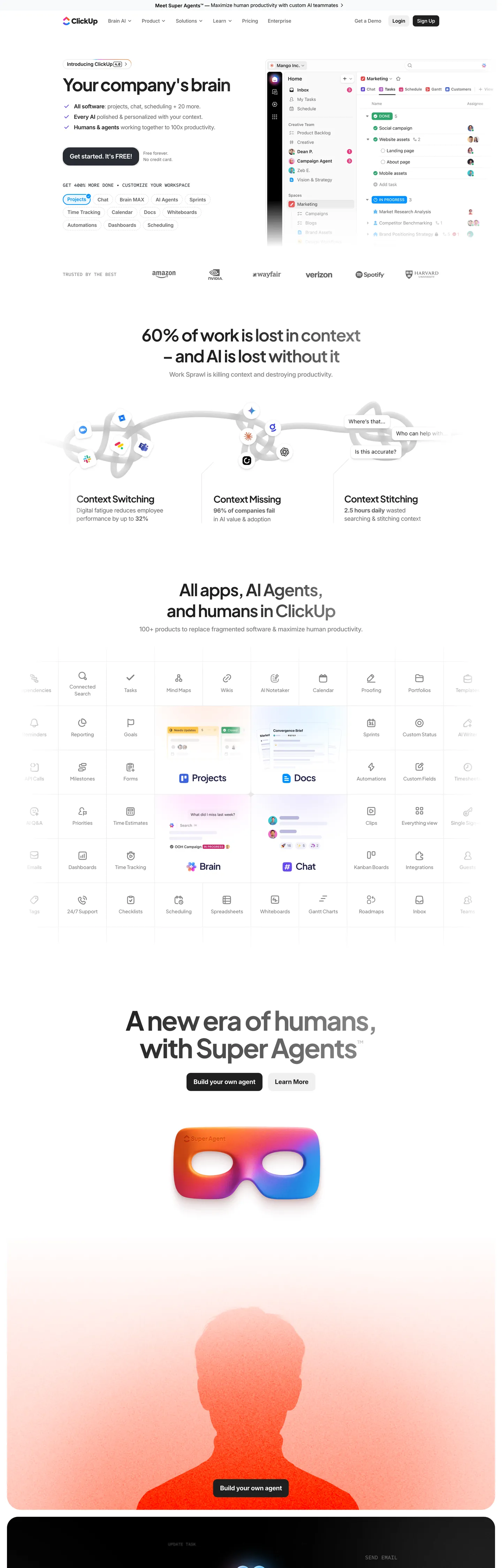
ClickUp's homepage is a white canvas with one voltage and one gradient. The page floor is "#ffffff" with graphite "#292d34" carrying every heading and every hairline (3585 occurrences across text and border). The dominant chromatic signal is neon purple "#7612fa" — but it appears almost exclusively inside the primary-CTA gradient `linear-gradient(263deg, #fa12e3 -35%, #7612fa 41%, #12d0fa 135%)`, not as a flat fill. The hero CTA itself ("Get started. It's FREE!") is the inversion of that rule: a near-black "#292d34" pill at 20px radius, white text, weight 650. The gradient sits behind secondary "Try ClickUp Brain" surfaces and the wordmark, while the page itself stays calm.
This DESIGN.md packages the homepage spec into one Google Labs DESIGN.md file. Inside: 28 colors tokens grouped into a graphite text ladder ("#292d34" through "#838383", "#b4b4b4"), a near-black-button family, a brand layer for neon purple "#7612fa", lavender link "#7b68ee" and the deep-blue utility "#4a2fff", and the 7 accent badge colors (blue "#0091ff", purple "#6647f0", pink "#ff02f0", orange "#f76808", green "#078d3b", red "#f0382d") drawn from the `--Core-Accents-*` CSS variable set. Typography spans 12 tokens running Plus Jakarta Sans for display and Inter for chrome, with Sometype Mono reserved for uppercase eyebrows. Eight rounded values (4px chip, 9px button, 12px tile, 14px card, 20px hero-pill, 25px section, 35px feature panel, 9999px avatar), nine spacing tokens on a 10px base, and 22 components covering buttons, cards, the workspace-app tile grid, gradient hero CTA, dark pill CTA, top nav and footer.
Feed the file to Claude, Cursor, or GitHub Copilot and the agent reproduces ClickUp's actual move — gradient reserved for one CTA family, dark pill for the primary, graphite text on white, Plus Jakarta display paired with Inter chrome — instead of a generic purple-SaaS theme. Or reference the tokens directly: every hex, font, radius, and spacing value is a quoted scalar you can paste into Tailwind config, CSS variables, or a component library. ClickUp is worth studying because it positions a multi-color gradient as the brand voltage without letting it leak across the rest of the page — every other surface is sober graphite-on-white.
What makes it distinct
5
- Gradient-as-brand voltagethe primary CTA is a 263deg sweep through #fa12e3, #7612fa and #12d0fa, never a flat fill
- Graphite over true blackpage text sits at #292d34 (1830 occurrences) so headings read warm against the white canvas, not stark
- Plus Jakarta Sans for display, Inter for chrometwo-family split with -3.04px tracking at the 76px hero
- Dark-pill primary CTAthe 'Get started. It is FREE!' button renders #292d34 background at 20px radius, not the brand gradient
- Sometype Mono uppercase eyebrowsthe only mono surface in a system that otherwise runs two sans families
clickup.com
Live at clickup.com
A snapshot of the brand in production. Scroll the frame to see the whole page.
Colors
28 colors
ClickUp's system anchors on #7612fa (primary) as its primary color. Type is set in Plus Jakarta Sans across 13 tokens from 12px to 76px, weights 400–700. Shape language is soft — components average 17px corner radius, with no sharp interactive edges.
Brand & Accent
Sparing, CTA-only voltage · 15
Surface
Page and card backgrounds · 3
Text
Headlines, body, captions · 6
Borders & Hairlines
Dividers, outlines, rules · 2
Other
Specialty colors · 2
Typography
13 type tokens
Set in Plus Jakarta Sans across 13 tokens, from 12px to 76px, weights 400–700. Shown in its own stack: where the font isn't installed, the fallback the file names stands in.
- display-3xl76px · weight 700 · lh 1.05 · tracking -3.04pxThe quick brown fox jumps over the lazy dog
- display-2xl60px · weight 650 · lh 1.1 · tracking -2.1pxThe quick brown fox jumps over the lazy dog
- display-xl48px · weight 650 · lh 1.25 · tracking -1.68pxThe quick brown fox jumps over the lazy dog
- display-lg40px · weight 650 · lh 1.2 · tracking -1.6pxThe quick brown fox jumps over the lazy dog
- display-md34px · weight 650 · lh 1.2 · tracking -1.36pxThe quick brown fox jumps over the lazy dog
- heading-md26px · weight 650 · lh 1.25 · tracking -0.91pxThe quick brown fox jumps over the lazy dog
- heading-sm18px · weight 650 · lh 1.33 · tracking -0.54pxThe quick brown fox jumps over the lazy dog
- body-lg18px · weight 500 · lh 1.33 · tracking -0.36pxThe quick brown fox jumps over the lazy dog
- body-md16px · weight 400 · lh 1.375 · tracking -0.32pxThe quick brown fox jumps over the lazy dog
- body-sm14px · weight 400 · lh 1.43 · tracking -0.15pxThe quick brown fox jumps over the lazy dog
- button-md14px · weight 600 · lh 1.43 · tracking -0.15pxThe quick brown fox jumps over the lazy dog
- eyebrow-mono14px · weight 500 · lh 1.29 · tracking 0pxThe quick brown fox jumps over the lazy dog
- caption12px · weight 400 · lh 1.5 · tracking -0.12pxThe quick brown fox jumps over the lazy dog
Layout
Radii and spacing
8 corner radii and 9 spacing values. Shape language: soft.
Radii
- xxs4px
- sm9px
- md12px
- lg14px
- pill20px
- xl25px
- xxl35px
- full9999px
Spacing
- xxs4px
- xs8px
- sm12px
- md20px
- lg24px
- xl40px
- xxl60px
- section100px
- hero150px
Components
22 components
Each rendered from its tokens (color, type, radius, padding) on ClickUp's own canvas.
- Button Primarybutton-primaryButton Primary
- Button Primary Hoverbutton-primary-hoverButton Primary Hover
- Button Gradientbutton-gradientButton Gradient
- Button Secondarybutton-secondaryButton Secondary
- Button Tertiarybutton-tertiaryButton Tertiary
- Top Navtop-navTop Nav
- Nav Linknav-linkNav Link
- Card Tilecard-tileCard Tile
- Card Featurecard-featureCard Feature
- Card Feature Panelcard-feature-panelCard Feature Panel
- Card Sectioncard-sectionCard Section
- Hero Bandhero-bandHero Band
- Pricing Cardpricing-cardPricing Card
- Pricing Card Featuredpricing-card-featuredPricing Card Featured
- Badge Accentbadge-accentBadge Accent
- Badge Pillbadge-pillBadge Pill
- App Icon Chipapp-icon-chipApp Icon Chip
- Type here…text-inputText Input
- Type here…text-input-focusedText Input Focused
- Cta Banner Lightcta-banner-lightCta Banner Light
- Footer Regionfooter-regionFooter Region
- Footer Linkfooter-linkFooter Link
In use
The system, in use
ClickUp's tokens on the kind of product it builds.
Build something people actually use.
A short paragraph of marketing copy that previews how the brand's display tier and body tier read together. Two sentences is usually enough.
FAQ
ClickUp design system FAQ
Common questions about ClickUp's tokens, components, and how to use this DESIGN.md in your project.
Read next
Related reading
Specs, directories, and component libraries that pair with this design system.
- Browse all design systemsThe full directory of DESIGN.md files on shadcn.io, with live mockups for each.shadcn.io
- ClickUp — official siteClickUp's marketing homepage — the everything app for work, with tasks, docs, goals, and chat.clickup.com (opens in a new tab)
- The DESIGN.md specificationGoogle Labs' open spec for machine-readable design system files — the format this page is built on.github.com (opens in a new tab)
Use it
Use ClickUp in your project
One machine-readable file. Drop it into Claude, Cursor, or any AI tool that reads DESIGN.md.
Download the DESIGN.md
One machine-readable file: every color, type, radius, spacing, and component token of ClickUp.
Feed it to your AI tool
Drop it into Claude, Cursor, or GitHub Copilot. The agent writes React components and Tailwind classes that match ClickUp's visual language.
Reference the tokens directly
Or paste the values into your Tailwind config, CSS variables, or component library: every color, size and radius is a quoted, ready-to-copy value.
Read the full DESIGN.md: overview, rationale, do’s and don’ts
Overview
ClickUp's marketing system is a productivity SaaS that hides its purple voltage inside a gradient and leaves the rest of the page on graphite-and-white. The canvas is {colors.canvas} ("#ffffff"); the page-floor text is {colors.ink} ("#292d34"), a warm graphite that appears 3585 times across text and hairline borders. The single saturated chromatic signal is neon purple {colors.primary} ("#7612fa"), which lives almost entirely inside the primary CTA gradient linear-gradient(263deg, #fa12e3 -35%, #7612fa 41%, #12d0fa 135%). A quieter lavender {colors.brand-link} ("#7b68ee") sits in the --color-brand-clickup variable and surfaces on inline links and footer chrome.
Gradient-as-brand: where most productivity tools commit to one flat brand swatch (Asana coral, Linear lavender, Notion purple-pill), ClickUp's identity is the 263-degree magenta-to-purple-to-cyan sweep itself. The flat "#7612fa" hex never appears as a section background — it's a stop inside the gradient, not a fill. The hero CTA inverts this rule one more time: "Get started. It's FREE!" renders as a dark pill at {colors.ink} ("#292d34") with white text, 20px radius, weight 650. The gradient stays in supporting CTAs and brand surfaces while the dominant action goes graphite.
Display type runs Plus Jakarta Sans at weight 650-700 with negative tracking that pulls hardest at the top of the ramp — the hero h2 hits 76px / weight 700 / -3.04px letter-spacing (the --display-3xl token). Body copy, nav links, and button labels switch to Inter at weight 400-600. A third family, Sometype Mono uppercase at 14px / 500, is reserved for eyebrow labels — the only mono surface on the page.
Page rhythm leans on a workspace-app tile grid rather than atmospheric color. Below the hero, ClickUp renders dense 6-column grids of small product-app icons (Tasks, Docs, Goals, Chat, Whiteboards, Forms…) inside 12px-rounded white tiles with 1px hairline borders. The visual density of the grid is the design move; the marketing chrome stays calm so the grid can do the heavy lifting.
Key Characteristics:
- Light-canvas marketing system —
{colors.canvas}("#ffffff") with graphite{colors.ink}("#292d34") carrying every heading and hairline. - Gradient-as-brand voltage — primary CTA renders the 263deg magenta-purple-cyan sweep; flat "#7612fa" never fills a section.
- Dark pill primary —
{colors.ink}("#292d34") background, white text,{rounded.pill}20px radius, weight 650. - Plus Jakarta Sans display paired with Inter chrome; Sometype Mono reserved for uppercase eyebrows.
- Aggressive negative tracking on display — -3.04px at 76px, scaling to -0.15px at 14px body.
- Eight-step radius scale — from
{rounded.xxs}4px chips through{rounded.xxl}35px feature panels. - Workspace-app tile grid carries the product story; no atmospheric gradients, no spotlight cards.
Colors
- ClickUp neon purple (
#7612fa) — frequency 426. Used as background (426), text (0), border (0). The brand voltage, but reserved almost exclusively for the primary CTA gradient stop and the "ClickUp Brain" wordmark accent — never a flat section fill. - Graphite ink (
#292d34) — frequency 3585. Used as text (1830), border (1750), bg (1). The page-floor text color; pairs with the canvas as the dominant ink layer and carries hairline borders below content blocks. - Page-floor white (
#ffffff) — frequency 173. Used as bg (95), border (32), text (31). Canvas color for--Core-Background-Main; also appears as text inside the dark pill CTA and the gradient buttons. - Surface soft (
#e9ebf0) — frequency 529. Used as bg (510), border (10), text (8). The light tile background carrying app-grid chips, secondary buttons, and the lighter strip dividers between hero sections. - Ink secondary (
#646464) — frequency 201. Used as text (108), border (91), bg (2). Mapped to--Core-Text-Secondary; carries dimmed copy, nav-link inactive states, and footer labels. - Brand link lavender (
#7b68ee) — frequency 46. Used as text (25), border (21). The--color-brand-clickupand--color-linkvalue; scoped to inline links, "Learn more" affordances, and footer accent dots — never a button background. - Ink tertiary (
#838383) — frequency 142. Used as text (71), border (71). Mapped to--Core-Text-Tertiary; the third tier of the warm-gray ramp for meta labels and caption copy. - Ink deep (
#202020) — frequency 119. Used as text (50), border (54), bg (7). Mapped to--Core-Text-Mainand--Core-Button-Primary; the deepest non-black ink, used for emphasis copy and the hover state of the dark pill CTA. - Ink darkest (
#090c1d) — frequency 100. Used as text (50), border (50). A near-black navy used for compressed dark surfaces (the bottom CTA banner border, certain dark-mode product mockups). - Accent blue (
#0091ff) — frequency 28. Used as gradient (17), text (5), border (5), shadow (1). The--Core-Accents-Bluevalue; appears in the in-product UI mockups for "Tasks" and "Calendar" tile icons and in the secondary CTA gradient halo. - Accent purple (
#6647f0) — frequency 21. Used as text (9), border (9), gradient (3). The--Core-Accents-Purplevalue; mapped to the AI-feature label chips and the "ClickUp Brain" subhead accent. - Hairline (
#e8e8e8) — drawn from--Core-Border-Default. Carries every 1px divider between feature cards, app-tile grids, and the footer region. - Hairline strong (
#d9d9d9) — frequency 15. Mapped to--Core-Button-Secondary-Hover; used as the inactive border on form inputs and the resting state of secondary buttons. - Shadow indigo (
#122ba5) — frequency 12. Used exclusively as a shadow stop (shadow 12). Tints the deep-purple drop shadow under hero mockups; not a fill color. - Brand pink (
#fa24ce), brand orange (#f76808), brand coral (#fc6d7b), brand amber (#fd9a46), brand sky (#4fb9fa) — each at gradient frequency 4. The brand-color spectrum used inside icon illustrations and gradient halos around feature mockups; none of them fills a content surface. - Accent magenta (
#a43cb4), accent green (#078d3b), accent red (#f0382d) — drawn from--Core-Accents-Pink,--Core-Utilities-Green,--Core-Utilities-Red; reserved for in-product status badges and semantic chips.
Typography
ClickUp runs two type families plus a mono accent. Plus Jakarta Sans carries every display tier — {typography.display-3xl} lands at 76px / weight 700 with -3.04px tracking (the hero h2 token, --display-3xl), and the ramp scales down through 60px, 48px, 40px, 34px, 26px headings, each at weight 650 with proportional negative tracking. Inter takes over for body copy, nav links, and button labels: 18px lg / 16px md / 14px sm at weight 400-600 with -0.15px to -0.36px tracking.
Mono as eyebrow signature: where most SaaS marketing pages use uppercase Inter or Geist for eyebrow labels, ClickUp swaps in Sometype Mono at 14px / weight 500 / uppercase / 0 tracking. The mono family appears only in this eyebrow role — the body copy and headlines stay proportional. It's the typographic signal that the section underneath belongs to a product surface rather than marketing prose.
Weight discipline is tight: display tokens cluster at 650-700, body holds at 400-500, and buttons render at 600-650. No weight 800/900 anywhere, no italic anywhere on the homepage, and the system never crosses Plus Jakarta into a body role or Inter into a display role.
Layout
The page is centered on a --size-v3-homepage-container of 1160px, with --breakpoint-v3-container set at 70rem. Section padding lives at 80-150px vertical (--spacing-stack-spacing-desktop is 150px); inline gutter is 40px desktop, 20px mobile. The 10px base unit (--spacing-1 is 10px) drives a generous rhythm — most stacking lands at 20px, 40px, or 60px multiples, not the tighter 4px / 8px scale typical of dev-tooling marketing pages.
The hero is centered (headline, eyebrow, dual CTA pair, mockup floating beneath). Below the hero, the page cycles through 6-column app-icon tile grids, 3-column feature mockup cards, and a centered-headline section pattern that breaks every 100px of vertical scroll. Section dividers are 1px hairlines at {colors.hairline} — no full-width band changes inside the body region.
Elevation & Depth
Shadows are tinted, not gray. The hero mockup card uses a layered drop shadow with #122ba5 (deep indigo, 12 occurrences as a shadow stop) and #1b1754 (navy, 4 occurrences as shadow) as the tint colors — the shadow color echoes the brand purple rather than being neutral. Tokens are organized in --shadow-xs (0 4px 12px), --shadow-sm (0 10px 25px), --shadow-md (0 20px 60px), --shadow-lg (0 16px 78px), and --shadow-xl (0 34px 54px).
The page itself avoids heavy elevation: app-tile grids and feature cards rest on the canvas with 1px hairline borders, not drop shadows. Only the hero mockup and the bottom CTA banner lift visibly. Hover states use the 0.25s cubic-bezier(0.5, 0, 0.5, 1) transition (the --transition-short token) — short, slightly anticipatory.
Shapes
The corner-radius scale is wider than most SaaS marketing pages. Avatars and icon chips push to {rounded.full} (50%, 926 occurrences — by far the dominant radius). Chips and badges land at {rounded.xxs} (4px), secondary buttons and inputs at {rounded.sm} (9px, 52 occurrences), app-grid tiles at {rounded.md} (12px, 16 occurrences), feature cards at {rounded.lg} (14px, 9 occurrences), the primary CTA pill at {rounded.pill} (20px, 4 occurrences), section panels at {rounded.xl} (25px), and oversized feature frames at {rounded.xxl} (35px, the --border-radius-xl token).
The geometry contrast is deliberate: chips are nearly square (4px), tiles are softly square (12px), buttons are pill-tipped (20px), and feature panels feel oversized-rounded (35px). The radius scale itself carries hierarchy without resorting to color or shadow shifts.
Components
button-primary— the dark pill CTA. Background{colors.ink}("#292d34"), text{colors.canvas}, typography{typography.body-lg}(Inter 18px / 650),{rounded.pill}20px, padding 14px 20px, height 52px. The dominant action on every section.button-primary-hover— pressed state. Shifts the background to{colors.ink-deep}("#202020") while keeping the rest of the spec.button-gradient— the secondary-tier CTA. Background renders the263deg, #fa12e3 -35%, #7612fa 41%, #12d0fa 135%gradient with white text at the same body-lg / pill geometry as the dark primary.button-secondary— the soft secondary action. Background{colors.surface-soft}("#e9ebf0"),{rounded.sm}9px, 1px hairline border.button-tertiary— text-only affordance. Transparent background,{colors.brand-link}("#7b68ee") text for inline "Learn more" links.top-nav— 60px height, canvas background, ink text, no border. Sticky on scroll with a subtle resting-state hairline.nav-link— transparent affordance,{colors.ink}text at body-md.card-tile— the app-grid tile. Canvas background, 1px hairline border,{rounded.md}12px, 20px padding. Houses a single product icon and label.card-feature— the 3-column feature mockup tile. Canvas background,{rounded.lg}14px, 24px padding, 1px hairline.card-feature-panel— the oversized feature panel.{rounded.xxl}35px, 40px padding.card-section— the surface-tinted background panel.{colors.surface}("#f8f9fa") background,{rounded.xl}25px, 60px padding — used for the "Brain" and "Chat" feature bands.hero-band— the hero region. Canvas background, no border, 80px top / 8px bottom padding so the mockup card can break out underneath.pricing-card+pricing-card-featured— the 4-tier pricing comparison rows. Featured tier gets a 2px{colors.primary}purple border.badge-accent— the eyebrow badge with Sometype Mono uppercase typography,{rounded.xxs}4px chip geometry.badge-pill— the meta status badge with caption typography,{rounded.full}pill shape.app-icon-chip— the 40px circular icon chip in the app-grid header.text-input+text-input-focused— 44px-tall inputs at{rounded.sm}9px. Focus shifts the border to a 2px{colors.primary}purple.cta-banner-light— the bottom-of-page CTA banner.{colors.surface}background,{rounded.xxl}35px, 60px padding.footer-region+footer-link— the multi-column footer with{colors.ink-secondary}("#646464") text at body-sm.
Do's and Don'ts
Do keep neon purple "#7612fa" inside the gradient. The flat hex never appears as a section background on ClickUp's homepage — using it as a fill breaks the gradient-as-brand discipline. For a purple surface, use the lavender brand-link "#7b68ee" instead.
Do render the primary CTA in graphite "#292d34" with white text, not in purple. The inversion (dark pill against the gradient-rendered secondary) is the visual rhythm of the page.
Do pair Plus Jakarta Sans 650-700 display with Inter 400-600 body. Crossing the families (Inter at 76px, Plus Jakarta at 14px) breaks the two-family contract — the validator can not catch this, only your eye can.
Don't use "#7b68ee" lavender for a CTA background. It is a --color-link and --color-brand-clickup text/border value (46 occurrences, 25 as text, 21 as border) — never a button fill. For a purple-leaning CTA, use the gradient.
Don't apply the --shadow-md (0 20px 60px) drop shadow with a neutral gray tint. ClickUp's shadows are tinted "#122ba5" deep indigo or "#1b1754" navy — the shadow color echoes the brand purple. A neutral-gray shadow reads as a different design system.
Don't mix radius tiers inside a single component cluster. Pricing cards ({rounded.lg} 14px) should not sit next to feature panels ({rounded.xxl} 35px) in the same row — pick one. The wide radius scale carries hierarchy only when each tier stays within its lane.
Don't use uppercase tracking on Plus Jakarta Sans headlines. Uppercase is reserved for the Sometype Mono eyebrow role at 14px / weight 500 — pushing display headings into uppercase breaks the eyebrow-vs-headline reading hierarchy.
Known Gaps
- The text-input geometry is inferred from sibling productivity tools (the homepage is read-only above the fold and does not surface a styled form input).
- Dark-mode token values are not documented for the marketing surfaces — the in-app dark theme is a separate spec.
- Motion specifics for the gradient hover state (the magenta-to-cyan sweep animates on hover) were not extracted beyond the 0.25s
cubic-bezier(0.5, 0, 0.5, 1)baseline. - The 7-color accent badge palette is drawn from
--Core-Accents-*CSS variables; the actual in-product label palette may include additional hues for project tags and priority levels. - Form-validation states (success, error) are not surfaced on the captured homepage; the
--color-errorand--color-successCSS variables are documented but not visible in components.
Project Management
More systems like this
More DESIGN.md files in Project Management.
Pricing
Build it with Pro
The DESIGN.md files are free. Pro adds 6,000+ blocks, premium templates and the MCP server, so your AI editor builds in your system for you.
4.9/5 out of 5 · 150+ reviewsfrom 150+ founders and developers.
Billing
Billed once a year in USD. Cancel anytime.
- How many people can use the license.
- Client work, SaaS products and anything you charge for.
- Production-ready React sections: hero, pricing, features, dashboards and more.
- Complete multi-page sites you can ship as they are.
- React icons from every major library, installable with one command.
- Presets that restyle every block, in light and dark.
- Lets your AI editor search, preview and install blocks for you.
- Priority requests are answered first.
Individual
For personal projects & open source
$32instead of $49/mo
$389 billed yearly
- Seats: 1 seat
- Commercial use: Personal & open source only
- Pro blocks: 6,000+ blocks
- Templates: All 14 templates
- React icons: 294k+ icons
- Themes: All 59 themes
- MCP server: Basic usage
- Support: Standard
Team
Most popularFor freelancers, agencies & startups
$66instead of $99/mo
$789 billed yearly · ≈ $13/dev/mo
- Seats: Up to 5 seats
- Commercial use: Included
- Pro blocks: 6,000+ blocks
- Templates: All 14 templates
- React icons: 294k+ icons
- Themes: All 59 themes
- MCP server: High usage
- Support: Priority
Organization
For companies with larger teams
$132instead of $199/mo
$1,589 billed yearly
- Seats: Unlimited seats
- Commercial use: Included
- Pro blocks: 6,000+ blocks
- Templates: All 14 templates
- React icons: 294k+ icons
- Themes: All 59 themes
- MCP server: Unlimited usage
- Support: Priority
Billed once a year in USD. Cancel anytime.
Individual
For personal projects & open source
$32instead of $49/mo
$389 billed yearly
- How many people can use the license.Seats: 1 seat
- Client work, SaaS products and anything you charge for.Commercial use: Personal & open source only
- Production-ready React sections: hero, pricing, features, dashboards and more.Pro blocks: 6,000+ blocks
- Complete multi-page sites you can ship as they are.Templates: All 14 templates
- React icons from every major library, installable with one command.React icons: 294k+ icons
- Presets that restyle every block, in light and dark.Themes: All 59 themes
- Lets your AI editor search, preview and install blocks for you.MCP server: Basic usage
- Priority requests are answered first.Support: Standard
Team
Most popularFor freelancers, agencies & startups
$66instead of $99/mo
$789 billed yearly · ≈ $13/dev/mo
Everything in Individual, plus
- How many people can use the license.Seats: Up to 5 seats
- Client work, SaaS products and anything you charge for.Commercial use: Included
- Lets your AI editor search, preview and install blocks for you.MCP server: High usage
- Priority requests are answered first.Support: Priority
Organization
For companies with larger teams
$132instead of $199/mo
$1,589 billed yearly
Everything in Team, plus
- How many people can use the license.Seats: Unlimited seats
- Lets your AI editor search, preview and install blocks for you.MCP server: Unlimited usage
- Secure checkout via Stripe
- Code lives in your repo
- Keep what you've shipped if you cancel
- License terms
Your system, built for you
Every block, template and icon, installed by your AI agent in your design system. The DESIGN.md files stay free.