Whimsical Design System
Whimsical's marketing site uses a violet-to-magenta gradient as the entire above-fold canvas, with 96px Agrandir display in white. Tokens for React, Next.js, and AI coding tools.
Add shadcn.io to your AI agent. · Pro It installs blocks, icons and templates in your design system from a prompt, with Pro.
Set up MCP- Primary
- #250835
- Typeface
- Manrope
- Shape
- Soft
- Base radius
- 9px
- Colors
- 9
- Type tokens
- 13
- Components
- 16
- Spacing values
- 10
About
About Whimsical DESIGN.md
Curated by Dov Azencot · Updated May 19, 2026 · Source whimsical.com (opens in a new tab)
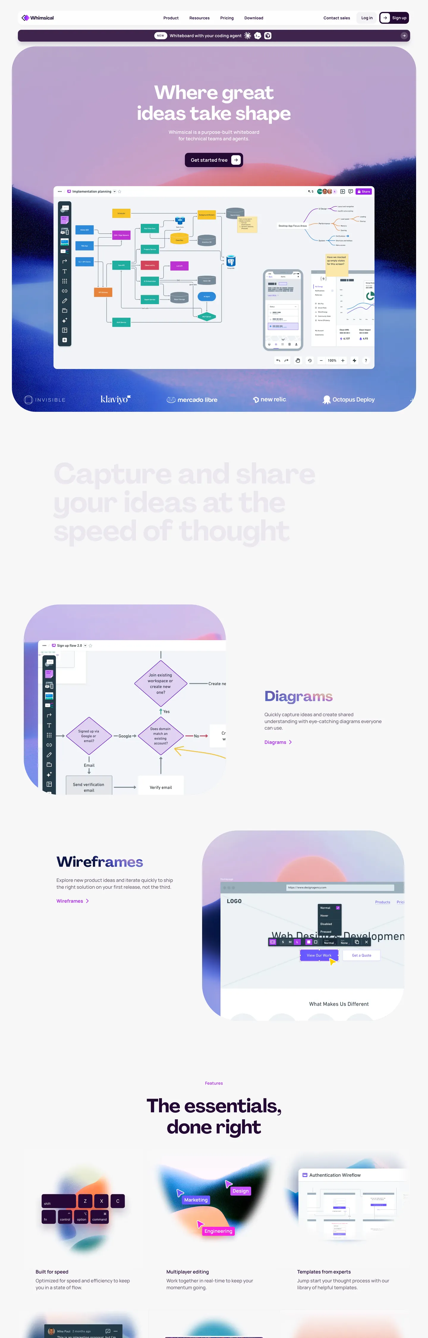
Whimsical's marketing site does something most diagramming brands avoid: it gives the hero a saturated gradient instead of a flat surface. The above-fold is a violet-to-magenta gradient field (deep plum at the corners, lavender toward the center, with a grain texture overlay riding on top), carrying a 96px Agrandir display headline in white ("Where great ideas take shape"), a dark plum CTA pill, and a tilted laptop mockup showing the Whimsical editor surface with rainbow-colored sticky-note nodes — mint, aqua, blue, purple, hot-pink, yellow — laid out across a flow diagram. Where Figma and Miro keep their hero canvases on white or near-white, and Notion sits on a warm cream surface, Whimsical paints the entire above-fold with the brand's purple territory and lets the editor mockup carry the chromatic variety.
The DESIGN.md file packages the system into a machine-readable spec for React tooling. Inside: 9 colors tokens organized around a deep plum base (#250835), a near-white off-canvas (#ffffff at 96.8% lightness), a soft lilac surface tier (#efe3ed), and a brand purple ladder spanning lavender to magenta. 14 typography tokens cover Agrandir display in five sizes (24px / 48px / 64px / 72px / 96px at weight 700 with tight negative letter-spacing) and Manrope in seven sizes (9px / 12px / 13px / 14px / 16px in weights 500–700, plus an uppercase kicker tier at 9px with 1.35px tracking). A radius scale split into utility tier (8–16px) and illustrative tier (80–160px). 16 components covering the gradient hero, the dark plum CTA pill, the lavender illustrated card, the laptop mockup frame, the section-header kicker, and the top-nav.
Feed this file to Claude or Cursor and it reproduces Whimsical's specific moves: violet-to-magenta gradient hero instead of a flat surface, deep plum as the load-bearing CTA fill, Agrandir display at weight 700 with tight negative tracking, Manrope chrome at 13–16px with the uppercase 9px kicker tier, and the binary radius split between 12px utility rounding and 80–160px illustrative rounding. The one move worth borrowing only if your product surface is itself visually rich: the willingness to let the editor mockup do all the chromatic variety while the marketing chrome stays inside the purple gradient.
What makes it distinct
5
- Violet-to-magenta gradient herothe above-fold is a purple gradient field rather than a flat surface, with a grain texture overlay riding on top
- Two-face display + bodyAgrandir at 48–96px for every display moment, Manrope at 13–16px in weights 500–700 for every chrome label
- Deep plum base #250835the darkest tone in the system, used as the primary CTA fill and as the shadow ink across every cream-card lift
- Super-rounded illustrative cardsradii jump from 12px utility rounding to 80–160px on the rainbow-colored feature cards below the fold
- Rainbow product palettesticky-note nodes in mint, aqua, blue, purple, hot-pink, and yellow render the editor canvas inside the laptop mockup
whimsical.com
Live at whimsical.com
A snapshot of the brand in production. Scroll the frame to see the whole page.
Colors
9 colors
Whimsical's system runs on #250835 as its primary voltage, used in 11 of 16 components. Type is set in Manrope across 13 tokens from 9px to 96px, weights 500–700. Shape language is soft — components average 21px corner radius, with no sharp interactive edges.
Brand & Accent
Sparing, CTA-only voltage · 6
Surface
Page and card backgrounds · 2
Text
Headlines, body, captions · 1
Typography
13 type tokens
Set in Manrope across 13 tokens, from 9px to 96px, weights 500–700. Shown in its own stack: where the font isn't installed, the fallback the file names stands in.
- display-xl96px · weight 700 · lh 96px · tracking -0.96pxThe quick brown fox jumps over the lazy dog
- display-lg72px · weight 700 · lh 72px · tracking -0.96pxThe quick brown fox jumps over the lazy dog
- display-md64px · weight 700 · lh 70.4px · tracking -0.64pxThe quick brown fox jumps over the lazy dog
- display-sm48px · weight 700 · lh 52.8pxThe quick brown fox jumps over the lazy dog
- heading-md24px · weight 700 · lh 26.4px · tracking -0.24pxThe quick brown fox jumps over the lazy dog
- body-lg16px · weight 500 · lh 22.4pxThe quick brown fox jumps over the lazy dog
- body-md16px · weight 600 · lh 22.4pxThe quick brown fox jumps over the lazy dog
- body-bold16px · weight 700 · lh 16pxThe quick brown fox jumps over the lazy dog
- body-sm14px · weight 600 · lh 19.6px · tracking 0.14pxThe quick brown fox jumps over the lazy dog
- button-md13px · weight 700 · lh 13px · tracking 0.12pxThe quick brown fox jumps over the lazy dog
- caption12px · weight 700 · lh 16.8px · tracking 0.24pxThe quick brown fox jumps over the lazy dog
- kicker9px · weight 700 · lh 10.8px · tracking 1.35pxThe quick brown fox jumps over the lazy dog
- tiny10px · weight 600 · lh 14px · tracking 0.3pxThe quick brown fox jumps over the lazy dog
Layout
Radii and spacing
9 corner radii and 10 spacing values. Shape language: soft.
Radii
- none0px
- sm8px
- md9px
- lg12px
- xl16px
- illustrative-sm80px
- illustrative-md120px
- illustrative-lg160px
- full9999px
Spacing
- xs2px
- sm4px
- base8px
- md11px
- lg16px
- xl20px
- 2xl24px
- 3xl32px
- 4xl40px
- 5xl60px
Components
16 components
Each rendered from its tokens (color, type, radius, padding) on Whimsical's own canvas.
- Hero Sectionhero-sectionHero Section
- Hero Headinghero-headingHero Heading
- Section Headingsection-headingSection Heading
- Body Paragraphbody-paragraphBody Paragraph
- Body Paragraph On Purplebody-paragraph-on-purpleBody Paragraph On Purple
- Kicker Labelkicker-labelKicker Label
- Button Primarybutton-primaryButton Primary
- Button Primary On Lightbutton-primary-on-lightButton Primary On Light
- Button Secondarybutton-secondaryButton Secondary
- Top Navtop-navTop Nav
- Nav Linknav-linkNav Link
- Card Illustrativecard-illustrativeCard Illustrative
- Card Flatcard-flatCard Flat
- Laptop Framelaptop-frameLaptop Frame
- BadgebadgeBadge
- Type here…text-inputText Input
In use
The system, in use
Whimsical's tokens on the kind of product it builds.
Build something people actually use.
A short paragraph of marketing copy that previews how the brand's display tier and body tier read together. Two sentences is usually enough.
FAQ
Whimsical design system FAQ
Common questions about Whimsical's tokens, components, and how to use this DESIGN.md in your project.
Read next
Related reading
Specs, directories, and component libraries that pair with this design system.
- Browse all design systemsThe full directory of DESIGN.md files on shadcn.io, with live mockups for each.shadcn.io
- Whimsical — official siteWhimsical's public marketing site — the source of truth for the live tokens captured in this file.whimsical.com (opens in a new tab)
- The DESIGN.md specificationGoogle Labs' open spec for machine-readable design system files — the format this page is built on.github.com (opens in a new tab)
Use it
Use Whimsical in your project
One machine-readable file. Drop it into Claude, Cursor, or any AI tool that reads DESIGN.md.
Download the DESIGN.md
One machine-readable file: every color, type, radius, spacing, and component token of Whimsical.
Feed it to your AI tool
Drop it into Claude, Cursor, or GitHub Copilot. The agent writes React components and Tailwind classes that match Whimsical's visual language.
Reference the tokens directly
Or paste the values into your Tailwind config, CSS variables, or component library: every color, size and radius is a quoted, ready-to-copy value.
Read the full DESIGN.md: overview, rationale, do’s and don’ts
Overview
Whimsical's marketing site does something most diagramming brands avoid. Gradient hero, flat below. The above-fold is not a near-white surface with a brand-accent CTA — it is a saturated violet-to-magenta gradient field carrying the entire hero composition. Deep plum {colors.primary} (#250835) sits at the corners; a mid-violet around {colors.primary-light} (#ba59ff) sits toward the center; a grain texture overlay rides on top to soften the gradient stops. A 96px Agrandir headline in white reads "Where great ideas take shape"; a dark plum CTA pill labeled "Get started" sits beneath; a tilted laptop mockup showing the editor surface with rainbow-colored sticky-note nodes (mint, aqua, blue, purple, hot-pink, yellow) floats in the lower-right. Where Figma and Miro keep their hero canvases on white, and Notion sits on a warm cream, Whimsical paints the entire above-fold with the brand's purple territory and lets the editor mockup carry the chromatic variety.
The chromatic restraint inverts as you scroll. Below the fold the page flips to a warm off-white canvas ({colors.canvas} — #ffffff) and the rainbow product palette returns inside super-rounded illustrative cards: a lavender {colors.surface-lilac} (#efe3ed) card carries the flow-chart diagram, a mint card carries the wireframes, an aqua card carries the diagrams; each card holds a tiny screenshot in the corner and a 48px Agrandir section heading. The deep plum {colors.primary} reappears as the body-text color on the off-white floor and as the shadow ink under every cream card. Unlike the convention of holding a single accent against a white surface for SaaS marketing pages, Whimsical splits the page into two chromatic acts: the purple-gradient hero, then the cream-and-rainbow editorial.
Typography pairs two faces with clearly divided labor. Agrandir carries every display moment — 96px for the hero h1, 64px for h2 mid-section displays, 48px for the section-heading tier, 24px for h3 sub-headings — all in weight 700 with tight negative letter-spacing (-0.96px on the hero, -0.64px on the 64px tier). Manrope carries every chrome label — nav links and CTA pills in {typography.button-md} (13px / 700), body paragraphs in {typography.body-lg} (16px / 500), captions in {typography.caption} (12px / 700), and an uppercase kicker tier at 9px / 700 / 1.35px tracking that sits above each section heading. There is no third tier and no serif moment anywhere on the page.
Key Characteristics:
- Violet-to-magenta gradient hero with grain texture overlay — runs from deep plum
{colors.primary}(#250835) at the corners through{colors.primary-light}(#ba59ff) toward the top-right. - Two-act page structure — purple-gradient above the fold, warm off-white below, with the rainbow product palette returning inside the cream-floor illustrated cards.
- Two-face display + body typography — Agrandir at 24–96px / 700 with tight negative tracking, Manrope at 9–16px / 500–700 for every chrome label.
- Binary radius scale — 8–16px utility rounding (CTA pills, dropdowns, dialog cards) plus 80–160px illustrative rounding (the super-rounded rainbow feature cards). No 24–48px middle tier.
- Deep plum CTA fills carry the primary action —
{colors.primary}sits as the load-bearing button-fill against both the purple-gradient hero and the cream below-fold body. - Uppercase kicker tier at 9px / 700 / 1.35px tracking — Manrope's smallest weight-700 sits above every section heading as the "The essentials, done right"-style section label.
- Rainbow product palette inside the editor mockup — mint, aqua, blue, purple, hot-pink, yellow sticky-note nodes laid out across a flow diagram in the laptop frame.
- Grain texture overlay — 5% / 10% / 15% / 50% grain PNGs ride on top of every gradient surface as a softening texture.
Colors
Brand
- Deep Plum (
{colors.primary}— #250835): frequency 19. Used as bg (1), shadow (10), gradient (8). Wired in CSS as--purple-800and--base-800. The system's load-bearing voltage — primary CTA fill, body-shadow ink under every cream card, and the lower-stop on every brand gradient. The only color in the system that does the work of both "ink" and "accent". - Purple Light (
{colors.primary-light}— #ba59ff): frequency 3, all inside gradients. Wired as--purple-400. The mid-stop on the hero gradient and the upper-stop on the dark gradient feature cards. - Purple Pale (
{colors.primary-pale}— #e9bded): frequency 1, as a background fill. A soft lilac used inside the kicker-label pill and as a badge tint.
Surface
- Surface Lilac (
{colors.surface-lilac}— #efe3ed): frequency 2, both as background fills. Wired as--base-100,--base-200,--base-300. Carries the larger illustrated feature cards on the cream floor. - Canvas (
{colors.canvas}— #ffffff): frequency 61 (24 text, 13 bg, 24 border). The dominant surface color — the off-white floor below the fold, every cream card background, and the white text rendered on top of the purple-gradient hero.
Accent
- Magenta (
{colors.accent-magenta}— #ff59f1): frequency 2, both in gradients. Reserved for the brightest pink stop on the pink-gradient horizontal feature cards. - Aqua (
{colors.accent-aqua}— #3ca1ff): frequency 1, in a gradient. Wired as--aqua-400and--teal-400. The mid-blue stop on the teal-gradient horizontal card. - Blue Pale (
{colors.accent-blue-pale}— #bbcfe4): frequency 1, as a background fill. The lightest blue inside the rainbow product mockup.
Ink
- Ink Black (
{colors.ink-black}— #000000): frequency 3 (1 text, 1 border, 1 shadow). Used as the laptop-frame outline and as the corner-grain texture composite. The laptop mockup is the only place pure black appears on the page.
Typography
Font Families
The system runs two voices with clearly divided labor: Agrandir for every display moment (hero h1, section h2 / h3, feature-card titles) and Manrope for every chrome label (nav links, CTA pills, body paragraphs, captions, kickers). Agrandir falls back through Avenir, Montserrat, Corbel, "URW Gothic", source-sans-pro, sans-serif; Manrope falls back through "Helvetica Neue", Helvetica, Arial, sans-serif. There is no third tier and no serif moment anywhere on the page.
The pairing is the typographic signature. Agrandir is a friendly geometric grotesque with a tall x-height and rounded terminals — it carries the personality. Manrope is a neutral humanist sans — it carries the chrome. The split allows Agrandir to dominate every display tier without competing with the chrome labels.
Hierarchy
| Token | Family | Size | Weight | Line Height | Letter Spacing | Use |
|---|---|---|---|---|---|---|
{typography.display-xl} | Agrandir | 96px | 700 | 96px | -0.96px | Hero h1 ("Where great ideas take shape") |
{typography.display-lg} | Agrandir | 72px | 700 | 72px | -0.96px | Larger section h2 displays |
{typography.display-md} | Agrandir | 64px | 700 | 70.4px | -0.64px | h1 on secondary pages |
{typography.display-sm} | Agrandir | 48px | 700 | 52.8px | 0 | Section h2 ("Capture and share your ideas...") |
{typography.heading-md} | Agrandir | 24px | 700 | 26.4px | -0.24px | h3 sub-section titles ("Diagrams", "Wireframes") |
{typography.body-lg} | Manrope | 16px | 500 | 22.4px | 0 | Default body paragraph |
{typography.body-md} | Manrope | 16px | 600 | 22.4px | 0 | Mid-emphasis body lines |
{typography.body-bold} | Manrope | 16px | 700 | 16px | 0 | Inline-bold body strings and chrome labels |
{typography.body-sm} | Manrope | 14px | 600 | 19.6px | 0.14px | Caption rows |
{typography.button-md} | Manrope | 13px | 700 | 13px | 0.12px | Every nav link and CTA pill label |
{typography.caption} | Manrope | 12px | 700 | 16.8px | 0.24px | Footnote captions and small labels |
{typography.kicker} | Manrope | 9px | 700 | 10.8px | 1.35px (uppercase) | Section-header kicker above every display |
{typography.tiny} | Manrope | 10px | 600 | 14px | 0.3px | The smallest readable label — used inside the laptop-frame mockup |
Principles
Display weight is always 700, never lighter. Whimsical commits to a heavy display tier with tight negative letter-spacing — the inverse of the editorial-magazine treatment that brands like Stripe and Cloudflare use. The confidence comes from weight and tracking together, not from size alone. The hero at 96px / 700 / -0.96px is the loudest moment in the system; the 48px section heading repeats the same weight and tracking philosophy at smaller scale.
The kicker tier — Manrope 9px / 700 / 1.35px tracking, uppercase — is the small-caps device that sits above every section heading ("The essentials, done right" style). There is no full-uppercase tier in Agrandir; small-caps duty falls entirely to Manrope kickers. The result reads as editorial signposting without ever shouting in display.
Note on Font Substitutes
Agrandir is a licensed display family from Velvetyne. The closest open-source substitute is Avenir at the same weights (already in the fallback stack), or Inter at slightly tighter tracking. General Sans is closer in feel but not free. For Manrope, the family is itself open-source under the SIL Open Font License and can be used directly.
Layout
Spacing System
- Base unit: 8px (with 4px and 2px as the sub-base tier).
- Tokens:
{spacing.xs}2px ·{spacing.sm}4px ·{spacing.base}8px ·{spacing.md}11px ·{spacing.lg}16px ·{spacing.xl}20px ·{spacing.2xl}24px ·{spacing.3xl}32px ·{spacing.4xl}40px ·{spacing.5xl}60px. - Hero padding:
{spacing.5xl}(60px) horizontal — the only marketing surface with 60px breathing room on every side of the gradient block. - Illustrated card padding:
{spacing.4xl}(40px) — the super-rounded{component.card-illustrative}carries generous internal space to let the embedded screenshot sit centered. - CTA pill vertical padding:
{spacing.sm}4px — the pills are tightly packed vertically to keep the chrome quiet.
Grid & Container
- Max content width: ~1320px on the hero and the below-fold sections (wired as
--max-content-width). - Hero block: full-bleed gradient surface with the headline + CTA + laptop mockup arranged in a 60% / 40% horizontal split.
- Below-fold sections: centered displays at ~1080px with single-column body text.
- Feature card grid: 3-up on desktop showing the lavender / mint / aqua illustrated cards, collapsing to 1-up on tablet.
Rhythm
The page alternates between two chromatic acts. Act 1 is the purple-gradient hero with the laptop mockup; the rhythm is generous (large display, large CTA, lots of breathing room). Act 2 is the cream-floor below-fold; the rhythm tightens to a 3-up card grid with smaller display sizes (48px instead of 96px) and the rainbow product palette returning inside the cards rather than overlaid on the surface. The transition between acts is abrupt — there is no atmospheric gradient between them.
Elevation
The system has a soft, plum-tinted shadow tier centered on {colors.primary} (#250835) at low opacity:
- Light low (
--ds-light-low):0px 8px 16px -4px rgba(37, 8, 53, .04)— the softest lift, used on the small illustrated cards. - Light medium (
--ds-light-medium):0px 16px 32px -4px rgba(37, 8, 53, .06)— used on the mid-tier illustrated cards. - Light high (
--ds-light-high):0px 32px 64px -8px rgba(37, 8, 53, .08)— used on the laptop-mockup frame inside the hero. - Dark low / medium / high: same offset/blur scale at higher opacities (.20 / .24 / .32), reserved for the dark-mode product surfaces not exposed in the captured page.
The plum-tinted shadow ink is the brand's color-of-depth — gray shadows would feel borrowed from a neutral SaaS system; the plum ties every elevation back to the hero gradient.
Shapes
The radius scale is binary: utility tier (8–16px) plus illustrative tier (80–160px).
{rounded.none}0px — only on body running text containers.{rounded.sm}8px — small UI surfaces (dropdowns, popovers, dialog inputs — 9 occurrences).{rounded.md}9px — declared as an off-grid intermediate; used on one product-surface accent (1 occurrence).{rounded.lg}12px — the dominant utility tier (13 occurrences). Used on the CTA pills, the nav-link hover pills, the cream cards, the laptop-frame outer corners.{rounded.xl}16px — larger utility cards (7 occurrences). Used on the embedded screenshot frames inside the illustrated cards.{rounded.illustrative-sm}80px (1 occurrence),{rounded.illustrative-md}120px (2 occurrences),{rounded.illustrative-lg}160px (2 occurrences) — the super-rounded radii used on the rainbow-colored feature cards below the fold. The jump from 16px to 80px is deliberate: the small radii read as utility chrome; the giant radii read as illustrative shapes that belong with the laptop mockup.{rounded.full}9999px — declared for completeness; used on circular badges at 50% radius (8 occurrences).
There is no 24 / 32 / 48px middle tier. The binary split keeps utility chrome visually distinct from illustrative content.
Components
hero-section — Full-bleed violet-to-magenta gradient canvas, 60px padding on every side. Holds the hero h1 in white at {typography.display-xl}, the deep plum CTA pill centered, and the tilted laptop mockup floating in the lower-right.
hero-heading — White text on the gradient hero, 96px Agrandir weight 700 with -0.96px tracking. The loudest typographic moment in the system.
section-heading — Deep plum text on the cream floor, 48px Agrandir weight 700 with 0 letter-spacing. Used for "Capture and share your ideas at the speed of thought", "The essentials, done right", etc.
body-paragraph — Default deep plum running text on the cream floor at {typography.body-lg}.
body-paragraph-on-purple — White text on the gradient hero at {typography.body-lg} — the sub-headline beneath the 96px h1.
kicker-label — Manrope 9px / 700 / 1.35px tracking, uppercase. The small-caps section label that sits above every section heading.
button-primary — The deep plum CTA pill. {colors.primary} fill, white text, {typography.button-md} (13px / 700), {rounded.lg} 12px radius, 4x0 padding, 40px height. The "Get started" button is the canonical instance.
button-primary-on-light — Same plum fill with white text, used below the fold against the cream floor. 4x18 horizontal padding to compensate for the absence of the gradient background.
button-secondary — White fill, deep plum text, same {rounded.lg} and dimensions as the primary. Used for the "Log in" affordance in the top-nav.
top-nav — Transparent surface floating over the gradient hero, 64px height. The Whimsical wordmark sits flush left in white; product links (Why / Templates / Pricing / Company) center; the "Log in" white pill and the "Sign up" plum pill cluster flush right.
nav-link — White text on the gradient hero in {typography.button-md}, 0x18 padding, 40px height, {rounded.lg} hover pill on a transparent surface that lifts to a soft white wash on hover.
card-illustrative — Lavender {colors.surface-lilac} fill, deep plum text, super-rounded {rounded.illustrative-md} 120px radius, 40px padding. The flagship surface — holds an embedded screenshot in the upper portion and a 48px section heading + body paragraph beneath.
card-flat — White fill, deep plum text, {rounded.xl} 16px radius, 24px padding. The default content card on the cream floor — used for the 4-up "Mind maps / Whiteboards / Wireframes / Sticky notes" grid.
laptop-frame — Pure black outer shell with a rainbow-product-canvas interior, {rounded.xl} 16px outer radius, 0 padding. Houses the tilted Whimsical editor mockup that floats in the hero's lower-right.
badge — Lilac {colors.primary-pale} fill, deep plum text in {typography.kicker}, fully-rounded {rounded.full} pill, 2x8 padding, 20px height.
text-input — White fill, deep plum text, lilac border, {rounded.lg} 12px radius, 12x16 padding, 44px height.
Do's and Don'ts
Do treat the violet-to-magenta gradient as the entire above-fold canvas. The single move that defines this system is the hero {component.hero-section} — a flat purple surface would lose the chromatic depth that absorbs the rainbow editor mockup into a single mood. Either commit to the gradient or move the mockup off the hero.
Do keep display weight at 700 with tight negative tracking. The hero at 96px / 700 / -0.96px and the section heading at 48px / 700 / 0 are the brand's typographic signature; dropping to weight 400 or 500 turns the editorial confidence into a generic sans hero.
Do use {colors.primary} (#250835) as the load-bearing CTA fill on both the purple-gradient hero and the cream below-fold. The plum carries the brand recognition across the two-act page structure; swapping to a brighter purple would break the cohesion.
Do pair Agrandir with Manrope — never use Agrandir for chrome labels or Manrope for display headings. Agrandir's personality belongs to display; Manrope's neutrality belongs to chrome. Crossing the line breaks the visual rhythm between display and chrome.
Don't use the brighter purples ({colors.primary-light} or {colors.accent-magenta}) outside of gradient stops. The brighter purples are reserved as gradient end-stops; using them as flat CTA fills would shout against the deep plum that carries every flat surface.
Don't introduce a 24 / 32 / 48px middle radius tier. The system is binary — small utility rounding (8–16px) plus illustrative giant rounding (80–160px). Adding a middle value softens the contrast between the chrome surfaces and the rainbow illustrative cards.
Don't swap the plum-tinted shadow ink for a neutral gray. Whimsical's shadow color is plum at low opacity, wired as rgba(37, 8, 53, *). A gray shadow reads as borrowed from a neutral SaaS system and disconnects the elevation from the hero gradient.
Don't render the rainbow product nodes (mint, aqua, blue, hot-pink, yellow) outside of the laptop-frame mockup or the illustrated cards. The rainbow palette is a product surface; bringing it into the marketing chrome would compete with the brand's purple voltage and dissolve the two-act page structure.
Known Gaps
- Dark mode: the captured marketing surface is the public marketing site only. Dark-mode product surfaces (the editor in dark theme) carry their own token system with the
--ds-dark-*shadow tier, not exposed here. - Hover and focus states: the CTA pills, nav links, and illustrated cards all hover-lift, but the captured surface only carries the resting state — the full hover matrix lives in component CSS not reflected in the page.
- Form input error states:
{component.text-input}carries the resting state; error / validation styling lives inside the product editor and is not exposed on the marketing surface. - Motion: the hero gradient subtly animates and the laptop mockup tilts on scroll, but the spec captures end-state values only.
- Product editor surfaces: the rainbow sticky-note palette, the connector strokes, the in-canvas formatting toolbar, and the multiplayer cursor surfaces all live inside the editor and are not represented here.
- Pricing tier accents: Whimsical's pricing page exposes additional accent ladders (mint, blue, hot-pink, yellow) wired as
--mint-100/800,--blue-100/800, etc.; these are utility palettes not rendered on the marketing home and are not included as primary tokens. - Grain texture overlays: the gradient surfaces ride a grain texture PNG at 5% / 10% / 15% / 50% opacity; the texture asset is not capturable as a CSS token and is referenced indirectly via the
--gradient-*URL stack.
Productivity & SaaS
More systems like this
More DESIGN.md files in Productivity & SaaS.
Pricing
Build it with Pro
The DESIGN.md files are free. Pro adds 6,000+ blocks, premium templates and the MCP server, so your AI editor builds in your system for you.
4.9/5 out of 5 · 150+ reviewsfrom 150+ founders and developers.
Billing
Billed once a year in USD. Cancel anytime.
- How many people can use the license.
- Client work, SaaS products and anything you charge for.
- Production-ready React sections: hero, pricing, features, dashboards and more.
- Complete multi-page sites you can ship as they are.
- React icons from every major library, installable with one command.
- Presets that restyle every block, in light and dark.
- Lets your AI editor search, preview and install blocks for you.
- Priority requests are answered first.
Individual
For personal projects & open source
$32instead of $49/mo
$389 billed yearly
- Seats: 1 seat
- Commercial use: Personal & open source only
- Pro blocks: 6,000+ blocks
- Templates: All 14 templates
- React icons: 294k+ icons
- Themes: All 59 themes
- MCP server: Basic usage
- Support: Standard
Team
Most popularFor freelancers, agencies & startups
$66instead of $99/mo
$789 billed yearly · ≈ $13/dev/mo
- Seats: Up to 5 seats
- Commercial use: Included
- Pro blocks: 6,000+ blocks
- Templates: All 14 templates
- React icons: 294k+ icons
- Themes: All 59 themes
- MCP server: High usage
- Support: Priority
Organization
For companies with larger teams
$132instead of $199/mo
$1,589 billed yearly
- Seats: Unlimited seats
- Commercial use: Included
- Pro blocks: 6,000+ blocks
- Templates: All 14 templates
- React icons: 294k+ icons
- Themes: All 59 themes
- MCP server: Unlimited usage
- Support: Priority
Billed once a year in USD. Cancel anytime.
Individual
For personal projects & open source
$32instead of $49/mo
$389 billed yearly
- How many people can use the license.Seats: 1 seat
- Client work, SaaS products and anything you charge for.Commercial use: Personal & open source only
- Production-ready React sections: hero, pricing, features, dashboards and more.Pro blocks: 6,000+ blocks
- Complete multi-page sites you can ship as they are.Templates: All 14 templates
- React icons from every major library, installable with one command.React icons: 294k+ icons
- Presets that restyle every block, in light and dark.Themes: All 59 themes
- Lets your AI editor search, preview and install blocks for you.MCP server: Basic usage
- Priority requests are answered first.Support: Standard
Team
Most popularFor freelancers, agencies & startups
$66instead of $99/mo
$789 billed yearly · ≈ $13/dev/mo
Everything in Individual, plus
- How many people can use the license.Seats: Up to 5 seats
- Client work, SaaS products and anything you charge for.Commercial use: Included
- Lets your AI editor search, preview and install blocks for you.MCP server: High usage
- Priority requests are answered first.Support: Priority
Organization
For companies with larger teams
$132instead of $199/mo
$1,589 billed yearly
Everything in Team, plus
- How many people can use the license.Seats: Unlimited seats
- Lets your AI editor search, preview and install blocks for you.MCP server: Unlimited usage
- Secure checkout via Stripe
- Code lives in your repo
- Keep what you've shipped if you cancel
- License terms
Your system, built for you
Every block, template and icon, installed by your AI agent in your design system. The DESIGN.md files stay free.