Vimeo Design System
Vimeo's design system as a DESIGN.md file. Cyan #17d5ff, ABCRepro sans, 22 colors, 21 components. For React, Next.js, and AI tools.
Add shadcn.io to your AI agent. · Pro It installs blocks, icons and templates in your design system from a prompt, with Pro.
Set up MCP- Primary
- #17d5ff
- Typeface
- ABCRepro
- Shape
- Mixed
- Base radius
- 8px
- Colors
- 22
- Type tokens
- 14
- Components
- 21
- Spacing values
- 8
About
About Vimeo DESIGN.md
Curated by Dov Azencot · Updated May 13, 2026 · Source vimeo.com (opens in a new tab)
Vimeo's marketing surface is the strictest single-accent dark canvas in the streaming category. The page floor is "#0a0e12" — a near-black with a faint blue cast registered at OKLCH lightness 0.16, never the flat "#000000" true black most video platforms default to — lifted by a single charcoal surface "#141a20" that carries every card, the pricing tile, the global nav, and the accordion panel. The brand voltage is a saturated electric cyan "#17d5ff" that appears 45 times across the captured page, scoped strictly to the primary Join CTA, the chroma play-button background, and the carousel-nav sub-content marker. No second chromatic accent. No gradient mesh. No atmospheric wash. The body palette runs through a graded warm-gray ladder — "#3d4751", "#4c5864", "#a9b2bc" — that handles secondary text, focus outlines, and tooltip icons.
The DESIGN.md file packages 22 colors tokens, 14 typography roles, 7 corner radii, 8 spacing values, and 21 components definitions, all grounded in 493 declared CSS custom properties on the live `:root`. ABCRepro is the only typeface — every one of the 17 distinct type signatures resolves to the same family, with InterTight as the documented fallback. Display sits at 72px weight 500 with -3.6px negative letter-spacing for the hero, stepping down through 40px h2, 24px h3, 22px subhead, and 16px body at -0.48px. The corner-radius scale is bimodal — 100 captured 16px values for surface cards against 97 captured 8px values for buttons and chips, with the 12px CTA radius reserved for the primary Join action alone.
Feed the file to Claude, Cursor, or GitHub Copilot and the agent reproduces Vimeo's discipline — dark canvas, single cyan accent, surface lift over shadow — rather than a generic streaming dark theme. Or reference the tokens directly: every hex, font, radius, and spacing value is a quoted scalar you can paste into Tailwind config, CSS variables, or your component library. Vimeo is worth studying because it shows how an editorial video brand sustains a 72px hero and a saturated brand voltage without ever using the cyan as a section background — the page reads as production studio, not consumer streaming app.
What makes it distinct
5
- Single accent voltageVimeo Cyan (#17d5ff) appears 45 times, scoped to the Join CTA and play-button primary against an otherwise monochrome dark canvas
- Surface ladder over shadowsthree near-black tiers (#0a0e12 canvas, #141a20 cards, #23313b borders) carry hierarchy where most video platforms reach for drop shadows
- Hero display at 72px weight 500 with -3.6px negative trackingconfidence by typographic compression rather than the 700+ weight enterprise video tools default to
- ABCRepro as the only typeface17 type signatures, every one in the same family, where most marketing pages mix a display serif with a UI sans
- Bimodal radius scale100 captured 16px values for surface chrome against 97 captured 8px values for controls, with the 12px CTA radius scoped to one action
vimeo.com
Live at vimeo.com
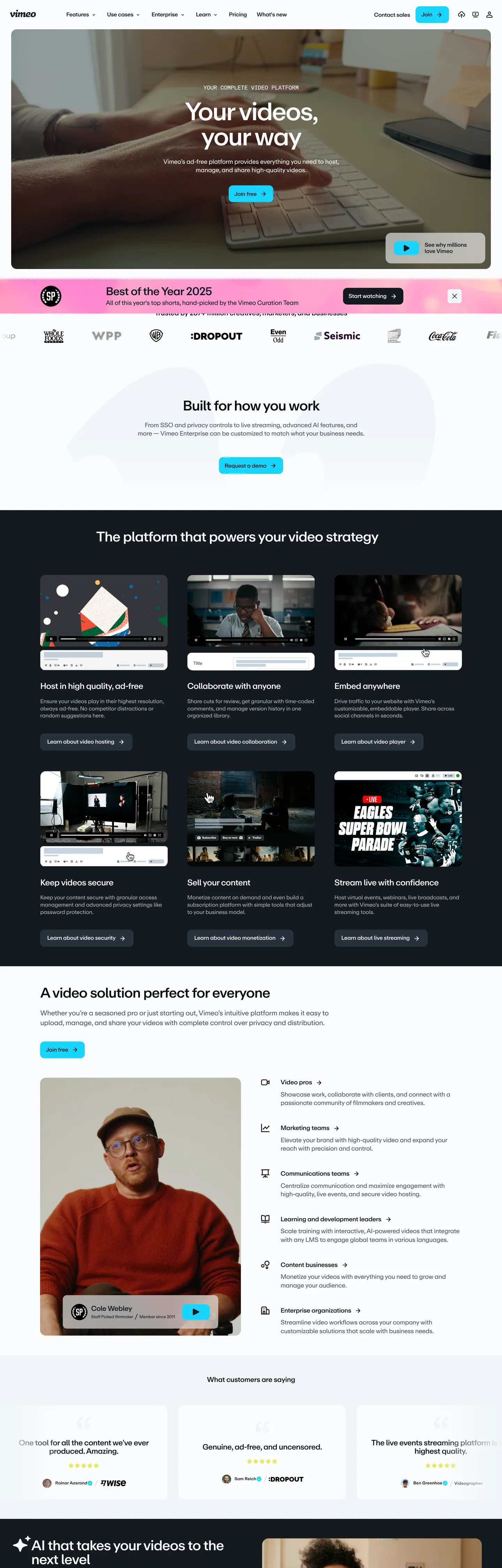
A snapshot of the brand in production. Scroll the frame to see the whole page.
Colors
22 colors
Vimeo's system runs on #17d5ff as its primary voltage, used in 2 of 21 components. Type is set in ABCRepro across 14 tokens from 12px to 72px, weights 400–500. Shape language is mixed across 21 components, blending pills, soft rounds, and squarer corners.
Brand & Accent
Sparing, CTA-only voltage · 3
Surface
Page and card backgrounds · 3
Text
Headlines, body, captions · 8
Borders & Hairlines
Dividers, outlines, rules · 2
Semantic
Status, errors, success, links · 2
Other
Specialty colors · 4
Typography
14 type tokens
Set in ABCRepro across 14 tokens, from 12px to 72px, weights 400–500. Shown in its own stack: where the font isn't installed, the fallback the file names stands in.
- display-hero72px · weight 500 · lh 1 · tracking -3.6pxThe quick brown fox jumps over the lazy dog
- display-lg40px · weight 500 · lh 1 · tracking -1.6pxThe quick brown fox jumps over the lazy dog
- heading-md24px · weight 500 · lh 1.1 · tracking -0.96pxThe quick brown fox jumps over the lazy dog
- subhead22px · weight 500 · lh 1.1 · tracking -0.86pxThe quick brown fox jumps over the lazy dog
- lead18px · weight 500 · lh 1.35 · tracking -0.54pxThe quick brown fox jumps over the lazy dog
- body-lead18px · weight 400 · lh 1.58 · tracking -0.54pxThe quick brown fox jumps over the lazy dog
- body-md16px · weight 400 · lh 1.3 · tracking -0.48pxThe quick brown fox jumps over the lazy dog
- body-strong16px · weight 500 · lh 1.2 · tracking -0.48pxThe quick brown fox jumps over the lazy dog
- body-sm14px · weight 500 · lh 1.2 · tracking -0.42pxThe quick brown fox jumps over the lazy dog
- caption12px · weight 400 · lh 1.2 · tracking -0.36pxThe quick brown fox jumps over the lazy dog
- label12px · weight 500 · lh 1.33 · tracking normalThe quick brown fox jumps over the lazy dog
- button16px · weight 400 · lh 1 · tracking normalThe quick brown fox jumps over the lazy dog
- nav-link16px · weight 400 · lh 1 · tracking normalThe quick brown fox jumps over the lazy dog
- eyebrow14px · weight 500 · lh 1 · tracking -0.42pxThe quick brown fox jumps over the lazy dog
Layout
Radii and spacing
7 corner radii and 8 spacing values. Shape language: mixed.
Radii
- xs4px
- sm6px
- md8px
- lg12px
- xl16px
- pill9999px
- full9999px
Spacing
- xxs4px
- xs8px
- sm10px
- md16px
- base20px
- lg24px
- xl40px
- section56px
Components
21 components
Each rendered from its tokens (color, type, radius, padding) on Vimeo's own canvas.
- Button Primarybutton-primaryButton Primary
- Button Primary Hoverbutton-primary-hoverButton Primary Hover
- Button Primary Pressedbutton-primary-pressedButton Primary Pressed
- Button Secondarybutton-secondaryButton Secondary
- Button Inversebutton-inverseButton Inverse
- Play Button Primaryplay-button-primaryPlay Button Primary
- Play Button Overlayplay-button-overlayPlay Button Overlay
- Generic Cardgeneric-cardGeneric Card
- Pricing Cardpricing-cardPricing Card
- Pricing Card Prominentpricing-card-prominentPricing Card Prominent
- Comparison Table Headingcomparison-table-headingComparison Table Heading
- Accordion Collapsedaccordion-collapsedAccordion Collapsed
- Accordion Expandedaccordion-expandedAccordion Expanded
- Tab Selectedtab-selectedTab Selected
- Tab Defaulttab-defaultTab Default
- Tag Chiptag-chipTag Chip
- Carousel Nav Buttoncarousel-nav-buttonCarousel Nav Button
- Type here…text-inputText Input
- Top Navtop-navTop Nav
- FooterfooterFooter
- Featured Cardfeatured-cardFeatured Card
In use
The system, in use
Vimeo's tokens on the kind of product it builds.
Build something people actually use.
A short paragraph of marketing copy that previews how the brand's display tier and body tier read together. Two sentences is usually enough.
FAQ
Vimeo design system FAQ
Common questions about Vimeo's tokens, components, and how to use this DESIGN.md in your project.
Read next
Related reading
Specs, directories, and component libraries that pair with this design system.
- Browse all design systemsThe full directory of DESIGN.md files on shadcn.io, with live mockups for each.shadcn.io
- Vimeo — official siteVimeo's marketing surface — the all-in-one video platform for creators, teams, and enterprises that this file extracts.vimeo.com (opens in a new tab)
- The DESIGN.md specificationGoogle Labs' open spec for machine-readable design system files — the format this page is built on.github.com (opens in a new tab)
Use it
Use Vimeo in your project
One machine-readable file. Drop it into Claude, Cursor, or any AI tool that reads DESIGN.md.
Download the DESIGN.md
One machine-readable file: every color, type, radius, spacing, and component token of Vimeo.
Feed it to your AI tool
Drop it into Claude, Cursor, or GitHub Copilot. The agent writes React components and Tailwind classes that match Vimeo's visual language.
Reference the tokens directly
Or paste the values into your Tailwind config, CSS variables, or component library: every color, size and radius is a quoted, ready-to-copy value.
Read the full DESIGN.md: overview, rationale, do’s and don’ts
Overview
Vimeo's marketing canvas is the strictest single-accent dark surface in the streaming category — {colors.canvas} is "#0a0e12", a near-black with a faint blue cast at OKLCH lightness 0.16, never the flat "#000000" true black most video platforms reach for. On top sits a one-step charcoal surface {colors.surface-1} "#141a20" carrying every card, the global nav, accordion expanded panels, and the pricing tiles. The body palette runs through a graded warm-gray ladder — {colors.ink-tertiary} "#3d4751", {colors.ink-secondary} "#4c5864", {colors.ink-muted} "#a9b2bc" — that handles secondary text, focus outlines, and tooltip icons.
Electric scarcity: the single chromatic accent is Vimeo Cyan {colors.primary} "#17d5ff" — used 45 times across the captured page on the primary Join CTA, the chroma play-button background, and the carousel-nav sub-content marker. The hover state steps to {colors.primary-hover} "#13b1d4" (the vimeo-blue-58 token), with {colors.primary-pressed} "#02464f" reserved for pressed and disabled tiers. Vimeo avoids a second chromatic accent on the dark canvas — the only semantic colors are {colors.semantic-link} "#13b1d4" for inline links and {colors.semantic-error} "#550000" for error states that do not appear on the public surface.
Compression as voice: where most streaming platforms inflate display to weight 700 with a tight 1.0 line-height, Vimeo holds hero at weight 500 with -3.6px negative tracking at 72px — confidence by typographic pull rather than weight. Display scales from 72px hero down through 40px h2 (-1.6px), 24px h3 (-0.96px), 22px subhead, 18px lead, 16px body (-0.48px), 14px secondary, and 12px caption. Every tier resolves to ABCRepro with InterTight, Helvetica, and Arial as documented fallbacks.
The page rhythm is dense feature cards — the platform-grid section stacks six {colors.surface-1} panels with {rounded.xl} 16px corners, each carrying a 24px headline plus a single-line description and a short customer-logo strip. Pricing tiles step up to {colors.pricing-prominent} "#000000" for the prominent plan, with {rounded.xl} corners against the dark canvas. Where Linear puts product screenshots in the foreground, Vimeo leads with use-case imagery framed in dark panels.
Key Characteristics:
- Dark-canvas single-accent system —
{colors.canvas}"#0a0e12" with one cyan voltage at{colors.primary}"#17d5ff". - One typeface family — ABCRepro across 17 type signatures, with InterTight as the documented fallback.
- Display tracking pulls aggressively negative (-3.6px at 72px); body holds at -0.48px.
- Bimodal radius scale — 100 captured 16px values for surface cards against 97 captured 8px for controls.
- Cards use
{rounded.xl}16px corners with no drop shadows — surface lift handles hierarchy. - The 12px CTA radius is scoped to the primary Join action alone.
Colors
- Vimeo Cyan (
#17d5ff) — frequency 45. Used as bg (22), text (10), border (10), gradient (3). Reserved for the primary Join CTA background, the chroma play-button primary, and the carousel-nav sub-content marker — Vimeo's load-bearing brand voltage and the only chromatic on the dark canvas. - Canvas Near-Black (
#0a0e12) — frequency 1314. Used as text (636), border (634), gradient (41), bg (1). The page floor and global-nav background, with a faint blue cast at OKLCH hue 248 — never pure black, never gray. - Surface Charcoal (
#141a20) — frequency 1256. Used as text (641), border (607), bg (8). The one-step lift above canvas, mapped to--colors-pricing-card,--colors-generic-card-background-dark, and--colors-accordion-expanded-background. - Off-White Ink (
#fafcfd) — frequency 722. Used as text (349), border (321), bg (29), gradient (23). The primary body and headline color on dark sections, also the canvas for the customer-logo strip and the testimonial grid bands. - Warm Gray Tertiary (
#3d4751) — frequency 219. Used as gradient (77), text (71), border (70). The form-input text and focus-outline token, mapped to--colors-chroma-alpha-neutral-600-*with four alpha tiers. - Warm Gray Secondary (
#4c5864) — frequency 196. Used as gradient (70), text (62), border (62). The body-paragraph color on dark cards, mapped to--colors-chroma-text-body-secondaryand--colors-chroma-tooltip-icon. - Strikeout Charcoal (
#333333) — frequency 82. Used as gradient (81), shadow (1). The card-strikeout, tag-background, and pricing-card-border token — never appears as a primary surface, only as a darker chip against{colors.surface-1}. - Ink Muted (
#a9b2bc) — frequency 78. Used as gradient (32), text (23), border (23). The secondary-content color on dark surfaces, mapped to--colors-pricing-sub-contentand--colors-comparison-table-content. - Hairline Light (
#dfe4ea) — frequency 57. Used as bg (45), gradient (12). The light-section hairline and comparison-table top-heading background — the warmest gray in the structural ladder at OKLCH hue 253. - Border Pricing (
#23313b) — frequency 10. Used as text (5), border (5). The hairline that separates dark pricing tiles from the canvas, mapped to--colors-ebony-gray.
Typography
ABCRepro is the only typeface on the page — every one of the 17 captured type signatures resolves to the same family, with InterTight, Helvetica, and Arial documented as fallbacks. The display scale runs from 72px weight 500 (hero h2 with -3.6px tracking) through 40px h2 (-1.6px), 24px h3 (-0.96px), 22px subhead (-0.86px), 18px lead (-0.54px), 16px body weight 400 (-0.48px), 14px secondary weight 500 (-0.42px), and 12px caption weight 400 (-0.36px). The button label and nav link both hold at 16px weight 400 with normal letter-spacing — the only tiers that release the negative tracking.
Weight as restraint: Vimeo holds display at weight 500 across every tier. Unlike the convention of dialing fintech and enterprise headlines to 700, the brand trusts negative letter-spacing — pulling tracking to 5% of font size at the top of the ramp — to compress headlines optically. The hero {typography.display-hero} at 72px / 72px line-height feels denser than a weight-700 setting at the same point because the letters sit tighter against each other.
Layout
Section spacing runs on a base unit visible across the captured padding values — 8px at 200 occurrences (the dominant gap), 16px at 41, 20px at 20, 40px at 12, 56px at 8. The hero and pricing sections lean on {spacing.section} 56px vertical rhythm, while card interiors hold at {spacing.base} 20px padding. The platform-grid section uses a three-column grid of {rounded.xl} 16px cards, with the comparison-table section dropping to a two-column split. The global nav holds 64px tall against {colors.canvas}.
Elevation & Depth
Vimeo carries hierarchy through surface lift rather than drop shadows — {colors.surface-1} "#141a20" sits as the only step above {colors.canvas} "#0a0e12", with {colors.surface-elevated} "#23313b" reserved as the hairline divider for dark pricing tiles. The captured shadow values are minimal: 1314 occurrences of {colors.canvas} appear in shadow context with only 2 actual shadow tints, and the structural tokens log zero shadows on the cyan brand. Shadow-as-hairline: where most streaming dashboards reach for a 0 4px 12px rgba blur to separate cards, Vimeo trusts a one-step charcoal lift and a 16px corner radius to do the work.
Shapes
The corner-radius scale is bimodal — 100 captured 16px values for surface cards against 97 captured 8px values for buttons and chips, with the 12px CTA radius scoped exclusively to the primary Join action. The 9999px pill geometry surfaces 25 times, reserved for the play-button primary, the carousel-nav buttons, the tab indicators, and the tag chips. The 4px tier (3 occurrences) is rare — it appears only on the smallest content chrome. The CTA discipline: Vimeo's primary button radius is neither pill nor card-corner — the 12px value is unique to the Join action and the chroma close-modal primary, marking the brand-voltage CTA against every other rounded surface.
Components
The 21 component definitions cover the full marketing chrome. {components.button-primary} is the cyan Join CTA at 48px tall with {rounded.lg} 12px corners, {spacing.sm} 10px × {spacing.md} 16px padding, and {typography.button} 16px weight 400. The {components.play-button-primary} is the round cyan player overlay — pill geometry, {colors.canvas} icon. {components.pricing-card} and {components.pricing-card-prominent} are the two pricing-tile variants: charcoal {colors.surface-1} for default plans, {colors.pricing-prominent} true black for the featured tier. {components.accordion-collapsed} and {components.accordion-expanded} swap canvas for surface lift at 16px × 20px padding. {components.tab-selected} and {components.tab-default} use pill geometry against the {colors.accordion-strikeout} "#333333" track. {components.top-nav} holds at 64px tall against {colors.canvas} with {typography.nav-link} 16px weight 400 navigation.
Do's and Don'ts
Do scope {colors.primary} "#17d5ff" to the primary Join CTA, play-button primary, and carousel-nav sub-content marker — those are the three roles the brand voltage carries in the captured page. Use {colors.primary-hover} "#13b1d4" for hover states.
Do pair display tiers with the documented negative letter-spacing — the -3.6px at 72px and -0.96px at 24px are load-bearing for Vimeo's voice. Stripping the negative tracking softens the brand and pushes the page toward generic SaaS.
Do lift cards with {colors.surface-1} "#141a20" against {colors.canvas} "#0a0e12" — the one-step charcoal handles every card, pricing tile, and accordion panel. The hierarchy is one lift, not three.
Don't use {colors.primary} "#17d5ff" as a section background or atmospheric fill — the cyan appears 22 times as bg, exclusively on the play-button and CTA surfaces (48px and 60px wide). Painting a hero band cyan reads as a generic streaming startup, not as Vimeo.
Don't mix in a second chromatic accent on the dark canvas — the bokeh tokens ({colors.bokeh-pink} "#ffaacc", {colors.bokeh-warm} "#887766") exist in the declared scale but live in gradient definitions for product imagery, never on marketing chrome. Additional bokeh ladders (warm beige and lime ranges) surface only inside gradient stops.
Don't use {rounded.lg} 12px on secondary buttons — the 12px corner is scoped to the primary Join action and the chroma close-modal primary alone. Secondary controls drop to {rounded.md} 8px, and pills go to {rounded.pill} 9999px.
Don't weight headlines above 500 — the hero, h2, h3, and subhead all hold at weight 500. Stepping to 600 or 700 breaks the typographic compression principle and pushes the page toward enterprise-video aesthetics rather than the editorial-film posture Vimeo carries.
Don't use {colors.surface-elevated} "#23313b" as a card background — it is a hairline-only token (10 occurrences, 5 as text and 5 as border, mapped to --colors-ebony-gray). For card surfaces, use {colors.surface-1} "#141a20" instead.
Known Gaps
- Form-input styling is partial — the captured page does not surface a text-input field on the first scroll, so
{components.text-input}infers values from--colors-form-input-textand--colors-form-input-backgroundrather than measuring a live control. - The bokeh and chroma gradient tokens (warm-pink and beige ladders at "#ffaacc" and "#887766") exist as declared CSS variables and surface in gradient definitions, but never appear as flat fills on the captured marketing page.
- The player chrome and embedded-video controls live in Vimeo's product UI rather than the marketing surface, and are not extracted here.
- The cyan hover and pressed values come straight from Vimeo's canonical
--colors-vimeo-blue-58("#13b1d4") and--colors-vimeo-blue-80("#02464f") CSS variables. - Dark mode is the default and only mode documented — the alternating light-canvas bands ("#fafcfd" surface) handle inverse sections but the spec does not ship a separate light-theme component set.
Music, Video & Streaming
More systems like this
More DESIGN.md files in Music, Video & Streaming.
Pricing
Build it with Pro
The DESIGN.md files are free. Pro adds 6,000+ blocks, premium templates and the MCP server, so your AI editor builds in your system for you.
4.9/5 out of 5 · 150+ reviewsfrom 150+ founders and developers.
Billing
Billed once a year in USD. Cancel anytime.
- How many people can use the license.
- Client work, SaaS products and anything you charge for.
- Production-ready React sections: hero, pricing, features, dashboards and more.
- Complete multi-page sites you can ship as they are.
- React icons from every major library, installable with one command.
- Presets that restyle every block, in light and dark.
- Lets your AI editor search, preview and install blocks for you.
- Priority requests are answered first.
Individual
For personal projects & open source
$32instead of $49/mo
$389 billed yearly
- Seats: 1 seat
- Commercial use: Personal & open source only
- Pro blocks: 6,000+ blocks
- Templates: All 14 templates
- React icons: 294k+ icons
- Themes: All 59 themes
- MCP server: Basic usage
- Support: Standard
Team
Most popularFor freelancers, agencies & startups
$66instead of $99/mo
$789 billed yearly · ≈ $13/dev/mo
- Seats: Up to 5 seats
- Commercial use: Included
- Pro blocks: 6,000+ blocks
- Templates: All 14 templates
- React icons: 294k+ icons
- Themes: All 59 themes
- MCP server: High usage
- Support: Priority
Organization
For companies with larger teams
$132instead of $199/mo
$1,589 billed yearly
- Seats: Unlimited seats
- Commercial use: Included
- Pro blocks: 6,000+ blocks
- Templates: All 14 templates
- React icons: 294k+ icons
- Themes: All 59 themes
- MCP server: Unlimited usage
- Support: Priority
Billed once a year in USD. Cancel anytime.
Individual
For personal projects & open source
$32instead of $49/mo
$389 billed yearly
- How many people can use the license.Seats: 1 seat
- Client work, SaaS products and anything you charge for.Commercial use: Personal & open source only
- Production-ready React sections: hero, pricing, features, dashboards and more.Pro blocks: 6,000+ blocks
- Complete multi-page sites you can ship as they are.Templates: All 14 templates
- React icons from every major library, installable with one command.React icons: 294k+ icons
- Presets that restyle every block, in light and dark.Themes: All 59 themes
- Lets your AI editor search, preview and install blocks for you.MCP server: Basic usage
- Priority requests are answered first.Support: Standard
Team
Most popularFor freelancers, agencies & startups
$66instead of $99/mo
$789 billed yearly · ≈ $13/dev/mo
Everything in Individual, plus
- How many people can use the license.Seats: Up to 5 seats
- Client work, SaaS products and anything you charge for.Commercial use: Included
- Lets your AI editor search, preview and install blocks for you.MCP server: High usage
- Priority requests are answered first.Support: Priority
Organization
For companies with larger teams
$132instead of $199/mo
$1,589 billed yearly
Everything in Team, plus
- How many people can use the license.Seats: Unlimited seats
- Lets your AI editor search, preview and install blocks for you.MCP server: Unlimited usage
- Secure checkout via Stripe
- Code lives in your repo
- Keep what you've shipped if you cancel
- License terms
Your system, built for you
Every block, template and icon, installed by your AI agent in your design system. The DESIGN.md files stay free.