Ubisoft Design System
Ubisoft's game-publisher marketing design system. Cobalt-blue CTA pills on a near-black dark canvas, full-bleed artwork tiles, Ubisoft Sans display, Open Sans body. Tokens for React, Next.js, and AI coding tools.
Add shadcn.io to your AI agent. · Pro It installs blocks, icons and templates in your design system from a prompt, with Pro.
Set up MCP- Primary
- #006ef5
- Typeface
- Open Sans
- Shape
- Sharp
- Base radius
- 8px
- Colors
- 10
- Type tokens
- 9
- Components
- 14
- Spacing values
- 6
About
About Ubisoft DESIGN.md
Curated by Dov Azencot · Updated May 19, 2026 · Source ubisoft.com (opens in a new tab)
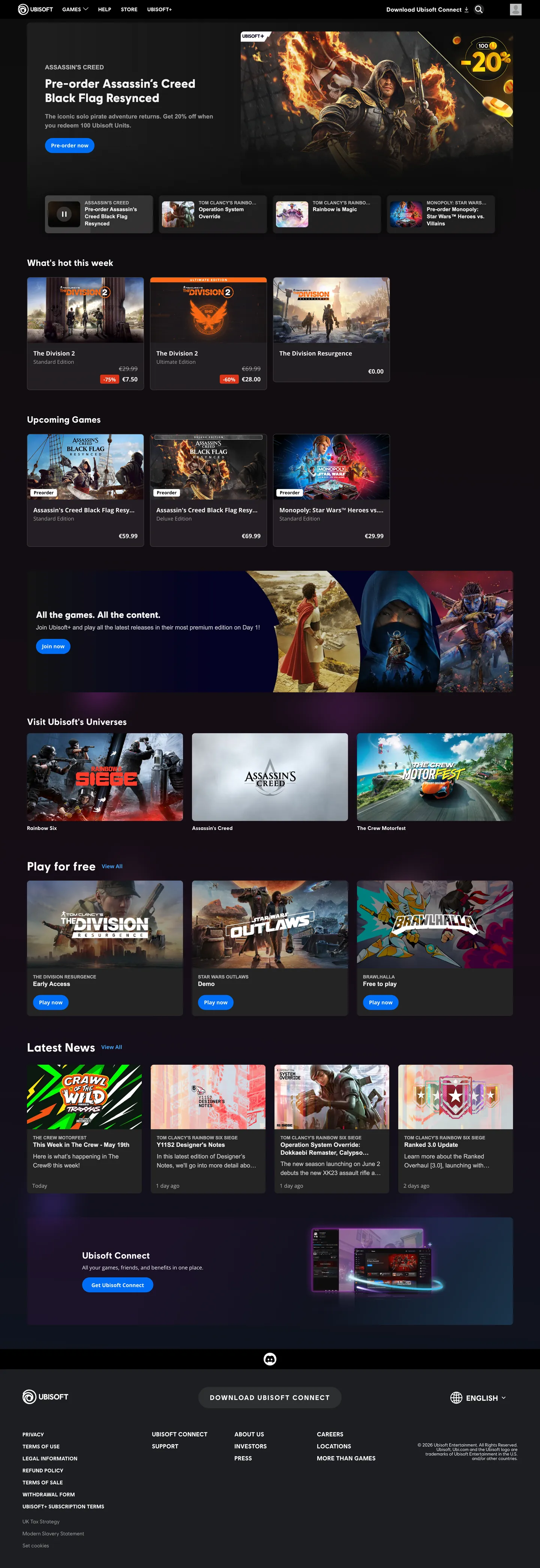
Ubisoft's marketing homepage is a game-store front. Above the fold: a full-bleed hero banner for a pre-order (Assassin's Creed Black Flag Resynced at launch), with a large Ubisoft Sans headline in off-white and a cobalt-blue "Pre-order now" pill. Below the fold: section after section of game tiles arranged in a horizontal scroll grid — new releases, upcoming games, free-to-play games, Ubisoft+ subscription picks — each tile a game key-art image with a title, platform badges, and price tag. The cobalt-blue appears only on action buttons. Where Steam leans into a dark-teal brand color across its entire surface, and where the PlayStation Store uses a dark indigo, Ubisoft keeps its brand blue strictly on the call-to-action layer.
The DESIGN.md file packages the system into a machine-readable spec for React and AI tools. Inside: 10 colors tokens organized into a brand tier (cobalt blue, alert red), a structural tier of near-black and off-white surfaces, and a hairline tier. Ten typography tokens span two families — Ubisoft Sans (proprietary, display-only, weight 700) and Open Sans (body and labels, weights 400 and 700). The radius scale has three values — 4px on small details, 8px on cards and inputs (the dominant value at 49 occurrences), and a full pill on buttons. Spacing centers on 16px and 8px with generous 64px section breaks.
Feed this file to Claude or Cursor and it reproduces Ubisoft's specific moves: full-bleed game artwork in an 8px-radius tile, cobalt-blue pill CTA on a near-black canvas, Ubisoft Sans at 32px for section heds with Open Sans body beneath, and the light/dark section alternation that marks the "Play for free" band. The principle worth borrowing in any media-catalog context: a card that is purely an image with a title and price below it is more expressive than a card with a background surface, a border, and an icon cluster.
What makes it distinct
5
- Full-bleed game artworkthe page is organized as a media grid where editorial photography (game key art) fills every card edge-to-edge; the brand chrome frames the art rather than competes with it
- Single cobalt-blue voltagethe primary brand blue appears 13 times, all as button fills and a single gradient stop; all other chromatic moments come from game key art
- Binary radius8px on cards and UI surfaces everywhere; 10000px (effective pill) on CTA buttons only; no middle tier
- Ubisoft Sans for display onlythe proprietary typeface appears on h2/h3 display sizes at weight 700; Open Sans handles all body, label, and secondary copy
- Near-black dark canvas with off-white textcharcoal dark surface at near-black with off-white text; the system inverts between dark game sections and light promotional strips
ubisoft.com
Live at ubisoft.com
A snapshot of the brand in production. Scroll the frame to see the whole page.
Colors
10 colors
Ubisoft's system runs on #006ef5 as its primary voltage, used in 1 of 14 components. Type is set in Open Sans across 9 tokens from 12px to 32px, weights 400–700. Shape language is sharp — components average 3px corner radius, favoring crisp rectangles.
Brand & Accent
Sparing, CTA-only voltage · 2
Surface
Page and card backgrounds · 3
Text
Headlines, body, captions · 2
Borders & Hairlines
Dividers, outlines, rules · 2
Other
Specialty colors · 1
Typography
9 type tokens
Set in Open Sans across 9 tokens, from 12px to 32px, weights 400–700. Shown in its own stack: where the font isn't installed, the fallback the file names stands in.
- display-lg32px · weight 700 · lh 38.4px · tracking 0.019pxThe quick brown fox jumps over the lazy dog
- display-md24px · weight 700 · lh 28.8pxThe quick brown fox jumps over the lazy dog
- display-sm14px · weight 700 · lh 21pxThe quick brown fox jumps over the lazy dog
- body-md16px · weight 400 · lh 24px · tracking 0.019pxThe quick brown fox jumps over the lazy dog
- body-bold16px · weight 700 · lh 24pxThe quick brown fox jumps over the lazy dog
- body-sm14px · weight 400 · lh 21pxThe quick brown fox jumps over the lazy dog
- label-bold14px · weight 700 · lh 21pxThe quick brown fox jumps over the lazy dog
- label-caps12px · weight 700 · lh 15.6px · tracking 0.019pxThe quick brown fox jumps over the lazy dog
- button-md14px · weight 700 · lh 21pxThe quick brown fox jumps over the lazy dog
Layout
Radii and spacing
4 corner radii and 6 spacing values. Shape language: sharp.
Radii
- none0px
- sm4px
- md8px
- full10000px
Spacing
- xs8px
- sm12px
- md16px
- lg24px
- xl64px
- 2xl72px
Components
14 components
Each rendered from its tokens (color, type, radius, padding) on Ubisoft's own canvas.
- Button Primarybutton-primaryButton Primary
- Button Secondarybutton-secondaryButton Secondary
- Top Navtop-navTop Nav
- Nav Linknav-linkNav Link
- Hero Headinghero-headingHero Heading
- Section Headingsection-headingSection Heading
- Body Paragraphbody-paragraphBody Paragraph
- CardcardCard
- Game Tilegame-tileGame Tile
- Price Badgeprice-badgePrice Badge
- Platform Badgeplatform-badgePlatform Badge
- Hero Sectionhero-sectionHero Section
- Section Lightsection-lightSection Light
- FooterfooterFooter
In use
The system, in use
Ubisoft's tokens on the kind of product it builds.
Build something people actually use.
A short paragraph of marketing copy that previews how the brand's display tier and body tier read together. Two sentences is usually enough.
FAQ
Ubisoft design system FAQ
Common questions about Ubisoft's tokens, components, and how to use this DESIGN.md in your project.
Read next
Related reading
Specs, directories, and component libraries that pair with this design system.
- Browse all design systemsThe full directory of DESIGN.md files on shadcn.io, with live mockups for each.shadcn.io
- Ubisoft — official siteUbisoft's public marketing site — the source of truth for the live tokens captured in this file.ubisoft.com (opens in a new tab)
- The DESIGN.md specificationGoogle Labs' open spec for machine-readable design system files — the format this page is built on.github.com (opens in a new tab)
Use it
Use Ubisoft in your project
One machine-readable file. Drop it into Claude, Cursor, or any AI tool that reads DESIGN.md.
Download the DESIGN.md
One machine-readable file: every color, type, radius, spacing, and component token of Ubisoft.
Feed it to your AI tool
Drop it into Claude, Cursor, or GitHub Copilot. The agent writes React components and Tailwind classes that match Ubisoft's visual language.
Reference the tokens directly
Or paste the values into your Tailwind config, CSS variables, or component library: every color, size and radius is a quoted, ready-to-copy value.
Read the full DESIGN.md: overview, rationale, do’s and don’ts
Overview
Ubisoft's marketing homepage is organized as a game-store catalog front. Artwork-first tile system. The surface is not a brand statement — it is a merchandise display surface. Each page section is a horizontal rail of game tiles, each tile a key-art image with a 8px radius, a bold title, platform badges, and a price. The cobalt-blue CTA pill appears only when a game is purchasable; the rest of the chrome retreats to near-black and off-white. Where EA's marketing surface leans into its yellow brand accent across section headings and promotional frames, and where PlayStation's Store uses a pervasive dark indigo system, Ubisoft holds its primary blue for CTA-only duty and lets the games' own key art carry every color conversation.
The typographic system divides into two voices. Ubisoft Sans — the company's proprietary condensed display typeface — handles section headings at 24–32px weight 700, rendering white against dark artwork banners. Open Sans handles all secondary content: body paragraphs, navigation, platform labels, price displays, and category tags. The division is exact: every element the player would skim to navigate (title, price, platform) is Open Sans bold; every element that identifies a page section is Ubisoft Sans. The radius system is binary — 8px on every tile, card, and interactive surface, and a full pill on CTA buttons.
Key Characteristics:
- Single cobalt-blue voltage (
{colors.primary}) on 13 elements, all CTA buttons and a single gradient stop — never used as text or section-header color. - Full-bleed game tile system — 8px-radius tiles with zero internal padding; key art fills edge-to-edge and text appears below the image.
- Two-family typographic split: Ubisoft Sans weight 700 for section display heds, Open Sans weights 400/700 for all secondary content.
- Binary radius —
{rounded.md}8px on all UI surfaces,{rounded.full}pill on all CTA buttons,{rounded.sm}4px on platform badges only. - Near-black canvas with off-white text as the default dark mode; white surface section for the "Play for free" band inverts to light — the system's strongest tonal contrast moment.
- Alert-red accent (
{colors.alert-red}) appears on sale-badge and promotional percentage labels — the semantic "discount" signal distinct from the CTA blue. - Horizontal-scroll game rails — the primary navigation pattern is a horizontally scrollable tile row with arrow controls, repeated per content category.
Colors
Brand
- Cobalt Blue (
{colors.primary}— #006ef5): frequency 13. Used as background (6), border (6), gradient (1). The primary action color — every "Pre-order now" and "Play" button runs in cobalt blue. Never used as text or section color. The single chromatic brand voltage in the system. - Cobalt Light (
{colors.primary-light}— #3da2ff): frequency 4. Used as text (2) and border (2). A lighter blue for secondary interactive states or link text on dark surfaces. - Alert Red (
{colors.alert-red}— #dc3318): frequency 4. Used as background (2) and border (2). The discount/sale badge color — appears on promotional percentage labels (e.g., "−20%") and limited-offer chips.
Text
- Ink (
{colors.ink}— #f2f2f2): frequency 182. Used as text (91) and border (91). The primary text tone — a cool off-white used for headlines and body copy against dark surfaces. Not pure white; the slight neutral gray softens the contrast. - Ink Bright (
{colors.ink-bright}— #ffffff): frequency 171. Pure white — 72 as text (button labels, hero heds over dark imagery), 26 as background (the "Play for free" light section), 73 as border.
Surface
- Canvas (
{colors.canvas}— #000000): frequency 246. Pure black — 125 as text on light surfaces, 116 as border, 1 as background, 4 as shadow. The floor of the dark game sections and the nav bar background. - Surface 1 (
{colors.surface-1}— #242424): frequency 8. The charcoal lifted surface — used as the background for game tile cards in the grid sections, providing a perceptible dark lift above the pure-black floor.
Hairline
- Hairline (
{colors.hairline}— #b5b5b5): frequency 26. Used as text (13) and border (13). The mid-gray hairline for dividers, section separators, and secondary chrome on dark surfaces. - Hairline Dark (
{colors.hairline-dark}— #000000): pure black used as hairline on the light-surface section where white borders would disappear.
Surface Light
- Surface Light (
{colors.surface-light}— #ffffff): the "Play for free" promotional band, which inverts to a white background with charcoal text and cobalt-blue CTA.
Typography
Font Families
The system runs two families in role-based division. Ubisoft Sans — a proprietary condensed display typeface (fallbacks: Roboto, sans-serif) — handles section display headings at 24–32px weight 700. It appears on h2 and h3 elements that title each game rail ("What's hot this week", "Upcoming Games") and on hero banners. Open Sans — an open-source humanist sans (variants: "Open Sans Alt", full stack) — handles all body, label, navigation, and secondary content. Open Sans spans weights 400 and 700; the 700 weight runs on game tile titles and interactive labels.
Hierarchy
| Token | Size | Weight | Line Height | Use |
|---|---|---|---|---|
{typography.display-lg} | 32px | 700 | 38.4px | Hero h2 game title / page section display |
{typography.display-md} | 24px | 700 | 28.8px | Rail section headings |
{typography.display-sm} | 14px | 700 | 21px | Ubisoft Sans on small h2 game titles in tiles |
{typography.body-md} | 16px | 400 | 24px | Body paragraphs, game descriptions |
{typography.body-bold} | 16px | 700 | 24px | Bold body, price display, bold callouts |
{typography.body-sm} | 14px | 400 | 21px | Secondary body, metadata, dates |
{typography.label-bold} | 14px | 700 | 21px | Nav links, game tile titles, interactive labels |
{typography.label-caps} | 12px | 700 | 15.6px | Platform badges, category tags (uppercase) |
{typography.button-md} | 14px | 700 | 21px | CTA button labels ("Pre-order now") |
Principles
Ubisoft Sans at weight 700 is the system's only display-serif-equivalent statement: bold, slightly condensed, reads legibly at 32px against dark game artwork. Open Sans at weight 700 handles all the interactive labeling tasks that Ubisoft Sans does not touch — game tile titles, button labels, price display. The system does not use any weight below 400; the minimum rendering weight is the default body.
Note on Font Substitutes
Ubisoft Sans is proprietary. Barlow Semi Condensed Bold or Rajdhani Bold are the closest open-source matches for a weight-700 display sans with slight condensing. Exo 2 Bold also transfers well at the 24–32px display sizes. Open Sans is already freely available on Google Fonts and needs no substitute.
Layout
Spacing System
- Base unit: 8px, with 16px as the dominant module.
- Tokens:
{spacing.xs}8px ·{spacing.sm}12px ·{spacing.md}16px ·{spacing.lg}24px ·{spacing.xl}64px ·{spacing.2xl}72px. - Section padding: 0px × 72px horizontal on the hero; 64px vertical on the "Play for free" light section.
- Tile gap: 8px between game tiles in the horizontal rails.
Grid & Container
- Hero panel: full-bleed game artwork at viewport width, with text and CTA anchored in the lower-left quadrant.
- Game tile rails: horizontal flex rows of fixed-width tiles (approximately 200–250px each), scrollable with overflow-x, separated by 8px gaps. Each rail is preceded by a section heading and optionally a "See all" link.
- "Play for free" band: full-width white-background section, 64px vertical padding, 3-up grid of free game tiles.
- Footer: full-width dark canvas, 24px padding, multi-column link list in Open Sans body-sm.
Rhythm
The page alternates between dark game rail (canvas background, off-white text, cobalt-blue CTAs) and light promotional band (white background, black text). The contrast between these two bands is the page's primary navigational device — the light band marks a distinct content category (free games, subscription content). Within each dark rail, rhythm is produced by the tile height uniformity: every tile in a given rail has the same dimensions, creating a consistent horizontal register.
Elevation
The system has a minimal shadow tier. Four shadow occurrences exist in the captured page, all as black-with-opacity ink. The charcoal {colors.surface-1} tiles sit above the black-canvas floor by tonal contrast alone — the 24-lightness gap between surface and floor reads as lift without any rendered shadow. The hero banner uses a gradient overlay (from dark near-black to transparent) over the game key art to ensure text legibility, which functions as an elevation-adjacent technique.
Shapes
The radius scale is binary with one small exception:
{rounded.none}0px — nav, footer, section bands, hero panel edges.{rounded.sm}4px — platform-badge chips (5 occurrences).{rounded.md}8px — the dominant radius, appearing 49 times — every game tile, every card, every interactive surface.{rounded.full}10000px — CTA buttons only ("Pre-order now", "Play", "Play for free").
The 8px radius is the system's harmonic center. It is consistent enough to feel deliberate and soft enough to feel approachable — a standard game-UI radius that also appears in the Epic Games Store, GOG, and the Microsoft Store.
Components
button-primary — Cobalt-blue {colors.primary} fill, white text, {rounded.full} full-pill, 0px × 16px padding, 40px height. "Pre-order now" is the canonical instance. The only element on the page with brand-colored fill.
button-secondary — Transparent fill, 1px white border, white text, same pill rounding and height. Used for secondary actions ("Watch trailer", "Learn more") alongside the primary CTA.
top-nav — Pure black {colors.canvas} surface, 48px height. Houses the Ubisoft spiral logo mark (white) flush left, navigation links (Games, Store, News, Esports) in Open Sans bold, a search icon, and a login icon flush right.
nav-link — Transparent, off-white text at {typography.label-bold} (14px / 700), 8px × 12px padding. Active state indicated by underlining.
hero-heading — Off-white {colors.ink} text, Ubisoft Sans 32px / 700, 0.019px tracking. The game title headline in the hero banner — renders against full-bleed key art with a gradient scrim beneath for legibility.
section-heading — Off-white text, Ubisoft Sans 24px / 700. The rail section title above each horizontal tile grid ("What's hot this week", "Upcoming Games").
body-paragraph — Off-white text, Open Sans 16px / 400. Game description copy in hero panels and on individual game pages.
card — Charcoal {colors.surface-1} fill, off-white text, {rounded.md} 8px radius, 16px × 16px × 42px padding (the extra bottom accommodates the button row). Used for featured game cards with more editorial treatment than the compact tile.
game-tile — Charcoal {colors.surface-1} fill, {rounded.md} 8px radius, zero padding. Key art fills edge-to-edge; title in Ubisoft Sans or Open Sans bold appears below the image outside the tile container. The standard catalog unit.
price-badge — Transparent, white text in {typography.body-bold}. Renders the game price (e.g., "£34.99") below the tile title. The alert-red {colors.alert-red} discount badge overlaps when a sale price is active.
platform-badge — Transparent, gray {colors.hairline} text in {typography.label-caps} 12px uppercase. Platform icons (PS5, Xbox, PC) appear as icon + text label chips below each tile title.
hero-section — Pure black canvas background, 0px × 72px horizontal padding. Contains the full-bleed artwork image with a gradient scrim, the hero heading, body paragraph, and primary/secondary CTA pair.
section-light — White {colors.surface-light} background, 64px vertical padding. The "Play for free" band — the single light section on an otherwise dark page. Tile titles and headings render in near-black {colors.canvas} text.
footer — Black canvas, off-white body-sm text, 24px padding, 1px gray-hairline top border. Multi-column link tree: Games, Community, Careers, Legal, Support.
Do's and Don'ts
Do use {colors.primary} (#006ef5) exclusively for CTA buttons. The cobalt-blue at 13 occurrences is tightly reserved for purchase and play actions. Using it on section headings, nav accents, or decorative elements would break the "blue means buy" convention the system enforces.
Do fill game tiles with key art at zero padding and {rounded.md} 8px radius. The edge-to-edge image treatment is the system's core catalog pattern — any internal padding on the art container weakens the immersive game-store effect.
Do use Ubisoft Sans at weight 700 for section headings only. The proprietary typeface is reserved for navigational headings that title each rail; Open Sans handles the rest. Mixing Ubisoft Sans into body copy or labels would reduce its distinctiveness.
Do maintain the dark-to-light section alternation for free-game or subscription content bands. The white {colors.surface-light} band is the page's only tonal inversion and it functions as a section-type signal — "this content is different" — not a purely aesthetic decision.
Don't introduce intermediate border-radius values between 8px and the full pill. The binary system (8px everywhere, pill on buttons) is deliberate. Adding 12px or 16px on featured cards would create a radius gradient that dilutes the binary discipline.
Don't use the alert-red {colors.alert-red} (#dc3318) for anything other than discount/sale price labels. It is a semantic color for "reduced from regular price" — using it on promotional text, section labels, or error states would introduce an ambiguous signal in a commerce context where red specifically means savings.
Don't render Ubisoft Sans below 24px. At smaller sizes the proprietary display typeface's slight condensing and weight-700 rendering competes with Open Sans rather than leading it. Below 24px, all copy defaults to Open Sans.
Don't apply the cobalt-blue as a background for section headers or feature panels. The single hero-gradient use of the cobalt family (as a gradient stop) is the maximum application of the brand color outside button fills — a full-bleed cobalt section would feel like a product-marketing violation of the game-store surface.
Known Gaps
- Dark mode / light mode toggle: the site delivers a mixed dark/light page with one light-band section, but no system-level theme toggle was observed. The light section appears to be a content-type declaration, not a user preference.
- Authenticated surfaces: the logged-in state (Ubisoft Connect account, game library, subscription status) is not represented. The Ubisoft Connect overlay and account management surfaces carry their own component set.
- Hover and focus states: only resting states are captured. The game tile hover effect (likely a scale transform or overlay glow on key art) and button hover fills are not documented.
- Video player chrome: promotional trailer overlays and the embedded video player chrome appear on individual game pages but were not present in the captured marketing surface.
- Subscription badge system: Ubisoft+ subscriber tiles carry a badge overlay; the badge design, color, and positioning are not fully documented from the captured surface.
- Localization surface: the game store adjusts regional pricing, currency symbols, and rating badges (PEGI, ESRB) per locale. These surfaces were not captured.
Gaming & Entertainment
More systems like this
More DESIGN.md files in Gaming & Entertainment.
Pricing
Build it with Pro
The DESIGN.md files are free. Pro adds 6,000+ blocks, premium templates and the MCP server, so your AI editor builds in your system for you.
4.9/5 out of 5 · 150+ reviewsfrom 150+ founders and developers.
Billing
Billed once a year in USD. Cancel anytime.
- How many people can use the license.
- Client work, SaaS products and anything you charge for.
- Production-ready React sections: hero, pricing, features, dashboards and more.
- Complete multi-page sites you can ship as they are.
- React icons from every major library, installable with one command.
- Presets that restyle every block, in light and dark.
- Lets your AI editor search, preview and install blocks for you.
- Priority requests are answered first.
Individual
For personal projects & open source
$32instead of $49/mo
$389 billed yearly
- Seats: 1 seat
- Commercial use: Personal & open source only
- Pro blocks: 6,000+ blocks
- Templates: All 14 templates
- React icons: 294k+ icons
- Themes: All 59 themes
- MCP server: Basic usage
- Support: Standard
Team
Most popularFor freelancers, agencies & startups
$66instead of $99/mo
$789 billed yearly · ≈ $13/dev/mo
- Seats: Up to 5 seats
- Commercial use: Included
- Pro blocks: 6,000+ blocks
- Templates: All 14 templates
- React icons: 294k+ icons
- Themes: All 59 themes
- MCP server: High usage
- Support: Priority
Organization
For companies with larger teams
$132instead of $199/mo
$1,589 billed yearly
- Seats: Unlimited seats
- Commercial use: Included
- Pro blocks: 6,000+ blocks
- Templates: All 14 templates
- React icons: 294k+ icons
- Themes: All 59 themes
- MCP server: Unlimited usage
- Support: Priority
Billed once a year in USD. Cancel anytime.
Individual
For personal projects & open source
$32instead of $49/mo
$389 billed yearly
- How many people can use the license.Seats: 1 seat
- Client work, SaaS products and anything you charge for.Commercial use: Personal & open source only
- Production-ready React sections: hero, pricing, features, dashboards and more.Pro blocks: 6,000+ blocks
- Complete multi-page sites you can ship as they are.Templates: All 14 templates
- React icons from every major library, installable with one command.React icons: 294k+ icons
- Presets that restyle every block, in light and dark.Themes: All 59 themes
- Lets your AI editor search, preview and install blocks for you.MCP server: Basic usage
- Priority requests are answered first.Support: Standard
Team
Most popularFor freelancers, agencies & startups
$66instead of $99/mo
$789 billed yearly · ≈ $13/dev/mo
Everything in Individual, plus
- How many people can use the license.Seats: Up to 5 seats
- Client work, SaaS products and anything you charge for.Commercial use: Included
- Lets your AI editor search, preview and install blocks for you.MCP server: High usage
- Priority requests are answered first.Support: Priority
Organization
For companies with larger teams
$132instead of $199/mo
$1,589 billed yearly
Everything in Team, plus
- How many people can use the license.Seats: Unlimited seats
- Lets your AI editor search, preview and install blocks for you.MCP server: Unlimited usage
- Secure checkout via Stripe
- Code lives in your repo
- Keep what you've shipped if you cancel
- License terms
Your system, built for you
Every block, template and icon, installed by your AI agent in your design system. The DESIGN.md files stay free.