Twitch Design System
Twitch's design system as a DESIGN.md file. Twitch Purple #9147ff, Inter + Roobert stack, 22 colors, 18 components. For React, Next.js, and AI tools.
Add shadcn.io to your AI agent. · Pro It installs blocks, icons and templates in your design system from a prompt, with Pro.
Set up MCP- Primary
- #9147ff
- Typeface
- Inter
- Shape
- Mixed
- Base radius
- 2px
- Colors
- 22
- Type tokens
- 9
- Components
- 18
- Spacing values
- 6
About
About Twitch DESIGN.md
Curated by Dov Azencot · Updated May 13, 2026 · Source twitch.tv (opens in a new tab)
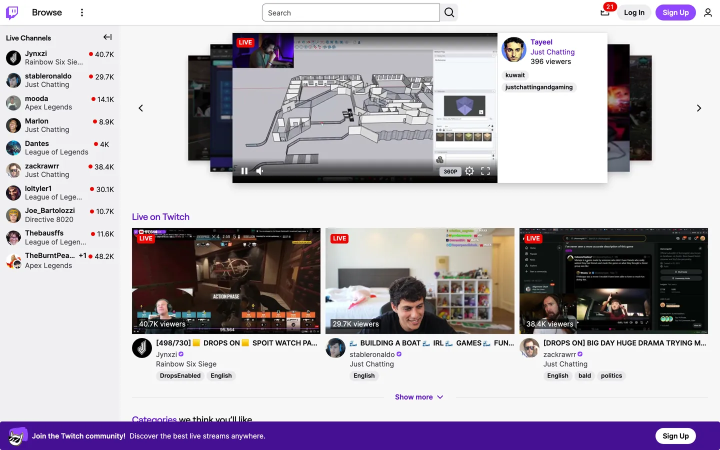
Twitch's logged-out homepage is unusual for a gaming brand. The chrome runs on a light canvas — "#ffffff" body, "#0e0e10" near-black text, "#adadb8" structural greys for hairlines and borders — and the saturation budget is parked entirely inside the video thumbnails, category art, and avatar avatars filling the carousel. The Twitch Purple "#9147ff" appears as a single primary CTA fill (the "Sign Up" pill in the top-right) and as the bottom "Join the Twitch community!" community banner. Deeper grape "#5c16c5" carries every link text run, including "Live on Twitch" anchor titles and the violet hover state on streamer names. Vivid red "#eb0400" tags every LIVE pill — and only LIVE pills, plus the corner notification badge — eighteen background renders and zero text or border roles. The chrome is quiet; the content carousel is loud. This file packages the public homepage system as a single Google Labs DESIGN.md spec. Inside: 22 colors tokens covering the two-purple voltage, the off-white surface stack, the structural greys, and the alert reds plus the Prime cerulean and success green for in-product status; 9 typography styles all built on the Inter + Roobert + Helvetica Neue stack with the chrome-running Inter at 14px and the heading-only Roobert at 18px; a four-step radius scale where every pill renders at 9000px, cards at 4px, badges at 2px, and inputs at 6px; 6 spacing steps tuned to a 2-4-8-16 rhythm; and 18 components recipes covering the primary purple pill, ghost pill, tag pill, LIVE badge, top nav, sidebar channel row, video card, search input, and the bottom community banner. Feed this file to Claude, Cursor, or GitHub Copilot and the AI will produce React components that read as Twitch — a light-canvas application chrome with one purple voltage, fully-rounded 9000px pills, red LIVE indicators, and an Inter-on-Roobert typographic split where Roobert only appears on h2 and primary anchor labels. Or reference the tokens directly when building streaming, creator-tool, or community-app surfaces: every hex is quoted, every component recipe ready to paste into Tailwind config or CSS custom properties. The system is worth studying because it proves a gaming-adjacent brand can hold a light canvas without losing its energy — let the video carousel do the shouting and let the chrome whisper one purple.
What makes it distinct
5
- Two-purple voltage hierarchyTwitch Purple '#9147ff' fills primary CTAs while deeper grape '#5c16c5' carries link text and accent borders, never swapped
- Single LIVE red '#eb0400'the red appears in 18 background renders, exclusively on live indicators, notification badges, and destructive alerts
- 9000px pill geometryevery button, tag, search field, and pill marker renders at 9000px corner radius (80 declarations) for a fully-rounded silhouette
- Inter for chrome, Roobert for displaychrome labels at Inter 14px weight 400-600, h2 headings at Roobert 18px weight 500 with -0.18px tracking
- Light-canvas chrome, dark-content imagerythe application surface is '#ffffff' with '#0e0e10' text, and the saturation budget belongs to video thumbnails and category covers
twitch.tv
Live at twitch.tv
A snapshot of the brand in production. Scroll the frame to see the whole page.
Colors
22 colors
Twitch's system runs on #9147ff as its primary voltage, used in 1 of 18 components. Type is set in Inter across 9 tokens from 10.5px to 18px, weights 400–600. Shape language is mixed across 18 components, blending pills, soft rounds, and squarer corners.
Surface
Page and card backgrounds · 3
Text
Headlines, body, captions · 4
Borders & Hairlines
Dividers, outlines, rules · 2
Semantic
Status, errors, success, links · 1
Other
Specialty colors · 12
Typography
9 type tokens
Set in Inter across 9 tokens, from 10.5px to 18px, weights 400–600. Shown in its own stack: where the font isn't installed, the fallback the file names stands in.
- heading-md18px · weight 500 · lh 19.8px · tracking -0.18pxThe quick brown fox jumps over the lazy dog
- heading-sm14px · weight 600 · lh 19.6px · tracking normalThe quick brown fox jumps over the lazy dog
- heading-anchor14px · weight 400 · lh 19.6px · tracking normalThe quick brown fox jumps over the lazy dog
- body-md14px · weight 400 · lh 19.6px · tracking normalThe quick brown fox jumps over the lazy dog
- label-md14px · weight 600 · lh 19.6px · tracking normalThe quick brown fox jumps over the lazy dog
- label-sm12px · weight 600 · lh 16.8px · tracking normalThe quick brown fox jumps over the lazy dog
- button-md14px · weight 600 · lh 14px · tracking normalThe quick brown fox jumps over the lazy dog
- caption-md14px · weight 400 · lh 14px · tracking normalThe quick brown fox jumps over the lazy dog
- micro10.5px · weight 600 · lh 14px · tracking normalThe quick brown fox jumps over the lazy dog
Layout
Radii and spacing
5 corner radii and 6 spacing values. Shape language: mixed.
Radii
- badge2px
- card4px
- input6px
- card-lg8px
- pill9000px
Spacing
- xxs2px
- xs4px
- sm5px
- base8px
- md10px
- lg16px
Components
18 components
Each rendered from its tokens (color, type, radius, padding) on Twitch's own canvas.
- Button Primarybutton-primaryButton Primary
- Button Primary Hoverbutton-primary-hoverButton Primary Hover
- Button Primary Pressedbutton-primary-pressedButton Primary Pressed
- Button Secondarybutton-secondaryButton Secondary
- button-iconButton Icon
- Tag Pilltag-pillTag Pill
- Tag Pill Hovertag-pill-hoverTag Pill Hover
- Live Badgelive-badgeLive Badge
- Notification Badgenotification-badgeNotification Badge
- Top Navtop-navTop Nav
- Nav Linknav-linkNav Link
- Link Anchorlink-anchorLink Anchor
- Sidebar Channel Rowsidebar-channel-rowSidebar Channel Row
- Video Cardvideo-cardVideo Card
- Type here…text-inputText Input
- Type here…text-input-focusText Input Focus
- Community Bannercommunity-bannerCommunity Banner
- Heading Anchorheading-anchorHeading Anchor
In use
The system, in use
Twitch's tokens on the kind of product it builds.
Build something people actually use.
A short paragraph of marketing copy that previews how the brand's display tier and body tier read together. Two sentences is usually enough.
FAQ
Twitch design system FAQ
Common questions about Twitch's tokens, components, and how to use this DESIGN.md in your project.
Read next
Related reading
Specs, directories, and component libraries that pair with this design system.
- Browse all design systemsThe full directory of DESIGN.md files on shadcn.io, with live mockups for each.shadcn.io
- Twitch — official siteLive streaming platform for gaming, entertainment, music, sports, and creator communities.twitch.tv (opens in a new tab)
- The DESIGN.md specificationGoogle Labs' open spec for machine-readable design system files — the format this page is built on.github.com (opens in a new tab)
Use it
Use Twitch in your project
One machine-readable file. Drop it into Claude, Cursor, or any AI tool that reads DESIGN.md.
Download the DESIGN.md
One machine-readable file: every color, type, radius, spacing, and component token of Twitch.
Feed it to your AI tool
Drop it into Claude, Cursor, or GitHub Copilot. The agent writes React components and Tailwind classes that match Twitch's visual language.
Reference the tokens directly
Or paste the values into your Tailwind config, CSS variables, or component library: every color, size and radius is a quoted, ready-to-copy value.
Read the full DESIGN.md: overview, rationale, do’s and don’ts
Overview
Twitch's logged-out homepage runs on a light canvas, which is unusual for a brand most viewers associate with the dark-canvas video chrome of an active stream. The application surface is {colors.surface} ("#ffffff") with near-black {colors.ink} ("#0e0e10") text — a near-pure achromatic chrome whose only chromatic moves are a Twitch Purple {colors.twitch-purple} ("#9147ff") "Sign Up" pill pinned to the top-right corner, a deeper grape {colors.twitch-purple-deep} ("#5c16c5") that carries the "Live on Twitch" anchor text and the bottom community banner band, and a {colors.live-red} ("#eb0400") that tags every LIVE pill and the corner notification badge. The video carousel — gameplay screenshots, Just Chatting webcams, category covers — is where the saturation budget actually lands.
Two-purple voltage hierarchy: where most consumer-app brands publish a single primary color and let hover/pressed states drop or lift its lightness, Twitch operates a strict purple ladder. The lighter #9147ff (61% lightness in OKLCH) is the CTA fill — only one render on the homepage chrome, on the "Sign Up" pill. A mid-tone #772ce8 (52% lightness) is the hover-and-focus voltage — declared on 27 CSS variables including --color-text-link-hover, --color-border-input-focus, and --color-background-button-brand-hover. The deeper #5c16c5 (44% lightness, 416 declarations on the page) is the read-resting state of text and accent borders — the workhorse purple. Unlike the convention of treating the lightest purple as primary and using darker variants only for pressed states, Twitch lets the deepest purple do most of the work and reserves the brightest one for the one moment that matters most.
Pill-as-default geometry: every interactive element on the page renders at a 9000px corner radius. Buttons, search inputs, tag pills, sidebar avatar masks, the corner notification badge — 80 declarations of 9000px on a single page. The radius is expressed as a large absolute value rather than the conventional 9999px, but the effect is identical: fully rounded. The page has zero sharp corners on chrome; the only sub-pill radii are 4px on video cards and 2px on the LIVE badge itself. This is pill-default, square-LIVE — the one element that breaks the pill rule is the LIVE indicator, signaling "this is a status, not an action" through its rectangular silhouette against the universally-pilled surrounding chrome.
Key Characteristics:
- Light canvas
{colors.surface}("#ffffff") with{colors.ink}("#0e0e10") text — the homepage chrome refuses the dark-canvas convention of most streaming platforms - Two-purple voltage ladder —
{colors.twitch-purple}("#9147ff") for CTAs,{colors.twitch-purple-deep}("#5c16c5") for link text and accent borders,{colors.twitch-purple-hover}("#772ce8") for hover and focus states - 9000px pill on every interactive element — 80 declarations of fully-rounded geometry across buttons, inputs, tags, and the notification badge
- LIVE red
{colors.live-red}("#eb0400") with 18 background renders, exclusively on live indicators, notification badges, and destructive alert state — never as text or border - Inter at 14px for chrome (46 instances at weight 400, 36 at weight 600), Roobert at 18px weight 500 only for h2 headings and primary anchors
- Bottom community banner runs
{colors.twitch-purple-deep}("#5c16c5") edge-to-edge — the one full-bleed purple band on the page, anchoring conversion below the carousel
Colors
The palette splits along three functional stacks: a structural achromatic stack (off-white surface, near-black text, ash hairlines), a triple-purple brand ladder (CTA, hover, link), and a strict semantic stack (LIVE red, Prime cerulean, success green, warn amber). Every alert, error, status, and brand voltage hex is declared multiple times across the system's design tokens — Twitch's CSS exposes 1008 root custom properties, and a single hex often serves 5-30 semantic roles.
- Ink (
#0e0e10) — frequency 1506. Used as text (755), border (751). The dominant achromatic; the universal body-text color and the on-light hairline color, serving 21 declared CSS variables including--color-text-base,--color-fill-base, and--color-text-input. The single load-bearing achromatic on the page. - Twitch Purple-deep (
#5c16c5) — frequency 416. Used as text (208), background (1), border (207). The workhorse purple; powers--color-text-link,--color-text-brand,--color-background-top-nav, and the bottom community banner band. Bears far more weight than the brighter#9147ff. - Canvas white (
#ffffff) — frequency 209. Used as text (98), background (10), border (98), gradient (3). The application surface; also the on-purple text color in the CTA pill and the community banner. Declared through 137 CSS variables including--color-background-base,--color-text-button-primary, and--color-background-modal. - Ink-tertiary (
#3b3b44) — frequency 156. Used as text (78), border (78). The mid-grey for secondary text and inactive borders; declared through--color-text-alt-2,--color-fill-alt-2, and--color-data-axis. - Hairline (
#adadb8) — frequency 70. Used as background (67), border (3). The structural ash; primary background for the--color-background-button-secondary-defaultfill, sidebar separator color, and disabled-button surface. Twitch's go-to neutral chip color. - Ink-black (
#000000) — frequency 41. Used as text (5), background (12), border (6), shadow (14), gradient (4). Reserved for overlay scrims, scrollbar tracks, social-button fills (Apple, Twitter), and the destructive-button-text token. Never the page canvas — that role belongs to#0e0e10. - LIVE red (
#eb0400) — frequency 18. Used as background (18). The strictest token on the page — zero text, zero border, zero shadow renders. Declared through--color-fill-live,--color-fill-alert,--color-fill-error, and--color-background-pill-notification. The LIVE indicator on video thumbnails and the corner notification badge are the only on-page renders. - Twitch Purple-darkest (
#330c6e) — frequency 5. Used as background (5). The deepest grape in the ladder; lives in--color-twitch-purple-5,--color-background-accent-alt-2, and--color-data-series-a-alt-4. Reserved for analytics gradients and the deepest band of the purple data ramp. - Charcoal (
#323239) — frequency 1 (shadow). Used as shadow (1). The single shadow color on chrome; carries--color-border-input,--color-border-toggle, and--color-hinted-grey-5. The system's "almost-but-not-pure" border color, similar in role to Discord's not-quite-black. - Twitch Purple (
#9147ff) — frequency 1. Used as background (1). The brightest brand voltage; declared through--color-twitch-purple,--color-accent,--color-fill-brand,--color-background-button-primary-default, and--color-border-button-focus. One on-page render (the "Sign Up" pill), but the highest-priority single render on the chrome. - Surface-alt (
#efeff1) — frequency 1. Used as background (1). The subtle off-white for secondary surfaces;--color-background-alt,--color-background-chat-alt,--color-background-graph. The whitespace inside cards and modals. - Surface-pill (
#c8c8d0) — frequency 1. Used as background (1). A muted pill background for subtle tags;--color-background-pill-subtle,--color-hinted-grey-10. - Twitch Purple-pressed (
#451093) — frequency 1. Used as background (1). The pressed-state purple between#5c16c5and#330c6e; declared through--color-background-input-checkbox-checked-active,--color-twitch-purple-6,--color-deprecated-brand-accent-eggplant. - Ink-secondary (
#18181b) — declared as--color-text-label,--color-text-chat-line-mentioning,--color-hinted-grey-2. The deep-canvas text color for the in-product viewer chrome; not rendered on the captured homepage but reserved for the dark surface mode. - Warn-amber (
#c28100) — declared as--color-orange-10,--color-data-series-e-base. The warning color for caution states and the orange tier of the analytics data ramp. - Prime-cerulean (
#0e9bd8) — declared as--color-background-prime,--color-prime-blue,--color-fill-prime,--color-text-prime. The Amazon Prime cerulean — reserved exclusively for the Prime crown badge and Prime-tier subscriber chrome. - Success-green (
#00f593) — declared as--color-success,--color-fill-drops,--color-fill-crate,--color-deprecated-brand-accent-slime. The success / drops-active green; an electric mint that appears only on success states and active Drops indicators. - Red-pressed (
#bb1411) — declared as--color-red-darker,--color-border-button-status-focus,--color-border-input-checkbox-error. The pressed-state variant of the LIVE red, used on destructive-button hover and form-validation error borders. - Hairline-soft (
#dedee3) — declared as--color-border-region,--color-opac-gl-4. The softest hairline for the lightest dividers between sections. - Social-facebook (
#3b5998) — declared as--color-facebook-legacy,--color-social-facebook-legacy. The legacy social-share blue; reserved for the Facebook icon fill in share menus.
Typography
Every text role on the page sits inside two faces declared in a single shared stack: Inter (with Noto Sans Arabic for RTL fallback) for body, labels, buttons, and chrome at 14px or 12px, and Roobert (with Tajawal for RTL fallback) for h2 headings and primary anchor labels at 18px or 14px. The split is binary and load-bearing — Inter handles chrome, Roobert handles headings — and the gap is unusual in scope: Inter has 46 instances at the 14px / weight 400 register alone, while Roobert appears 5 times at 18px / weight 500.
Inter at one size, three weights: every Inter-rendered element is 14px tall. Weight 400 is the body register (paragraphs, nav links, anchors). Weight 600 is the label register (button labels, sidebar usernames, top-nav button text). A 12px / weight 600 variant covers tags and tiny labels. The 14px ceiling for chrome is strict — there is no 16px or 18px Inter on the page. Line-heights are tight at 19.6px (1.4 ratio) for paragraph runs and 14px (1.0 ratio) for label-only renders where the chrome needs to clamp height to 14-20px.
Roobert as heading-only: Roobert renders 18px / weight 500 / 19.8px line-height / -0.18px tracking on h2 anchors ("Live on Twitch", "Categories we think you'll like") and on the primary "Browse" label in the top-nav. A 14px weight 600 / 19.6px line-height variant covers h3 headings inside cards. Roobert never drops to weight 400 or rises above 18px on chrome — its scope is hard-clamped to the heading and primary-anchor role. The -0.18px negative tracking is the only negative tracking on the page; every Inter token uses normal tracking.
Layout
The page is a column-first vertical layout with a fixed 50px top nav, a 200px-wide left sidebar holding the "Live Channels" rail of recommended streamers, and a main content column that fills the remaining width with a hero carousel (~360px tall) followed by stacked video-grid sections. The sidebar and main column share the same {colors.surface} ("#ffffff") background — no surface step between them — and the divide is signaled by a single {colors.hairline} ("#adadb8") vertical hairline.
The hero carousel pins a single featured streamer's video to the center, with the previous and next streamers peeking from the left and right edges as 80% scale-down dimmed thumbnails. The carousel chrome is light gray controls (left and right arrows at the column edges); the previewed streamer card on the right surfaces a 240px-wide info panel with the streamer name, "Just Chatting" category, viewer count, and tag pills. Below the carousel, "Live on Twitch" h2 anchor leads a 3-up video card grid where each card is roughly 420px wide, with the thumbnail at 16:9 aspect, a 4px corner radius, a LIVE pill in the upper-left corner, and a viewer count in the lower-left.
Vertical spacing leans on a 2-4-5-8-10-16 multiple: 2px and 4px for tag-pill internal padding, 5px and 8px for component-internal gaps, 10px for component-internal padding on banners, 16px for major component-level spacing. The page never uses a 24px, 32px, or 48px step on chrome — the rhythm caps at 16px and lets the implicit row-heights (32px buttons, 50px nav, 60px banner) do the structural work. The bottom community banner is a 60px-tall full-bleed #5c16c5 strip — the only edge-to-edge non-white surface on the page.
Elevation & Depth
Twitch's homepage doesn't lean on drop shadows for elevation. The captured CSS produces a single shadow declaration with {colors.charcoal} ("#323239") and the rest of the depth comes from color layering and hairline borders. Cards sit flat on the canvas; the perceived layer comes from the 4px corner radius and the boundary against the {colors.surface-alt} ("#efeff1") subtle off-white peeking around them.
The sidebar and main column share the same #ffffff surface, so depth is signaled entirely through the {colors.hairline} ("#adadb8") vertical divider and the avatar circles in the sidebar that anchor each channel row visually without needing a card outline. The hero carousel's preview thumbnails dim to roughly 50% opacity scrim — that opacity step is the only atmospheric depth on the page.
The one explicit layered element is the bottom community banner: a {colors.twitch-purple-deep} ("#5c16c5") strip that sits on top of the white canvas without a shadow, with a soft purple-on-purple "Twitch community" avatar character on its left edge. The strip floats on color contrast alone — no shadow, no border, just the saturation step from #ffffff to #5c16c5. Flat-on-canvas elevation is the entire model: every UI surface is opaque, every layer is signaled through hue and hairline rather than blur or alpha.
Shapes
The radius scale is intentional and tight: 2px for the LIVE badge, 4px for video cards and category tiles, 6px for text inputs, 8px for the rare wider card, and 9000px for every pill, button, and rounded chip. The 9000px declaration is unusual — most systems express full pills as 9999px or use border-radius: 50%. Twitch's CSS commits to a large absolute value, declared 80 times across the chrome.
The two load-bearing radii are 4px and 9000px. Card-at-4, pill-at-9000 is the entire system: every static surface (video card, category tile, sidebar row) gets the subtle 4px softening; every interactive element (button, search input, tag, notification badge) gets the fully-rounded pill. The 6px and 8px tier appears only on text inputs and the rare wider modal card. Unlike the convention of running a single radius across an entire page (Stripe's 6px-everywhere, Linear's 8px-everywhere), Twitch maintains a binary: static-card-square-ish vs interactive-pill-fully-round. The LIVE badge's 2px corner is the system's one rule-break — square enough to read as "status" rather than "click me", but soft enough to share the visual rhythm.
Components
- button-primary — Twitch Purple (
{colors.twitch-purple}"#9147ff") pill, white text, Inter at 14px weight 600 with 14px line-height, 32px tall, 0px × 10px padding, 9000px radius. The "Sign Up" CTA in the top-right; the single brightest-purple render on the homepage chrome. - button-primary-hover — Twitch Purple-hover (
{colors.twitch-purple-hover}"#772ce8") fill, white text, same geometry. The lifted hover state, declared through--color-background-button-brand-hover. - button-primary-pressed — Twitch Purple-pressed (
{colors.twitch-purple-pressed}"#451093") fill, white text, same geometry. The pressed/active state for keyboard-focused CTAs. - button-secondary — Surface-alt (
{colors.surface-alt}"#efeff1") fill, ink text, same 32px × 9000px-radius pill geometry. The "Log In" pill paired next to "Sign Up" in the top-right. - button-icon — Transparent fill, ink-on-canvas at Inter 14px weight 600, 32px tall, 8px horizontal padding, 9000px radius. The vertical-ellipsis menu and the bell-icon notification trigger.
- tag-pill — Surface-alt (
{colors.surface-alt}"#efeff1") fill, ink text, Inter 12px weight 600, 20px tall, 1px × 5px padding, 9000px radius. The "kuwait", "justchattingandgaming", "DropsEnabled", "English", "bald", "politics" tags on video cards and the streamer-preview panel. - tag-pill-hover — Hairline (
{colors.hairline}"#adadb8") fill, ink text, same geometry. The hover state when a tag becomes interactive. - live-badge — Live-red (
{colors.live-red}"#eb0400") fill, white text at Inter 12px weight 600, 20px tall, 0px × 5px padding, 2px radius. The "LIVE" indicator on every active video thumbnail — the one square-ish element on the page, signaling status rather than action. - notification-badge — Live-red (
{colors.live-red}"#eb0400") fill, white text at Inter 10.5px weight 600, 16px tall, 0px × 6px padding, 9000px radius. The numeric "21" badge on the bell icon in the top-right; full-pill geometry distinguishes it from the square LIVE indicator. - top-nav — Surface (
{colors.surface}"#ffffff") strip, ink text, Inter body at 14px, 50px tall, 16px horizontal padding. The Twitch glitch logo on the left, then "Browse" anchor, then center search input, then the right-side action cluster (notifications, "Log In", "Sign Up", avatar). - nav-link — Transparent fill, ink-on-canvas at Inter 14px weight 600, 30px tall, 8px horizontal padding. The "Browse" top-nav label and any tertiary nav item.
- link-anchor — Transparent fill, Twitch Purple-deep (
{colors.twitch-purple-deep}"#5c16c5") text at Inter 14px weight 400. The streamer-name anchor below each video card ("Jynxzi", "stableronaldo", "zackrawrr") and the inline link runs in body copy. - sidebar-channel-row — Surface (
{colors.surface}"#ffffff") fill, ink text at Inter 14px weight 600, 42px tall, 5px × 8px padding. Each row in the "Live Channels" rail — circular avatar on the left, channel name and current category stacked, viewer count with red dot on the right. - video-card — Surface (
{colors.surface}"#ffffff") fill, ink text, Inter body at 14px, 4px corner radius, zero padding. The 16:9 thumbnail card with overlaid LIVE pill and viewer count; below the thumbnail, the title, streamer name (Twitch Purple-deep link), category text, and tag pill rail. - text-input — Surface (
{colors.surface}"#ffffff") fill, ink text at Inter 14px weight 400, 32px tall, 8px horizontal padding, 6px radius. The center search input in the top nav and any in-product search/filter field. - text-input-focus — Same surface; focus is signaled by a Twitch Purple-hover (
{colors.twitch-purple-hover}"#772ce8") 2px ring declared through--color-border-input-focus. - community-banner — Twitch Purple-deep (
{colors.twitch-purple-deep}"#5c16c5") full-width band, white text at Inter 14px weight 600, 60px tall, 10px × 16px padding. The bottom "Join the Twitch community!" conversion strip pinned to the viewport bottom, with the avatar mascot on the left edge and a white-on-purple "Sign Up" pill on the right. - heading-anchor — Transparent fill, Twitch Purple-deep (
{colors.twitch-purple-deep}"#5c16c5") text at Roobert 18px weight 500 with -0.18px tracking. The "Live on Twitch" and "Categories we think you'll like" h2 anchors that lead each grid section — clickable section titles, which is why the heading color matches link color.
Do's and Don'ts
Do keep Twitch Purple #9147ff to a single primary CTA per page. The "Sign Up" pill is the only render of #9147ff on the homepage chrome — when a secondary purple is needed, drop to #5c16c5 (link / accent border) or #772ce8 (hover / focus). Adding a second #9147ff surface breaks the singular-voltage discipline.
Do render every LIVE indicator at 2px radius and every other red surface at the standard 9000px pill. The LIVE badge's square-ish silhouette is the one shape break in the system, signaling "status" rather than "action" against the universally-pilled surrounding chrome.
Do use Roobert exclusively for h2 headings, primary anchor labels, and the "Browse" top-nav label. Every other text role — body, button label, tag, caption — runs Inter. The two-face binary is load-bearing; mixing Roobert into body copy collapses the heading-speak / body-speak split.
Don't use #9147ff for body text or accent borders — it's button-fill-only. The link-text role belongs to #5c16c5, the hover/focus role belongs to #772ce8. Setting color: #9147ff on an anchor produces a text color that vibrates against the white canvas because the bright purple is calibrated for a fill, not a 14px text run.
Don't use {colors.live-red} ("#eb0400") for any button that isn't destructive. Red on Twitch means "broadcasting now" or "this will delete something" — the discipline is strict and a 5th render for a generic "stop" or "cancel" button breaks the LIVE-only / destructive-only contract. Use the secondary pill instead.
Don't drop the 9000px pill radius to 8px or 16px because "it looks more like a button." Every interactive element on the chrome shares the full-pill silhouette — the radius is the system's interactive affordance. Setting a button to 8px makes it visually indistinguishable from a video card.
Don't put #ffffff text on #9147ff and call it accessible without testing the specific weight. Inter 600 at 14px on #9147ff clears WCAG AA contrast (4.5:1) at body sizes, but Inter 400 at 12px lands marginally below — keep button-on-purple labels at weight 600 minimum.
Don't use the Prime cerulean #0e9bd8 outside the Prime crown badge and Prime-tier chrome. The cerulean is reserved exclusively for Amazon Prime subscriber indicators; using it as a generic info-blue breaks the affordance for users who scan for the Prime icon.
Known Gaps
- In-product viewer chrome (channel page, video player controls, chat dock, emote picker) is out of scope — the captured surface is the logged-out homepage only. The component recipes here cover marketing chrome, sidebar rail, and the video-grid browse surface, not the live-stream-watching application.
- Dark canvas mode is real and dominant on the in-product viewer page, but not present on the homepage capture. The dark surface (
#0e0e10background with#9147ffpurple chrome) reverses the light-canvas contract — both modes share the pill geometry and purple voltage, but the surface-to-on-surface roles flip. - Mobile breakpoint behavior is not captured. The responsive collapse (hamburger nav, single-column video grid, sidebar drawer) is known but not extracted from this snapshot.
- Motion — the LIVE indicator pulses, the hero carousel auto-rotates, viewer counts increment live, and the bell badge animates on new notifications. The specific timing functions and choreography are not in the captured tokens.
- Hover and focus state pixel-precise treatments for the carousel arrows, tag pills, and sidebar rows are only partially extracted.
- Form validation — error-state borders, helper-text styles, and inline form-validation messaging beyond the
red-pressedcolor token are not captured. - Per-category theming — Twitch's category and tag system allows custom accent colors for partnered creators and special events; those overrides are not in scope.
Music, Video & Streaming
More systems like this
More DESIGN.md files in Music, Video & Streaming.
Pricing
Build it with Pro
The DESIGN.md files are free. Pro adds 6,000+ blocks, premium templates and the MCP server, so your AI editor builds in your system for you.
4.9/5 out of 5 · 150+ reviewsfrom 150+ founders and developers.
Billing
Billed once a year in USD. Cancel anytime.
- How many people can use the license.
- Client work, SaaS products and anything you charge for.
- Production-ready React sections: hero, pricing, features, dashboards and more.
- Complete multi-page sites you can ship as they are.
- React icons from every major library, installable with one command.
- Presets that restyle every block, in light and dark.
- Lets your AI editor search, preview and install blocks for you.
- Priority requests are answered first.
Individual
For personal projects & open source
$32instead of $49/mo
$389 billed yearly
- Seats: 1 seat
- Commercial use: Personal & open source only
- Pro blocks: 6,000+ blocks
- Templates: All 14 templates
- React icons: 294k+ icons
- Themes: All 59 themes
- MCP server: Basic usage
- Support: Standard
Team
Most popularFor freelancers, agencies & startups
$66instead of $99/mo
$789 billed yearly · ≈ $13/dev/mo
- Seats: Up to 5 seats
- Commercial use: Included
- Pro blocks: 6,000+ blocks
- Templates: All 14 templates
- React icons: 294k+ icons
- Themes: All 59 themes
- MCP server: High usage
- Support: Priority
Organization
For companies with larger teams
$132instead of $199/mo
$1,589 billed yearly
- Seats: Unlimited seats
- Commercial use: Included
- Pro blocks: 6,000+ blocks
- Templates: All 14 templates
- React icons: 294k+ icons
- Themes: All 59 themes
- MCP server: Unlimited usage
- Support: Priority
Billed once a year in USD. Cancel anytime.
Individual
For personal projects & open source
$32instead of $49/mo
$389 billed yearly
- How many people can use the license.Seats: 1 seat
- Client work, SaaS products and anything you charge for.Commercial use: Personal & open source only
- Production-ready React sections: hero, pricing, features, dashboards and more.Pro blocks: 6,000+ blocks
- Complete multi-page sites you can ship as they are.Templates: All 14 templates
- React icons from every major library, installable with one command.React icons: 294k+ icons
- Presets that restyle every block, in light and dark.Themes: All 59 themes
- Lets your AI editor search, preview and install blocks for you.MCP server: Basic usage
- Priority requests are answered first.Support: Standard
Team
Most popularFor freelancers, agencies & startups
$66instead of $99/mo
$789 billed yearly · ≈ $13/dev/mo
Everything in Individual, plus
- How many people can use the license.Seats: Up to 5 seats
- Client work, SaaS products and anything you charge for.Commercial use: Included
- Lets your AI editor search, preview and install blocks for you.MCP server: High usage
- Priority requests are answered first.Support: Priority
Organization
For companies with larger teams
$132instead of $199/mo
$1,589 billed yearly
Everything in Team, plus
- How many people can use the license.Seats: Unlimited seats
- Lets your AI editor search, preview and install blocks for you.MCP server: Unlimited usage
- Secure checkout via Stripe
- Code lives in your repo
- Keep what you've shipped if you cancel
- License terms
Your system, built for you
Every block, template and icon, installed by your AI agent in your design system. The DESIGN.md files stay free.