TickTick Design System
TickTick's marketing design system: ink-black text on white, cobalt-blue voltage for CTAs and headings, and extreme 30px card rounding that signals tablet-native design. Tokens for React and AI tools.
Add shadcn.io to your AI agent. · Pro It installs blocks, icons and templates in your design system from a prompt, with Pro.
Set up MCP- Primary
- #4772fa
- Typeface
- system-ui
- Shape
- Soft
- Base radius
- 20px
- Colors
- 8
- Type tokens
- 13
- Components
- 14
- Spacing values
- 9
About
About TickTick DESIGN.md
Curated by Dov Azencot · Updated May 19, 2026 · Source ticktick.com (opens in a new tab)
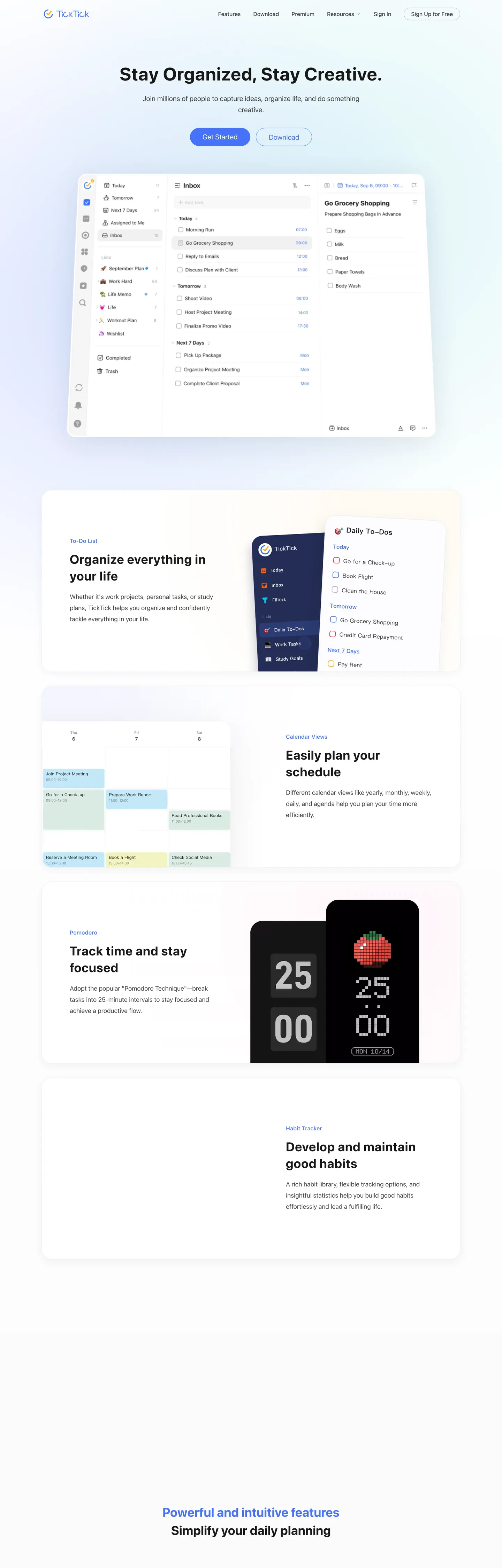
TickTick's marketing page reads as a mobile app store listing scaled to a desktop browser. The hero places a full product-screenshot of the app — three-panel layout showing the sidebar, task list, and detail pane — on a blue-to-teal gradient cloud, with the headline "Stay Organized, Stay Creative." in 52px weight 700 above. Below the fold, each feature section (To-Do List, Calendar Views, Pomodoro, Habit Tracker) uses the same format: a label in cobalt blue, a two-line heading in ink black, a paragraph, and a product screenshot on the alternate side. The rhythm is app-store feature rundown rather than SaaS marketing narrative. Where Todoist's marketing emphasizes task hierarchy with progressive disclosure screenshots, and where Things 3 leans on photography and white space, TickTick shows the interface densely and trusts the feature count to make the argument.
The DESIGN.md file packages the system into a machine-readable spec for React tooling. Inside: 8 colors tokens built on an ink-black base — the dominant text tone is #000000 (701 frequency) with near-black #191919 (252 frequency) for secondary text, and cobalt blue (#4772fa, 34 frequency) as the sole chromatic voltage; 13 typography tokens running the system-ui stack at weights 400 through 700 with the 52px / 700 display headline as the one heavy moment; 5 corner-radius tokens centered on a 30px default that defines every feature card; and 14 components definitions covering the pill CTA, the extreme-radius feature cards, and the section heading treatment that puts cobalt blue directly on the h2.
Feed this file to an AI coding tool and it reproduces TickTick's specific moves: ink-black text on a pure white canvas, cobalt blue used directly on section headings as well as on CTAs, 30px corner rounding as the default for every contained surface, and the system-ui stack for typography. The one principle worth examining is the heading-as-accent move: using the brand voltage as the color of an h2 label rather than reserving it for interactive elements alone creates a visual rhythm that ties the feature sections together without additional decorative chrome.
What makes it distinct
5
- Extreme card roundingevery feature card uses 30px radius (frequency 44), the defining visual move that distinguishes TickTick from Todoist's flat-card and Linear's sharp-corner conventions
- Cobalt section headingsthe blue (#4772fa) appears not just on CTAs but directly as the color of h2 section headings, an unusual move that uses the brand voltage as typographic accent
- System-ui with no custom typefacethe entire system runs the OS default font stack, betting that familiarity reads as utility rather than as brand deficit
- 52px hero at 1.04px trackingthe display headline uses positive letter-spacing, rare in the SaaS marketing convention of negative-tracking large headlines, giving it an expansive app-store feel
- Blue-to-teal gradient on the hero backdropthe app-screenshot hero sits on a blue (#4772fa) to cyan (#93dde5) gradient cloud, the only gradient moment in an otherwise flat system
ticktick.com
Live at ticktick.com
A snapshot of the brand in production. Scroll the frame to see the whole page.
Colors
8 colors
TickTick's system runs on #4772fa as its primary voltage, used in 2 of 14 components. Type is set in system-ui across 13 tokens from 14px to 52px, weights 400–700. Shape language is soft — components average 353px corner radius, with no sharp interactive edges.
Brand & Accent
Sparing, CTA-only voltage · 2
Surface
Page and card backgrounds · 1
Text
Headlines, body, captions · 3
Other
Specialty colors · 2
Typography
13 type tokens
Set in system-ui across 13 tokens, from 14px to 52px, weights 400–700. Shown in its own stack: where the font isn't installed, the fallback the file names stands in.
- display-xl52px · weight 700 · lh 63px · tracking 1.04pxThe quick brown fox jumps over the lazy dog
- display-md36px · weight 700 · lh 48px · tracking 0.72pxThe quick brown fox jumps over the lazy dog
- heading-lg26px · weight 600 · lh 40pxThe quick brown fox jumps over the lazy dog
- heading-md24px · weight 500 · lh 30pxThe quick brown fox jumps over the lazy dog
- heading-sm20px · weight 500 · lh 24pxThe quick brown fox jumps over the lazy dog
- body-lg18px · weight 400 · lh 28pxThe quick brown fox jumps over the lazy dog
- body-md16px · weight 400 · lh 26pxThe quick brown fox jumps over the lazy dog
- body-bold18px · weight 700 · lh 31pxThe quick brown fox jumps over the lazy dog
- label-md16px · weight 500 · lh 22px · tracking 0.32pxThe quick brown fox jumps over the lazy dog
- caption14px · weight 400 · lh 19pxThe quick brown fox jumps over the lazy dog
- serif-quote28px · weight 500 · lh 52px · tracking 0.56pxThe quick brown fox jumps over the lazy dog
- nav-link16px · weight 500 · lh 80pxThe quick brown fox jumps over the lazy dog
- button-md20px · weight 400 · lh 52pxThe quick brown fox jumps over the lazy dog
Layout
Radii and spacing
5 corner radii and 9 spacing values. Shape language: soft.
Radii
- none0px
- sm12px
- md20px
- lg30px
- full999px
Spacing
- xs8px
- sm12px
- md16px
- lg20px
- xl24px
- 2xl32px
- 3xl36px
- 4xl40px
- 5xl48px
Components
14 components
Each rendered from its tokens (color, type, radius, padding) on TickTick's own canvas.
- Button Primarybutton-primaryButton Primary
- Button Secondarybutton-secondaryButton Secondary
- Top Navtop-navTop Nav
- Nav Linknav-linkNav Link
- Hero Headinghero-headingHero Heading
- Section Labelsection-labelSection Label
- Section Headingsection-headingSection Heading
- Feature Headingfeature-headingFeature Heading
- Body Paragraphbody-paragraphBody Paragraph
- CardcardCard
- Hero Cardhero-cardHero Card
- Feature Cardfeature-cardFeature Card
- Testimonial Blocktestimonial-blockTestimonial Block
- FooterfooterFooter
In use
The system, in use
TickTick's tokens on the kind of product it builds.
Build something people actually use.
A short paragraph of marketing copy that previews how the brand's display tier and body tier read together. Two sentences is usually enough.
FAQ
TickTick design system FAQ
Common questions about TickTick's tokens, components, and how to use this DESIGN.md in your project.
Read next
Related reading
Specs, directories, and component libraries that pair with this design system.
- Browse all design systemsThe full directory of DESIGN.md files on shadcn.io, with live mockups for each.shadcn.io
- TickTick — official siteTickTick's public marketing site — the source of truth for the live tokens captured in this file.ticktick.com (opens in a new tab)
- The DESIGN.md specificationGoogle Labs' open spec for machine-readable design system files — the format this page is built on.github.com (opens in a new tab)
Use it
Use TickTick in your project
One machine-readable file. Drop it into Claude, Cursor, or any AI tool that reads DESIGN.md.
Download the DESIGN.md
One machine-readable file: every color, type, radius, spacing, and component token of TickTick.
Feed it to your AI tool
Drop it into Claude, Cursor, or GitHub Copilot. The agent writes React components and Tailwind classes that match TickTick's visual language.
Reference the tokens directly
Or paste the values into your Tailwind config, CSS variables, or component library: every color, size and radius is a quoted, ready-to-copy value.
Read the full DESIGN.md: overview, rationale, do’s and don’ts
Overview
TickTick's marketing page borrows its structural logic from the mobile app store. Heading-as-accent. The most distinctive move is using the cobalt-blue voltage (#4772fa) directly as the color of h2 section labels — "To-Do List," "Calendar Views," "Pomodoro," "Habit Tracker" — turning the brand color into a typographic navigation system rather than reserving it exclusively for interactive elements. Each feature section opens with a small blue category label, then shifts to ink-black for the heading and body, then shifts back to blue for the next section's label. The blue functions as a visual separator and section identifier simultaneously.
Unlike Todoist, which uses a raspberry-red voltage on white with 8px card rounding, and unlike Things 3, which leans on photography and whitespace restraint, TickTick makes its feature case through density and rounding. Feature cards at 30px radius (wired as --baseCardBorderRadius) read as tablet-native — the corner language of iOS widgets and Android cards, not the web-first 8px default. The marketing page is an argument for "this is a mobile app that also works on web," not the reverse.
Typographically, the system runs the OS default stack throughout — no custom typeface, no web font request. The 52px hero headline at weight 700 with 1.04px positive letter-spacing is the one measured display moment; below that, the body sits at 16-18px in the system's rendered face, which on macOS is San Francisco and on Windows is Segoe UI.
Key Characteristics:
- Cobalt blue (#4772fa) used as h2 section label color — the brand voltage as typographic section divider, not only as interactive element.
- 30px card radius (frequency 44, --baseCardBorderRadius) — tablet-native rounding language that distinguishes the system from web-first productivity tools.
- System-ui stack throughout — no custom typeface; the OS renders the correct face per platform.
- 52px hero headline at 1.04px positive letter-spacing — expansive tracking, not tight; an app-store aesthetic rather than editorial restraint.
- Blue-to-teal gradient (#4772fa → #93dde5) as the hero card backdrop — the only gradient moment on a page that is otherwise white and flat.
- Georgia serif appears for pull-quote testimonials — a secondary voice that signals the tool is used by people who value writing.
- Deep-navy shadow (#0f1c47, 17 instances) gives the hero card dimensional lift without a darker background surface.
Colors
Brand
- Cobalt Blue (
{colors.primary}— #4772fa): frequency 34. Used as text (14), border (14), bg (4), gradient (2). Section headings, primary CTA fill, featured card accent, gradient start. The system's only chromatic tone. - Aqua Teal (
{colors.primary-teal}— #93dde5): frequency 1 as gradient. The gradient end stop on the hero backdrop cloud. Not used anywhere else in the marketing system.
Ink
- Ink Black (
{colors.ink-black}— #000000): frequency 701. Used as text (362), border (338), shadow (1). The dominant text and border tone — pure black, not charcoal, used at maximum frequency for both text and hairlines. - Near Black (
{colors.ink}— #191919): frequency 252. Used as text (114), border (134), bg (4). The primary heading color for h1 and feature headings — slightly softer than pure black while still reading as near-black. - Dark Gray (
{colors.ink-dark}— #3d3d3d): frequency 46. Used as text (23), border (23). Body text in feature sections and footer links — visible distinction from #191919 creates a subtle two-tier text hierarchy.
Canvas
- White (
{colors.canvas}— #ffffff): frequency 69. Used as bg (46), border (13), text (9), gradient (1). The page canvas, card fills, and button text on dark surfaces.
Shadows
- Deep Navy Shadow (
{colors.shadow-deep}— #0f1c47): frequency 17 as shadow only. The hero product-screenshot card shadow — a blue-tinted deep navy rather than gray or black, which means the shadow carries a chromatic hint of the brand's blue family. - Navy Shadow (
{colors.shadow-navy}— #0b2060): frequency 5 as shadow only. A secondary shadow layer on the hero card, deeper than the primary shadow.
Typography
Font Family
The system runs the OS system-ui stack exclusively — system-ui, -apple-system, "system-ui", "Segoe UI", Roboto, Helvetica, Arial, sans-serif. No web font is loaded; no custom typeface is declared. This means TickTick's marketing page renders in San Francisco on macOS, Segoe UI on Windows, and Roboto on Android. The functional result: the marketing site feels like the native platform it's advertising the app on.
A secondary voice appears in the testimonial pull-quote section: Georgia / Merriweather serif at 28px weight 500, 0.56px letter-spacing. This serif insert reads as a print-magazine quote format — a deliberate contrast with the functional system-ui surrounding it that signals TickTick is used by people who think in sentences.
Hierarchy
| Token | Size | Weight | Line Height | Tracking | Use |
|---|---|---|---|---|---|
{typography.display-xl} | 52px | 700 | 63px | 1.04px | Hero h1 — "Stay Organized, Stay Creative." |
{typography.display-md} | 36px | 700 | 48px | 0.72px | Section h2 headings |
{typography.heading-lg} | 26px | 600 | 40px | 0 | Feature section titles |
{typography.heading-md} | 24px | 500 | 30px | 0 | Sub-feature headings |
{typography.heading-sm} | 20px | 500 | 24px | 0 | Smaller sub-section labels |
{typography.body-lg} | 18px | 400 | 28px | 0 | Feature section descriptions |
{typography.body-md} | 16px | 400 | 26px | 0 | Standard body paragraphs |
{typography.body-bold} | 18px | 700 | 31px | 0 | Emphasized feature claims |
{typography.label-md} | 16px | 500 | 22px | 0.32px | Card labels and nav items |
{typography.caption} | 14px | 400 | 19px | 0 | Footer links, sub-labels |
{typography.serif-quote} | 28px | 500 | 52px | 0.56px | Pull-quote testimonials |
{typography.nav-link} | 16px | 500 | 80px | 0 | Top-nav link labels |
{typography.button-md} | 20px | 400 | 52px | 0 | CTA pill button label |
Principles
The display tier uses positive letter-spacing (1.04px at 52px), which inverts the SaaS design convention — most systems use 0 or negative tracking at large sizes to compact headlines. TickTick's positive tracking gives the large headline an expansive, app-store marketing poster quality. Below the display tier everything returns to 0 tracking except the medium label (0.32px), which uses a minimal trace of tracking for nav readability.
Note on Font Substitutes
Since the system runs the OS stack, no substitution is needed for most contexts — the OS will render the correct face. For a fixed rendering across platforms, Inter at the same weights is the closest alternative. For the serif-quote token, Georgia is already the first fallback; if Georgia is unavailable, Lora or Merriweather at the same size and weight will preserve the print-quote feel.
Layout
Spacing System
- Base unit: 4px, with 16px, 20px, and 40px as the dominant module values.
- Tokens:
{spacing.xs}8px ·{spacing.sm}12px ·{spacing.md}16px ·{spacing.lg}20px ·{spacing.xl}24px ·{spacing.2xl}32px ·{spacing.3xl}36px ·{spacing.4xl}40px ·{spacing.5xl}48px. - Section vertical spacing: 140px top margin for section titles (--moduleTitleMarginTop), 60px bottom (--moduleTitleMarginBottom) — generous vertical breathing room between feature sections.
- Card padding: 32x28px standard, 36x48x32px on tall feature panels.
- Container: 90% width up to 1200px max (--containerWidth / --containerMaxWidth); large container up to 1400px (--containerLargeMaxWidth).
Grid & Container
- Max content width: 1200px (standard), 1400px (large sections).
- Hero: centered headline + sub-copy + two pill CTAs (Get Started / Download) above a full-width product-screenshot card on a blue-teal gradient backdrop.
- Feature sections: alternating two-column layout — text column (label + heading + paragraph) on one side, product screenshot on the other, alternating L/R.
- Platform section: horizontal icon strip with platform logos.
- Testimonial section: pull-quotes in a Georgia serif, with highlighted text markers.
- Footer: white canvas with logo, nav links, and platform download badges.
Rhythm
The page follows a strict alternating pattern: each feature section flips which side holds the text and which holds the screenshot. The cobalt-blue section labels mark each new section, creating a visual drum-beat that carries the eye down the page. Section padding (140px top) keeps each section clearly separated — the page does not rush.
Elevation
The hero product-screenshot card uses a blue-tinted layered shadow: rgba(15,28,71,0.x) at two depth levels (deep navy #0f1c47 and navy #0b2060), creating a blue-chromatic depth effect rather than a gray or black shadow. This means the card floats against the blue-to-teal gradient backdrop with a shadow that carries the same color family, keeping the hero visually unified.
All feature cards below the fold sit flat — no shadow, only the 30px white card surface on the light-gray page background. The page does not use a surface ladder or multiple elevation tiers.
Shapes
The radius scale is defined by a single dominant value:
{rounded.none}0px — inline text elements, dividers.{rounded.sm}12px — smaller interactive surfaces and inner elements.{rounded.md}20px — medium UI containers and some feature card variants.{rounded.lg}30px — every feature card, hero product-screenshot, pricing card. Frequency 44 — by far the dominant value. Wired as --baseCardBorderRadius.{rounded.full}999px — CTA pill buttons only.
The 30px radius is the defining radius choice of the system. At this scale on a 400px-wide card, the corners are substantially curved — not pill-shaped, but generously rounded in a way that reads as mobile-native rather than web-native. The pill buttons at 999px sit at the opposite extreme, with nothing between 30px and pill — no intermediate 8-16px card tier exists.
Components
button-primary — Cobalt (#4772fa) fill, white text, 999px pill radius, 0x36px padding, 52px height. "Get Started" is the canonical hero instance.
button-secondary — White fill, ink-black border, pill radius, same sizing. "Download" sits beside the primary CTA in the hero.
top-nav — White canvas, ink-black text, 0x24px padding, 80px height. Houses the TickTick logo, five nav links (Features / Download / Upgrade / Resources), and Sign In + Sign Up pill buttons on the right.
nav-link — Transparent, ink-black text at 16px weight 500, 80px line-height (matching nav height for vertical centering).
hero-heading — Near-black (#191919) text, system-ui 52px weight 700, 1.04px letter-spacing.
section-label — Cobalt blue (#4772fa) text, 14px weight 400. The small category markers above each feature heading ("To-Do List," "Calendar Views," "Pomodoro," "Habit Tracker").
section-heading — Near-black (#191919) text, system-ui 36px weight 700, 0.72px letter-spacing. The h2 text is rendered in cobalt blue rather than ink — the one instance where the heading itself takes the brand voltage.
feature-heading — Near-black text, 26px weight 600. Feature section titles like "Organize everything in your life," "Easily plan your schedule."
body-paragraph — Near-black text, 16px weight 400. Feature section body copy.
card — White fill, 30px radius, 32x28px padding. The standard feature card container.
hero-card — White fill, 30px radius, 0 padding. The product-screenshot frame in the hero, sitting on the blue-teal gradient backdrop with deep-navy shadow.
feature-card — White fill, 30px radius, 36x48x32px padding. The feature illustration panels (To-Do List, Calendar, Pomodoro, Habit Tracker).
testimonial-block — White fill, 30px radius, 32x28px padding. The Georgia-serif pull-quote blocks with highlighted text markers.
footer — White canvas, dark-gray (#3d3d3d) text, 40x24px padding. Logo, navigation links, platform download links, and copyright.
Do's and Don'ts
Do use the cobalt blue (#4772fa) on section-label text above each feature heading. This is the system's navigation rhythm — the blue label marks the start of each section, and its absence at the heading level would flatten the visual hierarchy.
Do use 30px corner radius for all feature cards and container surfaces. The --baseCardBorderRadius token is the system's defining visual identity. Using 8px or 12px cards would make the marketing surface read as a different product.
Do keep the hero headline at 1.04px positive letter-spacing. The positive tracking at 52px is the display tier's signature — negative tracking would shift the register from app-store expansive to editorial compressed.
Do apply the blue-tinted layered shadow (rgba(15,28,71,x)) to the hero product-screenshot card only. The dual-layer blue shadow keeps the hero card tied to the brand's blue family without needing a separate shadow color variable.
Don't use the cobalt blue (#4772fa) as a background fill for feature cards. In this system, cobalt appears as text (labels and links) and as the CTA button fill — not as a card background tint. A blue-tinted feature card would break the white-card visual rhythm that the 30px rounding establishes.
Don't use a custom web typeface alongside the system-ui stack. The system's bet is that platform-native rendering reads as utility; introducing a web font would add load time and visual contrast that undercuts the "this is a native app" argument.
Don't reduce card rounding below 20px. The 30px radius is the brand's most distinctive visual marker — approaching 12px or 8px would make TickTick's feature sections visually indistinguishable from Todoist's or Asana's.
Don't place the Georgia serif token ({typography.serif-quote}) in headings or body copy. It exists only for pull-quote testimonial blocks — using it in feature section headings would create a register mismatch between the functional system-ui body and the literary serif display.
Known Gaps
- Dark mode: TickTick ships a dark theme in the product (the marketing site is light-only). Dark-mode palette not captured here.
- Hover and focus states: only resting states are captured. The CTA button hover, nav link active states, and focus rings are not represented.
- Mobile responsive layout: the marketing page stacks the two-column feature sections on mobile, and the hero card scales down to a single panel. Mobile token overrides not captured.
- Animation: the hero product-screenshot likely includes scroll-triggered entrance animations for the feature cards. Easing curves and timing are not captured in static extraction.
- Gradient spec: the exact gradient angle, stop positions, and opacity for the hero backdrop cloud are not captured — only the start (#4772fa) and end (#93dde5) colors are extracted.
- Platform-specific features: the marketing page references a Pomodoro timer (shown with a dark card), habit-tracking statistics, and calendar integrations — each has its own in-product color palette not captured here.
Productivity & SaaS
More systems like this
More DESIGN.md files in Productivity & SaaS.
Pricing
Build it with Pro
The DESIGN.md files are free. Pro adds 6,000+ blocks, premium templates and the MCP server, so your AI editor builds in your system for you.
4.9/5 out of 5 · 150+ reviewsfrom 150+ founders and developers.
Billing
Billed once a year in USD. Cancel anytime.
- How many people can use the license.
- Client work, SaaS products and anything you charge for.
- Production-ready React sections: hero, pricing, features, dashboards and more.
- Complete multi-page sites you can ship as they are.
- React icons from every major library, installable with one command.
- Presets that restyle every block, in light and dark.
- Lets your AI editor search, preview and install blocks for you.
- Priority requests are answered first.
Individual
For personal projects & open source
$32instead of $49/mo
$389 billed yearly
- Seats: 1 seat
- Commercial use: Personal & open source only
- Pro blocks: 6,000+ blocks
- Templates: All 14 templates
- React icons: 294k+ icons
- Themes: All 59 themes
- MCP server: Basic usage
- Support: Standard
Team
Most popularFor freelancers, agencies & startups
$66instead of $99/mo
$789 billed yearly · ≈ $13/dev/mo
- Seats: Up to 5 seats
- Commercial use: Included
- Pro blocks: 6,000+ blocks
- Templates: All 14 templates
- React icons: 294k+ icons
- Themes: All 59 themes
- MCP server: High usage
- Support: Priority
Organization
For companies with larger teams
$132instead of $199/mo
$1,589 billed yearly
- Seats: Unlimited seats
- Commercial use: Included
- Pro blocks: 6,000+ blocks
- Templates: All 14 templates
- React icons: 294k+ icons
- Themes: All 59 themes
- MCP server: Unlimited usage
- Support: Priority
Billed once a year in USD. Cancel anytime.
Individual
For personal projects & open source
$32instead of $49/mo
$389 billed yearly
- How many people can use the license.Seats: 1 seat
- Client work, SaaS products and anything you charge for.Commercial use: Personal & open source only
- Production-ready React sections: hero, pricing, features, dashboards and more.Pro blocks: 6,000+ blocks
- Complete multi-page sites you can ship as they are.Templates: All 14 templates
- React icons from every major library, installable with one command.React icons: 294k+ icons
- Presets that restyle every block, in light and dark.Themes: All 59 themes
- Lets your AI editor search, preview and install blocks for you.MCP server: Basic usage
- Priority requests are answered first.Support: Standard
Team
Most popularFor freelancers, agencies & startups
$66instead of $99/mo
$789 billed yearly · ≈ $13/dev/mo
Everything in Individual, plus
- How many people can use the license.Seats: Up to 5 seats
- Client work, SaaS products and anything you charge for.Commercial use: Included
- Lets your AI editor search, preview and install blocks for you.MCP server: High usage
- Priority requests are answered first.Support: Priority
Organization
For companies with larger teams
$132instead of $199/mo
$1,589 billed yearly
Everything in Team, plus
- How many people can use the license.Seats: Unlimited seats
- Lets your AI editor search, preview and install blocks for you.MCP server: Unlimited usage
- Secure checkout via Stripe
- Code lives in your repo
- Keep what you've shipped if you cancel
- License terms
Your system, built for you
Every block, template and icon, installed by your AI agent in your design system. The DESIGN.md files stay free.