Things Design System
Things by Cultured Code is a Mac-native task manager whose marketing site matches the product exactly — off-white canvas, system-sans type, single cobalt blue accent. Tokens for React, Next.js, and AI coding tools.
Add shadcn.io to your AI agent. · Pro It installs blocks, icons and templates in your design system from a prompt, with Pro.
Set up MCP- Primary
- #2576eb
- Typeface
- ui-sans-serif
- Shape
- Mixed
- Base radius
- 6px
- Colors
- 12
- Type tokens
- 11
- Components
- 15
- Spacing values
- 8
About
About Things DESIGN.md
Curated by Dov Azencot · Updated May 19, 2026 · Source culturedcode.com (opens in a new tab)
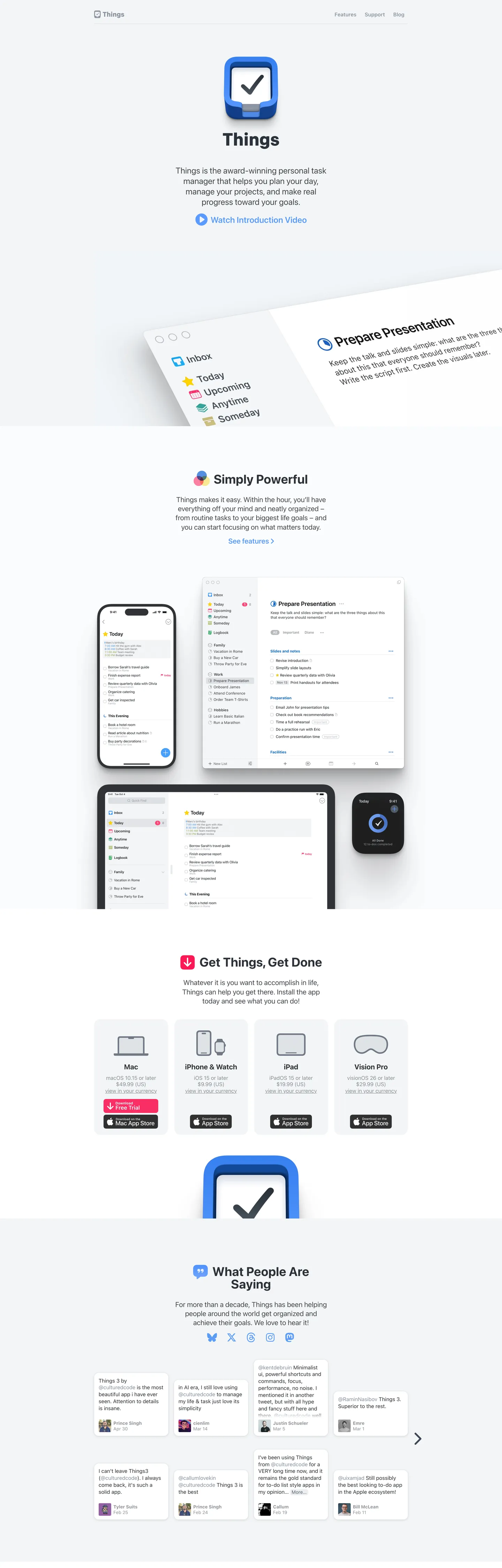
Things' marketing page at culturedcode.com is the most Mac-native-feeling website in the productivity-app category. The hero places the app icon — a rounded-rectangle with a cobalt-blue checkmark — above a single line of body text and a "Watch Introduction Video" link, then the page shifts immediately into product screenshots. There is no hero headline beyond the product name, no gradient, no brand-color fill. The design communicates Mac-quality by being as spare as the Mac HIG itself.
The token system behind that restraint: one typeface (Apple's system-sans, rendering as San Francisco on macOS and iOS), one chromatic accent (a cobalt blue that appears on links, the CTA button, and nowhere else), and a canvas that isn't quite white — the off-white floor has a faint blue cast that matches macOS window backgrounds. Where Notion uses a cream and where Todoist uses red, Things holds still at the neutrals and lets the product do the talking. The radius scale is anchored at 18px — the Mac-window rounding — rather than the 4-8px tight-crop that developer tools favor.
Feed this file to an AI coding tool and it reproduces Things' disciplined Mac-native moves: system-sans at modest weights (400 body, 700 for section headers only), off-white canvas instead of pure white, cobalt blue reserved for a single interactive accent per surface, and 18px rounding on any element that needs to feel at home on macOS. The one constraint worth noting: this system only works at the scale of a focused single-product site. Introducing a second accent or a display font would break the "the app IS the brand" identity.
What makes it distinct
5
- Product screenshots as decorationdevice mockups of the Mac, iPhone, iPad, and Vision Pro apps carry every visual moment; there is no brand-layer chrome
- System-sans throughoutui-sans-serif/-apple-system stack renders as San Francisco on Apple devices, matching the native Mac app pixel-for-pixel
- Single cobalt accenta medium blue appears only on interactive links, the CTA button, and the app icon; the rest of the palette is neutral grays
- 18px dominant radiusthe largest radius tier, used on product screenshot frames and promotional chips, gives the page a Mac-native rounded-window feel
- Cool off-white canvasthe page floor is a faint blue-gray near-white rather than pure white, echoing macOS window backgrounds
culturedcode.com
Live at culturedcode.com
A snapshot of the brand in production. Scroll the frame to see the whole page.
Colors
12 colors
Things's system runs on #2576eb as its primary voltage, used in 2 of 15 components. Type is set in ui-sans-serif across 11 tokens from 13px to 36px, weights 400–800. Shape language is mixed across 15 components, blending pills, soft rounds, and squarer corners.
Brand & Accent
Sparing, CTA-only voltage · 2
Surface
Page and card backgrounds · 4
Text
Headlines, body, captions · 4
Borders & Hairlines
Dividers, outlines, rules · 1
Other
Specialty colors · 1
Typography
11 type tokens
Set in ui-sans-serif across 11 tokens, from 13px to 36px, weights 400–800. Shown in its own stack: where the font isn't installed, the fallback the file names stands in.
- display-md36px · weight 700 · lh 36pxThe quick brown fox jumps over the lazy dog
- heading-lg20.25px · weight 700 · lh 24.3pxThe quick brown fox jumps over the lazy dog
- heading-md20.25px · weight 400 · lh 26.325pxThe quick brown fox jumps over the lazy dog
- body-lg18px · weight 400 · lh 24.3pxThe quick brown fox jumps over the lazy dog
- body-md15.3px · weight 400 · lh 18.36pxThe quick brown fox jumps over the lazy dog
- body-sm13.5px · weight 400 · lh 16.2pxThe quick brown fox jumps over the lazy dog
- label-md13px · weight 700 · lh 15.6pxThe quick brown fox jumps over the lazy dog
- label-sm13px · weight 400 · lh 15.6pxThe quick brown fox jumps over the lazy dog
- eyebrow14.4px · weight 800 · lh 14.4pxThe quick brown fox jumps over the lazy dog
- button-md15px · weight 600 · lh 24pxThe quick brown fox jumps over the lazy dog
- nav-link15.3px · weight 700 · lh 18.36pxThe quick brown fox jumps over the lazy dog
Layout
Radii and spacing
7 corner radii and 8 spacing values. Shape language: mixed.
Radii
- none0px
- xs3px
- sm4.5px
- md6px
- lg12px
- xl18px
- full9999px
Spacing
- xs4px
- sm8px
- md12px
- base16px
- lg24px
- xl32px
- 2xl40px
- 3xl64px
Components
15 components
Each rendered from its tokens (color, type, radius, padding) on Things's own canvas.
- Button Primarybutton-primaryButton Primary
- Button Secondarybutton-secondaryButton Secondary
- Top Navtop-navTop Nav
- Nav Linknav-linkNav Link
- Hero Headinghero-headingHero Heading
- Section Headingsection-headingSection Heading
- Body Paragraphbody-paragraphBody Paragraph
- Body Paragraph Mutedbody-paragraph-mutedBody Paragraph Muted
- Link Accentlink-accentLink Accent
- Eyebrow Labeleyebrow-labelEyebrow Label
- CardcardCard
- Screenshot Framescreenshot-frameScreenshot Frame
- Type here…text-inputText Input
- Platform Chipplatform-chipPlatform Chip
- FooterfooterFooter
In use
The system, in use
Things's tokens on the kind of product it builds.
Build something people actually use.
A short paragraph of marketing copy that previews how the brand's display tier and body tier read together. Two sentences is usually enough.
FAQ
Things design system FAQ
Common questions about Things's tokens, components, and how to use this DESIGN.md in your project.
Read next
Related reading
Specs, directories, and component libraries that pair with this design system.
- Browse all design systemsThe full directory of DESIGN.md files on shadcn.io, with live mockups for each.shadcn.io
- Things — official siteCultured Code's public marketing site — the source of truth for the live tokens captured in this file.culturedcode.com (opens in a new tab)
- The DESIGN.md specificationGoogle Labs' open spec for machine-readable design system files — the format this page is built on.github.com (opens in a new tab)
Use it
Use Things in your project
One machine-readable file. Drop it into Claude, Cursor, or any AI tool that reads DESIGN.md.
Download the DESIGN.md
One machine-readable file: every color, type, radius, spacing, and component token of Things.
Feed it to your AI tool
Drop it into Claude, Cursor, or GitHub Copilot. The agent writes React components and Tailwind classes that match Things's visual language.
Reference the tokens directly
Or paste the values into your Tailwind config, CSS variables, or component library: every color, size and radius is a quoted, ready-to-copy value.
Read the full DESIGN.md: overview, rationale, do’s and don’ts
Overview
Things' marketing page does what almost no other productivity-app brand attempts. Product-as-authority. The hero is a device mockup, the mid-page is a device mockup, and the bottom is a row of platform download chips — Mac, iPhone & Watch, iPad, Vision Pro. There is no hero gradient, no display typeface, no lifestyle photography. The identity claim is entirely structural: the app runs on every Apple platform, and the marketing page proves it by showing the app on every Apple platform. Where Notion uses editorial typography and Todoist uses its red accent to signal brand, Things uses silence.
The chromatic restraint enforces the same message. There is one brand color — a cobalt blue that appears on the hero link, the CTA download button, and nowhere else — surrounded by a palette of neutral gray-blues that mirror the macOS system color palette. The canvas is not pure white; it is a cool off-white that matches macOS window backgrounds, so the product screenshots above it feel native rather than staged. Compare to Bear (which warms to cream) or Linear (which darkens to near-black): Things stays at the system midpoint.
Typography is the system-sans stack — rendering as San Francisco on Apple devices — across every tier. Section headings reach 36px / weight 700; body copy sits at 18-20px / weight 400. There is no display font, no second family, no weight heavier than 700. This is the typographic equivalent of HIG compliance: correct, legible, and invisible.
Key Characteristics:
- Cool off-white canvas (
{colors.canvas}— near-white with blue cast) matching macOS window floor, not pure white. - Single cobalt-blue accent (
{colors.primary}) reserved for links and the CTA button — appears on no other surface. - System-sans stack only: ui-sans-serif / -apple-system renders as San Francisco on Apple hardware, matching the app itself.
- 18px dominant radius (
{rounded.xl}) on screenshot frames and promotional cards — mirrors Apple's app-icon rounded-rectangle HIG value. - Device mockups (Mac window, iPhone, iPad, Apple Watch, Vision Pro headset) are the only decoration; no brand illustration or iconography appears in the hero.
- Uppercase eyebrow labels at 14.4px / weight 800 mark section transitions ("Get Things, Get Done", "What People Are Saying") — the single typographic flourish in the system.
- Platform chips (Mac / iPhone & Watch / iPad / Vision Pro) at the bottom of the page use the rounded card format — the only grid on the page.
- Shadow is pure black-with-alpha beneath device mockups only; no elevation system elsewhere.
Colors
Brand
- Cobalt Primary (
{colors.primary}— ): frequency 64. Used as text (32) and border (32) — appears on the CTA link, download button text, and inline feature links. The single chromatic brand moment; no background fill use on the marketing surface. - Cobalt Light (
{colors.primary-light}— ): frequency 14. A lighter cobalt used alongside the primary, likely for hover or secondary link states. Seven text, seven border occurrences.
Surface
- Canvas (
{colors.canvas}— ): frequency 24 as background. The page floor — a cool blue-cast off-white that clusters three near-white values. Mirrors macOS window background color. - Surface-1 (
{colors.surface-1}— ): frequency 12 as background. Pure white, used inside cards and the text input field where the canvas-color floor creates the contrast.
Text
- Ink (
{colors.ink}— ): frequency 402 (201 text, 201 border). The dominant text color across every tier. A very dark blue-gray, not pure black — reads as near-black on the off-white canvas. - Ink Mid (
{colors.ink-mid}— ): frequency 62. Secondary text — sub-labels, platform chip captions, secondary body copy. - Ink Soft (
{colors.ink-soft}— ): frequency 20. A mid-gray used for body paragraphs where the full ink value would feel too heavy. - Ink Muted (
{colors.ink-muted}— ): frequency 106 (53 text, 53 border). Used for caption rows, metadata labels, and secondary navigation.
Dark surfaces (product UI)
- Surface Dark (
{colors.surface-dark}— ): frequency 13. Appears inside the product screenshot mockups — the Things dark mode and the Apple Watch face. Not used in marketing chrome. - Surface Deep (
{colors.surface-deep}— ): frequency 107. Deep navy used inside the Watch and dark-mode mockup surfaces. Not marketing chrome.
Hairlines & Shadow
- Hairline (
{colors.hairline}— ): frequency 1. The single border tone in the marketing chrome — used on the email input field. Low occurrence because most depth comes from canvas-vs-surface-1 contrast rather than outlines. - Shadow (
{colors.shadow}— ): frequency 18, all as shadow ink beneath device mockups. Black-with-alpha only.
Typography
Font Family
The system runs a single stack: ui-sans-serif, -apple-system, "system-ui", Roboto, sans-serif — rendering as San Francisco on macOS and iOS, Segoe UI on Windows, and Roboto on Android. There is no display family, no serif tier, no custom font. Every typographic tier shares this one family. The weight range is 400 (body) through 700 (section headings), with an 800 eyebrow tier for section labels.
Hierarchy
| Token | Size | Weight | Line Height | Use |
|---|---|---|---|---|
{typography.display-md} | 36px | 700 | 36px | Section h3 headings ("Simply [brand tagline]", "What People Are Saying") |
{typography.heading-lg} | 20.25px | 700 | 24.3px | Sub-section h3 titles |
{typography.heading-md} | 20.25px | 400 | 26.325px | Body-copy lead paragraphs |
{typography.body-lg} | 18px | 400 | 24.3px | Default section body text |
{typography.body-md} | 15.3px | 400 | 18.36px | Navigation labels, secondary body |
{typography.body-sm} | 13.5px | 400 | 16.2px | Caption rows, fine-print labels |
{typography.label-md} | 13px | 700 | 15.6px | Bold annotation labels |
{typography.label-sm} | 13px | 400 | 15.6px | Standard annotation labels |
{typography.eyebrow} | 14.4px | 800 | 14.4px | Uppercase section eyebrows |
{typography.button-md} | 15px | 600 | 24px | Button and download-link labels |
{typography.nav-link} | 15.3px | 700 | 18.36px | Top-nav link labels |
Principles
The system never exceeds weight 700 except for the uppercase eyebrow tier at 800 — and even that only appears four times across the page. Body and sub-section text sit at 400; the page communicates hierarchy through size (36px vs. 15px) rather than through weight contrast. The 36px / 700 section headings are the loudest typographic moment, but they are modest compared to the 56-64px display tiers that dev-tool and SaaS brands use.
Note on Font Substitutes
The system font stack is already the substitute. On any platform that doesn't render San Francisco (i.e., non-Apple), the fallback chain lands on Roboto or Segoe UI, which are good matches at the 15-20px body sizes. If you want to force the San Francisco aesthetic on non-Apple platforms, Inter is the closest open-source approximation at equivalent weights.
Layout
Spacing System
- Base unit: the spacing tokens suggest a 4px micro-unit with 8px as the primary repetition module.
- Tokens:
{spacing.xs}4px ·{spacing.sm}8px ·{spacing.md}12px ·{spacing.base}16px ·{spacing.lg}24px ·{spacing.xl}32px ·{spacing.2xl}40px ·{spacing.3xl}64px. - Section vertical padding: ~64px between major sections.
- Card internal padding:
{spacing.lg}(24px) on the platform chips and promotional cards. - Screenshot frames: 0 internal padding — the product mockup fills edge-to-edge within the rounded container.
Grid & Container
- Max content width: ~640px for the hero text column, ~880px for the device mockup grids.
- Hero: centered single column — app icon, product name, single-sentence dek, video link CTA.
- Platform download chips: 4-column grid at desktop (Mac / iPhone & Watch / iPad / Vision Pro) with each chip carrying a platform icon, price note, and App Store badge.
- Testimonial grid: multi-column masonry of social media testimonials below the fold.
Rhythm
The page alternates between centered editorial (hero text, section headings) and full-bleed product (the device mockup grids that extend to the container edge). There is no atmospheric gradient; sections transition by content type rather than by background-color change. The off-white canvas is constant across every band.
Elevation
The elevation system is minimal. Depth comes from three sources only: the off-white canvas ({colors.canvas}) against pure-white card surfaces ({colors.surface-1}), the 18px radius that frames screenshot containers, and the pure-black-with-alpha shadow under device mockups (18 shadow occurrences, all beneath screenshots). There are no card shadows in the marketing chrome; the hairline border on the email input is the only drawn boundary in the system.
- Flat: hero, body bands, nav, footer — everything outside screenshot frames.
- Tonal lift:
{colors.surface-1}white cards on the off-white canvas — the primary depth tool. - Photographic depth: device mockups carry their own drop shadows as part of the product imagery.
Shapes
The radius scale centers on 18px — Apple's app-icon rounded-rectangle value:
{rounded.none}0px — for inlined text and hero elements.{rounded.xs}3px — small chips, dividers.{rounded.sm}4.5px — input fields and small interactive surfaces.{rounded.md}6px — mid-size promotional cards and download buttons.{rounded.lg}12px — larger feature cards.{rounded.xl}18px — screenshot frames and the top-most promotional card; the dominant visual rounding.{rounded.full}9999px — fully circular elements (the app icon's background shape).
The 18px tier is the system's signature. It is larger than most SaaS systems (which anchor at 8-12px) and smaller than pill-style systems (which push to 56px+). The specific value is deliberate: it matches the Apple HIG's rounded-rectangle spec for app icons and macOS windows.
Components
button-primary — The download CTA. Cobalt-blue {colors.primary} background, white text, {rounded.sm} radius, 4×10px padding, 36px height. "Free Trial" / "Mac App Store" / "App Store" instances across the page.
button-secondary — White {colors.surface-1} fill, ink text, 1px hairline border, same radius and height as the primary. Used for the alternate-platform download chips.
top-nav — Off-white canvas surface, 48px height, no bottom border. Three right-aligned links (Features / Support / Blog) plus the "Things" wordmark flush left.
nav-link — Transparent background, ink text at {typography.body-md}, 4×8px padding.
hero-heading — Transparent background, ink text at {typography.display-md} (36px / 700). Used for section headings, not the page title (which is just the product name in body weight).
section-heading — Same as hero-heading, applied to section titles below the fold.
body-paragraph — {colors.ink-soft} text at {typography.heading-md} (20.25px / 400) — the lead body paragraphs that accompany section headings.
body-paragraph-muted — {colors.ink-muted} text at {typography.body-md} for secondary captions and feature sub-labels.
link-accent — {colors.primary} cobalt text, no background, at body-md size. The "Watch Introduction Video", "See features", and "Get it today" inline links.
eyebrow-label — Muted text at {typography.eyebrow} (14.4px / 800 / uppercase). Used for section identifiers like "Get Things, Get Done" above the platform grid.
card — Pure-white {colors.surface-1} surface, ink text, {rounded.xl} 18px radius, 24px padding, hairline border. The platform download chip container.
screenshot-frame — White surface, {rounded.xl} 18px radius, 0 padding. The container for full-bleed product screenshots; the rounding is the only chrome.
text-input — White {colors.surface-1} fill, ink text at {typography.body-md}, {rounded.md} 6px radius, 8px padding, 36px height, hairline border. The newsletter email field at the page bottom.
platform-chip — Off-white {colors.canvas} fill, mid-ink text at {typography.label-md}, {rounded.lg} 12px radius. The Mac / iPhone & Watch / iPad / Vision Pro download grid items.
footer — Off-white canvas continuation, muted text at {typography.body-sm}, 40×24px padding. No surface contrast against the page floor.
Do's and Don'ts
Do keep the cobalt blue on interactive elements only — links and one primary CTA per surface. The {colors.primary} accent works because it appears exactly once per section; multiplying it into decorative icons or section backgrounds destroys the scarcity signal.
Do use device mockups as the page's decorative layer. The screenshots carry every visual energy; the surrounding chrome exists only to frame them. Add brand illustration or pattern and you undermine the "the product speaks for itself" premise.
Do use {colors.canvas} (the cool off-white) as the page floor, not {colors.surface-1} (pure white). The distinction is small but consistent — the off-white reads as native to macOS, and white card surfaces on top of it create the system's only depth.
Do keep section headings at 36px / weight 700 max. The system communicates authority through restraint; a 56px display headline would read as borrowed from a SaaS competitor and break the Mac-HIG register.
Don't introduce a second accent color. The system has one chromatic moment — the cobalt — and everything else is neutral. Adding a warm orange or green would require brand rationale that the marketing surface does not establish.
Don't use {rounded.full} (pill) for buttons or CTAs. The 4.5px or 6px radius on interactive surfaces is the Mac-native convention. Pill buttons would feel like an iOS web-app aesthetic, not a Mac-native one.
Don't add a background gradient to the hero. The off-white-to-white transition below the app icon is already doing the depth work. A gradient overlay would add visual noise where the system deliberately chooses quiet.
Don't use weight 900 or a condensed variant anywhere. The system's maximum weight is 800, and that appears only four times for uppercase eyebrows. The typographic identity is restrained weight, not expressive weight.
Known Gaps
- Hover and active states: the captured marketing surface shows only resting states. Button hover, link underline behavior, and nav active treatment are not documented.
- Dark mode: Things has a finished dark mode in the actual app but the marketing page does not expose a dark-mode variant. The dark surfaces visible in mockups are the product, not the marketing system.
- Price strings: the platform chip pricing ("macOS 15 or later, $49.99 on Mac App Store") appears in a non-captured variant — the exact typography weight for price annotations is inferred from the label-md token.
- App Store badges: the download badges (Mac App Store, App Store button art) are SVG/PNG assets, not part of the token system.
- Animation: the hero includes a "Watch Introduction Video" link implying a video modal, but the modal chrome and overlay tokens are not captured.
- Testimonials grid: the social media testimonial cards below the fold use the card token but the grid gutter, card max-height, and avatar sizing are not independently extracted.
Productivity & SaaS
More systems like this
More DESIGN.md files in Productivity & SaaS.
Pricing
Build it with Pro
The DESIGN.md files are free. Pro adds 6,000+ blocks, premium templates and the MCP server, so your AI editor builds in your system for you.
4.9/5 out of 5 · 150+ reviewsfrom 150+ founders and developers.
Billing
Billed once a year in USD. Cancel anytime.
- How many people can use the license.
- Client work, SaaS products and anything you charge for.
- Production-ready React sections: hero, pricing, features, dashboards and more.
- Complete multi-page sites you can ship as they are.
- React icons from every major library, installable with one command.
- Presets that restyle every block, in light and dark.
- Lets your AI editor search, preview and install blocks for you.
- Priority requests are answered first.
Individual
For personal projects & open source
$32instead of $49/mo
$389 billed yearly
- Seats: 1 seat
- Commercial use: Personal & open source only
- Pro blocks: 6,000+ blocks
- Templates: All 14 templates
- React icons: 294k+ icons
- Themes: All 59 themes
- MCP server: Basic usage
- Support: Standard
Team
Most popularFor freelancers, agencies & startups
$66instead of $99/mo
$789 billed yearly · ≈ $13/dev/mo
- Seats: Up to 5 seats
- Commercial use: Included
- Pro blocks: 6,000+ blocks
- Templates: All 14 templates
- React icons: 294k+ icons
- Themes: All 59 themes
- MCP server: High usage
- Support: Priority
Organization
For companies with larger teams
$132instead of $199/mo
$1,589 billed yearly
- Seats: Unlimited seats
- Commercial use: Included
- Pro blocks: 6,000+ blocks
- Templates: All 14 templates
- React icons: 294k+ icons
- Themes: All 59 themes
- MCP server: Unlimited usage
- Support: Priority
Billed once a year in USD. Cancel anytime.
Individual
For personal projects & open source
$32instead of $49/mo
$389 billed yearly
- How many people can use the license.Seats: 1 seat
- Client work, SaaS products and anything you charge for.Commercial use: Personal & open source only
- Production-ready React sections: hero, pricing, features, dashboards and more.Pro blocks: 6,000+ blocks
- Complete multi-page sites you can ship as they are.Templates: All 14 templates
- React icons from every major library, installable with one command.React icons: 294k+ icons
- Presets that restyle every block, in light and dark.Themes: All 59 themes
- Lets your AI editor search, preview and install blocks for you.MCP server: Basic usage
- Priority requests are answered first.Support: Standard
Team
Most popularFor freelancers, agencies & startups
$66instead of $99/mo
$789 billed yearly · ≈ $13/dev/mo
Everything in Individual, plus
- How many people can use the license.Seats: Up to 5 seats
- Client work, SaaS products and anything you charge for.Commercial use: Included
- Lets your AI editor search, preview and install blocks for you.MCP server: High usage
- Priority requests are answered first.Support: Priority
Organization
For companies with larger teams
$132instead of $199/mo
$1,589 billed yearly
Everything in Team, plus
- How many people can use the license.Seats: Unlimited seats
- Lets your AI editor search, preview and install blocks for you.MCP server: Unlimited usage
- Secure checkout via Stripe
- Code lives in your repo
- Keep what you've shipped if you cancel
- License terms
Your system, built for you
Every block, template and icon, installed by your AI agent in your design system. The DESIGN.md files stay free.