Supercell Design System
Supercell's marketing-site design system as a DESIGN.md file. White canvas, hot-pink #fb4a9d border voltage, SupercellHeadline-Heavy at 56px / uppercase, proprietary type family. 7 colors tokens, 14 components. For React, Next.js, and AI tools.
Add shadcn.io to your AI agent. · Pro It installs blocks, icons and templates in your design system from a prompt, with Pro.
Set up MCP- Primary
- #808080
- Typeface
- SupercellText-Medium
- Shape
- Mixed
- Base radius
- 8px
- Colors
- 7
- Type tokens
- 12
- Components
- 14
- Spacing values
- 8
About
About Supercell DESIGN.md
Curated by Dov Azencot · Updated May 19, 2026 · Source supercell.com (opens in a new tab)
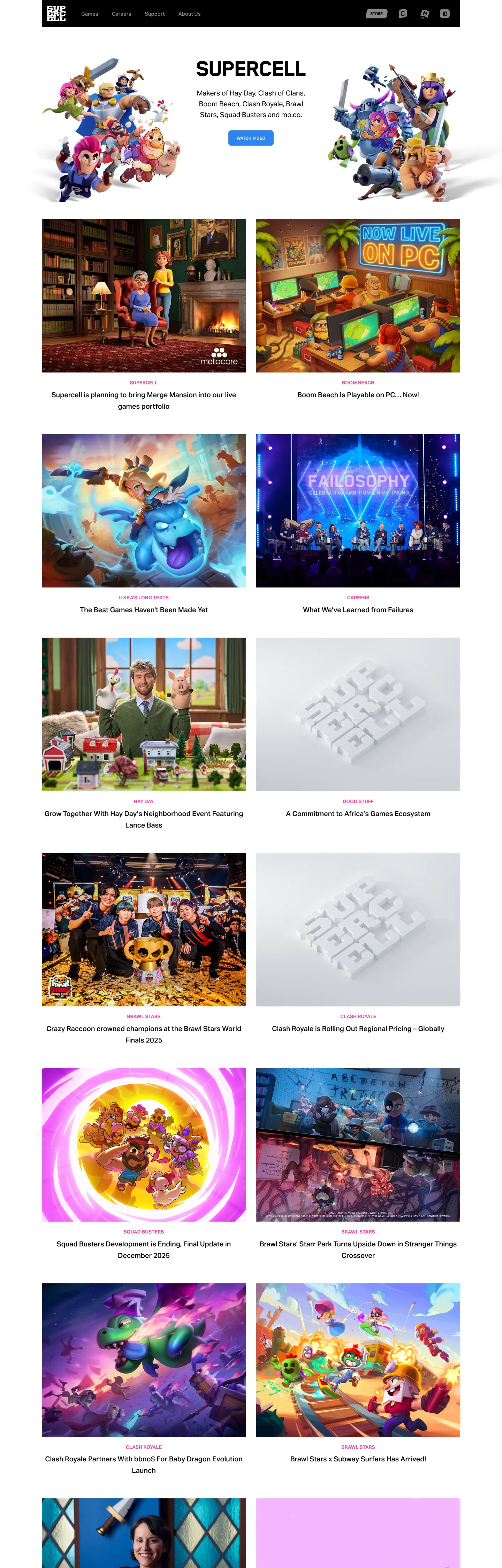
Supercell's marketing site is the corporate face of a company that has never made a complicated product — and it shows. The hero is a white panel with the Supercell wordmark in SupercellHeadline-Heavy (56px / weight 900 / uppercase / -0.8px tracking), a three-line description of the company, and a single blue "Watch Video" button. Three game-character illustrations (Clash of Clans, Brawl Stars, and Hay Day characters) float in the upper right quadrant of the hero against the white background. There are no gradients, no hero video loops, no franchise-colored zones. Below the fold, the entire page becomes a dense 2-column editorial photograph grid — game announcement images, team photos, event coverage, cultural moments — captioned only with a title and a pink category label. The hot-pink (#fb4a9d) appears exclusively on these category labels and as border/text accents on section headers; it never fills a panel, a card, or a button. Unlike EA's neon-dark game-marketing system or Activision's franchise-color saturation, Supercell runs white.
The DESIGN.md file packages the system as a machine-readable spec for React and AI tools. Inside: 7 colors tokens anchored by a pure white canvas (#ffffff), black ink (#000000), a warm mid-gray for muted text (#989893), and the hot-pink voltage (#fb4a9d); 12 typography tokens spanning SupercellHeadline-Heavy at two display sizes and SupercellText-Medium and SupercellText-Bold across 10 body, label, and nav tiers; a single 8px radius token (the only border-radius value on the page); and 14 components definitions covering the hero, the blue video CTA, the editorial photo grid, and the footer navigation.
Feed this file to Claude or Cursor and it will reproduce Supercell's specific moves: pure white canvas instead of the dark-gradient game-marketing default, hot-pink as a category-label and border accent rather than a CTA fill, uppercase-heavy display headings in a custom proprietary face, and a dense photograph editorial grid with no card chrome. The system is worth studying because it is the corporate-studio inverse of most game-marketing design: understated, editorially structured, and willing to let game photography carry all visual energy. The proprietary font family is the single non-replicable element — Inter at weight 900 / uppercase is the closest substitute for the display tier.
What makes it distinct
5
- Hot-pink as border and text only#fb4a9d appears 42 times but never as a background fill; it functions as an underline and label-accent against white
- Uppercase at every heading tierSupercellHeadline-Heavy renders all display text in all-caps with tight -0.8px tracking, matching the bold visual grammar of Clash of Clans box art
- White canvas with no gradientunlike EA or Activision's dark-gradient marketing surfaces, Supercell's corporate site is pure white with black ink and a single accent
- Single 8px radiusthe entire captured component set uses exactly one corner radius value; no radius scale, no pill variants in the marketing chrome
- Dense editorial photo gridbelow the hero, a 2-column masonry-style grid of game-and-culture images fills the page without section breaks or card chrome
supercell.com
Live at supercell.com
A snapshot of the brand in production. Scroll the frame to see the whole page.
Colors
7 colors
Supercell's system runs on #808080 as its primary voltage, used in 1 of 14 components. Type is set in SupercellText-Medium across 12 tokens from 12px to 56px, weights 400–900. Shape language is mixed across 14 components, blending pills, soft rounds, and squarer corners.
Brand & Accent
Sparing, CTA-only voltage · 3
Surface
Page and card backgrounds · 1
Text
Headlines, body, captions · 3
Typography
12 type tokens
Set in SupercellText-Medium across 12 tokens, from 12px to 56px, weights 400–900. Shown in its own stack: where the font isn't installed, the fallback the file names stands in.
- display-xl56px · weight 400 · lh 70px · tracking -0.8pxThe quick brown fox jumps over the lazy dog
- display-md34px · weight 900 · lh 56px · tracking 0The quick brown fox jumps over the lazy dog
- body-lg20px · weight 400 · lh 31px · tracking normalThe quick brown fox jumps over the lazy dog
- body-md20px · weight 500 · lh 33px · tracking normalThe quick brown fox jumps over the lazy dog
- body-sm16px · weight 400 · lh 26px · tracking normalThe quick brown fox jumps over the lazy dog
- label-lg14px · weight 700 · lh 22px · tracking normalThe quick brown fox jumps over the lazy dog
- label-md13px · weight 500 · lh 21px · tracking normalThe quick brown fox jumps over the lazy dog
- label-sm13px · weight 700 · lh 21px · tracking normalThe quick brown fox jumps over the lazy dog
- nav-link15px · weight 500 · lh 25px · tracking normalThe quick brown fox jumps over the lazy dog
- caption12px · weight 400 · lh 20px · tracking normalThe quick brown fox jumps over the lazy dog
- button-md12px · weight 700 · lh 12px · tracking normalThe quick brown fox jumps over the lazy dog
- button-label13px · weight 700 · lh 13px · tracking normalThe quick brown fox jumps over the lazy dog
Layout
Radii and spacing
1 corner radii and 8 spacing values. Shape language: mixed.
Radii
- md8px
Spacing
- xs7px
- sm12px
- md15px
- base18px
- lg24px
- xl30px
- 2xl48px
- 3xl64px
Components
14 components
Each rendered from its tokens (color, type, radius, padding) on Supercell's own canvas.
- Button Primarybutton-primaryButton Primary
- Button Primary Hoverbutton-primary-hoverButton Primary Hover
- Button Secondarybutton-secondaryButton Secondary
- Top Navtop-navTop Nav
- Nav Linknav-linkNav Link
- Hero Headinghero-headingHero Heading
- Section Headingsection-headingSection Heading
- Body Paragraphbody-paragraphBody Paragraph
- Category Labelcategory-labelCategory Label
- Photo Cardphoto-cardPhoto Card
- Photo Card Metaphoto-card-metaPhoto Card Meta
- FooterfooterFooter
- Footer Nav Linkfooter-nav-linkFooter Nav Link
- Nav Mobile Togglenav-mobile-toggleNav Mobile Toggle
In use
The system, in use
Supercell's tokens on the kind of product it builds.
Build something people actually use.
A short paragraph of marketing copy that previews how the brand's display tier and body tier read together. Two sentences is usually enough.
FAQ
Supercell design system FAQ
Common questions about Supercell's tokens, components, and how to use this DESIGN.md in your project.
Read next
Related reading
Specs, directories, and component libraries that pair with this design system.
- Browse all design systemsThe full directory of DESIGN.md files on shadcn.io, with live mockups for each.shadcn.io
- Supercell — official siteSupercell's public marketing site — the source of truth for the live tokens captured in this file.supercell.com (opens in a new tab)
- The DESIGN.md specificationGoogle Labs' open spec for machine-readable design system files — the format this page is built on.github.com (opens in a new tab)
Use it
Use Supercell in your project
One machine-readable file. Drop it into Claude, Cursor, or any AI tool that reads DESIGN.md.
Download the DESIGN.md
One machine-readable file: every color, type, radius, spacing, and component token of Supercell.
Feed it to your AI tool
Drop it into Claude, Cursor, or GitHub Copilot. The agent writes React components and Tailwind classes that match Supercell's visual language.
Reference the tokens directly
Or paste the values into your Tailwind config, CSS variables, or component library: every color, size and radius is a quoted, ready-to-copy value.
Read the full DESIGN.md: overview, rationale, do’s and don’ts
Overview
Supercell's marketing surface is the corporate inverse of the industry it operates in. Editorial white against game-world maximalism. Where EA's marketing site runs dark gradients and franchise-color saturation, and where Activision layers neon on black for each Call of Duty release, Supercell runs pure white with black ink and a single hot-pink category label. The white is not neutral — it is a deliberate studio-identity statement that says: we are the company behind the games, not a game itself.
The hot-pink voltage (#fb4a9d) appears 42 times across the captured page — 21 as text color, 21 as border. It never fills a button, a panel, or a card. It marks category labels in the editorial grid ("NEWS," franchise tags) and section-header hairlines. The primary CTA is blue (#2d85f3), a separate Supercell brand blue that carries the "Watch Video" button. Two chromatic voices, each with a distinct role, on a white floor that lets both read without competing.
Typography is entirely proprietary: SupercellHeadline-Heavy at 56px / uppercase for the hero (with a declared weight of 400 on the font axis, but visually heavy at grade 9), SupercellText-Medium for body and nav, SupercellText-Bold for labels and buttons. The uppercase treatment at every heading tier is the system's most recognizable move — it carries the same bold direct-address quality as the Clash of Clans and Brawl Stars box-art lettering, transplanted into a corporate-editorial register.
Key Characteristics:
- Pure white canvas (#ffffff) — no off-white, no gray zones, no gradient bands.
- Hot-pink (#fb4a9d) exclusively as text and border accent, 0 background uses.
- Blue (#2d85f3) as the CTA fill — the only button-fill color in the system, distinct from the pink accent.
- Three-tier proprietary font system: SupercellHeadline-Heavy (display), SupercellText-Medium (body / nav), SupercellText-Bold (labels / buttons).
- All-caps at every heading tier — display, section h3, category label, button.
- Single 8px radius — the only border-radius value in the extracted components; no pill variant in the marketing chrome.
- Dense 2-column editorial photo grid below the fold, no card chrome, no border-radius on the image cells.
- Gray nav links (#808080) that darken to black on hover — muted by default, active by state.
Colors
Surface
- Canvas (
{colors.canvas}— #ffffff): frequency 133 as text and border. The dominant and only page floor — pure white with no warm or cool cast. Every section sits on the same canvas without background-color variation.
Text
- Ink (
{colors.ink}— #000000): frequency 305 — the dominant text and border color. Pure black on pure white, maximum contrast. Carries all headings, the primary display tier, nav active states, and most body text. - Ink Muted (
{colors.ink-muted}— #989893): frequency 98 — used for secondary text across the editorial grid (publication dates, sub-labels, footer text). A warm mid-gray with a slight olive cast. - Ink Subdued (
{colors.ink-subdued}— #808080): frequency 16 as text. Declared via--supercell-color-greyCSS custom property. Used for nav links in resting state, placeholder text.
Accent
- Accent Pink (
{colors.accent-pink}— #fb4a9d): frequency 42 — 21 text, 21 border, 0 background. The system's chromatic voltage — used only for category labels and section-header accent lines.
Interactive
- Primary Blue (
{colors.primary-blue}— #2d85f3): frequency 2 as background. The CTA button fill. A saturated medium blue used exclusively on the "Watch Video" primary action. - Primary Blue Hover (
{colors.primary-blue-hover}— #1f7aeb): frequency 1 as background. The hover state for the primary blue button — a slightly deeper shade.
Typography
Font Families
The system runs three proprietary Supercell faces with no fallback beyond the system sans stack (Helvetica, Arial, sans-serif):
- SupercellHeadline-Heavy — display only, uppercase at every size. The 56px h1 declares
fontWeight: 400on the font axis (the face is optically heavy regardless), while the 34px h3 declares 900. Visually equivalent weight across both sizes. - SupercellText-Medium — the workhorse face for body, nav, and most label tiers at weight 500.
- SupercellText-Regular — body text at weight 400 for the longer paragraph runs below the hero.
- SupercellText-Bold — labels, buttons, and category tags at weight 700, always uppercase.
Hierarchy
| Token | Size | Weight | Line Height | Use |
|---|---|---|---|---|
{typography.display-xl} | 56px | 400 | 70px | Hero h1 — "SUPERCELL" — uppercase |
{typography.display-md} | 34px | 900 | 56px | Section h3 — uppercase |
{typography.body-lg} | 20px | 400 | 31px | Hero sub-paragraph |
{typography.body-md} | 20px | 500 | 33px | Editorial grid article titles |
{typography.body-sm} | 16px | 400 | 26px | Footer navigation body text |
{typography.label-lg} | 14px | 700 | 22px | Category labels — uppercase |
{typography.label-md} | 13px | 500 | 21px | Nav links (resting), meta text |
{typography.label-sm} | 13px | 700 | 21px | Secondary uppercase labels |
{typography.nav-link} | 15px | 500 | 25px | Top nav link labels |
{typography.caption} | 12px | 400 | 20px | Small caption text |
{typography.button-md} | 12px | 700 | 12px | Button label — uppercase |
{typography.button-label} | 13px | 700 | 13px | Mobile toggle label |
Substitute Note
SupercellHeadline-Heavy → Inter Black (weight 900) at uppercase with -0.5px tracking. SupercellText-Medium → Inter Medium (weight 500). SupercellText-Bold → Inter Bold (weight 700). The uppercase transforms are as load-bearing as the weight choices — applying Inter at the same sizes without uppercase will not reproduce the system's identity.
Layout
Spacing System
- Base unit: the system shows an irregular mix — 7px, 12px, 15px, 18px, 30px, 64px — suggesting a 7px primary unit.
- Tokens:
{spacing.xs}7px ·{spacing.sm}12px ·{spacing.md}15px ·{spacing.base}18px ·{spacing.lg}24px ·{spacing.xl}30px ·{spacing.2xl}48px ·{spacing.3xl}64px. - Nav height: 78px — unusually tall for a minimalist corporate nav, creating a generous breathing zone at the top.
- Section gap: 64px vertical rhythm between editorial grid rows.
Grid & Container
- Max content width: ~1200px.
- Hero layout: centered text column with floating game-character illustrations (Clash, Brawl Stars, Hay Day art) at right.
- Editorial photo grid: 2-column masonry grid below hero, spanning the full content width. No gutter borders, no card chrome, text metadata sits directly below each image on the white floor.
Rhythm
The page has two zones: the hero (type-led) and the editorial body (photography-led). There are no intermediate editorial bands — no feature sections, no feature strips, no colored zones. The transition from hero to grid is immediate. All section rhythm is conveyed through the 64px inter-row gap in the photo grid.
Elevation
The system has no shadows and no elevated surfaces. The white canvas is flat; card backgrounds are transparent (images sit directly on the floor). The only visual separation between card cells is the 30px gap between them in the grid. There are no drop shadows, no border-radius on image cells, no hairline card borders.
- Flat (no shadow): all surfaces.
- No tonal lift: unlike dark-canvas systems that use a surface ladder for elevation, the white-canvas system has nothing to lift.
- Button depth: the primary blue button has no shadow — the filled blue-on-white contrast is sufficient to read as interactive.
Shapes
The radius scale has a single entry:
{rounded.md}8px — used on the "Watch Video" button and mobile navigation toggle.
Every other surface — photo grid cells, the hero heading, nav links, footer — has no applied border-radius. The absence of card rounding is the most distinctive shape decision: the editorial photo grid runs square-cornered images edge-to-edge, which gives the page a print-layout quality rather than a product-card aesthetic.
Components
button-primary — Blue {colors.primary-blue} fill, white text, {rounded.md} 8px rounding, 14.4×24 padding, 44px height. SupercellText-Bold at 12px / uppercase. The only filled CTA on the page — "Watch Video."
button-primary-hover — Background deepens to {colors.primary-blue-hover} (#1f7aeb). Everything else unchanged.
button-secondary — Canvas fill with black ink text and 1px black border. Same rounding and height as primary.
top-nav — White {colors.canvas} floor, 78px height, 30px horizontal padding. Houses the Supercell wordmark (a stylized "SC" mark) and navigation links (Games, People, News) in {typography.nav-link} at muted-gray resting state.
nav-link — Transparent, {colors.ink-subdued} (#808080) text at {typography.nav-link} (15px / 500). Muted gray in resting state; darkens to {colors.ink} on hover.
hero-heading — Black text, {typography.display-xl} (56px / uppercase / -0.8px tracking). The only display moment on the page where the font identity is unambiguous.
section-heading — Black text, {typography.display-md} (34px / 900 / uppercase).
body-paragraph — Black text at {typography.body-lg} (20px / 400). The hero sub-paragraph; no background.
category-label — Hot-pink {colors.accent-pink} text at {typography.label-lg} (14px / 700 / uppercase). Appears above each editorial photo card as a category tag ("NEWS," franchise name).
photo-card — Full-bleed image occupying the full cell width, no background fill, no border-radius, 0 padding. Text metadata sits directly below on the white floor.
photo-card-meta — Muted gray {colors.ink-muted} text at {typography.label-md} (13px / 500). Publication date, category sub-label.
footer — White canvas floor, muted-gray text at {typography.label-md}, 30px all-side padding.
footer-nav-link — Ink-black text at {typography.label-md}, no background, 0 padding.
nav-mobile-toggle — The three-line mobile hamburger button. Black text, {rounded.md} 8px, 15×21 padding.
Do's and Don'ts
Do keep the hot-pink to text and border roles only. Filling a button or card background with {colors.accent-pink} (#fb4a9d) would make it a primary CTA that competes with the blue button — the pink's role is editorial accent, not interactive fill.
Do uppercase every headline at every size tier. SupercellHeadline-Heavy, {typography.display-xl} and {typography.display-md}, are uppercase by design. Removing the transform makes them read as an ordinary condensed sans rather than the game-studio headline face.
Do use {colors.ink-subdued} (#808080) for nav links in their resting state, not black ink. The gray-to-black nav-link hover contrast is subtle but intentional — it marks the nav as secondary content relative to the editorial grid.
Do run photo cards with zero border-radius. The square-cornered editorial grid (rounded: "0px") is what gives the page its print-layout quality. Rounding photo card corners to 8px or 12px would shift the aesthetic from editorial to product-marketing.
Don't use the hot-pink (#fb4a9d) for the primary button fill. The CTA button is blue (#2d85f3). Swapping to pink would invert the system's two-accent logic: blue = action, pink = editorial label.
Don't introduce additional radius values above 8px. The entire system uses a single 8px token for the two interactive elements that need rounding. Adding 12px or 16px card rounding would break the flat-editorial visual contract.
Don't add background-color sections or color bands to the page structure. Supercell's editorial below-fold is entirely white — no gray alternating bands, no dark feature strips. Introducing background-color zones would make the corporate site look like a product landing page.
Don't apply {typography.display-xl} at weights other than the declared 400/900. The apparent weight of SupercellHeadline-Heavy comes from the font's own optical design, not from CSS weight axes — setting weight 700 on this face will not produce an intermediate result; it will fall back to system sans.
Known Gaps
- Dark mode: no alternate theme captured; the marketing surface is light-only.
- Mobile layout: the 2-column photo grid presumably collapses to single-column on mobile, but breakpoint widths and column-count changes are not captured.
- Hover and focus states: only button-primary-hover is documented; nav link hover, photo card hover overlay, and focus ring styles are absent.
- Game sub-brand pages: each Supercell franchise (Clash of Clans, Brawl Stars, Hay Day, Clash Royale) has its own branded landing page with distinct color systems not captured here.
- Animation: the hero game-character illustrations may animate or parallax on scroll — end-state values only are captured.
- Form and input styling: no form fields appear on the marketing surface; input token styling is not represented.
- SVG illustration tokens: the character illustrations (Clash, Brawl Stars) are vector art with their own color palettes not included in this token set.
Gaming & Entertainment
More systems like this
More DESIGN.md files in Gaming & Entertainment.
Pricing
Build it with Pro
The DESIGN.md files are free. Pro adds 6,000+ blocks, premium templates and the MCP server, so your AI editor builds in your system for you.
4.9/5 out of 5 · 150+ reviewsfrom 150+ founders and developers.
Billing
Billed once a year in USD. Cancel anytime.
- How many people can use the license.
- Client work, SaaS products and anything you charge for.
- Production-ready React sections: hero, pricing, features, dashboards and more.
- Complete multi-page sites you can ship as they are.
- React icons from every major library, installable with one command.
- Presets that restyle every block, in light and dark.
- Lets your AI editor search, preview and install blocks for you.
- Priority requests are answered first.
Individual
For personal projects & open source
$32instead of $49/mo
$389 billed yearly
- Seats: 1 seat
- Commercial use: Personal & open source only
- Pro blocks: 6,000+ blocks
- Templates: All 14 templates
- React icons: 294k+ icons
- Themes: All 59 themes
- MCP server: Basic usage
- Support: Standard
Team
Most popularFor freelancers, agencies & startups
$66instead of $99/mo
$789 billed yearly · ≈ $13/dev/mo
- Seats: Up to 5 seats
- Commercial use: Included
- Pro blocks: 6,000+ blocks
- Templates: All 14 templates
- React icons: 294k+ icons
- Themes: All 59 themes
- MCP server: High usage
- Support: Priority
Organization
For companies with larger teams
$132instead of $199/mo
$1,589 billed yearly
- Seats: Unlimited seats
- Commercial use: Included
- Pro blocks: 6,000+ blocks
- Templates: All 14 templates
- React icons: 294k+ icons
- Themes: All 59 themes
- MCP server: Unlimited usage
- Support: Priority
Billed once a year in USD. Cancel anytime.
Individual
For personal projects & open source
$32instead of $49/mo
$389 billed yearly
- How many people can use the license.Seats: 1 seat
- Client work, SaaS products and anything you charge for.Commercial use: Personal & open source only
- Production-ready React sections: hero, pricing, features, dashboards and more.Pro blocks: 6,000+ blocks
- Complete multi-page sites you can ship as they are.Templates: All 14 templates
- React icons from every major library, installable with one command.React icons: 294k+ icons
- Presets that restyle every block, in light and dark.Themes: All 59 themes
- Lets your AI editor search, preview and install blocks for you.MCP server: Basic usage
- Priority requests are answered first.Support: Standard
Team
Most popularFor freelancers, agencies & startups
$66instead of $99/mo
$789 billed yearly · ≈ $13/dev/mo
Everything in Individual, plus
- How many people can use the license.Seats: Up to 5 seats
- Client work, SaaS products and anything you charge for.Commercial use: Included
- Lets your AI editor search, preview and install blocks for you.MCP server: High usage
- Priority requests are answered first.Support: Priority
Organization
For companies with larger teams
$132instead of $199/mo
$1,589 billed yearly
Everything in Team, plus
- How many people can use the license.Seats: Unlimited seats
- Lets your AI editor search, preview and install blocks for you.MCP server: Unlimited usage
- Secure checkout via Stripe
- Code lives in your repo
- Keep what you've shipped if you cancel
- License terms
Your system, built for you
Every block, template and icon, installed by your AI agent in your design system. The DESIGN.md files stay free.