Suno Design System
Suno's design system as a DESIGN.md file. Atmospheric haze, cream #f7f4ef pill, multi-accent palette, Neue Montreal 500. For React, Next.js, and AI tools.
Add shadcn.io to your AI agent. · Pro It installs blocks, icons and templates in your design system from a prompt, with Pro.
Set up MCP- Primary
- #f7f4ef
- Typeface
- Neue Montreal
- Shape
- Mixed
- Base radius
- 12px
- Colors
- 22
- Type tokens
- 12
- Components
- 19
- Spacing values
- 9
About
About Suno DESIGN.md
Curated by Dov Azencot · Updated May 13, 2026 · Source suno.com (opens in a new tab)
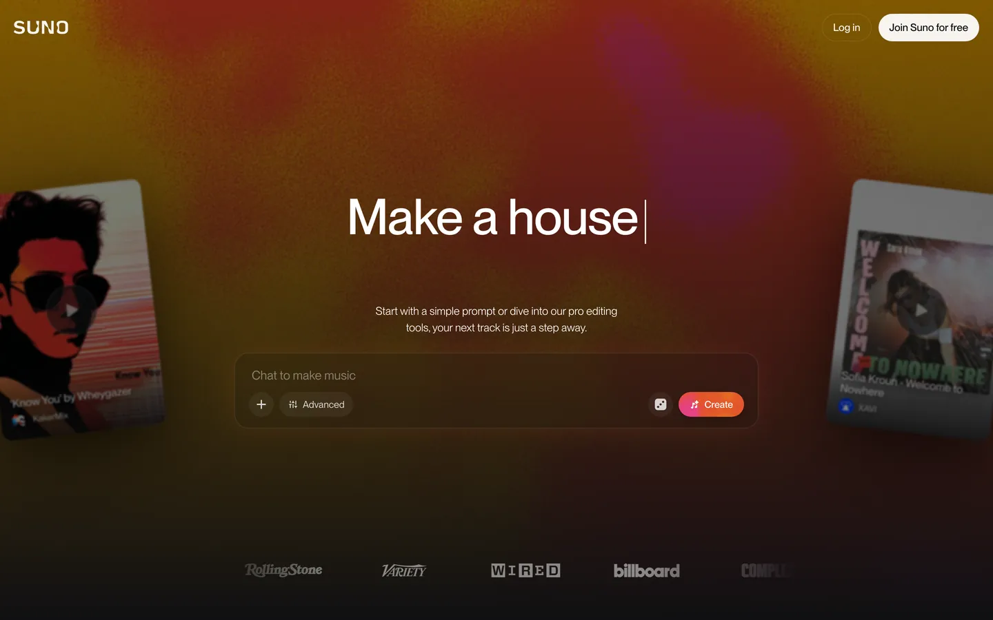
Suno's landing surface is a near-black theater (`#101012`) lit from behind by an animated orange-to-magenta-to-violet atmospheric haze — closer to a vinyl-cover backdrop than to a typical SaaS gradient mesh. The wordmark sits at 12.68px in uppercase Neue Montreal, the 72px hero ("Make a song about…") cycles a typewriter cursor at -0.96px tracking, and two tilted album-art preview cards drift in from the page edges as the only product chrome. Where most AI tools paint a saturated brand voltage onto the primary CTA, Suno inverts the move: the primary "Join Suno for free" is a cream-white pill (`#f7f4ef` fill, `#101012` ink) and the saturated palette is reserved for the sub-action — a pink-to-orange-to-violet "Create" button that cycles through the six accent tokens of the system.
This DESIGN.md packages the marketing surface into a single machine-readable file built on the Google Labs spec. Inside: 22 colors tokens spanning the canvas tier, surface ladder, hairline atmospheric stack, and the six saturated accent voltages; 12 type styles all running Neue Montreal at weight 300 / 500 from a 72px display down to an 11px micro-caption; 6 radius tokens including the strict 20px card and 9999px pill; 9 spacing tokens anchored on a 4px base; and 19 components recipes covering the cream pill, gradient sub-pill, glass chat input, advanced toggle, tilted album-art card, press-logo row, and the dim "Log in" outline pill that pairs with the primary.
Feed the file to Claude, Cursor, or GitHub Copilot and the agent reproduces Suno's inversion — cream pill primary, gradient sub-CTA, atmospheric haze, tilted preview cards — rather than defaulting to a saturated-CTA-on-dark AI-product theme. Reference the tokens directly to seed a Tailwind config or CSS variable layer; the component block maps each surface to its token references, so reconstructing the hero is a token lookup. The system is worth studying because it refuses two category defaults at once: the saturated primary CTA and the centered product illustration. Atmospheric haze plus tilted-card decoration carries the brand instead.
What makes it distinct
5
- Inverted CTA voltagethe primary is a cream pill (`#f7f4ef`) on the near-black canvas, the saturated brand color sits on the sub-action only
- Atmospheric haze, not gradient mesha single orange-to-magenta-to-violet radial bloom carries every brand color cue across the hero band
- Multi-accent palettesix saturated tokens (`#fd429c`, `#ff9448`, `#f5d907`, `#02d95c`, `#1f8bff`, `#8b6efe`) cycle through the Create-button gradient rather than locking to one voltage
- Neue Montreal at weight 500 across every tier72px hero, 16px dek at weight 300, 12.68px uppercase wordmark, no italics
- Tilted album-art cards as decorative product previewtwo `20px` rounded cards rotate in from the page edges instead of a centered hero illustration
suno.com
Live at suno.com
A snapshot of the brand in production. Scroll the frame to see the whole page.
Colors
22 colors
Suno's system runs on #f7f4ef as its primary voltage, used in 1 of 19 components. Type is set in Neue Montreal across 12 tokens from 11px to 72px, weights 300–500. Shape language is mixed across 19 components, blending pills, soft rounds, and squarer corners.
Brand & Accent
Sparing, CTA-only voltage · 10
Surface
Page and card backgrounds · 5
Text
Headlines, body, captions · 5
Other
Specialty colors · 2
Typography
12 type tokens
Set in Neue Montreal across 12 tokens, from 11px to 72px, weights 300–500. Shown in its own stack: where the font isn't installed, the fallback the file names stands in.
- display-hero72px · weight 500 · lh 1 · tracking -0.96pxThe quick brown fox jumps over the lazy dog
- display-hero-loose72px · weight 500 · lh 1.125The quick brown fox jumps over the lazy dog
- dek-light18px · weight 400 · lh 1.33The quick brown fox jumps over the lazy dog
- body-light16px · weight 300 · lh 1.5The quick brown fox jumps over the lazy dog
- body-md15px · weight 500 · lh 1.6The quick brown fox jumps over the lazy dog
- body-sm14px · weight 400 · lh 1.43The quick brown fox jumps over the lazy dog
- label-md14px · weight 500 · lh 1.14The quick brown fox jumps over the lazy dog
- caption-sm11.685px · weight 500 · lh 1.33The quick brown fox jumps over the lazy dog
- caption-xs11px · weight 500 · lh 1.27The quick brown fox jumps over the lazy dog
- wordmark12.68px · weight 500 · lh 1.2The quick brown fox jumps over the lazy dog
- button-md15px · weight 500 · lh 1.6The quick brown fox jumps over the lazy dog
- nav-link15.581px · weight 500 · lh 1The quick brown fox jumps over the lazy dog
Layout
Radii and spacing
6 corner radii and 9 spacing values. Shape language: mixed.
Radii
- none0px
- xs6px
- md12px
- lg20px
- pill9999px
- full9999px
Spacing
- xxs4px
- xs8px
- sm12px
- base16px
- md20px
- lg24px
- xl32px
- section80px
- hero-gutter150px
Components
19 components
Each rendered from its tokens (color, type, radius, padding) on Suno's own canvas.
- Top Navtop-navTop Nav
- WordmarkwordmarkWordmark
- Button Primary Creambutton-primary-creamButton Primary Cream
- Button Log In Outlinebutton-log-in-outlineButton Log In Outline
- Button Create Gradientbutton-create-gradientButton Create Gradient
- Button Advanced Chipbutton-advanced-chipButton Advanced Chip
- Button Add Circlebutton-add-circleButton Add Circle
- Button Dice Squarebutton-dice-squareButton Dice Square
- Chat Inputchat-inputChat Input
- Chat Placeholderchat-placeholderChat Placeholder
- Hero Headinghero-headingHero Heading
- Hero Dekhero-dekHero Dek
- Hero Bandhero-bandHero Band
- Haze Bloomhaze-bloomHaze Bloom
- Album Card Tiltedalbum-card-tiltedAlbum Card Tilted
- Press Logo Rowpress-logo-rowPress Logo Row
- Play Glyph Circleplay-glyph-circlePlay Glyph Circle
- Log In Text Linklog-in-text-linkLog In Text Link
- Footer Captionfooter-captionFooter Caption
In use
The system, in use
Suno's tokens on the kind of product it builds.
Build something people actually use.
A short paragraph of marketing copy that previews how the brand's display tier and body tier read together. Two sentences is usually enough.
FAQ
Suno design system FAQ
Common questions about Suno's tokens, components, and how to use this DESIGN.md in your project.
Read next
Related reading
Specs, directories, and component libraries that pair with this design system.
- Browse all design systemsThe full directory of DESIGN.md files on shadcn.io, with live mockups for each.shadcn.io
- SunoThe AI music generator whose marketing surface this spec captures.suno.com (opens in a new tab)
- The DESIGN.md specificationGoogle Labs' open spec for machine-readable design system files.github.com (opens in a new tab)
Use it
Use Suno in your project
One machine-readable file. Drop it into Claude, Cursor, or any AI tool that reads DESIGN.md.
Download the DESIGN.md
One machine-readable file: every color, type, radius, spacing, and component token of Suno.
Feed it to your AI tool
Drop it into Claude, Cursor, or GitHub Copilot. The agent writes React components and Tailwind classes that match Suno's visual language.
Reference the tokens directly
Or paste the values into your Tailwind config, CSS variables, or component library: every color, size and radius is a quoted, ready-to-copy value.
Read the full DESIGN.md: overview, rationale, do’s and don’ts
Overview
Suno's landing surface is a near-black theater ({colors.canvas} — #101012) lit from behind by an animated orange-to-magenta-to-violet atmospheric haze. The wordmark sits at 12.68px uppercase Neue Montreal in the top-left, a 72px hero rotates through typewriter prompts at -0.96px tracking, and two tilted album-art preview cards drift in from the page edges. The brand voltage is inverted CTA: the primary "Join Suno for free" is a cream-white pill ({colors.primary} — #f7f4ef) carrying {colors.primary-ink} text, and the saturated palette is held back for a secondary "Create" sub-pill that mixes the six accent tokens into a pink-to-orange-to-violet gradient.
Where most AI-product hero bands paint a single saturated CTA against a dark canvas, Suno reverses the move. The cream primary handles onboarding; the gradient secondary handles the act of composing music inside the chat input. Two tiers of action, two opposite voltage strategies.
Type runs Neue Montreal at weight 500 across every visible tier — there is no display serif, no monospace, and no italic. Weight 300 appears only on the 16px dek and the 18px h2; everything else holds 500. The hero h1 lands at 72px with a 72px line-height (line-height equals font-size, no display leading), which keeps the typewriter cursor flush against the cap-height.
Key Characteristics:
- Inverted primary CTA: cream pill
{colors.primary}(#f7f4ef) on near-black canvas{colors.canvas}(#101012). - Atmospheric haze (orange
{colors.haze-warm}/ rose{colors.haze-rose}) as the only background color cue — no gradient mesh, no overlay grid. - Multi-accent palette (six saturated voltages) reserved for the gradient sub-CTA, never on the primary.
- Neue Montreal at weight 500 across every tier, with weight 300 only on the dek.
- Strict short radius scale:
6pxchips,12pxchat input,20pxalbum cards,9999pxpills. - Tilted album-art preview cards drift in from page edges instead of a centered hero illustration.
- 80px hero-band padding, 150px hero-gutter — generous vertical breathing without crowding the haze.
Colors
The palette stacks in four bands: a near-black canvas tier, a thin hairline ladder, an inverted cream primary, and a six-token saturated accent pool.
Canvas & Surface
- Canvas (
#101012) — frequency 12. Used as bg (3), gradient (5), text (2), border (2). The base near-black holding the entire page; CSS variable--color-background-primary. Not pure black — a 0.4% violet tint at oklch lightness 0.17. - Canvas Elevated (
#1c1c1f) — frequency 2. Used as bg (2). The chat input and tilted album-card surface; CSS variable--color-background-secondary. Sits one shade above the canvas — visible only on the chat input perimeter. - Canvas Deep (
#000000) — frequency 4. Used as shadow (4). Pure black, reserved for cast-shadow stops on the tilted album-art cards. - Surface Tertiary (
#252529) — Used as bg (1). The "+" add-circle and dice-square button surface inside the chat input. - Surface Hairline (
#38383e) — Default 1px divider on the chat input perimeter and the "Log in" outline pill.
Cream Primary (inverted)
- Primary (
#f7f4ef) — frequency 244. Used as text (123), border (120), bg (1). The cream pill primary CTA fill; CSS variable--color-background-button-primary. Doubles as the foreground-primary text token in the rare light-mode contexts. - Primary Ink (
#101012) — The black ink that sits on the cream pill. Same hex as the canvas — the inversion is built from one canvas token used as both ground and figure depending on the surface.
Text
- Ink on Canvas (
#ffffff) — frequency 462. Used as text (231), border (231). The white text on the dark canvas — hero h1, dek, wordmark. - Ink Secondary (
#c2c2c1) — Used as text. The dim chat-input placeholder and advanced-chip label. Maps to--color-foreground-secondary. - Ink Tertiary (
#7d7c83) — Used as text. The press-logo row caption tier. Maps to--color-foreground-tertiary-on-light. - Ink Inactive (
#6a6a72) — Used as text. Maps to--color-foreground-inactive. The disabled state inside the chat-input chip row.
Saturated Accent Pool (signature)
- Accent Pink (
#fd429c) —--color-accent-pink/--color-accent-brand. The dominant stop on the Create-gradient sub-pill. The closest token to a single brand voltage but cycles through the other five. - Accent Orange (
#ff9448) —--color-pumpkin-600. The mid stop on the Create-gradient. - Accent Vermilion (
#fa7658) —--color-vermilion-600. Transitional stop between pink and orange. - Accent Yellow (
#f5d907) —--color-accent-yellow. The lightest stop, used scarcely. - Accent Green (
#02d95c) —--color-accent-green. Reserved for success and the upload-state glyph. - Accent Blue (
#1f8bff) —--color-accent-blue. Reserved for link affordance and the secondary accent badge. - Accent Violet (
#8b6efe) —--color-accent-purple. The terminal stop on the Create-gradient. - Accent Red (
#f8441b) —--color-accent-red. Error and destructive states only.
Atmospheric Haze (decorative)
- Haze Warm (
#ffb003) — frequency 1. Used as shadow (1). The orange center of the radial bloom behind the hero band — pure atmosphere, never a fill or text color. - Haze Rose (
#fe3c7d) — frequency 1. Used as shadow (1). The magenta lobe of the haze. Same role — atmosphere only.
Typography
Font Family
Neue Montreal is the entire system — display, body, button, wordmark, caption. There is no display serif and no monospace. Fallback stack: ui-sans-serif, system-ui, sans-serif, plus the legacy 'Apple Color Emoji', 'Segoe UI Emoji', 'Segoe UI Symbol', 'Noto Color Emoji' for emoji glyph passthrough.
Hierarchy
| Token | Size | Weight | Line Height | Letter Spacing | Use |
|---|---|---|---|---|---|
{typography.display-hero} | 72px | 500 | 1.0 | -0.96px | Hero h1 with typewriter cursor |
{typography.display-hero-loose} | 72px | 500 | 1.125 | 0 | Hero variant where line-height needs leading |
{typography.dek-light} | 18px | 400 | 1.33 | 0 | Sub-heading h2 |
{typography.body-light} | 16px | 300 | 1.5 | 0 | Dek prose, chat input placeholder |
{typography.body-md} | 15px | 500 | 1.6 | 0 | Button label, default body |
{typography.body-sm} | 14px | 400 | 1.43 | 0 | Secondary body, footer |
{typography.label-md} | 14px | 500 | 1.14 | 0 | Chat advanced-chip label |
{typography.caption-sm} | 11.685px | 500 | 1.33 | 0 | Press-logo row caption |
{typography.caption-xs} | 11px | 500 | 1.27 | 0 | Album-card metadata |
{typography.wordmark} | 12.68px | 500 | 1.2 | 0 | Uppercase "SUNO" wordmark |
{typography.button-md} | 15px | 500 | 1.6 | 0 | Cream pill primary, gradient sub-pill |
{typography.nav-link} | 15.581px | 500 | 1.0 | 0 | Top-nav text-link |
Principles
- Weight 500 is the system default. Display, button, label, and wordmark all hold 500. Weight 300 appears only on the dek and a narrow body variant.
- Display line-height equals font-size. The 72px hero runs at a 72px line-height so the typewriter cursor flushes against the cap-height — display leading would float the cursor too high.
- Negative tracking only on hero. The 72px display pulls -0.96px tighter; every other tier holds normal tracking.
Note on Font Substitutes
Neue Montreal is licensed from Pangram Pangram. Open-source substitutes: General Sans at weight 500 (the closest geometric humanist match), Inter Tight at weight 500 (preserves the cap-height ratio), or PP Neue Montreal Mono for the wordmark tier only.
Layout
Spacing System
- Base unit: 4px.
- Tokens:
{spacing.xxs}4px ·{spacing.xs}8px ·{spacing.sm}12px ·{spacing.base}16px ·{spacing.md}20px ·{spacing.lg}24px ·{spacing.xl}32px ·{spacing.section}80px ·{spacing.hero-gutter}150px. - Section padding: 80px vertical, 24px horizontal on the top-nav and the press-logo row.
Grid & Container
- Single-column landing: hero band is centered with the chat input capped at ~720px width and the tilted album-art cards positioned at the left and right edges with negative offsets.
- The hero-gutter token (150px) is the vertical breathing distance between the top-nav and the hero h1 — generous enough to keep the haze from crowding the wordmark.
Whitespace Philosophy
The landing is one viewport tall by design. Padding is heavy at the top (150px gutter) and shallow inside the chat input (20px) so the haze occupies the full canvas while the interactive surface stays compact.
Elevation & Depth
The system uses atmospheric depth, not shadow ladders. Cards float over the canvas via the orange-to-magenta haze rather than via cast shadows; the only literal shadow stop is #000000 underneath the tilted album-art cards.
| Level | Treatment | Use |
|---|---|---|
| Canvas | {colors.canvas} (#101012) | The entire page floor |
| Elevated card | {colors.canvas-elevated} (#1c1c1f) | Chat input, tilted album cards |
| Haze bloom | Radial gradient {colors.haze-warm} → {colors.haze-rose} → violet | Atmospheric depth behind the hero |
| Cast shadow | 0 32px 64px rgba(0, 0, 0, 0.5) | Tilted album-art cards only |
Decorative Depth
The orange-to-magenta-to-violet haze is the system's strongest atmospheric pattern. It is generated as a radial bloom centered behind the hero h1, and it animates slowly to suggest motion without forcing the eye away from the cream pill primary.
Shapes
Border Radius Scale
| Token | Value | Use |
|---|---|---|
{rounded.none} | 0px | Reserved |
{rounded.xs} | 6px | Advanced chip, dice-square glyph |
{rounded.md} | 12px | Chat input wrapper |
{rounded.lg} | 20px | Tilted album-art preview cards |
{rounded.pill} | 9999px | Every CTA pill — cream primary, gradient sub-pill, log-in outline |
{rounded.full} | 9999px | Add-circle glyph, play-glyph circle |
The JSON extractor reports the legacy 3.35544e+07px value for full pills — both 9999px and that value resolve identically in browsers. Every interactive surface is rounded; the only sharp corners in the system are inside the play-button SVG glyph.
Components
Top Navigation
top-nav — Background {colors.canvas}, text {colors.ink-on-canvas}. Wordmark left at {typography.wordmark} (12.68px uppercase), "Log in" text-link plus "Join Suno for free" cream pill right. Padding 0px 24px, height 64px.
wordmark — Uppercase "SUNO" at 12.68px / weight 500 / {colors.ink-on-canvas} — the only uppercase tier in the system.
Buttons
button-primary-cream — The inverted primary. Background {colors.primary} (#f7f4ef), text {colors.primary-ink} (#101012), type {typography.button-md} (15px / 500), padding 8px 16px, height 40px, rounded {rounded.pill}, border 0. Used on "Join Suno for free" only.
button-log-in-outline — Transparent pill with a {colors.surface-hairline} 1px border. Background transparent, text {colors.ink-on-canvas}, type {typography.button-md}, padding 8px 16px, height 40px, rounded {rounded.pill}. Pairs with the cream primary as the secondary nav action.
button-create-gradient — The pink-to-orange-to-violet sub-pill on the chat input. Background {colors.accent-pink} (linear gradient to {colors.accent-orange} and through {colors.accent-violet}), text {colors.ink-on-canvas}, type {typography.button-md}, padding 8px 16px, height 40px, rounded {rounded.pill}. The saturated palette lives here, not on the primary.
button-advanced-chip — Inline "Advanced" toggle inside the chat input. Background transparent, text {colors.ink-secondary}, type {typography.label-md}, padding 4px 8px, height 32px, rounded {rounded.xs}.
button-add-circle — The 32×32 round "+" glyph button inside the chat input. Background {colors.surface-tertiary}, rounded {rounded.full}.
button-dice-square — The 32×32 dice-randomize glyph next to the Create sub-pill. Background {colors.surface-tertiary}, rounded {rounded.xs}.
Hero & Atmospheric
hero-band — Background {colors.canvas}, padding 80px 0px. Holds the wordmark, the 72px hero h1 with typewriter cursor, the dek, and the chat input centered.
hero-heading — Display h1 at {typography.display-hero} (72px / 500 / -0.96px / lh:1). Text {colors.ink-on-canvas}. Width capped at ~593px to wrap the typewriter prompt across two lines.
hero-dek — Sub-heading at {typography.dek-light} (18px / 400). Padding 12px 20px 0px (no bottom padding — the chat input sits directly below).
haze-bloom — Decorative atmospheric layer. Background {colors.haze-warm} radial-gradient through {colors.haze-rose} to violet, opacity 0.6. Pure decoration — no copy or interactive surface sits inside the bloom.
Chat Input
chat-input — The composer surface. Background {colors.canvas-elevated}, text {colors.ink-secondary}, type {typography.body-light}, padding 20px, height 104px, rounded {rounded.md} (12px), 1px {colors.surface-hairline} border.
chat-placeholder — The "Chat to make music" placeholder at {typography.body-light} (16px / 300), color {colors.ink-tertiary}.
Product Preview
album-card-tilted — Tilted album-art preview cards drifting in from the left and right edges. Background {colors.canvas-elevated}, rounded {rounded.lg} (20px), padding 12px, width 240px. Each card holds a play-glyph circle, an artwork image, and a 11px caption-xs metadata row.
play-glyph-circle — 48×48 circular play glyph over the album artwork. Background {colors.canvas-elevated}, opacity 0.6, rounded {rounded.full}.
Press Logo Row
press-logo-row — Footer-adjacent row carrying Rolling Stone, Variety, Wired, Billboard, Complex logos. Background transparent, text {colors.ink-tertiary}, type {typography.caption-sm} (11.685px), padding 0px 24px, height 56px.
Inline Affordances
log-in-text-link — Plain text "Log in" affordance in the top-nav, paired with the cream pill primary. Background transparent, text {colors.ink-on-canvas}, type {typography.button-md}.
footer-caption — The thin caption tier under the press-logo row. Background transparent, text {colors.ink-tertiary}, type {typography.caption-sm}.
Do's and Don'ts
Do
- Reserve
{colors.primary}(cream pill) for the onboarding primary CTA — "Join Suno for free" and equivalents. - Hold the saturated accent pool back for the
{component.button-create-gradient}sub-pill and the in-product compose action. - Use the atmospheric haze (
{colors.haze-warm}+{colors.haze-rose}+ violet) as decoration only, never as a fill or text color. - Use Neue Montreal at weight 500 across every visible tier. Weight 300 stays on the 16px dek and the 18px h2 only.
- Use the strict short radius scale:
6pxchips,12pxchat input,20pxalbum cards,9999pxpills. No 8px, no 16px.
Don't
- Don't paint the primary CTA with the accent pink (
#fd429c). That hex is reserved for the gradient Create sub-pill — using it on the primary collapses the inversion that distinguishes onboarding from compose. - Don't extract a fill color from the atmospheric haze. The orange
#ffb003and rose#fe3c7dare shadow-tier hexes with a total frequency of 1 each in the JSON — they exist only as the radial-gradient stops, not as surface colors. - Don't use a
9999pxpill on the chat input. The composer surface holds12px({rounded.md}) specifically to distinguish a typing surface from an interactive CTA. - Don't drop the hero h1 below 72px on desktop. Suno's display tier is a single fixed size with -0.96px tracking — scaling it down to 56px or 48px shifts the brand voice from theatrical to utility.
- Don't pair the cream pill with a saturated outline. The "Log in" secondary uses a
{colors.surface-hairline}(#38383e) outline on the canvas — a saturated outline competes with the gradient Create sub-pill below. - Don't use the multi-accent palette as a six-color rainbow on the same surface. The accents cycle inside the Create-gradient as a continuous bloom, not as discrete swatches.
Known Gaps
- Neue Montreal is a licensed typeface; General Sans and Inter Tight are documented substitutes.
- The atmospheric haze animation timing (slow drift, color cycle period) is out of scope for the static spec.
- In-product surfaces (the actual track-generation studio, library, and player) are not captured — the spec covers only the public landing.
- The typewriter-cursor hero loop (prompt rotation list, cursor blink rate) is documented as a single 72px display but not as a motion sequence.
- Sub-brand surfaces (Suno Studio, Suno Pro) may use additional accent voltages not visible on the public homepage.
Music, Video & Streaming
More systems like this
More DESIGN.md files in Music, Video & Streaming.
Pricing
Build it with Pro
The DESIGN.md files are free. Pro adds 6,000+ blocks, premium templates and the MCP server, so your AI editor builds in your system for you.
4.9/5 out of 5 · 150+ reviewsfrom 150+ founders and developers.
Billing
Billed once a year in USD. Cancel anytime.
- How many people can use the license.
- Client work, SaaS products and anything you charge for.
- Production-ready React sections: hero, pricing, features, dashboards and more.
- Complete multi-page sites you can ship as they are.
- React icons from every major library, installable with one command.
- Presets that restyle every block, in light and dark.
- Lets your AI editor search, preview and install blocks for you.
- Priority requests are answered first.
Individual
For personal projects & open source
$32instead of $49/mo
$389 billed yearly
- Seats: 1 seat
- Commercial use: Personal & open source only
- Pro blocks: 6,000+ blocks
- Templates: All 14 templates
- React icons: 294k+ icons
- Themes: All 59 themes
- MCP server: Basic usage
- Support: Standard
Team
Most popularFor freelancers, agencies & startups
$66instead of $99/mo
$789 billed yearly · ≈ $13/dev/mo
- Seats: Up to 5 seats
- Commercial use: Included
- Pro blocks: 6,000+ blocks
- Templates: All 14 templates
- React icons: 294k+ icons
- Themes: All 59 themes
- MCP server: High usage
- Support: Priority
Organization
For companies with larger teams
$132instead of $199/mo
$1,589 billed yearly
- Seats: Unlimited seats
- Commercial use: Included
- Pro blocks: 6,000+ blocks
- Templates: All 14 templates
- React icons: 294k+ icons
- Themes: All 59 themes
- MCP server: Unlimited usage
- Support: Priority
Billed once a year in USD. Cancel anytime.
Individual
For personal projects & open source
$32instead of $49/mo
$389 billed yearly
- How many people can use the license.Seats: 1 seat
- Client work, SaaS products and anything you charge for.Commercial use: Personal & open source only
- Production-ready React sections: hero, pricing, features, dashboards and more.Pro blocks: 6,000+ blocks
- Complete multi-page sites you can ship as they are.Templates: All 14 templates
- React icons from every major library, installable with one command.React icons: 294k+ icons
- Presets that restyle every block, in light and dark.Themes: All 59 themes
- Lets your AI editor search, preview and install blocks for you.MCP server: Basic usage
- Priority requests are answered first.Support: Standard
Team
Most popularFor freelancers, agencies & startups
$66instead of $99/mo
$789 billed yearly · ≈ $13/dev/mo
Everything in Individual, plus
- How many people can use the license.Seats: Up to 5 seats
- Client work, SaaS products and anything you charge for.Commercial use: Included
- Lets your AI editor search, preview and install blocks for you.MCP server: High usage
- Priority requests are answered first.Support: Priority
Organization
For companies with larger teams
$132instead of $199/mo
$1,589 billed yearly
Everything in Team, plus
- How many people can use the license.Seats: Unlimited seats
- Lets your AI editor search, preview and install blocks for you.MCP server: Unlimited usage
- Secure checkout via Stripe
- Code lives in your repo
- Keep what you've shipped if you cancel
- License terms
Your system, built for you
Every block, template and icon, installed by your AI agent in your design system. The DESIGN.md files stay free.