Steam Design System
Steam's design system as a DESIGN.md file. Install green #a4d007, Motiva Sans, 22 colors, 22 components. For React, Next.js, and AI tools.
Add shadcn.io to your AI agent. · Pro It installs blocks, icons and templates in your design system from a prompt, with Pro.
Set up MCP- Primary
- #a4d007
- Typeface
- Motiva Sans
- Shape
- Sharp
- Base radius
- 4px
- Colors
- 22
- Type tokens
- 11
- Components
- 22
- Spacing values
- 9
About
About Steam DESIGN.md
Curated by Dov Azencot · Updated May 13, 2026 · Source store.steampowered.com (opens in a new tab)
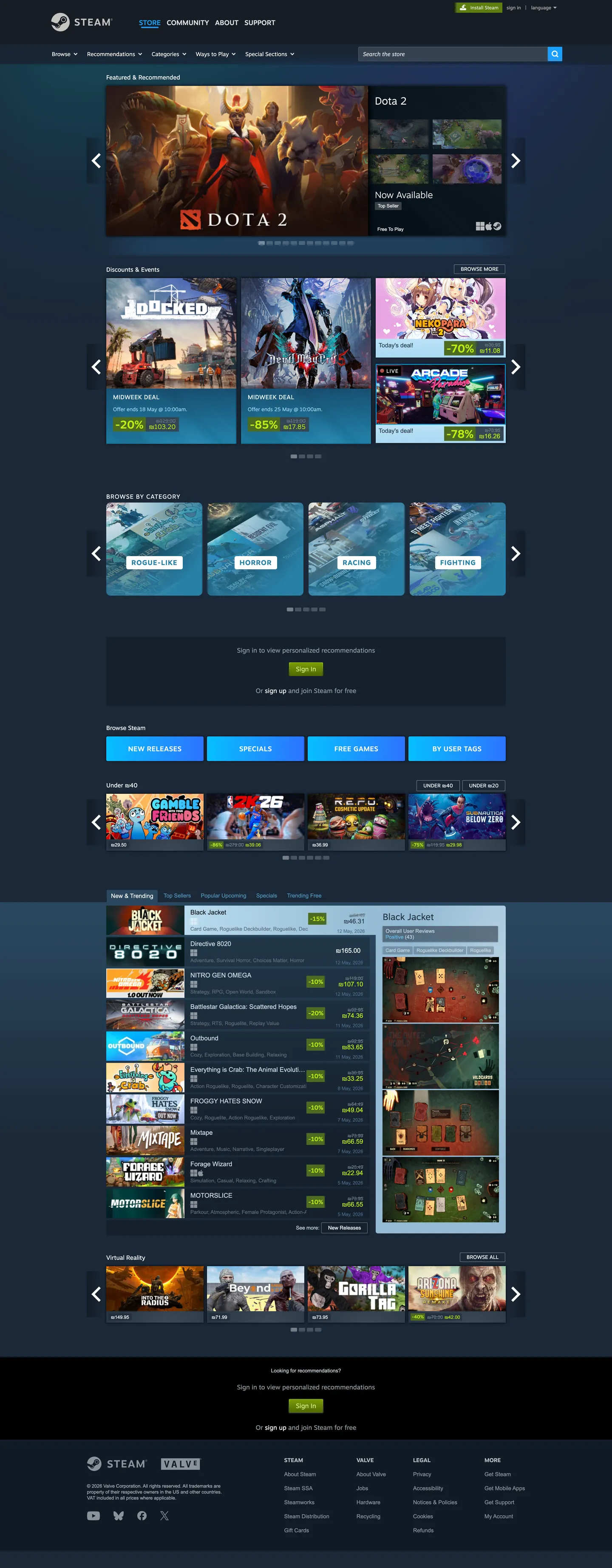
Steam's storefront reads like a dense PC-enthusiast bulletin board cross-bred with a 2025-era e-commerce surface. The page sits on a four-step dark navy ladder — "#1b2838" for the canvas, "#141f2c" for the global header rail, "#283645" for the game-tile background, "#384959" for the inset hairline that separates carousels. The brand voltage is unmistakable: the lime-to-olive "Install Steam" gradient running "#a4d007" at the top stop down to "#5c7e10" at the bottom, framed in a "#beee11" highlight, reserved for the install pill and "Play" CTAs. Every other action — Add to Cart, Visit Store, Browse Categories — runs a parallel cyan gradient from "#06bfff" through "#2881a7" to "#2d73ff". The result is a two-voltage grammar where the page tells you, by hue alone, what's a commit-action versus a navigation-action.
This file packages the full storefront chrome as a DESIGN.md document on the Google Labs spec. Inside: 22 colors tokens covering the navy canvas ladder, the dual gradient stops, slate body text, and structural hairlines; 11 typography styles split across Motiva Sans for chrome and Arial for body, ranging from 11px footer copy through a 26px featured-strip headline; 5 radius tokens with the dominant 2px corner; 9 spacing tokens stepping from 3px through 24px and a 96px section rhythm; and 22 components recipes covering the install pill, cyan secondary pill, dark tile, game-card grid item, gradient header, slate text input, faceted browse pill, sale price tag, and the queue carousel paddle.
Feed this file to Claude, Cursor, or Copilot and the agent produces React surfaces that match Steam's actual chrome — sharp 2px tiles on a navy ladder, dual-gradient pills that distinguish install from add-to-cart, Motiva Sans display headers over Arial body, slate "#c6d4df" subtitle text rather than warm grey. Or reference the tokens directly when building a PC-gaming storefront, a niche-marketplace catalogue, or any product surface where information density matters more than whitespace. The system is worth studying because it inverts the prevailing marketplace convention — instead of a white canvas with one accent and 16px rounded cards, Steam runs a dark forum-density grid with two competing gradient voltages and 2px corners, and it has worked for two decades.
What makes it distinct
5
- Dual gradient grammarlime "#a4d007" to "#5c7e10" for install actions, cyan "#06bfff" through "#2881a7" to "#2d73ff" for every other CTA
- Four-step navy canvas ladder"#1b2838" page, "#141f2c" rail, "#283645" tile, "#384959" inset hairline, layered as elevation cues
- 2px corner radius dominates63 of 131 captured radii sit at 2px, giving the chrome a sharp 2003-enthusiast-forum geometry rather than the 12-16px rounding most marketplaces ship today
- Dual-font splitMotiva Sans 200-700 for display and chrome, Arial 11-15px for the long tail of body and link copy
- Cool slate body text"#c6d4df" subtitle and "#8b929a" note carry 90% of running copy; pure white is reserved for headers and hover states
store.steampowered.com
Live at store.steampowered.com
A snapshot of the brand in production. Scroll the frame to see the whole page.
Colors
22 colors
Steam's system runs on #a4d007 as its primary voltage, used in 1 of 22 components. Type is set in Motiva Sans across 11 tokens from 11px to 26px, weights 200–700. Shape language is sharp — components average 2px corner radius, favoring crisp rectangles.
Surface
Page and card backgrounds · 1
Text
Headlines, body, captions · 5
Borders & Hairlines
Dividers, outlines, rules · 1
Semantic
Status, errors, success, links · 1
Other
Specialty colors · 14
Typography
11 type tokens
Set in Motiva Sans across 11 tokens, from 11px to 26px, weights 200–700. Shown in its own stack: where the font isn't installed, the fallback the file names stands in.
- display-lg26px · weight 500 · lh 34pxThe quick brown fox jumps over the lazy dog
- display-md24px · weight 300 · lh 28pxThe quick brown fox jumps over the lazy dog
- display-sm21px · weight 200 · lh 18pxThe quick brown fox jumps over the lazy dog
- heading-md16px · weight 700 · lh 19px · tracking 1.104pxThe quick brown fox jumps over the lazy dog
- heading-sm14px · weight 500 · lh 18pxThe quick brown fox jumps over the lazy dog
- label-md12px · weight 500 · lh 15pxThe quick brown fox jumps over the lazy dog
- body-md15px · weight 400 · lh 18pxThe quick brown fox jumps over the lazy dog
- body-sm13px · weight 400 · lh 17pxThe quick brown fox jumps over the lazy dog
- body-xs12px · weight 400 · lh 20pxThe quick brown fox jumps over the lazy dog
- caption11px · weight 400 · lh 12pxThe quick brown fox jumps over the lazy dog
- button-md13px · weight 400 · lh 17pxThe quick brown fox jumps over the lazy dog
Layout
Radii and spacing
5 corner radii and 9 spacing values. Shape language: sharp.
Radii
- none0px
- xs2px
- sm3px
- md4px
- lg10px
Spacing
- xxs3px
- xs5px
- sm6px
- md10px
- base12px
- lg15px
- xl16px
- xxl24px
- section96px
Components
22 components
Each rendered from its tokens (color, type, radius, padding) on Steam's own canvas.
- Button Installbutton-installButton Install
- Button Install Hoverbutton-install-hoverButton Install Hover
- Button Ctabutton-ctaButton Cta
- Button Cta Hoverbutton-cta-hoverButton Cta Hover
- Button Secondarybutton-secondaryButton Secondary
- Button Disabledbutton-disabledButton Disabled
- Type here…text-inputText Input
- Search Barsearch-barSearch Bar
- Primary Navprimary-navPrimary Nav
- Sub Navsub-navSub Nav
- Game Tilegame-tileGame Tile
- Game Cardgame-cardGame Card
- Featured Stripfeatured-stripFeatured Strip
- Carousel Paddlecarousel-paddleCarousel Paddle
- Category Pillcategory-pillCategory Pill
- Category Pill Activecategory-pill-activeCategory Pill Active
- Price Tagprice-tagPrice Tag
- Sale Tagsale-tagSale Tag
- DropdowndropdownDropdown
- TooltiptooltipTooltip
- Link Inlinelink-inlineLink Inline
- Footer Sectionfooter-sectionFooter Section
In use
The system, in use
Steam's tokens on the kind of product it builds.
Build something people actually use.
A short paragraph of marketing copy that previews how the brand's display tier and body tier read together. Two sentences is usually enough.
FAQ
Steam design system FAQ
Common questions about Steam's tokens, components, and how to use this DESIGN.md in your project.
Read next
Related reading
Specs, directories, and component libraries that pair with this design system.
- Browse all design systemsThe full directory of DESIGN.md files on shadcn.io, with live mockups for each.shadcn.io
- Steam Store — official siteValve's digital PC games storefront and Steam client download landing page.store.steampowered.com (opens in a new tab)
- The DESIGN.md specificationGoogle Labs' open spec for machine-readable design system files.github.com (opens in a new tab)
Use it
Use Steam in your project
One machine-readable file. Drop it into Claude, Cursor, or any AI tool that reads DESIGN.md.
Download the DESIGN.md
One machine-readable file: every color, type, radius, spacing, and component token of Steam.
Feed it to your AI tool
Drop it into Claude, Cursor, or GitHub Copilot. The agent writes React components and Tailwind classes that match Steam's visual language.
Reference the tokens directly
Or paste the values into your Tailwind config, CSS variables, or component library: every color, size and radius is a quoted, ready-to-copy value.
Read the full DESIGN.md: overview, rationale, do’s and don’ts
Overview
Steam's storefront is one of the few large-scale consumer surfaces still running an information-density-first chrome instead of a whitespace-first marketing layout. The page sits on a four-step navy ladder — {colors.canvas} ("#1b2838") for the page itself, {colors.rail} ("#141f2c") for the global header and rail, {colors.tile} ("#283645") for the game-tile and card backgrounds, and {colors.inset} ("#384959") for the hairline and inset that separates carousels. Every CTA is a horizontal gradient pill cut at a 2px corner — no full rounding anywhere on the page.
Dual voltage grammar: where most consumer marketplaces commit to one accent voltage, Steam runs two in parallel. The install pill is a vertical lime gradient from {colors.install-green-top} ("#a4d007") at the top stop down to {colors.install-green-bottom} ("#5c7e10") at the bottom, with a {colors.install-highlight} ("#beee11") 1px highlight at the top edge — reserved for "Install Steam" and "Play" actions. Every other interactive surface — Add to Cart, Visit Store, browse categories — uses a cyan gradient running {colors.cta-cyan-bright} ("#06bfff") through {colors.cta-cyan-mid} ("#2881a7") to {colors.cta-blue} ("#2d73ff"). The page tells you by hue alone whether an action commits you to download or merely navigates you elsewhere.
Forum-density geometry: Steam's radius scale lives at 2px, 3px, 4px, and 10px, with 2px dominating 63 of 131 captured corners. There is no full pill anywhere, no 16px-rounded card, no 8px softening — every tile, button, dropdown, and price tag is a sharp horizontal rectangle. The chrome reads as a 2003 PC-enthusiast bulletin board reskinned with high-resolution gradients and a sharper typeface, and that is the deliberate brand signature.
Unlike the convention of pairing a single display face with a single body face, Steam runs a dual-font split: Motiva Sans (proprietary Valve face) handles display and chrome at weights 200 through 700, while Arial 11–15px carries every long-tail body and link span — 101 captured spans use 11px Arial weight 400 alone. The split is functional: Motiva for things the brand owns, Arial for the high-frequency utility text that needs to render at every system fallback.
Key Characteristics:
- Four-step navy canvas ladder:
{colors.canvas}("#1b2838") →{colors.rail}("#141f2c") →{colors.tile}("#283645") →{colors.inset}("#384959") - Lime install gradient (
{colors.install-green-top}"#a4d007" →{colors.install-green-bottom}"#5c7e10") reserved for commit actions only - Cyan secondary gradient (
{colors.cta-cyan-bright}"#06bfff" →{colors.cta-cyan-mid}"#2881a7" →{colors.cta-blue}"#2d73ff") for every other CTA - 2px corner radius across 63 of 131 captured chrome surfaces — the angular-geometry signature
- Dual-font split: Motiva Sans 200-700 for chrome, Arial 11-15px for body
- Slate body text tones (
{colors.subtitle}"#c6d4df",{colors.body-mute}"#8b929a") rather than warm grey, locking the page tonally to the navy canvas - Pure white
{colors.on-canvas}("#ffffff") reserved for hover-state headers and high-emphasis labels — never for running body copy
Colors
- Install Lime Top (
#a4d007) — frequency 2 (gradient 2). The top stop of the install-button vertical gradient — Steam's commit-action voltage. - Install Olive Mid (
#799905) — frequency 2 (gradient 2). The middle stop of the install gradient — bridges the lime top to the deep olive bottom. - Install Olive Bottom (
#5c7e10) — frequency 1 (bg 1). The bottom stop of the install gradient — anchors the pill in the canvas. - Install Highlight (
#beee11) — frequency 216 (text 108, border 108). The 1px highlight border at the top edge of every install pill, and the accent text inside sale tags — the gradient's edge-light. - Install Deep (
#4c6b22) — frequency 59 (bg 55, gradient 4). The fill for sale-event banners and the "Special Offer" badge — saturated enough to read at the deep end of the canvas ladder. - CTA Cyan Bright (
#06bfff) — frequency 4 (gradient 4). The bright top stop of every secondary "Add to Cart" / "Visit Store" pill gradient. - CTA Cyan Mid (
#2881a7) — frequency 60 (text 20, border 20, gradient 20). The workhorse middle stop of the secondary CTA gradient and the active filter chip fill. - CTA Cyan Link (
#66c0f4) — frequency 2 (text 1, border 1). The inline link color throughout body copy — bright enough to register against the navy canvas. - CTA Blue (
#2d73ff) — frequency 4 (gradient 4). The deepest blue gradient stop for navigation pills on the home tabbed nav. - CTA Blue Deep (
#1a9fff) — frequency 3 (text 1, bg 1, border 1). The active-state fill for the "What's New" and "Top Sellers" tabs. - Canvas Navy (
#1b2838) — frequency 2 (bg 1, gradient 1). The page-itself canvas — the deepest non-black surface and the default backdrop. - Rail Navy (
#141f2c) — frequency 63 (bg 56, border 2, gradient 5). The global header and side-rail fill — the structural chrome below the canvas. - Tile Slate (
#283645) — frequency 70 (text 12, bg 6, border 12, gradient 40). The game-tile and dropdown background — one notch lighter than the canvas to lift cards off the page. - Inset Hairline (
#384959) — frequency 97 (text 21, bg 13, border 21, gradient 42). The carousel-divider hairline and the inset border on text inputs — the lightest surface in the navy ladder. - Shadow (
#000000) — frequency 144 (shadow 98, bg 34). The drop-shadow color under floating elements and the inset shadow under the global header. - On-Canvas White (
#ffffff) — frequency 1671 (text 801, bg 64, border 801). The hover-state header color and active-filter label — pure white is reserved for emphasis, never for running body text. - Slate Subtitle (
#c6d4df) — frequency 325 (text 162, border 162). The dominant body-text color across game titles, descriptions, and category labels — the cool slate that ties body copy to the navy canvas. - Slate Mute (
#8b929a) — frequency 86 (text 43, border 43). The secondary text color for tags, meta information, and review counts. - Slate Grey (
#738895) — frequency 108 (text 54, border 54). The tertiary text color for footer links, copyright lines, and disabled chrome. - Slate Deep (
#5e6d7c) — frequency 100 (text 50, border 50). The dimmest readable text color for legal disclaimers and inline form helper text. - Hairline Slate (
#4c6c8c) — frequency 20 (text 10, border 10). The thin 1px divider color between dropdown rows and accordion sections. - Warning Red (
#a94847) — frequency 9 (shadow 9). Used only as a shadow color under modal dialogs and inline validation pop-ups — there is no red text or red badge fill in the captured chrome.
Typography
Steam runs a dual-font split rather than a single typographic voice. Motiva Sans (proprietary Valve face, also used in the Steam client UI) covers display, chrome, and emphasized labels at weights 200, 300, 400, 500, and 700. The signature display tier is 26px weight 500 at 34px line-height for featured-strip headlines, 24px weight 300 at 28px for sub-section headers, and a curious 21px weight 200 at 18px line-height — a weight that almost no other consumer storefront ships in production. Heading-md sits at 16px weight 700 with 1.104px letter-spacing, the tracking that gives Steam's "STORE / COMMUNITY / ABOUT / SUPPORT" navigation its tightly-set bold rhythm.
Arial, Helvetica, sans-serif covers the long tail of body and link copy at 11px, 12px, 13px, and 15px. 101 of the captured spans use 11px Arial weight 400 alone — the meta-info layer (review counts, release dates, tag chips, footer links) that has to render at every system fallback. The split is functional, not decorative: Motiva for things the brand owns (display headers, primary nav, button labels, featured-strip titles), Arial for the dense utility tier that must remain legible at 11–12px on every operating system and locale fallback.
Layout
The page operates on a fixed 940px content column centered against the navy canvas, with a 1440px outer breakpoint. Cards lock to a 12-column game-tile grid with no fluid gutters — the rhythm is column-snapped rather than spacing-token-snapped. Vertical rhythm steps at {spacing.xs} (5px), {spacing.md} (10px), {spacing.base} (12px), {spacing.xl} (16px), {spacing.xxl} (24px), and {spacing.section} (96px) for between-rail dividers. The dominant 5px gap is the inter-tile spacing inside carousels — tight enough that the page reads as a continuous wall of inventory rather than a series of breathing cards.
Elevation & Depth
Steam's elevation system is the navy ladder itself, not a shadow scale. Surfaces step up the canvas hierarchy by darkening or lightening one notch — {colors.canvas} ("#1b2838") for the page → {colors.rail} ("#141f2c") for the header → {colors.tile} ("#283645") for cards → {colors.inset} ("#384959") for the inset border. Drop shadows exist only in two places: under the global navigation bar (a 1px {colors.shadow} "#000000" inset at 98 captured shadow declarations) and under floating dropdowns. Game tiles cast no shadow — they rely on the surface-step alone for elevation. Surface-as-elevation: where most marketplaces ship a shadow scale to lift cards, Steam uses one-notch background shifts on a navy ladder, which is part of why the chrome reads as flat-dense rather than airy-layered.
Shapes
The radius scale runs 0px, 2px, 3px, 4px, and 10px. 2px corners dominate — 63 of 131 captured radii sit at 2px, applied to every game tile, button, dropdown, search bar, sale tag, and inline price chip. The 10px radius (20 captured) is reserved for a small set of rounded-top frame containers around tabbed carousel groups. 4px (22 captured) appears on a handful of mid-weight modal cards and the cookie consent strip. There is no full-pill geometry anywhere on the page — Steam's chrome is rigorously rectangular, and the absence of soft rounding is the geometric signature.
Components
- Install Pill (
button-install) — the lime gradient CTA reserved for "Install Steam" and "Play" actions. 31px tall, 6px/15px padding, 2px corner,{colors.install-highlight}("#beee11") top-edge highlight. - CTA Pill (
button-cta) — the cyan gradient CTA for "Add to Cart" / "Visit Store" / "Browse" actions. Same geometry as the install pill, different voltage. - Secondary Button (
button-secondary) — flat{colors.inset}("#384959") fill, used for low-priority actions like "Read More" and "Show All". - Text Input (
text-input) — 34px tall,{colors.rail}("#141f2c") fill, 2px corner, no visible border. Body copy renders at{colors.on-canvas}("#ffffff") at 13px Arial. - Search Bar (
search-bar) — 30px tall variant of the input used in the global header. Placeholder copy at{colors.subtitle}("#c6d4df"). - Primary Nav (
primary-nav) — the global header bar, 104px tall,{colors.rail}("#141f2c") fill, with Motiva Sans 16px weight 700 labels at 1.104px tracking. - Sub Nav (
sub-nav) — the 33px-tall secondary navigation below the global header, with category links in{colors.body-mute}("#8b929a"). - Game Tile (
game-tile) — the carousel item itself, a sharp-cornered image card with no padding and a{colors.tile}("#283645") fill that shows briefly during image load. - Game Card (
game-card) — the wider product card on the home page with 12px padding and a{colors.tile}("#283645") fill. - Featured Strip (
featured-strip) — the wide hero card at the top of the home page with Motiva Sans display-lg headlines on an{colors.inset}("#384959") fill. - Carousel Paddle (
carousel-paddle) — the left/right arrow at the edge of each game-tile carousel. 40px tall,{colors.inset}("#384959") fill, 2px corner. - Category Pill (
category-pill) — the small filter chip used in faceted-browse rails. Activates by swapping to{colors.cta-cyan-mid}("#2881a7") fill. - Price Tag (
price-tag) — the small chip showing the game's base price at{colors.inset}("#384959") fill. - Sale Tag (
sale-tag) — the prominent discount badge with{colors.install-deep}("#4c6b22") fill and{colors.install-highlight}("#beee11") text — the only place "BEEE11" appears as a text color. - Dropdown (
dropdown) — the sort and filter dropdown menus. 30px tall,{colors.rail}("#141f2c") fill. - Tooltip (
tooltip) — the hover-state floating tip used over tag chips and review badges. - Link Inline (
link-inline) — body-copy hyperlink in{colors.cta-cyan-link}("#66c0f4") — the only place that lighter cyan appears. - Footer Section (
footer-section) — the global footer band in{colors.rail}("#141f2c") with caption-tier 11px Arial copy.
Do's and Don'ts
Do
- Use the lime gradient (
{colors.install-green-top}to{colors.install-green-bottom}) for install and play actions only — its scarcity is what makes it carry weight. - Use the cyan gradient (
{colors.cta-cyan-bright}to{colors.cta-blue}) for every other CTA — the two-voltage grammar collapses if you reuse lime for navigation. - Render body copy in
{colors.subtitle}("#c6d4df") or{colors.body-mute}("#8b929a"), never in pure white — pure white is reserved for hover-state emphasis. - Set the 1.104px letter-spacing on 16px Motiva Sans weight 700 headings — the tracking is the brand's chrome signature.
- Apply 2px corners (
{rounded.xs}) to every interactive surface — the angular geometry is the system's shape voice.
Don't
- Don't apply the lime install gradient to "Add to Cart" or "Buy Now" — those are cyan-voltage actions. Mixing the two breaks the commit-versus-navigate signal that the page relies on.
- Don't use full-pill rounding (
9999px) anywhere. The 2px corner is non-negotiable — a fully-rounded CTA on Steam's navy canvas reads as a foreign pill from a different brand entirely. - Don't reach for
{colors.on-canvas}("#ffffff") for body paragraph text. White at body weight against the navy canvas produces a glare that breaks Steam's tonal unity — drop to{colors.subtitle}("#c6d4df") instead. - Don't substitute Arial with Inter or system-ui for the 11px caption tier. Inter at 11px has a different x-height and rendering pattern that breaks the dense forum-grid information rhythm Arial provides.
- Don't add card drop shadows. Steam's elevation is surface-step, not shadow-step — adding a
0px 2px 4px rgba(0,0,0,0.2)shadow under a game tile imports a foreign elevation grammar.
Known Gaps
- Steam client (desktop application) chrome is not captured — the in-app library, friends panel, and overlay use a different layout system from the web store.
- Community hub, workshop, and profile pages fall outside the captured set and use a denser tabbed-rail layout.
- Per-title custom themes — individual game pages can override the base palette with publisher hero art and custom CTA color (e.g. the "Half-Life Alyx" page uses orange CTA accents). The base storefront chrome documented here is the default.
- Sale event overlays (Summer Sale, Winter Sale, Steam Next Fest) introduce temporary banner art and per-event gradient overrides that this document does not describe.
- Mobile browser views were not captured directly — Steam reflows the same 940px column at narrower breakpoints with a hamburger drawer.
- Hover-state full color shifts are not documented per system policy.
- Form validation states (success / error inline messages) are not present in the captured surfaces beyond the
{colors.warning}("#a94847") shadow color.
Gaming & Entertainment
More systems like this
More DESIGN.md files in Gaming & Entertainment.
Pricing
Build it with Pro
The DESIGN.md files are free. Pro adds 6,000+ blocks, premium templates and the MCP server, so your AI editor builds in your system for you.
4.9/5 out of 5 · 150+ reviewsfrom 150+ founders and developers.
Billing
Billed once a year in USD. Cancel anytime.
- How many people can use the license.
- Client work, SaaS products and anything you charge for.
- Production-ready React sections: hero, pricing, features, dashboards and more.
- Complete multi-page sites you can ship as they are.
- React icons from every major library, installable with one command.
- Presets that restyle every block, in light and dark.
- Lets your AI editor search, preview and install blocks for you.
- Priority requests are answered first.
Individual
For personal projects & open source
$32instead of $49/mo
$389 billed yearly
- Seats: 1 seat
- Commercial use: Personal & open source only
- Pro blocks: 6,000+ blocks
- Templates: All 14 templates
- React icons: 294k+ icons
- Themes: All 59 themes
- MCP server: Basic usage
- Support: Standard
Team
Most popularFor freelancers, agencies & startups
$66instead of $99/mo
$789 billed yearly · ≈ $13/dev/mo
- Seats: Up to 5 seats
- Commercial use: Included
- Pro blocks: 6,000+ blocks
- Templates: All 14 templates
- React icons: 294k+ icons
- Themes: All 59 themes
- MCP server: High usage
- Support: Priority
Organization
For companies with larger teams
$132instead of $199/mo
$1,589 billed yearly
- Seats: Unlimited seats
- Commercial use: Included
- Pro blocks: 6,000+ blocks
- Templates: All 14 templates
- React icons: 294k+ icons
- Themes: All 59 themes
- MCP server: Unlimited usage
- Support: Priority
Billed once a year in USD. Cancel anytime.
Individual
For personal projects & open source
$32instead of $49/mo
$389 billed yearly
- How many people can use the license.Seats: 1 seat
- Client work, SaaS products and anything you charge for.Commercial use: Personal & open source only
- Production-ready React sections: hero, pricing, features, dashboards and more.Pro blocks: 6,000+ blocks
- Complete multi-page sites you can ship as they are.Templates: All 14 templates
- React icons from every major library, installable with one command.React icons: 294k+ icons
- Presets that restyle every block, in light and dark.Themes: All 59 themes
- Lets your AI editor search, preview and install blocks for you.MCP server: Basic usage
- Priority requests are answered first.Support: Standard
Team
Most popularFor freelancers, agencies & startups
$66instead of $99/mo
$789 billed yearly · ≈ $13/dev/mo
Everything in Individual, plus
- How many people can use the license.Seats: Up to 5 seats
- Client work, SaaS products and anything you charge for.Commercial use: Included
- Lets your AI editor search, preview and install blocks for you.MCP server: High usage
- Priority requests are answered first.Support: Priority
Organization
For companies with larger teams
$132instead of $199/mo
$1,589 billed yearly
Everything in Team, plus
- How many people can use the license.Seats: Unlimited seats
- Lets your AI editor search, preview and install blocks for you.MCP server: Unlimited usage
- Secure checkout via Stripe
- Code lives in your repo
- Keep what you've shipped if you cancel
- License terms
Your system, built for you
Every block, template and icon, installed by your AI agent in your design system. The DESIGN.md files stay free.