Spotify Design System
Spotify's design system as a DESIGN.md file. Green #1ed760, SpotifyMixUI font, 19 colors, 29 components. For React, Next.js, and AI tools.
Add shadcn.io to your AI agent. · Pro It installs blocks, icons and templates in your design system from a prompt, with Pro.
Set up MCP- Primary
- #1ed760
- Typeface
- SpotifyMixUI
- Shape
- Soft
- Base radius
- 8px
- Colors
- 19
- Type tokens
- 14
- Components
- 29
- Spacing values
- 13
About
About Spotify DESIGN.md
Curated by Dov Azencot · Updated May 12, 2026 · Source spotify.com (opens in a new tab)
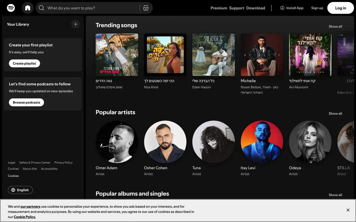
Spotify's web interface is a near-black theater built around one principle: the UI disappears so the content can glow. Three charcoal surfaces stack the page in shade (#121212 base, #181818 cards, #1f1f1f interactive fills), and the only true color comes from album artwork plus Spotify Green (#1ed760), which is reserved exclusively for play buttons, active navigation, and primary CTAs. The typography uses SpotifyMixUI and SpotifyMixUITitle — proprietary fonts from the CircularSp family with an extensive fallback stack covering Arabic, Hebrew, Cyrillic, Greek, Devanagari, and CJK scripts to serve Spotify's 180+ markets.
This page packages the full system into a single DESIGN.md file built on the Google Labs spec. Inside: 19 colors tokens grouped into brand, text, semantic, surface, and shadow roles; 14 type styles spanning a compact 10px–24px range; 11 corner radii from 2px badges through 9999px full pills; a 20-step spacing scale built on an 8px base unit; and 29 components recipes covering dark pills, outlined pills, circular play buttons, search pills with inset borders, dark cards, and the achromatic sidebar navigation.
Feed the file to Claude, Cursor, or GitHub Copilot and the agent writes React components that match Spotify's voice — pill geometry, uppercase tracking, heavy dark-mode shadows — rather than a generic dashboard theme. Or reference the tokens directly: every hex, font-stack, radius, and shadow definition is quoted and ready to paste into Tailwind config or CSS variables. The system is worth studying for the discipline of letting one functional accent and a single typeface family carry an entire app — restraint as identity, not as compromise.
What makes it distinct
5
- Near-black immersive canvasthree charcoal surfaces (#121212, #181818, #1f1f1f) let album art carry every drop of color
- Single accent voltageSpotify Green (#1ed760) is functional only, reserved for play controls, active states, and CTAs
- Pill-and-circle geometry500px to 9999px radii on buttons, 50% on play controls, no square interactive surface anywhere
- Uppercase button labels with 1.4–2px trackinga systematic 'label voice' distinct from running content text
- Heavy shadow language0.5 opacity at 24px blur for dialogs, an inset rgb(124,124,124) border for tactile input depth
spotify.com
Live at spotify.com
A snapshot of the brand in production. Scroll the frame to see the whole page.
Colors
19 colors
Spotify's system runs on #1ed760 as its primary voltage, used in 2 of 29 components. Type is set in SpotifyMixUI across 14 tokens from 10px to 24px, weights 400–700. Shape language is soft — components average 158px corner radius, with no sharp interactive edges.
Brand & Accent
Sparing, CTA-only voltage · 2
Surface
Page and card backgrounds · 6
Text
Headlines, body, captions · 8
Borders & Hairlines
Dividers, outlines, rules · 2
Other
Specialty colors · 1
Typography
14 type tokens
Set in SpotifyMixUI across 14 tokens, from 10px to 24px, weights 400–700. Shown in its own stack: where the font isn't installed, the fallback the file names stands in.
- section-title24px · weight 700 · lh normal · tracking normalThe quick brown fox jumps over the lazy dog
- feature-heading18px · weight 600 · lh 1.3 · tracking normalThe quick brown fox jumps over the lazy dog
- body-bold16px · weight 700 · lh normal · tracking normalThe quick brown fox jumps over the lazy dog
- body16px · weight 400 · lh normal · tracking normalThe quick brown fox jumps over the lazy dog
- button-uppercase14px · weight 700 · lh 1 · tracking 1.4pxThe quick brown fox jumps over the lazy dog
- button14px · weight 700 · lh normal · tracking 0.14pxThe quick brown fox jumps over the lazy dog
- nav-link-active14px · weight 700 · lh normal · tracking normalThe quick brown fox jumps over the lazy dog
- nav-link14px · weight 400 · lh normal · tracking normalThe quick brown fox jumps over the lazy dog
- caption-bold14px · weight 700 · lh 1.5 · tracking normalThe quick brown fox jumps over the lazy dog
- caption14px · weight 400 · lh normal · tracking normalThe quick brown fox jumps over the lazy dog
- small-bold12px · weight 700 · lh 1.5 · tracking normalThe quick brown fox jumps over the lazy dog
- small12px · weight 400 · lh normal · tracking normalThe quick brown fox jumps over the lazy dog
- badge10.5px · weight 600 · lh 1.33 · tracking normalThe quick brown fox jumps over the lazy dog
- micro10px · weight 400 · lh normal · tracking normalThe quick brown fox jumps over the lazy dog
Layout
Radii and spacing
11 corner radii and 13 spacing values. Shape language: soft.
Radii
- none0px
- minimal2px
- xs4px
- sm6px
- md8px
- lg10px
- xl20px
- pill-large100px
- pill500px
- full9999px
- circle50%
Spacing
- xxs1px
- xxs22px
- xxs33px
- xs4px
- xs25px
- xs36px
- sm8px
- sm210px
- md12px
- md214px
- md315px
- base16px
- lg20px
Components
29 components
Each rendered from its tokens (color, type, radius, padding) on Spotify's own canvas.
- Button Dark Pillbutton-dark-pillButton Dark Pill
- Button Dark Large Pillbutton-dark-large-pillButton Dark Large Pill
- Button Light Pillbutton-light-pillButton Light Pill
- Button Outlined Pillbutton-outlined-pillButton Outlined Pill
- button-circular-playButton Circular Play
- Button Play Greenbutton-play-greenButton Play Green
- Button Cta Greenbutton-cta-greenButton Cta Green
- Card Surfacecard-surfaceCard Surface
- Card Elevatedcard-elevatedCard Elevated
- Card Altcard-altCard Alt
- Album Art Containeralbum-art-containerAlbum Art Container
- Search Input Pillsearch-input-pillSearch Input Pill
- Type here…text-inputText Input
- SidebarsidebarSidebar
- Sidebar Item Activesidebar-item-activeSidebar Item Active
- Sidebar Item Inactivesidebar-item-inactiveSidebar Item Inactive
- icon-button-circleIcon Button Circle
- Badge Pillbadge-pillBadge Pill
- Badge Explicitbadge-explicitBadge Explicit
- Track Rowtrack-rowTrack Row
- Track Row Metatrack-row-metaTrack Row Meta
- Now Playing Barnow-playing-barNow Playing Bar
- DialogdialogDialog
- Dropdown Menudropdown-menuDropdown Menu
- Separator Lineseparator-lineSeparator Line
- Link Mutedlink-mutedLink Muted
- Link Activelink-activeLink Active
- Tag Smalltag-smallTag Small
- Legal Bandlegal-bandLegal Band
In use
The system, in use
Spotify's tokens on the kind of product it builds.
Build something people actually use.
A short paragraph of marketing copy that previews how the brand's display tier and body tier read together. Two sentences is usually enough.
FAQ
Spotify design system FAQ
Common questions about Spotify's tokens, components, and how to use this DESIGN.md in your project.
Read next
Related reading
Specs, directories, and component libraries that pair with this design system.
Use it
Use Spotify in your project
One machine-readable file. Drop it into Claude, Cursor, or any AI tool that reads DESIGN.md.
Download the DESIGN.md
One machine-readable file: every color, type, radius, spacing, and component token of Spotify.
Feed it to your AI tool
Drop it into Claude, Cursor, or GitHub Copilot. The agent writes React components and Tailwind classes that match Spotify's visual language.
Reference the tokens directly
Or paste the values into your Tailwind config, CSS variables, or component library: every color, size and radius is a quoted, ready-to-copy value.
Read the full DESIGN.md: overview, rationale, do’s and don’ts
Overview
Spotify is the canonical example of a content-first dark interface. The base canvas is near-black ({colors.bg-base} — #121212) with cards stepping up through {colors.surface-dark} (#181818) and interactive fills at {colors.surface-mid} (#1f1f1f). The only true brand color is Spotify Green ({colors.brand-green} — #1ed760), reserved exclusively for play controls, active navigation, and primary CTAs. Album art and content provide every other drop of color on the page — the chrome itself is achromatic by design.
Type runs SpotifyMixUI (body) and SpotifyMixUITitle (display), both proprietary fonts from the CircularSp family (Circular by Lineto, customized for Spotify). The fallback stack walks CircularSp-Arab, CircularSp-Hebr, CircularSp-Cyrl, CircularSp-Grek, CircularSp-Deva before reaching system stacks — a deliberate accommodation for Spotify's 180+ market reach. The type system operates as a bold/regular binary: 700 for emphasis, navigation, and captions; 400 for body and inactive nav; 600 reserved for the feature-heading and badge tokens. Button labels run uppercase with 1.4–2px letter-spacing, creating a systematic "label voice" distinct from running content.
The shape language is pill-and-circle. Primary action buttons run 500px–9999px radii (full pill), circular play controls render at 50% ({rounded.circle}), and the global search input is a 500px pill. Cards rest at a tighter 6px–8px radius ({rounded.sm}–{rounded.md}), badges and explicit tags use minimal 2px, and panel overlays sit at 10–20px. There is essentially no square corner on any interactive surface — pill-and-circle geometry is the system's tactile identity.
Key Characteristics:
- Three-tier dark canvas:
{colors.bg-base}(#121212) base,{colors.surface-dark}(#181818) cards,{colors.surface-mid}(#1f1f1f) interactive fills. Depth comes from shade variation, not from layered shadows on a white surface. - Single functional accent:
{colors.brand-green}(#1ed760) appears only on play and pause controls, active navigation items, and primary green CTAs ({component.button-cta-green}). Never decorative, never on backgrounds. - Custom font family:
SpotifyMixUIandSpotifyMixUITitlefrom the CircularSp family, with an extensive Arabic / Hebrew / Cyrillic / Greek / Devanagari / CJK fallback stack reflecting 180+ market reach. - Bold/regular binary type system: most text is either 700 or 400, with 600 used sparingly on feature headings and badges. Hierarchy comes from weight contrast more than size.
- Uppercase button labels:
{typography.button-uppercase}runs 14px / 700 with 1.4px tracking, transforming the standard pill button into a systematic "label" element. - Pill-and-circle button geometry:
{rounded.pill}(500px) for large pills,{rounded.full}(9999px) for navigation pills,{rounded.circle}(50%) for play and avatar controls. - Heavy elevation shadows:
rgba(0,0,0,0.5) 0px 8px 24pxon dialogs and menus,rgba(0,0,0,0.3) 0px 8px 8pxon hovered cards. On dark backgrounds, shadows have to be heavy to be visible. - Inset border-shadow on inputs:
rgb(18,18,18) 0px 1px 0px, rgb(124,124,124) 0px 0px 0px 1px inset— a tactile recessed quality without a visible 1px outline. - Compact 10px–24px type range — Spotify is an app, not a magazine. Density beats breathing room when the goal is scanning playlists.
Colors
Brand & Accent
- Spotify Green (
{colors.brand-green}— #1ed760): The single functional brand color. Used only on play and pause buttons, active sidebar items, and primary green CTAs ("Get Spotify Free", "Continue"). Never decorative, never on background fills. - Spotify Green Border (
{colors.brand-green-border}— #1db954): A slightly darker green used as a border accent on rare outlined CTA variants — the historic original Spotify green.
Surface
- Base (
{colors.bg-base}— #121212): The deepest layer, the page background everywhere. The sidebar uses this same tone for visual continuity. - Surface Dark (
{colors.surface-dark}— #181818): Card and container fill — playlist cards, dialogs, sectioned panels. One step lighter than base. - Surface Mid (
{colors.surface-mid}— #1f1f1f): Interactive surface fill — pill buttons, search input, circular play backgrounds, icon-button circles. - Surface Card (
{colors.surface-card}— #252525): Elevated card surface for hover and dropdown menus. - Surface Card Alt (
{colors.surface-card-alt}— #272727): Slight variant used for alternating list-row surfaces. - Surface Light (
{colors.surface-light}— #eeeeee): The single light-mode fill, reserved for marketing CTAs like cookie consent and rare promotional pills. Out of place anywhere inside the listening interface.
Text
- White (
{colors.text-base}— #ffffff): Primary text on every dark surface — headings, active navigation, track titles. - Silver (
{colors.text-secondary}— #b3b3b3): Secondary running text — artist names, inactive nav, timestamps, captions. - Near White (
{colors.text-near-white}— #cbcbcb): Slightly brighter than silver, used in metadata where silver feels too dim. - Light (
{colors.text-light}— #fdfdfd): Near-pure white for maximum emphasis on key labels and counts.
Semantic
- Negative Red (
{colors.text-negative}— #f3727f): Error text — failed actions, validation errors. A softer pink-red rather than a harsh signal red, tuned for legibility on near-black. - Warning Orange (
{colors.text-warning}— #ffa42b): Warning text — payment issues, expiring trials. - Announcement Blue (
{colors.text-announcement}— #539df5): Informational text — feature announcements, neutral system messages.
Borders & Dividers
- Border Gray (
{colors.border-gray}— #4d4d4d): Default 1px border tone on buttons and dialogs at rest. - Light Border (
{colors.border-light}— #7c7c7c): Outlined-button border and the inset border-shadow input ring. - Separator (
{colors.separator}— #b3b3b3): Divider lines between sections — same tone as silver text, applied as a 1px rule. - On Green (
{colors.on-green}— #000000): Black text and icons on Spotify Green CTAs and the circular play-on-green button.
Typography
Font Family
The system runs SpotifyMixUI for everything except section-level display, which uses SpotifyMixUITitle. Both are proprietary fonts from the CircularSp family — Circular by Lineto, customized for Spotify and licensed only to Spotify. The fallback stack walks CircularSp-Arab, CircularSp-Hebr, CircularSp-Cyrl, CircularSp-Grek, CircularSp-Deva and then system fonts — Helvetica Neue, helvetica, arial, Hiragino Sans, Hiragino Kaku Gothic ProN, Meiryo, MS Gothic.
The extensive Arabic / Hebrew / Cyrillic / Greek / Devanagari / CJK fallback stack is a deliberate accommodation for Spotify's 180+ market reach — type renders cleanly across the company's full geographic surface area.
Hierarchy
| Token | Size | Weight | Line Height | Letter Spacing | Use |
|---|---|---|---|---|---|
{typography.section-title} | 24px | 700 | normal | normal | Major section titles ("Made for You", "Your Library") |
{typography.feature-heading} | 18px | 600 | 1.30 | normal | Sub-section heads inside cards and dialogs |
{typography.body-bold} | 16px | 700 | normal | normal | Emphasized body text — track titles in detail views |
{typography.body} | 16px | 400 | normal | normal | Standard body running text |
{typography.button-uppercase} | 14px | 700 | 1.00 | 1.4px (uppercase) | Primary CTA labels ("LOG IN", "SIGN UP") |
{typography.button} | 14px | 700 | normal | 0.14px | Standard pill button labels |
{typography.nav-link-active} | 14px | 700 | normal | normal | Active sidebar navigation |
{typography.nav-link} | 14px | 400 | normal | normal | Inactive sidebar navigation |
{typography.caption-bold} | 14px | 700 | 1.50 | normal | Emphasized metadata — playlist owner, count |
{typography.caption} | 14px | 400 | normal | normal | Standard metadata — artist, album, date |
{typography.small-bold} | 12px | 700 | 1.50 | normal | Tags, counts, explicit badges |
{typography.small} | 12px | 400 | normal | normal | Fine-print body — copyright lines, footer legal |
{typography.badge} | 10.5px | 600 | 1.33 | normal (capitalize) | Pill badge labels with capitalize transform |
{typography.micro} | 10px | 400 | normal | normal | Smallest text — timestamps, debug labels |
Principles
Most text in the system is either 700 bold or 400 regular — the binary creates clear visual hierarchy through weight contrast rather than size variation. The intermediate 600 weight is reserved for the feature-heading token and the capitalize-transformed badge.
Button labels live in a separate voice: uppercase with 1.4–2px letter-spacing. The combination transforms pill buttons into systematic "labels" that read differently from content text. This is the single most distinctive typographic move in the system.
The full size range is 10px–24px — narrower than most design systems. Spotify's typography is compact and functional, designed for scanning playlists and queue rows, not for reading articles.
Note on Font Substitutes
If SpotifyMixUI and CircularSp are unavailable, Inter is the closest open-source substitute. Tighten letter-spacing on the uppercase button token from 1.4px to 1.2px to compensate for Inter's slightly wider glyphs, and preserve the bold/regular binary at 700 and 400.
Layout
Spacing System
- Base unit: 8px (with 1px–6px micro-steps for fine spacing).
- Tokens:
{spacing.xxs}1px ·{spacing.xxs2}2px ·{spacing.xxs3}3px ·{spacing.xs}4px ·{spacing.xs2}5px ·{spacing.xs3}6px ·{spacing.sm}8px ·{spacing.sm2}10px ·{spacing.md}12px ·{spacing.md2}14px ·{spacing.md3}15px ·{spacing.base}16px ·{spacing.lg}20px. - Card internal padding:
{spacing.base}(16px) for playlist and album cards;{spacing.md}(12px) for circular play buttons;{spacing.sm}(8px) for icon-button padding and dense track row gutters. - Section gutters:
{spacing.lg}(20px) between major panels;{spacing.base}(16px) between cards in playlist grids;{spacing.sm}(8px) between dense track rows.
Grid & Container
- Three-region layout: fixed sidebar (left) + main content (center) + optional right rail. The now-playing bar spans full-width across the bottom at every breakpoint.
- Album / playlist grid: 5 columns on large desktop, dropping to 3 on tablet, 2 on small tablet, 1 on mobile.
- Sidebar: fixed-width left column with the Spotify logo top-left, navigation entries below, and the playlist list filling the remainder.
- Now-playing bar: persistent bottom bar carrying track art (left), playback controls (center), and queue/volume controls (right).
Whitespace Philosophy
The system favors dark compression over breathing room. Playlist grids, track lists, and navigation are all tightly spaced — the dark {colors.bg-base} background provides visual rest between elements without needing large gaps. This is an app, not a marketing site; every pixel serves the listening experience. Marketing surfaces use generous spacing, but the core product is dense by design.
Elevation
| Level | Treatment | Use |
|---|---|---|
| Base (Level 0) | Flat {colors.bg-base} background | Page background, sidebar |
| Surface (Level 1) | Flat {colors.surface-dark} or {colors.surface-mid} fill | Cards, dialogs, containers |
| Elevated (Level 2) | rgba(0,0,0,0.3) 0px 8px 8px | Dropdown menus, hovered cards |
| Dialog (Level 3) | rgba(0,0,0,0.5) 0px 8px 24px | Modals, overlays, full menus |
| Inset (Border) | rgb(18,18,18) 0px 1px 0px, rgb(124,124,124) 0px 0px 0px 1px inset | Search and text inputs |
Shadow Philosophy: Spotify uses notably heavy shadows for a dark-themed app. The 0.5-opacity shadow at 24px blur creates a dramatic "floating in darkness" effect for dialogs and full menus, while the 0.3-opacity shadow at 8px blur provides a subtler card lift on hover. The inset border-shadow combination on inputs gives a recessed, tactile quality without a visible 1px outline — a small but distinctive detail. On dark backgrounds, light shadows are invisible; the system compensates by going heavy.
Components
Buttons
button-dark-pill — {colors.surface-mid} (#1f1f1f) fill, white text or silver, 9999px full-pill radius ({rounded.full}), 8×16px padding. Used for navigation pills and secondary actions.
button-dark-large-pill — {colors.surface-dark} (#181818) fill, white text, 500px pill radius ({rounded.pill}), 0×43px padding (asymmetric for visual weight). Used for primary app navigation. Carries the uppercase button typography token.
button-light-pill — {colors.surface-light} (#eeeeee) fill, {colors.surface-dark} (#181818) text, 500px radius. The single light-mode pill — used for cookie consent, promotional banners, and marketing-page CTAs. Out of place inside the listening interface.
button-outlined-pill — Transparent fill, white text, 1px {colors.border-light} (#7c7c7c) border, 9999px radius, 4×16×4×36px asymmetric padding (extra left padding for an icon). Used for "Follow" and secondary actions.
button-circular-play — {colors.surface-mid} (#1f1f1f) fill, white icon, 50% radius ({rounded.circle}), 12px padding. The standard play and pause control across track rows and small cards.
button-play-green — {colors.brand-green} (#1ed760) fill, {colors.on-green} (#000000) icon, 50% radius, 12px padding. The signature green play button — appears on hovered playlist and album cards, and as the primary play action on detail pages.
button-cta-green — {colors.brand-green} (#1ed760) fill, black text, 500px pill radius, 8×32px padding. The marketing-page primary CTA ("Get Spotify Free", "Continue"). Carries the uppercase button typography token.
Cards & Surfaces
card-surface — {colors.surface-dark} (#181818) fill, 8px radius ({rounded.md}), no visible border at rest. Hover state: slight background lightening to {colors.surface-card} (#252525). Used for playlist cards, album cards, and panel containers.
card-elevated — {colors.surface-card} (#252525) fill, 8px radius — the hover-elevated card state, also used at rest for content panels that need to sit above the default card layer.
card-alt — {colors.surface-card-alt} (#272727) fill, 8px radius — used for alternating list-row backgrounds inside dense queue and history views.
album-art-container — A 6px ({rounded.sm}) clipped square that holds album artwork. The radius is deliberately tight; the corner clipping is the only visible card frame around album art.
Inputs
search-input-pill — {colors.surface-mid} (#1f1f1f) fill, white text, 500px pill radius, 12×96×12×48px icon-aware padding. On focus, the border flips to a 1px outline with the inset border-shadow combo rgb(18,18,18) 0px 1px 0px, rgb(124,124,124) 0px 0px 0px 1px inset. The signature global search field.
text-input — {colors.surface-mid} (#1f1f1f) fill, white text, 4px radius ({rounded.xs}), 12×16px padding. Used for inline form inputs in account settings and dialogs. Same inset-border focus state as the search pill.
Navigation
sidebar — {colors.bg-base} (#121212) fill (same as the page base, no separator), housing the Spotify logo at top-left in {colors.brand-green}, nav links beneath, and the playlist list filling the remainder. Uses {typography.nav-link} at 14px / 400 for inactive items and {typography.nav-link-active} at 14px / 700 for the current page.
sidebar-item-active — White text, weight 700, transparent background. The active item is signaled by weight contrast rather than a colored fill or border.
sidebar-item-inactive — Silver text ({colors.text-secondary} — #b3b3b3), weight 400. Hovers to white text.
icon-button-circle — {colors.surface-mid} (#1f1f1f) fill, white icon, 50% radius, 8px padding. Used for utility actions (back, forward, more) in the sidebar header and dialog title bars.
Badges & Tags
badge-pill — {colors.surface-mid} (#1f1f1f) fill, white text, 9999px radius, 2×8px padding. Carries the {typography.badge} token at 10.5px / 600 with capitalize transform. Used for "New", "Updated", and category labels.
badge-explicit — {colors.border-gray} (#4d4d4d) fill, white text, 2px radius ({rounded.minimal}), 0×4px padding. The "E" explicit-content badge that appears next to track titles. The minimal 2px radius — almost a square — is deliberately tight to distinguish it from the pill family.
tag-small — {colors.surface-mid} (#1f1f1f) fill, white text, 2px radius, 1×6px padding. Used for inline metadata tags inside dense list rows.
Lists & Tracks
track-row — Transparent fill, white text in {typography.caption} (14px / 400), 8×16px padding. Hover state: background lifts to {colors.surface-card-alt} (#272727). Track number column left, title and artist center, album and duration right.
track-row-meta — Silver text in caption type — used inside track rows for artist names, album titles, and duration columns.
Overlays
dialog — {colors.surface-dark} (#181818) fill, white text, 8px radius. Carries the dialog-level shadow rgba(0,0,0,0.5) 0px 8px 24px — the heaviest elevation in the system, creating the floating-in-darkness effect.
dropdown-menu — {colors.surface-card} (#252525) fill, white text, 8px radius. Uses the elevated shadow rgba(0,0,0,0.3) 0px 8px 8px — lighter than the dialog tier but still strong enough to read on the near-black canvas.
Player
now-playing-bar — {colors.bg-base} (#121212) fill spanning full width at the bottom of every page. Track art (left, 6px clipped), playback controls (center), queue and volume (right). Persistent at every breakpoint — collapses internally rather than hiding.
Misc
separator-line — A 1px rule in {colors.border-gray} (#4d4d4d) used between major sections inside dialogs and detail pages.
link-muted — Silver text in caption type, no underline at rest, underlines on hover.
link-active — White text in caption-bold type, used for actively selected text links and "Show more" affordances.
legal-band — {colors.bg-base} (#121212) fill, silver text in {typography.small} (12px / 400) — the footer legal strip carrying copyright, language picker, and policy links.
Responsive Behavior
| Name | Width | Key Changes |
|---|---|---|
| Mobile Small | < 425px | Compact mobile layout; sidebar hidden; bottom-bar navigation replaces sidebar; single-column album grid. |
| Mobile | 425–576px | Standard mobile; bottom-bar nav persists; album grid stays 1-column. |
| Tablet | 576–768px | 2-column album grid; sidebar still hidden behind hamburger sheet. |
| Tablet Large | 768–896px | Expanded layout; sidebar appears in collapsed form. |
| Desktop Small | 896–1024px | Sidebar visible (full); 3-column album grid; now-playing bar full-width. |
| Desktop | 1024–1280px | Full desktop layout; 4-column album grid; right rail available. |
| Large Desktop | > 1280px | Expanded grid (5-column); generous gutters. |
Touch Targets
- Primary play buttons sit at 48×48px or larger when surfaced as standalone CTAs.
- Circular icon buttons run 32×32px with 8px internal padding — borderline AAA but compensated by generous outer surface spacing.
- Sidebar items use full-width row hit targets, comfortably above 48px tap area.
- Now-playing bar buttons run 40×40px circular — sized for thumbs reaching the bottom of the screen.
Collapsing Strategy
- Sidebar: full → collapsed (icon-only) → hidden behind a hamburger sheet on mobile.
- Album grid: 5 columns → 4 → 3 → 2 → 1, reducing column count cleanly without reflowing rows.
- Now-playing bar: maintained at every breakpoint; internal regions collapse (queue and volume hide on mobile) rather than the whole bar disappearing.
- Search pill: maintained as a pill at every breakpoint; width adjusts down rather than the shape changing.
- Navigation: sidebar → bottom-bar nav on mobile, carrying just the core entries (Home, Search, Library).
Known Gaps
- Motion and transitions: the system uses subtle cross-fades on card hovers and a slide-up reveal on dialogs, but exact easing curves and durations are not captured in this DESIGN.md.
- Now-playing scrubber: the progress bar inside the now-playing bar uses a hover-revealed handle and a green progress fill, but the precise hover states and active drag styling aren't extracted.
- Equalizer and waveform components: the green animated equalizer that signals an actively-playing track, and any waveform visualizations on podcast pages, are not captured here.
- Full hover-state color shifts: the system uses subtle background lightening (e.g., card surfaces stepping from
{colors.surface-dark}to{colors.surface-card}) but precise interpolations between rest and hover aren't documented for every component. - Mobile bottom-bar navigation: the native iOS and Android bottom navigation lives in mobile shells rather than the web product, and isn't represented in this spec.
- Marketing-page sub-system: the Spotify marketing site uses a parallel light-mode treatment with
{colors.surface-light}(#eeeeee) fills and additional brand colors that aren't part of the core listening interface.
Music, Video & Streaming
More systems like this
More DESIGN.md files in Music, Video & Streaming.
Pricing
Build it with Pro
The DESIGN.md files are free. Pro adds 6,000+ blocks, premium templates and the MCP server, so your AI editor builds in your system for you.
4.9/5 out of 5 · 150+ reviewsfrom 150+ founders and developers.
Billing
Billed once a year in USD. Cancel anytime.
- How many people can use the license.
- Client work, SaaS products and anything you charge for.
- Production-ready React sections: hero, pricing, features, dashboards and more.
- Complete multi-page sites you can ship as they are.
- React icons from every major library, installable with one command.
- Presets that restyle every block, in light and dark.
- Lets your AI editor search, preview and install blocks for you.
- Priority requests are answered first.
Individual
For personal projects & open source
$32instead of $49/mo
$389 billed yearly
- Seats: 1 seat
- Commercial use: Personal & open source only
- Pro blocks: 6,000+ blocks
- Templates: All 14 templates
- React icons: 294k+ icons
- Themes: All 59 themes
- MCP server: Basic usage
- Support: Standard
Team
Most popularFor freelancers, agencies & startups
$66instead of $99/mo
$789 billed yearly · ≈ $13/dev/mo
- Seats: Up to 5 seats
- Commercial use: Included
- Pro blocks: 6,000+ blocks
- Templates: All 14 templates
- React icons: 294k+ icons
- Themes: All 59 themes
- MCP server: High usage
- Support: Priority
Organization
For companies with larger teams
$132instead of $199/mo
$1,589 billed yearly
- Seats: Unlimited seats
- Commercial use: Included
- Pro blocks: 6,000+ blocks
- Templates: All 14 templates
- React icons: 294k+ icons
- Themes: All 59 themes
- MCP server: Unlimited usage
- Support: Priority
Billed once a year in USD. Cancel anytime.
Individual
For personal projects & open source
$32instead of $49/mo
$389 billed yearly
- How many people can use the license.Seats: 1 seat
- Client work, SaaS products and anything you charge for.Commercial use: Personal & open source only
- Production-ready React sections: hero, pricing, features, dashboards and more.Pro blocks: 6,000+ blocks
- Complete multi-page sites you can ship as they are.Templates: All 14 templates
- React icons from every major library, installable with one command.React icons: 294k+ icons
- Presets that restyle every block, in light and dark.Themes: All 59 themes
- Lets your AI editor search, preview and install blocks for you.MCP server: Basic usage
- Priority requests are answered first.Support: Standard
Team
Most popularFor freelancers, agencies & startups
$66instead of $99/mo
$789 billed yearly · ≈ $13/dev/mo
Everything in Individual, plus
- How many people can use the license.Seats: Up to 5 seats
- Client work, SaaS products and anything you charge for.Commercial use: Included
- Lets your AI editor search, preview and install blocks for you.MCP server: High usage
- Priority requests are answered first.Support: Priority
Organization
For companies with larger teams
$132instead of $199/mo
$1,589 billed yearly
Everything in Team, plus
- How many people can use the license.Seats: Unlimited seats
- Lets your AI editor search, preview and install blocks for you.MCP server: Unlimited usage
- Secure checkout via Stripe
- Code lives in your repo
- Keep what you've shipped if you cancel
- License terms
Your system, built for you
Every block, template and icon, installed by your AI agent in your design system. The DESIGN.md files stay free.