SoundCloud Design System
SoundCloud's design system as a DESIGN.md file. Near-black hero on ivory body, Söhne, orange `#ff5500` micro-accent, 19 components.
Add shadcn.io to your AI agent. · Pro It installs blocks, icons and templates in your design system from a prompt, with Pro.
Set up MCP- Primary
- #121212
- Typeface
- Söhne
- Shape
- Soft
- Base radius
- 10px
- Colors
- 24
- Type tokens
- 10
- Components
- 19
- Spacing values
- 9
About
About SoundCloud DESIGN.md
Curated by Dov Azencot · Updated May 13, 2026 · Source soundcloud.com (opens in a new tab)
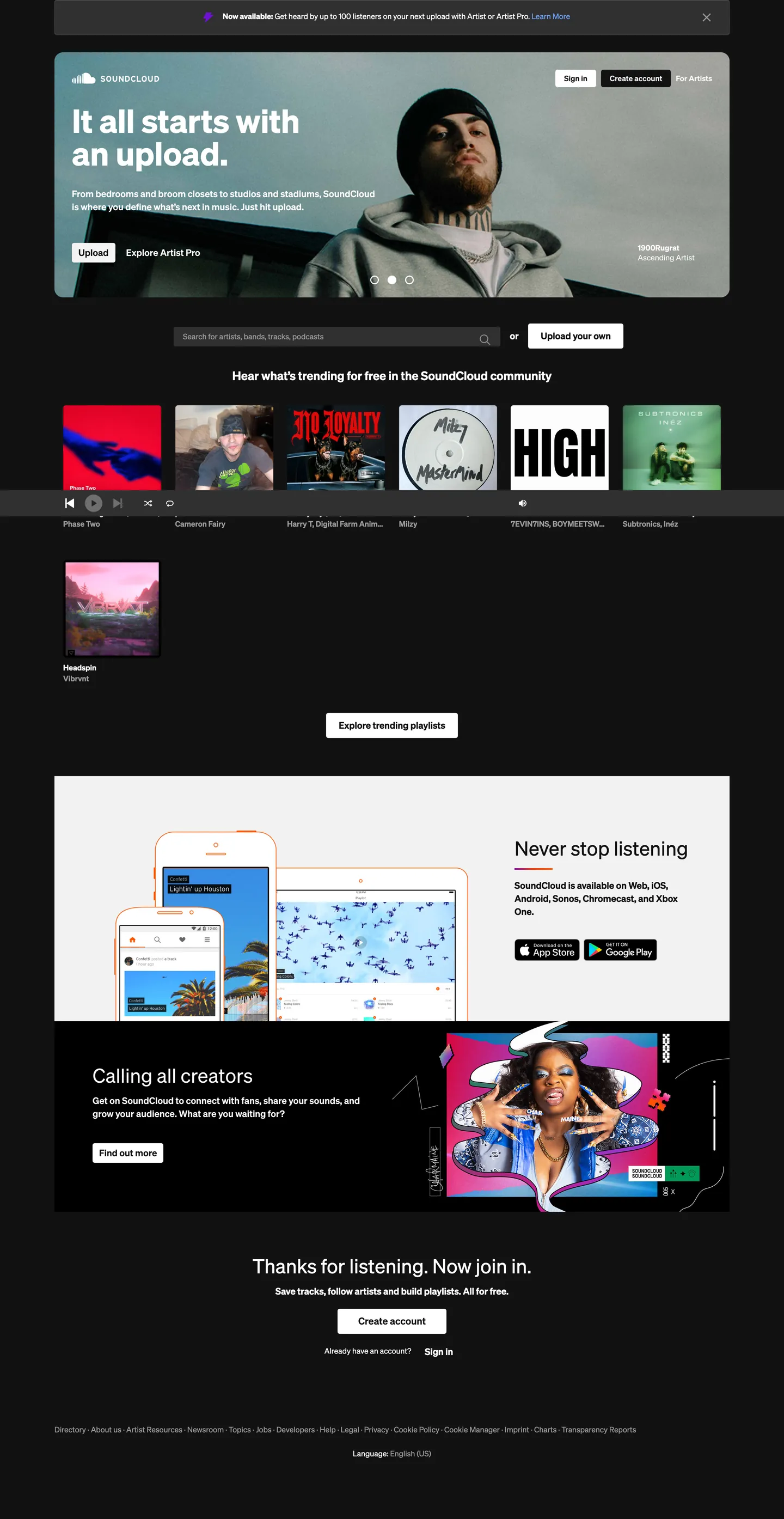
SoundCloud's marketing page is a two-canvas system rather than a single dark or single light theme. The top band is a `#121212` near-black theater holding a black-and-white creator photo, the 60px "Discover.Get Discovered." h2 in white, and an orange-banded Artist Pro promo strip — the only place the historic SoundCloud Orange (`#ff5500`) reads at any scale. Scroll past the hero and the canvas flips to `#ffffff` ivory: a search bar, a six-card trending-tracks grid with album art at `16px` rounding, a "Never stop listening" device callout with the App Store and Google Play badges, and a "Calling all creators" panel that returns briefly to the dark band. The CTAs ("Sign in", "Create account", "Upload your own", "Find out more", "Explore trending playlists") all sit in `#121212` on `#ffffff` with a `4px` radius — black-on-white, never orange.
This DESIGN.md packages the full marketing surface into a single machine-readable file built on the Google Labs spec. Inside: 24 colors tokens grouped into the canvas, surface, ink, hairline, voltage, and semantic roles; 10 typography styles all running Söhne from a 60px hero display down to a 12px capitalized micro-caption; 6 radius tokens spanning a `4px` chip to a `100px` legacy tag pill, plus a `50%` circle for play and avatar controls; 9 spacing tokens anchored on the `--spacing-1x` 8px base unit found in the extracted CSS variables; and 19 components recipes covering the dark hero, the trending-track card, the search field, the activated checkbox, the device-store badge row, and the dim sign-in link beside the primary `Create account` pill.
Feed the file to Claude, Cursor, or GitHub Copilot and the agent reproduces the two-canvas inversion — dark hero on top, ivory product body below, micro-orange checkbox state — rather than defaulting to a saturated-orange-on-dark theme. Reference the tokens directly to seed a Tailwind config or CSS variable layer; the component block maps each surface (button-primary-dark, button-primary-light, card-track, hero-band, input-search, checkbox-activated) to its token references, so reconstructing the hero is a token lookup. The system is worth studying because it refuses the obvious move: SoundCloud Orange is the brand color the audience expects to see on the CTA, and the company instead reserves it for a 12-by-12-pixel checkbox fill, letting black-on-white carry every primary action.
What makes it distinct
5
- Two-canvas split`#121212` near-black hero band stacks above a `#ffffff` ivory body, with the brand inverting palette mid-page rather than running one canvas top to bottom
- Black-on-white primary CTAthe `Create account` and `Upload your own` buttons sit at `#121212` ink on `#ffffff` fill, refusing the saturated orange that legacy SoundCloud branding still implies
- Orange as micro-accent`#ff5500` lives only inside `--checkbox-checked-background-color` and `--toggle-on-body-color`, scoped to form state and never to a CTA
- Söhne across every tierdisplay h2 runs 60px / weight 700 with a flat 60px line-height, body p sits at 17px / 600, and nav and button labels share a 14px / 600 register
- Short radius ladder`4px` chips and inputs, `6px` and `10px` cards, `16px` artwork, plus a legacy `100px` tag pill that survives from the 2010-era badge system
soundcloud.com
Live at soundcloud.com
A snapshot of the brand in production. Scroll the frame to see the whole page.
Colors
24 colors
SoundCloud's system runs on #121212 as its primary voltage, used in 5 of 19 components. Type is set in Söhne across 10 tokens from 10px to 60px, weights 400–700. Shape language is soft — components average 14px corner radius, with no sharp interactive edges.
Brand & Accent
Sparing, CTA-only voltage · 3
Surface
Page and card backgrounds · 3
Text
Headlines, body, captions · 7
Borders & Hairlines
Dividers, outlines, rules · 1
Semantic
Status, errors, success, links · 6
Other
Specialty colors · 4
Typography
10 type tokens
Set in Söhne across 10 tokens, from 10px to 60px, weights 400–700. Shown in its own stack: where the font isn't installed, the fallback the file names stands in.
- display-hero60px · weight 700 · lh 1 · tracking -0.02emThe quick brown fox jumps over the lazy dog
- heading-h128px · weight 600 · lh 1.286 · tracking normalThe quick brown fox jumps over the lazy dog
- heading-h222px · weight 600 · lh 1.273 · tracking normalThe quick brown fox jumps over the lazy dog
- heading-h318px · weight 600 · lh 1.333 · tracking normalThe quick brown fox jumps over the lazy dog
- lead-body17px · weight 600 · lh 1.412 · tracking normalThe quick brown fox jumps over the lazy dog
- body-default14px · weight 400 · lh 1.429 · tracking normalThe quick brown fox jumps over the lazy dog
- body-strong14px · weight 700 · lh 1.286 · tracking normalThe quick brown fox jumps over the lazy dog
- button-label14px · weight 600 · lh 1.429 · tracking normalThe quick brown fox jumps over the lazy dog
- caption12px · weight 400 · lh 1.333 · tracking normalThe quick brown fox jumps over the lazy dog
- micro-uppercase10px · weight 600 · lh 1.143 · tracking 0.1emThe quick brown fox jumps over the lazy dog
Layout
Radii and spacing
8 corner radii and 9 spacing values. Shape language: soft.
Radii
- none0px
- xs4px
- sm6px
- md10px
- lg16px
- xl20px
- tag-legacy100px
- circle50%
Spacing
- xxs2px
- xs4px
- sm8px
- md12px
- base16px
- lg24px
- xl32px
- 2xl48px
- 3xl64px
Components
19 components
Each rendered from its tokens (color, type, radius, padding) on SoundCloud's own canvas.
- Button Primary Darkbutton-primary-darkButton Primary Dark
- Button Primary Lightbutton-primary-lightButton Primary Light
- Button Secondary Mutedbutton-secondary-mutedButton Secondary Muted
- Button Ghost On Darkbutton-ghost-on-darkButton Ghost On Dark
- Link Standardlink-standardLink Standard
- Hero Bandhero-bandHero Band
- Body Bandbody-bandBody Band
- Artist Pro Promoartist-pro-promoArtist Pro Promo
- Card Trackcard-trackCard Track
- Card Artworkcard-artworkCard Artwork
- Input Searchinput-searchInput Search
- Checkbox Activatedcheckbox-activatedCheckbox Activated
- Toggle Ontoggle-onToggle On
- Tag Legacy Pilltag-legacy-pillTag Legacy Pill
- Nav Linknav-linkNav Link
- Device Store Badgedevice-store-badgeDevice Store Badge
- Play Control Circleplay-control-circlePlay Control Circle
- Legal Bandlegal-bandLegal Band
- Footer Linkfooter-linkFooter Link
In use
The system, in use
SoundCloud's tokens on the kind of product it builds.
Build something people actually use.
A short paragraph of marketing copy that previews how the brand's display tier and body tier read together. Two sentences is usually enough.
FAQ
SoundCloud design system FAQ
Common questions about SoundCloud's tokens, components, and how to use this DESIGN.md in your project.
Read next
Related reading
Specs, directories, and component libraries that pair with this design system.
- Browse all design systemsThe full directory of DESIGN.md files on shadcn.io, with live mockups for each.shadcn.io
- SoundCloudThe audio-creator marketplace whose marketing surface this spec captures.soundcloud.com (opens in a new tab)
- The DESIGN.md specificationGoogle Labs' open spec for machine-readable design system files.github.com (opens in a new tab)
Use it
Use SoundCloud in your project
One machine-readable file. Drop it into Claude, Cursor, or any AI tool that reads DESIGN.md.
Download the DESIGN.md
One machine-readable file: every color, type, radius, spacing, and component token of SoundCloud.
Feed it to your AI tool
Drop it into Claude, Cursor, or GitHub Copilot. The agent writes React components and Tailwind classes that match SoundCloud's visual language.
Reference the tokens directly
Or paste the values into your Tailwind config, CSS variables, or component library: every color, size and radius is a quoted, ready-to-copy value.
Read the full DESIGN.md: overview, rationale, do’s and don’ts
Overview
SoundCloud's 2026 marketing surface is a two-canvas split, not a single dark or single light theme. The top section is a {colors.hero-canvas} (#121212) near-black theater holding a black-and-white creator photo, the 60px "Discover.Get Discovered." h2 in {colors.ink-on-dark} (#ffffff), and an {colors.artist-pro-surface} (#f4eedf) Artist Pro promo strip. Below the hero the canvas flips to {colors.body-canvas} (#ffffff) ivory carrying the search field, the six-card trending grid with {rounded.lg} (16px) artwork, the device-callout row, and the "Calling all creators" panel that briefly returns to the dark band. The inversion mid-page is the layout signal — the brand is announcing two audiences (listener, creator) by switching the canvas under them.
Type runs Söhne across every tier — the 60px hero h2 sits at weight 700 with a flat 60px line-height and -0.02em tracking, the 28px h1 and 22px h2 sit at weight 600, body paragraphs at 17px / 600, and nav and button labels share a 14px / 600 register. The fallback stack walks system-ui, -apple-system, Segoe UI, Roboto, Ubuntu, Cantarell, Noto Sans, sans-serif. The weight binary is 600 for chrome, 400 for running paragraphs — there is no 300 in the system at any size, and the only 700 appearance is the hero h2 itself. The shape language is short-radius square: 4px chips, buttons, and inputs (--borderRadiuses-4), 10px trending cards (--borderRadiuses-10), 16px artwork (--borderRadiuses-16), 20px larger panels (--borderRadiuses-20), a legacy 100px track-tag pill (--borderRadiuses-100) that survives from the 2010-era badge system, and a 50% circle for play and avatar controls.
Inverted voltage: where most music platforms paint the primary CTA with the brand voltage (Spotify Green, Apple Music red, Suno cream), SoundCloud now reserves the historic {colors.accent-orange} (#ff5500) for form state alone — the activated checkbox, the toggle-on handle, the small go focus shadow. The CTAs (Create account, Sign in, Upload your own, Find out more) sit at #121212 ink on #ffffff fill with a 4px corner instead. The hierarchy reads as black-on-white = act on the site, orange = your form is in the on state. Unlike the convention of leading with the historic identity color on the CTA, SoundCloud is letting black do the load-bearing work and keeping orange as a 16-by-16-pixel signal.
Key Characteristics:
- Two-canvas hero/body split:
{colors.hero-canvas}(#121212) hero band stacked above{colors.body-canvas}(#ffffff) ivory body, with the canvas flipping mid-page rather than running one tone end to end. - Black-on-white primary CTAs:
{component.button-primary-light}and{component.button-primary-dark}both run a4pxcorner with weight-600 14px Söhne labels — orange does not appear on any hero action. - Orange as micro-accent:
{colors.accent-orange}(#ff5500) is scoped to--checkbox-checked-background-color,--toggle-on-body-color, and--special-color— never to a CTA fill or hero text. - Söhne weight binary: most chrome sits at weight 600, body running text at 400, with the 60px hero h2 alone at weight 700.
- Short radius ladder:
4pxchips /10pxcards /16pxartwork /20pxpanels /100pxlegacy tag /50%circle — no8pxor12pxmid-step. - Link blue (
{colors.accent-link}—#044dd2): the secondary voltage, scoped to inline links and the 2px focus ring--button-focused-box-shadow: 0 0 0 2px #044dd2 inset. - Artist Pro accent system:
{colors.artist-pro-surface}(#f4eedf) cream surface plus{colors.artist-pro-ink}(#6f5b37) brown ink for the upsell band, mirroring the violet{colors.artist-surface-violet}(#eee8fe) plus{colors.artist-violet}(#5a45fd) pair that lives one tier deeper in the artist surfaces. - Spacing grounded on an 8px base (
--spacing-1x=8px) with a 2px micro step and a48px(--spacing-6x) gap as the dominant section gutter.
Colors
Canvas
- Hero Canvas (
{colors.hero-canvas}—#121212) — frequency 54. Used as text (21), bg (6), border (20), shadow (7). The brand's load-bearing surface tone: the hero band, a near-black sibling merged into it during clustering, the--background-dark-colorand--primary-colorCSS variable, and every primary button fill on the ivory canvas. Near-black, never pure black. - Body Canvas (
{colors.body-canvas}—#ffffff) — frequency 368. Used as text (182), bg (8), border (178). The dominant ink on the dark hero and the dominant fill on the body band — appears in 27 separate CSS variables ranging from--surface-colorto--button-primary-font-color. - Surface Highlight (
{colors.surface-highlight}—#f3f3f3) — frequency 5. Used as bg (5). Stored as--highlight-color,--button-secondary-background-color,--input-default-background-color,--tag-default-background-color. Carries 18 alias variables — the workhorse muted surface for inputs, secondary pills, and tag chips. - Surface Dark Elevated (
{colors.surface-dark-elevated}—#303030) — frequency 10. Used as bg (10). The slightly-lifted dark surface that appears inside the hero band beneath theUploadandExplore Artist Procontrols.
Ink
- Ink on Dark (
{colors.ink-on-dark}—#ffffff) — see Body Canvas. Doubles as the primary text color on the#121212hero band and button fill on the ivory canvas. - Ink on Light (
{colors.ink-on-light}—#121212) — see Hero Canvas. The primary text color on every ivory surface. - Ink Secondary (
{colors.ink-secondary}—#666666) — frequency 1. Used as bg (1). Stored as--font-secondary-color,--link-secondary-color,--input-placeholder-font-color. The supporting text color for captions, placeholder text, and the footer legal band. - Ink Disabled (
{colors.ink-disabled}—#999999) — frequency 124. Used as text (62), border (62). The dim nav-link color visible onPhase Two,Cameron Fairy, and the other artist credits beneath each trending card. - Hairline Light (
{colors.hairline-light}—#cccccc) — frequency 3. Used as border (3). The faint divider rule between sections on the ivory canvas.
Voltage
- SoundCloud Orange (
{colors.accent-orange}—#ff5500) — stored in 4 CSS variables (--special-color,--checkbox-checked-background-color,--checkbox-checked-border-color,--toggle-on-body-color). Used scarcely. Appears only on the activated checkbox fill, the toggle handle when on, and the focus shadow on the smallgoindicator — never on a CTA, never as a background fill, never on hero text. Reserved for "your form is in the on state." - Link Blue (
{colors.accent-link}—#044dd2) — stored in 6 CSS variables including--link-color,--font-link-color,--link-standard-color. The inline-link voltage and the 2px focus ring (--button-focused-box-shadow: 0 0 0 2px #044dd2 inset). Scoped to typography, not to buttons. - Focus Halo (
{colors.accent-focus}—#699fff) — frequency 44. Used as text (22), border (22). The lighter complement to link blue, surfacing on hover and focus rings inside form controls.
Artist & Pro
- Artist Pro Surface (
{colors.artist-pro-surface}—#f4eedf) — stored as--artist-pro-surface-color. The cream band behind the "Get on SoundCloud" Artist Pro promo strip inside the hero. - Artist Pro Ink (
{colors.artist-pro-ink}—#6f5b37) — stored as--artist-pro-color. The brown text that pairs with the cream surface. - Artist Violet (
{colors.artist-violet}—#5a45fd) — stored as--artist-color. The deep violet reserved for the artist-tier badge. - Artist Surface Violet (
{colors.artist-surface-violet}—#eee8fe) — stored as--artist-surface-color. The pale violet that pairs with the artist token on supporting surfaces.
Semantic
- Success (
{colors.success}—#008850) and Success Surface ({colors.success-surface}—#e6f7ee) — the pair behind toast-success states and supporting badges. - Warning Surface (
{colors.warning-surface}—#fff8e1) — the only warning token surfaced on the page, used inside expiring-trial banners on auth pages. - Error (
{colors.error}—#d61348), Error Dark ({colors.error-dark}—#b40030), Error Surface ({colors.error-surface}—#ffebee) — the three-token error stack carrying invalid-input text, hover-deepened error fill, and the soft pink validation surface. - Pure Black (
{colors.ink-pure-black}—#000000) — stored as--input-disabled-border-color,--checkbox-default-background-color,--transparent-color(paradoxically). Used only as a border seed value; never as a text or fill color, which sit at#121212instead.
Typography
Font Family
The system runs Söhne for every tier — display, body, button, caption. The fallback stack is system-ui, -apple-system, Segoe UI, Roboto, Ubuntu, Cantarell, Noto Sans, sans-serif, "Segoe UI", Roboto, "Lucida Grande", sans-serif, "Apple Color Emoji", "Segoe UI Emoji". Söhne is licensed from Klim Type Foundry. If you cannot license Söhne, Inter Tight or General Sans at weight 500 / 600 / 700 are the closest open-source substitutes — preserve the binary by skipping weight 300 and 500 entirely.
Hierarchy
| Token | Size | Weight | Line Height | Letter Spacing | Use |
|---|---|---|---|---|---|
{typography.display-hero} | 60px | 700 | 1.0 | -0.02em | Hero h2 ("Discover.Get Discovered.") |
{typography.heading-h1} | 28px | 600 | 1.286 | normal | Page h1 — "Hear what's trending for free in the SoundCloud community" |
{typography.heading-h2} | 22px | 600 | 1.273 | normal | Section h2 — "Never stop listening", "Calling all creators" |
{typography.heading-h3} | 18px | 600 | 1.333 | normal | Card sub-headings inside trending tracks |
{typography.lead-body} | 17px | 600 | 1.412 | normal | Hero lead paragraph beneath the 60px h2 |
{typography.body-default} | 14px | 400 | 1.429 | normal | Standard body running text — track artist names, footer copy |
{typography.body-strong} | 14px | 700 | 1.286 | normal | Emphasized body — track titles inside the trending grid |
{typography.button-label} | 14px | 600 | 1.429 | normal | Button labels — Sign in, Create account, Upload, Find out more |
{typography.caption} | 12px | 400 | 1.333 | normal | Caption text and footer legal links |
{typography.micro-uppercase} | 10px | 600 | 1.143 | 0.1em (uppercase) | Tiny uppercase labels — "h6" register, badge headers |
Principles
Most text is at weight 600 (chrome, buttons, nav, headings) or weight 400 (running paragraphs, captions). The single appearance of weight 700 is the 60px hero h2 itself — it carries the line-height-equals-font-size move (60px font / 60px leading) that lets two stacked lines of "Discover.Get Discovered." sit at zero display leading, giving the headline a compressed, tightly-set newspaper feel rather than the loose 1.2x leading common on hero copy.
The hero h2 is the only token with negative tracking (-0.02em); every other tier sits at normal. The weight contrast and tight leading carry the headline; there is no display ligature, no italic register, and no h1 / h2 dimension at marketing-typical 80–96px sizes. Hero h2 at 60px is the ceiling.
Layout
Spacing System
- Base unit: 8px (
--spacing-1x). The full extracted spacing scale is--spacing-0_25x: 2px,--spacing-0_5x: 4px,--spacing-0_75x: 6px,--spacing-1x: 8px,--spacing-1_25x: 10px,--spacing-1_5x: 12px,--spacing-1_75x: 14px,--spacing-2x: 16px,--spacing-2_5x: 20px,--spacing-3x: 24px,--spacing-3_5x: 28px,--spacing-4x: 32px,--spacing-5x: 40px,--spacing-6x: 48px,--spacing-7x: 56px,--spacing-8x: 64px. - Tokens:
{spacing.xxs}2px·{spacing.xs}4px·{spacing.sm}8px·{spacing.md}12px·{spacing.base}16px·{spacing.lg}24px·{spacing.xl}32px·{spacing.2xl}48px·{spacing.3xl}64px. - Hero band padding:
180px 0px 0px(top-only) — the hero pushes content 180px down from the page top before the headline lands. - Body band padding:
96px 64px 64px 32px— the dominant--play-controls-height48pxand--header-height46pxset the vertical rhythm beneath the hero. - Card internal padding:
13px 8pxon nav links,13px 23pxon Artist Pro promo cells,6px 12pxon buttons,8px 40px 8px 16pxon the search field with the right-sideUpload your ownbutton overlap.
Grid & Container
- Top header: a 46px (
--header-height) row holding the SoundCloud logo at left andSign in / Create account / For artistsat right. - Hero band: full-width
#121212row carrying the creator photo (left), aDiscover.Get Discovered.h2 (overlaid), and the Artist Pro promo strip (top-of-band). - Trending grid: 5 columns wide on desktop, plus a sixth "Headrush" card on the next row beneath; cards crop their album art at
16px(--borderRadiuses-16) and pair it with the{typography.body-strong}track title and{typography.body-default}artist credit at#999999. - Device row: "Never stop listening" plus the App Store and Google Play badges at right.
- Creator promo band: a return to
#121212carrying theCalling all creatorsh2 and a tilted creator portrait at right.
Whitespace Philosophy
The system favors documentary breathing room over dense compression. Section gutters run 48px (--spacing-6x) and 64px (--spacing-8x), the trending grid uses generous gaps between cards, and the hero band reserves 180px of top padding before the headline — these are marketing-page numbers, not app-density numbers. The body canvas in particular reads like an editorial layout (the page is in fact roughly 2789px tall) rather than the wall-to-wall density of the in-product feed.
Elevation
| Level | Treatment | Use |
|---|---|---|
| Base (Level 0) | Flat {colors.body-canvas} (#ffffff) or {colors.hero-canvas} (#121212) — depending on band | Page background |
| Surface (Level 1) | Flat {colors.surface-highlight} (#f3f3f3) fill on inputs and secondary pills | Search input, secondary chips |
| Inset Focus | 0 0 0 2px #044dd2 inset (--button-focused-box-shadow) | Focused button or input outline |
| Outset Focus | 0 0 0 2px #044dd2 (--link-primary-focus-box-shadow) | Focus halo on links and tags |
| Overlay | rgba(18,18,18,0.4) (--overlay-color) | Modal scrim |
Shadow Philosophy: SoundCloud's marketing surface does almost no drop-shadow work. Cards, buttons, and the trending grid render as flat color fills with 1px hairlines or 4px corner clipping. The only elevation move is the 2px focus ring (--button-focused-box-shadow: 0 0 0 2px #044dd2 inset) inside form controls, and a 0.4-opacity overlay scrim on modal opens. Where Spotify uses a heavy rgba(0,0,0,0.5) 0px 8px 24px dialog shadow, SoundCloud relies on the two-canvas contrast and the #121212 ink to do the lifting instead.
Shapes
The radius ladder is short and biased toward small: none (0px), xs (4px), sm (6px), md (10px), lg (16px), xl (20px), tag-legacy (100px), and circle (50%). Buttons and inputs all sit at 4px, trending track cards round at 10px, album artwork rounds at 16px, larger content panels at 20px, and the historic SoundCloud track-meta tag survives at 100px — a fully-rounded pill that the rest of the system has otherwise abandoned. Play controls and avatars use a true 50% circle. The deliberate absence of an 8px or 12px mid-step keeps the page feeling document-like; there is no 8px rounded button anywhere in the extracted CSS variables.
Components
Buttons
button-primary-dark — {colors.hero-canvas} (#121212) fill, white text in {typography.button-label} (14px / 600), {rounded.xs} (4px) radius, 6px 12px padding, 32px height. The default primary CTA on the ivory body band — Create account, Find out more, Sign in, Upload your own.
button-primary-light — {colors.ink-on-dark} (#ffffff) fill, {colors.hero-canvas} (#121212) text, {rounded.xs} (4px) radius, 6px 12px padding, 32px height. The hero-band primary CTA on #121212 — Sign in, Create account at top-right, Upload inside the hero. Inverted-canvas twin of the primary dark button.
button-secondary-muted — {colors.surface-highlight} (#f3f3f3) fill, #121212 text, {rounded.xs} (4px) radius — the secondary CTA on the ivory body band. Used inside form rows and as the Already have an account? companion.
button-ghost-on-dark — Transparent fill, white text, {rounded.xs} (4px) radius. The Explore Artist Pro link beside the Upload pill inside the hero — a ghost button that pairs with the primary-light fill.
link-standard — Transparent, {colors.accent-link} (#044dd2) text in {typography.body-default}, underline on hover. Inline link voltage — the only place blue appears at any scale in the marketing surface.
Bands
hero-band — {colors.hero-canvas} (#121212) fill, {colors.ink-on-dark} (#ffffff) text, {typography.display-hero} (60px / 700), 180px 0px 0px top padding. The dark theater at the page top carrying the creator photo, the Discover.Get Discovered. h2, the lead paragraph, the Artist Pro promo strip, and the Upload + Explore Artist Pro controls.
body-band — {colors.body-canvas} (#ffffff) fill, #121212 text in {typography.body-default}, 96px 64px 64px 32px padding. The ivory section that holds the search field, the trending grid, the device callouts, and the legal footer.
artist-pro-promo — {colors.artist-pro-surface} (#f4eedf) fill, {colors.artist-pro-ink} (#6f5b37) ink, {typography.body-strong} (14px / 700), {rounded.lg} (16px) radius, 13px 23px padding. The cream Artist Pro upsell strip pinned to the top of the hero band — the only place the cream and brown pair surfaces.
Cards
card-track — {colors.body-canvas} (#ffffff) fill, #121212 text, {rounded.md} (10px) radius, 8px padding. The 5-column trending grid carrying album art at top, track title in {typography.body-strong}, and artist name in {typography.body-default} at {colors.ink-disabled} (#999999) beneath.
card-artwork — {colors.surface-highlight} (#f3f3f3) fill at rest, {rounded.lg} (16px) radius. The 1:1 album-art container clipped to a 16px corner — wraps the trending-grid art (MILEY cover, LOYALTY, Phase Two portrait, etc.) and the device-screenshot tiles in the App Store / Google Play row.
Inputs
input-search — {colors.surface-input} (#f3f3f3) fill, #121212 text in {typography.body-default}, {rounded.xs} (4px) radius, 8px 40px 8px 16px icon-aware padding (extra right-padding for the magnifying-glass icon). On focus, the --button-focused-box-shadow: 0 0 0 2px #044dd2 inset blue halo appears.
checkbox-activated — {colors.accent-orange} (#ff5500) fill when checked, white check glyph, {rounded.xs} (4px) radius, 16px square. The single place SoundCloud Orange appears at any size on the marketing surface — --checkbox-checked-background-color and --checkbox-checked-border-color both seed #ff5500.
toggle-on — {colors.accent-orange} (#ff5500) body when on (--toggle-on-body-color), white handle (--toggle-on-handle-color), {rounded.xl} (20px) — the body radius is actually 16px (--toggle-body-border-radius), but the visual circle of the 24px-tall track reads as a full pill at the rendered scale.
Tags & Pills
tag-legacy-pill — {colors.surface-highlight} (#f3f3f3) fill, #121212 text in {typography.caption} (12px / 400), {rounded.tag-legacy} (100px) radius, 2px 8px padding, 24px height. The legacy SoundCloud track-meta tag pill that survives from the 2010-era badge system — a fully-rounded form that the rest of the system has otherwise abandoned for the 4px and 10px rectangles.
Navigation
nav-link — Transparent fill, {colors.ink-disabled} (#999999) text in {typography.button-label} (14px / 600), 13px 8px padding, 46px row height matching --header-height. The Home / Sign in / Create account / For artists links along the top header.
Marketing
device-store-badge — {colors.hero-canvas} (#121212) fill, white App Store / Google Play wordmark, {rounded.sm} (6px) radius, 40px height. The two pill badges in the "Never stop listening" callout row.
play-control-circle — {colors.hero-canvas} (#121212) fill, white play-glyph, {rounded.circle} (50%) radius, 48px (--play-controls-height) height. The standalone play control surfaced inside the in-product mini-player; on the marketing surface it appears beneath the trending grid as the global play affordance.
Footer
legal-band — {colors.body-canvas} (#ffffff) fill, {colors.ink-secondary} (#666666) text in {typography.caption} (12px / 400). The bottom strip carrying Directory · About us · Artist Resources · Newsroom · Topics · Jobs · Developers · Help · Legal · Privacy · Cookie Policy · Consent Manager · Charts · Transparency Reports and a Language: English (US) picker.
footer-link — Transparent, #666666 text in caption type, hover-only underline.
Do's and Don'ts
Do
- Do keep
{colors.accent-orange}(#ff5500) on--checkbox-checked-background-color,--toggle-on-body-color, and the focus shadow only. The historic orange is form state, not a CTA fill. - Do pair
{colors.hero-canvas}(#121212) ink with{colors.body-canvas}(#ffffff) fill for every primary CTA on the body band — black-on-white at a4pxcorner is the canonical primary button. - Do carry the hero h2 at
60px / weight 700 / -0.02em / 1.0 line-height. The line-height-equals-font-size move is the headline's signature — do not loosen it to 1.1 or 1.2. - Do invert the canvas mid-page (
#121212hero →#ffffffbody →#121212creator promo →#fffffflegal). The stacked-band inversion is the layout signal; a single-tone page reads as the wrong product.
Don't
- Don't use
{colors.accent-orange}(#ff5500) as a button fill or hero text color. It lives only on16pxcheckbox squares and24pxtoggle bodies — applying it to a 32px-tall pill collapses the hierarchy that lets the brand call out form state. - Don't introduce an
8pxor12pxradius — the system jumps from4pxchip to10pxtrack card to16pxartwork, with no mid-step. An8pxbutton sits visually between the two and reads as wrong. - Don't use
{colors.ink-disabled}(#999999) for primary text. It is scoped to the dim header nav-link state (Home,For artists, the inactive artist credit beneath each trending card) — a frequency of 124 occurrences, all border or inactive text. For secondary running text use{colors.ink-secondary}(#666666) instead. - Don't add weight 300 or weight 500 to the Söhne stack. The system runs a 400 / 600 / 700 binary-plus-headline only — adding an intermediate weight breaks the chrome / body contrast.
- Don't apply the
{rounded.tag-legacy}(100px) pill to anything other than the historic track-meta tag. The rest of the system rounds at4px/10px/16px/20px; reintroducing the full pill on a button reverts to the 2010-era SoundCloud chrome. - Don't use
{colors.ink-pure-black}(#000000) for text or fill. The#000000token in--input-disabled-border-colorand--checkbox-default-background-coloris a structural seed; running text and ink sit at{colors.hero-canvas}(#121212) instead.
Known Gaps
- Motion and transitions: the system cross-fades hover states on track cards and slides the now-playing bar in from the bottom on first play, but exact easing curves and durations are not captured in this DESIGN.md.
- In-product chrome: this spec captures the marketing surface at
soundcloud.com. The signed-in product (the feed, the upload flow, the now-playing scrubber, the waveform comment markers) lives in a separate set of components and is not represented here. - Waveform component: the orange-on-gray waveform that signals an actively-playing track, plus the comment-marker overlay, are core to SoundCloud's identity but live inside the player and are not extracted on the marketing page.
- Sub-brand palettes: the Artist Pro cream-and-brown pair (
#f4eedf/#6f5b37) and the Artist violet pair (#5a45fd/#eee8fe) are surfaced on the marketing page, but the full sub-brand systems (Artist, Artist Pro, Next Pro, Go+) each carry their own type and color treatment that isn't captured. - Dark mode for the body band: the marketing surface is light by default with the hero band as a fixed dark section. The signed-in product offers a dark-mode toggle that flips the body band to
#121212, but the inversion specifics aren't in this file. - Social brand colors: the extracted CSS variable layer seeds
--twitter-color,--facebook-color,--tumblr-color,--pinterest-colorfor share buttons on track pages, but the full share-button styling isn't surfaced on the marketing page and those tokens are intentionally omitted from the spec.
Music, Video & Streaming
More systems like this
More DESIGN.md files in Music, Video & Streaming.
Pricing
Build it with Pro
The DESIGN.md files are free. Pro adds 6,000+ blocks, premium templates and the MCP server, so your AI editor builds in your system for you.
4.9/5 out of 5 · 150+ reviewsfrom 150+ founders and developers.
Billing
Billed once a year in USD. Cancel anytime.
- How many people can use the license.
- Client work, SaaS products and anything you charge for.
- Production-ready React sections: hero, pricing, features, dashboards and more.
- Complete multi-page sites you can ship as they are.
- React icons from every major library, installable with one command.
- Presets that restyle every block, in light and dark.
- Lets your AI editor search, preview and install blocks for you.
- Priority requests are answered first.
Individual
For personal projects & open source
$32instead of $49/mo
$389 billed yearly
- Seats: 1 seat
- Commercial use: Personal & open source only
- Pro blocks: 6,000+ blocks
- Templates: All 14 templates
- React icons: 294k+ icons
- Themes: All 59 themes
- MCP server: Basic usage
- Support: Standard
Team
Most popularFor freelancers, agencies & startups
$66instead of $99/mo
$789 billed yearly · ≈ $13/dev/mo
- Seats: Up to 5 seats
- Commercial use: Included
- Pro blocks: 6,000+ blocks
- Templates: All 14 templates
- React icons: 294k+ icons
- Themes: All 59 themes
- MCP server: High usage
- Support: Priority
Organization
For companies with larger teams
$132instead of $199/mo
$1,589 billed yearly
- Seats: Unlimited seats
- Commercial use: Included
- Pro blocks: 6,000+ blocks
- Templates: All 14 templates
- React icons: 294k+ icons
- Themes: All 59 themes
- MCP server: Unlimited usage
- Support: Priority
Billed once a year in USD. Cancel anytime.
Individual
For personal projects & open source
$32instead of $49/mo
$389 billed yearly
- How many people can use the license.Seats: 1 seat
- Client work, SaaS products and anything you charge for.Commercial use: Personal & open source only
- Production-ready React sections: hero, pricing, features, dashboards and more.Pro blocks: 6,000+ blocks
- Complete multi-page sites you can ship as they are.Templates: All 14 templates
- React icons from every major library, installable with one command.React icons: 294k+ icons
- Presets that restyle every block, in light and dark.Themes: All 59 themes
- Lets your AI editor search, preview and install blocks for you.MCP server: Basic usage
- Priority requests are answered first.Support: Standard
Team
Most popularFor freelancers, agencies & startups
$66instead of $99/mo
$789 billed yearly · ≈ $13/dev/mo
Everything in Individual, plus
- How many people can use the license.Seats: Up to 5 seats
- Client work, SaaS products and anything you charge for.Commercial use: Included
- Lets your AI editor search, preview and install blocks for you.MCP server: High usage
- Priority requests are answered first.Support: Priority
Organization
For companies with larger teams
$132instead of $199/mo
$1,589 billed yearly
Everything in Team, plus
- How many people can use the license.Seats: Unlimited seats
- Lets your AI editor search, preview and install blocks for you.MCP server: Unlimited usage
- Secure checkout via Stripe
- Code lives in your repo
- Keep what you've shipped if you cancel
- License terms
Your system, built for you
Every block, template and icon, installed by your AI agent in your design system. The DESIGN.md files stay free.