Roblox Design System
Roblox's marketing-site design system as a DESIGN.md file. Black game-mosaic canvas, Builder Sans at weight 500-700, near-white card with 8px rounding, 14 colors tokens. For React, Next.js, and AI tools.
Add shadcn.io to your AI agent. · Pro It installs blocks, icons and templates in your design system from a prompt, with Pro.
Set up MCP- Primary
- #707070
- Typeface
- Builder Sans
- Shape
- Mixed
- Base radius
- 8px
- Colors
- 14
- Type tokens
- 11
- Components
- 13
- Spacing values
- 8
About
About Roblox DESIGN.md
Curated by Dov Azencot · Updated May 19, 2026 · Source roblox.com (opens in a new tab)
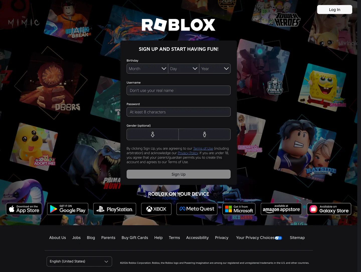
Roblox's home page is not a marketing site — it is a registration gate. The full viewport is filled with a mosaic of game thumbnails from the platform's user-generated library: Adopt Me!, Doors, The Mimic, Tower Heroes, Jailbreak, Bedwars, and dozens more, each in a rounded tile arranged at overlapping angles. The "ROBLOX" logotype floats centered above this content wall in white, and directly below it sits a near-white registration card (signup form, birthday picker, username and password fields, a "Sign Up" button) with 8px rounding. One "Log In" pill button lives in the upper right. That is the entire marketing surface. Where gaming platforms like Epic Games build extensive marketing narratives and Steam presents content grids, Roblox skips the narrative entirely: the game library IS the pitch, rendered edge-to-edge behind the sign-up form.
This DESIGN.md file captures 14 colors tokens from the near-monochromatic marketing surface — near-white (#f7f7f8) carrying the card and canvas, a cool gray scale for borders and muted text (#d5d7dd, #707070, #494d5a), the cobalt emphasis voltage (#335fff) declared in CSS but not rendered on any marketing element, and a small alert red (#df281f). Typography tokens span Builder Sans (Roblox's custom proprietary sans) at 12 sizes from 20px uppercase section heading down to 10px fine-print caption. The CSS variables expose a comprehensive token system covering display-large through caption-small, all in Builder Sans at weights 400, 500, 600, and 700. Thirteen components cover the sign-up form, the white Log In button, the registration card, the platform badge row, and the footer strip.
Feed this file to Claude or Cursor and it will reproduce Roblox's specific approach: pure-black canvas with user-generated content as the background, near-white surface card over it, weight-500 Builder Sans for all interactive labels, 8px corner radius on forms and inputs, and the cobalt voltage reserved entirely for selection states and system emphasis inside the product. The marketing surface declares none of its brand color — the game library does that work.
What makes it distinct
5
- Game-mosaic as herothe entire above-fold background is a collage of user-created game thumbnails, making user content the brand hero rather than any brand-designed asset
- Single-screen conversion focusthe page has no scroll narrative; it is a registration gate with logo, sign-up form, and platform badges
- Builder Sans at modest weights500 for interactive labels and body, 700 for the uppercase section callout; no display-tier headline exists in the marketing chrome
- Cobalt voltage declared but invisible#335fff is wired as --color-action-emphasis-background but appears zero times in the captured marketing chrome
- Near-white not whitethe registration card and canvas use #f7f7f8 (merged with #ffffff), a barely-visible cool tint that separates surface from pure white
roblox.com
Live at roblox.com
A snapshot of the brand in production. Scroll the frame to see the whole page.
Colors
14 colors
Roblox's system anchors on #707070 (ink-light) as its primary color. Type is set in Builder Sans across 11 tokens from 10px to 80px, weights 300–700. Shape language is mixed across 13 components, blending pills, soft rounds, and squarer corners.
Surface
Page and card backgrounds · 2
Text
Headlines, body, captions · 5
Borders & Hairlines
Dividers, outlines, rules · 2
Semantic
Status, errors, success, links · 2
Other
Specialty colors · 3
Typography
11 type tokens
Set in Builder Sans across 11 tokens, from 10px to 80px, weights 300–700. Shown in its own stack: where the font isn't installed, the fallback the file names stands in.
- display-lg80px · weight 700 · lh 96px · tracking -0.8pxThe quick brown fox jumps over the lazy dog
- display-md56px · weight 700 · lh 67.2px · tracking -0.56pxThe quick brown fox jumps over the lazy dog
- heading-lg28px · weight 700 · lh 33.6px · tracking -0.28pxThe quick brown fox jumps over the lazy dog
- heading-md24px · weight 700 · lh 28.8px · tracking -0.24pxThe quick brown fox jumps over the lazy dog
- heading-sm20px · weight 700 · lh 24px · tracking -0.2pxThe quick brown fox jumps over the lazy dog
- section-callout20px · weight 700 · lh 28pxThe quick brown fox jumps over the lazy dog
- body-md16px · weight 400 · lh 22.4pxThe quick brown fox jumps over the lazy dog
- body-sm14px · weight 300 · lh 19.6pxThe quick brown fox jumps over the lazy dog
- button-md16px · weight 500 · lh 16pxThe quick brown fox jumps over the lazy dog
- label-md12px · weight 500 · lh 12pxThe quick brown fox jumps over the lazy dog
- caption10px · weight 500 · lh 15pxThe quick brown fox jumps over the lazy dog
Layout
Radii and spacing
4 corner radii and 8 spacing values. Shape language: mixed.
Radii
- none0px
- sm4px
- md8px
- full9999px
Spacing
- xxs2px
- xs4px
- sm6px
- base8px
- md10px
- lg16px
- xl20px
- 2xl24px
Components
13 components
Each rendered from its tokens (color, type, radius, padding) on Roblox's own canvas.
- Button Primarybutton-primaryButton Primary
- Button Loginbutton-loginButton Login
- Top Navtop-navTop Nav
- Hero Headinghero-headingHero Heading
- Registration Cardregistration-cardRegistration Card
- Card Headingcard-headingCard Heading
- Body Paragraphbody-paragraphBody Paragraph
- Type here…text-inputText Input
- Dropdown Selectdropdown-selectDropdown Select
- Platform Badgeplatform-badgePlatform Badge
- FooterfooterFooter
- Legal Captionlegal-captionLegal Caption
- Canvas Backgroundcanvas-backgroundCanvas Background
In use
The system, in use
Roblox's tokens on the kind of product it builds.
Build something people actually use.
A short paragraph of marketing copy that previews how the brand's display tier and body tier read together. Two sentences is usually enough.
FAQ
Roblox design system FAQ
Common questions about Roblox's tokens, components, and how to use this DESIGN.md in your project.
Read next
Related reading
Specs, directories, and component libraries that pair with this design system.
- Browse all design systemsThe full directory of DESIGN.md files on shadcn.io, with live mockups for each.shadcn.io
- Roblox — official siteRoblox's public marketing site — the source of truth for the live tokens captured in this file.roblox.com (opens in a new tab)
- The DESIGN.md specificationGoogle Labs' open spec for machine-readable design system files — the format this page is built on.github.com (opens in a new tab)
Use it
Use Roblox in your project
One machine-readable file. Drop it into Claude, Cursor, or any AI tool that reads DESIGN.md.
Download the DESIGN.md
One machine-readable file: every color, type, radius, spacing, and component token of Roblox.
Feed it to your AI tool
Drop it into Claude, Cursor, or GitHub Copilot. The agent writes React components and Tailwind classes that match Roblox's visual language.
Reference the tokens directly
Or paste the values into your Tailwind config, CSS variables, or component library: every color, size and radius is a quoted, ready-to-copy value.
Read the full DESIGN.md: overview, rationale, do’s and don’ts
Overview
Roblox's home page is the design-system equivalent of a keyhole: the brand shows you everything through a narrow opening. Content-as-canvas. The full viewport is tiled edge-to-edge with game thumbnails from the user library — angled diamond tiles of Adopt Me!, Doors, Tower Heroes, Jailbreak, Bayside, Sponge Bob — and a centered registration card sits on top of this mosaic as if pinned to a corkboard. The brand invests zero pixels in designed hero art. Unlike Epic Games, which commissions hero artwork for each featured release, or Steam, which surfaces an algorithmic editorial grid, Roblox lets the user-generated library serve as every hero image simultaneously.
The surface chrome is achromatic by function. The "ROBLOX" logotype floats in white above the mosaic. The registration card uses near-white (#f7f7f8) — not pure white — with 8px rounded inputs, dark charcoal text, and a "Sign Up" button that is also near-white with dark text. One "Log In" pill button occupies the top-right corner. The cobalt emphasis voltage (#335fff) that Roblox uses throughout its product — for selection states, active button backgrounds, and system emphasis — is absent from every rendered element in the marketing surface. The marketing page declares brand color without displaying it. Where Spline makes the product the hero, Roblox makes the community's output the hero.
Builder Sans — Roblox's custom proprietary sans-serif — runs at weight 500 for all interactive labels (button text, nav links, form labels) and weight 700 for the one uppercase editorial moment ("SIGN UP AND START HAVING FUN!"). The CSS variable system exposes a comprehensive typographic scale with display-large (80px) through caption-small (10px), all in Builder Sans.
Key Characteristics:
- Pure-black (#000000) canvas — not near-black; true black behind the game-thumbnail mosaic.
- Near-white (#f7f7f8) registration card and button fills — merged from #f7f7f8 and #ffffff, a cool-tinted surface rather than pure white.
- Cobalt emphasis (#335fff) in 21 CSS custom properties — zero rendered occurrences on the marketing surface.
- Builder Sans across every typographic tier — weights 300, 400, 500, 600, 700 all declared; marketing surface uses 300, 500, and 700.
- 8px as the sole corner radius in the captured interface — applies to all form inputs, dropdowns, and buttons uniformly.
- Platform badge row (App Store, Google Play, PlayStation, Xbox, Meta Quest, Microsoft, Amazon, Samsung) below the registration card.
- No navigation menu — top-nav has only the Roblox logo and a single "Log In" button.
- Comprehensive Foundation token system in CSS covering light, dark, inverse, kids, and startmode variants.
Colors
Surface
- Canvas (
{colors.canvas}— #f7f7f8): frequency 172. Used as text (85) and border (85). The near-white surface for the registration card, input fills, and button fills. Merged from #f7f7f8 and #ffffff — the slight cool tint is consistent and intentional. - Hairline (
{colors.hairline}— #d5d7dd): frequency 49. Used as text (27), background (1), border (21). The separator and muted-text color — appears on the footer legal text and subtle card dividers. - Hairline Light (
{colors.hairline-light}— #d0d9fb): frequency 7, all as background (6) and border (1). The input field background fill — a barely-visible cool blue tint that distinguishes editable fields from static surfaces.
Text
- Ink (
{colors.ink}— #121215): frequency 4. Pure near-black — the darkest surface value, used for the canvas-background overlay and the deepest text contexts. Wired as--dark-mode-surface-0. - Ink Soft (
{colors.ink-soft}— #212326): frequency 2. Dark near-black for the registration card's heading text. Wired as--color-system-contrastand--color-action-standard-foreground. - Ink Muted (
{colors.ink-muted}— #494d5a): frequency 1 border. Default body text and subtle interactive borders. Wired as--color-content-defaultand--color-action-subtle-border. - Ink Light (
{colors.ink-light}— #707070): frequency 4, all as border. Input field border in resting state. Wired as--color-content-muted.
Brand / System
- System Emphasis (
{colors.system-emphasis}— #335fff): frequency 0 rendered. Declared across 21 CSS custom properties as--color-action-emphasis-background,--color-system-emphasis,--color-selection-start/end. The cobalt CTA color that would appear on a primary "Play" button in the product. Not rendered on the marketing surface. - Link Light (
{colors.link-light}— #70a0ff): frequency 4. Used as text (2) and border (2). The inline link color for dark-mode surfaces (wired as--kids-dark-color-content-linkand--color-extended-blue-500).
Semantic
- System Alert (
{colors.system-alert}— #df281f): frequency 6. Used as text (3) and border (3). Error and alert states across the registration form. - System Success (
{colors.system-success}— #39c582): declared as--color-system-success— validation success feedback. - System Warning (
{colors.system-warning}— #f2ba2a): declared as--color-system-warning— age-gating or parental-consent warnings.
Typography
Font Family
Builder Sans is Roblox's custom proprietary sans-serif. Every CSS typography token on the page references it: typography-display-large-font through typography-caption-small-font, using computed calc() expressions to build size from the 4px base unit (e.g., 700 calc(4px * 20) / calc(120%) "Builder Sans"). The marketing page renders only a thin slice of this scale — weight 300 for body fine print, weight 500 for button labels and nav, weight 700 for the uppercase section callout.
Hierarchy
| Token | Size | Weight | Line Height | Use |
|---|---|---|---|---|
{typography.display-lg} | 80px | 700 | 96px | Not rendered on marketing — product display tier |
{typography.display-md} | 56px | 700 | 67.2px | Not rendered on marketing — product display tier |
{typography.heading-lg} | 28px | 700 | 33.6px | Section headings in product surfaces |
{typography.heading-md} | 24px | 700 | 28.8px | Card headings |
{typography.heading-sm} | 20px | 700 | 24px | Sub-section labels |
{typography.section-callout} | 20px | 700 | 28px | "SIGN UP AND START HAVING FUN!" (uppercase) |
{typography.body-md} | 16px | 400 | 22.4px | Form field body text |
{typography.body-sm} | 14px | 300 | 19.6px | Secondary text in registration card |
{typography.button-md} | 16px | 500 | 16px | "Log In" button, "Sign Up" button |
{typography.label-md} | 12px | 500 | 12px | Form field labels ("Birthday," "Username") |
{typography.caption} | 10px | 500 | 15px | Footer legal text |
Note on Substitutes
Builder Sans is proprietary. Inter at matched weights and sizes is the closest open-source substitute for the body and button tiers. For the display scale (80px / 56px), Geist from Vercel has similar aperture and spacing. The display sizes are not rendered on the marketing surface but are present in the CSS token system.
Layout
- Base unit: 4px (--platform-base: 4). The typography and spacing system is built entirely on multiples of 4px via calc() expressions.
- Registration card: centered at approximately 415px width, with 20×24px internal padding, 8px corner radius.
- Background mosaic: full-viewport cover, black base, diamond-angled game thumbnails at approximately 60-degree rotations.
- Platform badges: full-width row of 8 black-pill badges (App Store, Google Play, PlayStation, Xbox, Meta Quest, Microsoft, Amazon, Samsung) below the registration card.
- Top nav: transparent over the mosaic, with the Roblox logotype centered and "Log In" button flush right.
Elevation
The system has a shadow token ({colors.shadow} — #000000 at various opacity values) declared across multiple CSS properties. The registration card reads as elevated against the black mosaic through surface-color contrast alone — the near-white (#f7f7f8) card reads off the pure-black (#000000) background without any box-shadow. No explicit shadow is applied to the card in the captured surface. The CSS variables include --color-common-shadow: rgba(0,0,0,0.5) and --fui-future-alpha-color-shadow-subtle: rgba(0,0,0,0.08) for product contexts.
Shapes
The marketing surface uses a single radius value:
{rounded.none}0px — the full-bleed mosaic background.{rounded.md}8px — form inputs, dropdowns, the "Sign Up" button, the registration card itself (8px is the--radius-mediumvalue in the Foundation system:calc(4px * 2)).{rounded.full}9999px — platform badges row (black pills for each app store), the "Log In" button in the top-right corner.
The CSS Foundation system declares additional radii: --radius-small: calc(1px * 4) (4px), --radius-large: calc(4px * 4) (16px), --radius-circle: calc(1px * 9999). Only 8px is rendered in the marketing surface.
Components
button-primary — Near-white (#f7f7f8) fill, dark-charcoal (#121215) text, Builder Sans at 16px / 500, 8px radius, 9px all-around padding, 36px height. The "Sign Up" form-submit button — not a colored CTA.
button-login — Same near-white fill and geometry as button-primary — used for the "Log In" button in the top-right corner over the black mosaic. The near-white against pure black gives it strong contrast without any brand color.
top-nav — Transparent background over the mosaic, 64px height. Roblox logotype centered, "Log In" button right-aligned. No menu links, no search, no account dropdown.
hero-heading — White text on transparent overlay, Builder Sans at 20px / 700 in uppercase. "SIGN UP AND START HAVING FUN!" is the only editorial text on the marketing surface.
registration-card — Near-white (#f7f7f8) fill over the black mosaic, 8px corner radius, 20×24px padding. Contains birthday picker, username field, password field, gender selector, terms text, and the "Sign Up" button.
card-heading — Near-black (#212326) text at Builder Sans 20px / 700 — the "Sign up and start having fun!" heading inside the registration card.
body-paragraph — Ink-muted (#494d5a) text at Builder Sans 14px / 300 — the form terms-of-service paragraph and secondary descriptive text.
text-input — Cool-blue-tinted (#d0d9fb) fill, muted-gray (#d5d7dd) placeholder text, Builder Sans at 16px / 400, 8px radius, 5×12px padding, 38px height, 1px mid-gray (#707070) border. The username and password input fields.
dropdown-select — Near-white fill, ink-muted text, 8px radius, 0×32px right / 0×8px left padding compound, 36px height, 1px mid-gray border. Birthday month, day, and year picker dropdowns.
platform-badge — Black fill, near-white text, fully-rounded pill, 6×16px padding, 44px height. App Store / Google Play / PlayStation / Xbox / Meta Quest / Microsoft Store / Amazon / Samsung Galaxy Store badges.
footer — Black canvas, muted-gray (#d5d7dd) text, Builder Sans at 10px / 500, 16×24px padding.
legal-caption — Muted-gray (#d5d7dd) text at Builder Sans 10px / 500. The footer copyright string.
canvas-background — Pure-black (#000000) fill behind the game-thumbnail mosaic. No padding — full-viewport cover.
Do's and Don'ts
Do use the near-white (#f7f7f8) rather than pure white (#ffffff) for any surface that sits above the black mosaic background. The slight cool tint reads as intentional design rather than uncorrected white-balance; pure #ffffff alongside the mosaic tiles reads as rendered differently.
Do reserve the cobalt (#335fff) for action-emphasis states — primary "Play" buttons, selection fills, progress indicators — inside the product. On the marketing surface it should remain invisible; introducing it into the registration card or nav strip breaks the monochromatic restraint.
Do apply 8px corner radius uniformly across all form elements. The system has exactly one interactive radius value on the marketing surface — mixing in 4px or 12px on specific inputs creates an inconsistency the eye reads as a bug.
Don't use the input background fill color (#d0d9fb) for any non-input surface. The cool-blue tint signals "editable field" in the near-monochrome form context; applying it to cards, badges, or section backgrounds defeats that signal.
Don't introduce a navigation menu into the marketing hero. The single-screen conversion approach is a deliberate choice — adding product nav links to the top bar dilutes the registration focus that the page is built around.
Don't render the game-mosaic in a cropped or framed format. The mosaic reads as immersive because it bleeds to every viewport edge; constraining it to a contained hero region converts it from "you're inside the platform" to "here's an image of the platform."
Don't use Builder Sans at weight 400 for button labels. The marketing surface uses weight 500 for all interactive text (buttons, nav labels, form labels); weight 400 in an interactive context reads visually lighter than the near-white button surface expects.
Known Gaps
- Logged-in state: the captured surface is the logged-out registration gate only. The authenticated home feed, game discovery grid, avatar customization, and Friends surfaces all carry richer token sets not captured here.
- Cobalt voltage in context: the primary-action button (#335fff fill) appears throughout the product — game pages, the Robux purchase flow, the catalog — but is absent from the marketing surface. The button-primary defined here (near-white) is marketing-only.
- Dark-mode and kids-mode variants: the CSS Foundation token system includes --dark-mode-, --kids-dark-color-, --kids-light-color-, --inverse-, and --startmode-* variants for every role. Only the light-mode canonical set is rendered on the captured page.
- Motion: the game thumbnail mosaic is animated (tiles reveal progressively); the CSS easing curves (--ease-expressive-out: cubic-bezier(.25,1.5,.5,1)) and timing tokens (--time-200 through --time-1000) are declared but not measurable from static capture.
- Display typography in product: the Foundation system declares display-large at 80px and display-medium at 56px, both in Builder Sans weight 700 — these appear on game landing pages and promotional surfaces inside the app, not on the marketing home page.
- Icon system: Roblox uses custom SVG icons throughout the product that are not exposed in the marketing surface extraction.
Gaming & Entertainment
More systems like this
More DESIGN.md files in Gaming & Entertainment.
Pricing
Build it with Pro
The DESIGN.md files are free. Pro adds 6,000+ blocks, premium templates and the MCP server, so your AI editor builds in your system for you.
4.9/5 out of 5 · 150+ reviewsfrom 150+ founders and developers.
Billing
Billed once a year in USD. Cancel anytime.
- How many people can use the license.
- Client work, SaaS products and anything you charge for.
- Production-ready React sections: hero, pricing, features, dashboards and more.
- Complete multi-page sites you can ship as they are.
- React icons from every major library, installable with one command.
- Presets that restyle every block, in light and dark.
- Lets your AI editor search, preview and install blocks for you.
- Priority requests are answered first.
Individual
For personal projects & open source
$32instead of $49/mo
$389 billed yearly
- Seats: 1 seat
- Commercial use: Personal & open source only
- Pro blocks: 6,000+ blocks
- Templates: All 14 templates
- React icons: 294k+ icons
- Themes: All 59 themes
- MCP server: Basic usage
- Support: Standard
Team
Most popularFor freelancers, agencies & startups
$66instead of $99/mo
$789 billed yearly · ≈ $13/dev/mo
- Seats: Up to 5 seats
- Commercial use: Included
- Pro blocks: 6,000+ blocks
- Templates: All 14 templates
- React icons: 294k+ icons
- Themes: All 59 themes
- MCP server: High usage
- Support: Priority
Organization
For companies with larger teams
$132instead of $199/mo
$1,589 billed yearly
- Seats: Unlimited seats
- Commercial use: Included
- Pro blocks: 6,000+ blocks
- Templates: All 14 templates
- React icons: 294k+ icons
- Themes: All 59 themes
- MCP server: Unlimited usage
- Support: Priority
Billed once a year in USD. Cancel anytime.
Individual
For personal projects & open source
$32instead of $49/mo
$389 billed yearly
- How many people can use the license.Seats: 1 seat
- Client work, SaaS products and anything you charge for.Commercial use: Personal & open source only
- Production-ready React sections: hero, pricing, features, dashboards and more.Pro blocks: 6,000+ blocks
- Complete multi-page sites you can ship as they are.Templates: All 14 templates
- React icons from every major library, installable with one command.React icons: 294k+ icons
- Presets that restyle every block, in light and dark.Themes: All 59 themes
- Lets your AI editor search, preview and install blocks for you.MCP server: Basic usage
- Priority requests are answered first.Support: Standard
Team
Most popularFor freelancers, agencies & startups
$66instead of $99/mo
$789 billed yearly · ≈ $13/dev/mo
Everything in Individual, plus
- How many people can use the license.Seats: Up to 5 seats
- Client work, SaaS products and anything you charge for.Commercial use: Included
- Lets your AI editor search, preview and install blocks for you.MCP server: High usage
- Priority requests are answered first.Support: Priority
Organization
For companies with larger teams
$132instead of $199/mo
$1,589 billed yearly
Everything in Team, plus
- How many people can use the license.Seats: Unlimited seats
- Lets your AI editor search, preview and install blocks for you.MCP server: Unlimited usage
- Secure checkout via Stripe
- Code lives in your repo
- Keep what you've shipped if you cancel
- License terms
Your system, built for you
Every block, template and icon, installed by your AI agent in your design system. The DESIGN.md files stay free.