Reflect Design System
Reflect's design system as a DESIGN.md file. Indigo #060317, lavender #9382ff, AeonikPro display. For React, Next.js, and AI tools.
Add shadcn.io to your AI agent. · Pro It installs blocks, icons and templates in your design system from a prompt, with Pro.
Set up MCP- Primary
- #9382ff
- Typeface
- Inter V
- Shape
- Soft
- Base radius
- 8px
- Colors
- 21
- Type tokens
- 14
- Components
- 18
- Spacing values
- 9
About
About Reflect DESIGN.md
Curated by Dov Azencot · Updated May 13, 2026 · Source reflect.app (opens in a new tab)
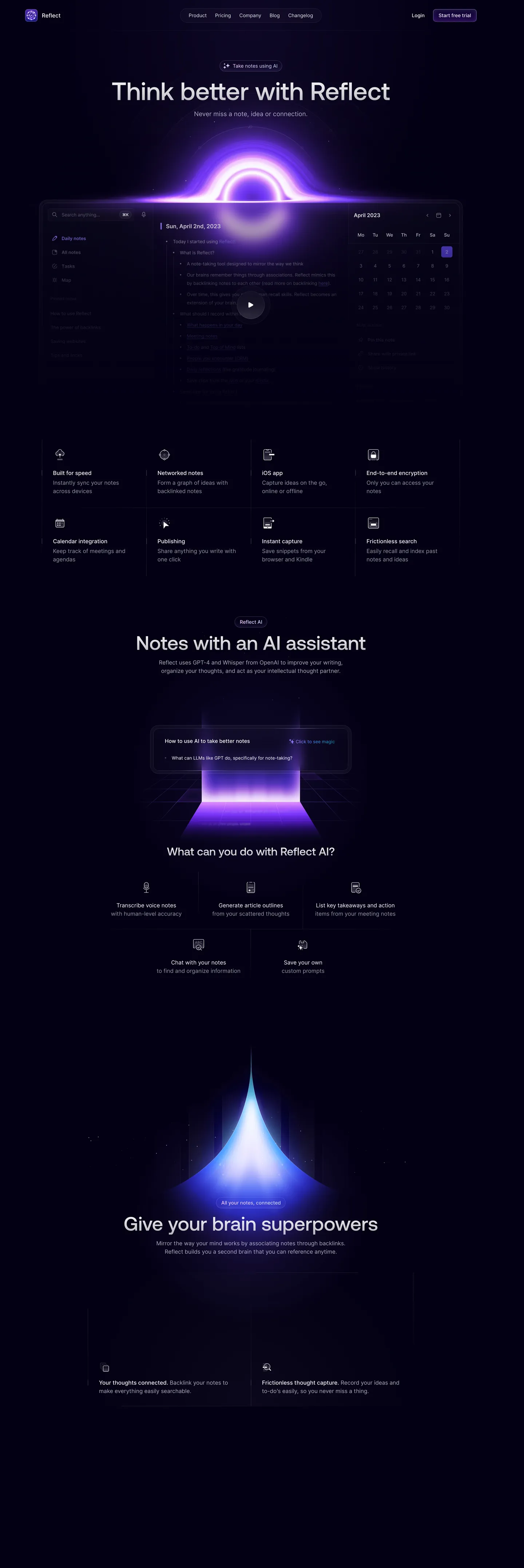
Reflect's marketing canvas is the rare dark-mode site that refuses pure black — the page floor sits at "#060317", a near-black indigo with a measurable violet cast (oklch hue 287). On top, the brand renders three luminous portals: a purple-pink singularity above the daily-notes screenshot, a violet pyramid beneath the AI assistant section, and a sky-blue spire over the second-brain demo. Each portal is composed from a five-stop gradient family running periwinkle "#787bff", orchid "#ba9cff", lilac "#9cb2ff", magenta "#e59cff", and electric voltage "#5439ff". There is no second canvas color, no white interlude, no light-mode flip — the entire 4300px scroll holds the indigo floor.
This page packages the spec into one DESIGN.md file written to the Google Labs format. Inside: 21 colors tokens grouped into canvas, ink, hairline, and a five-stop violet gradient family; 14 typography levels mapping AeonikPro at sizes 24/32/48/56/72px weight 500 for display and Inter V at 12/13/14/16/18px for body; a 6-step rounded scale anchored on 6px buttons and 8px cards; a 9-step spacing scale on an 8px base; and 18 components definitions covering the lavender CTA pill, feature-grid icon tiles, the daily-notes panel, the AI prompt input, the dark top-nav, and the section-portal frame.
Feed the file to Claude, Cursor, or GitHub Copilot and the agent reproduces Reflect's restraint — the indigo-not-black canvas, the single-weight display ramp, the portal-as-anchor rhythm — rather than a generic dark theme. Or reference the tokens directly: every hex, font, radius, and spacing value is a quoted scalar you can paste into Tailwind config or CSS variables. Reflect is worth studying because it proves a note-taking tool can earn its "second brain" pitch through atmospheric visuals — the purple portals do the work that product screenshots do on Linear or Notion.
What makes it distinct
5
- Indigo-not-black canvas#060317 with a measurable violet hue (oklch h=287), never the default #000000 that most dark-mode sites fall into
- Five-stop violet gradient familyperiwinkle #787bff, orchid #ba9cff, lilac #9cb2ff, magenta #e59cff, electric #5439ff — used as section portals, not as accent fills
- AeonikPro at weight 500 across every display tierthe brand commits to one weight and varies size 24/32/48/56/72px instead of stacking 500/600/700
- Single CTA per pagethe lavender "Start free trial" pill at 6px radius is the only filled button visible across 4300px of scroll
- Border-only purple#efedfd appears 153 times as borderColor and 153 times as text, zero times as bg fill, the brand's hairline voltage
reflect.app
Live at reflect.app
A snapshot of the brand in production. Scroll the frame to see the whole page.
Colors
21 colors
Reflect's system runs on #9382ff as its primary voltage, used in 3 of 18 components. Type is set in Inter V across 14 tokens from 12px to 72px, weights 400–500. Shape language is soft — components average 118px corner radius, with no sharp interactive edges.
Brand & Accent
Sparing, CTA-only voltage · 4
Surface
Page and card backgrounds · 1
Text
Headlines, body, captions · 4
Borders & Hairlines
Dividers, outlines, rules · 2
Other
Specialty colors · 10
Typography
14 type tokens
Set in Inter V across 14 tokens, from 12px to 72px, weights 400–500. Shown in its own stack: where the font isn't installed, the fallback the file names stands in.
- display-xxl72px · weight 500 · lh 1.11The quick brown fox jumps over the lazy dog
- display-xl56px · weight 500 · lh 1.14The quick brown fox jumps over the lazy dog
- display-lg48px · weight 500 · lh 1.17The quick brown fox jumps over the lazy dog
- display-md32px · weight 500 · lh 1.25The quick brown fox jumps over the lazy dog
- display-sm24px · weight 500 · lh 1.33The quick brown fox jumps over the lazy dog
- body-lg18px · weight 400 · lh 1.56The quick brown fox jumps over the lazy dog
- body-md16px · weight 400 · lh 1.5The quick brown fox jumps over the lazy dog
- body-md-strong16px · weight 500 · lh 1.5The quick brown fox jumps over the lazy dog
- body-sm14px · weight 400 · lh 1.43The quick brown fox jumps over the lazy dog
- body-sm-strong14px · weight 500 · lh 1.43The quick brown fox jumps over the lazy dog
- label-md13px · weight 500 · lh 1.85The quick brown fox jumps over the lazy dog
- body-xs13px · weight 400 · lh 1.85The quick brown fox jumps over the lazy dog
- micro12px · weight 400 · lh 1.33The quick brown fox jumps over the lazy dog
- button-md14px · weight 500 · lh 1.43The quick brown fox jumps over the lazy dog
Layout
Radii and spacing
6 corner radii and 9 spacing values. Shape language: soft.
Radii
- xs4px
- sm6px
- md8px
- lg16px
- xl32px
- full999px
Spacing
- xxs2px
- xs4px
- sm8px
- md12px
- base16px
- lg20px
- xl24px
- xxl32px
- huge48px
Components
18 components
Each rendered from its tokens (color, type, radius, padding) on Reflect's own canvas.
- Button Primarybutton-primaryButton Primary
- Button Primary Hoverbutton-primary-hoverButton Primary Hover
- Button Secondarybutton-secondaryButton Secondary
- Link Navlink-navLink Nav
- Pill Eyebrowpill-eyebrowPill Eyebrow
- Top Navtop-navTop Nav
- Feature Tilefeature-tileFeature Tile
- Daily Notes Paneldaily-notes-panelDaily Notes Panel
- Prompt Input Cardprompt-input-cardPrompt Input Card
- Type here…text-inputText Input
- Ai Cta Linkai-cta-linkAi Cta Link
- Feature Row Itemfeature-row-itemFeature Row Item
- Portal Frameportal-framePortal Frame
- Date Pilldate-pillDate Pill
- Calendar Cellcalendar-cellCalendar Cell
- Icon Tileicon-tileIcon Tile
- FooterfooterFooter
- Divider Hairlinedivider-hairlineDivider Hairline
In use
The system, in use
Reflect's tokens on the kind of product it builds.
Build something people actually use.
A short paragraph of marketing copy that previews how the brand's display tier and body tier read together. Two sentences is usually enough.
FAQ
Reflect design system FAQ
Common questions about Reflect's tokens, components, and how to use this DESIGN.md in your project.
Read next
Related reading
Specs, directories, and component libraries that pair with this design system.
- Browse all design systemsThe full directory of DESIGN.md files on shadcn.io, with live mockups for each.shadcn.io
- Reflect — official siteReflect's marketing page — daily notes, networked thought, and the GPT-4 + Whisper AI assistant.reflect.app (opens in a new tab)
- The DESIGN.md specificationGoogle Labs' open spec for machine-readable design system files — the format this page is built on.github.com (opens in a new tab)
Use it
Use Reflect in your project
One machine-readable file. Drop it into Claude, Cursor, or any AI tool that reads DESIGN.md.
Download the DESIGN.md
One machine-readable file: every color, type, radius, spacing, and component token of Reflect.
Feed it to your AI tool
Drop it into Claude, Cursor, or GitHub Copilot. The agent writes React components and Tailwind classes that match Reflect's visual language.
Reference the tokens directly
Or paste the values into your Tailwind config, CSS variables, or component library: every color, size and radius is a quoted, ready-to-copy value.
Read the full DESIGN.md: overview, rationale, do’s and don’ts
Overview
Reflect's marketing canvas is a dark-mode system that refuses pure black — {colors.canvas} is "#060317", a near-black indigo whose oklch hue (287) sits squarely in the violet spectrum. The page floor reads as deep space rather than the default #000000 that most note-taking tools fall into. Body type runs {colors.ink} ("#ffffff") and {colors.ink-muted} ("#efedfd") — that off-white with a faint lavender cast appears 306 times across the page as both border and text, never as a background fill.
The brand's signature move is portals-as-anchor: each section break is anchored by a luminous radial gradient — a purple-pink singularity above the daily-notes panel, a violet pyramid beneath the AI assistant section, a sky-blue spire over the second-brain demo. The portals are composed from a five-stop gradient family running {colors.gradient-periwinkle} ("#787bff"), {colors.gradient-orchid} ("#ba9cff"), {colors.gradient-lilac} ("#9cb2ff"), {colors.gradient-magenta} ("#e59cff"), and {colors.primary-electric} ("#5439ff"). Where Linear leads with product UI screenshots and Notion leads with embedded demos, Reflect leads with atmospheric color.
Display type runs AeonikPro at one weight — 500 across every tier from 72px down to 24px. The brand commits to a single weight and varies size only, rather than the 400/500/600/700 stack most SaaS systems deploy. Body holds Inter V at 13/14/16/18px in weights 400 and 500. Line-heights stay generous (1.5 on body, 1.85 on label-md).
The single-CTA rule governs interactive density. The only filled button across 4300px of scroll is the lavender "Start free trial" pill at {rounded.sm} 6px radius, repeated twice (top-nav and footer). Every other interactive element is an unstyled text link in {colors.ink-muted}. Where most productivity tools push trial signups every band, Reflect trusts the portal visuals to carry the story.
Key Characteristics:
- Indigo-not-black canvas —
{colors.canvas}"#060317" with oklch hue 287, never the default true black. - Five-stop violet gradient family — periwinkle, orchid, lilac, magenta, electric — used as portal anchors, never as flat fills.
- Single-weight display ramp — AeonikPro at weight 500 across 24/32/48/56/72px.
- Border-only purple voltage —
{colors.ink-muted}"#efedfd" appears 153 times as borderColor and 153 times as text, zero times as bg. - One CTA per page — the lavender
{colors.primary}("#9382ff") pill at 6px radius is the only filled button visible. - 6px and 8px corners govern buttons and tiles; 16px and 32px reserved for panels and portal frames.
- No second canvas color; no white interlude; no light-mode flip across the full scroll.
Colors
The palette divides into three layers: canvas + ink, the violet voltage family, and the gradient stops used inside the portal compositions.
- Indigo canvas (
#060317) — frequency 44. Used as bg (40), gradient (4). The page floor — every section, every panel, the nav, the footer. Oklch hue 287 places it in the violet spectrum, not neutral black. - White ink (
#ffffff) — frequency 1533. Used as text (651), border (636), bg (53), gradient (131), shadow (62). The dominant text color and the structural hairline color on hero cards. - Lavender ink-muted (
#efedfd) — frequency 306. Used as text (153), border (153). The off-white with a faint violet cast that carries secondary body text and every hairline border on the page. Never appears as a bg fill — a deliberateborder + texttoken. - Lavender primary (
#9382ff) — frequency 41. Used as text (20), border (20), gradient (1). The trial-CTA pill, the link emphasis, the date-pill in the calendar. The brand's load-bearing voltage despite its low total. - Periwinkle (
#787bff) — frequency 16. Used as gradient (16). A pure gradient stop — never as text or fill. Lives inside the portal compositions. - Orchid (
#ba9cff) — frequency 20. Used as gradient (20). The brightest violet gradient stop, used at the bloom centers. - Lilac (
#9cb2ff) — frequency 13. Used as gradient (13). The cooler periwinkle-leaning stop in the second-brain spire. - Magenta (
#e59cff) — frequency 13. Used as gradient (13). The pink-leaning warmth in the purple-pink singularity portal. - Violet (
#8562ff) — frequency 8. Used as gradient (8). The mid-stop voltage between periwinkle and electric. - Electric (
#5439ff) — frequency 6. Used as bg (6). The deepest gradient terminator and the rare saturated fill inside the portal cones. - Shadow-violet (
#a48fff) — frequency 12. Used as shadow (12). The single shadow color across the page — purple-tinted, never neutral gray. - Border-violet (
#c4bbff) — frequency 7. Used as border (7). The AI prompt-input card's signature 1px hairline.
Typography
Reflect runs two families: AeonikPro for display (24/32/48/56/72px, weight 500 only) and Inter V for body (12/13/14/16/18px, weights 400 and 500). The hero h1 sits at 72px / 80px leading, the section h2s at 56px / 64px, and the third-tier headings at 48px / 56px and 32px / 40px. Every display tier holds the same weight 500 — the brand never reaches for bold.
Body type splits across two roles. The 13px label-md and 13px body-xs tokens carry the bulk of the daily-notes panel and the calendar cells; 14px body-sm carries nav links, button labels, and feature-tile descriptions; 16px body-md carries paragraphs and longer marketing copy; 18px body-lg is reserved for the hero sub-headline ("Never miss a note, idea or connection.") and one or two opening paragraphs per portal section.
Letter-spacing holds at 0 across every tier — the brand doesn't reach for negative tracking the way Linear does, because AeonikPro's geometric proportions already read as compressed at weight 500. Line-heights run generous: 1.5 on body, 1.85 on the 13px label-md, 1.11 on the 72px display. This combination — single-weight display, generous body leading, and zero tracking — distinguishes Reflect from the dense Inter-at-560 productivity stacks like Linear and Superhuman.
Layout
The page width caps at 1440px with most sections holding center-aligned 720–900px content blocks. Spacing follows an 8px base unit — {spacing.sm} 8px appears 40 times as the dominant gap, with the {spacing.xl} 24px outer gutter and {spacing.lg} 20px inside-panel rhythm following close behind. Padding shorthand 12px 20px (count 20) and 24px 28px (count 16) govern the feature tiles and the daily-notes panel respectively.
Section breaks are vertical — each portal sits as a 600–800px tall vertical anchor between content bands, separated by {spacing.huge} 48px gutters on top and bottom. The feature-grid sits as a 4-column tile arrangement at the top (Built for speed / Networked notes / iOS app / End-to-end encryption) over a second 4-column row (Calendar integration / Publishing / Instant capture / Frictionless search). Each tile holds a 24px icon at top-left, a 14px title in weight 500, and a 13px description in weight 400 with 1.85 leading.
Elevation & Depth
Reflect avoids drop shadows almost entirely — the only shadow token, {colors.shadow-violet} ("#a48fff"), appears 12 times and is purple-tinted rather than the conventional neutral gray. Elevation comes from two moves: portal luminance (the radial gradient bloom that lights neighboring sections from below) and hairline-on-canvas (1px borders in {colors.hairline} "#efedfd" or the deeper {colors.border-violet} "#c4bbff" around the AI prompt card). Where most dark-mode systems lift surfaces via a 3-step surface ladder, Reflect holds every panel at {colors.canvas} "#060317" and lifts only through the portal glow.
Shapes
Six corner-radius tokens govern the system, with a clear hierarchy by use:
{rounded.xs}4px — calendar cells, small icon containers, nav-link hit zones{rounded.sm}6px — the trial-CTA pill, secondary buttons, the text-input box (count 35){rounded.md}8px — feature tiles, icon containers, the daily-notes search field (count 43, the most common radius){rounded.lg}16px — the daily-notes panel, the prompt-input card (count 17){rounded.xl}32px — the portal-frame and the wide section containers (count 12){rounded.full}999px — date-pill in the calendar, eyebrow-pill above each section heading (count 1)
The system favors 6px and 8px on interactive elements — never the 12px or 14px that many SaaS systems default to. Cards and panels lift to 16px; the portal frames push to 32px. There's no 24px tier and no pill-button — the only 9999px shape is the small pill used as section eyebrow ("Reflect AI", "All your notes, connected").
Components
Eighteen component definitions cover the marketing surface:
button-primary— the lavender trial-CTA pill, 6px radius, "#9382ff" fill on indigo canvasbutton-primary-hover— lifts to "#a87fff"button-secondary— the rare outlined alternative, 1px hairline border on canvaslink-nav— top-nav links (Product, Pricing, Company, Blog, Changelog) in body-sm-strongpill-eyebrow— the small 999px pill above each section ("Reflect AI", "All your notes, connected")top-nav— fixed dark bar, 64px tall, 12px 20px paddingfeature-tile— the 4-column grid tiles (Built for speed, etc.), 8px radius, 24px 28px paddingdaily-notes-panel— the central product mockup framed at 16px radius with hairline borderprompt-input-card— the AI assistant input ("How to use AI to take better notes"), 16px radius, signature{colors.border-violet}purple hairlinetext-input— the search-anything field, 6px radius, 36px heightai-cta-link— the "+ Click to see magic" link in lavender over the prompt cardfeature-row-item— the 3-up "Transcribe / Generate / List takeaways" tiles below the AI portalportal-frame— the wide section container that holds each portal composition, 32px radiusdate-pill— the lavender filled date marker in the April 2023 calendar (the "2")calendar-cell— the bare numeric cell at 4px radiusicon-tile— the 32px-tall icon container inside each feature tilefooter— the closing band at 48px 24px padding in body-xsdivider-hairline— the 1px hairline rule between major sections
Do's and Don'ts
Do
- Use
{colors.canvas}"#060317" as the page floor — its oklch hue 287 is the brand signature, not neutral darkness. - Render the portal compositions as radial gradients with the full five-stop violet family. Pulling out any single stop weakens the bloom.
- Hold display at AeonikPro weight 500. The single-weight ramp is the typographic move.
- Use
{colors.ink-muted}"#efedfd" for both 1px borders and secondary text — the dual-role usage is deliberate.
Don't
- Don't use
{colors.gradient-periwinkle}"#787bff" as a text or button color — it's a gradient-only stop (16 occurrences, all asgradient). For brand voltage on text, use{colors.primary}"#9382ff" instead. - Don't stack multiple CTAs in a single section. The brand uses one filled button per page (the trial pill, repeated nav + footer). Adding a second filled CTA breaks the single-CTA rule.
- Don't reach for weight 700 on display headings — AeonikPro at weight 500 carries every tier from 72px down to 24px. Pushing to 600 or 700 breaks the single-weight ramp.
- Don't use a 12px corner radius. The system jumps from 8px tiles directly to 16px panels; the missing 12px tier is intentional.
- Don't fill
{colors.ink-muted}"#efedfd" as a background — it appears 0 times as bg across 1956 elements. For light surfaces inside a dark composition, use a{colors.canvas}panel with a 1px{colors.hairline}border instead. - Don't replace the purple-tinted
{colors.shadow-violet}"#a48fff" with a neutral gray shadow. Reflect's elevation reads as atmospheric because the shadow color sits inside the brand gradient family.
Known Gaps
- Form-field error and validation styling is not surfaced on the inspected marketing pages.
- Light mode is not documented because Reflect's marketing site ships dark-only.
- The in-app editor surfaces (backlink popovers, command menu, daily-note timeline, graph view) live in a separate UI language not captured here.
- The portal compositions are rendered as bitmap
.webpart rather than CSS-composable radial gradients — the spec captures the contributing color stops but not the rendering pipeline (radial position, blur radius, opacity ramp). - AeonikPro is licensed via CoType Foundry and not free-tier distributed; the spec documents the font name only.
- Motion vocabulary (scroll-triggered portal fades, daily-note typewriter effect) is not captured in static tokens.
Productivity & SaaS
More systems like this
More DESIGN.md files in Productivity & SaaS.
Pricing
Build it with Pro
The DESIGN.md files are free. Pro adds 6,000+ blocks, premium templates and the MCP server, so your AI editor builds in your system for you.
4.9/5 out of 5 · 150+ reviewsfrom 150+ founders and developers.
Billing
Billed once a year in USD. Cancel anytime.
- How many people can use the license.
- Client work, SaaS products and anything you charge for.
- Production-ready React sections: hero, pricing, features, dashboards and more.
- Complete multi-page sites you can ship as they are.
- React icons from every major library, installable with one command.
- Presets that restyle every block, in light and dark.
- Lets your AI editor search, preview and install blocks for you.
- Priority requests are answered first.
Individual
For personal projects & open source
$32instead of $49/mo
$389 billed yearly
- Seats: 1 seat
- Commercial use: Personal & open source only
- Pro blocks: 6,000+ blocks
- Templates: All 14 templates
- React icons: 294k+ icons
- Themes: All 59 themes
- MCP server: Basic usage
- Support: Standard
Team
Most popularFor freelancers, agencies & startups
$66instead of $99/mo
$789 billed yearly · ≈ $13/dev/mo
- Seats: Up to 5 seats
- Commercial use: Included
- Pro blocks: 6,000+ blocks
- Templates: All 14 templates
- React icons: 294k+ icons
- Themes: All 59 themes
- MCP server: High usage
- Support: Priority
Organization
For companies with larger teams
$132instead of $199/mo
$1,589 billed yearly
- Seats: Unlimited seats
- Commercial use: Included
- Pro blocks: 6,000+ blocks
- Templates: All 14 templates
- React icons: 294k+ icons
- Themes: All 59 themes
- MCP server: Unlimited usage
- Support: Priority
Billed once a year in USD. Cancel anytime.
Individual
For personal projects & open source
$32instead of $49/mo
$389 billed yearly
- How many people can use the license.Seats: 1 seat
- Client work, SaaS products and anything you charge for.Commercial use: Personal & open source only
- Production-ready React sections: hero, pricing, features, dashboards and more.Pro blocks: 6,000+ blocks
- Complete multi-page sites you can ship as they are.Templates: All 14 templates
- React icons from every major library, installable with one command.React icons: 294k+ icons
- Presets that restyle every block, in light and dark.Themes: All 59 themes
- Lets your AI editor search, preview and install blocks for you.MCP server: Basic usage
- Priority requests are answered first.Support: Standard
Team
Most popularFor freelancers, agencies & startups
$66instead of $99/mo
$789 billed yearly · ≈ $13/dev/mo
Everything in Individual, plus
- How many people can use the license.Seats: Up to 5 seats
- Client work, SaaS products and anything you charge for.Commercial use: Included
- Lets your AI editor search, preview and install blocks for you.MCP server: High usage
- Priority requests are answered first.Support: Priority
Organization
For companies with larger teams
$132instead of $199/mo
$1,589 billed yearly
Everything in Team, plus
- How many people can use the license.Seats: Unlimited seats
- Lets your AI editor search, preview and install blocks for you.MCP server: Unlimited usage
- Secure checkout via Stripe
- Code lives in your repo
- Keep what you've shipped if you cancel
- License terms
Your system, built for you
Every block, template and icon, installed by your AI agent in your design system. The DESIGN.md files stay free.