Raycast Design System
Raycast's design system as a DESIGN.md file. Pure-near-black #07080a, Inter with ss03, 31 colors, 28 components. For React, Next.js, and AI tools.
Add shadcn.io to your AI agent. · Pro It installs blocks, icons and templates in your design system from a prompt, with Pro.
Set up MCP- Primary
- #ffffff
- Typeface
- Inter
- Shape
- Mixed
- Base radius
- 8px
- Colors
- 31
- Type tokens
- 15
- Components
- 28
- Spacing values
- 8
About
About Raycast DESIGN.md
Curated by Dov Azencot · Updated May 12, 2026 · Source raycast.com (opens in a new tab)
Raycast's marketing site reads like an extended product screenshot. The chrome IS the in-product command palette scaled up: pure-near-black canvas at #07080a, hairline 1px borders at #242728, command-palette-style cards with corners between 6 and 16px, and a single white CTA pill anchoring every primary action. The system runs Inter with font-feature-settings "calt", "kern", "liga", "ss03" enabled site-wide — the ss03 stylistic set swaps in Inter's single-story alternate g, which is the brand's signature typographic detail. Without that flag the chrome loses its voice and reads as generic Inter.
This page packages the whole spec into a single DESIGN.md file using the Google Labs format. Inside: 31 colors tokens grouped into brand, surface, text, semantic, and gradient bands; 16 typography tokens from a 64px display-xl down to 12px caption-sm; 7 corner radii from 0 to 9999px; 8 spacing tokens including the 96px section rhythm; and 28 components covering buttons, command-palette cards, pricing tiers, store extension cards, keycap glyphs, and the hero stripe band. Every value is quoted and machine-readable.
Feed the file to Claude, Cursor, GitHub Copilot, or any agent that reads structured tokens. The AI will reproduce Raycast's restraint — single white CTA, hairline borders, ss03-enabled Inter, four-step surface ladder — rather than a generic dark-mode shadcn theme. Reference tokens directly in Tailwind config or CSS variables. Raycast is worth studying because it's the rare system where the marketing chrome and the in-product chrome are genuinely the same surface, and the discipline shows.
What makes it distinct
5
- Single dark surface modea 4-step ladder from #07080a canvas through #0d0d0d, #101111, to #121212 carries every elevation tier
- White CTA pill at #ffffff is the universal primary actionthere is no second primary color in the entire system
- Inter with font-feature-settings ss03 enabled site-widethe alternate single-story g is the brand's signature typographic detail
- Hairline 1px borders at #242728 carry every card edgethe system has zero drop shadows
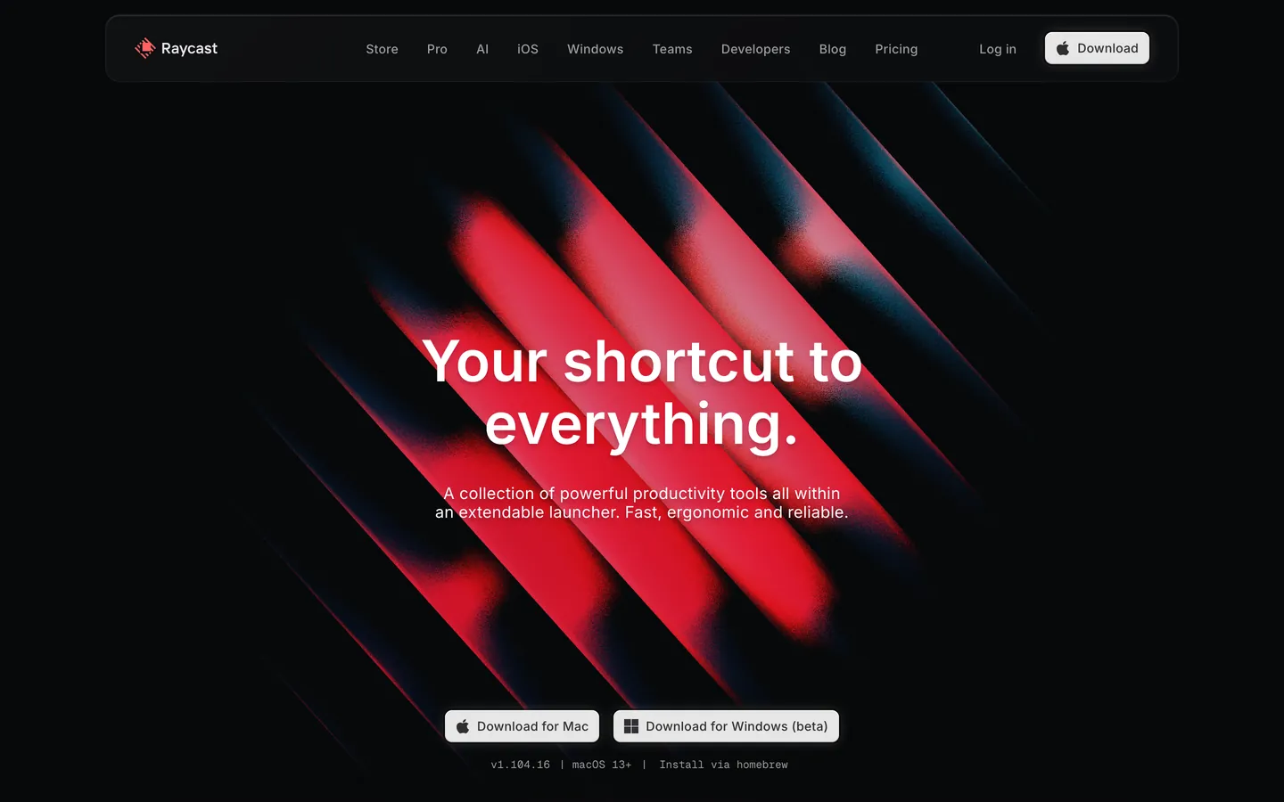
- Red diagonal-stripe gradient from #ff5757 to #a1131a appears once per page maximumthe only chromatic moment on chrome
raycast.com
Live at raycast.com
A snapshot of the brand in production. Scroll the frame to see the whole page.
Colors
31 colors
Raycast's system runs on #ffffff as its primary voltage, used in 1 of 28 components. Type is set in Inter across 15 tokens from 12px to 64px, weights 400–600. Shape language is mixed across 28 components, blending pills, soft rounds, and squarer corners.
Brand & Accent
Sparing, CTA-only voltage · 10
Surface
Page and card backgrounds · 4
Text
Headlines, body, captions · 6
Borders & Hairlines
Dividers, outlines, rules · 3
Semantic
Status, errors, success, links · 2
Other
Specialty colors · 6
Typography
15 type tokens
Set in Inter across 15 tokens, from 12px to 64px, weights 400–600. Shown in its own stack: where the font isn't installed, the fallback the file names stands in.
- display-xl64px · weight 600 · lh 1.1The quick brown fox jumps over the lazy dog
- display-lg56px · weight 500 · lh 1.17 · tracking 0.2pxThe quick brown fox jumps over the lazy dog
- heading-xl24px · weight 500 · lh 1.6 · tracking 0.2pxThe quick brown fox jumps over the lazy dog
- heading-lg22px · weight 500 · lh 1.15The quick brown fox jumps over the lazy dog
- heading-md20px · weight 500 · lh 1.4 · tracking 0.2pxThe quick brown fox jumps over the lazy dog
- heading-sm18px · weight 500 · lh 1.4 · tracking 0.2pxThe quick brown fox jumps over the lazy dog
- body-lg18px · weight 400 · lh 1.6The quick brown fox jumps over the lazy dog
- body-md16px · weight 400 · lh 1.6The quick brown fox jumps over the lazy dog
- body-strong16px · weight 500 · lh 1.4 · tracking 0.2pxThe quick brown fox jumps over the lazy dog
- body-sm14px · weight 400 · lh 1.6The quick brown fox jumps over the lazy dog
- body-sm-strong14px · weight 500 · lh 1.6 · tracking 0.2pxThe quick brown fox jumps over the lazy dog
- caption-md13px · weight 400 · lh 1.4 · tracking 0.1pxThe quick brown fox jumps over the lazy dog
- caption-sm12px · weight 400 · lh 1.5 · tracking 0.4pxThe quick brown fox jumps over the lazy dog
- link-md16px · weight 500 · lh 1.4 · tracking 0.3pxThe quick brown fox jumps over the lazy dog
- button-md14px · weight 500 · lh 1.6 · tracking 0.2pxThe quick brown fox jumps over the lazy dog
Layout
Radii and spacing
7 corner radii and 8 spacing values. Shape language: mixed.
Radii
- none0px
- xs4px
- sm6px
- md8px
- lg10px
- xl16px
- full9999px
Spacing
- xxs2px
- xs4px
- sm8px
- md12px
- lg16px
- xl24px
- xxl32px
- section96px
Components
28 components
Each rendered from its tokens (color, type, radius, padding) on Raycast's own canvas.
- Button Primarybutton-primaryButton Primary
- Button Primary Pressedbutton-primary-pressedButton Primary Pressed
- Button Secondarybutton-secondaryButton Secondary
- Button Tertiarybutton-tertiaryButton Tertiary
- Button Disabledbutton-disabledButton Disabled
- Install Buttoninstall-buttonInstall Button
- Type here…text-inputText Input
- Type here…text-input-focusedText Input Focused
- Store Search Barstore-search-barStore Search Bar
- Command Palette Rowcommand-palette-rowCommand Palette Row
- Command Palette Row Activecommand-palette-row-activeCommand Palette Row Active
- Pill Tabpill-tabPill Tab
- Pill Tab Activepill-tab-activePill Tab Active
- Badge Probadge-proBadge Pro
- Badge Info Softbadge-info-softBadge Info Soft
- KeycapkeycapKeycap
- Command Palette Cardcommand-palette-cardCommand Palette Card
- Feature Card Darkfeature-card-darkFeature Card Dark
- Feature Card Elevatedfeature-card-elevatedFeature Card Elevated
- Store Extension Cardstore-extension-cardStore Extension Card
- Pricing Tier Cardpricing-tier-cardPricing Tier Card
- Pricing Tier Card Featuredpricing-tier-card-featuredPricing Tier Card Featured
- Hero Stripe Bandhero-stripe-bandHero Stripe Band
- App Icon Tileapp-icon-tileApp Icon Tile
- App Icon Tile Largeapp-icon-tile-largeApp Icon Tile Large
- Primary Navprimary-navPrimary Nav
- Footer Sectionfooter-sectionFooter Section
- Link Inlinelink-inlineLink Inline
In use
The system, in use
Raycast's tokens on the kind of product it builds.
Build something people actually use.
A short paragraph of marketing copy that previews how the brand's display tier and body tier read together. Two sentences is usually enough.
FAQ
Raycast design system FAQ
Common questions about Raycast's tokens, components, and how to use this DESIGN.md in your project.
Read next
Related reading
Specs, directories, and component libraries that pair with this design system.
Use it
Use Raycast in your project
One machine-readable file. Drop it into Claude, Cursor, or any AI tool that reads DESIGN.md.
Download the DESIGN.md
One machine-readable file: every color, type, radius, spacing, and component token of Raycast.
Feed it to your AI tool
Drop it into Claude, Cursor, or GitHub Copilot. The agent writes React components and Tailwind classes that match Raycast's visual language.
Reference the tokens directly
Or paste the values into your Tailwind config, CSS variables, or component library: every color, size and radius is a quoted, ready-to-copy value.
Read the full DESIGN.md: overview, rationale, do’s and don’ts
Overview
Raycast's marketing site reads like an extended product screenshot. The chrome IS the in-product command palette at marketing scale: pure-near-black canvas ({colors.canvas} — "#07080a"), hairline 1px borders ({colors.hairline} — "#242728"), command-palette-style cards with rounded corners between 6 and 16px, Inter typography with the ss03 stylistic set enabled site-wide (a single character — the alternate g — that gives Raycast's typography its signature subtle distinction), a single white CTA pill that anchors every primary action, and small splashes of saturated accent reserved for category illustrations.
The system has effectively one surface mode — dark — with a faint four-step surface ladder ({colors.canvas} → {colors.surface} → {colors.surface-elevated} → {colors.surface-card}) carrying cards, in-card panels, and key-cap glyph backgrounds. The signature decorative moment is a red diagonal-stripe gradient band across the very top of the home page hero, used as a launch-banner motif behind the headline — the only time saturated red appears on chrome. Beyond that single moment, color in the chrome is reserved for category accents inside extension and feature illustrations: Hacker News yellow ("#ffc533"), Slack red ("#ff6161"), Linear green ("#59d499"), info blue ("#57c1ff").
The design philosophy is "the marketing page is the product." Section rhythm is generous ({spacing.section} 96px) but the page never breaks tonal continuity — the whole site sits in one continuous dark mode, full-bleed product UI screenshots show Raycast's actual command palette, store, and AI chat surfaces, and the typography ligature settings (ss03) are inherited from the in-product app's text rendering.
Key Characteristics:
- Single dark surface mode with a 4-step surface ladder:
{colors.canvas}("#07080a") →{colors.surface}("#0d0d0d") →{colors.surface-elevated}("#101111") →{colors.surface-card}("#121212") - White CTA pill (
{colors.primary}— "#ffffff") is the universal primary action; everything else is monochrome dark - Inter typography with
font-feature-settings: "calt", "kern", "liga", "ss03"enabled site-wide — the ss03 alternategis part of the brand voice - Hairline 1px borders (
{colors.hairline}— "#242728") carry every card edge; there are no drop shadows in the system - Multi-radius card vocabulary:
{rounded.sm}(6px) for keycaps,{rounded.md}(8px) for buttons and small cards,{rounded.lg}(10px) for feature cards,{rounded.xl}(16px) for hero command-palette mockup containers - Saturated category accents appear only inside extension tile imagery — never on chrome
- Signature red diagonal-stripe gradient band at the very top of the hero — three angled stripes from
{colors.hero-stripe-start}("#ff5757") to{colors.hero-stripe-end}("#a1131a"), used once per page maximum
Known Gaps
- Mobile screenshots not captured — responsive behavior synthesizes Raycast's mobile pattern (hamburger drawer, single-column grid, hero downscale) from desktop evidence and the breakpoint stack.
- Hover states not documented by system policy. Raycast's in-product app has rich hover behavior on command-palette rows that this document doesn't capture.
- In-product app chrome (the actual Raycast launcher running on macOS) is referenced in marketing screenshots but not documented as a separate UI system here. The marketing site is documented; the in-product app surface is its own design system.
- Dark mode is the only mode — no light variant exists in the captured surfaces.
- Form validation states beyond the focused-input border treatment are not present in the captured surfaces.
- Authenticated chrome (account dashboard, billing settings, team management) not in the captured pages.
Productivity & SaaS
More systems like this
More DESIGN.md files in Productivity & SaaS.
Pricing
Build it with Pro
The DESIGN.md files are free. Pro adds 6,000+ blocks, premium templates and the MCP server, so your AI editor builds in your system for you.
4.9/5 out of 5 · 150+ reviewsfrom 150+ founders and developers.
Billing
Billed once a year in USD. Cancel anytime.
- How many people can use the license.
- Client work, SaaS products and anything you charge for.
- Production-ready React sections: hero, pricing, features, dashboards and more.
- Complete multi-page sites you can ship as they are.
- React icons from every major library, installable with one command.
- Presets that restyle every block, in light and dark.
- Lets your AI editor search, preview and install blocks for you.
- Priority requests are answered first.
Individual
For personal projects & open source
$32instead of $49/mo
$389 billed yearly
- Seats: 1 seat
- Commercial use: Personal & open source only
- Pro blocks: 6,000+ blocks
- Templates: All 14 templates
- React icons: 294k+ icons
- Themes: All 59 themes
- MCP server: Basic usage
- Support: Standard
Team
Most popularFor freelancers, agencies & startups
$66instead of $99/mo
$789 billed yearly · ≈ $13/dev/mo
- Seats: Up to 5 seats
- Commercial use: Included
- Pro blocks: 6,000+ blocks
- Templates: All 14 templates
- React icons: 294k+ icons
- Themes: All 59 themes
- MCP server: High usage
- Support: Priority
Organization
For companies with larger teams
$132instead of $199/mo
$1,589 billed yearly
- Seats: Unlimited seats
- Commercial use: Included
- Pro blocks: 6,000+ blocks
- Templates: All 14 templates
- React icons: 294k+ icons
- Themes: All 59 themes
- MCP server: Unlimited usage
- Support: Priority
Billed once a year in USD. Cancel anytime.
Individual
For personal projects & open source
$32instead of $49/mo
$389 billed yearly
- How many people can use the license.Seats: 1 seat
- Client work, SaaS products and anything you charge for.Commercial use: Personal & open source only
- Production-ready React sections: hero, pricing, features, dashboards and more.Pro blocks: 6,000+ blocks
- Complete multi-page sites you can ship as they are.Templates: All 14 templates
- React icons from every major library, installable with one command.React icons: 294k+ icons
- Presets that restyle every block, in light and dark.Themes: All 59 themes
- Lets your AI editor search, preview and install blocks for you.MCP server: Basic usage
- Priority requests are answered first.Support: Standard
Team
Most popularFor freelancers, agencies & startups
$66instead of $99/mo
$789 billed yearly · ≈ $13/dev/mo
Everything in Individual, plus
- How many people can use the license.Seats: Up to 5 seats
- Client work, SaaS products and anything you charge for.Commercial use: Included
- Lets your AI editor search, preview and install blocks for you.MCP server: High usage
- Priority requests are answered first.Support: Priority
Organization
For companies with larger teams
$132instead of $199/mo
$1,589 billed yearly
Everything in Team, plus
- How many people can use the license.Seats: Unlimited seats
- Lets your AI editor search, preview and install blocks for you.MCP server: Unlimited usage
- Secure checkout via Stripe
- Code lives in your repo
- Keep what you've shipped if you cancel
- License terms
Your system, built for you
Every block, template and icon, installed by your AI agent in your design system. The DESIGN.md files stay free.