Paramount+ Design System
Paramount+'s landing-page design system as a DESIGN.md file. Deep navy canvas behind a tiled poster wallpaper, 71px Proxima Nova Black display, cobalt-blue gradient CTA, 7 colors, 14 components — for React and AI coding tools.
Add shadcn.io to your AI agent. · Pro It installs blocks, icons and templates in your design system from a prompt, with Pro.
Set up MCP- Primary
- #0037c5
- Typeface
- Proxima Nova
- Shape
- Mixed
- Base radius
- 10px
- Colors
- 7
- Type tokens
- 11
- Components
- 14
- Spacing values
- 8
About
About Paramount+ DESIGN.md
Curated by Dov Azencot · Updated May 18, 2026 · Source paramountplus.com (opens in a new tab)
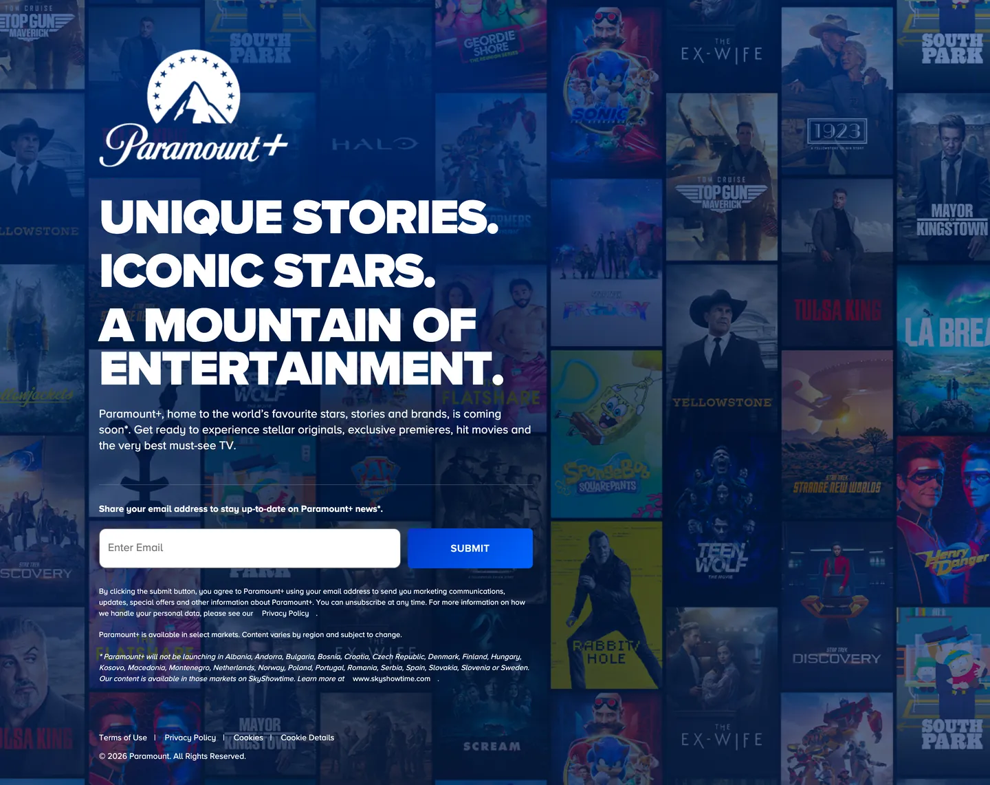
Paramount+'s landing page treats its content library as the literal wallpaper. Where Netflix opens with a single autoplay still and Disney+ leads with a hero card framed by a navy gradient, Paramount+ tiles forty-plus series posters edge-to-edge as a low-opacity backdrop — Halo, Yellowstone, Top Gun, 1923, La Brea, Teen Wolf, South Park — and punches the headline straight through them in pure white at 71px. The poster wall doesn't sit beside the type; it carries the type. The deep midnight navy that bleeds through the tile gaps is the closest thing the system has to a brand surface, and even that recedes behind the library inventory.
The DESIGN.md file packages the system into a machine-readable spec for React and AI tooling. Inside: 7 colors tokens centered on the cobalt-navy gradient voltage and the pure-white text tier; 11 typography tokens running Proxima Nova in three weights (Regular for body, SemiBold for the all-caps locale label, Black for the four-line display) at sizes ranging from 11px legal copy to 71px headlines; a small radius scale (6px on the submit pill, 10px on the email input); and 14 components definitions covering the wallpaper hero, the white-with-shadow email input, the cobalt-gradient submit button, the legal-copy stack, and the centered mountain wordmark.
Feed this file to Claude or Cursor and it reproduces Paramount+'s specific moves: tiled-library wallpaper instead of a single hero still, Proxima Nova Black at 71px with -2.13px tracking for the four-line shouted headline, cobalt-blue gradient CTA as the single chromatic action, and an all-caps SemiBold locale stamp as the only secondary type role. One opinionated framing: this is the inverse of the streaming-marketing default. Most rivals sell one show; Paramount+ sells the catalog — the wallpaper is the pitch, the headline labels it ("A MOUNTAIN OF ENTERTAINMENT"), and the cobalt pill closes the deal.
What makes it distinct
5
- Poster wallpaper herodozens of low-opacity series stills tile edge-to-edge as the page floor, with the headline punched straight through them
- Display at 71px Black, body at 17px RegularProxima Nova carries every tier, with a one-step jump from cap-tracked SemiBold labels to massive Black headlines
- Cobalt gradient submitthe email-capture pill runs a #0037c5 to #0064ff horizontal gradient, the only saturated chromatic moment on the page
- Navy as groundthe canvas behind the poster wall is a deep midnight #0a1d61, not black, anchoring the cobalt-blue brand temperature
- Mountain logo as sole chromethe centered Paramount+ wordmark plus mountain mark is the only brand element above the headline
paramountplus.com
Live at paramountplus.com
A snapshot of the brand in production. Scroll the frame to see the whole page.
Colors
7 colors
Paramount+'s system runs on #0037c5 as its primary voltage, used in 1 of 14 components. Type is set in Proxima Nova across 11 tokens from 11px to 71px, weights 400–900. Shape language is mixed across 14 components, blending pills, soft rounds, and squarer corners.
Brand & Accent
Sparing, CTA-only voltage · 2
Surface
Page and card backgrounds · 1
Text
Headlines, body, captions · 3
Borders & Hairlines
Dividers, outlines, rules · 1
Typography
11 type tokens
Set in Proxima Nova across 11 tokens, from 11px to 71px, weights 400–900. Shown in its own stack: where the font isn't installed, the fallback the file names stands in.
- display-xl71px · weight 900 · lh 63.9px · tracking -2.13pxThe quick brown fox jumps over the lazy dog
- display-lg48px · weight 900 · lh 48px · tracking -1.44pxThe quick brown fox jumps over the lazy dog
- heading-md20px · weight 700 · lh 24pxThe quick brown fox jumps over the lazy dog
- body-lg17px · weight 400 · lh 23pxThe quick brown fox jumps over the lazy dog
- body-md16px · weight 400 · lh 22pxThe quick brown fox jumps over the lazy dog
- body-sm12px · weight 400 · lh 21pxThe quick brown fox jumps over the lazy dog
- caption11px · weight 400 · lh 16pxThe quick brown fox jumps over the lazy dog
- label-bold13.5px · weight 700 · lh 16pxThe quick brown fox jumps over the lazy dog
- label-caps15px · weight 600 · lh 16px · tracking 0.4pxThe quick brown fox jumps over the lazy dog
- button-md15px · weight 600 · lh 16px · tracking 0.4pxThe quick brown fox jumps over the lazy dog
- input-md16px · weight 400 · lh 22pxThe quick brown fox jumps over the lazy dog
Layout
Radii and spacing
3 corner radii and 8 spacing values. Shape language: mixed.
Radii
- none0px
- sm6px
- md10px
Spacing
- xs6px
- sm16px
- md20px
- lg30px
- xl40px
- 2xl44px
- 3xl68px
- gutter144px
Components
14 components
Each rendered from its tokens (color, type, radius, padding) on Paramount+'s own canvas.
- Hero Wallpaperhero-wallpaperHero Wallpaper
- Hero Headinghero-headingHero Heading
- Body Paragraphbody-paragraphBody Paragraph
- Body Paragraph Disclaimerbody-paragraph-disclaimerBody Paragraph Disclaimer
- Label Capslabel-capsLabel Caps
- Email Capture Rowemail-capture-rowEmail Capture Row
- Type here…text-inputText Input
- Button Primarybutton-primaryButton Primary
- Button Primary Hoverbutton-primary-hoverButton Primary Hover
- Brand Markbrand-markBrand Mark
- Legal Linklegal-linkLegal Link
- Footer Rowfooter-rowFooter Row
- Poster Tileposter-tilePoster Tile
- Card Hairlinecard-hairlineCard Hairline
In use
The system, in use
Paramount+'s tokens on the kind of product it builds.
Build something people actually use.
A short paragraph of marketing copy that previews how the brand's display tier and body tier read together. Two sentences is usually enough.
FAQ
Paramount+ design system FAQ
Common questions about Paramount+'s tokens, components, and how to use this DESIGN.md in your project.
Read next
Related reading
Specs, directories, and component libraries that pair with this design system.
- Browse all design systemsThe full directory of DESIGN.md files on shadcn.io, with live mockups for each.shadcn.io
- Paramount+ — official siteParamount+'s public marketing site — the source of truth for the live tokens captured in this file.paramountplus.com (opens in a new tab)
- The DESIGN.md specificationGoogle Labs' open spec for machine-readable design system files — the format this page is built on.github.com (opens in a new tab)
Use it
Use Paramount+ in your project
One machine-readable file. Drop it into Claude, Cursor, or any AI tool that reads DESIGN.md.
Download the DESIGN.md
One machine-readable file: every color, type, radius, spacing, and component token of Paramount+.
Feed it to your AI tool
Drop it into Claude, Cursor, or GitHub Copilot. The agent writes React components and Tailwind classes that match Paramount+'s visual language.
Reference the tokens directly
Or paste the values into your Tailwind config, CSS variables, or component library: every color, size and radius is a quoted, ready-to-copy value.
Read the full DESIGN.md: overview, rationale, do’s and don’ts
Overview
Paramount+'s landing page inverts the streaming-acquisition convention. Wallpaper-as-pitch. Where Netflix and Max lead with one autoplay still and a single show's marketing voice, Paramount+ tiles forty-plus series posters edge-to-edge as a low-opacity backdrop, then drops a four-line 71px Proxima Nova Black headline in pure white straight through them. The poster wall does not sit beside the headline; it carries the headline. The deep midnight navy ({colors.canvas} — #0a1d61) that bleeds between the dimmed tiles is the only declared brand surface, and even that recedes behind the library inventory.
The chromatic discipline is severe. There is exactly one saturated brand moment on the page — the submit pill on the email-capture row, which runs a cobalt-blue gradient from {colors.primary} (#0037c5) on the left to {colors.primary-bright} (#0064ff) on the right. Every other surface is either dim-poster wallpaper, midnight-navy floor, or pure white text. Where Spline holds a single cobalt CTA against pure black and Cloudflare gives an orange canvas the full hero, Paramount+ does both at once: a navy canvas full-bleed, plus a single cobalt voltage reserved for the only action that matters above the fold.
Typography runs Proxima Nova across every tier in three weights — Regular for body and disclaimers, SemiBold for the all-caps locale label, and Black for the display headline. The 71px / 63.9px line-height ratio is unusual: leading tighter than size forces the four hard-broken lines ("UNIQUE STORIES. / ICONIC STARS. / A MOUNTAIN OF / ENTERTAINMENT.") to stack as one continuous slab. The -2.13px letter-spacing pulls the cap forms close enough that each line reads as a poster headline rather than as running editorial copy.
Key Characteristics:
- Tiled-poster wallpaper hero — dozens of series stills dropped to ~35% opacity over the navy canvas, with the headline punched straight through them.
- Single cobalt-blue voltage (
{colors.primary}to{colors.primary-bright}) — a horizontal gradient reserved for the submit pill, the only saturated chromatic moment on the page. - Deep midnight navy (
{colors.canvas}— #0a1d61) as the ground beneath the wallpaper — not black, not slate, the Paramount-blue temperature that has anchored the parent network for decades. - Display at 71px Proxima Nova Black with -2.13px tracking and 63.9px line-height — leading tighter than size, deliberately, to lock the four lines into one slab.
- All-caps SemiBold locale label at 15px with 0.4px tracking — the system's only uppercase tier, used as the "Share your email address…" stamp above the form.
- White email input with 10px rounding and dark
{colors.ink-on-input}(#1d1d1d) typed text — sits flush against the 6px-radius cobalt submit pill, forming a single hybrid form row. - Mountain wordmark centered at the top of the wallpaper as the only branded chrome above the headline — no top nav, no secondary CTAs.
- 144px horizontal gutter on the body copy and footer rows — the wide margin contains the headline-width to roughly four columns of poster tiles.
Colors
Brand
- Cobalt (
{colors.primary}— #0037c5): frequency 1, used as the left end-stop of the submit pill's horizontal gradient. The deep cobalt tier of the Paramount-blue family; sits just below the brighter end-stop on the same hue ramp. - Cobalt Bright (
{colors.primary-bright}— #0064ff): frequency 1, used as the right end-stop of the submit gradient. The electric cobalt that gives the pill its lift — without this hue the gradient would read as flat navy. - Canvas (
{colors.canvas}— #0a1d61): frequency 1 as background — the midnight-navy floor that sits behind the poster wallpaper and bleeds between the dimmed tiles. The Paramount-blue temperature at maximum saturation depth; not pure black, not slate.
Text
- Ink (
{colors.ink}— #ffffff): frequency 68 — the dominant text and border color across the page. Used as text (34), border (33), background fill (1). Carries every word above the fold — display headline, body paragraph, label, disclaimer, and the typed-form caret. The white-on-navy contrast is the page's load-bearing readability move. - Ink On Input (
{colors.ink-on-input}— #1d1d1d): frequency 2 — the typed-text color inside the white email-input. Not pure black; the slight lift to charcoal-1d softens the contrast on white without losing legibility. - Ink Pure (
{colors.ink-pure}— #000000): frequency 2 — used as a text and border tone in scoped places. Reserved rather than dominant; the page's "true black" appears almost nowhere as a body surface.
Hairline
- Hairline (
{colors.hairline}— #666666): frequency 1, used as a single border on a secondary element. The system's only mid-gray; with white doing nearly every border job on the page, this gray is reserved for surfaces that need a softer outline against the navy.
Typography
Font Family
The system runs Proxima Nova for everything — the licensed Mark Simonson family. Three weights do the work: Regular (400) for body, disclaimers, and the typed-input copy; SemiBold (600) for the all-caps locale label and the submit button; and Black (900) for the display headline. Fallbacks walk system-ui, sans-serif. There is no serif tier, no monospace, no second sans family.
Hierarchy
| Token | Size | Weight | Line Height | Letter Spacing | Use |
|---|---|---|---|---|---|
{typography.display-xl} | 71px | 900 | 63.9px | -2.13px | Hero headline ("UNIQUE STORIES. / ICONIC STARS. / A MOUNTAIN OF / ENTERTAINMENT.") |
{typography.display-lg} | 48px | 900 | 48px | -1.44px | Reserved smaller display step for secondary acquisition pages |
{typography.heading-md} | 20px | 700 | 24px | 0 | Sub-section headings on category pages |
{typography.body-lg} | 17px | 400 | 23px | 0 | Hero sub-paragraph beneath the headline |
{typography.body-md} | 16px | 400 | 22px | 0 | Default running text |
{typography.body-sm} | 12px | 400 | 21px | 0 | Marketing-consent disclaimer and country-availability copy |
{typography.caption} | 11px | 400 | 16px | 0 | Footer copyright row, legal links |
{typography.label-bold} | 13.5px | 700 | 16px | 0 | Form-section title above the email capture |
{typography.label-caps} | 15px | 600 | 16px | 0.4px | All-caps locale stamp ("EN" / language selector) |
{typography.button-md} | 15px | 600 | 16px | 0.4px | Submit button label |
{typography.input-md} | 16px | 400 | 22px | 0 | Typed-text inside the email input |
Principles
The display jumps one full step from 17px body straight to 71px hero — there is no 24 / 32 / 40px intermediate display tier on the captured surface. The leap is the page's central typographic move: body sits quiet at 17px, the headline shouts at 71px, and the locale label at 15px SemiBold uppercase is the only middle voice. The 63.9px line-height on the 71px headline is tighter than the cap size; the deliberate negative leading is what fuses the four hard-broken lines into one slab rather than four discrete sentences.
The cap-tracked 15px SemiBold label is the only uppercase tier in the system. There is no all-caps display, no all-caps button-tertiary variant, no all-caps section eyebrow — just the locale stamp. That singularity is what keeps the uppercase from reading as decorative.
Note on Font Substitutes
Proxima Nova is licensed from Mark Simonson Studio. The closest open-source substitute is Montserrat at the same weights — the proportions transfer cleanly at 17px body and 71px display, with a slightly squarer counter. For the 71px Black tier specifically, Inter Black at the same negative tracking is a viable alternative; the counters open up a touch but the cap weight reads close enough. Mulish is a third option at body sizes but starts to feel narrower than Proxima Nova above 32px.
Layout
Spacing System
- Base unit: 4px — the underlying grid, with 8 and 16 carrying most of the work.
- Tokens:
{spacing.xs}6px ·{spacing.sm}16px ·{spacing.md}20px ·{spacing.lg}30px ·{spacing.xl}40px ·{spacing.2xl}44px ·{spacing.3xl}68px ·{spacing.gutter}144px. - Gutter: the body-text container sits inside a 144px horizontal margin, which constrains the headline to roughly four poster-tile widths wide.
- Vertical rhythm: 68px above the headline block, 44px around the centered brand mark, 30px below the body paragraph before the form section, 20px between form and disclaimer rows.
- Form padding: the email input uses an asymmetric
13px 0px 13px 13px— 13px on top, bottom, and left, but 0 on the right where it abuts the submit pill.
Grid & Container
- Hero canvas: full-bleed midnight navy, with the poster wallpaper tiling edge-to-edge in roughly 8 columns and 5 rows at desktop width.
- Headline column: centered text constrained by the 144px side gutter — width ends up around 800px on the captured 1080px-wide capture.
- Brand mark: centered above the headline at the top of the canvas, no padding container.
- Form row: the email input (424px) and submit pill (~120px) sit flush together, total form-row width about 580px, left-aligned to the same gutter as the headline.
- Footer: legal link strip and copyright row stacked left-aligned, same 144px gutter.
Rhythm
The page is one long full-bleed wallpaper band with no section dividers. Hero, form, disclaimer, and footer all sit on the same navy floor; there is no shift to a second surface color, no separator rule, no card boundary. The rhythm comes from vertical whitespace and one consistent text-color ({colors.ink}) doing every layer of hierarchy.
Elevation
The system has essentially no shadow tier. The captured surface uses 0 declared shadow occurrences. Depth comes entirely from two non-shadow moves: the poster-wallpaper opacity drop (~35%) creates the perception that the navy canvas sits behind the tiles, and the white email-input fill makes the form row read as the only "lit" surface on the page.
- Flat (no shadow): wallpaper, headline, body, disclaimer, footer — every surface.
- Opacity-as-depth: dimmed poster tiles read as background because their luminance drops them behind the navy.
- White-as-elevation: the email input is the only white fill on the canvas; against the navy it reads as the most-tappable, most-foregrounded surface, no shadow required.
Shapes
The radius scale is small and binary:
{rounded.none}0px — every poster tile, every wallpaper edge.{rounded.sm}6px — the submit pill ({component.button-primary}).{rounded.md}10px — the email input ({component.text-input}).
There is no 12px tier, no 16px card radius, no full pill, no large surface tile. The constraint is structural: the page has only two rounded objects (input + button), so it has only the two radii those objects need. Adding a third would have nothing to land on.
Components
hero-wallpaper — Full-bleed {colors.canvas} (#0a1d61) midnight floor with the tiled-poster wallpaper layered above at ~35% opacity. 68px top padding holds the centered brand mark; 144px horizontal gutter holds the headline-and-form column.
hero-heading — Pure-white text on the wallpaper, Proxima Nova Black 71px / 63.9px / -2.13px. The four broken lines ("UNIQUE STORIES. / ICONIC STARS. / A MOUNTAIN OF / ENTERTAINMENT.") stack as one slab because the leading is tighter than the cap size.
body-paragraph — Default white running-text at {typography.body-lg} (17px / 400). One paragraph beneath the headline: "Paramount+, home to the world's favourite stars, stories and brands, is coming soon!"
body-paragraph-disclaimer — 12px / 21px / 400 white text at the marketing-consent and country-availability disclaimer tier. Tighter line-height than the body lead, but same family.
label-caps — All-caps 15px SemiBold with 0.4px tracking. The only uppercase tier in the system, used for the locale / language stamp.
email-capture-row — Container for the input plus submit pill. No fill of its own; the two children sit flush.
text-input — White {colors.ink} fill (the only white surface on the canvas), {colors.ink-on-input} (#1d1d1d) typed-text, 10px {rounded.md} radius, asymmetric 13px 0px 13px 13px padding (0 right where it abuts the button), 58px height, 424px width.
button-primary — Cobalt gradient fill from {colors.primary} (#0037c5) left to {colors.primary-bright} (#0064ff) right, white text, 6px {rounded.sm} radius, 16px 40px 14px padding, 58px height. The pill height matches the input so they form one row.
button-primary-hover — The gradient brightens toward the cobalt-bright end-stop on hover. No documented active state on the captured surface.
brand-mark — The Paramount+ wordmark plus mountain mark, white-on-navy, centered at the top of the wallpaper. ~120px tall, 44px vertical padding above and below.
legal-link — White text inline link at {typography.body-sm}, 6×10 padding for hit area. Used in the legal-link strip ("Terms of Use / Privacy Policy / Cookies / Cookie Details").
footer-row — White 11px / 16px text at the page floor, same 144px gutter. Holds the copyright line.
poster-tile — Individual series-poster image at ~35% opacity, 0px radius (square corners), 0 padding. The wallpaper grid tiles dozens of these edge-to-edge.
card-hairline — Reserved transparent surface with a {colors.hairline} (#666666) 1px border, 20px padding. Not used in the captured hero; available for secondary acquisition-page cards where white-on-navy is too loud.
Do's and Don'ts
Do treat the poster wallpaper as the hero element, not as decoration. The tiled library inventory is the page's actual pitch — replacing it with a single flagship still would shift the system into the Netflix / Max convention and lose the "breadth of catalog" framing the headline labels.
Do keep the display at 71px Black with the 63.9px / -2.13px tracking pair. The negative leading is what fuses the four hard-broken lines into one slab; loosening it to 1.2 line-height breaks the headline into four separate sentences and the slab feel disappears.
Do reserve the cobalt gradient ({colors.primary} to {colors.primary-bright}) for the one primary CTA above the fold. Multiplying the gradient onto secondary buttons dilutes the only saturated brand moment on the page.
Do use white ({colors.ink}) as the workhorse text color across every tier. Body, headline, disclaimer, locale label, and link text all share the same pure-white value — the system's chromatic discipline depends on a single text color carrying every level of hierarchy.
Don't swap the canvas from midnight navy ({colors.canvas} — #0a1d61) to pure black. The Paramount-blue temperature is the brand surface; black would break the cobalt-pill harmony and turn the system generic-streaming dark.
Don't raise the poster wallpaper opacity above ~40%. Above that threshold the artwork starts to compete with the white headline for foreground attention and the page loses its single typographic focus.
Don't introduce a third corner radius between 6px and 10px. The system is deliberately binary on radius — input at 10px, button at 6px, everything else at 0 — and a middle value softens the hard edge that the poster wall provides.
Don't use the {typography.label-caps} 15px SemiBold uppercase treatment outside the single locale-label role. It is the only uppercase tier in the system; spreading it across multiple labels turns it into decorative caps rather than a structural stamp.
Known Gaps
- Above-wallpaper navigation: the captured landing page is a soon-launching territory page, so the standard top nav (Home / Shows / Movies / Live TV / Brands / Pricing) is not present. Only the centered mountain mark stands in for chrome.
- Logged-in product surface: this DESIGN.md captures the public acquisition page only. The streaming product itself (the show-grid hub, the player, the My List page) carries a much richer component system that is not represented here.
- Hover, focus, and disabled states: the cobalt-gradient hover is described, but the full state matrix (focus rings, disabled tints, error tints on the email input) was not visible on the captured surface.
- Form validation styling:
{component.text-input}carries the resting state only; error messaging and invalid-state outlines are not exposed on the landing page. - Motion: the poster wallpaper appears static in the capture, but the live page may animate (parallax, tile crossfade, drift). Easing curves and stagger timing are not represented in the spec.
- Sub-brand chrome: Paramount+ aggregates content from CBS, BET, Comedy Central, Nickelodeon, MTV, VH1, and Paramount Pictures, each with its own brand palette and type system. None of those sub-brand surfaces are captured here; the spec is the master Paramount+ marketing chrome only.
Music, Video & Streaming
More systems like this
More DESIGN.md files in Music, Video & Streaming.
Pricing
Build it with Pro
The DESIGN.md files are free. Pro adds 6,000+ blocks, premium templates and the MCP server, so your AI editor builds in your system for you.
4.9/5 out of 5 · 150+ reviewsfrom 150+ founders and developers.
Billing
Billed once a year in USD. Cancel anytime.
- How many people can use the license.
- Client work, SaaS products and anything you charge for.
- Production-ready React sections: hero, pricing, features, dashboards and more.
- Complete multi-page sites you can ship as they are.
- React icons from every major library, installable with one command.
- Presets that restyle every block, in light and dark.
- Lets your AI editor search, preview and install blocks for you.
- Priority requests are answered first.
Individual
For personal projects & open source
$32instead of $49/mo
$389 billed yearly
- Seats: 1 seat
- Commercial use: Personal & open source only
- Pro blocks: 6,000+ blocks
- Templates: All 14 templates
- React icons: 294k+ icons
- Themes: All 59 themes
- MCP server: Basic usage
- Support: Standard
Team
Most popularFor freelancers, agencies & startups
$66instead of $99/mo
$789 billed yearly · ≈ $13/dev/mo
- Seats: Up to 5 seats
- Commercial use: Included
- Pro blocks: 6,000+ blocks
- Templates: All 14 templates
- React icons: 294k+ icons
- Themes: All 59 themes
- MCP server: High usage
- Support: Priority
Organization
For companies with larger teams
$132instead of $199/mo
$1,589 billed yearly
- Seats: Unlimited seats
- Commercial use: Included
- Pro blocks: 6,000+ blocks
- Templates: All 14 templates
- React icons: 294k+ icons
- Themes: All 59 themes
- MCP server: Unlimited usage
- Support: Priority
Billed once a year in USD. Cancel anytime.
Individual
For personal projects & open source
$32instead of $49/mo
$389 billed yearly
- How many people can use the license.Seats: 1 seat
- Client work, SaaS products and anything you charge for.Commercial use: Personal & open source only
- Production-ready React sections: hero, pricing, features, dashboards and more.Pro blocks: 6,000+ blocks
- Complete multi-page sites you can ship as they are.Templates: All 14 templates
- React icons from every major library, installable with one command.React icons: 294k+ icons
- Presets that restyle every block, in light and dark.Themes: All 59 themes
- Lets your AI editor search, preview and install blocks for you.MCP server: Basic usage
- Priority requests are answered first.Support: Standard
Team
Most popularFor freelancers, agencies & startups
$66instead of $99/mo
$789 billed yearly · ≈ $13/dev/mo
Everything in Individual, plus
- How many people can use the license.Seats: Up to 5 seats
- Client work, SaaS products and anything you charge for.Commercial use: Included
- Lets your AI editor search, preview and install blocks for you.MCP server: High usage
- Priority requests are answered first.Support: Priority
Organization
For companies with larger teams
$132instead of $199/mo
$1,589 billed yearly
Everything in Team, plus
- How many people can use the license.Seats: Unlimited seats
- Lets your AI editor search, preview and install blocks for you.MCP server: Unlimited usage
- Secure checkout via Stripe
- Code lives in your repo
- Keep what you've shipped if you cancel
- License terms
Your system, built for you
Every block, template and icon, installed by your AI agent in your design system. The DESIGN.md files stay free.