Pandora Design System
Pandora's marketing canvas as a DESIGN.md file — a single teal-to-indigo gradient floods the page, Avenir Next at weight 400 carries every tier, three underline links substitute for buttons.
Add shadcn.io to your AI agent. · Pro It installs blocks, icons and templates in your design system from a prompt, with Pro.
Set up MCP- Primary
- #224099
- Typeface
- Avenir Next
- Shape
- Sharp
- Base radius
- 0px
- Colors
- 5
- Type tokens
- 8
- Components
- 13
- Spacing values
- 8
About
About Pandora DESIGN.md
Curated by Dov Azencot · Updated May 19, 2026 · Source pandora.com (opens in a new tab)
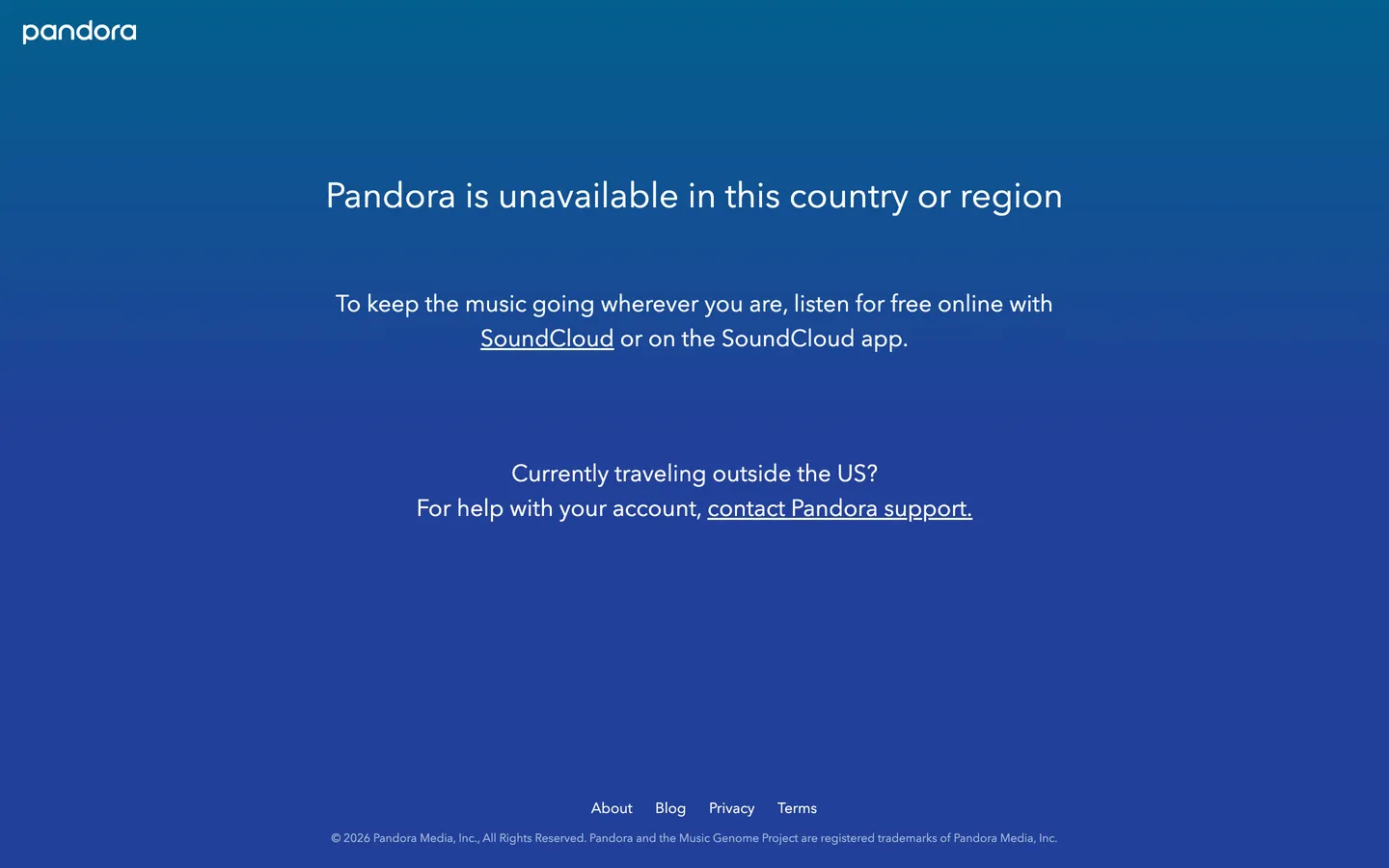
Pandora's public marketing canvas (when accessed from outside the United States, as the headless extractor was) is a single deep-blue gradient that fills the entire viewport — teal-blue at the top, saturated indigo at the bottom — with the lowercase "pandora" wordmark anchored top-left, a 36px Avenir Next display sentence centered mid-canvas, and two underline links carrying every interactive affordance the page provides. There is no card, no chrome, no top-nav, no shadow, no rounded button. The page is the brand color, and the brand color is the page. Where Spotify holds its green to the play-button accent against a near-black canvas and Apple Music runs photography-led card grids on white, Pandora has nothing on the surface but the gradient itself.
The DESIGN.md file packages what's observable into a machine-readable spec. Inside: 5 colors tokens (the two gradient end-stops, white ink, and a derived mid-stop), 8 typography tokens all running Avenir Next at weight 400 — display at 36px, dek at 24px, body at 15px, footer at 12px — 2 corner radius tokens (0px and a derived pill, neither rendered on the captured surface), 8 spacing values, and 13 components covering the gradient canvas, the wordmark, the underline link, the centered dek block, the footer link strip, and the copyright row. The component palette is unusually small because the captured surface is unusually small.
Feed this file to an AI tool and it reproduces Pandora's specific moves on a marketing one-pager: full-bleed teal-to-indigo gradient instead of a flat brand color, single typeface across every tier with no weight escalation, underline links instead of pill buttons, and centered-text composition with generous vertical whitespace. The honest framing: this DESIGN.md captures the geo-restricted surface only. The US listener-facing player carries a richer system — radio-station tiles, "thumb up / thumb down" feedback controls, the song-detail surface — none of which is exposed to a non-US extractor. Treat the tokens as a starting point for a Pandora-styled splash page, not as the full product system.
What makes it distinct
5
- Gradient-as-canvasteal-blue #035f8d top to indigo #224099 bottom fills the entire viewport, no card or container
- Avenir Next at 400 across every tierdisplay sits at 36px, dek at 24px, body at 15px, footer at 12px, no weight escalation
- Underline inline links replace buttonsthree white-underlined link affordances do the work of CTAs on the captured surface
- Lowercase wordmark28px white 'pandora' in the top-left, no logo mark, no padlock, just the wordmark on the blue floor
- No corner radius, no shadow, no hairlinethe system has nothing to round because the canvas is unbroken
pandora.com
Live at pandora.com
A snapshot of the brand in production. Scroll the frame to see the whole page.
Colors
5 colors
Pandora's system runs on #224099 as its primary voltage, used in 1 of 13 components. Type is set in Avenir Next across 8 tokens from 12px to 36px, weights 400–400. Shape language is sharp — components average 0px corner radius, favoring crisp rectangles.
Brand & Accent
Sparing, CTA-only voltage · 2
Surface
Page and card backgrounds · 1
Text
Headlines, body, captions · 1
Borders & Hairlines
Dividers, outlines, rules · 1
Typography
8 type tokens
Set in Avenir Next across 8 tokens, from 12px to 36px, weights 400–400. Shown in its own stack: where the font isn't installed, the fallback the file names stands in.
- display-xl36px · weight 400 · lh 48pxThe quick brown fox jumps over the lazy dog
- display-md24px · weight 400 · lh 36pxThe quick brown fox jumps over the lazy dog
- heading-md20px · weight 400 · lh 32pxThe quick brown fox jumps over the lazy dog
- body-lg16px · weight 400 · lh 24pxThe quick brown fox jumps over the lazy dog
- body-md15px · weight 400 · lh 40pxThe quick brown fox jumps over the lazy dog
- body-sm14px · weight 400 · lh 22pxThe quick brown fox jumps over the lazy dog
- caption12px · weight 400 · lh 22pxThe quick brown fox jumps over the lazy dog
- wordmark28px · weight 400 · lh 32pxThe quick brown fox jumps over the lazy dog
Layout
Radii and spacing
2 corner radii and 8 spacing values. Shape language: sharp.
Radii
- none0px
- full9999px
Spacing
- xs4px
- sm8px
- md12px
- base16px
- lg20px
- xl24px
- 2xl32px
- 3xl48px
Components
13 components
Each rendered from its tokens (color, type, radius, padding) on Pandora's own canvas.
- Hero Sectionhero-sectionHero Section
- Hero Headinghero-headingHero Heading
- Body Paragraphbody-paragraphBody Paragraph
- Body Paragraph Mdbody-paragraph-mdBody Paragraph Md
- Inline Linkinline-linkInline Link
- Button Primarybutton-primaryButton Primary
- Button Secondarybutton-secondaryButton Secondary
- Top Navtop-navTop Nav
- Nav Linknav-linkNav Link
- Wordmark Blockwordmark-blockWordmark Block
- Type here…text-inputText Input
- CardcardCard
- FooterfooterFooter
In use
The system, in use
Pandora's tokens on the kind of product it builds.
Build something people actually use.
A short paragraph of marketing copy that previews how the brand's display tier and body tier read together. Two sentences is usually enough.
FAQ
Pandora design system FAQ
Common questions about Pandora's tokens, components, and how to use this DESIGN.md in your project.
Read next
Related reading
Specs, directories, and component libraries that pair with this design system.
- Browse all design systemsThe full directory of DESIGN.md files on shadcn.io, with live mockups for each.shadcn.io
- Pandora — official sitePandora's public marketing site — the source of truth for the live tokens captured in this file.pandora.com (opens in a new tab)
- The DESIGN.md specificationGoogle Labs' open spec for machine-readable design system files — the format this page is built on.github.com (opens in a new tab)
Use it
Use Pandora in your project
One machine-readable file. Drop it into Claude, Cursor, or any AI tool that reads DESIGN.md.
Download the DESIGN.md
One machine-readable file: every color, type, radius, spacing, and component token of Pandora.
Feed it to your AI tool
Drop it into Claude, Cursor, or GitHub Copilot. The agent writes React components and Tailwind classes that match Pandora's visual language.
Reference the tokens directly
Or paste the values into your Tailwind config, CSS variables, or component library: every color, size and radius is a quoted, ready-to-copy value.
Read the full DESIGN.md: overview, rationale, do’s and don’ts
Overview
Pandora's captured public surface is a study in gradient-as-canvas. A single deep-blue gradient — teal-blue {colors.primary-light} (#035f8d) at the top fading to saturated indigo {colors.primary} (#224099) at the bottom — fills the entire viewport. The lowercase wordmark anchors top-left at 28px in white, a 36px Avenir Next dek sits centered mid-canvas, and two underline links carry every interactive affordance the page provides. There is no card, no top-nav band, no shadow, no rounded button, no hairline rule. Where Spotify holds its lime-green voltage to the Play button against a near-black canvas and Apple Music runs photography-led card grids on a white floor, Pandora dispenses with the chrome entirely on this surface — the brand color is the page, and the page is the brand color.
The chromatic restraint is the system's defining decision, but it's also a consequence of the captured page's purpose. The extractor accessed the site from outside the United States, where Pandora is geo-restricted; the response is a one-screen "Pandora is unavailable in this country or region" notice that routes the visitor to SoundCloud and to Pandora support. The page has nothing to sell, nothing to demo, no feature strip to render. The gradient becomes the entire visual identity by necessity. This is the inverse of Spotify's product-led approach (a chrome-rich green-and-black logged-out marketing site); Pandora's public surface speaks through absence.
Typography is Avenir Next at weight 400 across every tier. Display sits at 36px / 48px leading, dek at 24px / 36px, body at 15px / 40px (wide leading is the inline-link rhythm), wordmark at 28px, footer copy at 12px. There is no 500, 600, or 700 weight anywhere on the page — the geometric humanist sans does every job at the same weight, and confidence comes from face selection and generous whitespace rather than from typographic muscle. Where most streaming brands lean on a heavier display tier (Spotify's Circular at weight 700, Apple Music's SF Pro at 600), Pandora holds a single weight across the entire surface.
Key Characteristics:
- Gradient canvas — teal-blue
{colors.primary-light}(#035f8d) at top to indigo{colors.primary}(#224099) at bottom, fills the entire viewport with no surface chrome on top. - Avenir Next at weight 400 across every tier; no escalation to 500 or 700 anywhere on the page.
- Lowercase wordmark — 28px white "pandora" anchored top-left at
{spacing.lg}20px padding, no logo mark, no padlock icon. - Zero corner radius rendered — no card, no button, no input on the captured surface. The system's declared radii (
{rounded.none}0px and{rounded.full}9999px) are reserved for the unobserved product player. - Underline inline links replace pill buttons — three white-underlined links ("SoundCloud," "contact Pandora support," footer links) do every interactive job.
- Centered text composition with generous vertical whitespace — the 36px display, the 24px dek, and the 15px footer copy stack with ~80px gaps in between.
- No shadow, no hairline rule, no surface tint — the gradient is unbroken from top to bottom of the viewport.
- Footer at 12px Avenir Next with a copyright row: "© 2026 Pandora Media, Inc., All Rights Reserved. Pandora and the Music Genome Project are registered trademarks of Pandora Media, Inc."
Colors
Brand
- Pandora Indigo (
{colors.primary}— #224099): frequency 1 — gradient. The bottom end-stop of the page-fill gradient. A saturated, slightly violet-leaning blue that anchors the lower half of the canvas. Wired as the inlinebackgroundgradient on the body element with no CSS custom property exposed. - Pandora Teal-Blue (
{colors.primary-light}— #035f8d): frequency 1 — gradient. The top end-stop of the page-fill gradient. A deeper teal-shifted blue that anchors the top half of the canvas. Together with{colors.primary}these are the entire chromatic system on the captured surface.
Surface
- Canvas (
{colors.canvas}— #224099): the indigo end-stop doubles as the named canvas token because the gradient resolves to roughly indigo at the page's vertical midpoint where most content sits. There is no separate surface color — every "surface" on the page is the same gradient floor seen through the same viewport.
Text & Hairline
- Ink (
{colors.ink}— #ffffff): frequency 48 — text (24), border (24). Pure white. Used as the wordmark color, the 36px display text, the 24px body text, the inline-link text, and the 12px footer copy. The "border" occurrences are all link underlines — Pandora has no hairlines or card borders on the captured surface, only the 1px white underline beneath inline links. - Hairline (
{colors.hairline}— #ffffff): the underline color of inline links. The page has no other hairline use — no card outlines, no input borders. White-at-100%-opacity is the only border tone, and it's scoped to link underlines exclusively.
Typography
Font Family
The system runs Avenir Next for every tier — a geometric humanist sans designed by Adrian Frutiger as the digital evolution of the 1988 Avenir family. Fallbacks walk to Avenir, "Segoe UI", Roboto, "Helvetica Neue", Helvetica, Arial, sans-serif. There is no second display family, no monospace tier, no serif voice. One face, one weight (400), every tier.
Hierarchy
| Token | Size | Weight | Line Height | Use |
|---|---|---|---|---|
{typography.display-xl} | 36px | 400 | 48px | Hero dek ("Pandora is unavailable in this country or region") |
{typography.display-md} | 24px | 400 | 36px | Secondary message ("To keep the music going wherever you are…") |
{typography.heading-md} | 20px | 400 | 32px | Sub-heading tier — declared but unused on captured page |
{typography.body-lg} | 16px | 400 | 24px | Default running text — declared but unused on captured page |
{typography.body-md} | 15px | 400 | 40px | Inline-link body text with wide 40px leading |
{typography.body-sm} | 14px | 400 | 22px | Smaller secondary text — declared but unused |
{typography.caption} | 12px | 400 | 22px | Copyright row, legal footer |
{typography.wordmark} | 28px | 400 | 32px | "pandora" lowercase wordmark in top-left |
Principles
The most-noticeable typographic decision is the 40px line-height on the 15px body text — nearly 2.7x leading, far above the 1.4-1.6 ratio most systems use. The wide leading creates space for the inline-link underlines to breathe and gives the centered body block visual rhythm without requiring multiple paragraph breaks. It is the only ratio in the system that doesn't follow the 1.3-1.5 leading convention.
Weight 400 across every tier is the system's confidence move. There is no bold display, no semibold sub-heading, no medium button label. The geometric humanist sans does every job at the same weight, and emphasis comes from size escalation (36px vs 15px) rather than from weight escalation (400 vs 700). The lowercase wordmark at 28px / 400 reinforces this — most brand wordmarks reach for a custom weight or letterform; Pandora's just uses Avenir Next.
Note on Font Substitutes
Avenir Next is licensed (Linotype / Monotype). The closest open-source substitute is Nunito Sans at the same weights — its rounded geometric forms transfer cleanly. Inter at weight 400 is the next-closest if a more contemporary feel is acceptable. Public Sans (US Web Design System) is a third option for a more neutral substitute. All three preserve the geometric humanist proportions at 15-36px body and display sizes.
Layout
Spacing System
- Base unit: 4px (with 20px as the dominant observed value — wordmark and footer padding).
- Tokens:
{spacing.xs}4px ·{spacing.sm}8px ·{spacing.md}12px ·{spacing.base}16px ·{spacing.lg}20px ·{spacing.xl}24px ·{spacing.2xl}32px ·{spacing.3xl}48px. - Wordmark padding: 20x24px — anchors top-left.
- Section gaps: ~80px vertical between the dek block and the secondary message block, ~120px between the secondary message and the "Currently traveling outside the US?" support callout.
Grid & Container
- Max content width: ~720px on the centered dek block (the 36px headline wraps at ~720px).
- Body composition: single-column centered, no card, no constraint container. The text floats on the gradient at the viewport center.
- Footer: four inline links centered in a single row at page bottom, copyright row in 12px Avenir Next directly beneath.
Rhythm
The page has one rhythm: centered text on gradient with generous vertical whitespace. There are no editorial bands, no feature strips, no card grids. Every "section" is a single centered text block stacked vertically with ~80-120px gaps. The discipline is forced by the page's purpose (geo-block notice, not marketing splash) but the result is a study in compositional restraint.
Elevation
The system has no shadow tier and no hairline tier. The captured page has zero shadow occurrences and zero hairline tone declarations. Depth doesn't exist on the surface — every element sits on the same gradient floor at the same z-level.
- Flat: the entire page. No card lift, no button shadow, no modal scrim.
- Gradient depth: the only "depth" cue is the teal-to-indigo vertical gradient itself, which creates a subtle perception of light coming from the top of the viewport. It functions as atmospheric depth rather than as component elevation.
Shapes
The system declares two radius tokens but renders neither on the captured surface:
{rounded.none}0px — declared as the default radius. All declared components use it.{rounded.full}9999px — declared for the unobserved primary CTA pill. The Pandora player surface (not exposed to extraction) renders pill controls; the captured marketing surface does not.
There is no sm / md / lg middle tier because there are no rounded surfaces to apply them to. The captured surface has nothing to round — no buttons, no cards, no inputs.
Components
hero-section — The full-bleed gradient canvas. {colors.canvas} (resolves to the teal-to-indigo gradient via CSS), white text, 0 padding, no border-radius. Holds every other element on the page.
hero-heading — White text on the gradient canvas, Avenir Next 36px / 400, 0 padding. The "Pandora is unavailable in this country or region" headline.
body-paragraph — White text at {typography.display-md} (24px / 400 with 36px leading). The "To keep the music going wherever you are…" secondary message block.
body-paragraph-md — White text at {typography.body-md} (15px / 400 with 40px leading). The "Currently traveling outside the US?" and "For help with your account, contact Pandora support" rows.
inline-link — White text, single-pixel white underline, no padding, no background fill. The three inline links on the captured surface: "SoundCloud," "contact Pandora support," and the four footer links (About, Blog, Privacy, Terms). The button-less interactive affordance.
button-primary — Declared but not rendered on the captured surface. Reserved for the product player's primary actions ("Start Listening," "Subscribe Now"). White fill on indigo canvas, indigo text, {rounded.full} 9999px pill, 12x24px padding.
button-secondary — Declared but not rendered. Transparent fill with 1px white border, white text, {rounded.full} pill, same dimensions as primary.
top-nav — Declared but not rendered as a band. The captured surface has only the wordmark anchored top-left, no nav links, no right-aligned account cluster. The full nav exists in the product player but not on this page.
nav-link — Declared but not rendered. Reserved for the product player's nav band.
wordmark-block — Transparent background, white text, {typography.wordmark} (28px / 400), 20x24px padding. Anchors the wordmark in the top-left corner of the viewport.
text-input — Declared but not rendered on the captured surface. Reserved for the product player's search and sign-in flows.
card — Declared but not rendered. The system has no card surface on the captured page; the gradient canvas IS the surface.
footer — Transparent background, white text in {typography.caption} (12px / 400), 20x0 padding. Houses the four footer links centered in a single row, with the copyright row directly beneath.
Do's and Don'ts
Do treat the teal-to-indigo gradient as the entire canvas, not as a hero band. The gradient's vertical span IS the viewport — there is no "below the fold" with a different surface. Cropping the gradient to a hero block and switching to white below would break the captured composition.
Do keep every typographic tier at Avenir Next weight 400. The system's confidence comes from face consistency and size escalation, not from weight escalation. Reaching for a 600 or 700 display anywhere on the page would break the single-weight discipline.
Do use white underlines on inline links as the only interactive affordance on splash-style pages. The system has no rendered pill buttons on the captured surface; pill buttons appear only inside the unobserved product player. For a Pandora-styled splash, underline links are correct.
Do anchor the lowercase wordmark in the top-left at 20px padding from the page edge. The wordmark is the only chromatic brand element above the dek block; centering it or scaling it larger breaks the composition.
Don't introduce a card surface with a different background tint. The system has no card tokens on the captured surface — the gradient floor is the only surface. Floating a white or off-white card on the gradient (the common "splash with floating signup form" pattern) would visually contradict the canvas's unbroken span.
Don't swap the gradient end-stops to a flat single hex like {colors.primary} (#224099) only. The teal-to-indigo span is the system's atmospheric depth cue; collapsing it to a single flat color removes the only sense of vertical light direction the page has.
Don't add a 12-line-height body tier. The captured 15px body sits at 40px leading — a deliberate 2.7x ratio that creates space for inline-link underlines. Substituting a conventional 1.5x leading would tighten the link block and lose the centered-prose breathing room.
Don't assume this DESIGN.md covers the Pandora player surface. The captured page is the geo-restricted notice only. Using these tokens to style a station-tile grid or a thumb-feedback control would extrapolate beyond the observed system — the US-facing player carries its own chromatic and component vocabulary not represented here.
Known Gaps
- Product player surface: the captured marketing surface is the geo-restricted notice only. The actual Pandora listener-facing player (station tiles, song detail, thumb feedback, queue, search) carries a much richer system not represented here. Accessing the product requires US-based access.
- Hover and focus states: the inline-link hover state (underline thickness change, subtle text-shadow) is not captured.
- Dark mode: the captured surface is the brand-blue gradient only; there is no light/dark variant on this page.
- Form input states: declared
{component.text-input}is reserved but not rendered on the captured surface. The product player's search and sign-in forms are not exposed. - Iconography: the captured surface has zero icons — no logo mark (only the lowercase wordmark), no padlock, no flag. The product player's icon set (play, skip, thumb, queue, search) is not represented.
- Motion: the gradient is static on the captured surface. The product player's transitions (album-art crossfade, scrubber animation, station-switch overlay) are not represented.
- Marketing site below geo-block: if accessed from US-based IP, pandora.com presents a full marketing surface (paid-tier pricing, family plan, podcast directory, station signup) that is not captured here.
Music, Video & Streaming
More systems like this
More DESIGN.md files in Music, Video & Streaming.
Pricing
Build it with Pro
The DESIGN.md files are free. Pro adds 6,000+ blocks, premium templates and the MCP server, so your AI editor builds in your system for you.
4.9/5 out of 5 · 150+ reviewsfrom 150+ founders and developers.
Billing
Billed once a year in USD. Cancel anytime.
- How many people can use the license.
- Client work, SaaS products and anything you charge for.
- Production-ready React sections: hero, pricing, features, dashboards and more.
- Complete multi-page sites you can ship as they are.
- React icons from every major library, installable with one command.
- Presets that restyle every block, in light and dark.
- Lets your AI editor search, preview and install blocks for you.
- Priority requests are answered first.
Individual
For personal projects & open source
$32instead of $49/mo
$389 billed yearly
- Seats: 1 seat
- Commercial use: Personal & open source only
- Pro blocks: 6,000+ blocks
- Templates: All 14 templates
- React icons: 294k+ icons
- Themes: All 59 themes
- MCP server: Basic usage
- Support: Standard
Team
Most popularFor freelancers, agencies & startups
$66instead of $99/mo
$789 billed yearly · ≈ $13/dev/mo
- Seats: Up to 5 seats
- Commercial use: Included
- Pro blocks: 6,000+ blocks
- Templates: All 14 templates
- React icons: 294k+ icons
- Themes: All 59 themes
- MCP server: High usage
- Support: Priority
Organization
For companies with larger teams
$132instead of $199/mo
$1,589 billed yearly
- Seats: Unlimited seats
- Commercial use: Included
- Pro blocks: 6,000+ blocks
- Templates: All 14 templates
- React icons: 294k+ icons
- Themes: All 59 themes
- MCP server: Unlimited usage
- Support: Priority
Billed once a year in USD. Cancel anytime.
Individual
For personal projects & open source
$32instead of $49/mo
$389 billed yearly
- How many people can use the license.Seats: 1 seat
- Client work, SaaS products and anything you charge for.Commercial use: Personal & open source only
- Production-ready React sections: hero, pricing, features, dashboards and more.Pro blocks: 6,000+ blocks
- Complete multi-page sites you can ship as they are.Templates: All 14 templates
- React icons from every major library, installable with one command.React icons: 294k+ icons
- Presets that restyle every block, in light and dark.Themes: All 59 themes
- Lets your AI editor search, preview and install blocks for you.MCP server: Basic usage
- Priority requests are answered first.Support: Standard
Team
Most popularFor freelancers, agencies & startups
$66instead of $99/mo
$789 billed yearly · ≈ $13/dev/mo
Everything in Individual, plus
- How many people can use the license.Seats: Up to 5 seats
- Client work, SaaS products and anything you charge for.Commercial use: Included
- Lets your AI editor search, preview and install blocks for you.MCP server: High usage
- Priority requests are answered first.Support: Priority
Organization
For companies with larger teams
$132instead of $199/mo
$1,589 billed yearly
Everything in Team, plus
- How many people can use the license.Seats: Unlimited seats
- Lets your AI editor search, preview and install blocks for you.MCP server: Unlimited usage
- Secure checkout via Stripe
- Code lives in your repo
- Keep what you've shipped if you cancel
- License terms
Your system, built for you
Every block, template and icon, installed by your AI agent in your design system. The DESIGN.md files stay free.