Obsidian Design System
Obsidian's design system as a DESIGN.md file. Violet #a78bfa on zinc-900 canvas, system-ui stack, 19 colors, 19 components. For React, Next.js, and AI tools.
Add shadcn.io to your AI agent. · Pro It installs blocks, icons and templates in your design system from a prompt, with Pro.
Set up MCP- Primary
- #a78bfa
- Typeface
- ui-sans-serif
- Shape
- Sharp
- Base radius
- 6px
- Colors
- 19
- Type tokens
- 12
- Components
- 19
- Spacing values
- 7
About
About Obsidian DESIGN.md
Curated by Dov Azencot · Updated May 13, 2026 · Source obsidian.md (opens in a new tab)
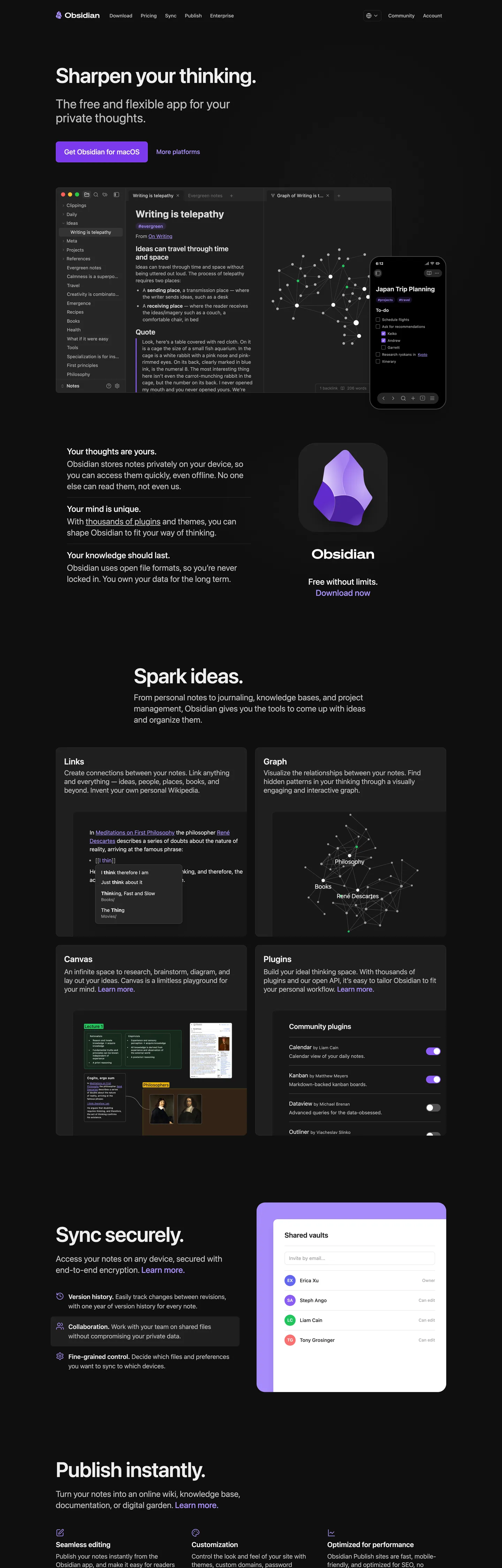
Obsidian's marketing page reads like the readme for a privacy-first piece of software, not a SaaS landing. The page floor is "#171717" — zinc-900, never pure "#000000" — and headlines like "Sharpen your thinking." sit at 60px weight 600 with -1.2px tracking in the platform system-font stack. There is no custom display family, no web-font request, no atmospheric gradient. The only chromatic voltage is a single violet — "#a78bfa" on the wordmark and link accents, "#8a5cf5" as the lone filled-button background on the "Get Obsidian for macOS" pill. Below the hero, a 2×2 card grid hosts real product captures (vault graph, canvas board, plugin list, sync sheet) framed by 1px hairlines at "#262626". The card-as-screenshot pattern carries the entire page rhythm.
This DESIGN.md packages the spec into one machine-readable file written to the Google Labs format. Inside: 19 colors tokens grouped into a violet brand ramp, a four-step dark surface ladder, structural hairlines, and a window-chrome triad ("#ff5f57", "#febc2e", "#28c840") used on the hero screenshot mockup; 12 typography roles all running ui-sans-serif from a 60px display down to 11px caption; a 6-step rounded scale anchored on 4px with a pill exit; a 7-step spacing scale on a 4px base unit; and 19 components definitions covering the violet macOS-download pill, the secondary ghost link, the feature-card frame, the dark top-nav, the plugin row, the encrypted-sync surface, and the in-card product screenshot frame.
Feed the file to Claude, Cursor, or Copilot and the agent reproduces Obsidian's restraint — system-font stack, single violet, four-step dark ladder, screenshots framed in cards — instead of a generic dark-theme template. Reference the tokens directly: every hex, font, radius, and spacing value is a quoted scalar you can paste into Tailwind config, CSS variables, or a component library. Obsidian is worth studying because it inverts the prevailing convention that personal-knowledge tools must announce themselves with a custom typeface and a gradient mesh; the brand identity is built almost entirely on what is absent.
What makes it distinct
5
- System-font sovereigntyevery word on the page rides ui-sans-serif with zero web-font payload, where competitors load Inter or a custom display family
- Single violet voltage#a78bfa carries the wordmark and the macOS download pill, with #8a5cf5 as the only filled-button background across the whole page
- Zinc-900 canvas with #262626 hairlinesa four-step dark ladder (#171717, #1e1e1e, #262626, #363636) where most dark sites flatten to a single near-black
- 4px-dominant corner vocabulary34 occurrences of 4px versus 7 pill instances, anchoring a software-documentation rectangle geometry rather than consumer pill softness
- Card-as-screenshot frameevery feature card hosts a real product capture (vault graph, canvas board, mobile sync sheet), so the chrome is a hairline frame around app evidence
obsidian.md
Live at obsidian.md
A snapshot of the brand in production. Scroll the frame to see the whole page.
Colors
19 colors
Obsidian's system runs on #a78bfa as its primary voltage, used in 4 of 19 components. Type is set in ui-sans-serif across 12 tokens from 11px to 60px, weights 400–600. Shape language is sharp — components average 4px corner radius, favoring crisp rectangles.
Brand & Accent
Sparing, CTA-only voltage · 3
Surface
Page and card backgrounds · 4
Text
Headlines, body, captions · 6
Borders & Hairlines
Dividers, outlines, rules · 3
Other
Specialty colors · 3
Typography
12 type tokens
Set in ui-sans-serif across 12 tokens, from 11px to 60px, weights 400–600. Shown in its own stack: where the font isn't installed, the fallback the file names stands in.
- display-xl60px · weight 600 · lh 1 · tracking -1.2pxThe quick brown fox jumps over the lazy dog
- display-lg36px · weight 400 · lh 1.11 · tracking -0.4pxThe quick brown fox jumps over the lazy dog
- heading-md24px · weight 600 · lh 1.33 · tracking -0.2pxThe quick brown fox jumps over the lazy dog
- heading-sm20px · weight 600 · lh 1.4The quick brown fox jumps over the lazy dog
- subhead20px · weight 500 · lh 1.4The quick brown fox jumps over the lazy dog
- body-lg16px · weight 400 · lh 1.5The quick brown fox jumps over the lazy dog
- body-md14px · weight 400 · lh 1.43The quick brown fox jumps over the lazy dog
- body-sm13px · weight 400 · lh 1.5The quick brown fox jumps over the lazy dog
- label-md14px · weight 500 · lh 1.43The quick brown fox jumps over the lazy dog
- button-md16px · weight 500 · lh 1.25The quick brown fox jumps over the lazy dog
- caption12px · weight 400 · lh 1.33The quick brown fox jumps over the lazy dog
- micro11px · weight 400 · lh 1.5The quick brown fox jumps over the lazy dog
Layout
Radii and spacing
7 corner radii and 7 spacing values. Shape language: sharp.
Radii
- none0px
- xs2px
- sm4px
- md6px
- lg8px
- xl12px
- pill9999px
Spacing
- xxs2px
- xs4px
- sm6px
- md8px
- base12px
- lg16px
- xl24px
Components
19 components
Each rendered from its tokens (color, type, radius, padding) on Obsidian's own canvas.
- Button Primarybutton-primaryButton Primary
- Button Primary Hoverbutton-primary-hoverButton Primary Hover
- Button Primary Pressedbutton-primary-pressedButton Primary Pressed
- Button Secondarybutton-secondaryButton Secondary
- Link Accentlink-accentLink Accent
- Feature Cardfeature-cardFeature Card
- Feature Card Titlefeature-card-titleFeature Card Title
- Hero Screenshot Framehero-screenshot-frameHero Screenshot Frame
- Window Chrome Barwindow-chrome-barWindow Chrome Bar
- Plugin Rowplugin-rowPlugin Row
- Toggle Ontoggle-onToggle On
- Toggle Offtoggle-offToggle Off
- Top Navtop-navTop Nav
- Nav Linknav-linkNav Link
- Type here…text-inputText Input
- Vault Rowvault-rowVault Row
- Bullet Markerbullet-markerBullet Marker
- Footer Bandfooter-bandFooter Band
- Graph Nodegraph-nodeGraph Node
In use
The system, in use
Obsidian's tokens on the kind of product it builds.
Build something people actually use.
A short paragraph of marketing copy that previews how the brand's display tier and body tier read together. Two sentences is usually enough.
FAQ
Obsidian design system FAQ
Common questions about Obsidian's tokens, components, and how to use this DESIGN.md in your project.
Read next
Related reading
Specs, directories, and component libraries that pair with this design system.
- Browse all design systemsThe full directory of DESIGN.md files on shadcn.io, with live mockups for each.shadcn.io
- Obsidian — official siteThe local-first markdown note-taking app — knowledge graph, plugins, end-to-end encrypted sync.obsidian.md (opens in a new tab)
- The DESIGN.md specificationGoogle Labs' open spec for machine-readable design system files.github.com (opens in a new tab)
Use it
Use Obsidian in your project
One machine-readable file. Drop it into Claude, Cursor, or any AI tool that reads DESIGN.md.
Download the DESIGN.md
One machine-readable file: every color, type, radius, spacing, and component token of Obsidian.
Feed it to your AI tool
Drop it into Claude, Cursor, or GitHub Copilot. The agent writes React components and Tailwind classes that match Obsidian's visual language.
Reference the tokens directly
Or paste the values into your Tailwind config, CSS variables, or component library: every color, size and radius is a quoted, ready-to-copy value.
Read the full DESIGN.md: overview, rationale, do’s and don’ts
Overview
Obsidian's marketing page is a dark-canvas software-documentation system that reads as a privacy app's readme rather than a productivity SaaS landing. The page floor is {colors.canvas} ("#171717") — zinc-900, with a faint warm cast and a four-step surface ladder running through {colors.surface-1} ("#1e1e1e"), {colors.surface-2} ("#262626"), and {colors.surface-3} ("#363636") for cards, hairline borders, and the publish-instantly band. Body ink sits at {colors.ink} ("#e5e5e5") with a quiet {colors.ink-muted} ("#b3b3b3") for deks and secondary copy. There is no atmospheric gradient anywhere on the page.
The single chromatic voltage is violet scarcity: {colors.primary} ("#a78bfa") carries the wordmark, the underlined link accents, the keyword color in code samples, and the crystal-mascot fill — appearing 17 times across the page. The macOS-download pill steps one tier deeper to {colors.primary-bold} ("#8a5cf5"), the only filled-button background on the entire page. Pressed lands on {colors.primary-pressed} ("#7c3aed"). Where most note-taking and project-management brands deploy a chromatic accent and a secondary accent and a gradient mesh, Obsidian commits to one violet and one geometry — a pill on macOS, a 4px rectangle on everything else.
The named principle is system-font sovereignty. Every word on the page rides ui-sans-serif, system-ui, -apple-system with zero web-font request. Display headings render at 60px weight 600 with -1.2px tracking in whatever face the operating system supplies — San Francisco on macOS, Segoe UI on Windows, Roboto on Android. The 36px / weight 400 dek immediately under each display line is the brand's signature typographic gesture: a near-display weight at near-body color, used to soften the headline rather than reinforce it.
Page rhythm leans on card-as-screenshot frame. Below the hero, a 2×2 card grid hosts real product captures — the vault knowledge graph, the canvas board, the plugin list, the mobile sync sheet. Each card is {colors.surface-1} filled with a 1px {colors.hairline} border and a 4-8px {rounded.lg} corner; the marketing chrome is a hairline frame around app evidence. There are no illustrations, no stock photography, no decorative iconography.
Key Characteristics:
- Dark-canvas marketing system —
{colors.canvas}("#171717") zinc-900, never pure black, with a four-step surface ladder. - Single violet voltage —
{colors.primary}("#a78bfa") at 17 occurrences, the only chromatic color on the entire page. - System-font sovereignty — every text role on
ui-sans-serifwith zero web-font payload. - Display tracking pulls to -1.2px at 60px; body holds at 0.
- Cards render at
{rounded.lg}8px with 1px{colors.hairline}borders — 4px corners dominate the radius vocabulary. - Product screenshots dominate the page. Each card is a hairline frame around an app capture.
- No atmospheric gradients. No second chromatic color. No custom typeface.
Colors
- Obsidian Violet (
#a78bfa) — frequency 17. Used as text (16), bg (1). Registered under--color-violet-400,--color-accent-400, and--code-value. The brand voltage, reserved for the wordmark, the underlined link accents, and the crystal mascot. - Violet Bold (
#8a5cf5) — frequency 8. Used as bg (8). The macOS-download pill background and the only filled-button color anywhere on the page. Steps to#7c3aedon press. - Violet Pressed (
#7c3aed) — frequency 2. Used as bg (2). The deepest pressed-state for the macOS pill; appears only on active button events. - Canvas Zinc (
#171717) — frequency 4. Used as bg (4). The page floor across every section, holding the entire dark marketing rhythm without an alternating-band pattern. - Surface-1 (
#1e1e1e) — frequency 4. Used as bg (4). Card and feature-tile fills, one tier lighter than canvas, with hairline borders. - Surface-2 (
#262626) — frequency 36. Used as text (12), bg (18), border (6). Doubles as the dominant hairline color ({colors.hairline}) and as the lifted top-nav surface fill. - Surface-3 (
#363636) — frequency 4. Used as border (4). The strongest hairline tier, used on hovered cards and on the encrypted-sync band separator. - Ink (
#e5e5e5) — frequency 751. Used as text (284), border (467). The workhorse body color, also doubling as a faint hairline inside the embedded mobile-app screenshot. - Ink Muted (
#b3b3b3) — frequency 124. Used as text (124). The hero dek color and secondary body copy — the "free and lightweight app for your private thoughts" sentence under each display headline. - Ink Subtle (
#a3a3a3) — frequency 17. Used as text (17). Caption-tier copy on footer rows and feature-card metadata. - Hairline Strong (
#404040) — frequency 12. Used as bg (1), border (11). The card-divider color on the plugin list and the inset hairline on toggle backgrounds. - Hairline Soft (
#525252) — frequency 6. Used as bg (3), border (3). Tertiary divider on FAQ rows and the encrypted-sync surface inner border. - Ink Deepest (
#0f0f0f) — frequency 2. Used as bg (1), gradient (1). The footer floor, one shade deeper than canvas to mark the band transition. - Window-chrome Red (
#ff5f57) — frequency 1. Used as bg (1). The macOS-style close-window dot inside the hero screenshot mockup. - Window-chrome Amber (
#febc2e) — frequency 1. Used as bg (1). The minimize dot in the same hero mockup. - Window-chrome Green (
#28c840) — frequency 1. Used as bg (1). The maximize dot completing the macOS chrome triad.
Typography
Obsidian runs the platform system-font stack across every text role — ui-sans-serif, system-ui, -apple-system, "system-ui", Roboto, Inter, "Helvetica Neue", Arial, "Noto Sans", sans-serif. There is no custom typeface, no Google Fonts request, no web-font payload anywhere in the page. Display headlines render in San Francisco on macOS, Segoe UI on Windows, Roboto on Android — whatever the operating system supplies natively.
The display tier sits at 60px weight 600 with -1.2px tracking; the matching display-lg dek lands at 36px weight 400 with -0.4px tracking — a deliberately large secondary line that absorbs the visual weight of the headline above it. Body copy holds at 16px weight 400 / 1.5 line-height for the primary paragraph and 14px / 1.43 for inside-card body. Captions run 12px / 1.33 and the smallest tier — micro labels and footer fine print — sits at 11px / 1.5. Weight discipline is restrained: 400 carries body, 500 marks links and labels, 600 marks display and section headings. There is no weight 700 anywhere except inside the in-card screenshot mockups.
Layout
The page rides a centered single-column layout capped at roughly 672px for prose blocks and a 2-column grid for feature cards. Section padding lands at 96px top/bottom on the hero and the spark-ideas band, with 48px between dense rows. Card interiors use 24px padding, with 12px inner spacing between metadata rows. The 4px base spacing unit anchors a 4 / 6 / 8 / 12 / 16 / 24 scale — none of the larger tokens you would find on a fintech or marketplace page. Card grids hold a 24px gap between tiles; the feature-card pair on the second band uses a 16px gap to read as one unit.
Elevation & Depth
Obsidian carries hierarchy with surface ladder over shadows. Canvas at {colors.canvas} is the page floor; {colors.surface-1} lifts cards one tier; {colors.surface-2} lifts the top-nav and the encrypted-sync band one tier above that; {colors.surface-3} marks hovered cards. There is no drop shadow on any card in the marketing chrome — every elevation cue is a surface-fill change paired with a 1px hairline border at {colors.hairline} ("#262626"). The only shadows in the system live inside the embedded mobile-app screenshot, where iOS-style elevation is rendered as part of the product capture rather than as marketing chrome.
Shapes
The radius vocabulary is anchored on 4px — {rounded.sm} appears 34 times across the page, more than any other value. {rounded.md} 6px and {rounded.lg} 8px follow at 14 and 19 occurrences; {rounded.xl} 12px lands on hero-screenshot frames and the encrypted-sync surface; {rounded.pill} 9999px is reserved for one place — the violet macOS-download pill in the hero. Cards default to 8px corners; toggles, badges, and the bullet markers next to feature copy use the pill. The 4px-dominant geometry inverts the consumer-SaaS convention of 12-16px rounded cards and reads as software-documentation rather than marketing.
Components
- button-primary: violet macOS-download pill at
{colors.primary-bold}("#8a5cf5"),{rounded.pill}, 8/16px padding. The only filled button on the page. - button-primary-hover / button-primary-pressed: hover lightens to
{colors.primary}("#a78bfa"); pressed deepens to{colors.primary-pressed}("#7c3aed"). - button-secondary: ghost violet "More platforms" link at
{colors.primary}text on canvas,{rounded.sm}, 8/12px padding. - link-accent: inline underlined violet links inside body copy ("thousands of plugins", "Learn more"),
{colors.primary}text, no padding, no radius. - feature-card: dark zinc-900 card at
{colors.surface-1}with a 1px{colors.hairline}border,{rounded.lg}corner, 24px padding. The repeating tile shape across "Links / Graph / Canvas / Plugins" and the encrypted-sync band. - feature-card-title:
{typography.heading-sm}at 20px weight 600 sitting inside each feature card above the body block. - hero-screenshot-frame: dark card holding the "Writing is telepathy" hero capture, 1px
{colors.hairline}border, 12px inner padding, 8px corner. - window-chrome-bar: the macOS-style window chrome inside the hero screenshot —
{colors.surface-2}fill, 32px height, hosting the red/amber/green dots. - plugin-row: dark card row with the toggle on the right (Calendar / Kanban / Dataview / Outliner),
{colors.surface-1}fill, 12/16px padding, 4px corner. - toggle-on / toggle-off: pill-shaped toggle, 20px height,
{colors.primary-bold}violet when on and{colors.surface-3}gray when off. - top-nav: canvas-color nav bar at 56px height, 12/24px padding, label-md typography, wordmark in violet on the left.
- nav-link: muted top-nav items ("Download", "Pricing", "Sync", "Publish", "Enterprise") in
{colors.ink-muted}body-md. - text-input: dark form input on
{colors.surface-1}with 1px{colors.hairline-soft}border, 8/12px padding, 4px corner — used on the encrypted-sync waitlist form. - vault-row: row showing a vault entry in the encrypted-sync mockup,
{colors.surface-1}fill, 12/16px padding, 4px corner. - bullet-marker: violet inline pill marker preceding the three sync-feature rows (editing, collaboration, fine-grained control) in the encrypted-sync band.
- footer-band: deepest-canvas band at the bottom of the page,
{colors.ink-deepest}floor, 48/24px padding, caption-tier copy in{colors.ink-subtle}. - graph-node: dot in the knowledge-graph visualization inside the "Writing is telepathy" hero card, 8px pill,
{colors.ink}fill.
Do's and Don'ts
Do keep {colors.primary-bold} ("#8a5cf5") as the only filled-button background on the page. Adding a second filled button at any chromatic color — green, blue, even a violet hover variant — collapses the page's signal-to-noise ratio.
Do render every text role in ui-sans-serif, system-ui without a web-font fallback. The system-font choice is the brand identity; substituting Inter or a custom face is the loudest change you can make.
Do frame product screenshots in a {colors.surface-1} card with a 1px {colors.hairline} border and a 4-8px corner. The hairline frame is the page's only chrome treatment.
Don't use {colors.surface-2} ("#262626") for card backgrounds — it appears 36 times but 467 of those uses are as borderColor rather than fill. Mistaking it for a surface-1 substitute reads as a 1-tier darker card than the rest of the grid.
Don't reach for {colors.hairline-strong} ("#404040") as a body-text color. It appears as borderColor 11 times and as backgroundColor once — it is a divider, not ink. For body copy use {colors.ink} ("#e5e5e5") or {colors.ink-muted} ("#b3b3b3").
Don't add a second chromatic accent (a blue link, an orange CTA, a teal badge). The page commits to one violet and one geometry. Any second hue reads as theme drift, since the violet is intentionally the only chromatic event in 18,000+ rendered pixels of dark canvas.
Don't use the {rounded.pill} 9999px radius anywhere except the macOS-download pill and the toggle bullet markers. The 4px-dominant geometry is what reads as software-documentation; rounding cards to pills would push the system toward consumer-app softness.
Don't load the Tailwind violet-50, violet-100, or violet-200 tints inside the dark canvas — they appear in the CSS variable table but never paint a surface. Light-tint violet on {colors.canvas} reads as a different theme entirely.
Known Gaps
- The marketing site is dark-only; light-mode tokens are not captured. The Obsidian desktop and mobile apps both ship a light theme that lives in product surfaces.
- Hover state is documented for the macOS-download pill; secondary ghost-link hover is observation-based.
- Animation and transition timings were not extracted; 150-200ms ease is a safe default.
- The in-app plugin and theme gallery uses a richer multi-color tag palette that is not represented in marketing chrome.
- Mobile responsive breakpoints are inferred from the captured 1440px page; the mobile composition of the feature-card grid is not separately captured.
- The window-chrome triad ("#ff5f57", "#febc2e", "#28c840") inside the hero screenshot is part of the macOS UI mockup rather than Obsidian brand tokens; they appear in the spec for fidelity but should not propagate to non-screenshot surfaces.
Productivity & SaaS
More systems like this
More DESIGN.md files in Productivity & SaaS.
Pricing
Build it with Pro
The DESIGN.md files are free. Pro adds 6,000+ blocks, premium templates and the MCP server, so your AI editor builds in your system for you.
4.9/5 out of 5 · 150+ reviewsfrom 150+ founders and developers.
Billing
Billed once a year in USD. Cancel anytime.
- How many people can use the license.
- Client work, SaaS products and anything you charge for.
- Production-ready React sections: hero, pricing, features, dashboards and more.
- Complete multi-page sites you can ship as they are.
- React icons from every major library, installable with one command.
- Presets that restyle every block, in light and dark.
- Lets your AI editor search, preview and install blocks for you.
- Priority requests are answered first.
Individual
For personal projects & open source
$32instead of $49/mo
$389 billed yearly
- Seats: 1 seat
- Commercial use: Personal & open source only
- Pro blocks: 6,000+ blocks
- Templates: All 14 templates
- React icons: 294k+ icons
- Themes: All 59 themes
- MCP server: Basic usage
- Support: Standard
Team
Most popularFor freelancers, agencies & startups
$66instead of $99/mo
$789 billed yearly · ≈ $13/dev/mo
- Seats: Up to 5 seats
- Commercial use: Included
- Pro blocks: 6,000+ blocks
- Templates: All 14 templates
- React icons: 294k+ icons
- Themes: All 59 themes
- MCP server: High usage
- Support: Priority
Organization
For companies with larger teams
$132instead of $199/mo
$1,589 billed yearly
- Seats: Unlimited seats
- Commercial use: Included
- Pro blocks: 6,000+ blocks
- Templates: All 14 templates
- React icons: 294k+ icons
- Themes: All 59 themes
- MCP server: Unlimited usage
- Support: Priority
Billed once a year in USD. Cancel anytime.
Individual
For personal projects & open source
$32instead of $49/mo
$389 billed yearly
- How many people can use the license.Seats: 1 seat
- Client work, SaaS products and anything you charge for.Commercial use: Personal & open source only
- Production-ready React sections: hero, pricing, features, dashboards and more.Pro blocks: 6,000+ blocks
- Complete multi-page sites you can ship as they are.Templates: All 14 templates
- React icons from every major library, installable with one command.React icons: 294k+ icons
- Presets that restyle every block, in light and dark.Themes: All 59 themes
- Lets your AI editor search, preview and install blocks for you.MCP server: Basic usage
- Priority requests are answered first.Support: Standard
Team
Most popularFor freelancers, agencies & startups
$66instead of $99/mo
$789 billed yearly · ≈ $13/dev/mo
Everything in Individual, plus
- How many people can use the license.Seats: Up to 5 seats
- Client work, SaaS products and anything you charge for.Commercial use: Included
- Lets your AI editor search, preview and install blocks for you.MCP server: High usage
- Priority requests are answered first.Support: Priority
Organization
For companies with larger teams
$132instead of $199/mo
$1,589 billed yearly
Everything in Team, plus
- How many people can use the license.Seats: Unlimited seats
- Lets your AI editor search, preview and install blocks for you.MCP server: Unlimited usage
- Secure checkout via Stripe
- Code lives in your repo
- Keep what you've shipped if you cancel
- License terms
Your system, built for you
Every block, template and icon, installed by your AI agent in your design system. The DESIGN.md files stay free.