Notion Design System
Notion's design system as a DESIGN.md file. Purple #5645d4 CTA, navy #0a1530 hero, Notion Sans, 50+ components. For React, Next.js, and AI tools.
Add shadcn.io to your AI agent. · Pro It installs blocks, icons and templates in your design system from a prompt, with Pro.
Set up MCP- Primary
- #5645d4
- Typeface
- Notion Sans
- Shape
- Mixed
- Base radius
- 8px
- Colors
- 47
- Type tokens
- 17
- Components
- 50
- Spacing values
- 12
About
About Notion DESIGN.md
Curated by Dov Azencot · Updated May 12, 2026 · Source notion.com (opens in a new tab)
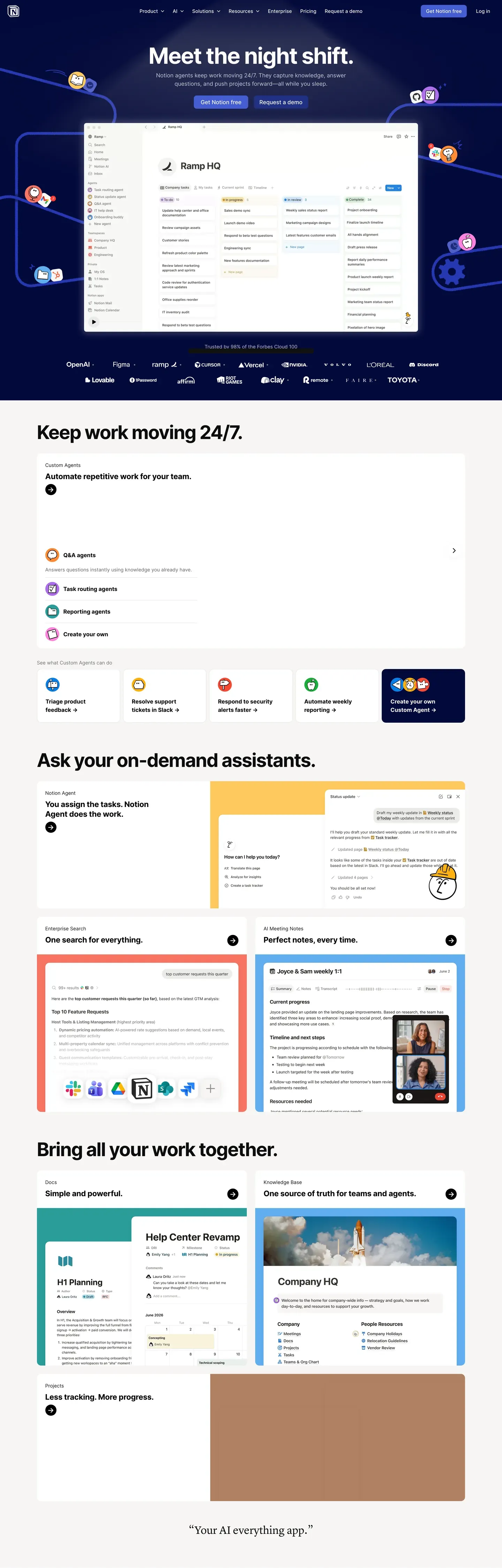
Notion's design system reads as a workspace, not a marketing site. The homepage opens with "Meet the night shift." centered over a deep navy band ("#0a1530") decorated with brand-colored sticky-note dots and mesh wire illustrations — atmosphere rather than chrome. The dominant action is a single purple pill button at "#5645d4", and a real "Ramp HQ" kanban mockup floats below the buttons with a 24px diffuse drop shadow. The voice is confident and illustration-rich without leaning maximalist.
This DESIGN.md packages the whole spec into one machine-readable file. Inside: 47 colors tokens grouped into brand purples, a 10-color brand spectrum, 9 pastel card tints, surface, hairline, text, and semantic scales; 17 typography tokens running Notion Sans (Inter-based) from 80px hero-display down to 11px micro-uppercase; 8 corner radii from 4px chips to 24px feature cards; 12 spacing tokens up to 120px hero gutters; and 50+ components covering buttons, pastel feature cards (peach, rose, mint, lavender, sky, yellow, cream), inputs, pill and segmented tabs, badges, the 4-tier pricing comparison, the embedded workspace mockup, FAQ accordions, and the multi-column footer. Format follows the Google Labs DESIGN.md spec.
A working React developer feeds this file to Claude, Cursor, or Copilot and gets components that match Notion's discipline — rectangular 8px buttons, 12px-rounded cards, purple reserved for one CTA per page, navy bands paired with sticky-note decoration — instead of a generic shadcn theme. Reference the tokens directly inside Tailwind config, CSS variables, or your own component library. The system is worth studying for one reason: it proves that "all-in-one workspace" branding can be illustration-rich and colorful without resorting to gradient bling or pill-button-everywhere uniformity.
What makes it distinct
5
- Signature purple voltage#5645d4 reserved for the dominant 'Get Notion free' CTA, never decorative
- Deep navy #0a1530 hero band with scattered sticky-note dots and mesh wire illustrations
- Nine pastel card tintspeach, rose, mint, lavender, sky, yellow, cream, gray, plus bold yellow #f9e79f
- Rectangular 8px buttons, not pillssober-editorial geometry distinguishes it from Stripe and Linear
- Live workspace mockup card embedded in the hero with a 24px diffuse drop shadow
notion.com
Live at notion.com
A snapshot of the brand in production. Scroll the frame to see the whole page.
Colors
47 colors
Notion's system runs on #5645d4 as its primary voltage, used in 3 of 50 components. Type is set in Notion Sans across 17 tokens from 11px to 80px, weights 400–600. Shape language is mixed across 50 components, blending pills, soft rounds, and squarer corners.
Brand & Accent
Sparing, CTA-only voltage · 17
Surface
Page and card backgrounds · 3
Text
Headlines, body, captions · 8
Borders & Hairlines
Dividers, outlines, rules · 3
Semantic
Status, errors, success, links · 3
Other
Specialty colors · 13
Typography
17 type tokens
Set in Notion Sans across 17 tokens, from 11px to 80px, weights 400–600. Shown in its own stack: where the font isn't installed, the fallback the file names stands in.
- hero-display80px · weight 600 · lh 1.05 · tracking -2pxThe quick brown fox jumps over the lazy dog
- display-lg56px · weight 600 · lh 1.1 · tracking -1pxThe quick brown fox jumps over the lazy dog
- heading-148px · weight 600 · lh 1.15 · tracking -0.5pxThe quick brown fox jumps over the lazy dog
- heading-236px · weight 600 · lh 1.2 · tracking -0.5pxThe quick brown fox jumps over the lazy dog
- heading-328px · weight 600 · lh 1.25The quick brown fox jumps over the lazy dog
- heading-422px · weight 600 · lh 1.3The quick brown fox jumps over the lazy dog
- heading-518px · weight 600 · lh 1.4The quick brown fox jumps over the lazy dog
- subtitle18px · weight 400 · lh 1.5The quick brown fox jumps over the lazy dog
- body-md16px · weight 400 · lh 1.55The quick brown fox jumps over the lazy dog
- body-md-medium16px · weight 500 · lh 1.55The quick brown fox jumps over the lazy dog
- body-sm14px · weight 400 · lh 1.5The quick brown fox jumps over the lazy dog
- body-sm-medium14px · weight 500 · lh 1.5The quick brown fox jumps over the lazy dog
- caption13px · weight 400 · lh 1.4The quick brown fox jumps over the lazy dog
- caption-bold13px · weight 600 · lh 1.4The quick brown fox jumps over the lazy dog
- micro12px · weight 500 · lh 1.4The quick brown fox jumps over the lazy dog
- micro-uppercase11px · weight 600 · lh 1.4 · tracking 1pxThe quick brown fox jumps over the lazy dog
- button-md14px · weight 500 · lh 1.3The quick brown fox jumps over the lazy dog
Layout
Radii and spacing
8 corner radii and 12 spacing values. Shape language: mixed.
Radii
- xs4px
- sm6px
- md8px
- lg12px
- xl16px
- xxl20px
- xxxl24px
- full9999px
Spacing
- xxs4px
- xs8px
- sm12px
- md16px
- lg20px
- xl24px
- xxl32px
- xxxl40px
- section-sm48px
- section64px
- section-lg96px
- hero120px
Components
50 components
Each rendered from its tokens (color, type, radius, padding) on Notion's own canvas.
- Button Primarybutton-primaryButton Primary
- Button Primary Pressedbutton-primary-pressedButton Primary Pressed
- Button Primary Disabledbutton-primary-disabledButton Primary Disabled
- Button Darkbutton-darkButton Dark
- Button Secondarybutton-secondaryButton Secondary
- Button On Darkbutton-on-darkButton On Dark
- Button Secondary On Darkbutton-secondary-on-darkButton Secondary On Dark
- Button Ghostbutton-ghostButton Ghost
- Button Linkbutton-linkButton Link
- Card Basecard-baseCard Base
- Card Featurecard-featureCard Feature
- Card Feature Yellow Boldcard-feature-yellow-boldCard Feature Yellow Bold
- Card Feature Peachcard-feature-peachCard Feature Peach
- Card Feature Rosecard-feature-roseCard Feature Rose
- Card Feature Mintcard-feature-mintCard Feature Mint
- Card Feature Skycard-feature-skyCard Feature Sky
- Card Feature Lavendercard-feature-lavenderCard Feature Lavender
- Card Feature Yellowcard-feature-yellowCard Feature Yellow
- Card Feature Creamcard-feature-creamCard Feature Cream
- Card Agent Tilecard-agent-tileCard Agent Tile
- Card Templatecard-templateCard Template
- Card Startup Perkcard-startup-perkCard Startup Perk
- Pricing Cardpricing-cardPricing Card
- Pricing Card Featuredpricing-card-featuredPricing Card Featured
- Type here…text-inputText Input
- Type here…text-input-focusedText Input Focused
- Search Pillsearch-pillSearch Pill
- Pill Tabpill-tabPill Tab
- Pill Tab Activepill-tab-activePill Tab Active
- Segmented Tabsegmented-tabSegmented Tab
- Segmented Tab Activesegmented-tab-activeSegmented Tab Active
- Badge Purplebadge-purpleBadge Purple
- Badge Pinkbadge-pinkBadge Pink
- Badge Orangebadge-orangeBadge Orange
- Badge Tag Purplebadge-tag-purpleBadge Tag Purple
- Badge Tag Orangebadge-tag-orangeBadge Tag Orange
- Badge Tag Greenbadge-tag-greenBadge Tag Green
- Badge Popularbadge-popularBadge Popular
- Promo Bannerpromo-bannerPromo Banner
- Hero Band Darkhero-band-darkHero Band Dark
- Workspace Mockup Cardworkspace-mockup-cardWorkspace Mockup Card
- Cta Banner Lightcta-banner-lightCta Banner Light
- Comparison Tablecomparison-tableComparison Table
- Comparison Rowcomparison-rowComparison Row
- Testimonial Cardtestimonial-cardTestimonial Card
- Logo Wall Itemlogo-wall-itemLogo Wall Item
- Faq Accordion Itemfaq-accordion-itemFaq Accordion Item
- Stat Rowstat-rowStat Row
- Footer Regionfooter-regionFooter Region
- Footer Linkfooter-linkFooter Link
In use
The system, in use
Notion's tokens on the kind of product it builds.
Build something people actually use.
A short paragraph of marketing copy that previews how the brand's display tier and body tier read together. Two sentences is usually enough.
FAQ
Notion design system FAQ
Common questions about Notion's tokens, components, and how to use this DESIGN.md in your project.
Read next
Related reading
Specs, directories, and component libraries that pair with this design system.
Use it
Use Notion in your project
One machine-readable file. Drop it into Claude, Cursor, or any AI tool that reads DESIGN.md.
Download the DESIGN.md
One machine-readable file: every color, type, radius, spacing, and component token of Notion.
Feed it to your AI tool
Drop it into Claude, Cursor, or GitHub Copilot. The agent writes React components and Tailwind classes that match Notion's visual language.
Reference the tokens directly
Or paste the values into your Tailwind config, CSS variables, or component library: every color, size and radius is a quoted, ready-to-copy value.
Read the full DESIGN.md: overview, rationale, do’s and don’ts
Overview
Notion presents itself as the all-in-one workspace through a confident, illustration-rich brand voice. The homepage opens with "Meet the night shift." rendered centered over a deep navy hero band ("#0a1530"), decorated with brand-colored sticky-note dots and mesh wire illustrations scattered around the headline. The signature purple pill primary CTA ("#5645d4") "Get Notion free" sits at the visual center, paired with an outlined "Request a demo" secondary. Below the buttons, a real Notion workspace UI mockup card (the "Ramp HQ" kanban board) breaks out of the hero band with a deep diffuse drop shadow.
Below the hero, the page cycles through a distinctive sequence of feature sections: a dense sticky-note "Keep work moving 24/7" panel with red/blue/green/purple/teal status icons; a bold yellow ("#f9e79f") "Ask your on-demand assistants" banner card flanked by orange/rose/mint pastel feature tiles showing assistant UI mockups; and a "Bring all your work together" 3-column grid with brand-colored mockups (sky-blue tutorial card, light Notion calendar, brown/rust testimonial slate). The pricing page renders 4 tiers (Free / Plus / Business / Enterprise) horizontally with one tier featured (purple-bordered) and a dense feature comparison table running below.
The system uses a Notion-Sans typeface (Inter-based) across every UI surface — humanist-geometric character that pairs naturally with the colorful illustrations. Buttons are 8px rectangles, NOT pills — distinguishing Notion's sober rectangular geometry from competitors that use pills universally. Cards use 12px corner rounding consistently.
Key Characteristics:
- Deep navy hero band ("#0a1530") with scattered sticky-note dots + mesh wire decorative illustrations
- Signature purple pill ("#5645d4") primary CTA — Notion's recognizable "Get Notion free" button color
- Real Notion workspace UI mockup card embedded in the hero with deep drop shadow
- Bold yellow feature banner ("#f9e79f") for high-emphasis content sections
- Pastel feature card palette (peach, rose, mint, lavender, sky, yellow) echoing the live product database properties
- Notion-Sans (Inter-based) across every UI surface
- 8px-rounded buttons (NOT pills), 12px-rounded cards — sober editorial geometry
- 4-tier pricing comparison with dense feature table
- Centered hero layout (different from the left-aligned norm of most B2B SaaS)
Known Gaps
- Specific dark-mode token values not surfaced beyond hero bands
- Animation/transition timings not extracted; recommend 150–200ms ease
- Form validation success state not explicitly captured
- Pastel-tint mapping (which feature uses which tint) is observation-based — the actual brand library may have more entries
Productivity & SaaS
More systems like this
More DESIGN.md files in Productivity & SaaS.
Pricing
Build it with Pro
The DESIGN.md files are free. Pro adds 6,000+ blocks, premium templates and the MCP server, so your AI editor builds in your system for you.
4.9/5 out of 5 · 150+ reviewsfrom 150+ founders and developers.
Billing
Billed once a year in USD. Cancel anytime.
- How many people can use the license.
- Client work, SaaS products and anything you charge for.
- Production-ready React sections: hero, pricing, features, dashboards and more.
- Complete multi-page sites you can ship as they are.
- React icons from every major library, installable with one command.
- Presets that restyle every block, in light and dark.
- Lets your AI editor search, preview and install blocks for you.
- Priority requests are answered first.
Individual
For personal projects & open source
$32instead of $49/mo
$389 billed yearly
- Seats: 1 seat
- Commercial use: Personal & open source only
- Pro blocks: 6,000+ blocks
- Templates: All 14 templates
- React icons: 294k+ icons
- Themes: All 59 themes
- MCP server: Basic usage
- Support: Standard
Team
Most popularFor freelancers, agencies & startups
$66instead of $99/mo
$789 billed yearly · ≈ $13/dev/mo
- Seats: Up to 5 seats
- Commercial use: Included
- Pro blocks: 6,000+ blocks
- Templates: All 14 templates
- React icons: 294k+ icons
- Themes: All 59 themes
- MCP server: High usage
- Support: Priority
Organization
For companies with larger teams
$132instead of $199/mo
$1,589 billed yearly
- Seats: Unlimited seats
- Commercial use: Included
- Pro blocks: 6,000+ blocks
- Templates: All 14 templates
- React icons: 294k+ icons
- Themes: All 59 themes
- MCP server: Unlimited usage
- Support: Priority
Billed once a year in USD. Cancel anytime.
Individual
For personal projects & open source
$32instead of $49/mo
$389 billed yearly
- How many people can use the license.Seats: 1 seat
- Client work, SaaS products and anything you charge for.Commercial use: Personal & open source only
- Production-ready React sections: hero, pricing, features, dashboards and more.Pro blocks: 6,000+ blocks
- Complete multi-page sites you can ship as they are.Templates: All 14 templates
- React icons from every major library, installable with one command.React icons: 294k+ icons
- Presets that restyle every block, in light and dark.Themes: All 59 themes
- Lets your AI editor search, preview and install blocks for you.MCP server: Basic usage
- Priority requests are answered first.Support: Standard
Team
Most popularFor freelancers, agencies & startups
$66instead of $99/mo
$789 billed yearly · ≈ $13/dev/mo
Everything in Individual, plus
- How many people can use the license.Seats: Up to 5 seats
- Client work, SaaS products and anything you charge for.Commercial use: Included
- Lets your AI editor search, preview and install blocks for you.MCP server: High usage
- Priority requests are answered first.Support: Priority
Organization
For companies with larger teams
$132instead of $199/mo
$1,589 billed yearly
Everything in Team, plus
- How many people can use the license.Seats: Unlimited seats
- Lets your AI editor search, preview and install blocks for you.MCP server: Unlimited usage
- Secure checkout via Stripe
- Code lives in your repo
- Keep what you've shipped if you cancel
- License terms
Your system, built for you
Every block, template and icon, installed by your AI agent in your design system. The DESIGN.md files stay free.