Netflix Design System
Netflix's design system as a DESIGN.md file. Red #e50914, Netflix Sans, 18 colors, 18 components. For React, Next.js, and AI tools.
Add shadcn.io to your AI agent. · Pro It installs blocks, icons and templates in your design system from a prompt, with Pro.
Set up MCP- Primary
- #e50914
- Typeface
- Netflix Sans
- Shape
- Mixed
- Base radius
- 8px
- Colors
- 18
- Type tokens
- 8
- Components
- 18
- Spacing values
- 9
About
About Netflix DESIGN.md
Curated by Dov Azencot · Updated May 13, 2026 · Source netflix.com (opens in a new tab)
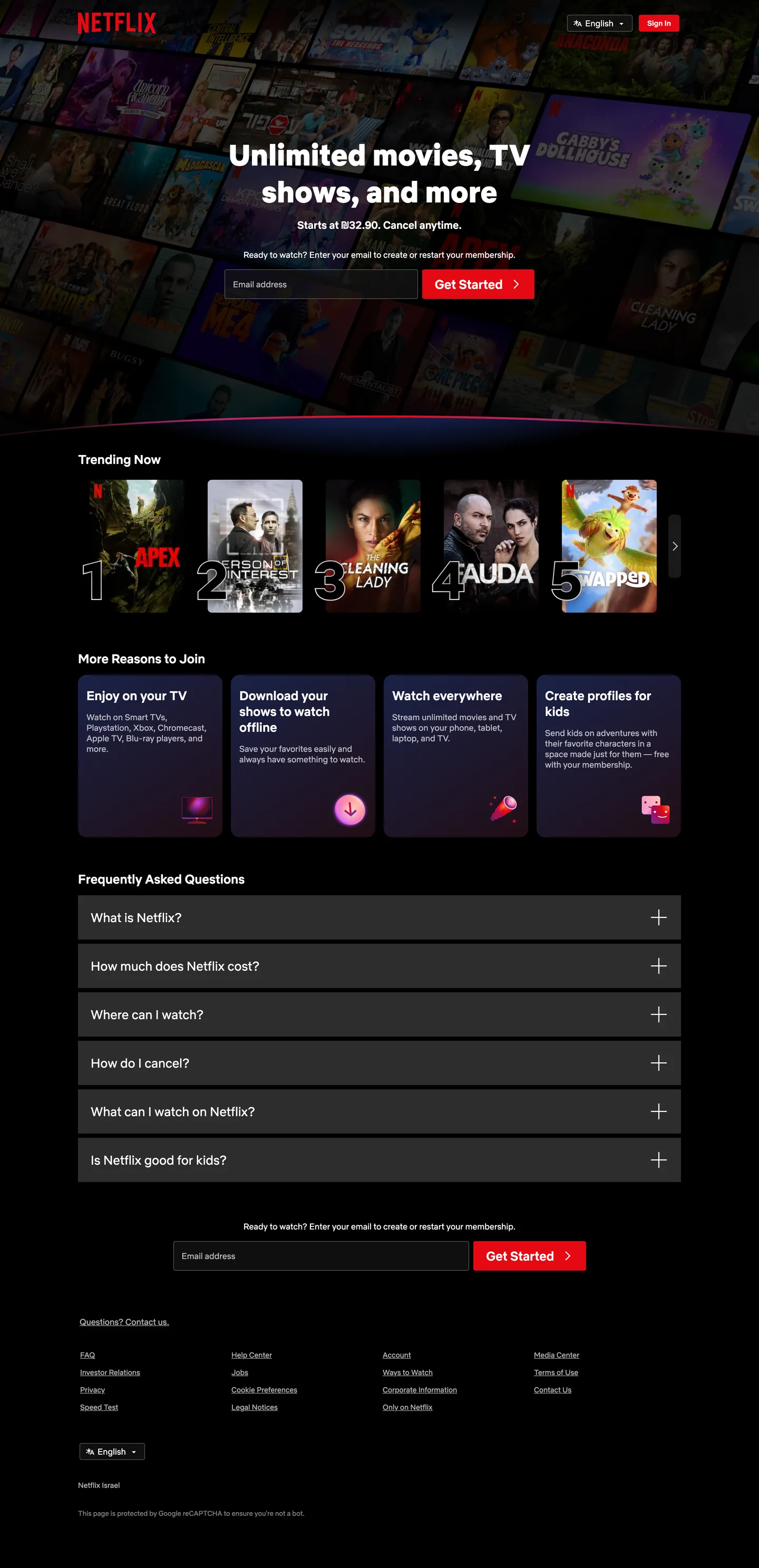
Netflix's sign-up page is a movie theater before the lights come up. The canvas is pure "#000000" with three charcoal surfaces — "#161616" for the trending rail backdrop, "#232323" for the FAQ accordion and feature cards, "#2d2d2d" for the inline email field — stacked so that movie-poster artwork is the only object on the page carrying chroma. Netflix Red ("#e50914") appears in exactly three places: the "Get Started" CTA pill, the top-right Sign In button, and the play-triangle glyph inside the rotating logo. Where streaming competitors crowd the homepage with feature shelves, marketing chrome, and hover affordances, Netflix runs a four-section funnel — hero, trending poster carousel, four reasons-to-join cards, FAQ accordion — that ends every screen in the same email-and-Get-Started field.
This page packages the Netflix homepage chrome into a single DESIGN.md file built on the Google Labs spec. Inside: 18 colors tokens grouped into brand, surface, ink, hairline, and gradient roles; 8 typography levels in a tight 13px–56px range; 5 corner radii anchored on the dominant "8px"; a 9-step spacing scale; and 18 components recipes covering the red CTA pill, dark accordion rows, gradient poster rail, vertical-stacked feature cards, and the inline email-capture field. The extraction picked up zero CSS custom properties on ":root" — Netflix ships its homepage with hex literals on inline styles rather than a token API, so every value here is a render-time measurement.
Feed the file to Claude, Cursor, or GitHub Copilot and the agent writes signup-funnel components that match Netflix's vocabulary — weight 900 hero on cinema-black, single-pill red CTA, "8px" rounded charcoal cards with FAQ accordion — rather than a generic SaaS landing template. Or reference the tokens directly: every hex, font stack, radius, and spacing value is a quoted DESIGN.md value ready for Tailwind config, CSS variables, or your own component library. The system is worth studying as the strict end of single-voltage marketing — one red, one font family, one corner radius, four sections — designed to make every visitor end at the same email field.
What makes it distinct
5
- Cinema-black canvaspure black ('#000000') page with three charcoal cards ('#161616', '#232323', '#2d2d2d') so movie posters carry all chroma
- Single-shot red voltageNetflix Red ('#e50914') restricted to the Get Started pill, Sign In button, and play glyph; never on hairlines or text
- Weight 900 hero with weight 400 bodya heavyweight Netflix Sans display sits on top of a thin body, no intermediate display tier
- Gradient wash poster raildeep navy ('#192247') into burgundy ('#461518') sits behind the trending row, the only place gradients live
- Eight-pixel rounding everywherebuttons, accordion FAQ rows, feature cards, and email input share one '8px' radius (44 of 71 measurements)
netflix.com
Live at netflix.com
A snapshot of the brand in production. Scroll the frame to see the whole page.
Colors
18 colors
Netflix's system runs on #e50914 as its primary voltage, used in 3 of 18 components. Type is set in Netflix Sans across 8 tokens from 13px to 56px, weights 400–900. Shape language is mixed across 18 components, blending pills, soft rounds, and squarer corners.
Brand & Accent
Sparing, CTA-only voltage · 5
Surface
Page and card backgrounds · 5
Text
Headlines, body, captions · 4
Borders & Hairlines
Dividers, outlines, rules · 3
Other
Specialty colors · 1
Typography
8 type tokens
Set in Netflix Sans across 8 tokens, from 13px to 56px, weights 400–900. Shown in its own stack: where the font isn't installed, the fallback the file names stands in.
- hero-display56px · weight 900 · lh 70px · tracking normalThe quick brown fox jumps over the lazy dog
- section-title24px · weight 500 · lh normal · tracking normalThe quick brown fox jumps over the lazy dog
- accordion-title24px · weight 400 · lh normal · tracking normalThe quick brown fox jumps over the lazy dog
- body-emphasis20px · weight 500 · lh normal · tracking normalThe quick brown fox jumps over the lazy dog
- body-base16px · weight 400 · lh 24px · tracking normalThe quick brown fox jumps over the lazy dog
- body-sm14px · weight 400 · lh 21px · tracking normalThe quick brown fox jumps over the lazy dog
- button-label24px · weight 500 · lh 24px · tracking normalThe quick brown fox jumps over the lazy dog
- legal-caption13px · weight 400 · lh normal · tracking normalThe quick brown fox jumps over the lazy dog
Layout
Radii and spacing
5 corner radii and 9 spacing values. Shape language: mixed.
Radii
- none0px
- hairline2px
- xs4px
- md8px
- lg16px
Spacing
- xxs2px
- xs3px
- sm8px
- md12px
- base16px
- lg24px
- xl64px
- card8px 22px
- rail0px 148px
Components
18 components
Each rendered from its tokens (color, type, radius, padding) on Netflix's own canvas.
- Button Cta Redbutton-cta-redButton Cta Red
- Button Signin Redbutton-signin-redButton Signin Red
- Button Secondarybutton-secondaryButton Secondary
- Email Inputemail-inputEmail Input
- Feature Cardfeature-cardFeature Card
- Faq Rowfaq-rowFaq Row
- Faq Row Expandedfaq-row-expandedFaq Row Expanded
- Hero Sectionhero-sectionHero Section
- Trending Railtrending-railTrending Rail
- Poster Tileposter-tilePoster Tile
- Rank Numeralrank-numeralRank Numeral
- Language Pickerlanguage-pickerLanguage Picker
- Icon Card Miniicon-card-miniIcon Card Mini
- Top Navtop-navTop Nav
- Footer Bandfooter-bandFooter Band
- DividerdividerDivider
- Logo Glyphlogo-glyphLogo Glyph
- Legal Captionlegal-captionLegal Caption
In use
The system, in use
Netflix's tokens on the kind of product it builds.
Build something people actually use.
A short paragraph of marketing copy that previews how the brand's display tier and body tier read together. Two sentences is usually enough.
FAQ
Netflix design system FAQ
Common questions about Netflix's tokens, components, and how to use this DESIGN.md in your project.
Read next
Related reading
Specs, directories, and component libraries that pair with this design system.
- Browse all design systemsThe full directory of DESIGN.md files on shadcn.io, with live mockups for each.shadcn.io
- Netflix — official siteThe streaming homepage this DESIGN.md was extracted from.netflix.com (opens in a new tab)
- The DESIGN.md specificationGoogle Labs' open spec for machine-readable design system files — the format this page is built on.github.com (opens in a new tab)
Use it
Use Netflix in your project
One machine-readable file. Drop it into Claude, Cursor, or any AI tool that reads DESIGN.md.
Download the DESIGN.md
One machine-readable file: every color, type, radius, spacing, and component token of Netflix.
Feed it to your AI tool
Drop it into Claude, Cursor, or GitHub Copilot. The agent writes React components and Tailwind classes that match Netflix's visual language.
Reference the tokens directly
Or paste the values into your Tailwind config, CSS variables, or component library: every color, size and radius is a quoted, ready-to-copy value.
Read the full DESIGN.md: overview, rationale, do’s and don’ts
Overview
Netflix's signup-funnel chrome is a movie theater before the lights come up — pure black canvas, a single red ticket-pill, and movie-poster thumbnails carrying every drop of color on the page. The base layer is "#000000", three achromatic charcoals stack the cards ("#161616" for the trending rail backdrop, "#232323" for the FAQ accordion and feature grid, "#2d2d2d" for the inline email field), and Netflix Red ("#e50914") appears in exactly three places out of 71 measured surfaces: the "Get Started" CTA pill, the top-right Sign In button, and the play-glyph inside the rotating-N logo.
Type runs Netflix Sans with a 'Helvetica Neue', 'Segoe UI', Roboto, Ubuntu fallback stack. The hero "Unlimited movies, TV shows, and more" lands at "56px" / weight 900 with a 70px line-height — the system's only weight-900 token. Section heads ("Trending Now", "More Reasons to Join") run "24px" / weight 500. Body, navigation, and form labels live at 14–16px / weight 400. Weight as silhouette: where most streaming brands carry a mid-weight 600–700 display tier, Netflix jumps directly from weight 900 to weight 400 — the gap is the brand voice. The intermediate weights simply don't exist on this page.
The shape language is one radius: "8px" appears on 44 of 71 measured corners. Buttons, FAQ accordion rows, feature cards, the inline email ticket, and icon-card mini-buttons all share the same rounding. Where Spotify uses pills, Stripe uses 6–8px, and Apple uses near-square, Netflix uses one card-shape and reuses it everywhere — the trending rail thumbnails, the four reasons-to-join cards, and the Get Started CTA are visually the same family. The remaining radii are scoped: "2px" (16 occurrences) for thin focus accents, "4px" (7) for the language-picker chevron, and "16px" (4) for the rotating-N logo container.
Key Characteristics:
- Cinema-black canvas:
{colors.canvas}("#000000") base,{colors.surface-deep}("#161616") for the trending rail backdrop,{colors.surface-card}("#232323") for FAQ and feature cards,{colors.surface-input}("#2d2d2d") for the inline email field. - Single-voltage red:
{colors.brand-red}("#e50914") used only in three places — the CTA pill ({component.button-cta-red}), top-right Sign In ({component.button-signin-red}), and the logo-glyph play triangle ({component.logo-glyph}). Never on hairlines, never on text, never on background panels. - Heavy-to-thin weight binary: 900 for the hero, 400 for body — no intermediate display tier. Section heads at weight 500 are the only middle-ground token.
- One-radius card family: "8px" on 44 surfaces (
{rounded.md}). Pills, FAQ rows, feature cards, and the email ticket are all the same shape. - Gradient wash poster rail: deep navy
{colors.brand-navy}("#192247") into wine{colors.gradient-wine}("#210e17") into burgundy{colors.brand-burgundy}("#461518") behind the trending rail — the only gradient on the page. Every other surface is flat. - Outline-stroked rank numerals: the "1", "2", "3", "4" labels behind trending posters are giant outline-only glyphs in
{typography.hero-display}size, stroked rather than filled — the page's most distinctive type detail. - Tall touch targets on dark: the inline email input is 56px tall with "24px 16px 8px" floating-label padding — sized for thumbs, not for visual lightness.
Colors
Brand & Accent
- Netflix Red (
{colors.brand-red}— "#e50914") — frequency 3. Used as background (3), text (0), border (0). The single voltage color — appears only on the Get Started CTA, the Sign In button, and the play-glyph inside the rotating-N logo. Never on backgrounds beyond a button, never on text, never on hairlines. - Brand Burgundy (
{colors.brand-burgundy}— "#461518") — frequency 2. Used as gradient (2). The right-stop of the trending-rail wash, sitting under the giant outline rank numerals. - Brand Oxblood (
{colors.brand-oxblood}— "#6f181d") — frequency 1. Used as gradient (1). The far-right accent in the trending-rail gradient — a deeper crimson than the burgundy stop, appearing once. - Brand Navy (
{colors.brand-navy}— "#192247") — frequency 4. Used as gradient (4). The left-stop of the trending-rail wash — a deep blue that warms the otherwise pure-black canvas under the poster row. - Brand Electric (
{colors.brand-electric}— "#4061e7") — frequency 1. Used as gradient (1). A single appearance inside the rotating-N logo gradient ramp — kept off everywhere else on the marketing page.
Surface
- Canvas (
{colors.canvas}— "#000000") — frequency 44. Used as background (4), gradient (26), border (7), text (7). The page base — every section, the top nav, the legal footer, and the language-picker chevron all sit on "#000000". - Surface Deep (
{colors.surface-deep}— "#161616") — frequency 4. Used as background (4). The trending-rail container — one step lighter than canvas so the poster thumbnails don't sit on absolute black. - Surface Card (
{colors.surface-card}— "#232323") — frequency 30. Used as background (30). The dominant card surface — FAQ accordion rows, the four feature cards, and the secondary action buttons all rest on this tone. - Surface Input (
{colors.surface-input}— "#2d2d2d") — frequency 6. Used as background (6). The inline email-capture field fill — sits one step above the FAQ card surface to read as interactive.
Gradient
- Gradient Wine (
{colors.gradient-wine}— "#210e17") — frequency 4. Used as gradient (4). The middle stop of the trending-rail wash — a dark plum that mediates between navy and burgundy.
Text & Ink
- White (
{colors.ink-base}— "#ffffff") — frequency 538. Used as text (272), border (265), bg (1). The dominant text color — every heading, every button label, every nav link, every FAQ title sits in white on dark. - Ink Muted (
{colors.ink-muted}— "#808080") — frequency 4. Used as border (4). Secondary text and footer legal copy — used for the small "Ready to watch?" caption and the copyright strip.
Hairlines
- Hairline Dim (
{colors.hairline-dim}— "#414141") — frequency 20. Used as text (10), border (10). The default 1px border tone on buttons at rest and on the language-picker dropdown frame.
Typography
Font Family
The system runs Netflix Sans for every visible string, with a fallback stack of 'Helvetica Neue', 'Segoe UI', Roboto, Ubuntu, sans-serif. Netflix Sans is the company's proprietary humanist sans, designed in-house and licensed only to Netflix. There is no secondary serif, no monospace tier, no display-only variant — every weight from 400 to 900 is the same Netflix Sans family.
Hierarchy
| Token | Size | Weight | Line Height | Use |
|---|---|---|---|---|
{typography.hero-display} | 56px | 900 | 70px | The single hero headline "Unlimited movies, TV shows, and more" |
{typography.section-title} | 24px | 500 | normal | Section heads — "Trending Now", "More Reasons to Join" |
{typography.accordion-title} | 24px | 400 | normal | FAQ accordion row titles — "What is Netflix?" |
{typography.button-label} | 24px | 500 | 24px | The Get Started CTA pill label |
{typography.body-emphasis} | 20px | 500 | normal | The "Ready to watch?" lead-in caption |
{typography.body-base} | 16px | 400 | 24px | Standard body text — feature card descriptions, form labels |
{typography.body-sm} | 14px | 400 | 21px | Navigation links, footer columns, language picker |
{typography.legal-caption} | 13px | 400 | normal | The smallest text — the copyright line |
Principles
Weight as silhouette: the page jumps from weight 900 (the single hero) to weight 400 (everything else). The only intermediate weight is 500, scoped to section heads, the Get Started label, and the "Ready to watch?" lead-in. There is no weight 600 or 700 anywhere — the gap between display and body is the brand voice.
Where most streaming and SaaS marketing pages run a four- or five-step weight ladder (300 / 400 / 500 / 600 / 700), Netflix runs a binary plus one mid-tone. The hero feels much heavier than its competitors because it has no weight 700 sibling to soften the contrast.
The full size range is 13px–56px — wide because the hero is unusually large for a marketing page, but compressed in the body (13–24px) for everything below the fold.
Note on Font Substitutes
If Netflix Sans is unavailable, Helvetica Now Display Black is the closest proprietary substitute at the hero weight, and Inter at weight 900 is the closest open-source option. The key move is preserving the gap — pick a weight-900 display and a weight-400 body and skip the intermediate tiers, rather than running a four-step ladder.
Layout
Spacing System
- Base unit: 8px (with 2–3px micro-steps and a 24/64px section-scale).
- Tokens:
{spacing.xxs}"2px" ·{spacing.xs}"3px" ·{spacing.sm}"8px" ·{spacing.md}"12px" ·{spacing.base}"16px" ·{spacing.lg}"24px" ·{spacing.xl}"64px" ·{spacing.card}"8px 22px" (button) ·{spacing.rail}"0px 148px" (page gutters). - Card internal padding:
{spacing.lg}(24px) for FAQ accordion rows;"24px 16px 128px"for the feature cards (extra bottom padding leaves room for an oversized illustration below the text). - Section gutters:
{spacing.xl}(64px) between major sections;"0px 148px"as the page-level horizontal gutter — generous because the layout is single-column at 1440 width.
Grid & Container
- Single-column funnel: four stacked sections — hero, trending rail, four-card reasons-to-join grid, FAQ accordion. The layout is intentionally linear; there is no sidebar, no fixed nav, no in-page jump links.
- Trending rail: five-column horizontal scroll of poster thumbnails with giant outline-stroked rank numerals layered behind them — the only horizontal scroll on the page.
- Reasons-to-join grid: four equal columns at desktop ("Enjoy on your TV", "Download your shows", "Watch everywhere", "Create profiles for kids") with a stacked-illustration bottom.
- FAQ accordion: six rows stacked vertically, each a
{component.faq-row}card with a + chevron right-aligned. - Email capture: repeated in both the hero and below the FAQ — same
{component.email-input}+{component.button-cta-red}pair in both spots.
Whitespace Philosophy
The system favors vertical breathing room over horizontal density. Section gutters are "64px" tall, FAQ rows carry "24px" internal padding, and feature cards add "128px" of bottom padding to make room for an illustration. The horizontal page gutter is "148px" at 1440 width — almost a fifth of the viewport on each side. The page reads as tall and spacious, not packed; the dark canvas does the visual work of holding sections apart, and the gutters keep the funnel feeling intentional rather than crammed.
Elevation
| Level | Treatment | Use |
|---|---|---|
| Base (Level 0) | Flat {colors.canvas} ("#000000") | Page background, top nav, footer |
| Surface (Level 1) | Flat {colors.surface-deep} ("#161616") | Trending rail backdrop |
| Surface (Level 2) | Flat {colors.surface-card} ("#232323") | FAQ accordion rows, feature cards, secondary buttons |
| Surface (Level 3) | Flat {colors.surface-input} ("#2d2d2d") | Inline email-capture field |
| Gradient wash | Navy → wine → burgundy linear gradient | Trending-rail backdrop only |
Shadow Philosophy: the extracted page carries zero box-shadow declarations across measured surfaces. Depth comes entirely from the four-step charcoal ladder: black canvas → 161616 deep → 232323 card → 2d2d2d input. Where Spotify uses heavy 0.5-opacity shadows on near-black to lift dialogs, Netflix relies on tone steps and the gradient wash under the poster rail — the page reads as flat planes stacked by lightness, not as floating cards. The only "depth" effect anywhere is the trending-rail gradient itself, which serves as a backdrop rather than as a shadow.
Components
Buttons
button-cta-red — {colors.brand-red} ("#e50914") fill, {colors.on-red} ("#ffffff") text, "8px" radius ({rounded.md}), "8px 22px" padding. The signature Get Started pill — appears once in the hero email-capture and once in the post-FAQ band. Carries the {typography.button-label} token at "24px" / weight 500.
button-signin-red — {colors.brand-red} ("#e50914") fill, white text, "4px" radius ({rounded.xs}), "4px 16px" padding. The smaller top-right Sign In affordance in the nav — uses the same red as the CTA pill but a tighter radius and {typography.body-base} for a quieter visual weight.
button-secondary — {colors.surface-card} ("#232323") fill, white text, "8px" radius, "8px 22px" padding, no visible border. Used for non-CTA actions (e.g. "Watch on Mobile" hover affordances) — same shape as the red CTA, different fill.
Inputs
email-input — {colors.surface-input} ("#2d2d2d") fill, white text, "8px" radius, "24px 16px 8px" floating-label padding, "56px" tall. The signature inline email-capture field. The asymmetric padding leaves room for the floating "Email address" label that slides up when the field is focused. Same field appears twice on the page — once in the hero, once below the FAQ.
Cards & Surfaces
feature-card — {colors.surface-card} ("#232323") fill, white text, "8px" radius, "24px 16px 128px" padding (heavy bottom padding for the illustration). The four reasons-to-join tiles ("Enjoy on your TV", "Download your shows", "Watch everywhere", "Create profiles for kids"). Each carries a title in {typography.section-title} and body in {typography.body-base}.
faq-row — {colors.surface-card} ("#232323") fill, white text, "8px" radius, "24px" padding. One row of the six-row Frequently Asked Questions accordion. Each row has a left-aligned title in {typography.accordion-title} ("24px" / weight 400) and a right-aligned "+" chevron.
faq-row-expanded — Same fill and shape as {component.faq-row}, but the chevron rotates to an × and the body text below the title appears in {typography.body-base}. Rows expand inline rather than overlapping.
Hero & Sections
hero-section — {colors.canvas} ("#000000") background, white text, "100px 0px 0px" top padding. Houses the hero headline ({typography.hero-display}), the "Ready to watch?" caption ({typography.body-emphasis}), and the email-input + red-CTA pair.
trending-rail — {colors.surface-deep} ("#161616") base with a horizontal gradient wash over it ({colors.brand-navy} → {colors.gradient-wine} → {colors.brand-burgundy} → {colors.brand-oxblood}). "64px" padding. Houses the five-poster scroll and the giant outline rank numerals layered behind.
poster-tile — Black-edged thumbnail with an "8px" clipped radius. No visible card frame; the corner clipping is the only chrome around the movie artwork.
rank-numeral — Giant outline-stroked numeral ("1", "2", "3", "4") rendered in the {typography.hero-display} token's metrics but stroke-only, layered behind the poster tile. The most distinctive type detail on the page — Netflix's signature trending-row treatment.
Navigation & Footer
top-nav — {colors.canvas} ("#000000") fill, white text, "16px 0px 0px" padding. Houses the Netflix logo top-left, the language picker, and the red Sign In button top-right. No drop shadow, no border separator — sits flush on the canvas.
footer-band — {colors.canvas} fill, {colors.ink-muted} ("#808080") text in {typography.body-sm}, "0px 148px" horizontal padding. The four-column footer at page bottom — Questions / Help Center / Account / Investor Relations links.
legal-caption — {colors.canvas} fill, {colors.ink-muted} text in {typography.legal-caption} ("13px" / weight 400). The single line at the very bottom — "Netflix Israel" copyright and reCAPTCHA legal text.
Utility
icon-card-mini — {colors.surface-card} ("#232323") fill, white text, "8px" radius, "12px 24px" padding. Small floating-illustration cards inside the feature tiles (e.g., the spinning disc with "Downloading…" label, the Wi-Fi icon with "Children" label).
language-picker — {colors.canvas} fill, white text, "4px" radius ({rounded.xs}), "6px 36px 6px 34px" asymmetric padding (extra left for the globe icon, extra right for the chevron). Carries {typography.body-sm}. The single dropdown affordance in the top nav.
logo-glyph — {colors.brand-red} ("#e50914") fill, "16px" radius ({rounded.lg}). The rotating-N icon at the top-left — the largest radius in the system, scoped to this single element.
divider — {colors.hairline-dim} ("#414141") 1px rule used between footer columns and inside the language-picker dropdown menu.
Responsive Behavior
| Name | Width | Key Changes |
|---|---|---|
| Mobile Small | < 425px | Page gutters collapse from "148px" to "16px"; feature cards stack 1-column; trending rail becomes a single-poster swipe |
| Mobile | 425–576px | Hero scales from "56px" to "32px"; the Get Started CTA shifts below the email input instead of inline |
| Tablet | 576–768px | Feature cards reflow to 2×2 grid; trending rail stays horizontal-scroll |
| Tablet Large | 768–1024px | Feature cards stay 2×2; FAQ rows take full width with reduced "16px" gutter padding |
| Desktop Small | 1024–1280px | Feature cards reflow to 4-column; page gutters expand to "80px" |
| Desktop | 1280–1440px | Standard layout — "148px" page gutters, 4-column feature grid, 5-tile trending rail |
| Large Desktop | > 1440px | Page max-width caps; gutters grow proportionally beyond "148px" |
Touch Targets
- The Get Started CTA pill sits at "44px+" tall thanks to "8px 22px" padding plus 24px label.
- FAQ accordion rows are full-row tap targets at "72px+" tall (24px text + 24×2 padding).
- The top-right Sign In button is the smallest target at "28px+" tall — borderline AAA, compensated by generous nav padding.
- Inline email input runs "56px" tall — sized for thumbs, not for visual lightness.
Collapsing Strategy
- Hero headline: "56px" → "40px" → "32px" across tablet and mobile breakpoints; weight 900 holds at every size.
- Trending rail: horizontal scroll preserved at every breakpoint; tile count reduces from 5 → 4 → 3 → 1.
- Feature card grid: 4 columns → 2×2 → 1 column.
- FAQ accordion: vertical stack preserved at every breakpoint; only the row padding compresses.
- Email + CTA pair: inline (input left, button right) on desktop; stacks vertically on mobile with the CTA below the input.
Do's and Don'ts
Do
- Reserve
{colors.brand-red}("#e50914") for the three sanctioned uses — Get Started CTA, Sign In, logo-glyph. Adding a fourth red surface (a red hairline, a red link, a red badge) breaks the single-voltage discipline. - Keep the trending-rail gradient (
{colors.brand-navy}→{colors.gradient-wine}→{colors.brand-burgundy}→{colors.brand-oxblood}) scoped to that one section. The rest of the page is flat fills. - Run the hero at weight 900 with a weight-400 body below it. The weight gap is the brand silhouette.
- Use
{rounded.md}("8px") on every card, button, FAQ row, and input. One-radius geometry is the system's continuity. - Stack the four-section funnel (hero → trending → reasons → FAQ) without sidebars or in-page jump links. Linear is the layout's identity.
Don't
- Don't use
{colors.brand-burgundy}("#461518") or{colors.brand-oxblood}("#6f181d") as button fills or text colors — they're gradient-only stops, with 2 and 1 occurrences respectively, both inside the trending-rail backdrop. A button in oxblood reads as an extracted swatch from a wash, not as a brand color. - Don't introduce a weight-600 or weight-700 display tier. The system runs weight 900 → weight 500 → weight 400; adding 700 collapses the silhouette gap that makes the hero feel heavy.
- Don't add box-shadows to the FAQ rows or feature cards. The card surface is
{colors.surface-card}("#232323") on a "#000000" canvas — the tone step is the depth. A shadow on charcoal-on-black reads as a halo, not as elevation. - Don't pill the Get Started CTA (radius > 24px). The "8px" rounding is shared across every interactive surface; turning the CTA into a pill breaks the one-radius family.
- Don't use
{colors.ink-muted}("#808080") for primary text — it's a footer-legal and hairline-only tone, with all 4 measured occurrences as borders. Body text and form labels sit in{colors.ink-base}("#ffffff"). - Don't add a light-mode variant. The canvas is "#000000" because every visual on the page assumes movie-poster artwork is the brightest object. Inverting to white breaks the photography-first identity.
Known Gaps
- Motion and transitions: the FAQ accordion expands with an inline slide and the chevron rotates from + to ×, but exact easing curves and durations are not captured in this DESIGN.md.
- Hover states: the four feature cards lift subtly on hover (background steps from
{colors.surface-card}to a slightly lighter tone), but the precise hover hex isn't extracted. - Authenticated product UI: this spec covers only the signed-out marketing homepage. The actual streaming product — the row-of-shelves browse view, the player chrome, the profile picker, the search overlay — uses a parallel token set with different surface treatments and live previews on hover.
- Localized hero variants: the hero copy ("Unlimited movies, TV shows, and more") changes per locale, and some markets carry a different CTA pill copy ("Try It Free", "Restart Your Membership"); the localization framework is not part of this DESIGN.md.
- The rotating-N logo: the actual logo carries a radial gradient inside the "16px" rounded glyph that isn't fully extractable from static CSS — the file documents the container shape but not the internal gradient stops.
- Cookie consent and legal overlays: these live as separate components outside the marketing-page chrome and aren't part of the captured surface.
Music, Video & Streaming
More systems like this
More DESIGN.md files in Music, Video & Streaming.
Pricing
Build it with Pro
The DESIGN.md files are free. Pro adds 6,000+ blocks, premium templates and the MCP server, so your AI editor builds in your system for you.
4.9/5 out of 5 · 150+ reviewsfrom 150+ founders and developers.
Billing
Billed once a year in USD. Cancel anytime.
- How many people can use the license.
- Client work, SaaS products and anything you charge for.
- Production-ready React sections: hero, pricing, features, dashboards and more.
- Complete multi-page sites you can ship as they are.
- React icons from every major library, installable with one command.
- Presets that restyle every block, in light and dark.
- Lets your AI editor search, preview and install blocks for you.
- Priority requests are answered first.
Individual
For personal projects & open source
$32instead of $49/mo
$389 billed yearly
- Seats: 1 seat
- Commercial use: Personal & open source only
- Pro blocks: 6,000+ blocks
- Templates: All 14 templates
- React icons: 294k+ icons
- Themes: All 59 themes
- MCP server: Basic usage
- Support: Standard
Team
Most popularFor freelancers, agencies & startups
$66instead of $99/mo
$789 billed yearly · ≈ $13/dev/mo
- Seats: Up to 5 seats
- Commercial use: Included
- Pro blocks: 6,000+ blocks
- Templates: All 14 templates
- React icons: 294k+ icons
- Themes: All 59 themes
- MCP server: High usage
- Support: Priority
Organization
For companies with larger teams
$132instead of $199/mo
$1,589 billed yearly
- Seats: Unlimited seats
- Commercial use: Included
- Pro blocks: 6,000+ blocks
- Templates: All 14 templates
- React icons: 294k+ icons
- Themes: All 59 themes
- MCP server: Unlimited usage
- Support: Priority
Billed once a year in USD. Cancel anytime.
Individual
For personal projects & open source
$32instead of $49/mo
$389 billed yearly
- How many people can use the license.Seats: 1 seat
- Client work, SaaS products and anything you charge for.Commercial use: Personal & open source only
- Production-ready React sections: hero, pricing, features, dashboards and more.Pro blocks: 6,000+ blocks
- Complete multi-page sites you can ship as they are.Templates: All 14 templates
- React icons from every major library, installable with one command.React icons: 294k+ icons
- Presets that restyle every block, in light and dark.Themes: All 59 themes
- Lets your AI editor search, preview and install blocks for you.MCP server: Basic usage
- Priority requests are answered first.Support: Standard
Team
Most popularFor freelancers, agencies & startups
$66instead of $99/mo
$789 billed yearly · ≈ $13/dev/mo
Everything in Individual, plus
- How many people can use the license.Seats: Up to 5 seats
- Client work, SaaS products and anything you charge for.Commercial use: Included
- Lets your AI editor search, preview and install blocks for you.MCP server: High usage
- Priority requests are answered first.Support: Priority
Organization
For companies with larger teams
$132instead of $199/mo
$1,589 billed yearly
Everything in Team, plus
- How many people can use the license.Seats: Unlimited seats
- Lets your AI editor search, preview and install blocks for you.MCP server: Unlimited usage
- Secure checkout via Stripe
- Code lives in your repo
- Keep what you've shipped if you cancel
- License terms
Your system, built for you
Every block, template and icon, installed by your AI agent in your design system. The DESIGN.md files stay free.