MUBI Design System
MUBI's design system as a DESIGN.md file. MUBI Blue #001489, Riforma, 18 colors, 20 components. For React, Next.js, and AI tools.
Add shadcn.io to your AI agent. · Pro It installs blocks, icons and templates in your design system from a prompt, with Pro.
Set up MCP- Primary
- #001489
- Typeface
- Riforma
- Shape
- Sharp
- Base radius
- 0px
- Colors
- 18
- Type tokens
- 13
- Components
- 20
- Spacing values
- 10
About
About MUBI DESIGN.md
Curated by Dov Azencot · Updated May 13, 2026 · Source mubi.com (opens in a new tab)
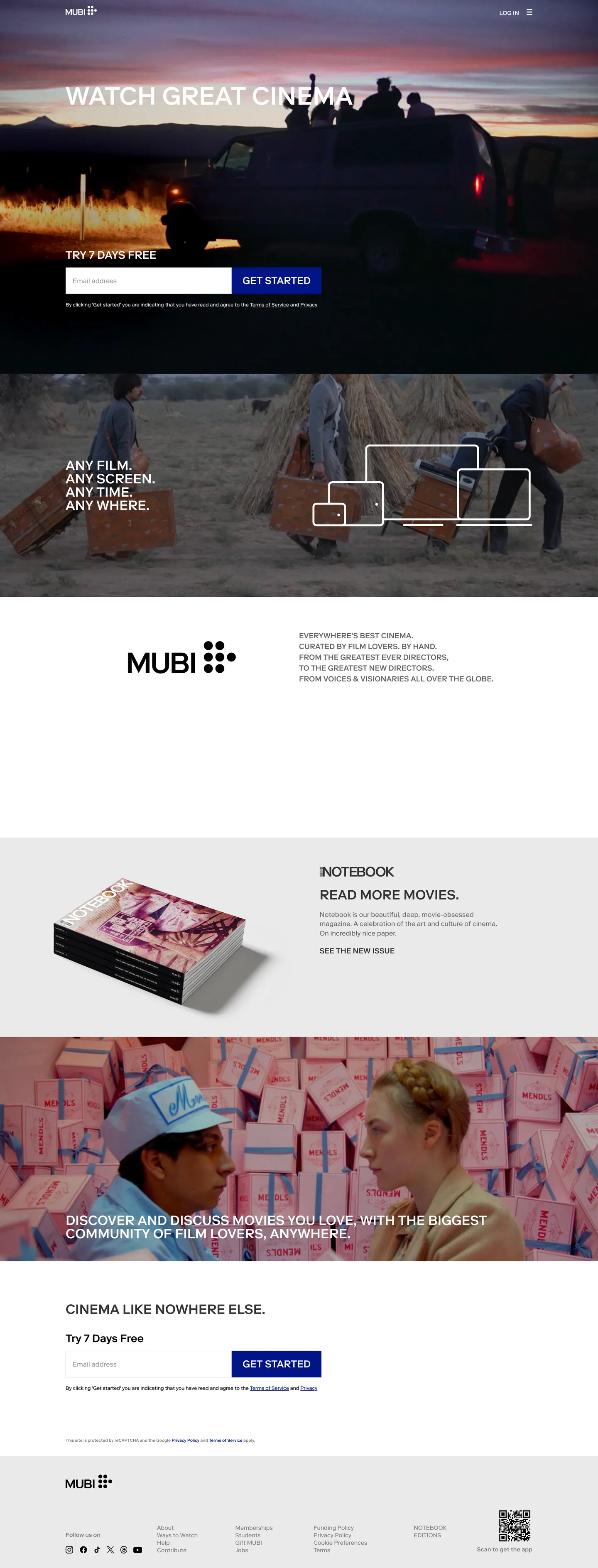
MUBI's homepage reads less like a streaming service and more like the masthead of an arthouse film journal. The page stacks four edge-to-edge bands — a black hero with a sunset still and the uppercase declaration "WATCH GREAT CINEMA LIKE NOWHERE ELSE", a white middle band with a wireframe-illustrated "ANY FILM. ANY SCREEN. ANY TIME. ANY WHERE." manifesto, a black photograph of a "cinema community" audience shot from below, and a final white CTA band carrying the same headline as the hero. Type runs Riforma — a single proprietary geometric sans — at a strict weight 300 / weight 500 binary, with all-caps treatment on every heading and button. The only chroma anywhere on the page is MUBI Blue ("#001489"), a deep cobalt that fills exactly one button per band and signals the in-canvas navigation links inside the footer.
This page packages MUBI's homepage chrome into a single DESIGN.md file built on the Google Labs spec. Inside: 18 colors tokens organized into one brand voltage, dual black-and-white canvases, three charcoal mid-steps for borders and muted text, and a hairline pair; 13 typography tokens spanning a "10px–60px" range, all in Riforma with strict weight-300/500 split and uppercase treatment on every display tier; one corner radius (zero); a 9-step spacing scale; and 20 components recipes covering the cobalt-on-black "Get Started" pill, the email-and-CTA inline pair, the alternating canvas bands, the Notebook editorial card, and the page-bottom language picker. Every value here is render-time measurement — the extraction picked up only one CSS custom property on ":root", confirming MUBI ships hard-coded hex literals and inline styles rather than a token API.
Feed the file to Claude, Cursor, or GitHub Copilot and the agent writes editorial cinema-marketplace surfaces that match MUBI's actual voice — alternating black-and-white canvas bands, uppercase Riforma display, single-cobalt CTA voltage, zero-radius card geometry — rather than defaulting to a generic streaming or SaaS theme. Or reference the tokens directly: every hex, font stack, radius, and spacing value is a quoted DESIGN.md value ready for Tailwind config, CSS variables, or your own component library. The system is worth studying as a counter-Netflix proposition — same category, opposite design move: MUBI rejects rounded cards, multi-step weight ladders, and gradient washes, and trusts photography plus typographic restraint to carry every screen.
What makes it distinct
5
- Single cobalt voltageMUBI Blue ('#001489') is the only chroma in the system, scoped to the 'Get Started' CTA, the in-canvas navigation link, and the focus border on the email field
- Zero-radius geometryevery measured surface ('button', 'input', tile, panel) renders at '0px' corner radius; there is no pill, no rounded card, no soft chip anywhere on the page
- All-caps hero at weight 500Riforma at '60px' / line-height '84px' / 'text-transform: uppercase' on the hero, with the same uppercase treatment carried into the '32px' section heads and the '24px' CTA label
- Alternating canvas bandsfull-bleed black ('#000000') hero, white ('#ffffff') middle for the Notebook editorial card, black again for the 'cinema community' photograph, white for the final CTA; the canvas swap is the section divider
- Weight 300 body with weight 500 chromemarketing body sits at weight 300 at 14–16px; only headlines, buttons, and labels step up to weight 500, with zero weight 400 or weight 600 in the ladder
mubi.com
Live at mubi.com
A snapshot of the brand in production. Scroll the frame to see the whole page.
Colors
18 colors
MUBI's system runs on #001489 as its primary voltage, used in 4 of 20 components. Type is set in Riforma across 13 tokens from 10px to 60px, weights 300–500. Shape language is sharp — components average 0px corner radius, favoring crisp rectangles.
Brand & Accent
Sparing, CTA-only voltage · 2
Surface
Page and card backgrounds · 6
Text
Headlines, body, captions · 6
Borders & Hairlines
Dividers, outlines, rules · 4
Typography
13 type tokens
Set in Riforma across 13 tokens, from 10px to 60px, weights 300–500. Shown in its own stack: where the font isn't installed, the fallback the file names stands in.
- hero-display60px · weight 500 · lh 84px · tracking normalThe quick brown fox jumps over the lazy dog
- section-title32px · weight 500 · lh 32px · tracking normalThe quick brown fox jumps over the lazy dog
- section-head-h226px · weight 500 · lh 36.4px · tracking normalThe quick brown fox jumps over the lazy dog
- button-label24px · weight 500 · lh 36px · tracking normalThe quick brown fox jumps over the lazy dog
- label-uppercase18px · weight 500 · lh 26px · tracking normalThe quick brown fox jumps over the lazy dog
- link-uppercase18px · weight 500 · lh 25.2px · tracking normalThe quick brown fox jumps over the lazy dog
- body-emphasis14px · weight 500 · lh 19.6px · tracking normalThe quick brown fox jumps over the lazy dog
- body-base16px · weight 300 · lh 22.4px · tracking normalThe quick brown fox jumps over the lazy dog
- body-sm14px · weight 300 · lh normal · tracking normalThe quick brown fox jumps over the lazy dog
- body-xs12px · weight 300 · lh 16.8px · tracking normalThe quick brown fox jumps over the lazy dog
- caption-uppercase14px · weight 500 · lh 14px · tracking normalThe quick brown fox jumps over the lazy dog
- micro-uppercase10px · weight 500 · lh 14px · tracking normalThe quick brown fox jumps over the lazy dog
- input-text16px · weight 400 · lh normal · tracking normalThe quick brown fox jumps over the lazy dog
Layout
Radii and spacing
1 corner radii and 10 spacing values. Shape language: sharp.
Radii
- none0px
Spacing
- xs8px
- sm12px
- md20px
- base22px
- lg28px
- cta13px 25px
- input21px 16px
- section-md50px 0px
- section-lg80px 0px
- section-xl170px 0px
Components
20 components
Each rendered from its tokens (color, type, radius, padding) on MUBI's own canvas.
- Button Primarybutton-primaryButton Primary
- Button Primary Hoverbutton-primary-hoverButton Primary Hover
- Button Secondarybutton-secondaryButton Secondary
- Email Inputemail-inputEmail Input
- Email Input Focusemail-input-focusEmail Input Focus
- Hero Sectionhero-sectionHero Section
- Band Darkband-darkBand Dark
- Band Lightband-lightBand Light
- Notebook Cardnotebook-cardNotebook Card
- Notebook Bodynotebook-bodyNotebook Body
- Closing Cta Bandclosing-cta-bandClosing Cta Band
- Inline Email Pairinline-email-pairInline Email Pair
- Top Navtop-navTop Nav
- Footer Bandfooter-bandFooter Band
- Footer Linkfooter-linkFooter Link
- Legal Captionlegal-captionLegal Caption
- Language Pickerlanguage-pickerLanguage Picker
- DividerdividerDivider
- Uppercase Captionuppercase-captionUppercase Caption
- Notebook Ctanotebook-ctaNotebook Cta
In use
The system, in use
MUBI's tokens on the kind of product it builds.
Build something people actually use.
A short paragraph of marketing copy that previews how the brand's display tier and body tier read together. Two sentences is usually enough.
FAQ
MUBI design system FAQ
Common questions about MUBI's tokens, components, and how to use this DESIGN.md in your project.
Read next
Related reading
Specs, directories, and component libraries that pair with this design system.
- Browse all design systemsThe full directory of DESIGN.md files on shadcn.io, with live mockups for each.shadcn.io
- MUBI — official siteThe editorial cinema marketplace this DESIGN.md was extracted from.mubi.com (opens in a new tab)
- The DESIGN.md specificationGoogle Labs' open spec for machine-readable design system files — the format this page is built on.github.com (opens in a new tab)
Use it
Use MUBI in your project
One machine-readable file. Drop it into Claude, Cursor, or any AI tool that reads DESIGN.md.
Download the DESIGN.md
One machine-readable file: every color, type, radius, spacing, and component token of MUBI.
Feed it to your AI tool
Drop it into Claude, Cursor, or GitHub Copilot. The agent writes React components and Tailwind classes that match MUBI's visual language.
Reference the tokens directly
Or paste the values into your Tailwind config, CSS variables, or component library: every color, size and radius is a quoted, ready-to-copy value.
Read the full DESIGN.md: overview, rationale, do’s and don’ts
Overview
MUBI's homepage chrome is an arthouse film journal printed at screen scale — alternating black-and-white full-bleed bands, all-caps Riforma typography, and a single cobalt ("#001489") button that appears once per band as the only chroma in the layout. The canvas swaps between "#000000" and "#ffffff" four times down the page, and the swap itself is the section divider; there is no border rule, no shadow lift, no gradient wash to separate the hero from the manifesto from the Notebook editorial card from the closing CTA. Every measured corner is "0px" — buttons, inputs, panels, and the language picker all render as flat rectangles, and the page reads as printed broadsheet rather than as application UI.
Type runs Riforma with a Helvetica, Arial, "Lucida Grande" fallback stack. The hero "WATCH GREAT CINEMA LIKE NOWHERE ELSE" lands at "60px" / weight 500 / "84px" line-height / text-transform: uppercase. Section heads ("ANY FILM. ANY SCREEN.", "CINEMA LIKE NOWHERE ELSE.") sit at "32px" or "26px" / weight 500 / uppercase. The "GET STARTED" CTA carries "24px" / weight 500 / uppercase. Marketing body lives at "16px" / weight 300 (Notebook editorial paragraph) and "14px" / weight 300 (navigation, language picker, legal copy). Weight as binary signature: where most editorial brands run a four-weight ladder (300/400/500/600), MUBI uses two — weight 300 for body, weight 500 for chrome — with zero weight 400 in the marketing layout. The gap is the brand's editorial restraint.
The shape language is one radius: zero. The extraction returned an empty radii array; every measured button, input, panel, and tile renders at "0px". Where Netflix rounds every surface to "8px" and Apple pills every interactive element, MUBI rejects radius entirely. The "Get Started" pill isn't a pill — it's a flat "13px 25px" rectangle in cobalt. The email input is a flat rectangle with a 1px hairline. The Notebook editorial card is a flat white panel sitting on a flat white band. The geometry reads as printed page rather than as application UI, and the absence of soft chrome is the system's most distinctive identity move.
Key Characteristics:
- Alternating canvas bands:
{colors.canvas-black}("#000000") hero,{colors.canvas-white}("#ffffff") manifesto, white Notebook editorial card, black "cinema community" photograph band, white closing CTA. The canvas swap is the section divider. - Single cobalt voltage:
{colors.brand-cobalt}("#001489") used as the fill on{component.button-primary}(twice), as the border on{component.email-input-focus}(once focused), and as the text color for every link inside{component.footer-band}(12 footer links). Never on hairlines, never on body, never on hero text. - Strict weight-300 / weight-500 binary: marketing body sits at weight 300 (Notebook copy, nav, language picker); headlines and chrome step up to weight 500. The page contains zero weight-400 or weight-600 tokens in the visible hierarchy.
- Uppercase everywhere it matters:
{typography.hero-display},{typography.section-title},{typography.button-label},{typography.label-uppercase},{typography.link-uppercase}, and{typography.caption-uppercase}all carrytext-transform: uppercase. The lowercase tokens are reserved for body and footer link copy. - Zero-radius geometry: every measured surface renders at
{rounded.none}("0px"). No pill, no card, no chip, no rounded input. - Footer-as-sitemap in brand voltage: every link inside
{component.footer-band}carries{colors.brand-cobalt}text color — the footer is the editorial outline of the platform, not a muted gray legal strip.
Colors
Brand & Accent
- MUBI Blue (
{colors.brand-cobalt}— "#001489") — frequency 28. Used as text (12), border (14), bg (2). The single voltage color on the page. Two bg occurrences are the "Get Started" CTAs (one per band); the 14 border occurrences are the focused-state email field plus the footer link underline rests; the 12 text occurrences are every footer navigation link.
Canvas & Surface
- Canvas Black (
{colors.canvas-black}— "#000000") — frequency 97. Used as text (49), border (47), bg (1). The dominant ink + canvas tone. Background on the hero and the "cinema community" band; text on every light-canvas band; border on every black-on-white hairline. - Canvas White (
{colors.canvas-white}— "#ffffff") — frequency 83. Used as text (41), border (39), bg (3). The complementary canvas. Background on the manifesto, Notebook, and closing CTA bands; text on every black-canvas band; border on every white-on-dark frame. - Surface Card Light (
{colors.surface-card-light}— "#eaeaea") — frequency 2. Used as bg (2). The off-white tint behind the Notebook product mockup — one step warmer than "#ffffff" so the printed-magazine spread reads as resting on a soft pearl rather than floating in absolute white.
Text & Ink
- Ink Body Muted (
{colors.ink-body-muted}— "#666666") — frequency 6. Used as text (3), border (3). The Notebook editorial paragraph body color — a mid-gray that sits one step below black on the white band, signaling secondary copy without dropping to a hairline tone. - Ink Secondary (
{colors.ink-secondary}— "#7d7d7d") — frequency 118. Used as text (59), border (59). The legal-and-footer ink tone — every copyright line, every fine-print mark, every hairline on the language-picker dropdown sits in this gray. The highest-frequency ink after pure black. - Ink Tertiary (
{colors.ink-tertiary}— "#323232") — frequency 6. Used as text (3), border (3). A deep charcoal scoped to the Notebook editorial "READ MORE MOVIES" link affordance — sits between body and pure black so the secondary link reads as ink, not as muted footnote.
Hairlines & Dividers
- Hairline Soft (
{colors.hairline-soft}— "#c8c8c8") — frequency 2. Used as border (2). The 1px stroke on the email input at rest and on the language-picker frame. The system's only neutral hairline tone. - Divider Light (
{colors.divider-light}— "#eaeaea") — frequency 2. Used as bg (2). The thin rule between footer columns on the white closing band.
Typography
Font Family
The system runs Riforma for every visible string, with a fallback stack of Helvetica, Arial, "Lucida Grande", sans-serif. Riforma is a geometric humanist sans released by Switzerland's Schick Toikka — MUBI licenses it as the platform-wide voice across web, app, and the print Notebook magazine. There is no secondary serif, no monospace tier, no display-only variant — every size from "10px" caption to "60px" hero is the same Riforma family with weight 300 and weight 500 as the only two stops.
Hierarchy
| Token | Size | Weight | Line Height | Case | Use |
|---|---|---|---|---|---|
{typography.hero-display} | 60px | 500 | 84px | UPPER | "WATCH GREAT CINEMA LIKE NOWHERE ELSE" |
{typography.section-title} | 32px | 500 | 32px | UPPER | "ANY FILM. ANY SCREEN. ANY TIME. ANY WHERE." |
{typography.section-head-h2} | 26px | 500 | 36.4px | UPPER | "TRY 7 DAYS FREE" closing prompt |
{typography.button-label} | 24px | 500 | 36px | UPPER | "GET STARTED" CTA label |
{typography.label-uppercase} | 18px | 500 | 26px | UPPER | "NOTEBOOK" section pre-label |
{typography.link-uppercase} | 18px | 500 | 25.2px | UPPER | "READ MORE MOVIES" Notebook link |
{typography.body-emphasis} | 14px | 500 | 19.6px | none | Notebook body lead, weight-stepped paragraphs |
{typography.body-base} | 16px | 300 | 22.4px | none | Notebook editorial paragraph body |
{typography.body-sm} | 14px | 300 | normal | none | Navigation links, language picker |
{typography.body-xs} | 12px | 300 | 16.8px | none | Footer fine print, language-picker dropdown text |
{typography.caption-uppercase} | 14px | 500 | 14px | UPPER | "MUBI" wordmark caption, hero pre-label |
{typography.micro-uppercase} | 10px | 500 | 14px | UPPER | Footer "MUBI" copyright caption |
{typography.input-text} | 16px | 400 | normal | none | Email input field text — the only weight-400 in the system |
Principles
Weight as binary signature: the page runs Riforma at weight 300 (body) and weight 500 (chrome) with zero weight 400 or weight 600 in the marketing layout. The single exception is the email-input field text at weight 400, which is the user-typed string and follows browser defaults rather than the brand ladder. Every other character on the page is weight 300 or weight 500 — no middle ground, no display tier above 500, no light tier below 300.
Where most editorial brands run a four-weight ladder (300/400/500/700) and most streaming pages run weight 700+ hero with weight 400 body, MUBI uses two weights and lets case carry the rest. Case as hierarchy: every heading, CTA, label, link tag, and pre-caption renders in text-transform: uppercase; only body copy, footer-link copy, and the legal strip stay in mixed case. The uppercase treatment is the brand's editorial cadence, and removing it from the hero or section heads collapses the broadsheet identity.
Note on Font Substitutes
If Riforma is unavailable, GT Walsheim at weight 500 is the closest geometric-humanist substitute for the display tier, and Söhne at weight 500 is the closest English-grotesque alternative. Inter at weight 500 with text-transform: uppercase and a tight tracking nudge (-1px) is the closest open-source approximation. The key move is preserving the weight-300 / weight-500 binary plus the uppercase display treatment — pick a geometric sans with both weights drawn and skip the intermediate tiers.
Layout
Spacing System
- Base unit: asymmetric — section padding follows a
{spacing.section-md}("50px 0px") /{spacing.section-lg}("80px 0px") /{spacing.section-xl}("170px 0px") ladder for the bands themselves, while interactive padding uses{spacing.cta}("13px 25px") for the CTA and{spacing.input}("21px 16px") for the email field. - Tokens:
{spacing.xs}"8px" ·{spacing.sm}"12px" ·{spacing.md}"20px" ·{spacing.base}"22px" ·{spacing.lg}"28px" ·{spacing.cta}"13px 25px" ·{spacing.input}"21px 16px" ·{spacing.section-md}"50px 0px" ·{spacing.section-lg}"80px 0px" ·{spacing.section-xl}"170px 0px". - Section gutters: the hero band carries "170px 0px" top/bottom — by far the largest gutter on the page, giving the sunset still and the uppercase hero room to breathe. The manifesto and Notebook bands sit at "80px 0px"; the closing CTA at "70px 0px".
- Page horizontal gutter:
{spacing.base}("0px 22px") — the standard horizontal rule used by both the top nav and the footer columns.
Grid & Container
- Single-column funnel: five stacked full-bleed bands — hero ("170px" gutters), manifesto ("ANY FILM. ANY SCREEN."), Notebook editorial card, cinema-community photographic band, closing CTA. No sidebar, no fixed nav, no in-page jump links.
- Notebook editorial layout: two-column inside the white band — printed-magazine product render on the left at "50%" width, weight-300 body paragraph plus "READ MORE MOVIES" link on the right.
- Inline email pair: the email field plus "Get Started" CTA appear together in both the hero and the closing CTA band — the email is "400px" wide, the button is "216px" wide, and they sit on the same baseline with zero gap between them (both are zero-radius rectangles meeting edge-to-edge).
- Footer sitemap: the closing white band houses a multi-column footer where every link carries
{colors.brand-cobalt}text color; the legal copyright caption underneath drops to{colors.ink-secondary}("#7d7d7d") gray.
Whitespace Philosophy
The system favors band-level breathing room over component-level padding. The hero gets "170px 0px" gutters — the largest in the system — while interactive elements are tightly packed: the CTA carries "13px 25px" padding, the email input "21px 16px". The page reads as tall and intentionally paced; each band is a single editorial spread, and the vertical scroll reads as flipping through a printed magazine rather than as scrolling a stacked SaaS landing page.
Elevation
| Level | Treatment | Use |
|---|---|---|
| Base (Level 0) | Flat {colors.canvas-black} or {colors.canvas-white} | Every band on the page |
| Surface (Level 1) | Flat {colors.surface-card-light} ("#eaeaea") | The Notebook product mockup backdrop |
| Hairline | 1px {colors.hairline-soft} ("#c8c8c8") | Email input border, language-picker frame |
| Hairline (focused) | 1px {colors.brand-cobalt} ("#001489") | Email input on focus |
| Divider | 1px {colors.divider-light} ("#eaeaea") | Footer column separators on the closing white band |
Shadow Philosophy: the extracted page carries zero box-shadow declarations across measured surfaces. Depth comes entirely from the canvas swap between black and white bands. Where most editorial publishers reach for a soft drop-shadow under product mockups to lift the magazine cover off the page, MUBI sits the Notebook spread directly on a flat "#eaeaea" tint — the tone step is the depth, and the absence of any shadow is the brand's editorial signal. The page reads as printed signature folds stacked vertically, not as floating cards on a unified surface.
Shapes
The system runs one radius: {rounded.none} ("0px"). Every measured corner across button, input, panel, language picker, and footer tile renders square. The "Get Started" pill isn't a pill — it's a "64px"-tall flat rectangle in cobalt. The email input is a "64px"-tall flat rectangle with a 1px hairline. The Notebook editorial card is a flat panel. The language-picker dropdown is a flat rectangle. Square geometry as editorial signal: where Netflix establishes continuity with one shared "8px" rounding and Apple uses full pills on every interactive element, MUBI rejects radius — the layout reads as printed page rather than as application UI. Adding any radius (even a single "2px" softening on the CTA) breaks the broadsheet identity.
Components
Buttons
button-primary — {colors.brand-cobalt} ("#001489") fill, {colors.on-cobalt} ("#ffffff") text, "0px" radius, "13px 25px" padding, "64px" tall, no border. The signature "GET STARTED" rectangle — appears once in the hero email-capture and once in the closing CTA band. Carries {typography.button-label} at "24px" / weight 500 / uppercase.
button-primary-hover — Same fill and shape as {component.button-primary} with opacity: "0.85" on hover. No color swap, no inset shadow — the only state change is a flat opacity step.
button-secondary — {colors.canvas-white} fill, {colors.ink-on-light} text, "0px" radius, "13px 25px" padding, 1px black border. Used for non-CTA actions on light bands (e.g. "WATCH NOW" affordances). Same flat-rectangle shape as the primary, with the cobalt swapped for an outline-on-white treatment.
Inputs
email-input — {colors.surface-input} ("#ffffff") fill, {colors.ink-on-light} ("#000000") text, "0px" radius, "21px 16px" padding, "64px" tall, 1px {colors.hairline-soft} ("#c8c8c8") border. The inline email-capture field. The asymmetric padding gives room for the "Email Address" placeholder. The field appears twice — once in the hero, once in the closing CTA band.
email-input-focus — Same fill and shape as {component.email-input}, with the border swapping to 1px {colors.brand-cobalt} ("#001489") on focus. The only focused-state visual on the page; no glow, no fill change.
Bands & Surfaces
hero-section — {colors.canvas-black} ("#000000") background, white text, "170px 0px" padding. Houses the hero headline in {typography.hero-display} (uppercase Riforma at "60px" / weight 500), the sunset still as a full-bleed background, and the email-input + cobalt-CTA pair anchored to the bottom-left.
band-dark — {colors.surface-band-dark} fill, white text, "80px 0px" padding. The "cinema community" photographic band sits in this token — a black canvas carrying a full-bleed audience photograph with an overlaid uppercase pre-caption ("CINEMA LIKE NOWHERE ELSE.").
band-light — {colors.surface-band-light} fill, black text, "80px 0px" padding. The manifesto band ("ANY FILM. ANY SCREEN. ANY TIME. ANY WHERE.") sits in this token — a white canvas with the uppercase section title in {typography.section-title} and a wireframe-illustrated tablet/laptop/phone illustration row.
notebook-card — {colors.canvas-white} fill, black text, "0px" radius, "50px 0px" vertical padding, no border. The two-column Notebook editorial section — printed-magazine product mockup left, weight-300 body paragraph right.
notebook-body — {colors.canvas-white} fill, {colors.ink-body-muted} ("#666666") text in {typography.body-base} ("16px" / weight 300 / "22.4px" line-height). The signature MUBI editorial copy — sits in a mid-gray that's neither black nor hairline, reading as printed-magazine running text.
closing-cta-band — {colors.canvas-white} fill, black text, "70px 0px" padding. The final band before the footer — carries the "CINEMA LIKE NOWHERE ELSE." headline in {typography.section-head-h2} plus the email-input + cobalt-CTA pair repeated from the hero.
inline-email-pair — {colors.canvas-white} fill, black text, "0px" radius, zero gap between the email field and the button. The two-rectangle inline pair that appears in both the hero (over the black band, inverted) and the closing CTA band — the button sits flush against the input edge, sharing the same "64px" height.
Navigation & Footer
top-nav — {colors.canvas-black} fill, white text, "0px 22px" padding. Houses the MUBI wordmark top-left and the Sign In link top-right. No drop shadow, no border, no fixed positioning — sits flush at the top of the hero band.
footer-band — {colors.canvas-white} fill, {colors.brand-cobalt} ("#001489") text in {typography.body-sm} ("14px" / weight 300), "50px 0px" padding. The multi-column sitemap-as-footer — programming, Notebook, FilmLib, gift cards, contact links. Every link inside this band uses the cobalt as its text color, which is unusual for a footer (most marketing pages use muted gray here).
footer-link — {colors.canvas-white} fill, {colors.brand-cobalt} text in {typography.body-sm}, "0px 15px 0px 0px" padding. The individual link inside the footer-band; 15 horizontal padding on the right gives breathing room between links in a row.
legal-caption — {colors.canvas-white} fill, {colors.ink-secondary} ("#7d7d7d") text in {typography.body-xs} ("12px" / weight 300). The "© MUBI" copyright strip plus reCAPTCHA legal text at the very bottom — the only place on the page that drops to gray text.
Utility
language-picker — {colors.canvas-white} fill, black text, "0px" radius, "8px 0px 0px" padding, 1px {colors.hairline-soft} border. The single dropdown affordance in the closing footer — region toggle for the MUBI locale (en/il, en/us, en/uk, etc.).
divider — {colors.divider-light} ("#eaeaea") 1px rule. Used between footer columns on the closing white band; the only horizontal rule anywhere in the layout.
uppercase-caption — {colors.canvas-black} fill, white text, {typography.caption-uppercase} ("14px" / weight 500 / uppercase). The small "WATCH GREAT CINEMA" pre-caption that sits above the hero headline on the black hero band.
notebook-cta — {colors.canvas-white} fill, black text, "0px" radius, "12px 0px 0px" top padding, no border. The "READ MORE MOVIES" link affordance inside the Notebook editorial card; carries {typography.link-uppercase} ("18px" / weight 500 / uppercase) and renders as an underlined inline link rather than as a pill.
Do's and Don'ts
Do
- Reserve
{colors.brand-cobalt}("#001489") for the three sanctioned uses — the "Get Started" CTA fill, the focused-state email-input border, and every link inside the footer-band. Adding a fourth cobalt surface (a cobalt hairline, a cobalt label tag, a cobalt headline) breaks the single-voltage discipline. - Alternate
{colors.canvas-black}and{colors.canvas-white}between bands and let the canvas swap be the section divider. Borders or rules between bands collapse the broadsheet rhythm. - Run every display tier (
{typography.hero-display},{typography.section-title},{typography.button-label},{typography.label-uppercase}) withtext-transform: uppercase. Case carries the hierarchy. - Use weight 300 for body and weight 500 for chrome. The two-weight binary is the brand silhouette.
- Render every interactive surface at
{rounded.none}("0px"). One-radius geometry is the system's printed-page identity.
Don't
- Don't round the "Get Started" CTA to "8px" or pill it — every measured corner on the page is "0px", and adding a single "2px" softening reads as application UI rather than as printed broadsheet. Keep the rectangle flat.
- Don't introduce a weight-400 or weight-700 display tier. The system runs Riforma at weight 300 and weight 500 only; adding 400 collapses the body-to-chrome gap, and 700 ruins the editorial restraint.
- Don't render the footer in muted gray ("#666666" or "#7d7d7d") — every footer link uses
{colors.brand-cobalt}("#001489"). The cobalt-on-white footer is the editorial sitemap signal; dropping it to gray turns the footer into a generic legal strip. - Don't add a box-shadow under the Notebook product mockup. The page carries zero shadow declarations; the "#eaeaea" backdrop tone is the lift, and a soft drop-shadow reads as SaaS card chrome rather than as printed-magazine cover art.
- Don't use mixed-case display headings. The hero ("WATCH GREAT CINEMA LIKE NOWHERE ELSE") and every section head render in uppercase — dropping to title-case or sentence-case breaks the typographic broadsheet cadence.
- Don't use
{colors.ink-secondary}("#7d7d7d") for body copy — it's the legal-and-copyright-only tone with all 118 occurrences scoped to fine print and footer hairlines. Body text on the white band sits in{colors.ink-body-muted}("#666666"); body text on the black band sits in{colors.ink-on-dark}("#ffffff").
Known Gaps
- Motion and transitions: the hero sunset still carries a slow horizontal pan, and the email-input border animates from
{colors.hairline-soft}to{colors.brand-cobalt}on focus — exact easing curves and durations are not captured in this DESIGN.md. - Hover states: the footer links underline-fade on hover and the "Get Started" CTA drops to
opacity: "0.85", but precise transition timings aren't extracted. - Authenticated product UI: this spec covers only the signed-out marketing homepage. The actual streaming product — the "Film of the Day" tile, the program grid, the player chrome, the Notebook magazine reader, the FilmLib browse view — uses a parallel token set with film-still thumbnails and editorial-side rails that aren't part of this DESIGN.md.
- Localized hero variants: the hero copy ("WATCH GREAT CINEMA LIKE NOWHERE ELSE") changes per locale, and some markets carry a different CTA pill copy ("Try MUBI Free", "Start Watching"); the localization framework is not part of this DESIGN.md.
- The Notebook print magazine: MUBI's Notebook is a printed-and-digital magazine with its own typographic system (a Riforma-paired serif for long-form essays); this DESIGN.md captures the homepage card preview but not the magazine reader's tokens.
- Cookie consent and locale overlays: these live as separate components outside the marketing-band chrome and aren't part of the captured surface.
Music, Video & Streaming
More systems like this
More DESIGN.md files in Music, Video & Streaming.
Pricing
Build it with Pro
The DESIGN.md files are free. Pro adds 6,000+ blocks, premium templates and the MCP server, so your AI editor builds in your system for you.
4.9/5 out of 5 · 150+ reviewsfrom 150+ founders and developers.
Billing
Billed once a year in USD. Cancel anytime.
- How many people can use the license.
- Client work, SaaS products and anything you charge for.
- Production-ready React sections: hero, pricing, features, dashboards and more.
- Complete multi-page sites you can ship as they are.
- React icons from every major library, installable with one command.
- Presets that restyle every block, in light and dark.
- Lets your AI editor search, preview and install blocks for you.
- Priority requests are answered first.
Individual
For personal projects & open source
$32instead of $49/mo
$389 billed yearly
- Seats: 1 seat
- Commercial use: Personal & open source only
- Pro blocks: 6,000+ blocks
- Templates: All 14 templates
- React icons: 294k+ icons
- Themes: All 59 themes
- MCP server: Basic usage
- Support: Standard
Team
Most popularFor freelancers, agencies & startups
$66instead of $99/mo
$789 billed yearly · ≈ $13/dev/mo
- Seats: Up to 5 seats
- Commercial use: Included
- Pro blocks: 6,000+ blocks
- Templates: All 14 templates
- React icons: 294k+ icons
- Themes: All 59 themes
- MCP server: High usage
- Support: Priority
Organization
For companies with larger teams
$132instead of $199/mo
$1,589 billed yearly
- Seats: Unlimited seats
- Commercial use: Included
- Pro blocks: 6,000+ blocks
- Templates: All 14 templates
- React icons: 294k+ icons
- Themes: All 59 themes
- MCP server: Unlimited usage
- Support: Priority
Billed once a year in USD. Cancel anytime.
Individual
For personal projects & open source
$32instead of $49/mo
$389 billed yearly
- How many people can use the license.Seats: 1 seat
- Client work, SaaS products and anything you charge for.Commercial use: Personal & open source only
- Production-ready React sections: hero, pricing, features, dashboards and more.Pro blocks: 6,000+ blocks
- Complete multi-page sites you can ship as they are.Templates: All 14 templates
- React icons from every major library, installable with one command.React icons: 294k+ icons
- Presets that restyle every block, in light and dark.Themes: All 59 themes
- Lets your AI editor search, preview and install blocks for you.MCP server: Basic usage
- Priority requests are answered first.Support: Standard
Team
Most popularFor freelancers, agencies & startups
$66instead of $99/mo
$789 billed yearly · ≈ $13/dev/mo
Everything in Individual, plus
- How many people can use the license.Seats: Up to 5 seats
- Client work, SaaS products and anything you charge for.Commercial use: Included
- Lets your AI editor search, preview and install blocks for you.MCP server: High usage
- Priority requests are answered first.Support: Priority
Organization
For companies with larger teams
$132instead of $199/mo
$1,589 billed yearly
Everything in Team, plus
- How many people can use the license.Seats: Unlimited seats
- Lets your AI editor search, preview and install blocks for you.MCP server: Unlimited usage
- Secure checkout via Stripe
- Code lives in your repo
- Keep what you've shipped if you cancel
- License terms
Your system, built for you
Every block, template and icon, installed by your AI agent in your design system. The DESIGN.md files stay free.