Microsoft Design System
Microsoft.com's marketing-home design system uses a single Microsoft Blue CTA, the 4-up Fluent product-tile grid, Segoe UI across every tier, and a 2px Fluent radius. Tokens for React, Next.js, and AI tools.
Add shadcn.io to your AI agent. · Pro It installs blocks, icons and templates in your design system from a prompt, with Pro.
Set up MCP- Primary
- #0067b8
- Typeface
- Segoe UI
- Shape
- Sharp
- Base radius
- 0px
- Colors
- 9
- Type tokens
- 11
- Components
- 15
- Spacing values
- 9
About
About Microsoft DESIGN.md
Curated by Dov Azencot · Updated May 18, 2026 · Source microsoft.com (opens in a new tab)
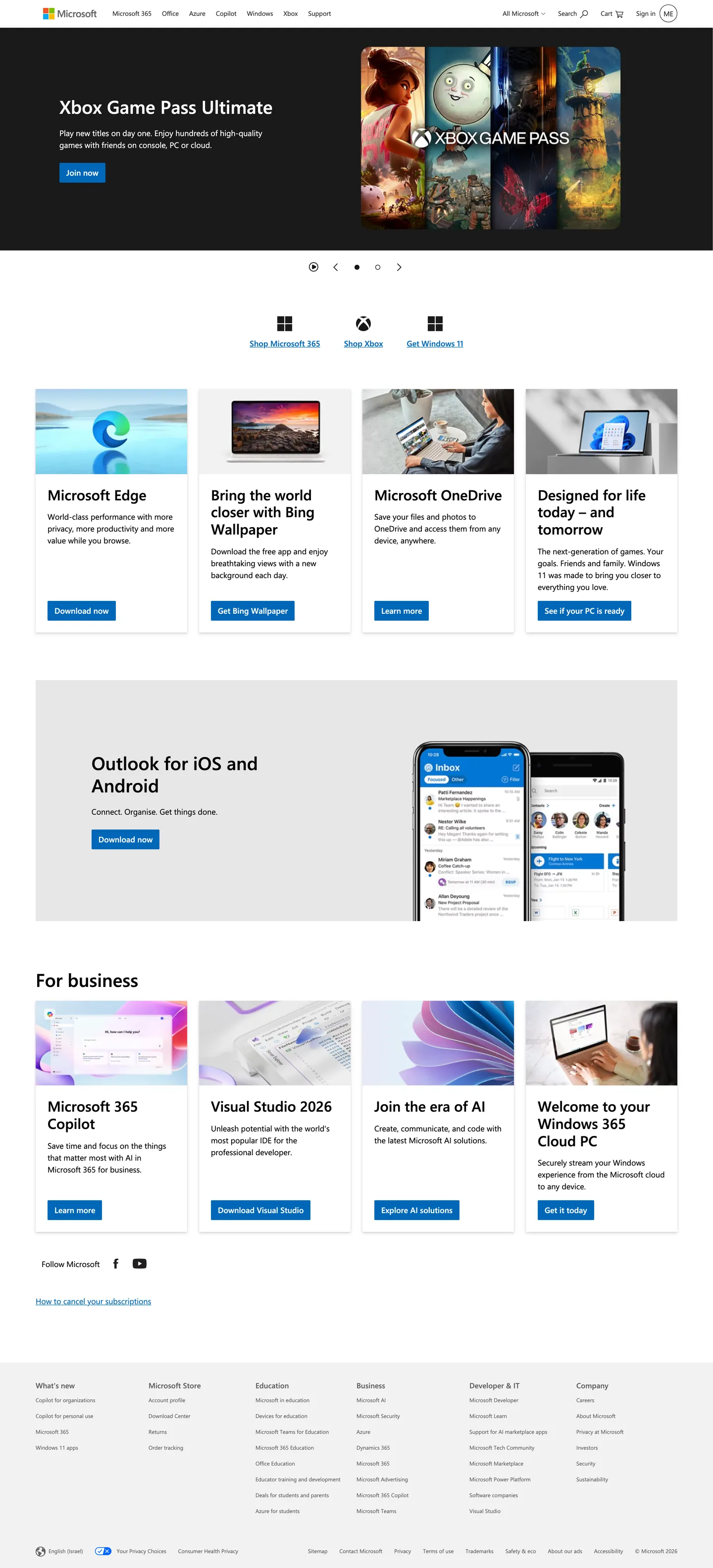
Microsoft.com's marketing home does something almost no other consumer-tech giant attempts: it commits entirely to the 4-up tile. The above-fold is a single dark hero block (a cinematic Xbox Game Pass Ultimate photograph filling the right two-thirds, the cobalt "Join now" CTA tucked at the lower-left) — and below it, every single band on the page is a 4-column row of Fluent product cards. Four tiles for the consumer-product row (Edge / Bing Wallpaper / OneDrive / Surface), four for the "For business" rail (Microsoft 365 Copilot / Visual Studio 2026 / Join the era of AI / Windows 365 Cloud PC), four for the bottom enterprise rail. Where Apple lays a single hero device per product page and Google constrains itself to three cards, Microsoft trusts the 4-column tile grid to do the entire navigational job — the page is a product catalog rendered as a wall of small windows.
The DESIGN.md file packages the system into a machine-readable spec for React tooling. Inside: 9 colors tokens drawn from the inherited Microsoft Blue brand color (`{colors.brand-blue}` — wired as `--sc-card-link-color`), pure ink black, three gray tones tracking the Fluent ramp (Fluent Gray 130 for body text, Fluent Gray 90 for nav links, Fluent Gray 60 for secondary), pure canvas white, and a single light-gray surface for the "For business" band background. Eleven typography tokens cover Segoe UI from the 11px footer link up to the 37px hero h1 — every tier at weight 400 or 600 with normal letter-spacing, no negative tracking anywhere on the page. Radius is the tightest in the directory at 2px (11 of 12 occurrences) plus a single 50% icon-circle mask. Fourteen components cover the dark hero, the 4-up product tile, the photo-top + body + CTA pattern, the soft-gray "For business" rail, the four-column footer category grid.
Feed this file to Claude or Cursor and it will reproduce Microsoft's specific moves: dark cinematic hero with a tucked-corner cobalt CTA, 4-up Fluent product tile grid as the entire page rhythm, Segoe UI across every tier with no display family, 2px Fluent card radius, photographic top on every product tile. The tokens resolve cleanly without invention. The single move worth borrowing only if you have a deep product catalog is the all-4-up commitment — most teams with five or fewer products will look hollow trying to fill four columns.
What makes it distinct
5
- Single Microsoft Blue voltagethe cobalt #0067b8 carries every CTA, link, and Fluent card icon; 30 total occurrences with no second accent color
- Segoe UI everywhere11px footer up to 37px hero, weights 400 and 600 only, normal tracking across every tier; no display family
- Fluent 2px card radiusthe tightest rounding in the directory; every card, button, and badge uses 2px or nothing
- 4-up product tile gridMicrosoft Edge / Bing Wallpaper / OneDrive / Surface, then 4-up for-business row, then 4-up enterprise row; every band is the same 4-column rhythm
- Photo-top card patternevery product tile has a fixed-aspect photographic top, a two-line h3 + body row, and a single 40px-height cobalt CTA stacked beneath
microsoft.com
Live at microsoft.com
A snapshot of the brand in production. Scroll the frame to see the whole page.
Colors
9 colors
Microsoft's system runs on #0067b8 as its primary voltage, used in 1 of 15 components. Type is set in Segoe UI across 11 tokens from 11px to 37px, weights 400–600. Shape language is sharp — components average 1px corner radius, favoring crisp rectangles.
Brand & Accent
Sparing, CTA-only voltage · 2
Surface
Page and card backgrounds · 2
Text
Headlines, body, captions · 4
Other
Specialty colors · 1
Typography
11 type tokens
Set in Segoe UI across 11 tokens, from 11px to 37px, weights 400–600. Shown in its own stack: where the font isn't installed, the fallback the file names stands in.
- display-xl37px · weight 600 · lh 44.4pxThe quick brown fox jumps over the lazy dog
- display-md29px · weight 600 · lh 34.8pxThe quick brown fox jumps over the lazy dog
- heading-md16px · weight 600 · lh 24pxThe quick brown fox jumps over the lazy dog
- heading-sm15px · weight 600 · lh 20pxThe quick brown fox jumps over the lazy dog
- body-md16px · weight 400 · lh 24pxThe quick brown fox jumps over the lazy dog
- body-sm13px · weight 400 · lh 19.5pxThe quick brown fox jumps over the lazy dog
- button-md16px · weight 600 · lh 16pxThe quick brown fox jumps over the lazy dog
- nav-link13px · weight 400 · lh 19.5pxThe quick brown fox jumps over the lazy dog
- footer-link11px · weight 400 · lh 16pxThe quick brown fox jumps over the lazy dog
- footer-quiet11px · weight 400 · lh 25pxThe quick brown fox jumps over the lazy dog
- section-label16px · weight 400 · lh 19.2pxThe quick brown fox jumps over the lazy dog
Layout
Radii and spacing
3 corner radii and 9 spacing values. Shape language: sharp.
Radii
- none0px
- xs2px
- full9999px
Spacing
- xs7px
- sm8px
- md12px
- base16px
- lg20px
- xl24px
- 2xl36px
- 3xl48px
- 4xl72px
Components
15 components
Each rendered from its tokens (color, type, radius, padding) on Microsoft's own canvas.
- Hero Sectionhero-sectionHero Section
- Hero Headinghero-headingHero Heading
- Section Headingsection-headingSection Heading
- Body Paragraphbody-paragraphBody Paragraph
- Body Paragraph Mutedbody-paragraph-mutedBody Paragraph Muted
- Button Primarybutton-primaryButton Primary
- Button Primary Hoverbutton-primary-hoverButton Primary Hover
- Top Navtop-navTop Nav
- Nav Linknav-linkNav Link
- Product Tileproduct-tileProduct Tile
- Product Tile Headingproduct-tile-headingProduct Tile Heading
- Business Bandbusiness-bandBusiness Band
- FooterfooterFooter
- Footer Linkfooter-linkFooter Link
- Language Pilllanguage-pillLanguage Pill
In use
The system, in use
Microsoft's tokens on the kind of product it builds.
Build something people actually use.
A short paragraph of marketing copy that previews how the brand's display tier and body tier read together. Two sentences is usually enough.
FAQ
Microsoft design system FAQ
Common questions about Microsoft's tokens, components, and how to use this DESIGN.md in your project.
Read next
Related reading
Specs, directories, and component libraries that pair with this design system.
- Browse all design systemsThe full directory of DESIGN.md files on shadcn.io, with live mockups for each.shadcn.io
- Microsoft — official siteMicrosoft's public marketing home — the source of truth for the live tokens captured in this file.microsoft.com (opens in a new tab)
- The DESIGN.md specificationGoogle Labs' open spec for machine-readable design system files — the format this page is built on.github.com (opens in a new tab)
Use it
Use Microsoft in your project
One machine-readable file. Drop it into Claude, Cursor, or any AI tool that reads DESIGN.md.
Download the DESIGN.md
One machine-readable file: every color, type, radius, spacing, and component token of Microsoft.
Feed it to your AI tool
Drop it into Claude, Cursor, or GitHub Copilot. The agent writes React components and Tailwind classes that match Microsoft's visual language.
Reference the tokens directly
Or paste the values into your Tailwind config, CSS variables, or component library: every color, size and radius is a quoted, ready-to-copy value.
Read the full DESIGN.md: overview, rationale, do’s and don’ts
Overview
Microsoft.com's marketing home does something almost no other consumer-tech giant attempts. All-4-up commitment. The above-fold is a single dark hero block — a cinematic Xbox Game Pass Ultimate photograph filling the right two-thirds, the cobalt "Join now" CTA tucked at the lower-left — and below it, every single band is a 4-column row of Fluent product cards. Four tiles for consumer products (Edge / Bing Wallpaper / OneDrive / Surface), four for the "For business" rail (Microsoft 365 Copilot / Visual Studio 2026 / Join the era of AI / Windows 365 Cloud PC), four for the bottom enterprise rail. Where Apple lays a single hero device per product page and Google constrains itself to three cards, Microsoft trusts the 4-up grid to do the entire navigational job — the page is a product catalog rendered as a wall of small windows.
The system's single voltage holds the catalog together. Microsoft Blue ({colors.brand-blue} — #0067b8) appears 30 times across the captured page (10 as text, 10 as background fill, 10 as border): every CTA fill, every link tone, every Fluent product-card icon outline. The hover-darker variant --sc-card-link-hover-color carries a single {colors.brand-blue-hover} (#004a7f) tone. Ink ({colors.ink} — #000000) carries every headline at 377 total occurrences (180 text, 179 border, 16 shadow, 2 gradient). The body-text tone ({colors.ink-muted} — #616161) carries 256 occurrences in the secondary tier. There is no second brand accent — no orange, no green, no teal. The single declared {colors.fluent-yellow} (#ffb900) wired as --sc-badge-bg-yellow-background-color belongs to the badge surface in product chrome and never renders on the marketing home.
Typography is Segoe UI for every tier — 11px footer link / 13px nav / 16px body / 29px section h2 / 37px hero h1 — at weight 400 or 600 with normal tracking. No negative tracking anywhere on the page. The hero h1 "Xbox Game Pass Ultimate" at 37px / 600 is the loudest typographic moment in the system, deliberately measured so the cinematic photograph beside it remains the visual protagonist. The radius scale is the tightest in the directory at 2px (11 of 12 captured occurrences) — canonical Fluent corners from the 2017 system shift.
Key Characteristics:
- Single Microsoft Blue voltage (
{colors.brand-blue}— #0067b8) carrying every CTA, link, and Fluent product-card icon — 30 total occurrences, no second accent. - 4-column product-tile grid as the entire page rhythm — three 4-up bands in sequence (consumer products / for business / enterprise / education footer).
- Segoe UI across every tier from 11px footer to 37px hero, at weight 400 or 600 only, with normal letter-spacing throughout.
- 2px Fluent card radius (
{rounded.xs}) on every card, button, and badge — the tightest in the directory; no pill, no 8 / 12 / 16px middle tier. - Photo-top tile pattern — every product card has a fixed-aspect photographic top, a 2-line
{typography.display-md}(29px / 600) heading, a 1-2 line body, and a single 40px-height cobalt CTA stacked at the bottom. - Dark hero band on
{colors.ink}(#000000) with a tucked-corner CTA — the cinematic photograph fills the right two-thirds, the CTA stack sits flush left and bottom. - "For business" rail uses a soft
{colors.surface-1}(#f2f2f2) tinted background — the only tinted band on the page, marking the consumer-to-enterprise pivot. - Dark footer on
{colors.ink-soft}(#171717) with four equal-width category columns (What's new / Microsoft Store / Education / Business / Developer & IT / Company).
Colors
Brand
- Microsoft Blue (
{colors.brand-blue}— #0067b8): frequency 30 — used as text (10), background (10), border (10). The single voltage of the system. Wired as--sc-card-link-colorand--sc-card-link-visited-color. Carries every primary CTA fill ("Join now", "Download now", "Get it today", "Get Bing Wallpaper", "Learn more"), every link tone, every Fluent product-card icon outline. - Microsoft Blue Hover (
{colors.brand-blue-hover}— #004a7f): the hover-darker variant. Wired as--sc-card-link-hover-color,--sc-card-link-visited-hover-color, and--sc-card-link-active-color. The single hover state worth noting in the system. - Fluent Yellow (
{colors.fluent-yellow}— #ffb900): wired as--sc-badge-bg-yellow-background-color. The badge fill for "New" / "Updated" pills in product chrome. Frequency 0 on the marketing home — reserved for in-product surfaces.
Surface
- Canvas (
{colors.canvas}— #ffffff): frequency 33 — text (16), background (11), border (6). The page floor below the dark hero and footer. Wired as--sc-card-background-colorand--sc-material-backdrop-background-color. - Surface-1 (
{colors.surface-1}— #f2f2f2): frequency 1, as background. The soft-gray tinted band behind the "For business" rail. The only tinted band on the page — marks the consumer-to-enterprise pivot.
Text
- Ink (
{colors.ink}— #000000): frequency 377 — text (180), border (179), shadow (16), gradient (2). The dominant text and structural color. Wired as--sc-card-color,--sc-material-backdrop-color,--sc-badge-bg-yellow-color. Every below-fold headline, every product-card title, every primary body paragraph resolves to pure black. - Ink Soft (
{colors.ink-soft}— #171717): frequency 12 — text (6), border (6). The dark footer band uses this slightly-off-black surface to differentiate from the pure-black hero. - Ink Quiet (
{colors.ink-quiet}— #262626): frequency 72 — text (36), border (36). The top-nav link color and secondary body tone. - Ink Muted (
{colors.ink-muted}— #616161): frequency 256 — text (128), border (128). The dominant secondary body color, carrying every product-card description paragraph, every "Save time and focus on the things that matter" sub-lead beneath product titles. The most common gray on the page.
Typography
Font Family
The system runs Segoe UI for every tier — Microsoft's house typeface, bundled with Windows so it renders natively for the majority of visitors. Fallbacks walk SegoeUI, "Helvetica Neue", Helvetica, Arial, sans-serif. There is no display family, no serif tier, no in-marketing monospace voice; one variable-weight sans does every job at exactly two weights (400 and 600).
The single-family commitment is the system's typographic move. Where Cloudflare splits FT Kunst Grotesk display against Apercu Mono Pro metadata, where Google splits Google Sans display against Google Sans Text body, Microsoft uses one family for everything from 11px footer link to 37px hero h1.
Hierarchy
| Token | Size | Weight | Line Height | Use |
|---|---|---|---|---|
{typography.display-xl} | 37px | 600 | 44.4px | Hero h1 ("Xbox Game Pass Ultimate") |
{typography.display-md} | 29px | 600 | 34.8px | Product-tile h2 ("Microsoft Edge", "Microsoft OneDrive") |
{typography.heading-md} | 16px | 600 | 24px | Card-link headings, inline "Learn more" link emphasis |
{typography.heading-sm} | 15px | 600 | 20px | Sub-heading bands ("Shop Microsoft 365 / Shop Xbox / Get Windows 11" cluster above the consumer row) |
{typography.body-md} | 16px | 400 | 24px | Default running text, product-tile body descriptions |
{typography.body-sm} | 13px | 400 | 19.5px | Top-nav links, secondary body tier |
{typography.button-md} | 16px | 600 | 16px | Primary CTA labels ("Join now", "Download now", "Get it today") |
{typography.nav-link} | 13px | 400 | 19.5px | Top-nav links ("Microsoft 365", "Office", "Azure", "Copilot", "Windows", "Xbox", "Support") |
{typography.footer-link} | 11px | 400 | 16px | Footer category links — the smallest tier on the page |
{typography.footer-quiet} | 11px | 400 | 25px | Footer meta row (Privacy / Cookies / Terms / Trademarks / Safety & eco / About our ads) |
{typography.section-label} | 16px | 400 | 19.2px | Small label moments ("Follow Microsoft", "For business") |
Principles
The system uses exactly two weights — 400 for body / nav / footer, 600 for every heading and CTA. There is no 500 / semibold middle tier and no 700+ tier. Letter-spacing is normal across every tier; the system never uses negative tracking, even on the 37px hero h1. This is the inverse of the editorial-display convention (Cloudflare's 56px display with -1.4px tracking, Google's 60px display with -0.5px); Microsoft's restraint reflects the inheritance from Windows OS chrome rather than from a marketing-first treatment.
The 11px footer link is the smallest typographic tier in the directory. It works because Segoe UI was designed for screen rendering at that size — the typeface's relatively-tall x-height and open counters survive 11px better than most sans-serifs.
Note on Font Substitutes
Segoe UI is bundled with Windows but not other platforms. The fallback stack SegoeUI, "Helvetica Neue", Helvetica, Arial, sans-serif ensures the page renders consistently across macOS, iOS, and Android. The closest open-source substitute is Inter at the same weights; Source Sans 3 transfers cleanly if Inter is unavailable. The 11px footer tier should use a typeface with high x-height (Inter, Source Sans 3, or system stacks) to survive at that size.
Layout
Spacing System
- Base unit: 8px — the dominant gap value, appearing 13 times in the captured page; combined with the 7px sub-spacing for tile internal padding.
- Tokens:
{spacing.xs}7px ·{spacing.sm}8px ·{spacing.md}12px ·{spacing.base}16px ·{spacing.lg}20px ·{spacing.xl}24px ·{spacing.2xl}36px ·{spacing.3xl}48px ·{spacing.4xl}72px. - Section padding (vertical): 48px between major bands (consumer row → for-business rail → enterprise rail → footer).
- Tile internal padding:
{spacing.base}16px top,{spacing.xl}24px sides,{spacing.xl}24px bottom — the heading sits at 24x24x0, the body + CTA stack at 16x24x24. - Top-nav padding: 0 vertical,
{spacing.xl}(24px) horizontal — the 54px nav height is set by the nav-link line height alone. - Footer padding:
{spacing.3xl}(48px) vertical,{spacing.4xl}(72px) horizontal on desktop.
Grid & Container
- Max content width: ~1280px on the product-tile grid; the page does not stretch beyond.
- Hero band: full-bleed dark surface with content left-aligned at ~40% width; the cinematic photograph fills the right ~60%.
- Consumer product row: 4-column equal-width grid (~280px per tile on desktop) with ~24px gutters between tiles.
- For-business band: soft-gray surface containing another 4-up tile grid at the same dimensions.
- Enterprise / education row: third 4-up tile grid at the same dimensions.
- Footer: 6-column grid of category links (What's new / Microsoft Store / Education / Business / Developer & IT / Company) with the meta row of language selector + privacy + terms beneath.
Rhythm
The page commits to one rhythm: 4-up tile, 4-up tile, 4-up tile, footer. There is no editorial moment, no centered single-column band, no full-bleed photographic interlude between bands. Each tile band runs at the same dimensions, the same internal pattern (photo top → heading → body → CTA), and the same vertical gutter. The relentless 4-up cadence is the page's structural device — Microsoft trusts the catalog to do the work that storytelling does on other product pages.
Elevation
The system has a single sub-pixel card shadow plus 16 captured shadow occurrences on the hero. The Fluent card-shadow convention is wired in CSS as --sc-card-box-shadow: 0 .1875rem .4375rem 0 rgba(0,0,0,.13), 0 .0625rem .125rem 0 rgba(0,0,0,.11) — a two-layer shadow with 13% and 11% black ink that lifts every tile by ~3px without ever reading as a layered drop shadow.
- Flat (no shadow): hero band, footer, "For business" tinted rail — the band-level surfaces.
- Fluent card lift: every product tile carries the two-layer card shadow at 13% + 11% black opacity — the canonical Fluent elevation, identical to the Windows 11 system chrome.
- Hero shadow: the cobalt "Join now" CTA sits with a subtle ink shadow against the dark hero — readable as a soft seat rather than a layered elevation.
Shapes
The radius scale is essentially binary: 2px Fluent rounding everywhere, plus a single 50% circular mask.
- 2px Fluent:
{rounded.xs}2px (11 of 12 captured occurrences). Every card, every button, every badge, every input field uses this canonical Fluent corner. The system has no other corner-rounding value above 0 and below 50%. - Circle: 50% on the language-selector globe icon mark only.
- No pill, no middle tier: the scale skips 4 / 6 / 8 / 12 / 16 / 24 / 48px entirely. Even the cobalt "Join now" CTA sits as a rectangular block with 2px corners, not a rounded pill — the inverse of Google's 48px CTA pill or Cloudflare's full-pill CTA.
The 2px corner is the system's only shape gesture. It marks the system as a canonical Fluent surface — sharper than rounded, softer than sharp, the corner Microsoft chose when they retired Metro in 2017.
Components
hero-section — Full-bleed dark {colors.ink} band, 48x36 padding, no border-radius. Holds the hero h1 in white at {typography.display-xl} flush left, a 2-line sub-paragraph beneath, and the cobalt "Join now" CTA tucked at the lower-left. The cinematic Xbox Game Pass Ultimate photograph fills the right two-thirds of the band.
hero-heading — White {colors.canvas} text on the dark hero, Segoe UI 37px / 600, normal tracking. The display tier — confidence by weight and color contrast, not by tracking.
section-heading — Ink {colors.ink} text, Segoe UI 29px / 600. Used for product-tile h2 ("Microsoft Edge", "Microsoft OneDrive", "Designed for life today and tomorrow").
body-paragraph — Default ink running-text at {typography.body-md} (16px / 400) inside product-tile descriptions.
body-paragraph-muted — {colors.ink-muted} (#616161) variant at {typography.body-sm} for secondary metadata rows.
button-primary — The signature CTA. Cobalt {colors.brand-blue} fill, white text, {rounded.xs} 2px radius, 10x12 padding, 40px height, weight 600. Every "Join now", "Download now", "Get it today", "Get Bing Wallpaper", "Learn more", "See if your PC is ready" CTA on the page uses this single shape. Rectangular, not pill.
button-primary-hover — Background flips to {colors.brand-blue-hover} (#004a7f) — a darker cobalt for the press state. The single hover state in the system.
top-nav — White {colors.canvas} surface, 54px height, 24px horizontal padding. Houses the four-square Microsoft mark + "Microsoft" wordmark flush left, the product-link rail center (Microsoft 365 / Office / Azure / Copilot / Windows / Xbox / Support), and the right-aligned account + search + cart cluster.
nav-link — Transparent background, ink-quiet text in {typography.nav-link} (13px / 400 / normal tracking), 0x8 padding, 54px height. No hover background visible in the captured surface.
product-tile — White {colors.canvas} surface with the canonical Fluent card shadow, {rounded.xs} 2px radius, 16x24x24 internal padding for the body + CTA stack. The product photograph fills the top ~180px of the tile edge-to-edge with no inset; below the photo sit a {typography.display-md} (29px / 600) heading, a 1-2 line body description, and a single 40px-height cobalt CTA flush left.
product-tile-heading — Ink text at {typography.display-md} with 24x24x0 padding (the 0 bottom padding lets the body paragraph sit tight beneath the heading).
business-band — Soft-gray {colors.surface-1} fill (the only tinted band on the page), ink text, 36x0 padding. Wraps the 4-up "For business" tile grid. The single visual cue that marks the consumer-to-enterprise pivot in the page rhythm.
footer — Dark {colors.ink-soft} (#171717) surface, white text at {typography.footer-link} (11px / 400), 48x72 padding. Houses 6 columns of category links (What's new / Microsoft Store / Education / Business / Developer & IT / Company), followed by a meta row of language pill + privacy / cookies / terms / trademarks / safety & eco / about our ads.
footer-link — Transparent background, white text in {typography.footer-link} (11px / 400), 8x0 padding. The smallest interactive surface on the page; the high x-height of Segoe UI keeps it readable at this size.
language-pill — Transparent background, white text, {rounded.full} 9999px (the only pill on the page), 0x12 padding, 32px height. The globe-icon language selector in the footer meta row — uniquely a pill where every other interactive surface on the page is a 2px rectangle.
Do's and Don'ts
Do commit to the 4-up product-tile grid as the entire page rhythm. The system's defining move is the three-band 4-up cadence — Microsoft trusts the catalog to do the navigational work. Breaking the rhythm with a centered single-column editorial band or a full-bleed photographic interlude undermines the catalog-as-marketing principle.
Do keep every CTA at {rounded.xs} 2px radius. The canonical Fluent corner is the system's only shape gesture. Swapping in a 48px pill or even an 8px rounded button reads as borrowed from another product brand and breaks the Fluent identity.
Do use {colors.brand-blue} (#0067b8) as the single voltage for every CTA, link, and product-card icon. The 30 captured occurrences carry every interactive moment; introducing a second accent color would break the single-voltage discipline.
Do keep Segoe UI at weights 400 and 600 only with normal tracking. The system uses exactly two weights and never uses negative tracking. Adding a 500 / semibold middle tier or tracking the hero h1 to -0.5px would push the system toward an editorial treatment Microsoft has deliberately rejected.
Don't add a pill radius anywhere other than the language selector. The system commits to 2px corners on every card, button, and badge. The single 9999px pill in the footer meta row is intentional — multiplying pills across CTAs flattens the Fluent identity.
Don't use the {colors.fluent-yellow} (#ffb900) on the marketing home. It is the badge fill for "New" / "Updated" pills in product chrome. Adding a yellow "New" badge to a marketing tile would introduce a second voltage and break the cobalt-only discipline.
Don't use a warm cream canvas. The page floor is pure {colors.canvas} (#ffffff). Warming it would compete with the photographic tops on every product tile.
Don't soften the 37px hero h1 with negative tracking. The hero "Xbox Game Pass Ultimate" sits at 37 / 600 / normal tracking. Adding -0.5px or -1px would pull the system toward an editorial treatment that doesn't fit the OS-chrome inheritance.
Known Gaps
- Hover and focus states: documented for
{component.button-primary-hover}only via the--sc-card-link-hover-colortoken; the full hover / active / focus / disabled matrix lives across product surfaces (Microsoft 365 / Edge / Visual Studio / Azure portal) and is not captured here. - Form input states: the captured marketing home has no text-input field. Search and sign-in inputs live in product surfaces.
- Dark mode: the hero band and footer are the only dark surfaces on the captured page; a full dark variant exists across product surfaces (Visual Studio, Edge dark theme, Office dark mode) but is not represented here.
- Mega-nav: the captured top-nav shows 8 top-level entries (Microsoft 365 / Office / Azure / Copilot / Windows / Xbox / Support / All Microsoft). The famous Microsoft mega-nav with 30+ hover-flyout categories lives behind the "All Microsoft" link and is not represented here.
- Motion: the hero photograph subtly cycles between Xbox Game Pass titles via a carousel; product tiles lift slightly on hover; the language pill scales on hover. The spec captures end-state values only.
- Product surfaces: this DESIGN.md captures the marketing home only. Microsoft 365, Visual Studio, Azure portal, Edge browser chrome, Xbox dashboard, Windows 11 settings, Teams, Outlook, and the Microsoft Store each carry their own Fluent token systems not represented here.
- The Fluent yellow / red / green semantic palette: the broader Fluent system exposes a full set of semantic colors (success green, warning yellow, danger red, info blue ramps) that are not declared on the marketing-home CSS. Reserved for product chrome.
Productivity & SaaS
More systems like this
More DESIGN.md files in Productivity & SaaS.
Pricing
Build it with Pro
The DESIGN.md files are free. Pro adds 6,000+ blocks, premium templates and the MCP server, so your AI editor builds in your system for you.
4.9/5 out of 5 · 150+ reviewsfrom 150+ founders and developers.
Billing
Billed once a year in USD. Cancel anytime.
- How many people can use the license.
- Client work, SaaS products and anything you charge for.
- Production-ready React sections: hero, pricing, features, dashboards and more.
- Complete multi-page sites you can ship as they are.
- React icons from every major library, installable with one command.
- Presets that restyle every block, in light and dark.
- Lets your AI editor search, preview and install blocks for you.
- Priority requests are answered first.
Individual
For personal projects & open source
$32instead of $49/mo
$389 billed yearly
- Seats: 1 seat
- Commercial use: Personal & open source only
- Pro blocks: 6,000+ blocks
- Templates: All 14 templates
- React icons: 294k+ icons
- Themes: All 59 themes
- MCP server: Basic usage
- Support: Standard
Team
Most popularFor freelancers, agencies & startups
$66instead of $99/mo
$789 billed yearly · ≈ $13/dev/mo
- Seats: Up to 5 seats
- Commercial use: Included
- Pro blocks: 6,000+ blocks
- Templates: All 14 templates
- React icons: 294k+ icons
- Themes: All 59 themes
- MCP server: High usage
- Support: Priority
Organization
For companies with larger teams
$132instead of $199/mo
$1,589 billed yearly
- Seats: Unlimited seats
- Commercial use: Included
- Pro blocks: 6,000+ blocks
- Templates: All 14 templates
- React icons: 294k+ icons
- Themes: All 59 themes
- MCP server: Unlimited usage
- Support: Priority
Billed once a year in USD. Cancel anytime.
Individual
For personal projects & open source
$32instead of $49/mo
$389 billed yearly
- How many people can use the license.Seats: 1 seat
- Client work, SaaS products and anything you charge for.Commercial use: Personal & open source only
- Production-ready React sections: hero, pricing, features, dashboards and more.Pro blocks: 6,000+ blocks
- Complete multi-page sites you can ship as they are.Templates: All 14 templates
- React icons from every major library, installable with one command.React icons: 294k+ icons
- Presets that restyle every block, in light and dark.Themes: All 59 themes
- Lets your AI editor search, preview and install blocks for you.MCP server: Basic usage
- Priority requests are answered first.Support: Standard
Team
Most popularFor freelancers, agencies & startups
$66instead of $99/mo
$789 billed yearly · ≈ $13/dev/mo
Everything in Individual, plus
- How many people can use the license.Seats: Up to 5 seats
- Client work, SaaS products and anything you charge for.Commercial use: Included
- Lets your AI editor search, preview and install blocks for you.MCP server: High usage
- Priority requests are answered first.Support: Priority
Organization
For companies with larger teams
$132instead of $199/mo
$1,589 billed yearly
Everything in Team, plus
- How many people can use the license.Seats: Unlimited seats
- Lets your AI editor search, preview and install blocks for you.MCP server: Unlimited usage
- Secure checkout via Stripe
- Code lives in your repo
- Keep what you've shipped if you cancel
- License terms
Your system, built for you
Every block, template and icon, installed by your AI agent in your design system. The DESIGN.md files stay free.