Skip to content

Mem Design System

Mem's marketing system pairs a 90px Ritual VF Variable display headline in deep indigo with pill-rounded illustration tiles at 100px radius on a warm cream canvas. Tokens for React, Next.js, and AI coding tools.

Add shadcn.io to your AI agent. · Pro It installs blocks, icons and templates in your design system from a prompt, with Pro.

Set up MCP
Primary
#000000
Typeface
Ritual VF Variable
Shape
Soft
Base radius
28px
Colors
6
Type tokens
9
Components
13
Spacing values
7

About

About Mem DESIGN.md

Curated by Dov Azencot · Updated May 18, 2026 · Source get.mem.ai (opens in a new tab)

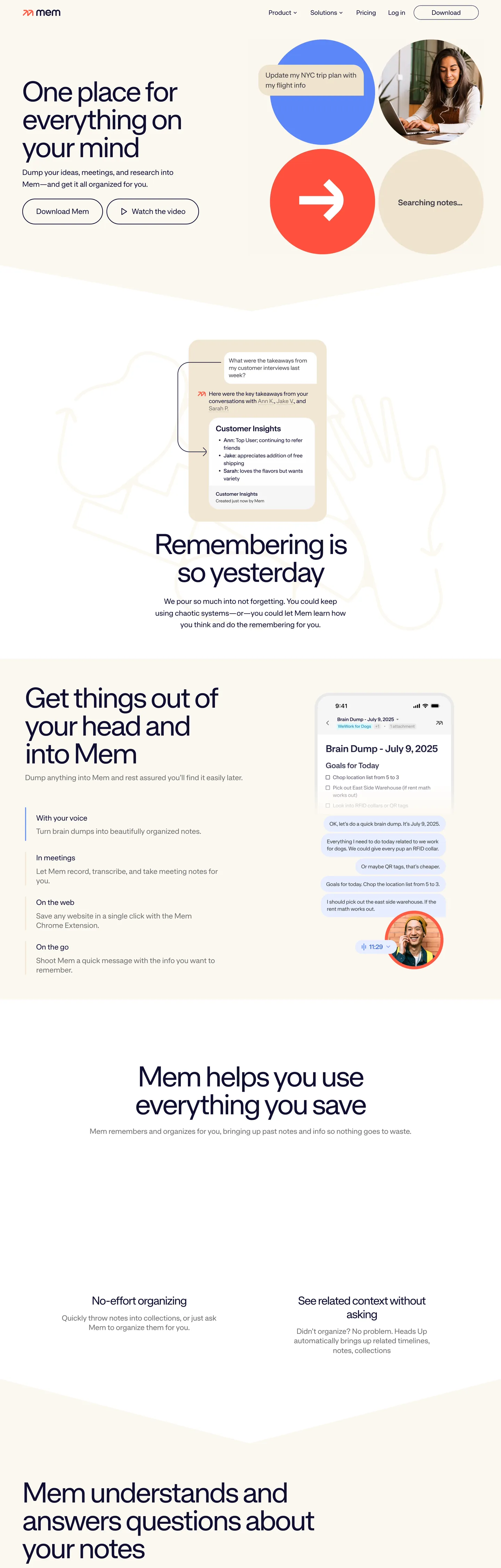
Mem's recent rebrand commits to a move that no other AI productivity tool in the directory makes: editorial-romantic. The hero is a 90px Ritual VF Variable display headline ("A match for great minds") in deep indigo on a warm cream canvas, with the descender of the y dropping below the baseline of the next line as if it were typeset in a literary quarterly. To the right of the headline, a 2x2 grid of pill-rounded illustration tiles — a cobalt circle, a terracotta square with an arrow, a warm cream notepad, and a small portrait photograph — sit at a 100px corner radius that turns them into pebbles. There is no CTA inside the hero band; the visitor scrolls.

The DESIGN.md file captures the system as a token spec for React tooling. Inside: 6 colors tokens (Mem deliberately runs a minimal palette — there is essentially no brand-blue voltage in the chrome), 9 typography tokens all on Ritual VF Variable at weight 400, a 3-step radius scale anchored at 100px pill, a 10px-based spacing system, and 13 components definitions covering the pill-illustration tile, the editorial display heading, the indigo body paragraph, and the no-chrome top nav. The single most distinctive token absence: there is no styled link color. Mem leaves the browser default #0000ee on text links.

Feed this file to an AI coding tool and it reproduces the specific moves: 90px / 80px display headlines on the same single sans-serif, weight 400 across every tier, indigo-on-cream contrast instead of black-on-white, 100px pebble-pill tiles instead of rectangular cards, and the disciplined refusal to style link colors. Borrow the geometry and the typeface restraint freely. The one move to think twice about is the unstyled link color — Mem gets away with it because the editorial composition of the page reframes the default-blue as a typographic choice; on a more conventional layout it would just read as forgotten styling.

What makes it distinct

5

  1. Browser-default link blueMem deliberately leaves text links at #0000ee, the literal browser default, instead of styling them in a brand color
  2. Ritual VF Variable at one weightweight 400 across every tier from the 90px hero headline to 16px body, no bold variant anywhere on the page
  3. 100px pill geometry on tilesillustration cards use a 100px corner radius that makes them read as soft pebbles rather than rectangles
  4. Warm cream canvasthe page reads as warm cream because the illustration tiles, fonts, and indigo ink all carry warm undertones over a literal white canvas
  5. Indigo ink for everythingdeep indigo carries headline, body, and nav at a single tone, not a tiered ink ladder

get.mem.ai

Live at get.mem.ai

A snapshot of the brand in production. Scroll the frame to see the whole page.

Mem's website at get.mem.ai

Colors

6 colors

Mem's system anchors on #000000 (ink-strong) as its primary color. Type is set in Ritual VF Variable across 9 tokens from 16px to 90px, weights 400–400. Shape language is soft — components average 71px corner radius, with no sharp interactive edges.

Surface

Page and card backgrounds · 1

Text

Headlines, body, captions · 5

Typography

9 type tokens

Set in Ritual VF Variable across 9 tokens, from 16px to 90px, weights 400–400. Shown in its own stack: where the font isn't installed, the fallback the file names stands in.

  • display-xl90px · weight 400 · lh 76.5px · tracking -3.6pxThe quick brown fox jumps over the lazy dog
  • display-lg80px · weight 400 · lh 80px · tracking -3.2pxThe quick brown fox jumps over the lazy dog
  • display-md32px · weight 400 · lh 38.4px · tracking -1.28pxThe quick brown fox jumps over the lazy dog
  • body-xl21px · weight 400 · lh 33.6pxThe quick brown fox jumps over the lazy dog
  • body-lg21px · weight 400 · lh 27.3pxThe quick brown fox jumps over the lazy dog
  • body-md18px · weight 400 · lh 23.58pxThe quick brown fox jumps over the lazy dog
  • body-sm16px · weight 400 · lh 20.8pxThe quick brown fox jumps over the lazy dog
  • caption16px · weight 400 · lh 20.8pxThe quick brown fox jumps over the lazy dog
  • icon-glyph18px · weight 400 · lh 18pxThe quick brown fox jumps over the lazy dog

Layout

Radii and spacing

4 corner radii and 7 spacing values. Shape language: soft.

Radii

  • none0px
  • md28px
  • lg60px
  • pill100px

Spacing

  • xxs2px
  • xs8px
  • sm10px
  • base16px
  • lg24px
  • xl32px
  • 2xl64px

Components

13 components

Each rendered from its tokens (color, type, radius, padding) on Mem's own canvas.

  • Button Primary
    button-primaryButton Primary
  • Button Secondary
    button-secondaryButton Secondary
  • Top Nav
    top-navTop Nav
  • Nav Link
    nav-linkNav Link
  • Hero Heading
    hero-headingHero Heading
  • Section Heading
    section-headingSection Heading
  • Sub Heading
    sub-headingSub Heading
  • Body Paragraph
    body-paragraphBody Paragraph
  • Body Paragraph Sm
    body-paragraph-smBody Paragraph Sm
  • Pill Tile
    pill-tilePill Tile
  • Inline Link
    inline-linkInline Link
  • Type here…
    text-inputText Input
  • Card
    cardCard

In use

The system, in use

Mem's tokens on the kind of product it builds.

Build something people actually use.

A short paragraph of marketing copy that previews how the brand's display tier and body tier read together. Two sentences is usually enough.

Get startedLearn more
Marketing heroHeadline, sub-copy, primary CTA — the universal homepage opener.
Reporting · 14 min read

The quiet collapse of an old idea

For decades the consensus held that the system would correct itself. Then it didn't. This is the inside story of what changed, told by the people who watched it unravel.

"Nobody noticed because the failure was indistinguishable from progress."

By Sam Reporter · Updated 2 hours ago

Editorial articleMagazine-style longform with display headline.

FAQ

Mem design system FAQ

Common questions about Mem's tokens, components, and how to use this DESIGN.md in your project.

Read next

Specs, directories, and component libraries that pair with this design system.

Use it

Use Mem in your project

One machine-readable file. Drop it into Claude, Cursor, or any AI tool that reads DESIGN.md.

Download DESIGN.md
  1. Download the DESIGN.md

    One machine-readable file: every color, type, radius, spacing, and component token of Mem.

  2. Feed it to your AI tool

    Drop it into Claude, Cursor, or GitHub Copilot. The agent writes React components and Tailwind classes that match Mem's visual language.

  3. Reference the tokens directly

    Or paste the values into your Tailwind config, CSS variables, or component library: every color, size and radius is a quoted, ready-to-copy value.

Read the full DESIGN.md: overview, rationale, do’s and don’ts

Overview

Mem's rebrand commits to a treatment no other AI productivity brand in the directory makes. Editorial-romantic. The hero is a 90px Ritual VF Variable display headline ("A match for great minds") in deep indigo ({colors.ink} — #100f31) on a warm cream canvas, with the descender of the y dropping below the next line's baseline as if typeset in a literary quarterly. To the right of the headline sits a 2x2 grid of pill-rounded illustration tiles — a cobalt circle, a terracotta square with an arrow, a warm cream notepad mockup, and a small portrait photograph — each at a 100px corner radius that turns them into soft pebbles. Where Notion stacks rectangular product screenshots above the fold and Reflect leans on dark-mode plus a saturated accent, Mem refuses both conventions and runs the hero as a piece of typographic composition.

The chromatic palette is the second move that sets the system apart. There is no styled brand voltage in the chrome. The only blue on the page is {colors.link} (#0000ee) — the literal browser-default text-link color, left unstyled. Most rebrands that introduce a new typeface also introduce a new brand voltage; Mem introduces the typeface and deliberately keeps the chromatic palette to six tones (indigo ink, two greys, pure black, pure white canvas, and the browser-default link blue). The colorful tiles in the hero are illustration assets, not declared system colors. The whole page reads warm cream rather than stark white because the indigo ink, the warm-undertone illustrations, and the Ritual typeface's slightly humanist proportions all carry warm undertones — the canvas hex itself is {colors.canvas} (#ffffff).

Typography sits at one weight across every tier. Ritual VF Variable runs at weight 400 from the 90px display headline down to the 16px navigation labels, with no bold variant anywhere on the page. The hierarchy comes entirely from size and letter-spacing — the 90px hero at -3.6px tracking, the 80px section headings at -3.2px, the 32px sub-headings at -1.28px. Below 32px the tracking returns to 0. This is the typographic move that defines the brand: confidence by single-weight discipline.

Key Characteristics:

  • Single-weight typography — Ritual VF Variable at weight 400 runs every tier from 90px hero to 16px nav, no bold variant declared.
  • Indigo-on-cream contrast — {colors.ink} (#100f31) deep indigo as text on warm-cream canvas, never black-on-white.
  • 100px pill geometry — the dominant radius (12 occurrences) used on illustration tiles, buttons, and inputs; secondary pill at 60px (3); a single 28px on inline chips.
  • No styled link color — text links remain at the browser default {colors.link} (#0000ee), a deliberate refusal to brand the link voltage.
  • No CTA above the fold — the hero is a single editorial composition (headline + sub-paragraph + tile grid); the page expects the reader to scroll.
  • Six-color palette — indigo, black, two greys, cream-white canvas, and the unstyled browser-default link blue. The illustrations carry the only saturated color in the system.
  • Tight negative tracking on display tiers — -3.6px at 90px, -3.2px at 80px, -1.28px at 32px; the tracking returns to 0 below 32px.

Colors

Text

  • Deep Indigo ({colors.ink} — #100f31): frequency 75. Used as text (37), border (37), bg (1). The dominant ink — runs every headline, body paragraph, and nav label on the page. Not pure black; the 6-point chromatic indigo gives the page a warm-cool tension against the cream canvas.
  • Pure Black ({colors.ink-strong} — #000000): frequency 428. Used as text (214), border (214). Despite the higher raw frequency, this lives almost entirely inside SVG illustration strokes and small chrome accents; the prose ink is the deep indigo above.
  • Muted Grey ({colors.ink-muted} — #707070): frequency 26. Used as text (13), border (13). Secondary running-text tone — appears on small captions and meta-rows below the hero.
  • Soft Grey ({colors.ink-soft} — #888888): frequency 6. Used as text (3), border (3). Tertiary tone for the smallest chrome labels.

Surface

  • Cream Canvas ({colors.canvas} — #ffffff): frequency 100. Used as text-on-dark (44), bg (12), border (44). The literal hex is pure white but the page reads as warm cream because the indigo ink, the warm illustration tiles, and the humanist sans's proportions all carry warm undertones. The CSS extraction also clustered a near-cream value here — a single explicit cream tone used on one illustration tile.

Link

  • Browser-Default Link Blue ({colors.link} — #0000ee): frequency 78. Used as text (39), border (39). The literal browser-default text-link color, left unstyled. The single deliberate move that defines the chromatic system — Mem refuses to brand the link voltage, treating the default as a typographic affordance the visitor already understands.

Typography

Font Family

The system runs Ritual VF Variable across every tier — display, heading, body, button, nav, and chrome labels share the same family. Fallbacks walk to sans-serif. There is no separate display family, no serif tier, and no monospace tier in the running text; the only secondary family is "Material Icons", monospace used twice as the icon glyph font.

Ritual VF Variable is a contemporary variable sans with display-serif undertones, designed by Mass-Driver. Its slightly humanist proportions and tight cap height carry the editorial feel; at the 90px display tier the letterforms read closer to a literary serif than a SaaS sans, even though the typeface is technically sans-serif.

Hierarchy

TokenSizeWeightLine HeightLetter SpacingUse
{typography.display-xl}90px40076.5px-3.6pxHero h1 ("A match for great minds")
{typography.display-lg}80px40080px-3.2pxSection h2 ("One place for everything on your mind")
{typography.display-md}32px40038.4px-1.28pxSub-section h4
{typography.body-xl}21px40033.6px0Hero sub-paragraph (loose leading variant)
{typography.body-lg}21px40027.3px0Default editorial body
{typography.body-md}18px40023.58px0Secondary body, link text
{typography.body-sm}16px40020.8px0Default chrome, nav links, buttons
{typography.caption}16px40020.8px0Same as body-sm, used for caption rows
{typography.icon-glyph}18px40018px0Material Icons glyphs only

Principles

Every tier sits at weight 400. There is no bold variant on the captured page — not on the hero headline, not on the section headings, not on the nav, not on the buttons. Hierarchy comes from size and tracking alone. The 90px hero at -3.6px tracking is the loudest moment; the 80px section heading at -3.2px tracking sits below it. The tight negative tracking on the display tiers is the editorial signature — at 16px and below the tracking returns to 0 to keep body copy comfortable. Two body-text leadings exist at 21px (33.6px loose for the hero sub-paragraph, 27.3px tight for default editorial body) — the looser leading is reserved for the single most-important paragraph on each page.

Note on Font Substitutes

Ritual VF Variable is a paid font from Mass-Driver. The closest open-source substitute for the display tiers is Fraunces (variable serif-flavored display) or PP Editorial New if you can license it; for body tiers Inter at weight 400 transfers cleanly. To preserve the single-weight discipline, declare only weight 400 of whichever substitute you choose — do not introduce a 500 or 700 weight to fake the hierarchy.

Layout

Spacing System

  • Base unit: 8px, with 10px as a secondary common gap (28 occurrences) and 16px as the next module (16 occurrences).
  • Tokens: {spacing.xxs} 2px · {spacing.xs} 8px · {spacing.sm} 10px · {spacing.base} 16px · {spacing.lg} 24px · {spacing.xl} 32px · {spacing.2xl} 64px.
  • Section padding (vertical): ~72px between major editorial sections; ~64px horizontal page padding on wide viewports.
  • Card / tile internal padding: ~32-40px on the pill-illustration tiles; ~24px on inline content rows.
  • Top-nav padding: 14px vertical, 32px horizontal on the left wordmark.

Grid & Container

  • Hero layout: asymmetric two-column at ~50/50 split — the 500px-wide display headline on the left, the 2x2 pill-tile grid on the right.
  • Body rhythm: centered single-column for editorial sections, with the heading and body paragraph constrained to ~568-628px wide.
  • Two-column rows: the "No effort organizing" / "See video & context without asking" row uses an even 2-column split with vertical hairline indigo divider.

Rhythm

The page alternates between editorial composition and illustration-anchored row. The hero is composition (typographic, off-center, asymmetric); the next section is illustration-anchored (a single annotated mockup); the next is editorial again (centered 80px display headline); the next is illustration-anchored. The cadence is closer to a print magazine spread than a SaaS landing page, where successive bands would normally each carry a similar weight.

Elevation

The system has essentially no shadow tier. Elevation comes from the pill-rounded illustration tiles themselves — each is a self-contained illustration with its own fill, and they sit flat on the cream canvas without any drop shadow doing depth work.

  • Flat (no shadow): hero, body bands, tile grid, footer — every surface.
  • Hairline divider: a single 1px indigo {colors.ink} vertical rule splits the 2-column row beneath "Mem helps you use everything you save"; the only border that does structural work in the captured page.
  • No declared shadow tokens. The captured CSS exposes one --one-if-corner-shape-supported custom property and nothing in the shadow family.

Shapes

The radius scale is pill-anchored, with only three values declared:

  • {rounded.none} 0px — body type, the hero text, every editorial surface.
  • {rounded.md} 28px — one occurrence, on an inline content chip below the fold.
  • {rounded.lg} 60px — 3 occurrences, on secondary pill buttons and a smaller tile.
  • {rounded.pill} 100px — 12 occurrences, the dominant rounded surface. Illustration tiles in the hero, primary action pills, the text input, and accent containers.

There is no 4-8px small-step tier and no fully-circular 9999px tier. The 100px value on the ~200px-square illustration tiles renders as a soft pebble — neither rectangle nor circle, but a shape where the corners flow into the edges rather than meeting them at a tangent. This pebble geometry is the brand's visual signature.

Components

button-primary — Deep indigo {colors.ink} fill, cream text, 100px pill radius, 15x23 padding, 48px height. Used for the primary action surfaces below the fold ("Get started", "Sign up"). The button typography sits at {typography.body-sm} (16px / 400) — same weight as the surrounding body text.

button-secondary — Cream {colors.canvas} fill, indigo text, 1px indigo border, 100px pill radius, 15x23 padding, 48px height. Used for the lower-priority action paired beside the primary button.

top-nav — Cream {colors.canvas} surface, indigo text, no border or shadow, 64px height, 14x32 padding. Mem wordmark flush left, product links centered, Download / Sign-in cluster flush right. The nav floats flat on the canvas without a hairline rule beneath it.

nav-link — Transparent background, indigo text at {typography.body-sm} (16px / 400), 10px padding. No hover background visible in the captured render.

hero-heading — Indigo text at {typography.display-xl} (90px / 400, -3.6px tracking). 0 padding; the headline sits in a constrained 500px column with the descenders allowed to break the baseline of the next line.

section-heading — Indigo text at {typography.display-lg} (80px / 400, -3.2px tracking), centered in a ~1080px column with 64px horizontal padding.

sub-heading — Indigo text at {typography.display-md} (32px / 400, -1.28px tracking). Used for the 4-up sub-section markers ("Remembering is so yesterday").

body-paragraph — Indigo text at {typography.body-xl} (21px / 400, 33.6px loose leading). The hero sub-paragraph and the lead paragraphs of each editorial section.

body-paragraph-sm — Indigo text at {typography.body-sm} (16px / 400). Default running text, caption rows, secondary chrome.

pill-tile — Cream {colors.canvas} fill (or an illustration-specific fill), indigo text, 100px pill radius, ~40px internal padding. The hero illustration tiles — each holds a single illustration, mockup, or photograph. The pebble geometry is the brand's visual signature.

inline-link — Transparent background, browser-default {colors.link} (#0000ee) text, no underline override. Mem deliberately leaves text links at the browser-default style — a typographic refusal to brand the link voltage.

text-input — Cream {colors.canvas} fill, indigo text, 1px indigo border, 100px pill radius, 15x23 padding, 48px height. Used for the email-capture field in the footer.

card — Cream {colors.canvas} fill, indigo text, 1px {colors.ink-muted} border, 28px radius, 24px padding. The single non-pill rounded surface in the system — used for the inline content chip below the fold.

Do's and Don'ts

Do keep every tier at weight 400. The hero headline at 90px / 400 and the body text at 16px / 400 share the same weight; the hierarchy comes from size and negative tracking alone. Adding a 700 weight to the hero turns the editorial composition into a SaaS shout and dissolves the single-weight discipline that defines the system.

Do use {colors.ink} (#100f31) — never pure #000000 — for prose text. The 6-point chromatic indigo gives the page its warm-cool tension against the cream canvas. The pure-black #000000 in the extraction is used almost entirely inside SVG illustration strokes, not in running text.

Do preserve the 100px pill geometry on illustration tiles. The soft pebble shape — corners that flow into edges rather than meeting at a tangent — is the brand's visual signature; replacing it with 16px-rounded rectangles dissolves the editorial-romantic feel.

Do leave text links at the browser default {colors.link} (#0000ee). The unstyled link is a deliberate move — Mem treats the default-blue as a typographic affordance the visitor already understands. Restyling it in indigo or any other tone breaks the single-most-distinctive chromatic decision in the system.

Don't add a saturated brand voltage outside the illustration tiles. The chrome palette is six tones (indigo, black, two greys, cream, browser-blue) and the colorful tiles in the hero are illustration assets, not declared system colors. Introducing a cobalt or terracotta as a system token would turn the rebrand into a generic SaaS palette.

Don't introduce a CTA pill into the hero band. The captured hero has no above-fold CTA — the right side is occupied by the 2x2 pill-tile grid. The no-CTA hero is the editorial-magazine move; adding a "Get Started" button to the hero turns the composition into a conversion funnel.

Don't soften the negative tracking on display tiers. The 90px / -3.6px and 80px / -3.2px tracking are what give the headlines their editorial density. Loosening to -1px or 0 produces a generic display sans that loses the literary-quarterly feel.

Don't introduce a small-step radius tier (4 / 6 / 8px). The system is pill-anchored at 100px with only two secondary radii (60px, 28px); adding a 4-8px tier — even for inputs — breaks the geometry that defines the brand.

Known Gaps

  • Hover and focus states: the captured marketing surface only renders resting states; the full hover / press / focus matrix for the primary buttons and the text input lives inside the product UI and is not documented here.
  • Form input error states: the {component.text-input} carries only the resting state; error and validation styling is not exposed on the marketing surface.
  • Dark mode: the captured surface is light-only. The Mem product UI exposes a dark variant, but the marketing chrome is light-only by design.
  • Motion: Mem's hero illustration tiles do not appear to animate on the captured page, but the in-product motion (the AI-suggested note pop-ins, the chat-style flow) is not documented in this spec.
  • Product surfaces: this DESIGN.md captures the marketing site only. The Mem app itself — note editor, chat interface, knowledge graph view — carries a much richer token system that is not represented here.
  • Illustration palette: the cobalt circle, terracotta square, and warm cream notepad in the hero are illustration assets with their own color choices; these are not declared as system color tokens because they belong to the illustration system, not the chrome.
  • Typographic state variants: the system runs weight 400 only on the captured page, but the Ritual VF Variable file ships with the full variable axis. Whether bold or other weights are used elsewhere in the brand surface is not represented here.

Productivity & SaaS

More systems like this

More DESIGN.md files in Productivity & SaaS.

Pricing

Build it with Pro

The DESIGN.md files are free. Pro adds 6,000+ blocks, premium templates and the MCP server, so your AI editor builds in your system for you.

4.9/5 out of 5 · 150+ reviewsfrom 150+ founders and developers.

Billed once a year in USD. Cancel anytime.

Individual

For personal projects & open source

$32instead of $49/mo

$389 billed yearly

  • How many people can use the license.Seats: 1 seat
  • Client work, SaaS products and anything you charge for.Commercial use: Personal & open source only
  • Production-ready React sections: hero, pricing, features, dashboards and more.Pro blocks: 6,000+ blocks
  • Complete multi-page sites you can ship as they are.Templates: All 14 templates
  • React icons from every major library, installable with one command.React icons: 294k+ icons
  • Presets that restyle every block, in light and dark.Themes: All 59 themes
  • Lets your AI editor search, preview and install blocks for you.MCP server: Basic usage
  • Priority requests are answered first.Support: Standard

Team

Most popular

For freelancers, agencies & startups

$66instead of $99/mo

$789 billed yearly · ≈ $13/dev/mo

Everything in Individual, plus

  • How many people can use the license.Seats: Up to 5 seats
  • Client work, SaaS products and anything you charge for.Commercial use: Included
  • Lets your AI editor search, preview and install blocks for you.MCP server: High usage
  • Priority requests are answered first.Support: Priority

Organization

For companies with larger teams

$132instead of $199/mo

$1,589 billed yearly

Everything in Team, plus

  • How many people can use the license.Seats: Unlimited seats
  • Lets your AI editor search, preview and install blocks for you.MCP server: Unlimited usage
  • Secure checkout via Stripe
  • Code lives in your repo
  • Keep what you've shipped if you cancel
  • License terms

Your system, built for you

Every block, template and icon, installed by your AI agent in your design system. The DESIGN.md files stay free.

Get Pro