Last.fm Design System
Last.fm's design system as a DESIGN.md file. Postbox Red #d92323, Barlow 48px/700 hero, navy links, 18 colors, 19 components — for React and AI tools.
Add shadcn.io to your AI agent. · Pro It installs blocks, icons and templates in your design system from a prompt, with Pro.
Set up MCP- Primary
- #d92323
- Typeface
- Barlow
- Shape
- Soft
- Base radius
- 3px
- Colors
- 18
- Type tokens
- 11
- Components
- 19
- Spacing values
- 9
About
About Last.fm DESIGN.md
Curated by Dov Azencot · Updated May 13, 2026 · Source last.fm (opens in a new tab)
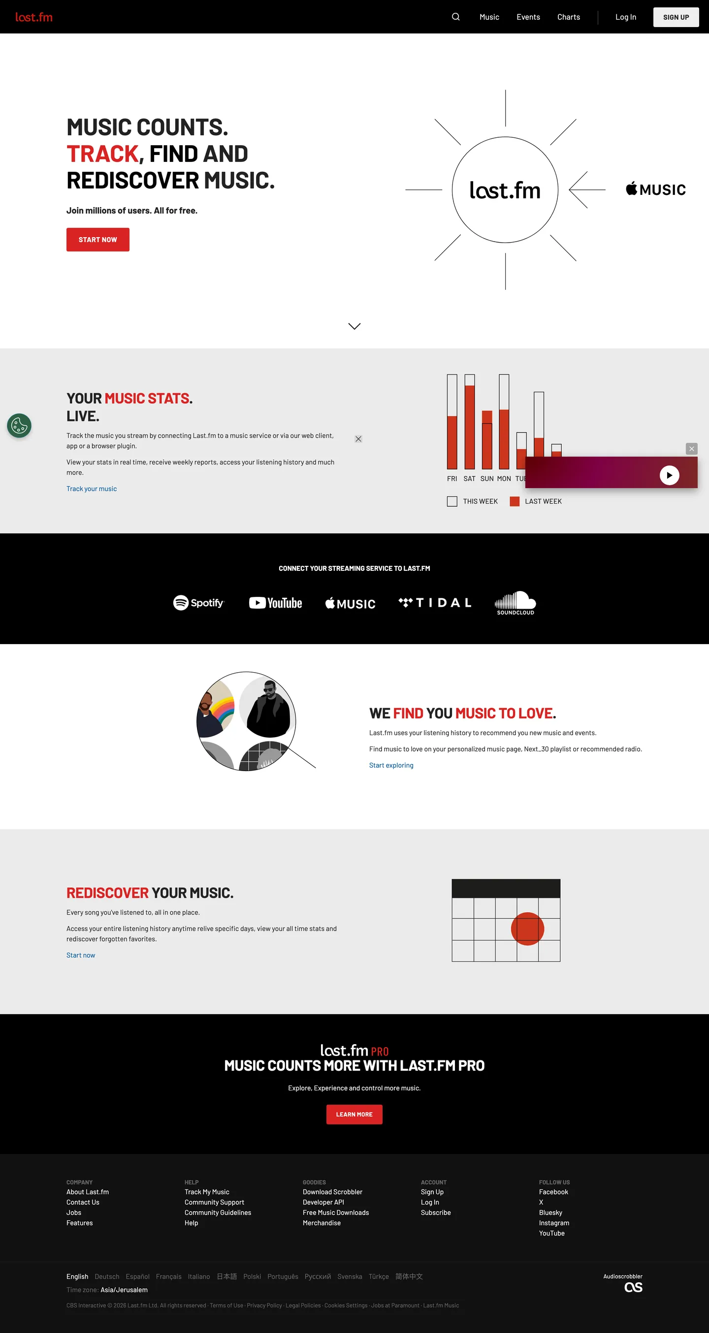
Last.fm's homepage is the rare 2026 music product that still looks like a 2008 scrobbler — a deliberate two-band layout where a white statistics surface sits above a black "Connect your streaming service to Last.fm" band, with a single Postbox Red ("#d92323") CTA labeled START NOW pinned beneath the hero. The brand voltage is applied with surgical scarcity: red appears on exactly one button, on one word inside each headline ("TRACK", "MUSIC STATS", "REDISCOVER"), and on a calendar dot illustration. Every other interactive surface is achromatic. Links run in Navy ("#005399") rather than the brand red, because red has been promoted to a structural role — almost a fifth typographic weight rather than a decorative accent.
This DESIGN.md file packages the system into a single machine-readable spec built on the Google Labs format. Inside: 18 colors tokens grouped into brand, surface, ink, and link roles; 11 typography tokens spanning the Barlow uppercase display ladder (48px / 30px / 14px / 12px) and the body / nav / button registers; 3 corner radii — 3px, 50px, and 100px — that intentionally skip the 6–16px mid-corner zone most products live in; an 8-step spacing scale built on 4px micro-steps; and 19 components recipes covering the dark-bordered START NOW pill, the outlined nav SIGN UP, the search icon button, the streaming-service connector band, and the footer language picker.
Feed the file to Claude, Cursor, or GitHub Copilot and the agent reproduces Last.fm's two-band rhythm — white-then-black sections separated by full-bleed color shifts, uppercase Barlow shouting the verb of each promise while weight-400 Barlow whispers the supporting copy, red restricted to a single CTA per screen. Reference the tokens directly to paste into Tailwind config or CSS variables. The system is worth studying because almost no contemporary music product still trusts a flat two-color canvas to carry the entire identity — Spotify went dark-immersive, Apple Music went translucent-glass, and Last.fm stayed loud, square, and almost newspaper-graphic.
What makes it distinct
5
- Single functional accentPostbox Red ("#d92323") used only on the primary START NOW CTA and on the emphasized word inside every uppercase headline
- Two-band canvasa white statistics surface stacked above a black streaming-service band, with no graded ladder of grays between them
- Uppercase Barlow 700 display at 48px / 30px with -0.4px tracking, weight 400 at 14px for bodya strict 700/400 weight binary
- Navy link voltage ("#005399") for running text links, never redred is structural CTA paint only
- Two-radius geometry3px on every button, image, and form field; 100px pill reserved for legal language toggles. No mid-corner softness.
last.fm
Live at last.fm
A snapshot of the brand in production. Scroll the frame to see the whole page.
Colors
18 colors
Last.fm's system runs on #d92323 as its primary voltage, used in 4 of 19 components. Type is set in Barlow across 11 tokens from 12px to 48px, weights 400–700. Shape language is soft — components average 21px corner radius, with no sharp interactive edges.
Brand & Accent
Sparing, CTA-only voltage · 3
Surface
Page and card backgrounds · 6
Text
Headlines, body, captions · 6
Other
Specialty colors · 3
Typography
11 type tokens
Set in Barlow across 11 tokens, from 12px to 48px, weights 400–700. Shown in its own stack: where the font isn't installed, the fallback the file names stands in.
- display-hero48px · weight 700 · lh 54px · tracking -0.4pxThe quick brown fox jumps over the lazy dog
- display-section30px · weight 700 · lh 36px · tracking -0.4pxThe quick brown fox jumps over the lazy dog
- lead-bold18px · weight 700 · lh 24px · tracking normalThe quick brown fox jumps over the lazy dog
- link-large16px · weight 400 · lh 40px · tracking normalThe quick brown fox jumps over the lazy dog
- body14px · weight 400 · lh 21px · tracking normalThe quick brown fox jumps over the lazy dog
- body-link14px · weight 400 · lh 24px · tracking normalThe quick brown fox jumps over the lazy dog
- button-uppercase14px · weight 700 · lh 40px · tracking 0.4pxThe quick brown fox jumps over the lazy dog
- caption-eyebrow14px · weight 700 · lh 21px · tracking normalThe quick brown fox jumps over the lazy dog
- caption12px · weight 400 · lh 18px · tracking normalThe quick brown fox jumps over the lazy dog
- caption-bold12px · weight 700 · lh 18px · tracking normalThe quick brown fox jumps over the lazy dog
- caption-tracked12px · weight 700 · lh 21px · tracking 0.4pxThe quick brown fox jumps over the lazy dog
Layout
Radii and spacing
3 corner radii and 9 spacing values. Shape language: soft.
Radii
- square3px
- chip50px
- pill100px
Spacing
- micro4px
- xs12px
- sm15px
- md18px
- base20px
- lg25px
- xl30px
- xxl48px
- section60px
Components
19 components
Each rendered from its tokens (color, type, radius, padding) on Last.fm's own canvas.
- Button Primarybutton-primaryButton Primary
- Button Primary Deepbutton-primary-deepButton Primary Deep
- Button Secondary Outlinedbutton-secondary-outlinedButton Secondary Outlined
- button-icon-circleButton Icon Circle
- Type here…text-inputText Input
- Top Navtop-navTop Nav
- Nav Linknav-linkNav Link
- Hero Sectionhero-sectionHero Section
- Stats Bandstats-bandStats Band
- Streaming Bandstreaming-bandStreaming Band
- Pro Callout Bandpro-callout-bandPro Callout Band
- Footer Bandfooter-bandFooter Band
- Body Linkbody-linkBody Link
- Body Link Hoverbody-link-hoverBody Link Hover
- Headline Accent Wordheadline-accent-wordHeadline Accent Word
- Section Accent Wordsection-accent-wordSection Accent Word
- Language Picker Chiplanguage-picker-chipLanguage Picker Chip
- Chart Bar Activechart-bar-activeChart Bar Active
- Chart Bar Priorchart-bar-priorChart Bar Prior
In use
The system, in use
Last.fm's tokens on the kind of product it builds.
Build something people actually use.
A short paragraph of marketing copy that previews how the brand's display tier and body tier read together. Two sentences is usually enough.
FAQ
Last.fm design system FAQ
Common questions about Last.fm's tokens, components, and how to use this DESIGN.md in your project.
Read next
Related reading
Specs, directories, and component libraries that pair with this design system.
- Browse all design systemsThe full directory of DESIGN.md files on shadcn.io, with live mockups for each.shadcn.io
- Last.fm — official siteTrack, find, and rediscover music — the world's largest scrobbling and music-statistics service.last.fm (opens in a new tab)
- The DESIGN.md specificationGoogle Labs' open spec for machine-readable design system files.github.com (opens in a new tab)
Use it
Use Last.fm in your project
One machine-readable file. Drop it into Claude, Cursor, or any AI tool that reads DESIGN.md.
Download the DESIGN.md
One machine-readable file: every color, type, radius, spacing, and component token of Last.fm.
Feed it to your AI tool
Drop it into Claude, Cursor, or GitHub Copilot. The agent writes React components and Tailwind classes that match Last.fm's visual language.
Reference the tokens directly
Or paste the values into your Tailwind config, CSS variables, or component library: every color, size and radius is a quoted, ready-to-copy value.
Read the full DESIGN.md: overview, rationale, do’s and don’ts
Overview
Last.fm's homepage is a two-band system that splits the page horizontally rather than layering it. The base canvas is Hazard White ({colors.surface-white} — "#ffffff") for the statistics section, immediately interrupted by a full-bleed Carbon Band ({colors.surface-black} — "#000000") that holds the "Connect your streaming service to Last.fm" row, and then a return to a Platinum-tinted white ({colors.surface-platinum} — "#f9f9f9") for the "Rediscover your music" section. The only true brand color is Postbox Red ({colors.brand-red} — "#d92323"), reserved for the single primary START NOW CTA, the emphasized word inside every uppercase headline ("TRACK", "FIND", "MUSIC STATS", "REDISCOVER"), and the active bar in the weekly stats chart.
Red-as-grammar: Where most music products use their brand red as a logo color or a marketing background wash, Last.fm has promoted it to a typographic role. Inside every hero and section headline, exactly one word turns red — "TRACK, FIND AND REDISCOVER MUSIC" reads as a three-color sentence (black, red, black) that doubles as the verb-emphasis grammar of the page. Frequency 12 across the entire homepage capture (5 as text, 5 as border, 2 as background), which is rare-tier scarcity. Unlike the convention of pairing a brand red with a complementary accent, there is no second voltage — Navy ("#005399") carries body links instead, and red never appears on running text.
Type runs Barlow for everything — heading, body, button, footer, language picker. The system is a strict 700/400 weight binary: weight 700 on the 48px hero and 30px section heads (both UPPERCASE, both at "-0.4px" tracking, line-heights of 54px and 36px respectively), and weight 400 on every 14px body paragraph at 21px leading. Buttons flip the tracking polarity — UPPERCASE 14px / 700 with positive "0.4px" tracking — which separates the "label voice" from the display headlines that pull tighter. There is no 500 or 600 weight anywhere in the extraction.
Key Characteristics:
- Two-band canvas, not a graded ladder:
{colors.surface-white}("#ffffff") and{colors.surface-platinum}("#f9f9f9") for stats, full-bleed{colors.surface-black}("#000000") for the streaming-service connector and the Pro callout. There is no intermediate gray surface between them. - Single functional accent:
{colors.brand-red}("#d92323") appears only on the primary START NOW CTA, the LEARN MORE button on the Pro band, the accented word inside every headline, and the active bar in the listening-chart visualization. Never decorative. - Strict 700/400 weight binary: every headline is 700, every paragraph is 400. No weight 500 or 600 exists in the extracted homepage CSS.
- Tracking polarity flip: display type pulls tight at "-0.4px"; UPPERCASE button labels push open at positive "0.4px". The same Barlow family carries two opposing letter-spacing behaviors.
- Two-radius geometry: 3px on every button, image, and form field; 100px pill reserved for the legal-language toggle. The mid-corner zone (6–16px) that most contemporary products inhabit is skipped entirely.
- Navy ("#005399") links — body text links run navy, never red. Hover transitions to a lighter Sky Blue ("#6699cc"). Red is structural CTA paint, not text-link color.
- Color-as-elevation: no drop shadows anywhere in the extracted styles. Section depth is delivered exclusively by the full-bleed band-color shift from white to black to platinum to obsidian footer.
- Uppercase-as-emphasis grammar: weight 700 + UPPERCASE + "-0.4px" tracking marks every editorial heading; the lowercase weight 400 paragraph immediately below carries the supporting copy.
Colors
Brand
- Postbox Red (
{colors.brand-red}— "#d92323") — frequency 12. Used as text (5), border (5), background (2). The single functional brand voltage — applied to the START NOW CTA fill, to the emphasized word inside every uppercase headline, and to the active bar inside the weekly-listening chart. Never decorative. - Sangria Red Deep (
{colors.brand-red-deep}— "#9d0000") — frequency 0 on the rendered page but declared as--clr-sangriain the stylesheet. Reserved as the deep-press state for the primary CTA. - Habanero Red Hot (
{colors.brand-red-hot}— "#f71414") — frequency 0 on the rendered page but declared as--clr-habanero. Available as an alternative high-saturation accent for error or active states; out of scope for the current homepage.
Surface
- Hazard White (
{colors.surface-white}— "#ffffff") — frequency 249. Used as text (123), border (122), background (4). The primary canvas of the statistics section and the dominant text color on every black band. - Platinum (
{colors.surface-platinum}— "#f9f9f9") — declared as--clr-platinum. A near-imperceptible warm-white tint used as the "Rediscover Your Music" band background to distinguish it from the pure-white hero. - Fog (
{colors.surface-fog}— "#ebebeb") — frequency 3 as background. Applied to the outlined SIGN UP button fill in the top nav, where the dark border carries the contrast rather than the fill. - Smog Border (
{colors.surface-smog}— "#d7d7d7") — declared as--clr-smog. Reserved 1px border tone for form inputs. - Carbon Black (
{colors.surface-black}— "#000000") — frequency 17. Used as background (6), text (3), border (3), shadow (3), gradient (2). The full-bleed streaming-service band, the Pro callout band, and the top nav all sit on this color. - Obsidian (
{colors.surface-obsidian}— "#111111") — frequency 2 as background. The footer band — one notch warmer than the streaming band, just enough to delineate it from the absolute-black above.
Ink
- Mineshaft (
{colors.ink-mineshaft}— "#222222") — frequency 92. Used as text (46), border (46). The primary headline and body text on every white surface. Never pure black — the slight lift to "#222222" reads as printed-paper rather than OLED-text. - Graphite (
{colors.ink-graphite}— "#666666") — frequency 114. Used as text (57), border (57). Secondary text — captions, footer columns, byline-equivalent metadata. - Ash (
{colors.ink-ash}— "#adadad") — declared as--clr-ashand--clr-anchor. Tertiary text and the resting border on outlined form fields when not in focus.
Link
- Navy (
{colors.link-navy}— "#005399") — frequency 12. Used as text (6), border (6). Every running text link — "Track your music", "Start exploring", "Start now" — runs in navy, not the brand red. The system's strongest "red is not for links" signal. - Sky (
{colors.link-sky}— "#6699cc") — declared as a hover-state variant. Body links transition to this lighter blue on hover; no underline shift. - Twitter Rest (
{colors.link-twitter-rest}— "#6aaae4") — declared as--clr-twitter-rest. Reserved for the Twitter/X social-follow button border on the footer.
Gradient Stops (Logo and Player Decoration)
- Red Gradient A (
{colors.red-gradient-stop-a}— "#b90000"), Red Gradient B ({colors.red-gradient-stop-b}— "#fa4b4b"), Red Gradient C ({colors.red-gradient-stop-c}— "#ff008a"): the three documented gradient stops, used only inside the audio-player overlay decoration in the lower-right corner and inside the wordmark drop. The homepage chrome itself uses zero gradients — gradients are scoped to one ornament.
Typography
Font Family
The entire system runs Barlow with a long fallback stack: Barlow, "Open Sans", "Lucida Grande", "Helvetica Neue", Helvetica, Arial, sans-serif. Barlow is open-source via Google Fonts; the variable-font version with weights 400 and 700 covers every token. The fallback stack is unusually long for a 2026 product — five named families before reaching the generic sans-serif — suggesting the spec predates the variable-font era and was never tightened.
Hierarchy
| Token | Size | Weight | Line Height | Letter Spacing | Use |
|---|---|---|---|---|---|
{typography.display-hero} | 48px | 700 | 54px | "-0.4px" UPPERCASE | The hero "MUSIC COUNTS. TRACK, FIND AND REDISCOVER MUSIC." headline |
{typography.display-section} | 30px | 700 | 36px | "-0.4px" UPPERCASE | Section heads ("YOUR MUSIC STATS. LIVE.", "WE FIND YOU MUSIC TO LOVE.") |
{typography.lead-bold} | 18px | 700 | 24px | normal | The "Join millions of users. All for free." sub-hero lead |
{typography.link-large} | 16px | 400 | 40px | normal | Streaming-service connector labels ("CONNECT YOUR STREAMING SERVICE TO LAST.FM") |
{typography.body} | 14px | 400 | 21px | normal | The standard paragraph everywhere — feature descriptions, footer columns |
{typography.body-link} | 14px | 400 | 24px | normal | Inline body links — "Track your music", "Start exploring" |
{typography.button-uppercase} | 14px | 700 | 40px | "0.4px" UPPERCASE | Every button label — START NOW, SIGN UP, LEARN MORE, LOG IN |
{typography.caption-eyebrow} | 14px | 700 | 21px | normal UPPERCASE | "COMPANY", "HELP", "GOODIES" footer column heads |
{typography.caption} | 12px | 400 | 18px | normal | Language picker, time-zone label, copyright legal |
{typography.caption-bold} | 12px | 700 | 18px | normal UPPERCASE | "CONNECT YOUR STREAMING SERVICE" band header |
{typography.caption-tracked} | 12px | 700 | 21px | "0.4px" UPPERCASE | Small uppercase chips and category labels |
Principles
Most text is either weight 700 or weight 400 — the binary creates hierarchy through weight contrast rather than through size variation. There is no weight 500 or 600 anywhere in the extracted CSS. Display type runs UPPERCASE with negative "-0.4px" tracking to compress the cap-heights into a tight horizontal band; button labels run UPPERCASE with positive "0.4px" tracking to open the cap-heights for readability at small sizes. The same Barlow family carries both polarities — the tracking flip is the typographic fingerprint.
The headline grammar is three-color sentence: black-red-black, where the red word is the verb-emphasis ("TRACK", "FIND", "REDISCOVER", "MUSIC STATS"). This is rare in contemporary product design — most systems use color only as a tile fill or a CTA background, never as part of the headline word grammar.
Note on Font Substitutes
Barlow is open-source, so no substitute is strictly required. If you cannot ship Barlow, Hanken Grotesk, Heebo, or Archivo at weights 400 and 700 match the geometric construction within ~1% character width. DM Sans is the closest free alternative if the slightly more humanist proportions are acceptable. Preserve the "-0.4px" tracking on the display tokens and the positive "0.4px" tracking on the button tokens — the polarity flip is what carries the system identity.
Layout
Spacing System
- Base unit: 4px micro / 12px standard, ranging to a 60px band-padding macro.
- Tokens:
{spacing.micro}4px ·{spacing.xs}12px ·{spacing.sm}15px ·{spacing.md}18px ·{spacing.base}20px ·{spacing.lg}25px ·{spacing.xl}30px ·{spacing.xxl}48px ·{spacing.section}60px. - Band padding (vertical): 60px between every full-bleed section on desktop. The streaming-service band tightens to 48px because its content is iconography rather than copy.
- Inline padding: primary buttons run 9×20×10px asymmetric vertical padding; outlined buttons run 0×20px with the 40px height carrying the vertical center. Form inputs use 12×25px — generous horizontal padding for the lead-text field aesthetic.
Grid & Container
- Two-band horizontal split: the page alternates white statistics surfaces with full-bleed black media-service bands. There is no max-width container that runs continuously top-to-bottom — instead, each band has its own internal max-width centered horizontally.
- Hero column pattern: a 2-column hero with the headline left and the streaming-service connector illustration right (last.fm circular logo with rays to Apple Music). On mobile the columns stack with the illustration above the copy.
- Footer columns: 5-column layout — COMPANY, HELP, GOODIES, ACCOUNT, FOLLOW US — each with weight-700 uppercase headers and weight-400 link lists below.
- Gutters: 30px horizontal margin on the outer page edge at every breakpoint above mobile.
Whitespace Philosophy
The system favors band rhythm over breathing room. The statistics section feels tight and density-oriented — paragraphs hug close to headlines, charts sit immediately adjacent to their captions — and the visual rest comes from the black streaming-service band that interrupts the white surface every 700–800px of vertical scroll. Where Spotify uses dark compression and Apple uses generous gallery breathing, Last.fm uses band oscillation: white → black → white → black → obsidian footer, with each transition acting as a palette cleanser.
Border Radius Scale
{rounded.square}"3px": every button, every form field, every image frame, every chart bar. This is the load-bearing radius of the system.{rounded.chip}"50px": the circular search icon button in the top nav. The only mid-radius value, and it is applied to exactly one component.{rounded.pill}"100px": the language-picker chip at the bottom of the footer. The full-pill reserved for legal/locale chrome.
Three radii is unusually few. The 6–16px mid-corner zone that most contemporary products inhabit is intentionally skipped — every interactive surface either reads as "infrastructure" (3px) or as a "navigation chip" (100px), with nothing in between.
Elevation
The system's depth philosophy is band-as-elevation. There are zero traditional box-shadows in the extracted styles — no 0px 8px 24px rgba(0, 0, 0, 0.5) or any equivalent. Hierarchy is carried by the full-bleed background-color shift between sections.
| Level | Treatment | Use |
|---|---|---|
| Base (0) | Flat {colors.surface-white} ("#ffffff") fill | The hero and statistics sections |
| Step (1) | Flat {colors.surface-platinum} ("#f9f9f9") fill | The "Rediscover Your Music" band, distinguished from the pure-white hero by a near-imperceptible warm tint |
| Cut (2) | Flat {colors.surface-black} ("#000000") fill | The streaming-service connector band and the Pro promotional band — full-bleed black slabs |
| Footer (3) | Flat {colors.surface-obsidian} ("#111111") fill | The bottom footer, one notch warmer than the cut bands |
| Border (Hairline) | 1px {colors.ink-mineshaft} ("#222222") | The outlined SIGN UP button in the top nav |
| Border (Form) | 1px {colors.surface-smog} ("#d7d7d7") | Form inputs at rest |
Shadow philosophy: the absence is the design. On a system this committed to flat band-shifts, a drop shadow would dissolve the editorial-page quality. Depth comes from the color-band rhythm, not from layered z-axis effects.
Shapes
The corner-radius story is the shortest in the directory: three values, two of them rare.
- 3px is the workhorse — applied to every button, every image, every form field, every chart bar. Almost-square but with just enough corner-radius to read as a contemporary product rather than a 1995 form field.
- 50px appears once — the search icon button in the top nav.
- 100px appears once — the language picker at the bottom of the page.
The system explicitly avoids the mid-corner zone (6–16px) where most 2026 products live. The result is that every interactive surface reads as either "this is functional engineering chrome" (3px) or "this is a contextual locale chip" (100px), with no rounded-but-soft middle ground.
Components
Buttons
button-primary — Postbox Red ("#d92323") fill, white text, Barlow 14px / 700 UPPERCASE with "0.4px" tracking, {rounded.square} 3px radius, 9×20×10px padding, 40px height. The single primary START NOW CTA pinned under the hero — used once per visible page.
button-primary-deep — Sangria Red Deep ("#9d0000") fill — reserved as the pressed/active state for the primary CTA, declared in the stylesheet as --clr-sangria but unused in the static homepage capture.
button-secondary-outlined — Fog ("#ebebeb") fill, Mineshaft ("#222222") text, 1px Mineshaft border, Barlow 14px / 700 UPPERCASE with "0.4px" tracking, {rounded.square} 3px radius, 0×20px padding, 40px height. The SIGN UP button in the top nav — visually distinct from the primary by carrying its contrast on the border rather than the fill.
button-icon-circle — Transparent fill, white icon (the search magnifying-glass in the top nav), {rounded.chip} 50px radius, 40px height. The only circular interactive surface in the system.
Inputs
text-input — White fill, Mineshaft text, 1px Smog ("#d7d7d7") border, Barlow 14px / 400, {rounded.square} 3px radius, 12×25px padding. The standard form field — used for "Username or email", "Password", and the in-band search. Generous horizontal padding suggests a lead-text aesthetic where the placeholder reads as instructional copy rather than a label.
Navigation
top-nav — Carbon Black ("#000000") fill, white text, 68px height, 0×30px horizontal padding. The persistent header that carries the lowercase "last.fm" wordmark left and the Music/Events/Charts/Log In/SIGN UP cluster right.
nav-link — Transparent fill, white text, Barlow 14px / 400 — the standard nav-link voice. Hovers to weight 700 implicitly via the active state.
Bands
hero-section — White ("#ffffff") fill, Mineshaft text, 60×30px band padding. The above-the-fold hero band carrying the 48px display headline, the 18px lead, the primary CTA, and the streaming-service illustration.
stats-band — Platinum ("#f9f9f9") fill, Mineshaft text, 60×30px band padding. The "Your Music Stats. Live." section — visually almost identical to the hero but with the near-imperceptible warm tint that signals "new band".
streaming-band — Carbon Black fill, white text in caption-bold UPPERCASE 12px / 700, 48×30px padding. The "CONNECT YOUR STREAMING SERVICE TO LAST.FM" full-bleed slab carrying the Spotify, YouTube, Apple Music, Tidal, and SoundCloud logos.
pro-callout-band — Carbon Black fill, white text in display-section 30px / 700 UPPERCASE, 60×30px padding. The "Music Counts More with Last.fm Pro" promotional band carrying the LEARN MORE CTA in Postbox Red — the only place red appears against the black canvas.
footer-band — Obsidian ("#111111") fill, white text, 48×30px padding. Five-column layout — COMPANY, HELP, GOODIES, ACCOUNT, FOLLOW US — with weight-700 uppercase column heads and weight-400 link lists below.
Links and Accent Words
body-link — Transparent fill, Navy ("#005399") text, Barlow 14px / 400 with 24px line-height. Every inline body link runs navy, never red — "Track your music", "Start exploring", "Start now".
body-link-hover — Transparent fill, Sky ("#6699cc") text. The hover-state of every body link — the navy lifts to a paler blue, with no underline shift.
headline-accent-word — Transparent fill, Postbox Red text inside the display-hero token. The single red word inside each 48px hero headline — "TRACK", "FIND", "REDISCOVER".
section-accent-word — Transparent fill, Postbox Red text inside the display-section token. The red word inside each 30px section head — "MUSIC STATS", "FIND YOU", "YOUR MUSIC".
Misc
language-picker-chip — Transparent fill, white text, Barlow 12px / 400, {rounded.pill} 100px radius, 4×12px padding. The footer language-row of "English · Deutsch · Español · Français · Italiano · 日本語 · Polski · Português · Русский · Svenska · Türkçe · 简体中文" — each treated as a 100px-pill clickable chip.
chart-bar-active — Postbox Red fill, {rounded.square} 3px radius. The "THIS WEEK" bar inside the weekly-listening chart visualization adjacent to the "Your music stats. Live." headline.
chart-bar-prior — Transparent fill, 1px Mineshaft border, {rounded.square} 3px radius. The "LAST WEEK" comparison bar — outlined rather than filled, so the active red bar dominates the visualization.
Do's and Don'ts
Do use Postbox Red ("#d92323") exclusively for the single primary CTA, the emphasized word inside each headline, and the active state in data visualizations. Where you would normally apply the brand red to a sticky promo banner, hover background, or focus ring, use Mineshaft ("#222222") or Navy ("#005399") instead — red has been reserved for verb-emphasis and the one CTA on screen.
Do flip letter-spacing polarity between display ("-0.4px") and button ("0.4px") tokens. Both are weight 700, both are UPPERCASE, both run Barlow — the tracking is what tells the reader "this is a headline" versus "this is a clickable label".
Don't use weight 500 or weight 600 anywhere in the system — the extracted CSS has zero declarations at those weights. Headings are 700, body is 400, and that binary carries the entire hierarchy. Adding a 600 sub-heading weight will dissolve the editorial bicolor character.
Don't apply a drop shadow to lift a card on hover — the system has no shadow tokens at all. To signal elevation, switch the section background to {colors.surface-black} or {colors.surface-platinum} and let the full-bleed band-shift carry the depth.
Don't soften button corners to a 8px or 12px radius for "friendliness". The 3px square corner reads as engineering chrome on purpose — a 12px radius makes the START NOW CTA look like a generic SaaS sign-up and breaks the editorial-poster voice.
Don't color body links red. Body links run Navy ("#005399"), hovering to Sky ("#6699cc"). Red is structural CTA paint and headline-verb paint — applying it to a 14px running text link erodes the scarcity that makes the CTA pop.
Don't introduce a gradient on a button, card, or surface. The only documented gradients in the system are inside one audio-player overlay decoration; the rest of the page uses flat color blocks. Adding a gradient anywhere else dissolves the two-band rhythm.
Don't add a third radius value at 8px or 12px. The 3px / 50px / 100px scale is intentionally bimodal — adding a mid-corner softens the system's "either engineering or chip" geometric voice.
Known Gaps
- Authenticated dashboard surfaces: the scrobble history, weekly reports, library views, friend feeds, and listening leaderboards live behind sign-in and are not captured in this DESIGN.md.
- Artist and album detail pages: the wiki-style biography type, similar-artist rails, and event listings are not represented — the spec covers the marketing homepage only.
- Hover and focus states: the resting styles for the search-icon button, the language picker chip, and the streaming-service tiles were captured, but hover and focus visual treatments could not be extracted from the static homepage.
- Mobile hamburger drawer: the mobile navigation drawer behavior is partially documented — the desktop top nav is fully captured but the mobile collapse is inferred from the responsive breakpoints rather than extracted.
- Last.fm Pro paid-tier surfaces: the homepage Pro callout band is captured, but the gated Pro dashboard UI (advanced analytics, expanded charts, ad-free listening view) is not in scope.
- Audio-player overlay decoration: the lower-right gradient audio-player ornament (containing the "#b90000" / "#fa4b4b" / "#ff008a" gradient stops) is documented at the color-token level but its full styling and interaction model are not captured.
Music, Video & Streaming
More systems like this
More DESIGN.md files in Music, Video & Streaming.
Pricing
Build it with Pro
The DESIGN.md files are free. Pro adds 6,000+ blocks, premium templates and the MCP server, so your AI editor builds in your system for you.
4.9/5 out of 5 · 150+ reviewsfrom 150+ founders and developers.
Billing
Billed once a year in USD. Cancel anytime.
- How many people can use the license.
- Client work, SaaS products and anything you charge for.
- Production-ready React sections: hero, pricing, features, dashboards and more.
- Complete multi-page sites you can ship as they are.
- React icons from every major library, installable with one command.
- Presets that restyle every block, in light and dark.
- Lets your AI editor search, preview and install blocks for you.
- Priority requests are answered first.
Individual
For personal projects & open source
$32instead of $49/mo
$389 billed yearly
- Seats: 1 seat
- Commercial use: Personal & open source only
- Pro blocks: 6,000+ blocks
- Templates: All 14 templates
- React icons: 294k+ icons
- Themes: All 59 themes
- MCP server: Basic usage
- Support: Standard
Team
Most popularFor freelancers, agencies & startups
$66instead of $99/mo
$789 billed yearly · ≈ $13/dev/mo
- Seats: Up to 5 seats
- Commercial use: Included
- Pro blocks: 6,000+ blocks
- Templates: All 14 templates
- React icons: 294k+ icons
- Themes: All 59 themes
- MCP server: High usage
- Support: Priority
Organization
For companies with larger teams
$132instead of $199/mo
$1,589 billed yearly
- Seats: Unlimited seats
- Commercial use: Included
- Pro blocks: 6,000+ blocks
- Templates: All 14 templates
- React icons: 294k+ icons
- Themes: All 59 themes
- MCP server: Unlimited usage
- Support: Priority
Billed once a year in USD. Cancel anytime.
Individual
For personal projects & open source
$32instead of $49/mo
$389 billed yearly
- How many people can use the license.Seats: 1 seat
- Client work, SaaS products and anything you charge for.Commercial use: Personal & open source only
- Production-ready React sections: hero, pricing, features, dashboards and more.Pro blocks: 6,000+ blocks
- Complete multi-page sites you can ship as they are.Templates: All 14 templates
- React icons from every major library, installable with one command.React icons: 294k+ icons
- Presets that restyle every block, in light and dark.Themes: All 59 themes
- Lets your AI editor search, preview and install blocks for you.MCP server: Basic usage
- Priority requests are answered first.Support: Standard
Team
Most popularFor freelancers, agencies & startups
$66instead of $99/mo
$789 billed yearly · ≈ $13/dev/mo
Everything in Individual, plus
- How many people can use the license.Seats: Up to 5 seats
- Client work, SaaS products and anything you charge for.Commercial use: Included
- Lets your AI editor search, preview and install blocks for you.MCP server: High usage
- Priority requests are answered first.Support: Priority
Organization
For companies with larger teams
$132instead of $199/mo
$1,589 billed yearly
Everything in Team, plus
- How many people can use the license.Seats: Unlimited seats
- Lets your AI editor search, preview and install blocks for you.MCP server: Unlimited usage
- Secure checkout via Stripe
- Code lives in your repo
- Keep what you've shipped if you cancel
- License terms
Your system, built for you
Every block, template and icon, installed by your AI agent in your design system. The DESIGN.md files stay free.