Google Design System
Google's About-page marketing system uses a single Google Blue CTA, the four-color G mark held for one centered moment, and Google Sans across every tier. Tokens for React, Next.js, and AI tools.
Add shadcn.io to your AI agent. · Pro It installs blocks, icons and templates in your design system from a prompt, with Pro.
Set up MCP- Primary
- #1a73e8
- Typeface
- Google Sans
- Shape
- Soft
- Base radius
- 8px
- Colors
- 14
- Type tokens
- 9
- Components
- 14
- Spacing values
- 9
About
About Google DESIGN.md
Curated by Dov Azencot · Updated May 18, 2026 · Source about.google (opens in a new tab)
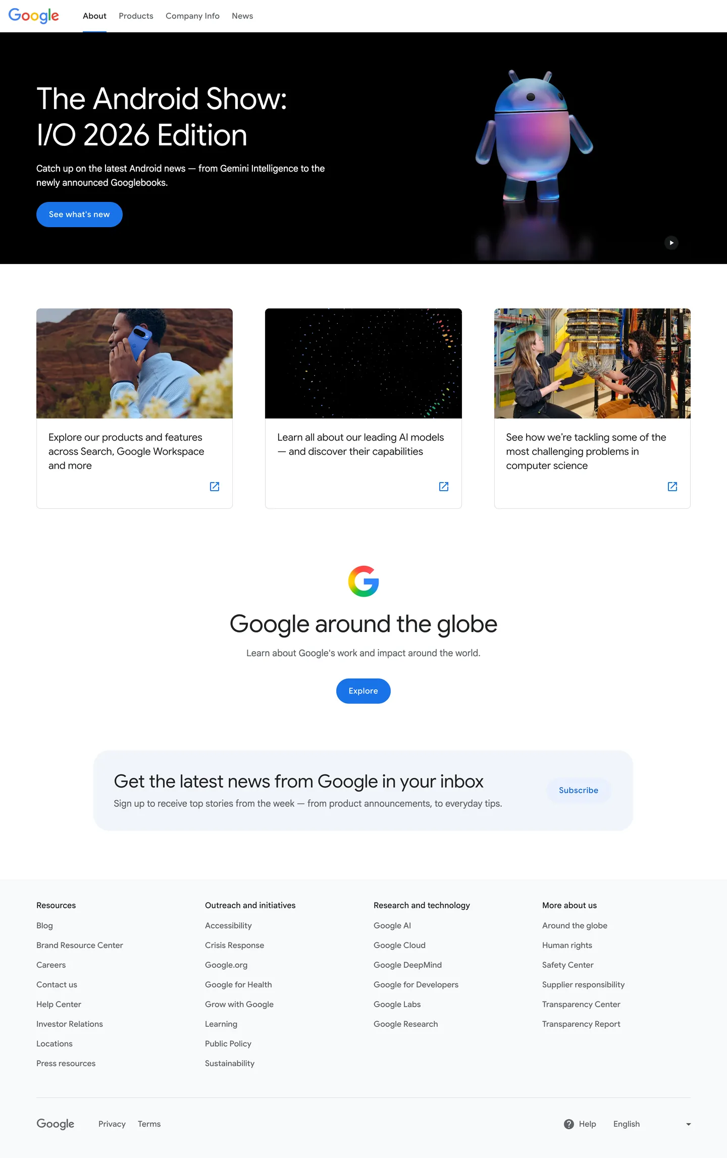
Google's about-page does something almost no other multicolor-brand SaaS attempts: it holds the four signature brand colors in reserve. The four-color G mark — the red / yellow / green / blue logotype every viewer recognizes instantly — appears exactly once on the entire page, as a small centered anchor above the "Google around the globe" section. Every other chromatic moment on the page is a single Google Blue cobalt: the "See what's new" CTA pill, the "Explore" CTA, the external-link arrows on the three product cards, the "Subscribe" subscription pill. Where Apple paints every product page in the saturated hue of its hero device and Microsoft uses bright photo blocks per product tile, Google treats the rainbow as a held-back signature gesture and lets the photography in the three product cards (man on the phone in red-rock canyon country, AI-particle abstract, scientists at the quantum-circuit lab) do the chromatic work.
The DESIGN.md file packages the system into a machine-readable spec for React and AI tools. Inside: 14 colors tokens including the four canonical Material-era Google brand colors (Google Blue, Google Red, Google Yellow, Google Green), each declared as a `--glue-*` CSS variable family with full 100-900 ramps; an ink tier at `--glue-grey-900`; a body-text tier at `--glue-grey-700`. Nine typography tokens cover Google Sans at the display tier (60px / 48px / 36px h1-h3 in weight 400) and Google Sans Text at body (18px / 400 with normal tracking). Six radius tokens span the 2px / 4px / 8px small-step ladder plus the 48px pill for interactive surfaces and 50% for icon-circle masks. Fourteen components cover the dark hero with the Android show video, the three hairline-bordered photo cards, the multicolor-G anchor moment, the centered explore CTA, the soft-blue subscription pill, and the wide four-column footer.
Feed this file to Claude or Cursor and it will reproduce Google's specific moves: dark hero band with a single cobalt CTA, multicolor G mark held for one centered moment, Google Sans-equivalent display at weight 400 with negative tracking, Google Sans Text-equivalent body, 4px Material rounding on cards and 48px pill on CTAs. The tokens resolve cleanly without invention. The single move worth borrowing only if you have an instantly-recognized multicolor mark is the restraint: hold the brand colors back, deploy them once, let monochrome chrome and color photography do the rest. Most teams need to deploy their accents more, not less.
What makes it distinct
5
- Four-color G held in reservethe canonical red / yellow / green / blue brand mark appears exactly once on the page, as a centered anchor; chrome is otherwise monochrome
- Google Blue as singular voltagethe cobalt #1a73e8 carries the primary CTA fill and every link tone, 44 total occurrences across text, fill, and border
- Display weight 400the 60px hero h1 and the 48px section h2 both run at weight 400 with -0.5px tracking, a restrained Material treatment
- Two-typeface splitGoogle Sans for display / heading / CTA, Google Sans Text for body and metadata; the split is the only typographic device in the system
- 48px pill CTA plus 4px card radiusinteractive surfaces use a fully-rounded pill, cards use the canonical 2014 Material tight rounding; no middle tier
about.google
Live at about.google
A snapshot of the brand in production. Scroll the frame to see the whole page.
Colors
14 colors
Google's system runs on #1a73e8 as its primary voltage, used in 3 of 14 components. Type is set in Google Sans across 9 tokens from 16px to 60px, weights 400–500. Shape language is soft — components average 20px corner radius, with no sharp interactive edges.
Surface
Page and card backgrounds · 2
Text
Headlines, body, captions · 4
Borders & Hairlines
Dividers, outlines, rules · 1
Other
Specialty colors · 7
Typography
9 type tokens
Set in Google Sans across 9 tokens, from 16px to 60px, weights 400–500. Shown in its own stack: where the font isn't installed, the fallback the file names stands in.
- display-xl60px · weight 400 · lh 72px · tracking -0.5pxThe quick brown fox jumps over the lazy dog
- display-lg48px · weight 400 · lh 56px · tracking -0.5pxThe quick brown fox jumps over the lazy dog
- display-md36px · weight 400 · lh 44px · tracking -0.25pxThe quick brown fox jumps over the lazy dog
- heading-md20px · weight 400 · lh 28pxThe quick brown fox jumps over the lazy dog
- body-lg18px · weight 400 · lh 28pxThe quick brown fox jumps over the lazy dog
- body-md16px · weight 500 · lh 24pxThe quick brown fox jumps over the lazy dog
- nav-link16px · weight 500 · lh 24px · tracking 0.25pxThe quick brown fox jumps over the lazy dog
- button-md16px · weight 500 · lh 24px · tracking 0.5pxThe quick brown fox jumps over the lazy dog
- footer-link16px · weight 400 · lh 24pxThe quick brown fox jumps over the lazy dog
Layout
Radii and spacing
6 corner radii and 9 spacing values. Shape language: soft.
Radii
- none0px
- xs2px
- sm4px
- md8px
- pill48px
- full9999px
Spacing
- xs4px
- sm8px
- md12px
- base16px
- lg24px
- xl32px
- 2xl48px
- 3xl64px
- 4xl80px
Components
14 components
Each rendered from its tokens (color, type, radius, padding) on Google's own canvas.
- Hero Sectionhero-sectionHero Section
- Hero Headinghero-headingHero Heading
- Section Headingsection-headingSection Heading
- Body Paragraphbody-paragraphBody Paragraph
- Body Paragraph Mutedbody-paragraph-mutedBody Paragraph Muted
- Button Primarybutton-primaryButton Primary
- Button Secondarybutton-secondaryButton Secondary
- Top Navtop-navTop Nav
- Nav Linknav-linkNav Link
- Card Photocard-photoCard Photo
- Card Anchorcard-anchorCard Anchor
- Subscribe Bandsubscribe-bandSubscribe Band
- Subscribe Buttonsubscribe-buttonSubscribe Button
- FooterfooterFooter
In use
The system, in use
Google's tokens on the kind of product it builds.
Build something people actually use.
A short paragraph of marketing copy that previews how the brand's display tier and body tier read together. Two sentences is usually enough.
FAQ
Google design system FAQ
Common questions about Google's tokens, components, and how to use this DESIGN.md in your project.
Read next
Related reading
Specs, directories, and component libraries that pair with this design system.
- Browse all design systemsThe full directory of DESIGN.md files on shadcn.io, with live mockups for each.shadcn.io
- Google — About pageGoogle's public about-the-company marketing site — the source of truth for the live tokens captured in this file.about.google (opens in a new tab)
- The DESIGN.md specificationGoogle Labs' open spec for machine-readable design system files — the format this page is built on.github.com (opens in a new tab)
Use it
Use Google in your project
One machine-readable file. Drop it into Claude, Cursor, or any AI tool that reads DESIGN.md.
Download the DESIGN.md
One machine-readable file: every color, type, radius, spacing, and component token of Google.
Feed it to your AI tool
Drop it into Claude, Cursor, or GitHub Copilot. The agent writes React components and Tailwind classes that match Google's visual language.
Reference the tokens directly
Or paste the values into your Tailwind config, CSS variables, or component library: every color, size and radius is a quoted, ready-to-copy value.
Read the full DESIGN.md: overview, rationale, do’s and don’ts
Overview
Google's about-page does something almost no other multicolor-brand SaaS attempts. Rainbow held in reserve. The four-color G logotype — the red / yellow / green / blue mark every viewer recognizes instantly — appears exactly once on the entire page, as a small centered anchor above the "Google around the globe" section. Every other chromatic moment on the page is a single Google Blue cobalt ({colors.blue-600} — #1a73e8): the "See what's new" CTA pill on the dark hero, the "Explore" pill anchoring the globe section, the external-link arrows on the three product cards, the "Subscribe" pill in the newsletter band. Where Apple paints every page in the saturated hue of its hero device and Microsoft uses bright photo blocks per product tile, Google treats the rainbow as a held-back signature gesture and lets the photography in the three product cards (man on the phone in canyon country, AI-particle abstract, scientists at the quantum-circuit lab) do the chromatic work.
The system's discipline reinforces the move. The hero band runs on a near-black surface ({colors.hero-bg} — #000000) with the iridescent Android mascot floating in the right two-thirds. Below the fold the page returns to a pure-white canvas ({colors.canvas} — #ffffff) and stays there for every subsequent band; only the subscribe rail uses a tinted soft-blue surface ({colors.blue-50}). Ink ({colors.ink} — #202124) carries every headline below the fold at 250 total occurrences (125 as text, 124 as border, 1 as background), with the secondary body tone ({colors.ink-muted} — #5f6368) at 86 occurrences for subordinate copy and metadata.
Typography runs the canonical two-typeface Google split: Google Sans for every display, heading, button, and nav surface; Google Sans Text for body and metadata. Display headlines hold at weight 400, not the 700 most tech brands lean on — the 60px hero h1 "The Android Show: I/O 2026 Edition" at weight 400 with -0.5px tracking is the loudest typographic moment in the system. The two-typeface split is the only typographic device in the system; there is no serif tier, no monospace voice, no italic moment.
Key Characteristics:
- Google Blue (
{colors.blue-600}— #1a73e8) as singular voltage — 44 total occurrences (21 text, 2 background, 21 border) carrying every CTA fill, every link tone, every focus state. - The four canonical brand colors (
{colors.blue-600},{colors.red-500},{colors.yellow-500},{colors.green-500}) appear together only inside the multicolor G mark — held in reserve as a held-back logotype gesture. - Ink (
{colors.ink}— #202124) for every headline, never pure black — wired as--glue-grey-900. - Two-typeface split: Google Sans for spoken surfaces, Google Sans Text for body — no third family, no serif tier.
- Display weight 400 across every tier (60 / 48 / 36px h1-h3) with -0.5 / -0.5 / -0.25px tracking — the restraint that distinguishes Google from the 700+ tech standard.
- Dark hero band on
{colors.hero-bg}(#000000) with the Android mascot, every below-fold band on the white canvas; the only tinted surface is the soft-blue subscribe rail at{colors.blue-50}. - Tight 4px Material card rounding (39 of 57 occurrences) plus a 48px pill on CTAs — the 2014 Material lineage carried into 2026 marketing.
- Hairline outlines (
{colors.hairline}— #dadce0) carry card edges; the system has essentially no shadow tier.
Colors
Brand
- Google Blue (
{colors.blue-600}— #1a73e8): frequency 44 — used as text (21), border (21), background (2). The single voltage of the system. Wired as--glue-blue-600. Carries the primary CTA pill fill, every link tone, the external-link arrows on photo cards, the focus ring on the active nav tab, the "Subscribe" pill text on the soft-blue rail. - Google Blue 700 (
{colors.blue-700}— #1967d2): frequency 1. The hover-darker variant. Wired as--glue-blue-700. - Google Blue 50 (
{colors.blue-50}— #e8f0fe): frequency 1, as background. The soft-blue surface for the newsletter / subscribe band. Wired as--glue-blue-50and--glue-grey-200. - Google Red (
{colors.red-500}— #ea4335): frequency 0 on the captured page. Wired as--glue-red-500. Appears only inside the multicolor G logotype rendered as a vector mark in the centered anchor; never used as page chrome. - Google Yellow (
{colors.yellow-500}— #fbbc04): frequency 0. Wired as--glue-yellow-500. Same logotype-only role as the red. - Google Green (
{colors.green-500}— #34a853): frequency 0. Wired as--glue-green-500. Same logotype-only role.
Surface
- Canvas (
{colors.canvas}— #ffffff): the page floor below the dark hero. Wired as--glue-grey-0and merged with--glue-grey-25/--glue-grey-50/--glue-grey-100. Pure white. - Surface-1 (
{colors.surface-1}— #f8f9fa): frequency 47 — used as background (41), text (4), border (2). The footer surface and the soft-gray section dividers below the photo cards. - Hero Background (
{colors.hero-bg}— #000000): frequency 3 — used as text (1), background (1), border (1). The above-fold hero band only. The Android mascot floats over this surface; the cobalt CTA carries the chromatic moment.
Text
- Ink (
{colors.ink}— #202124): frequency 250 — text (125), border (124), background (1). The dominant text color across every below-fold band. Wired as--glue-grey-900. Every below-fold headline, every body paragraph, every footer category label resolves to this tone. Never pure black. - Ink Soft (
{colors.ink-soft}— #3c4043): frequency 0. Wired as--glue-grey-800. Reserved for secondary running text inside long-form copy. - Ink Muted (
{colors.ink-muted}— #5f6368): frequency 86 — text (43), border (43). The subordinate body tone, used for "Learn about Google's work and impact around the world" sub-lead text and footer column sub-labels. Wired as--glue-grey-700. - Ink Quiet (
{colors.ink-quiet}— #80868b): frequency 0. Wired as--glue-grey-600. The disabled / metadata tone — reserved for product surfaces.
Hairline
- Hairline (
{colors.hairline}— #dadce0): wired as--glue-grey-300. The card edge tone, used on the three photo cards in the products band. Quiet enough to read as a soft edge rather than a layered border.
Typography
Font Families
The system runs the canonical Google two-typeface split: Google Sans for every display, heading, button, and nav surface; Google Sans Text for body and metadata. Fallbacks for both walk Arial, Helvetica, sans-serif. There is no serif tier, no in-marketing monospace voice, no italic moment.
The split is the only typographic device in the system. Google Sans (the display variant) carries tighter spacing and a touch more contrast for headline weight; Google Sans Text (the body variant) carries looser counters and slightly heavier x-height for paragraph readability at 18px. The pairing is invisible at a glance but holds the entire below-fold rhythm together.
Hierarchy
| Token | Size | Weight | Line Height | Letter Spacing | Use |
|---|---|---|---|---|---|
{typography.display-xl} | 60px | 400 | 72px | -0.5px | Hero h1 ("The Android Show: I/O 2026 Edition") |
{typography.display-lg} | 48px | 400 | 56px | -0.5px | Section h2 ("Google around the globe") |
{typography.display-md} | 36px | 400 | 44px | -0.25px | Sub-section h3 |
{typography.heading-md} | 20px | 400 | 28px | 0 | Photo-card titles, subscribe headline |
{typography.body-lg} | 18px | 400 | 28px | 0 | Default running text below the photo cards |
{typography.body-md} | 16px | 500 | 24px | 0 | Sub-body, secondary running copy |
{typography.nav-link} | 16px | 500 | 24px | 0.25px | Top-nav link labels ("About", "Products", "Company Info", "News") |
{typography.button-md} | 16px | 500 | 24px | 0.5px | Primary CTA labels ("See what's new", "Explore", "Subscribe") |
{typography.footer-link} | 16px | 400 | 24px | 0 | Footer column links (Blog, Brand Resource Center, Careers, etc.) |
Principles
Display weight stays at 400 — the system's most distinctive typographic move. The 60px hero h1 at weight 400 with -0.5px tracking carries authority through scale and tracking, not through bold weight. Most tech brands at this size would land at 600-700; Google's restraint lets the iridescent Android mascot beside the headline carry the visual weight instead.
Letter-spacing increments are deliberate: -0.5px on the two larger displays, -0.25px on the smaller, 0 on body, 0.25px on nav links, 0.5px on button labels. The progression is from tight (display) to loose (button) — the inverse of the convention that tightens labels for emphasis. Tracking grows with importance of legibility at small sizes.
Note on Font Substitutes
Google Sans and Google Sans Text are proprietary. Product Sans Free is the closest open-source substitute for Google Sans display tiers; Manrope transfers cleanly if Product Sans is unavailable. For Google Sans Text, Inter at the same weights matches the proportions well. The display weight of 400 with -0.5px tracking is the move to preserve regardless of substitute family.
Layout
Spacing System
- Base unit: 8px — the dominant gap value, appearing 25 times in the captured page.
- Tokens:
{spacing.xs}4px ·{spacing.sm}8px ·{spacing.md}12px ·{spacing.base}16px ·{spacing.lg}24px ·{spacing.xl}32px ·{spacing.2xl}48px ·{spacing.3xl}64px ·{spacing.4xl}80px. - Section padding (vertical): ~80px above the photo-card band and below the subscribe rail; ~64px between major section anchors.
- Card internal padding:
{spacing.lg}(24px) on the three photo cards; the photo fills the top portion edge-to-edge with no inset. - Hero padding: ~80px top, ~64px bottom, ~64px horizontal — the most generous band on the page.
- Top-nav padding: 0 vertical,
{spacing.lg}(24px) horizontal — the 64px nav height is set by the wordmark glyph height plus the bottom-underline indicator.
Grid & Container
- Max content width: ~1280px on the photo-card row, ~720px on the subscribe headline.
- Hero band: full-bleed dark surface, content left-aligned to a ~720px column with the Android mascot floating in the right two-thirds.
- Photo-card band: 3-column equal-width grid (~400px per card on desktop) with
{spacing.lg}(24px) gutters between cards. - Globe anchor: centered single-column moment — multicolor G mark + 48px h2 + sub-lead + Explore CTA, all anchored to the page horizontal center.
- Subscribe band: full-width
{colors.blue-50}rail with content centered at ~960px and a right-aligned subscribe pill. - Footer: 4-column grid of category links (Resources / Outreach / Research / More about us) followed by a thin meta row (Privacy / Terms / language selector).
Rhythm
The page alternates between edge-to-edge dark (hero), constrained card grid (photo cards), centered anchor (globe G mark), and full-width tinted rail (subscribe). There is no atmospheric gradient between bands — every transition is a hard surface change between black hero, white canvas, and soft-blue rail. The rhythm is the page's structural device — bands either go full-bleed or constrain to a centered column, never sit in between.
Elevation
The system has essentially no shadow tier. The captured page has 0 shadow occurrences in the extracted data. The three photo cards in the products band carry no drop shadow at all — they sit on a 1px {colors.hairline} outline against the white canvas, with the photo filling the top portion edge-to-edge and the title + sub-lead + external-link arrow stacked beneath.
- Flat (no shadow): hero, photo cards, globe anchor, subscribe band, footer — 100% of surfaces.
- Hairline outlines:
{colors.hairline}carries the photo-card edges. The hairline IS the elevation. - Tonal lift: the subscribe band lifts off the white canvas via the soft
{colors.blue-50}tint — the only band on the page with a tinted background.
Shapes
The radius scale is three-tier: tight Material card rounding, slightly larger surface rounding, fully-rounded pill on interactive surfaces.
- Tight Material:
{rounded.xs}2px (1 occurrence — a single small marker),{rounded.sm}4px (39 occurrences — the dominant card radius across photo cards, nav-link hover pills, footer-link hover pills). - Surface rounding:
{rounded.md}8px (9 occurrences — the subscribe-band container, slightly larger surfaces). - Pill:
{rounded.pill}48px (6 occurrences — every interactive CTA: See what's new, Explore, Subscribe),{rounded.full}9999px (icon-circle masks only). A single50%value appears once for the multicolor-G anchor mask. - No middle tier: the scale skips 12 / 16 / 20 / 24 / 32px entirely. Either a surface uses the 4 / 8px Material tier or it goes to a 48px pill — there is no rounded-but-not-pill option.
The 4px Material card rounding marks the system as the only one in the directory that still wears the 2014 Material lineage on a 2026 marketing surface. The 48px pill on CTAs is the warmest tappable shape in the system; every primary interactive moment uses it.
Components
hero-section — Full-bleed dark {colors.hero-bg} band, 80x64 padding, no border-radius. Holds the hero h1 in white at {typography.display-xl}, a 2-line lead sub-paragraph, the cobalt "See what's new" CTA pill flush left, and the iridescent Android mascot floating in the right two-thirds.
hero-heading — White {colors.canvas} text on the dark hero, Google Sans 60px / 400, -0.5px tracking. The display tier — confidence by scale and tracking, not by weight.
section-heading — Ink {colors.ink} text on the white canvas, Google Sans 48px / 400, -0.5px tracking. The single below-fold section h2 ("Google around the globe").
body-paragraph — Default ink running-text at {typography.body-lg} (18px / 400) below the photo cards and inside the subscribe band.
body-paragraph-muted — {colors.ink-muted} (#5f6368) variant for sub-lead text ("Learn about Google's work and impact around the world.") and footer column sub-labels.
button-primary — The signature CTA. Cobalt {colors.blue-600} fill, white text, {rounded.pill} 48px radius, 12x24 padding, 50px height, weight 500 with 0.5px tracking. "See what's new" on the hero, "Explore" on the globe anchor are the canonical instances.
button-secondary — White {colors.canvas} fill, cobalt {colors.blue-600} text, 1px hairline border, {rounded.pill} 48px radius, 12x24 padding, 50px height. Used for the "Subscribe" pill on the soft-blue rail.
top-nav — White surface, 64px height, 24px horizontal padding. Houses the four-color Google wordmark flush left, followed by the nav-link rail (About / Products / Company Info / News) with the active "About" carrying a 4px-thick cobalt-blue underline indicator beneath the label.
nav-link — Transparent background, ink text in {typography.nav-link} (16px / 500 / 0.25px), 0x12 padding, 48px height. The active link gets a 4px cobalt-blue bottom-rule indicator (no fill change).
card-photo — White {colors.canvas} surface, 1px {colors.hairline} outline, {rounded.sm} 4px radius, 24px internal padding. The photograph fills the top ~180px of the card edge-to-edge with no inset; below the photo sit a ~2-line title in {typography.heading-md} and a right-aligned external-link arrow icon in {colors.blue-600}. Used for the three "Explore our products / Learn all about our leading AI models / See how we're tackling" cards.
card-anchor — Transparent surface, 64x0 padding. The centered multicolor-G mark + h2 + sub-lead + Explore CTA composition. The G mark renders at ~80px height with the four canonical brand colors painting the four leaves of the logotype glyph — the single multi-color chromatic moment on the page.
subscribe-band — Soft-blue {colors.blue-50} fill, ink text, {rounded.md} 8px radius, 32x48 padding. Houses the subscribe headline at {typography.heading-md}, a 1-line sub-lead, and a right-aligned {component.subscribe-button} pill.
subscribe-button — White {colors.canvas} fill, cobalt {colors.blue-600} text, {rounded.pill} 48px radius. Sits flush right on the soft-blue subscribe rail.
footer — Soft-gray {colors.surface-1} surface, ink-muted text at {typography.footer-link}, 48x24 padding. Four equal-width columns of category links (Resources / Outreach and initiatives / Research and technology / More about us), followed by a thin meta row of Privacy / Terms / language selector / Help button.
Do's and Don'ts
Do hold the four canonical brand colors for the logotype only. The system's defining move is the restraint — the multicolor G appears exactly once on the page, as a centered anchor. Painting cards with red / yellow / green / blue fills would dilute the mark's status as a held-back signature gesture.
Do use {colors.blue-600} (#1a73e8) as the single voltage for every CTA, link, and focus state. The 44 captured occurrences carry every interactive moment on the page; introducing a second accent color would break the single-voltage discipline.
Do keep display headlines at weight 400 with negative tracking. The 60px hero h1 / 48px section h2 / 36px h3 all hold at weight 400. Bumping to 600 or 700 turns the editorial restraint into a generic tech-brand shout and undercuts the system's Material lineage.
Do use Google Sans for display / nav / button and Google Sans Text for body. The two-typeface split is the only typographic device in the system. Collapsing to a single family or introducing a third (serif, mono) breaks the canonical Google typographic identity.
Don't add card drop shadows. The system has 0 captured shadow occurrences — every elevation moment comes from the 1px {colors.hairline} outline against the white canvas. Adding a layered shadow tier reads as borrowed from another product brand.
Don't introduce a middle radius tier between 8px and the 48px pill. The system is binary in its corner-radius philosophy — tight Material on cards (4 / 8px) or fully-rounded pill on CTAs (48px). A 16 or 24px middle softens the contrast.
Don't paint the canvas with a warm cream. The page floor is pure {colors.canvas} (#ffffff). Warming it would force every photo card and the multicolor-G anchor to compete with the surface tint.
Don't use the soft-blue {colors.blue-50} outside the newsletter subscribe rail. It is a single-purpose surface tint, not a general-purpose accent. Using it on other bands flattens the subscribe band's elevation and dilutes the soft-blue's role as a "newsletter" affordance.
Known Gaps
- Hover and focus states: documented for resting states only; the full hover / active / focus / disabled matrix lives across product surfaces (Search, Gmail, Maps, Workspace) and is not captured here.
- Form input states: the captured about-page has no text-input field. The
inputslot in the extraction is null — input chrome lives in product surfaces. - Dark mode: the about-page hero band is the only dark surface on the captured page; a full dark variant exists in product surfaces (Google Search dark theme, YouTube) but is not represented here.
- Motion: the iridescent Android mascot animates subtly, the photo cards lift slightly on hover, and the multicolor-G anchor pulses on scroll-into-view. The spec captures end-state values only.
- Product surfaces: this DESIGN.md captures the about.google page only. Search, Gmail, Drive, Maps, YouTube, Workspace, Cloud Console, Android, and ChromeOS each carry their own token systems (Material 3 / Material You) not represented here.
- The 100-900 Material ramps: the CSS exposes full
--glue-blue-100through--glue-blue-900,--glue-red-100through--glue-red-900,--glue-green-*and--glue-yellow-*ramps. Only the 500 / 600 / 700 tones render on the captured marketing surface; the rest belong to product surfaces. - The purple tier:
--glue-purple-100and--glue-purple-900are declared but never render. Reserved for product surfaces (Calendar uses purple chrome).
Productivity & SaaS
More systems like this
More DESIGN.md files in Productivity & SaaS.
Pricing
Build it with Pro
The DESIGN.md files are free. Pro adds 6,000+ blocks, premium templates and the MCP server, so your AI editor builds in your system for you.
4.9/5 out of 5 · 150+ reviewsfrom 150+ founders and developers.
Billing
Billed once a year in USD. Cancel anytime.
- How many people can use the license.
- Client work, SaaS products and anything you charge for.
- Production-ready React sections: hero, pricing, features, dashboards and more.
- Complete multi-page sites you can ship as they are.
- React icons from every major library, installable with one command.
- Presets that restyle every block, in light and dark.
- Lets your AI editor search, preview and install blocks for you.
- Priority requests are answered first.
Individual
For personal projects & open source
$32instead of $49/mo
$389 billed yearly
- Seats: 1 seat
- Commercial use: Personal & open source only
- Pro blocks: 6,000+ blocks
- Templates: All 14 templates
- React icons: 294k+ icons
- Themes: All 59 themes
- MCP server: Basic usage
- Support: Standard
Team
Most popularFor freelancers, agencies & startups
$66instead of $99/mo
$789 billed yearly · ≈ $13/dev/mo
- Seats: Up to 5 seats
- Commercial use: Included
- Pro blocks: 6,000+ blocks
- Templates: All 14 templates
- React icons: 294k+ icons
- Themes: All 59 themes
- MCP server: High usage
- Support: Priority
Organization
For companies with larger teams
$132instead of $199/mo
$1,589 billed yearly
- Seats: Unlimited seats
- Commercial use: Included
- Pro blocks: 6,000+ blocks
- Templates: All 14 templates
- React icons: 294k+ icons
- Themes: All 59 themes
- MCP server: Unlimited usage
- Support: Priority
Billed once a year in USD. Cancel anytime.
Individual
For personal projects & open source
$32instead of $49/mo
$389 billed yearly
- How many people can use the license.Seats: 1 seat
- Client work, SaaS products and anything you charge for.Commercial use: Personal & open source only
- Production-ready React sections: hero, pricing, features, dashboards and more.Pro blocks: 6,000+ blocks
- Complete multi-page sites you can ship as they are.Templates: All 14 templates
- React icons from every major library, installable with one command.React icons: 294k+ icons
- Presets that restyle every block, in light and dark.Themes: All 59 themes
- Lets your AI editor search, preview and install blocks for you.MCP server: Basic usage
- Priority requests are answered first.Support: Standard
Team
Most popularFor freelancers, agencies & startups
$66instead of $99/mo
$789 billed yearly · ≈ $13/dev/mo
Everything in Individual, plus
- How many people can use the license.Seats: Up to 5 seats
- Client work, SaaS products and anything you charge for.Commercial use: Included
- Lets your AI editor search, preview and install blocks for you.MCP server: High usage
- Priority requests are answered first.Support: Priority
Organization
For companies with larger teams
$132instead of $199/mo
$1,589 billed yearly
Everything in Team, plus
- How many people can use the license.Seats: Unlimited seats
- Lets your AI editor search, preview and install blocks for you.MCP server: Unlimited usage
- Secure checkout via Stripe
- Code lives in your repo
- Keep what you've shipped if you cancel
- License terms
Your system, built for you
Every block, template and icon, installed by your AI agent in your design system. The DESIGN.md files stay free.