Fellow Design System
Fellow's marketing system pairs Sharp Grotesk Medium 20 display type with Inter body copy on a deep navy hero canvas, with a saturated violet-indigo primary CTA. Tokens for React, Next.js, and AI coding tools.
Add shadcn.io to your AI agent. · Pro It installs blocks, icons and templates in your design system from a prompt, with Pro.
Set up MCP- Primary
- #2941e0
- Typeface
- Inter
- Shape
- Soft
- Base radius
- 8px
- Colors
- 18
- Type tokens
- 12
- Components
- 15
- Spacing values
- 8
About
About Fellow DESIGN.md
Curated by Dov Azencot · Updated May 19, 2026 · Source fellow.app (opens in a new tab)
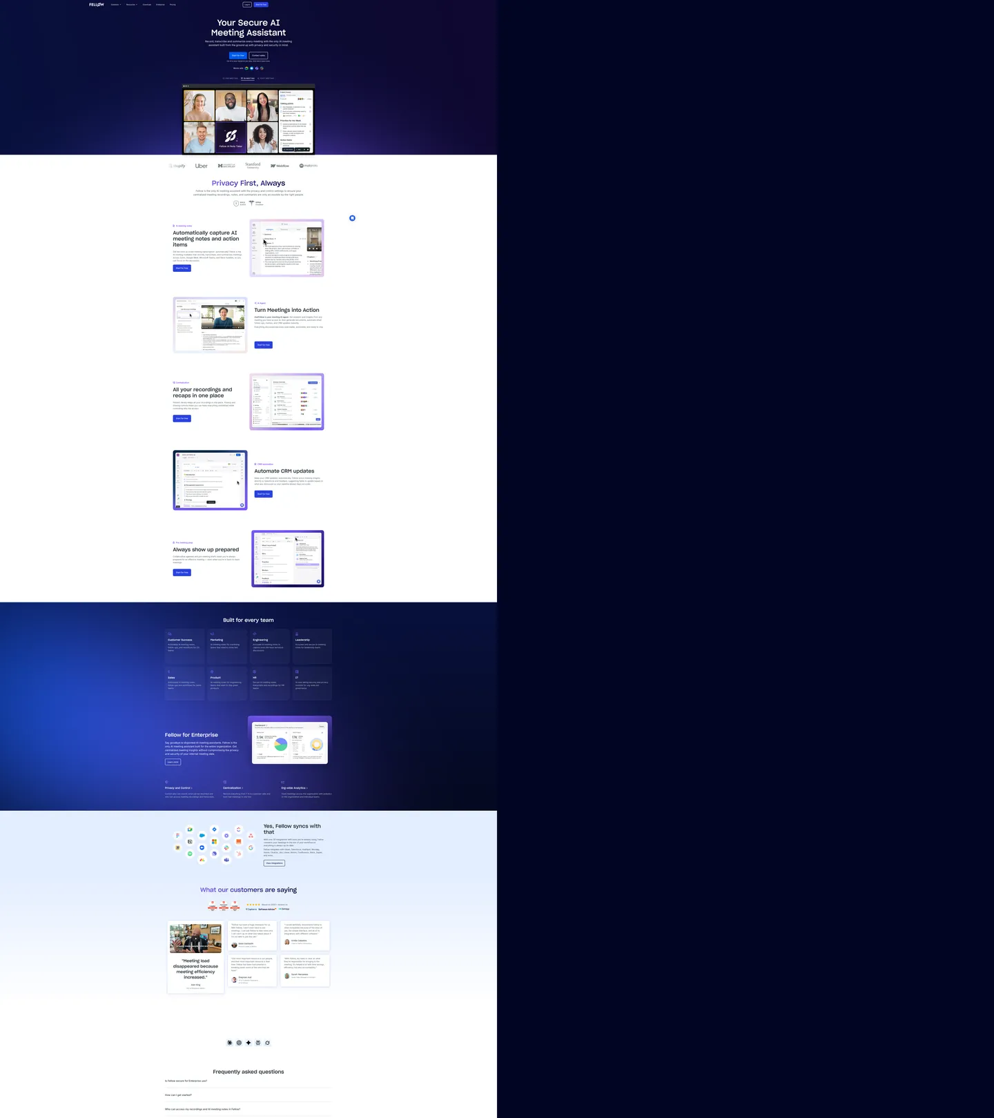
Fellow's marketing site commits to a two-register page design that most B2B SaaS tools avoid. The hero is a deep navy-to-indigo gradient with white text and a saturated violet-indigo CTA pill. Then at the fold, with no gradual transition, the canvas snaps to pure white for the feature sections — product screenshots in 16px-rounded cards, black body text, the same violet-indigo appearing as section headline accent color. The registers don't blend; they switch. This creates an immediate visual hierarchy where the hero makes the promise and the white-canvas body section fulfills it with evidence.
The typography engine is similarly split. Sharp Grotesk Medium 20 — a geometric grotesk with round terminals and generous apertures — handles all headings from 40px to 66px. Inter handles every body and label surface. Where most meeting-notes tools (Otter, Fireflies, Loom) use a single family throughout, Fellow's display-body split reads as a product that takes the manager's reading experience seriously. Sharp Grotesk Medium 20 at 66px / weight 500 on the hero h1 has the same geometric confidence that brands like Stripe and Figma bring to their display moments, but it runs at a heavier relative weight and larger scale.
The brand's violet-indigo (#2941e0) is worth noting for what it is not: it is not the system-browser default link blue (#0000ee) that appears 576 times in the extraction as text and border on anchors. That blue is a CSS artifact from unstyled anchor elements, not a brand decision. The brand color is the CTA fill (#2941e0 at bg: 7) and the gradient spine (#795afa in gradients at frequency 24). Any implementation using this spec should wire CTA backgrounds to {colors.primary}, anchor text to a styled {colors.ink}, and treat the browser-blue occurrences as a remediation target.
What makes it distinct
5
- Sharp Grotesk splitdisplay headings use Sharp Grotesk Medium 20, a geometric grotesk with round terminals distinct from Inter; body copy stays in Inter, creating a clear editorial-functional split
- Navy-to-indigo gradient herothe above-fold canvas descends from near-black navy (#000524) through deep indigo, framing white product screenshots as floating cards in space
- Violet-indigo CTAthe button-primary uses saturated indigo (#2941e0) as fill, distinct from the CSS-variable blue link default (#0000ee) that pervades less-considered parts of the system
- White canvas inversionbelow the hero fold, the page flips to pure white with feature screenshots in 16px-rounded cards, creating two distinct register zones
- 88px pill radiusthe primary badge/chip surfaces use an 88px border-radius value, effectively rendering as pills at any practical badge width
fellow.app
Live at fellow.app
A snapshot of the brand in production. Scroll the frame to see the whole page.
Colors
18 colors
Fellow's system runs on #2941e0 as its primary voltage, used in 2 of 15 components. Type is set in Inter across 12 tokens from 12px to 66px, weights 400–500. Shape language is soft — components average 22px corner radius, with no sharp interactive edges.
Brand & Accent
Sparing, CTA-only voltage · 5
Surface
Page and card backgrounds · 3
Text
Headlines, body, captions · 5
Borders & Hairlines
Dividers, outlines, rules · 2
Semantic
Status, errors, success, links · 1
Other
Specialty colors · 2
Typography
12 type tokens
Set in Inter across 12 tokens, from 12px to 66px, weights 400–500. Shown in its own stack: where the font isn't installed, the fallback the file names stands in.
- display-xl66px · weight 500 · lh 80pxThe quick brown fox jumps over the lazy dog
- display-lg56px · weight 400 · lh 64pxThe quick brown fox jumps over the lazy dog
- heading-lg40px · weight 500 · lh 48pxThe quick brown fox jumps over the lazy dog
- heading-sm20px · weight 400 · lh 28pxThe quick brown fox jumps over the lazy dog
- subheading16px · weight 400 · lh 26pxThe quick brown fox jumps over the lazy dog
- body-lg20px · weight 500 · lh 30pxThe quick brown fox jumps over the lazy dog
- body-md16px · weight 400 · lh 24pxThe quick brown fox jumps over the lazy dog
- body-sm14px · weight 400 · lh 22pxThe quick brown fox jumps over the lazy dog
- label-md16px · weight 500 · lh 26pxThe quick brown fox jumps over the lazy dog
- label-caps12px · weight 400 · lh 22pxThe quick brown fox jumps over the lazy dog
- caption12px · weight 400 · lh 20pxThe quick brown fox jumps over the lazy dog
- button-md14px · weight 500 · lh 16px · tracking 0.5pxThe quick brown fox jumps over the lazy dog
Layout
Radii and spacing
7 corner radii and 8 spacing values. Shape language: soft.
Radii
- none0px
- sm4px
- md8px
- lg10px
- xl16px
- badge88px
- full100%
Spacing
- xs2px
- sm8px
- md10px
- base16px
- lg20px
- xl24px
- 2xl40px
- 3xl56px
Components
15 components
Each rendered from its tokens (color, type, radius, padding) on Fellow's own canvas.
- Button Primarybutton-primaryButton Primary
- Button Secondarybutton-secondaryButton Secondary
- Top Navtop-navTop Nav
- Nav Linknav-linkNav Link
- Hero Headinghero-headingHero Heading
- Section Headingsection-headingSection Heading
- Hero Bodyhero-bodyHero Body
- Body Paragraphbody-paragraphBody Paragraph
- CardcardCard
- Feature Cardfeature-cardFeature Card
- BadgebadgeBadge
- Screenshot Cardscreenshot-cardScreenshot Card
- Type here…text-inputText Input
- Testimonial Cardtestimonial-cardTestimonial Card
- FooterfooterFooter
In use
The system, in use
Fellow's tokens on the kind of product it builds.
Build something people actually use.
A short paragraph of marketing copy that previews how the brand's display tier and body tier read together. Two sentences is usually enough.
FAQ
Fellow design system FAQ
Common questions about Fellow's tokens, components, and how to use this DESIGN.md in your project.
Read next
Related reading
Specs, directories, and component libraries that pair with this design system.
- Browse all design systemsThe full directory of DESIGN.md files on shadcn.io, with live mockups for each.shadcn.io
- Fellow — official siteFellow's public marketing site — the source of truth for the live tokens captured in this file.fellow.app (opens in a new tab)
- The DESIGN.md specificationGoogle Labs' open spec for machine-readable design system files — the format this page is built on.github.com (opens in a new tab)
Use it
Use Fellow in your project
One machine-readable file. Drop it into Claude, Cursor, or any AI tool that reads DESIGN.md.
Download the DESIGN.md
One machine-readable file: every color, type, radius, spacing, and component token of Fellow.
Feed it to your AI tool
Drop it into Claude, Cursor, or GitHub Copilot. The agent writes React components and Tailwind classes that match Fellow's visual language.
Reference the tokens directly
Or paste the values into your Tailwind config, CSS variables, or component library: every color, size and radius is a quoted, ready-to-copy value.
Read the full DESIGN.md: overview, rationale, do’s and don’ts
Overview
Fellow's marketing site divides into two unmistakable zones. Hard register break. The hero is deep night-navy bleeding into violet-indigo, white text, a rounded violet CTA; then at the fold, the canvas switches to pure white and the feature sections unfold in a product-screenshot grid. The tonal break is abrupt — no gradient transition, no intermediate gray surface. The convention across meeting-tools like Otter.ai, Fireflies, and Grain is to maintain a single background tone throughout; Fellow breaks it deliberately.
The typography is equally divided: Sharp Grotesk Medium 20 — a geometric grotesk with distinctively round terminals — for display headings, and Inter for all body and label copy. The split is consistent enough to read as a brand rule rather than a font-mixing accident. Sharp Grotesk at 66px / 500 on the hero h1 carries the same geometric confidence as Stripe's display moments.
Key Characteristics:
- Sharp Grotesk Medium 20 for headings (66px / 56px / 40px / 20px), Inter for body and labels — a persistent editorial-functional split.
- Saturated violet-indigo primary for CTA fills and accent headings; for gradient spine.
- Deep navy hero canvas with a violet-indigo radial gradient, followed by a hard break to white canvas for the feature body.
- 16px card rounding dominates feature sections; 88px pill rounding on badge chips; 8px on buttons.
- Product screenshots are framed in white cards with a periwinkle border, giving the mockups a floating quality against the white body canvas.
- Gold accent appears 10 times as text — likely used for rating stars or review highlights.
- Deep teal success at frequency 8 — semantic color for checkmarks or security indicators.
- The browser-default link blue appears 576 times as a CSS artifact on unstyled anchors — treat as a remediation target, not a brand color.
Colors
Brand
- Primary (
{colors.primary}— ): frequency 23. Used as text (8), bg (7), border (8). The CTA button fill, section accent heading color, and interactive link override. The intentional brand blue. - Primary-violet (
{colors.primary-violet}— ): frequency 24. Gradient (10), text (7), border (7). The gradient spine of the hero — the violet that bleeds into the navy-to-periwinkle descent. - Primary-violet-light (
{colors.primary-violet-light}— ): gradient fill only, frequency 8. The lightest stop of the violet family; used as screenshot card border tint. - Primary-indigo (
{colors.primary-indigo}— ): frequency 20. Used as text (10), border (10). Deep violet for supporting accent text and gradient. - Primary-indigo-mid (
{colors.primary-indigo-mid}— ): frequency 6. Used as text (3), border (3). Mid-violet for tertiary accent. - Hero-canvas (
{colors.hero-canvas}— ): frequency 3. Used as bg (2). The near-black midnight navy floor of the hero gradient.
Structural
- Ink (
{colors.ink}— ): frequency 1569. Used as text (780), border (780), shadow (8), bg (1). The dominant text and border color on the white canvas body sections. - Canvas (
{colors.canvas}— ): frequency 111. Used as text (39), bg (33), border (39). White page canvas for body sections and text-on-dark surfaces. - Ink-muted (
{colors.ink-muted}— ): frequency 42. Used as text (21), border (21). Near-black for secondary heading text. - Ink-disabled (
{colors.ink-disabled}— ): frequency 42. Used as text (21), border (21). Body copy on white canvas sections. - Ink-subtle (
{colors.ink-subtle}— ): frequency 38. Used as text (19), border (19). Secondary body text and metadata. - Ink-faint (
{colors.ink-faint}— ): frequency 126. Used as text (63), border (63). Captions, footnotes, and lighter secondary labels. - Hairline (
{colors.hairline}— ): frequency 22. Used as text (11), border (11). Default divider and input border tone. - Hairline-light (
{colors.hairline-light}— ): frequency 2. Lightest divider value. - Surface-1 (
{colors.surface-1}— ): frequency 7. Used as bg (1), gradient (6). Soft periwinkle tint for card borders and gradient bottoms. - Surface-2 (
{colors.surface-2}— ): frequency 5. Gradient fill. Icy light blue at the gradient's edge.
Semantic
- Gold (
{colors.gold}— ): frequency 10. Used as text (5), border (5). Rating stars and highlight indicators. - Success (
{colors.success}— ): frequency 8. Used as text (4), border (4). Security checkmarks and feature confirmation indicators.
Typography
Font Families
The system runs two families: Sharp Grotesk Medium 20 Regular for all display and heading surfaces, and Inter for body copy, labels, and UI text. Sharp Grotesk is wired through its full font-face name including placeholder; Inter is wired through its standard name.
Hierarchy
| Token | Size | Weight | Line Height | Use |
|---|---|---|---|---|
{typography.display-xl} | 66px | 500 | 80px | Hero h1 — Sharp Grotesk |
{typography.display-lg} | 56px | 400 | 64px | Section h2 — Sharp Grotesk |
{typography.heading-lg} | 40px | 500 | 48px | Feature section headings — Sharp Grotesk |
{typography.heading-sm} | 20px | 400 | 28px | Sub-section h4 labels — Sharp Grotesk |
{typography.subheading} | 16px | 400 | 26px | Sharp Grotesk body-scale |
{typography.body-lg} | 20px | 500 | 30px | Lead paragraph / hero sub-copy — Inter |
{typography.body-md} | 16px | 400 | 24px | Default body — Inter |
{typography.body-sm} | 14px | 400 | 22px | Secondary text and captions — Inter |
{typography.label-md} | 16px | 500 | 26px | Emphasized labels — Inter |
{typography.label-caps} | 12px | 400 | 22px | Uppercase badge text — Inter |
{typography.caption} | 12px | 400 | 20px | Footnotes and metadata — Inter |
{typography.button-md} | 14px | 500 | 16px | CTA button label — Inter (0.5px tracking) |
Principles
Sharp Grotesk Medium 20 runs at weight 500 for h1 and h3 level headings, and weight 400 for h2 and h4 — an alternating pattern that creates rhythm without a second family. The Inter body at weight 400 is the foundation; weight 500 Inter is reserved for lead paragraph text and emphasized labels. There is no 700+ weight moment on either family — the heaviest typographic expression is 500.
Note on Font Substitutes
Sharp Grotesk Medium 20 is a commercial typeface by Sharp Type. The closest open-source substitutes with comparable round-terminal geometric proportions are Plus Jakarta Sans and Instrument Sans. For a tighter match to the round-letter apertures, DM Sans at weight 500 reads close at 40-66px display scale. Inter is already open-source.
Layout
Spacing System
- Base unit: 8px (with 10px as the highest-frequency padding value — extracted at 134 occurrences).
- Tokens:
{spacing.xs}2px ·{spacing.sm}8px ·{spacing.md}10px ·{spacing.base}16px ·{spacing.lg}20px ·{spacing.xl}24px ·{spacing.2xl}40px ·{spacing.3xl}56px. - Section padding (vertical): 24px top / 0px bottom between feature rows; 56px before major transitions.
- Card internal padding: 16x24 (padding shorthand) for feature cards; 22px uniform for testimonial cards.
- Hero padding: 0px horizontal — the gradient extends edge-to-edge; headline and CTA are centered in the safe zone.
Grid & Container
- Max content width: ~1200px for hero; ~1000px for feature body sections.
- Hero: full-bleed navy gradient with the hero headline centered and a product screenshot (meeting grid with participant faces) below it.
- Feature sections: alternating 2-column rows — headline + body left, product screenshot card right (or mirrored) — with white canvas between rows.
- "Built for every team" section: a 4-by-2 grid of team-role cards (Customer Success, Marketing, Engineering, Data, Operations, Leadership, Product, AI) on a dark navy background.
Rhythm
The page alternates: dark hero → white feature grid → dark navy "enterprise" band → light periwinkle testimonials → dark navy footer. The register alternations are tight rather than gradual, making each zone feel like a distinct section rather than a continuous scroll.
Elevation
The system uses a shadow primarily on the "Built for every team" role cards. Feature screenshot cards achieve distinction through border rather than shadow — a thin periwinkle ({colors.primary-violet-light}) border on a white card against a white canvas creates just enough separation without shadow.
- Shadow: ink black
{colors.ink}drop shadows appear 8 times (on the "enterprise" section role cards at frequency 8, shadow layer). - Tonal lift: surface-1 periwinkle tint borders on screenshot cards.
- Hairline borders:
{colors.hairline}on input fields and section dividers.
Shapes
The radius scale has three clusters:
{rounded.sm}4px — utility surfaces and small icon badges.{rounded.md}8px — the primary button; most interactive elements.{rounded.lg}10px — input fields.{rounded.xl}16px — feature cards, screenshot frames, large containers. The dominant rounding for content surfaces.{rounded.badge}88px — badge chips (effectively pill at any practical badge width).{rounded.full}100% — circular icon buttons and avatar chips.
Components
button-primary — Saturated indigo {colors.primary} fill, white text, {rounded.md} 8px radius, 16x24 padding, 44px height. "Start for free" is the canonical instance in the hero.
button-secondary — Transparent fill, black text, {colors.hairline} border, {rounded.md} radius, 8x16 padding. Used for "Book a demo" adjacent to the primary CTA.
top-nav — White canvas, black text, 16x24 padding, 56px height. The Fellow wordmark sits flush left; nav links center-aligned; primary CTA button right-aligned. The nav is anchored to white regardless of the hero canvas behind it.
nav-link — Transparent, ink black text at {typography.body-sm}, 10px padding. "Features," "Product," "Solutions," "Pricing," "Integrations," "Blog" — standard B2B nav architecture.
hero-heading — White text, {typography.display-xl} (66px Sharp Grotesk / 500). Zero padding; headline floats in the dark gradient zone.
section-heading — Black text, {typography.heading-lg} (40px Sharp Grotesk / 500) for white-canvas sections. In dark sections, white text at the same token.
hero-body — White text at {typography.body-md} for the hero sub-copy ("Secure. Transcribes, summarizes…").
body-paragraph — {colors.ink-disabled} text at {typography.body-md} for feature section descriptions on the white canvas.
card — White canvas fill, ink text, {rounded.xl} 16px radius, 16x24 padding, periwinkle surface-1 border. General content card.
feature-card — White canvas fill, ink text, {rounded.xl} 16px radius, 24x0 vertical padding. Feature-row left-column content (headline + body + CTA).
screenshot-card — White canvas fill, {rounded.xl} 16px radius, zero padding, {colors.primary-violet-light} border. Frames product screenshots in the feature alternating rows.
badge — Surface-2 fill, primary-indigo text, {rounded.badge} 88px radius. "AI Meeting Notes," "Secure," etc.
text-input — White canvas fill, ink text, {rounded.lg} 10px radius, 10px padding, 40px height, hairline border. Email capture fields.
testimonial-card — White canvas fill, ink text, {rounded.xl} 16px radius, 22px uniform padding. Social proof cards in the periwinkle-tinted testimonials section.
footer — Hero-canvas dark navy fill, white text at {typography.caption}, 56x24 padding.
Do's and Don'ts
Do use Sharp Grotesk (or a round-terminal grotesk substitute) exclusively for headings and switch cleanly to Inter for any text below 24px. The visual contract between the two families is the system's editorial identity; mixing them at the same scale breaks the signal.
Do apply the hard register break between dark hero and white body as a direct cut, not a gradient fade. The abruptness is the move — it frames the hero as a brand statement and the body as a product demonstration.
Do limit {colors.primary} to CTA fills, accent headings, and interactive link text. The violet gradient ({colors.primary-violet}) is a separate surface-layer value; using it for CTA buttons would produce a lighter, less grounded action button.
Do treat the badge radius {rounded.badge} (88px) as specific to chip/tag surfaces no wider than ~200px. At wider applications it would produce invisible rounding or asymmetric pill termination.
Don't use the browser-default anchor color as an intentional brand value — it is a CSS artifact appearing 576 times in the extraction from unstyled anchor elements. Wire all anchor text to {colors.ink} or {colors.primary} in a production implementation.
Don't reduce the {typography.display-xl} line-height below 80px for the 66px hero heading. The 80px / 66px ratio (1.21 line-height) gives Sharp Grotesk at that scale room to breathe; tighter leading at weight 500 causes cap-to-cap crowding on two-line headlines.
Don't use {rounded.xl} (16px) on button surfaces — the system consistently uses {rounded.md} (8px) for buttons and reserves 16px for cards. Applying card rounding to buttons would borrow visual language from a different component register.
Don't introduce {colors.success} (deep teal ) as a CTA or accent color — it is a semantic indicator for security checkmarks and confirmation states. Promoting it to an attention surface would confuse semantic meaning with brand intent.
Known Gaps
- Hover states: only the button-primary resting state is captured; hover, active, and focus ring states are not represented.
- Mobile nav: the extracted surface appears to show a minimal hamburger nav on mobile; the mobile layout for the feature alternating rows is not captured.
- Dark-section text: the "Built for every team" grid and the enterprise section on a dark navy background — exact background hex values for this intermediate dark surface are inferred from the gradient; not directly extracted.
- Form error and validation states: text-input carries resting state only; error and success field states are not represented.
- Animation: the hero appears to include a subtle radial gradient animation or particle effect behind the product screenshot; this is not captured in static values.
- Pricing page: the pricing table structure is not captured from the marketing surface.
- App UI tokens: the Fellow in-app interface (meeting notes editor, agenda builder, action-item tracker) carries a different, more compact token system that is not represented here.
Productivity & SaaS
More systems like this
More DESIGN.md files in Productivity & SaaS.
Pricing
Build it with Pro
The DESIGN.md files are free. Pro adds 6,000+ blocks, premium templates and the MCP server, so your AI editor builds in your system for you.
4.9/5 out of 5 · 150+ reviewsfrom 150+ founders and developers.
Billing
Billed once a year in USD. Cancel anytime.
- How many people can use the license.
- Client work, SaaS products and anything you charge for.
- Production-ready React sections: hero, pricing, features, dashboards and more.
- Complete multi-page sites you can ship as they are.
- React icons from every major library, installable with one command.
- Presets that restyle every block, in light and dark.
- Lets your AI editor search, preview and install blocks for you.
- Priority requests are answered first.
Individual
For personal projects & open source
$32instead of $49/mo
$389 billed yearly
- Seats: 1 seat
- Commercial use: Personal & open source only
- Pro blocks: 6,000+ blocks
- Templates: All 14 templates
- React icons: 294k+ icons
- Themes: All 59 themes
- MCP server: Basic usage
- Support: Standard
Team
Most popularFor freelancers, agencies & startups
$66instead of $99/mo
$789 billed yearly · ≈ $13/dev/mo
- Seats: Up to 5 seats
- Commercial use: Included
- Pro blocks: 6,000+ blocks
- Templates: All 14 templates
- React icons: 294k+ icons
- Themes: All 59 themes
- MCP server: High usage
- Support: Priority
Organization
For companies with larger teams
$132instead of $199/mo
$1,589 billed yearly
- Seats: Unlimited seats
- Commercial use: Included
- Pro blocks: 6,000+ blocks
- Templates: All 14 templates
- React icons: 294k+ icons
- Themes: All 59 themes
- MCP server: Unlimited usage
- Support: Priority
Billed once a year in USD. Cancel anytime.
Individual
For personal projects & open source
$32instead of $49/mo
$389 billed yearly
- How many people can use the license.Seats: 1 seat
- Client work, SaaS products and anything you charge for.Commercial use: Personal & open source only
- Production-ready React sections: hero, pricing, features, dashboards and more.Pro blocks: 6,000+ blocks
- Complete multi-page sites you can ship as they are.Templates: All 14 templates
- React icons from every major library, installable with one command.React icons: 294k+ icons
- Presets that restyle every block, in light and dark.Themes: All 59 themes
- Lets your AI editor search, preview and install blocks for you.MCP server: Basic usage
- Priority requests are answered first.Support: Standard
Team
Most popularFor freelancers, agencies & startups
$66instead of $99/mo
$789 billed yearly · ≈ $13/dev/mo
Everything in Individual, plus
- How many people can use the license.Seats: Up to 5 seats
- Client work, SaaS products and anything you charge for.Commercial use: Included
- Lets your AI editor search, preview and install blocks for you.MCP server: High usage
- Priority requests are answered first.Support: Priority
Organization
For companies with larger teams
$132instead of $199/mo
$1,589 billed yearly
Everything in Team, plus
- How many people can use the license.Seats: Unlimited seats
- Lets your AI editor search, preview and install blocks for you.MCP server: Unlimited usage
- Secure checkout via Stripe
- Code lives in your repo
- Keep what you've shipped if you cancel
- License terms
Your system, built for you
Every block, template and icon, installed by your AI agent in your design system. The DESIGN.md files stay free.