Evernote Design System
Evernote's post-Bending Spoons marketing system: Figtree at 72px on warm parchment #f4eee5, near-black ink, and electric chartreuse #94e130 appearing exactly twice. Tokens for React and AI tools.
Add shadcn.io to your AI agent. · Pro It installs blocks, icons and templates in your design system from a prompt, with Pro.
Set up MCP- Primary
- #94e130
- Typeface
- Figtree
- Shape
- Mixed
- Base radius
- 10px
- Colors
- 12
- Type tokens
- 13
- Components
- 16
- Spacing values
- 7
About
About Evernote DESIGN.md
Curated by Dov Azencot · Updated May 19, 2026 · Source evernote.com (opens in a new tab)
Evernote's marketing site, rebuilt after the Bending Spoons acquisition, opens on a warm parchment canvas — not white, not cream, but the specific yellowish off-white of a legal pad — with a 72px Figtree headline in near-black and a single electric chartreuse CTA button that reads less like a brand color and more like a highlighter mark on paper. That tension is the whole design argument: the system is explicitly nostalgic (notebook paper ground, ink-black text) while the single chromatic moment — the chartreuse — is so contemporary and saturated that it refuses to let the page feel retro. Where Notion stays cool and gray, and Bear (the iOS notes rival) runs warm amber, Evernote commits to the parchment-plus-neon pairing that no other note-taking tool has attempted at this volume.
The DESIGN.md file captures 12 colors tokens grounded in the extraction's measured values — five structural neutrals, a warm secondary canvas (#f4eee5), and four brand-layer accent colors (chartreuse, lavender-pink, orange, yellow) that appear once each as illustration spot colors below the fold. Typography runs to 13 tokens in two families: Figtree for everything display and heading (72px hero, 50px section, 24px card titles, 16–18px body), and Inter for utility labels and small runs of body copy. The component set covers 16 definitions including the chartreuse primary button, the parchment card surface, the near-black hero heading, and the section containers.
Feed this file to Claude or Cursor and it reproduces the specific tension: parchment floor instead of white, Figtree at tight negative tracking for display, and the chartreuse reserved for the single most important action per screen. The tokens are particularly useful for note-taking and productivity-adjacent interfaces where the "paper" metaphor adds legibility without adding sentimentality. One discipline worth preserving: the chartreuse is not a secondary color — it is the only color. Any second accent breaks the visual economy.
What makes it distinct
5
- Chartreuse scarcity#94e130 appears in exactly 2 background fills on the entire page; the brand's visual identity rests on its restraint, not its saturation
- Figtree as single display voice72px / weight 600 / -3.6px tracking for the hero h1, 50px for section h2s, and all body copy; Inter handles only form-level utility text
- Warm parchment canvas#f4eee5 is the page floor, not plain white; a card-warm off-white that echoes physical notebook paper
- Achromatic constructionfive near-neutral tones (#141414, #4e4d4c, #737373, #a1a1a1, #ffffff) carry every border, label, and secondary text; the chartreuse needs the gray desert to read
- 5px dominant radiusthe smallest measured radius (52 occurrences) signals engineering restraint over consumer softness
evernote.com
Live at evernote.com
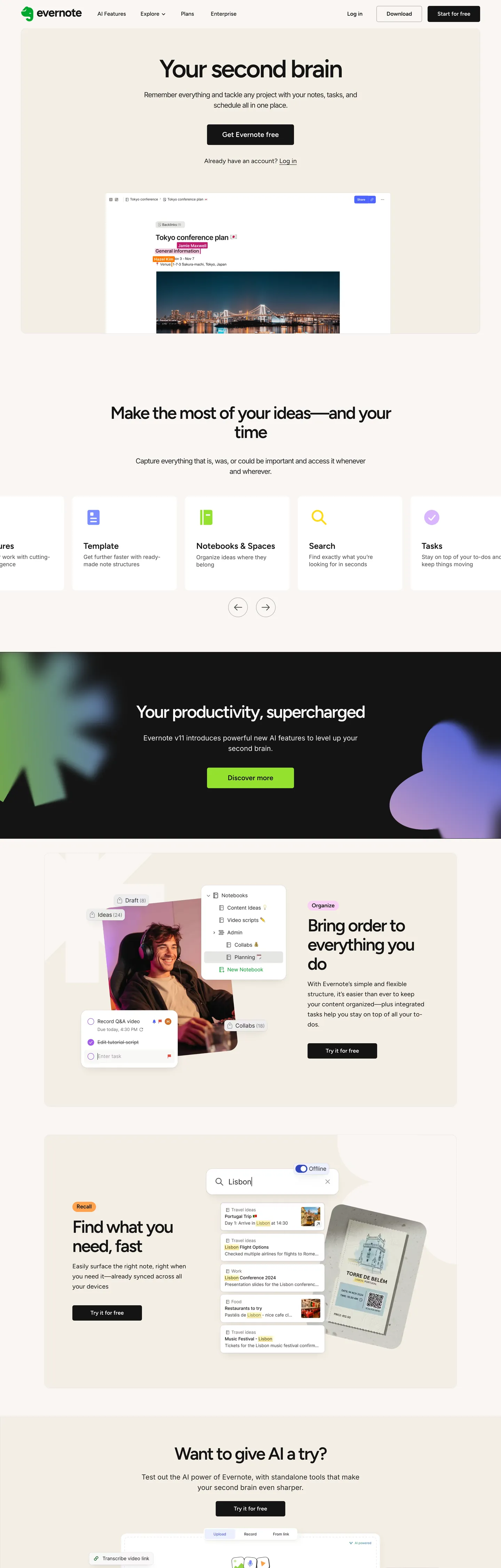
A snapshot of the brand in production. Scroll the frame to see the whole page.
Colors
12 colors
Evernote's system runs on #94e130 as its primary voltage, used in 1 of 16 components. Type is set in Figtree across 13 tokens from 8px to 72px, weights 300–600. Shape language is mixed across 16 components, blending pills, soft rounds, and squarer corners.
Brand & Accent
Sparing, CTA-only voltage · 4
Surface
Page and card backgrounds · 2
Text
Headlines, body, captions · 5
Borders & Hairlines
Dividers, outlines, rules · 1
Typography
13 type tokens
Set in Figtree across 13 tokens, from 8px to 72px, weights 300–600. Shown in its own stack: where the font isn't installed, the fallback the file names stands in.
- display-xl72px · weight 600 · lh 72px · tracking -3.6pxThe quick brown fox jumps over the lazy dog
- display-lg50px · weight 600 · lh 55px · tracking -2.5pxThe quick brown fox jumps over the lazy dog
- display-md40px · weight 600 · lh 44px · tracking -1.2pxThe quick brown fox jumps over the lazy dog
- heading-lg24px · weight 600 · lh 26.4pxThe quick brown fox jumps over the lazy dog
- heading-md20px · weight 600 · lh 26pxThe quick brown fox jumps over the lazy dog
- body-lg18px · weight 400 · lh 28.8px · tracking 0.18pxThe quick brown fox jumps over the lazy dog
- body-md16px · weight 400 · lh 24pxThe quick brown fox jumps over the lazy dog
- body-md-medium16px · weight 500 · lh 24pxThe quick brown fox jumps over the lazy dog
- label-md13px · weight 500 · lh 19.5pxThe quick brown fox jumps over the lazy dog
- caption12px · weight 300 · lh 14.4pxThe quick brown fox jumps over the lazy dog
- overline8px · weight 600 · lh 8pxThe quick brown fox jumps over the lazy dog
- body-utility16px · weight 400 · lh 20.8pxThe quick brown fox jumps over the lazy dog
- body-utility-lg20px · weight 400 · lh 30px · tracking -1pxThe quick brown fox jumps over the lazy dog
Layout
Radii and spacing
6 corner radii and 7 spacing values. Shape language: mixed.
Radii
- none0px
- sm5px
- md10px
- lg16px
- pill52px
- full100%
Spacing
- xs8px
- sm12px
- base16px
- md24px
- lg32px
- xl40px
- 2xl80px
Components
16 components
Each rendered from its tokens (color, type, radius, padding) on Evernote's own canvas.
- Button Primarybutton-primaryButton Primary
- Button Secondarybutton-secondaryButton Secondary
- Top Navtop-navTop Nav
- Nav Linknav-linkNav Link
- Hero Headinghero-headingHero Heading
- Section Headingsection-headingSection Heading
- Body Paragraphbody-paragraphBody Paragraph
- Body Paragraph Mutedbody-paragraph-mutedBody Paragraph Muted
- CardcardCard
- Card Parchmentcard-parchmentCard Parchment
- Card Accent Pinkcard-accent-pinkCard Accent Pink
- Card Accent Orangecard-accent-orangeCard Accent Orange
- Card Headingcard-headingCard Heading
- Type here…text-inputText Input
- FooterfooterFooter
- Overline Labeloverline-labelOverline Label
In use
The system, in use
Evernote's tokens on the kind of product it builds.
Build something people actually use.
A short paragraph of marketing copy that previews how the brand's display tier and body tier read together. Two sentences is usually enough.
FAQ
Evernote design system FAQ
Common questions about Evernote's tokens, components, and how to use this DESIGN.md in your project.
Read next
Related reading
Specs, directories, and component libraries that pair with this design system.
- Browse all design systemsThe full directory of DESIGN.md files on shadcn.io, with live mockups for each.shadcn.io
- Evernote — official siteEvernote's public marketing site — the source of truth for the live tokens captured in this file.evernote.com (opens in a new tab)
- The DESIGN.md specificationGoogle Labs' open spec for machine-readable design system files — the format this page is built on.github.com (opens in a new tab)
Use it
Use Evernote in your project
One machine-readable file. Drop it into Claude, Cursor, or any AI tool that reads DESIGN.md.
Download the DESIGN.md
One machine-readable file: every color, type, radius, spacing, and component token of Evernote.
Feed it to your AI tool
Drop it into Claude, Cursor, or GitHub Copilot. The agent writes React components and Tailwind classes that match Evernote's visual language.
Reference the tokens directly
Or paste the values into your Tailwind config, CSS variables, or component library: every color, size and radius is a quoted, ready-to-copy value.
Read the full DESIGN.md: overview, rationale, do’s and don’ts
Overview
Evernote's relaunched marketing site presents a textbook case of Parchment restraint: a warm yellowish off-white canvas (#f4eee5) carries the full page, with near-black Figtree headlines and a single electric chartreuse (#94e130) appearing exactly twice — once as the primary hero CTA and once as a section illustration accent. Where Notion builds its brand around a cool slate-gray utility canvas and Bear (the macOS notes app) leans warm amber, Evernote plants its identity squarely in the physical notebook metaphor: the paper, the ink, and one highlighter stroke.
The hero makes the argument forcefully. A 72px Figtree headline — "Your second brain" — in near-black on the parchment floor, with the chartreuse button centered beneath it. No gradient, no photography in the hero band, no secondary color. The chartreuse reads as bold precisely because the desert of neutral tones around it is so wide. Below the fold, the system introduces illustration-card sections with lavender-pink, orange, and yellow accent surfaces (each used exactly once), which vary the page rhythm without introducing competing brand voltages.
Typography is Figtree across all display and heading tiers, with Inter appearing only for utility body copy and labels. The display moves are aggressive: 72px at weight 600 with -3.6px tracking for h1, 50px at -2.5px for h2. The body sits at 18px / 400 with +0.18px tracking — the only positive letter-spacing in the system, giving paragraph text an open, easy-to-read quality that reads against the tight display tracking.
Key Characteristics:
- Single chartreuse voltage (
{colors.primary}— #94e130), layer 'brand', used in 2 background fills; zero text or border uses. The scarcity is the strategy. - Warm parchment floor (
{colors.surface-1}— #f4eee5, a clustered value that merged nearby gray-beige variants) carries the page identity; pure white (#ffffff) appears on individual cards lifted above it. - Figtree at tight negative tracking (-3.6px at 72px, -2.5px at 50px) — display headlines carry the visual weight that color is not allowed to.
- Five structural neutrals (#141414, #262626, #4e4d4c, #737373, #a1a1a1) handle every text, border, and secondary-surface role.
- 5px dominant radius (52 occurrences) — unusually tight for consumer productivity, echoing physical paper's square edges.
- Four single-use illustration accent colors (chartreuse, lavender-pink, orange, yellow) appear in section cards below the fold, each once.
- No shadow system — elevation comes from the warm border-to-surface contrast between #a1a1a1 hairlines and the parchment floor.
Colors
Brand
- Chartreuse Primary (
{colors.primary}— #94e130): frequency 2. Used as background only (2). Zero text or border occurrences. The only chromatic brand voltage in the system — the hero CTA fill and one section illustration. Its OKLCH chroma (0.211) is nearly as high as Cloudflare's orange; the scarcity is what makes it land rather than overwhelm.
Illustration Accents (single-use)
- Accent Pink (
{colors.accent-pink}— #fad0f6): frequency 1. Background fill only. Used as the background of one section illustration card. A muted lavender-pink that reads as a secondary pastel in the illustration system. - Accent Orange (
{colors.accent-orange}— #ffa24d): frequency 1. Background fill only. Warm orange illustration-card accent — pairs with the brand chartreuse across the section carousel. - Accent Yellow (
{colors.accent-yellow}— #ffd919): frequency 1. Background fill only. A saturated chrome-yellow that completes the warm illustration trio.
Surface
- Canvas (
{colors.canvas}— #ffffff): frequency 56 (bg: 32, text: 12, border: 12). The card and modal surface — pure white cards lift off the parchment floor without competing with it. - Surface-1 (
{colors.surface-1}— #f4eee5): frequency 12 (bg: 6, border: 6). The page floor — warm parchment. Wired as--color-bg-secondaryand--color-stroke-cards.
Text & Structure
- Ink (
{colors.ink}— #141414): frequency 600 — text (296), border (297). The dominant ink, wired as--color-text-primary. Not pure black — a very dark near-black that reads softer. - Ink Pure (
{colors.ink-pure}— #000000): frequency 350 — text (183), border (167). Pure black, used on navigation and high-contrast border elements. - Ink Secondary (
{colors.ink-secondary}— #262626): frequency 7. Wired as--color-text-secondary. The secondary text tone for supporting copy. - Ink Tertiary (
{colors.ink-tertiary}— #4e4d4c): frequency 50 — text (26), border (24). Wired as--color-text-tertiary. The caption and metadata tone. - Ink Muted (
{colors.ink-muted}— #737373): frequency 10 — text (5), border (5). Tertiary labels and decorative dividers. - Hairline (
{colors.hairline}— #a1a1a1): frequency 10 (border: 10). Wired as--color-stroke-buttons. The button and input border tone — the lightest structural gray that still reads on parchment.
Typography
Font Families
The system runs Figtree as the primary display, heading, and body face — a contemporary geometric sans-serif by Erik Kennedy, available as a Google Font. It carries every display moment: the 72px hero, 50px section headings, 24px card titles, and 18px body paragraphs. Inter appears as a secondary utility face at 16–20px for longer prose paragraphs and small labels. The two families share similar x-heights and proportions, so the visual boundary between them is subtle at body sizes.
Hierarchy
| Token | Size | Weight | Line Height | Letter Spacing | Use |
|---|---|---|---|---|---|
{typography.display-xl} | 72px | 600 | 72px | -3.6px | Hero h1 ("Your second brain") |
{typography.display-lg} | 50px | 600 | 55px | -2.5px | Section h2 ("Make the most of your ideas") |
{typography.display-md} | 40px | 600 | 44px | -1.2px | Sub-section h3 |
{typography.heading-lg} | 24px | 600 | 26.4px | 0 | Card titles, feature headings |
{typography.heading-md} | 20px | 600 | 26px | 0 | Feature sub-headings |
{typography.body-lg} | 18px | 400 | 28.8px | +0.18px | Hero sub-paragraph, section leads |
{typography.body-md} | 16px | 400 | 24px | 0 | Default running text |
{typography.body-md-medium} | 16px | 500 | 24px | 0 | Button labels, nav labels |
{typography.label-md} | 13px | 500 | 19.5px | 0 | Chip labels, metadata |
{typography.caption} | 12px | 300 | 14.4px | 0 | Fine print, secondary captions |
{typography.overline} | 8px | 600 | 8px | 0 | Section category labels (uppercase) |
{typography.body-utility} | 16px | 400 | 20.8px | 0 | Inter body copy paragraphs |
{typography.body-utility-lg} | 20px | 400 | 30px | -1px | Inter medium-display paragraphs |
Principles
Display weight sits at 600 throughout — higher than Cloudflare (500) or Stripe (300), reflecting a consumer product's need for visual authority. The 72px hero at -3.6px tracking is the loudest single moment: at this size, negative tracking tightens the headline into a dense block that the chartreuse button beneath must work to interrupt. The positive tracking (+0.18px) on 18px body text is the counter-move — the body breathes wide while the display compresses. Inter appears only where Figtree would feel overwrought: long utility paragraphs and functional labels.
Note on Font Substitutes
Figtree is a free Google Font — no substitution needed for web projects. For print or Figma at display sizes, Plus Jakarta Sans (Google Fonts) is the closest alternative with comparable geometric warmth. Inter is already available everywhere.
Layout
Spacing System
- Base unit: 8px.
- Tokens:
{spacing.xs}8px ·{spacing.sm}12px ·{spacing.base}16px ·{spacing.md}24px ·{spacing.lg}32px ·{spacing.xl}40px ·{spacing.2xl}80px. - Section vertical padding: 80px between major sections on the parchment canvas.
- Card padding: 32px on primary cards, 24px on compact feature cards.
- Hero padding: 40px vertical, 32px horizontal, centered within a max-content container.
Grid & Container
- Max content width: ~820px for display headlines and hero copy; ~1200px for feature cards.
- Hero: parchment canvas, centered headline + sub-copy + single CTA stack.
- Feature grid: 3-up card row for product feature sections, collapsing to 2-up on tablet.
- Illustration cards: full-bleed accent-colored panels (each a different accent hue) in alternating left-right layouts.
Rhythm
The page alternates between tight editorial (plain parchment with headline + body) and colored illustration (accent-panel sections introducing product screens). No major section uses a background gradient — the transition between bands is always a hard color stop from parchment to accent surface or back.
Elevation
The system has no shadow tier. Depth comes entirely from two sources: (1) hairline borders ({colors.hairline} — #a1a1a1) marking card edges, and (2) surface contrast between the warm parchment floor ({colors.surface-1} — #f4eee5) and white card surfaces ({colors.canvas} — #ffffff). The contrast is modest (~5% lightness in OKLCH) but perceptible on a warm background. No box-shadow values appear in the extraction — this is an entirely flat system.
Shapes
The radius scale is tight-utility, anchored at 5px:
{rounded.none}0px — bare structural lines and photo frames.{rounded.sm}5px — dominant rounding (52 occurrences): buttons, input fields, small chip labels.{rounded.md}10px — (30 occurrences): primary feature cards, content containers.{rounded.lg}16px — (5 occurrences): featured panels, modal surfaces.{rounded.pill}52px — pill-shaped CTA variants and tag badges.{rounded.full}100% — circular avatar and icon elements.
The 5px base is notably smaller than the Notion (4-8px varies), Bear (10px+), or Google Keep (12px+) competitors. It signals a product that considers itself a structured workspace tool rather than a casual consumer app — physical paper has square corners; the rounding is the minimum needed to read as interactive.
Components
button-primary — The system's sole chromatic moment. Chartreuse {colors.primary} fill, near-black {colors.ink} text, {rounded.sm} 5px radius, 10×28px padding, 46px height. "Get started for free" is the canonical instance in the hero.
button-secondary — Transparent fill, near-black text, 1px {colors.hairline} (#a1a1a1) border, same radius and height as the primary. Used for "Log in" and secondary navigation CTAs.
top-nav — White {colors.canvas} surface, 60px height, Evernote wordmark and elephant logo at left, product links center, "Log in" + primary CTA at right.
nav-link — Transparent background, pure-black {colors.ink-pure} text at {typography.body-md}, 0×20px horizontal padding. The nav links use pure black rather than the near-black ink, adding subtle visual authority to the navigation row.
hero-heading — Near-black {colors.ink} text, {typography.display-xl} (72px / 600 / -3.6px tracking). The tightest-tracked element in the system.
section-heading — Same near-black ink, {typography.display-lg} (50px / 600 / -2.5px). The section-level h2 used throughout the below-fold content.
body-paragraph — Near-black text at {typography.body-lg} (18px / 400 / +0.18px tracking) — the hero sub-paragraph style. The positive tracking is the only instance of open tracking in the system.
body-paragraph-muted — Tertiary ink {colors.ink-tertiary} (#4e4d4c) at {typography.body-md} for secondary card copy and caption text.
card — White {colors.canvas} fill, {rounded.md} 10px radius, 32px padding, {colors.surface-1} border. The standard product-feature card, lifting off the parchment floor via hairline contrast.
card-parchment — Parchment {colors.surface-1} fill, same radius and padding as card. Used where a card should blend into the page floor rather than lift above it.
card-accent-pink, card-accent-orange — Single-use illustration panels in lavender-pink and orange respectively. Each holds a product screenshot or UI illustration.
text-input — White surface, near-black text, {rounded.sm} 5px radius, 8×12px padding, 40px height, {colors.hairline} border.
footer — Parchment {colors.surface-1} surface, tertiary-ink text, {typography.caption} (12px / 300). The footer drops to the parchment floor — no canvas-colored interruption.
Do's and Don'ts
Do reserve {colors.primary} (#94e130) for exactly one action per screen. Its impact depends entirely on its scarcity — two chartreuse elements on the same viewport look accidental, not designed.
Do use {colors.surface-1} (#f4eee5) — NOT pure white — as the page floor. White card surfaces lifted against the parchment gain visual depth that white-on-white cannot achieve.
Do maintain the negative tracking at display sizes: -3.6px at 72px and -2.5px at 50px. These values are extracted from the actual rendered page; rounding to -2px or -3px flattens the tight typographic block.
Do use {typography.body-lg} (+0.18px) for hero sub-paragraphs — the positive tracking on body text is the deliberate counterweight to the tight display.
Don't use {colors.hairline} (#a1a1a1) for body text or inline labels. It is a border-only token (10 occurrences, all border). For secondary text, use {colors.ink-tertiary} (#4e4d4c) or {colors.ink-muted} (#737373) instead.
Don't apply the illustration accent colors (chartreuse, lavender-pink, orange, yellow) to interactive elements (buttons, links, hover states). Each accent is an illustration-surface-only token; pulling one into button fills creates two competing CTAs.
Don't add a shadow to cards. The system is intentionally flat — adding a box-shadow behind {component.card} on a parchment floor reads as a foreign element from a different design system.
Don't run {typography.display-xl} below 60px. At 72px the -3.6px tracking creates the intended dense block; at 48–56px the same tracking reads as over-kerned rather than editorial.
Known Gaps
- Hover and focus states: only the resting state is captured; button hover, link underline behavior, and input focus rings are not exposed on the marketing surface.
- Dark mode: no dark variant is present on the marketing site; whether the Bending Spoons product has a dark-mode system is not captured here.
- Mobile layout: the 1440px-wide extraction captures desktop layout only; the mobile nav, responsive grid behavior, and touch-target sizing are not documented.
- Product UI components: the design tokens for the actual Evernote note editor (sidebar, note surface, toolbar) are not represented here; this file covers only the marketing surface.
- Animation and micro-interactions: the marketing site uses scroll-triggered section reveals; the spec captures end-state values only.
- Illustration system: the four accent colors (chartreuse, pink, orange, yellow) appear in illustration cards but the illustration style itself (3D renders vs. flat vs. photography) is not captured as a component pattern.
Productivity & SaaS
More systems like this
More DESIGN.md files in Productivity & SaaS.
Pricing
Build it with Pro
The DESIGN.md files are free. Pro adds 6,000+ blocks, premium templates and the MCP server, so your AI editor builds in your system for you.
4.9/5 out of 5 · 150+ reviewsfrom 150+ founders and developers.
Billing
Billed once a year in USD. Cancel anytime.
- How many people can use the license.
- Client work, SaaS products and anything you charge for.
- Production-ready React sections: hero, pricing, features, dashboards and more.
- Complete multi-page sites you can ship as they are.
- React icons from every major library, installable with one command.
- Presets that restyle every block, in light and dark.
- Lets your AI editor search, preview and install blocks for you.
- Priority requests are answered first.
Individual
For personal projects & open source
$32instead of $49/mo
$389 billed yearly
- Seats: 1 seat
- Commercial use: Personal & open source only
- Pro blocks: 6,000+ blocks
- Templates: All 14 templates
- React icons: 294k+ icons
- Themes: All 59 themes
- MCP server: Basic usage
- Support: Standard
Team
Most popularFor freelancers, agencies & startups
$66instead of $99/mo
$789 billed yearly · ≈ $13/dev/mo
- Seats: Up to 5 seats
- Commercial use: Included
- Pro blocks: 6,000+ blocks
- Templates: All 14 templates
- React icons: 294k+ icons
- Themes: All 59 themes
- MCP server: High usage
- Support: Priority
Organization
For companies with larger teams
$132instead of $199/mo
$1,589 billed yearly
- Seats: Unlimited seats
- Commercial use: Included
- Pro blocks: 6,000+ blocks
- Templates: All 14 templates
- React icons: 294k+ icons
- Themes: All 59 themes
- MCP server: Unlimited usage
- Support: Priority
Billed once a year in USD. Cancel anytime.
Individual
For personal projects & open source
$32instead of $49/mo
$389 billed yearly
- How many people can use the license.Seats: 1 seat
- Client work, SaaS products and anything you charge for.Commercial use: Personal & open source only
- Production-ready React sections: hero, pricing, features, dashboards and more.Pro blocks: 6,000+ blocks
- Complete multi-page sites you can ship as they are.Templates: All 14 templates
- React icons from every major library, installable with one command.React icons: 294k+ icons
- Presets that restyle every block, in light and dark.Themes: All 59 themes
- Lets your AI editor search, preview and install blocks for you.MCP server: Basic usage
- Priority requests are answered first.Support: Standard
Team
Most popularFor freelancers, agencies & startups
$66instead of $99/mo
$789 billed yearly · ≈ $13/dev/mo
Everything in Individual, plus
- How many people can use the license.Seats: Up to 5 seats
- Client work, SaaS products and anything you charge for.Commercial use: Included
- Lets your AI editor search, preview and install blocks for you.MCP server: High usage
- Priority requests are answered first.Support: Priority
Organization
For companies with larger teams
$132instead of $199/mo
$1,589 billed yearly
Everything in Team, plus
- How many people can use the license.Seats: Unlimited seats
- Lets your AI editor search, preview and install blocks for you.MCP server: Unlimited usage
- Secure checkout via Stripe
- Code lives in your repo
- Keep what you've shipped if you cancel
- License terms
Your system, built for you
Every block, template and icon, installed by your AI agent in your design system. The DESIGN.md files stay free.