Dropbox Design System
Dropbox's design system as a DESIGN.md file. Blue #0061fe CTA, cream #f7f5f2 canvas, Sharp Grotesk + Atlas Grotesk, 21 colors, 17 components. For React, Next.js, and AI tools.
Add shadcn.io to your AI agent. · Pro It installs blocks, icons and templates in your design system from a prompt, with Pro.
Set up MCP- Primary
- #0061fe
- Typeface
- Atlas Grotesk Web
- Shape
- Soft
- Base radius
- 12px
- Colors
- 21
- Type tokens
- 12
- Components
- 17
- Spacing values
- 8
About
About Dropbox DESIGN.md
Curated by Dov Azencot · Updated May 13, 2026 · Source dropbox.com (opens in a new tab)
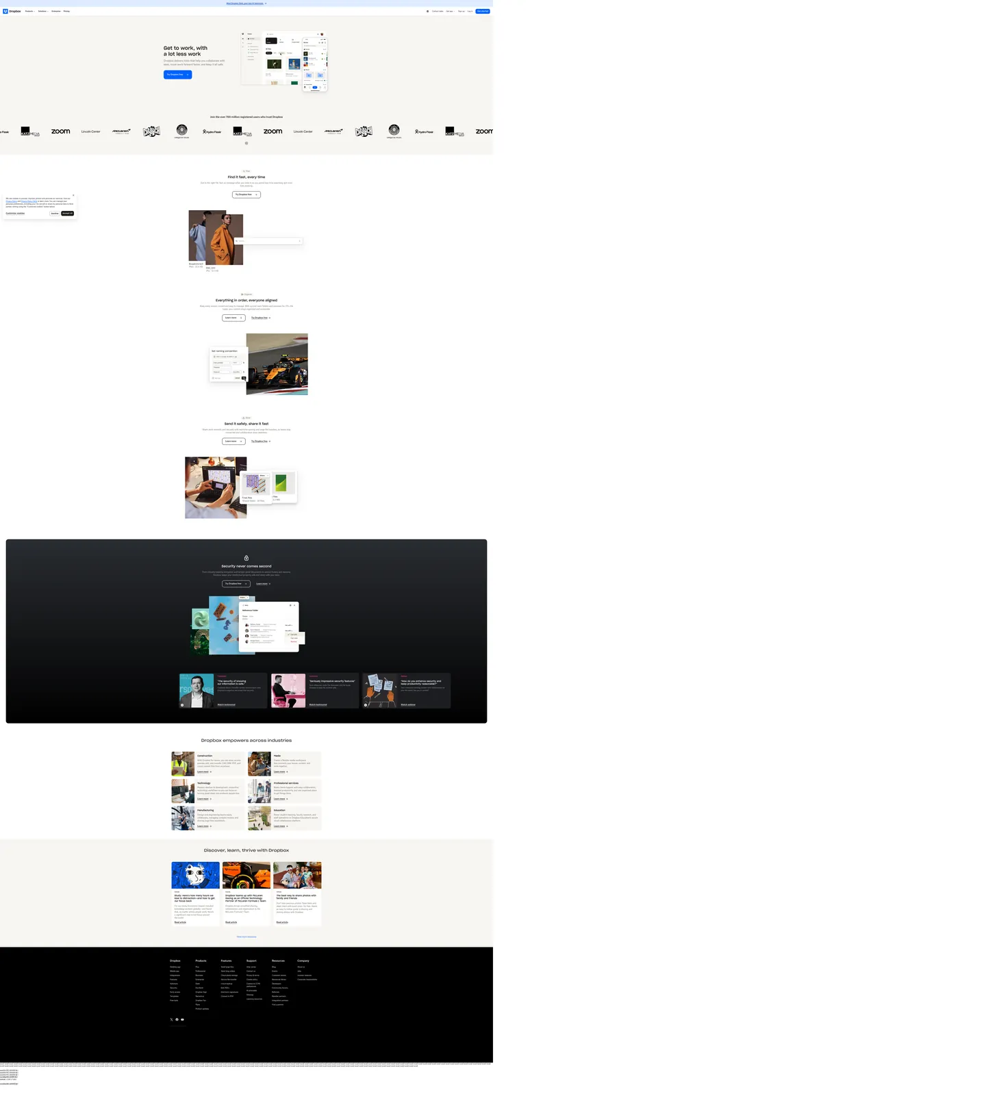
Dropbox's marketing page opens on a warm cream wash — not white — at "#f7f5f2", with the headline "Get to work, with a lot less work" set in Sharp Grotesk at 40px weight 500 against near-black ink "#1e1919". The lone filled CTA is a Dropbox Blue "#0061fe" pill carrying "Try Dropbox free", and a soft-gray product mockup hovers to the right of the type column. The page never doubles up on filled buttons in the same band, never gradients its hero, and never reaches for pure black on its primary canvas. The voice is workspace, not consumer; the chrome is warm-neutral, not fintech-blue.
This page packages the surface into a single DESIGN.md file. Inside: 21 colors tokens covering the cream canvas, near-black ink, Dropbox Blue voltage, the deep sapphire press state "#0044af", and the supporting brown-warm hairline tier, plus the inverted "#000000" dark band that carries the security pitch mid-page; 12 typography tokens running Sharp Grotesk at 18 to 40px for display and Atlas Grotesk Web at 14 to 20px for body and UI; 5 corner radii from 8px chips to the 100px button pill; 8 spacing values resolving to a 4 / 8 / 12 / 16 / 24px rhythm; and 17 components covering the primary pill, outline secondary, text input, top nav, customer logo strip, feature card, dark security band, and the eyebrow-and-headline pairing that opens every section. Format follows the Google Labs DESIGN.md spec.
Feed the file to Claude, Cursor, or GitHub Copilot. The agent reproduces Dropbox's warm-neutral discipline — cream canvas, single-blue CTA hierarchy, Sharp-and-Atlas typeface pairing, 12 to 16px card radii with 100px button pills — instead of a generic SaaS theme. Reference tokens directly inside Tailwind config or CSS variables. This system is worth studying for one reason: it shows that a 700-million-user productivity brand can stay warm and bookish on the page while keeping a single electric voltage in reserve, a stance most workspace competitors abandon for either dark dashboards or pastel maximalism.
What makes it distinct
5
- Single voltage CTADropbox Blue #0061fe carries the lone filled pill per band, never paired with a second filled button
- Warm cream canvas #f7f5f2 instead of pure whitethe brand softens its workspace identity with a 4-percent warm tint
- Dual-typeface contrastSharp Grotesk at weight 500 for display headlines, Atlas Grotesk Web for every body and UI surface
- Two-radius geometry12 to 16px on cards and surfaces, 100px on every interactive pill button
- Inverted security bandnear-black #000000 dark surface drops into the middle of a cream marketing flow for the security pitch
dropbox.com
Live at dropbox.com
A snapshot of the brand in production. Scroll the frame to see the whole page.
Colors
21 colors
Dropbox's system runs on #0061fe as its primary voltage, used in 2 of 17 components. Type is set in Atlas Grotesk Web across 12 tokens from 14px to 40px, weights 400–500. Shape language is soft — components average 36px corner radius, with no sharp interactive edges.
Brand & Accent
Sparing, CTA-only voltage · 7
Surface
Page and card backgrounds · 5
Text
Headlines, body, captions · 7
Borders & Hairlines
Dividers, outlines, rules · 2
Typography
12 type tokens
Set in Atlas Grotesk Web across 12 tokens, from 14px to 40px, weights 400–500. Shown in its own stack: where the font isn't installed, the fallback the file names stands in.
- display-xl40px · weight 500 · lh 1.2 · tracking -0.4pxThe quick brown fox jumps over the lazy dog
- display-lg32px · weight 400 · lh 1.2 · tracking -0.2pxThe quick brown fox jumps over the lazy dog
- display-md26px · weight 500 · lh 1.3The quick brown fox jumps over the lazy dog
- heading-md20px · weight 500 · lh 1.5The quick brown fox jumps over the lazy dog
- heading-sm18px · weight 500 · lh 1.2The quick brown fox jumps over the lazy dog
- body-lg20px · weight 400 · lh 1.5The quick brown fox jumps over the lazy dog
- body-md16px · weight 400 · lh 1.5The quick brown fox jumps over the lazy dog
- body-sm14px · weight 400 · lh 1.57The quick brown fox jumps over the lazy dog
- label-md16px · weight 500 · lh 1.2The quick brown fox jumps over the lazy dog
- label-sm14px · weight 500 · lh 1.43The quick brown fox jumps over the lazy dog
- button-md16px · weight 500 · lh 1.2The quick brown fox jumps over the lazy dog
- caption14px · weight 400 · lh 1.2The quick brown fox jumps over the lazy dog
Layout
Radii and spacing
5 corner radii and 8 spacing values. Shape language: soft.
Radii
- sm8px
- md12px
- lg16px
- xl20px
- pill100px
Spacing
- xs4px
- sm8px
- md12px
- base16px
- lg24px
- xl32px
- xxl48px
- huge64px
Components
17 components
Each rendered from its tokens (color, type, radius, padding) on Dropbox's own canvas.
- Button Primary Pillbutton-primary-pillButton Primary Pill
- Button Primary Pill Pressedbutton-primary-pill-pressedButton Primary Pill Pressed
- Button Secondary Outlinebutton-secondary-outlineButton Secondary Outline
- Button On Darkbutton-on-darkButton On Dark
- Button Ghost On Darkbutton-ghost-on-darkButton Ghost On Dark
- Type here…text-inputText Input
- Type here…text-input-focusedText Input Focused
- Top Navtop-navTop Nav
- Nav Linknav-linkNav Link
- Promo Barpromo-barPromo Bar
- Hero Eyebrowhero-eyebrowHero Eyebrow
- Hero Headlinehero-headlineHero Headline
- Card Featurecard-featureCard Feature
- Card Industrycard-industryCard Industry
- Band Dark Securityband-dark-securityBand Dark Security
- Testimonial Card Darktestimonial-card-darkTestimonial Card Dark
- Footer Darkfooter-darkFooter Dark
In use
The system, in use
Dropbox's tokens on the kind of product it builds.
Build something people actually use.
A short paragraph of marketing copy that previews how the brand's display tier and body tier read together. Two sentences is usually enough.
FAQ
Dropbox design system FAQ
Common questions about Dropbox's tokens, components, and how to use this DESIGN.md in your project.
Read next
Related reading
Specs, directories, and component libraries that pair with this design system.
- Browse all design systemsThe full directory of DESIGN.md files on shadcn.io, with live mockups for each.shadcn.io
- Dropbox — official siteCloud storage, file sharing, and Dash content search for teams of every size.dropbox.com (opens in a new tab)
- The DESIGN.md specificationGoogle Labs' open spec for machine-readable design system files.github.com (opens in a new tab)
Use it
Use Dropbox in your project
One machine-readable file. Drop it into Claude, Cursor, or any AI tool that reads DESIGN.md.
Download the DESIGN.md
One machine-readable file: every color, type, radius, spacing, and component token of Dropbox.
Feed it to your AI tool
Drop it into Claude, Cursor, or GitHub Copilot. The agent writes React components and Tailwind classes that match Dropbox's visual language.
Reference the tokens directly
Or paste the values into your Tailwind config, CSS variables, or component library: every color, size and radius is a quoted, ready-to-copy value.
Read the full DESIGN.md: overview, rationale, do’s and don’ts
Overview
Dropbox's marketing page opens on a warm cream wash — not white — at {colors.canvas} ("#f7f5f2"), with Sharp Grotesk display type at 40px weight 500 sitting on near-black ink {colors.ink} ("#1e1919"). The lone filled CTA is Dropbox Blue {colors.primary} ("#0061fe") carrying "Try Dropbox free". Below the hero, a customer-logo strip cycles MGM, McLaren, Lincoln Center, Hydro Flask, and Zoom across a horizontal band. Three feature sections follow — Dash search, organization, fast sharing — each pairing a Sharp Grotesk headline with an Atlas Grotesk body paragraph and a product UI mockup. Then the page inverts: a full-bleed {colors.surface-dark} ("#000000") band carries the "Security never comes second" pitch, and three dark testimonial cards sit inside. The flow returns to cream for the industries grid and articles strip, and closes on a dark footer.
Warm-neutral discipline: where most productivity brands lean either pastel-maximalist (Notion) or pure-white-clinical (Linear), Dropbox holds the entire page on a 4-percent warm tint — cream "#f7f5f2" rather than the conventional white — paired with near-black "#1e1919" rather than pure black. The single concession to chromatic voltage is Dropbox Blue, which carries a rare 7 page occurrences across the entire capture, all of them either CTAs, brand wordmark, or focus rings. The rest of the surface lives on a warm-neutral chrome ladder: cream "#f7f5f2" → cream-lift "#eee9e2" → ink-mute "#524a3e" → ink "#1e1919".
Inverted security band: the only place the page reaches for pure "#000000" is the security section in the middle of the marketing flow. The dark band is band-scoped (a single full-bleed rectangle inside the cream page), not a global dark theme, and it carries its own internal hierarchy — Sharp Grotesk headline, three {colors.surface-dark-elevated} ("#292c31") testimonial cards, and the same blue CTA. Every other surface returns immediately to cream. The inversion is a deliberate signal that security is the load-bearing argument, not a feature tile.
Key Characteristics:
- Cream canvas
{colors.canvas}("#f7f5f2") — 359 page occurrences — as the dominant surface color, replacing pure white. - Single-blue CTA voltage: filled
{colors.primary}("#0061fe") pill is the only filled button per band, one per section. - Sharp Grotesk display tier (18 / 26 / 40px at weight 500) paired with Atlas Grotesk Web body tier (14 / 16 / 20px at weight 400 / 500).
- 100px pill buttons (
{rounded.pill}) on every interactive button, 12 to 16px radius on every card and surface. - Inverted dark band — full-bleed
"#000000"for the security section only, then back to cream. - Customer logo strip in
{colors.ink}("#1e1919") word-mark silhouettes — never logos at brand color, never on a tinted background.
Colors
Source page: home (
https://www.dropbox.com/).
Brand & Accent
- Dropbox Blue (
{colors.primary}—"#0061fe") — frequency 7. Used as text (1), bg (3), border (3). The brand's single filled-CTA voltage, bound to--color__core__accent. Pill button, brand wordmark, focus state. - Dropbox Blue Press (
{colors.primary-press}—"#0044af") — frequency 6. Used as text (3), border (3). The pressed and emphasis lift on the primary, bound to--color__sapphire--90. Also carries link emphasis on the cream promo bar. - Link Classic (
{colors.link-classic}—"#0000ee") — frequency 4. Used as text (2), border (2). The default unstyled-link blue retained on legal nav links — a small, deliberate web-platform-default signal in the footer. - Surface Info Soft (
{colors.surface-info-soft}—"#deebff") — frequency 1. Background tint for the top promo strip ("Meet Dropbox Dash, now in private beta") sitting above the nav. Bound to--dig-color__primary__surface.
Surface
- Canvas (
{colors.canvas}—"#f7f5f2") — frequency 359. Used as text (168), bg (25), border (166). The default page background — a 4-percent warm tint of white that pulls the brand toward bookish-workspace rather than clinical-cool. Bound to--color__opacity--lighten3and--color__inverse__core__primary. - Canvas Lift (
{colors.canvas-lift}—"#eee9e2") — frequency 9. Used as bg (9). Half-step elevation above canvas, used for industry cards and the "Discover, learn, thrive" article strip. Bound to--dig-color__selection__surface. - Surface Dark (
{colors.surface-dark}—"#000000") — frequency 917. Used as text (457), bg (2), border (457), gradient (1). Reserved for the security band and the footer — the only places the page reaches for pure black. The high text frequency reflects how many small UI labels use it inside product mockups. - Surface Dark Elevated (
{colors.surface-dark-elevated}—"#292c31") — frequency 1. Used as gradient (1). The testimonial-card fill on the dark security band — a slate that lifts a half-step above pure black.
Text
- Ink (
{colors.ink}—"#1e1919") — frequency 243. Used as text (118), bg (7), border (118). The default body and headline text color across the entire page — a near-black with a barely-perceptible warm bias. Bound to--dwg-color__secondary__base. - Ink Mute (
{colors.ink-mute}—"#524a3e") — frequency 82. Used as text (41), border (41). Secondary text — sub-headings, eyebrow labels, supporting body copy beneath display headlines. The warm-brown bias matches the cream canvas. Bound to--color__utility__overlay. - On Dark (
{colors.on-dark}—"#f7f5f2"). Cream text on the dark security band — never pure white, so the warm-neutral discipline holds across light-and-dark inversions. - On Dark Mute (
{colors.on-dark-mute}—"#8e8b87"). Footer legal text and column sub-labels on the dark footer. - Ink Warm (
{colors.ink-warm}—"#393633"). Used inside product UI mockups as a secondary slate. Bound to--dig-color__secondary__base--state-1.
Hairline
- Hairline (
{colors.hairline}—"#a69171"). Warm-brown hairline for cream-on-cream separation. Bound to--color__faint__border. - Hairline Soft (
{colors.hairline-soft}—"#d3cec9"). Used as bg (1). Softer cream hairline for input borders and card outlines. Bound to--dig-color__secondary__surface--state-2.
Brand-Library Accent (Reserved)
The Dropbox token system declares a wider accent ladder for product-UI use that does not appear on the marketing canvas in any filled form. Use sparingly inside in-app illustrations only.
- Plum (
{colors.accent-plum}—"#78286e"). Bound to--dig-color__accent__purple. - Orchid (
{colors.accent-orchid}—"#c8aff0"). Bound to--dig-color__identity__purple. - Canopy (
{colors.accent-canopy}—"#175641"). Bound to--dig-color__identity__on-green. - Sunset (
{colors.accent-sunset}—"#f7561d"). Bound to--color__accent__sunset. - Yellow (
{colors.accent-yellow}—"#eecc5d"). Bound to--dig-color__identity__yellow.
Typography
Font Family
Dropbox pairs two custom families. Sharp Grotesk (proprietary) carries every display headline at weights 400 and 500, with a wider "Sharp Grotesk 23" variant at 32px for section openers. Atlas Grotesk Web (proprietary, by Commercial Type) handles every body paragraph, button label, nav link, footer item, and UI label — by raw frequency it is the dominant family on the page (50 paragraph instances at 14px alone).
The fallback stack walks AtlasGrotesk → -apple-system → system-ui → "Segoe UI" → "Helvetica Neue" → Helvetica → Arial → sans-serif. The open-source path: Inter at weight 400 to 500 for Atlas Grotesk, Space Grotesk at weight 500 for Sharp Grotesk — the proportional rhythm transfers closely.
Hierarchy
| Token | Family | Size | Weight | Line Height | Use |
|---|---|---|---|---|---|
{typography.display-xl} | Sharp Grotesk | 40px | 500 | 1.2 | Hero headline |
{typography.display-lg} | Sharp Grotesk 23 | 32px | 400 | 1.2 | Section opener |
{typography.display-md} | Sharp Grotesk | 26px | 500 | 1.3 | Compact section title |
{typography.heading-md} | Atlas Grotesk Web | 20px | 500 | 1.5 | Sub-heading on cream |
{typography.heading-sm} | Sharp Grotesk | 18px | 500 | 1.2 | Feature card title |
{typography.body-lg} | Atlas Grotesk Web | 20px | 400 | 1.5 | Hero sub-paragraph |
{typography.body-md} | Atlas Grotesk Web | 16px | 400 | 1.5 | Standard body |
{typography.body-sm} | Atlas Grotesk Web | 14px | 400 | 1.57 | Footer, captions, table labels |
{typography.label-md} | Atlas Grotesk Web | 16px | 500 | 1.2 | Nav links |
{typography.label-sm} | Atlas Grotesk Web | 14px | 500 | 1.43 | Industry card label |
{typography.button-md} | Atlas Grotesk Web | 16px | 500 | 1.2 | Primary and secondary pill labels |
{typography.caption} | Atlas Grotesk Web | 14px | 400 | 1.2 | Footer legal copy |
Principles
- Dual-family contrast. Sharp Grotesk carries display work; Atlas Grotesk Web carries everything else. The two families together do what one would not — geometric authority on headlines, neutral readability everywhere else.
- Weight 500, never 600+. Display sits at weight 500. Atlas Grotesk Web body sits at 400 with 500 for labels and buttons. Above weight 500 the page picks up an enterprise-trade-show muscle the brand resists.
- Proportional line-height. Display tokens use line-height 1.2; body sizes use 1.5 to 1.57. No tight negative letter-spacing — the brand reads roomy and bookish.
Layout
Spacing System
- Base unit: 4px (with 8 / 12 / 16 / 24px as the primary rhythm tokens).
- Tokens:
{spacing.xs}4px ·{spacing.sm}8px ·{spacing.md}12px ·{spacing.base}16px ·{spacing.lg}24px ·{spacing.xl}32px ·{spacing.xxl}48px ·{spacing.huge}64px. - Section padding: 64 to 96px on marketing surfaces; 48 to 64px on the dark security band.
- Card internal padding: 24px on feature cards; 16px on compact industry tiles.
Grid & Container
- Marketing page centers on a 1248px container with the dark security band extending edge-to-edge.
- Industries grid is 3-up at desktop, collapses to 2-up at tablet, 1-up at mobile.
- Customer logo strip auto-scrolls infinitely at ~40 pixels per second.
Whitespace Philosophy
Cream space carries the page. Sections gap at 80 to 120px; type columns max out at ~560px width with a 24px gutter to the adjacent product mockup. The dark security band breaks the rhythm deliberately — its internal 64px padding gives the testimonial cards room to breathe against pure black.
Elevation & Depth
| Level | Treatment | Use |
|---|---|---|
| 0 | Flat — no shadow | Default cream canvas |
| 1 | box-shadow: rgba(0,0,0,0.04) 0 1px 2px | Hairline lift on feature cards |
| 2 | box-shadow: rgba(0,0,0,0.08) 0 8px 24px | Hero product mockup card |
| 3 | Inverted dark band | The security section reverses polarity — the brand's primary depth medium is contrast, not literal shadow |
Decorative Depth
The hero product mockup is a multi-layer composite — three nested product UI cards (file browser, share dialog, properties pane) stacked at z-axis offsets with a soft Level 2 shadow underneath. The dark security band uses no shadows; its depth comes from polarity inversion alone.
Shapes
Border Radius Scale
| Token | Value | Use |
|---|---|---|
{rounded.sm} | "8px" | Form inputs, compact chips, product UI screenshots |
{rounded.md} | "12px" | Feature cards, industry tiles, testimonial cards |
{rounded.lg} | "16px" | Hero product mockup, dark security band |
{rounded.xl} | "20px" | Large card frames inside the article strip |
{rounded.pill} | "100px" | Every interactive pill button, primary and secondary |
Photography & Mockup Geometry
Photography inside industry cards and the article strip uses inset 4:3 ratios with a 12px {rounded.md} corner — no shadow. Product UI mockups render inside 16px {rounded.lg} containers with a soft Level 2 shadow. Customer logos are rendered as silhouettes at full opacity in {colors.ink} — never tinted or boxed.
Components
Buttons
button-primary-pill — the dominant CTA system-wide.
- Background
{colors.primary}("#0061fe"), text{colors.on-primary}("#f7f5f2"), type{typography.button-md}, padding8px 24px, rounded{rounded.pill}"100px", height"36px". - Pressed state
button-primary-pill-pressedshifts background to{colors.primary-press}("#0044af").
button-secondary-outline — the paired alternative.
- Background
{colors.canvas}("#f7f5f2"), text{colors.ink}("#1e1919"), 1px{colors.ink}hairline border, same pill geometry. Used for "Learn more" alongside the primary "Try Dropbox free".
button-on-dark — the blue CTA repeated on the dark security band.
- Same fill as the primary; the brand does not invert the CTA to white-on-blue. Blue stays blue across both light and dark surfaces.
button-ghost-on-dark — outline alternative on dark.
- Background
{colors.surface-dark}("#000000"), text{colors.on-dark}("#f7f5f2"), 1px{colors.on-dark}hairline border, pill geometry. The "Learn more" pair on the security band.
Inputs
text-input — standard form field.
- Background
{colors.canvas}("#f7f5f2"), text{colors.ink}, type{typography.body-md}, padding12px 16px, rounded{rounded.sm}"8px", 1px{colors.hairline-soft}("#d3cec9") border, height"44px". - Focus state
text-input-focused: border swaps to 2px{colors.primary}("#0061fe").
Navigation
top-nav — top nav bar over the cream canvas.
- Background
{colors.canvas}, text{colors.ink}, type{typography.body-sm}, padding12px 24px, height"60px". Wordmark logo left, primary nav center ("Products / Solutions / Enterprise / Pricing"), secondary actions right ("Contact sales / Get app / Sign up / Log in"), and thebutton-primary-pill"Get started" pinned to the far right.
nav-link — individual nav item.
- Background
{colors.canvas}, text{colors.ink}, type{typography.body-sm}, padding8px 12px. Hover state lifts to{colors.canvas-lift}.
promo-bar — top-of-page Dash announcement strip.
- Background
{colors.surface-info-soft}("#deebff"), text{colors.primary-press}("#0044af"), type{typography.body-sm}, padding8px 16px. Centered single line linking to the Dropbox Dash beta.
Hero & Sections
hero-eyebrow — small label above the headline (used on feature sections, not the main hero).
- Text
{colors.ink-mute}("#524a3e"), type{typography.label-sm}. The "Find" / "Organize" / "Share" / "Secure" pre-headers.
hero-headline — Sharp Grotesk display headline.
- Text
{colors.ink}("#1e1919"), type{typography.display-xl}(40px / 500 / 1.2). The lone-line "Get to work, with a lot less work" reads as the brand's primary statement.
Cards & Bands
card-feature — feature explanation card or section panel.
- Background
{colors.canvas-lift}("#eee9e2"), text{colors.ink}, type{typography.body-md}, padding24px, rounded{rounded.md}"12px". Used for the customer-logo strip background and feature-tile chrome.
card-industry — small industry-tile card inside the "Dropbox empowers across industries" grid.
- Background
{colors.canvas-lift}, text{colors.ink}, type{typography.body-sm}, padding16px, rounded{rounded.md}. Photo top, label, single-line description, "Learn more" link.
band-dark-security — full-bleed dark security section.
- Background
{colors.surface-dark}("#000000"), text{colors.on-dark}("#f7f5f2"), type{typography.body-md}, padding64px 24px, rounded{rounded.lg}"16px". Contains a centered Sharp Grotesk headline, body paragraph, primary blue CTA + outline ghost CTA, and three testimonial cards in a 3-up grid.
testimonial-card-dark — dark slate testimonial inside the security band.
- Background
{colors.surface-dark-elevated}("#292c31"), text{colors.on-dark}, type{typography.body-sm}, padding24px, rounded{rounded.md}. Quote text, brand photo strip, "Watch testimonial" link.
Footer
footer-dark — site footer.
- Background
{colors.surface-dark}("#000000"), text{colors.on-dark-mute}("#8e8b87"), type{typography.caption}, padding64px 24px. 6-column link grid (Dropbox / Products / Features / Support / Resources / Company), social icon row (Twitter / Facebook / YouTube), region selector at the bottom.
Do's and Don'ts
Do
- Hold
{colors.primary}("#0061fe") to one filled pill per band — the brand's single-voltage discipline only works when the blue stays rare. - Use
{colors.canvas}("#f7f5f2") — not pure white — as the page canvas. Pure white only appears inside product UI mockups. - Pair every Sharp Grotesk display headline with an Atlas Grotesk Web body paragraph. Reverse the pairing breaks the typographic rhythm.
- Render pill buttons at 100px radius even at 36px height — the full pill is the geometry signal.
- Render the security pitch on a full-bleed
{colors.surface-dark}("#000000") band, then return immediately to cream. The polarity flip is the brand's depth move.
Don't
- Don't pair two filled CTAs in the same band. The
button-secondary-outlineis the only legal companion tobutton-primary-pill— never two filled blues. - Don't use Sharp Grotesk at weight 600+. The brand caps display at 500; weight 600+ pushes the page toward enterprise-trade-show muscle the system resists.
- Don't swap the cream canvas for pure white — it breaks the warm-neutral discipline. The cream canvas at
"#f7f5f2"is non-negotiable, and pure white only ever appears inside product UI mockup chrome. - Don't tint customer logos with brand color. The MGM / McLaren / Lincoln Center / Hydro Flask / Zoom strip uses
{colors.ink}("#1e1919") silhouettes on canvas — never logos at brand color, never boxed. - Don't apply the dark band globally as a theme switch. The
band-dark-securityis band-scoped — one section, then back to cream. - Don't render text inputs at 12px radius — the input scale
{rounded.sm}("8px") is the only legal corner for forms.
Known Gaps
- Form validation states. Success, error, and warning text colors live inside the authenticated Dropbox web app rather than the marketing surface — not captured.
- Mobile responsive scaling. Sharp Grotesk drops from 40 → 28px on mobile, but exact breakpoint values were not traced.
- In-app palette. Product UI mockups embedded inside feature cards use the
--dig-color__*token tier, which carries its own semantic ladder (alert, attention, success, warning) distinct from the marketing palette documented here. - Animation specs. The hero mockup drift, the customer-logo strip auto-scroll, and the article-strip carousel were observed but the easing curves and durations were not extracted.
- Sub-brand surfaces. Dropbox Dash, Dropbox Sign, and Dropbox Replay each layer their own accent palette on top of the core blue system — none captured here.
Productivity & SaaS
More systems like this
More DESIGN.md files in Productivity & SaaS.
Pricing
Build it with Pro
The DESIGN.md files are free. Pro adds 6,000+ blocks, premium templates and the MCP server, so your AI editor builds in your system for you.
4.9/5 out of 5 · 150+ reviewsfrom 150+ founders and developers.
Billing
Billed once a year in USD. Cancel anytime.
- How many people can use the license.
- Client work, SaaS products and anything you charge for.
- Production-ready React sections: hero, pricing, features, dashboards and more.
- Complete multi-page sites you can ship as they are.
- React icons from every major library, installable with one command.
- Presets that restyle every block, in light and dark.
- Lets your AI editor search, preview and install blocks for you.
- Priority requests are answered first.
Individual
For personal projects & open source
$32instead of $49/mo
$389 billed yearly
- Seats: 1 seat
- Commercial use: Personal & open source only
- Pro blocks: 6,000+ blocks
- Templates: All 14 templates
- React icons: 294k+ icons
- Themes: All 59 themes
- MCP server: Basic usage
- Support: Standard
Team
Most popularFor freelancers, agencies & startups
$66instead of $99/mo
$789 billed yearly · ≈ $13/dev/mo
- Seats: Up to 5 seats
- Commercial use: Included
- Pro blocks: 6,000+ blocks
- Templates: All 14 templates
- React icons: 294k+ icons
- Themes: All 59 themes
- MCP server: High usage
- Support: Priority
Organization
For companies with larger teams
$132instead of $199/mo
$1,589 billed yearly
- Seats: Unlimited seats
- Commercial use: Included
- Pro blocks: 6,000+ blocks
- Templates: All 14 templates
- React icons: 294k+ icons
- Themes: All 59 themes
- MCP server: Unlimited usage
- Support: Priority
Billed once a year in USD. Cancel anytime.
Individual
For personal projects & open source
$32instead of $49/mo
$389 billed yearly
- How many people can use the license.Seats: 1 seat
- Client work, SaaS products and anything you charge for.Commercial use: Personal & open source only
- Production-ready React sections: hero, pricing, features, dashboards and more.Pro blocks: 6,000+ blocks
- Complete multi-page sites you can ship as they are.Templates: All 14 templates
- React icons from every major library, installable with one command.React icons: 294k+ icons
- Presets that restyle every block, in light and dark.Themes: All 59 themes
- Lets your AI editor search, preview and install blocks for you.MCP server: Basic usage
- Priority requests are answered first.Support: Standard
Team
Most popularFor freelancers, agencies & startups
$66instead of $99/mo
$789 billed yearly · ≈ $13/dev/mo
Everything in Individual, plus
- How many people can use the license.Seats: Up to 5 seats
- Client work, SaaS products and anything you charge for.Commercial use: Included
- Lets your AI editor search, preview and install blocks for you.MCP server: High usage
- Priority requests are answered first.Support: Priority
Organization
For companies with larger teams
$132instead of $199/mo
$1,589 billed yearly
Everything in Team, plus
- How many people can use the license.Seats: Unlimited seats
- Lets your AI editor search, preview and install blocks for you.MCP server: Unlimited usage
- Secure checkout via Stripe
- Code lives in your repo
- Keep what you've shipped if you cancel
- License terms
Your system, built for you
Every block, template and icon, installed by your AI agent in your design system. The DESIGN.md files stay free.