Craft Design System
Craft Docs as a DESIGN.md file. UntitledSerif hero, beige #fcf9f7 canvas, black pill CTA #030302, pastel feature blocks. For React, Next.js, and AI tools.
Add shadcn.io to your AI agent. · Pro It installs blocks, icons and templates in your design system from a prompt, with Pro.
Set up MCP- Primary
- #363634
- Typeface
- UntitledSansFont
- Shape
- Soft
- Base radius
- 14px
- Colors
- 21
- Type tokens
- 12
- Components
- 19
- Spacing values
- 9
About
About Craft DESIGN.md
Curated by Dov Azencot · Updated May 13, 2026 · Source craft.do (opens in a new tab)
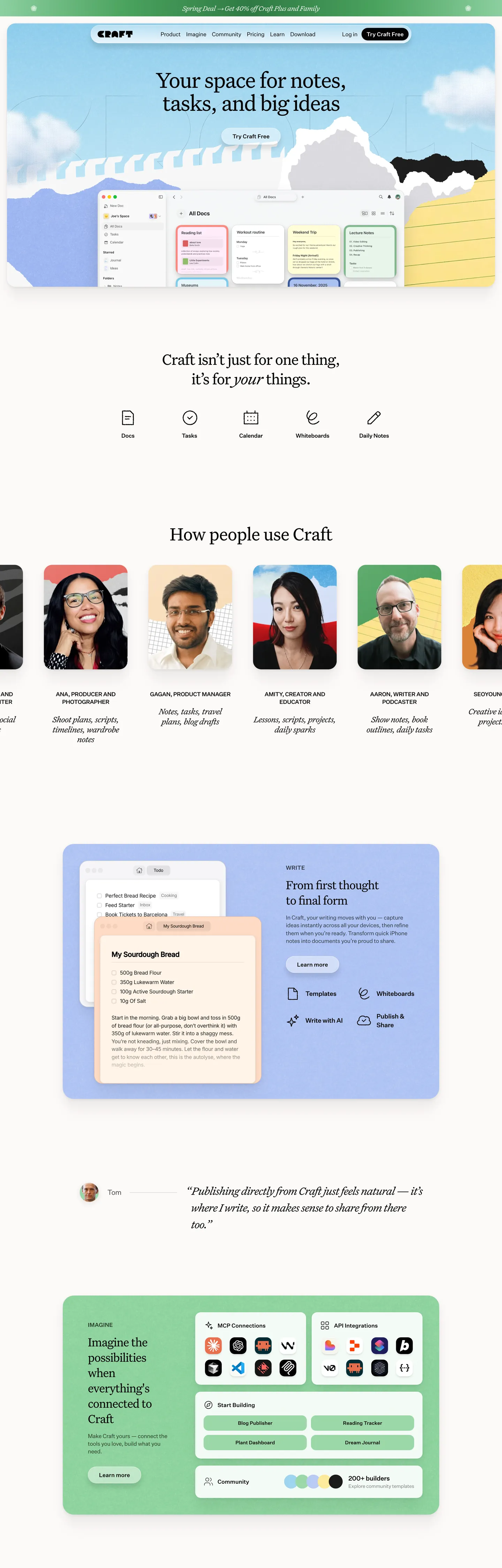
Craft's marketing page is shaped like the product it sells. The hero opens with a serif headline — "Your space for notes, tasks, and big ideas" — set in UntitledSerifFont at 66px with a -1.98px optical-tracking tightening, floating above a soft sky-illustration band and a real document mockup that shows a checkbox list, colored row blocks, and a tag chip in mint. Below the fold, the page hands off the editorial register to a UntitledSansFont workhorse and a vocabulary of pastel block cards. The dominant action is a single near-black pill — "Try Craft Free" at "#030302" with full corner radius — and every supporting surface, from the navbar tabs to the testimonial card, walks the warm beige floor at "#fcf9f7" rather than white.
This DESIGN.md packages that whole spec into one machine-readable file built on the Google Labs DESIGN.md format. Inside: 21 colors tokens covering the beige canvas, the near-black ink ramp, five pastel block tints, two semantic blues, and a chart palette; 12 typography tokens grouped into a serif display ladder (66/54/46/32/24px) and a sans body ladder (20/18/16/15/14/13/12px) with the matching weights and -0.32 to -1.98px letter-spacing; 6 corner radii from 4px chips through 32px hero illustrations and a full-pill token; 9 spacing values walking the dominant 4 and 8px grid; and 19 components covering buttons, the serif hero block, the document mockup card, pastel feature blocks for each tint, person testimonial cards, a navbar with announcement badge, and the footer.
A working React developer drops this file into Claude, Cursor, or GitHub Copilot and gets components that match Craft's specific moves — serif display with negative tracking, beige canvas instead of white, pastel block cards as feature surfaces, one black pill CTA per page — rather than a default shadcn theme. Reference the tokens directly inside Tailwind config, CSS variables, or your own component library. The system is worth studying for one reason: it shows that a productivity app can carry an editorial voice without falling into either fintech-blue restraint or workspace-tool maximalism.
What makes it distinct
5
- Serif-led display voiceUntitledSerifFont at 66px for the hero, 54px for section heads, 32px for pull-quotes — sans is reserved for chrome
- Warm beige canvas at '#fcf9f7' replaces the default whiteevery component sits on a slightly off-white ground that reads as paper, not screen
- Black pill primary CTA at '#030302' with full radius and 8px×14px paddingthe only saturated surface on the page
- Five pastel block tintsmint '#9bd8a9', amber '#fde99b', periwinkle '#b8caf5', sky '#9ed4ef', peach '#ffdbc5' — each used as a full-bleed feature card, never as decoration
- 24px and 14px the two dominant radiifeature cards and inputs land at 24px, secondary tiles at 14px, buttons go full-pill
craft.do
Live at craft.do
A snapshot of the brand in production. Scroll the frame to see the whole page.
Colors
21 colors
Craft's system runs on #363634 as its primary voltage, used in 1 of 19 components. Type is set in UntitledSansFont across 12 tokens from 14px to 66px, weights 400–500. Shape language is soft — components average 20px corner radius, with no sharp interactive edges.
Brand & Accent
Sparing, CTA-only voltage · 1
Surface
Page and card backgrounds · 4
Text
Headlines, body, captions · 6
Borders & Hairlines
Dividers, outlines, rules · 1
Semantic
Status, errors, success, links · 3
Other
Specialty colors · 6
Typography
12 type tokens
Set in UntitledSansFont across 12 tokens, from 14px to 66px, weights 400–500. Shown in its own stack: where the font isn't installed, the fallback the file names stands in.
- display-hero66px · weight 400 · lh 1 · tracking -1.98pxThe quick brown fox jumps over the lazy dog
- display-lg54px · weight 400 · lh 1.1 · tracking -1.08pxThe quick brown fox jumps over the lazy dog
- display-md46px · weight 400 · lh 1.22 · tracking -1.38pxThe quick brown fox jumps over the lazy dog
- pull-quote32px · weight 400 · lh 1.5 · tracking -1.28pxThe quick brown fox jumps over the lazy dog
- serif-md24px · weight 400 · lh 1.2 · tracking -0.72pxThe quick brown fox jumps over the lazy dog
- body-lg20px · weight 400 · lh 1.4 · tracking -0.6pxThe quick brown fox jumps over the lazy dog
- body-md18px · weight 500 · lh 1.4 · tracking -0.36pxThe quick brown fox jumps over the lazy dog
- body-sm16px · weight 400 · lh 1.4 · tracking -0.32pxThe quick brown fox jumps over the lazy dog
- body-sm-medium16px · weight 500 · lh 1.4 · tracking -0.32pxThe quick brown fox jumps over the lazy dog
- ui-md14px · weight 400 · lh 1.5The quick brown fox jumps over the lazy dog
- ui-md-medium14px · weight 500 · lh 1.5The quick brown fox jumps over the lazy dog
- caption-uppercase14px · weight 500 · lh 1.5 · tracking 0.14pxThe quick brown fox jumps over the lazy dog
Layout
Radii and spacing
6 corner radii and 9 spacing values. Shape language: soft.
Radii
- xs4px
- sm8px
- md14px
- lg24px
- xl32px
- full9999px
Spacing
- xxs4px
- xs6px
- sm8px
- md12px
- base16px
- lg20px
- xl24px
- 2xl32px
- 3xl60px
Components
19 components
Each rendered from its tokens (color, type, radius, padding) on Craft's own canvas.
- Button Primarybutton-primaryButton Primary
- Button Primary Hoverbutton-primary-hoverButton Primary Hover
- Button Secondarybutton-secondaryButton Secondary
- Nav Linknav-linkNav Link
- Top Navtop-navTop Nav
- Announcement Badgeannouncement-badgeAnnouncement Badge
- Card Documentcard-documentCard Document
- Card Feature Mintcard-feature-mintCard Feature Mint
- Card Feature Ambercard-feature-amberCard Feature Amber
- Card Feature Periwinklecard-feature-periwinkleCard Feature Periwinkle
- Card Feature Skycard-feature-skyCard Feature Sky
- Card Feature Peachcard-feature-peachCard Feature Peach
- Card Testimonialcard-testimonialCard Testimonial
- Card Personcard-personCard Person
- Avatar Roundavatar-roundAvatar Round
- Tag Chip Minttag-chip-mintTag Chip Mint
- Type here…text-inputText Input
- Footer Regionfooter-regionFooter Region
- Footer Linkfooter-linkFooter Link
In use
The system, in use
Craft's tokens on the kind of product it builds.
Build something people actually use.
A short paragraph of marketing copy that previews how the brand's display tier and body tier read together. Two sentences is usually enough.
FAQ
Craft design system FAQ
Common questions about Craft's tokens, components, and how to use this DESIGN.md in your project.
Read next
Related reading
Specs, directories, and component libraries that pair with this design system.
- Browse all design systemsThe full directory of DESIGN.md files on shadcn.io, with live mockups for each.shadcn.io
- Craft — official siteThe marketing surface this DESIGN.md was extracted from, including the document hero, feature cards, and pricing surface.craft.do (opens in a new tab)
- The DESIGN.md specificationGoogle Labs' open spec for machine-readable design system files — the format this page is built on.github.com (opens in a new tab)
Use it
Use Craft in your project
One machine-readable file. Drop it into Claude, Cursor, or any AI tool that reads DESIGN.md.
Download the DESIGN.md
One machine-readable file: every color, type, radius, spacing, and component token of Craft.
Feed it to your AI tool
Drop it into Claude, Cursor, or GitHub Copilot. The agent writes React components and Tailwind classes that match Craft's visual language.
Reference the tokens directly
Or paste the values into your Tailwind config, CSS variables, or component library: every color, size and radius is a quoted, ready-to-copy value.
Read the full DESIGN.md: overview, rationale, do’s and don’ts
Overview
Craft's homepage is staged as a stationery page rather than a product dashboard. The hero opens with a serif headline — "Your space for notes, tasks, and big ideas" — set in UntitledSerifFont at 66px with -1.98px optical tightening, floating over a soft sky-and-cloud illustration band. A real document mockup card breaks below the headline showing a checkbox list, colored row blocks, and a mint tag chip — the visual proof that the marketing page mirrors the actual editor. The dominant action is a single near-black pill, "Try Craft Free" at "#030302" with full corner radius, 36px tall, 8px×14px padded. Every secondary surface walks a warm beige floor at "#fcf9f7" rather than a default white.
Paper-canvas voltage: where most note-taking marketing sites default to "#ffffff" and let saturated brand color do the work, Craft inverts the convention — the canvas itself is a tinted "#fcf9f7" beige (shipped through --background and --color-beige CSS variables, 4 distinct cream tones clustered into one perceptual token), and the brand voltage is reserved for pastel feature blocks. One-pastel-per-block: mint "#9bd8a9" carries the bottom infrastructure card, amber "#fde99b" fills the note-page mockup, periwinkle "#b8caf5" surrounds the centerpiece editor block, sky "#9ed4ef" washes the hero, peach "#ffdbc5" lands on a single warmth callout — Craft never combines two pastels in the same surface.
Key Characteristics:
- Warm beige canvas "#fcf9f7" replaces the default white floor across every viewport
- UntitledSerifFont display ladder (66/54/46/32/24px) with -1.08px to -1.98px optical tracking; UntitledSansFont reserved for chrome
- Near-black "#030302" carries text, hairlines, and the pill primary CTA — 17 CSS custom properties share the same hex
- Five pastel block tints, one per feature surface — mint, amber, periwinkle, sky, peach
- Full-pill primary button on a 36px height, paired with 1px hairline secondary
- 24px the dominant radius (85 occurrences) for feature cards and document mockup; 14px for secondary tiles
- Document mockup card embedded directly in the hero, not abstracted into an illustration
- Spring promo strip with serif body running "Spring Deal → Get 40% off Craft Plus and Family"
- No saturated brand voltage anywhere — the only saturated hex on the page is
link-blue"#0087ff" at 3 occurrences
Colors
- Ink (
#030302) — frequency 1740. Used as text (742), border (989), background (6). The dominant ground for every body run, hairline, and the pill CTA fill — 17 CSS custom properties resolve to this one hex including--primary,--foreground,--border, and--ring. Near-black rather than pure black: the oklch lightness 0.096 with a faint 107° hue carries a sliver of warmth into the text. - Canvas beige (
#fcf9f7) — clustered from 4 near-white cream tones into one perceptual token, bg 20. Ships as--backgroundand--color-beige. The paper-tinted floor that replaces white across every viewport. - Surface card white (
#ffffff) — used inside the cluster above. Reserved for the document mockup, testimonial card, and inputs — the white-on-beige two-step is the page's primary depth signal in place of shadows. - Mint block (
#9bd8a9) — frequency 8. Used as bg (8). The bottom "Imagine the possibilities" infrastructure card, plus the inline tag chip in the document hero — paired with#2f7a43deep-green text for accessible contrast. - Amber block (
#fde99b) — frequency 5. Used as bg (5). The note-page mockup band that demonstrates document tagging — shipped as--color-amber-200rather than a custom token. - Periwinkle block (
#b8caf5) — frequency 3. Used as bg (3). Surrounds the centerpiece "From first thought to final form" editor block, the page's most prominent pastel surface. - Sky block (
#9ed4ef) — frequency 2. Used as bg (1), gradient (1). The hero atmosphere wash — fades into the cloud illustration above the document mockup. - Peach block (
#ffdbc5) — frequency 1. Used as bg (1). Reserved for a single warmth callout — the rarest pastel, narrated as an exception rather than a workhorse. - Hairline (
#e1e1e1) — frequency 27. Used as border (27). The 1px stroke that separates cards from the beige floor — ships as--sidebar-border,--color-zinc-200, and--color-neutral-200. - Link blue (
#0087ff) — frequency 3. Used as text (3). The only saturated link voltage on the page; reserved for inline anchors, never CTA fill.
Typography
Craft runs two custom typefaces in a strict role split. UntitledSerifFont — Klim Type Foundry's editorial serif — carries every display tier from the 66px hero down through the 54px section heads, the 46px h3, the 32px blockquote, and the 24px feature subheads. UntitledSansFont — the matching humanist sans — handles every UI surface: buttons, nav links, body paragraphs, captions, the ui-md 14px chrome run. The split is doctrinal; the serif never appears in a button, and the sans never appears in a display heading.
The display ladder uses weight 400 exclusively. The 66px hero ships with -1.98px optical tightening (-3% of em), the 54px h2 with -1.08px, the 32px pull-quote with -1.28px — the negative tracking is non-negotiable, because at weight 400 the serif needs the optical compression to read as confident rather than airy. The sans ladder runs weights 400 and 500 with -0.32px to -0.6px tracking; body-md (18/500) and body-sm (16/400) carry most of the page copy. If UntitledSerif is unavailable, Tiempos Headline or Source Serif Pro are the closest substitutes; for UntitledSans, Inter or Söhne match the proportions.
Layout
The page is a single 1440px-anchored column with a centered hero and alternating block sections below. Section rhythm is driven by a "3xl" 60px spacing token (19 occurrences) rather than a fluid scale; padded card interiors use the 16/24/32px base 8 ladder (33, 44, and 14 occurrences respectively). Where most note-taking marketing pages dump a six-column feature grid below the hero, Craft alternates one tall pastel block, one document-mockup tile, and one testimonial row — the visual cadence reads as a long-form magazine layout rather than a marketing template. The 8px atomic spacing unit shows up 55 times and anchors every chip, button, and input padding.
Elevation & Depth
Shadows are nearly absent. The captured CSS surfaces a single drop-shadow-sm utility — 0 1px 2px at 15% opacity black — but the rendered homepage uses it sparingly; depth on the page is carried instead by the two-step canvas ladder: beige "#fcf9f7" as the floor, white "#ffffff" as the elevated card, separated by a 1px "#e1e1e1" hairline. The document mockup in the hero, the testimonial card, the person tiles, and the inputs all share the same elevation pattern — white surface, hairline border, 24px radius, no shadow. The only place a heavier shadow appears is the hero-bottom-blur gradient that fades the document mockup into the section below.
Shapes
Two radii do the structural work. 24px feature cards (85 occurrences) carry the document mockup, every pastel block, and the testimonial card — soft enough to feel like paper rather than panels. 14px secondary tiles (54 occurrences) carry inputs, person cards, and chip groups. Buttons go full-pill at the effective 3.35544e+07px Tailwind rounded-full token (26 occurrences shared with avatar circles); the 4px chip (26 occurrences) handles tag chips and tiny status pills. 32px (13) wraps hero illustrations, 16px (11) and 8px (10) handle minor controls, and 12px (8) handles segment tabs.
Components
19 components cover the marketing surface end-to-end. button-primary ships the page's signature near-black pill — "#030302" fill, white text, full radius, 8×14px padded, 36px tall, body-sm-medium type. button-primary-hover darkens to "#1f2225". button-secondary runs transparent on a hairline border with no fill change on hover. top-nav is a 12×24px-padded beige strip with a 1px hairline divider below. announcement-badge is the spring-deal black pill at 28px height. card-document is the white mockup container with hairline border and 24px radius. The five card-feature-* components (mint, amber, periwinkle, sky, peach) share padding and radius but swap only backgroundColor — the canonical inheritance pattern. card-testimonial uses the pull-quote 32px serif type with -1.28px tracking. card-person and avatar-round cover the testimonial-strip people cards. tag-chip-mint pairs the mint background with the deep-green "#2f7a43" text. text-input is the 14px-rounded, 40px-tall white field. footer-region and footer-link close the page on the beige canvas.
Do's and Don'ts
Do keep the canvas tinted: "#fcf9f7" is the page floor; use pure white only inside cards and inputs. Switching the canvas to "#ffffff" collapses the depth pattern because the cards then have nothing to lift off.
Do reserve "#030302" for text, hairlines, and the one pill CTA. The hex resolves through 17 different --* custom properties on purpose — the system trusts a single near-black to carry every dark surface.
Do keep pastels one-per-block. Each tint is doctrinally scoped to a single feature card; combining mint and amber in the same surface breaks the "stationery page" reading.
Don't apply the pastel block tints as text or border colors — every pastel in the extraction registers as bg (mint 8/0/0, amber 5/0/0, periwinkle 3/0/0). For accessible-contrast text on a mint block, use block-mint-deep "#2f7a43"; for amber and peach, fall back to ink "#030302".
Don't swap the serif into buttons or the sans into display headings. Where most workspace brands run one humanist sans across every tier, Craft's role split is what makes the marketing page read as editorial rather than utility — collapsing it returns the page to a generic SaaS feel.
Don't add a drop shadow to feature cards. The page intentionally uses the beige-to-white canvas ladder instead of elevation; a box-shadow on a pastel block reads as web 2.0 and immediately breaks the paper register.
Don't soften the negative letter-spacing on the serif display. The 66px hero ships with -1.98px tracking for a reason — at weight 400, removing the optical compression makes the headline read as airy and uncertain.
Known Gaps
- UntitledSans and UntitledSerif are licensed Klim faces with no public web-font CDN — substitutes (Inter, Tiempos Headline, Source Serif Pro) are close but not exact.
- The Craft app's in-product chat surface, slash-command menu, document outline rail, and right-side properties panel are not part of this marketing capture.
- Animation and transition timings were not extracted; the default
--default-transition-duration: 0.15sis a safe starting point. - The chart palette (
--chart-1through--chart-5) is declared in CSS custom properties but not rendered on the homepage; role mapping is inferred from the variable names rather than visual confirmation. - Dark-mode tokens are not surfaced — the marketing page is light-only.
Productivity & SaaS
More systems like this
More DESIGN.md files in Productivity & SaaS.
Pricing
Build it with Pro
The DESIGN.md files are free. Pro adds 6,000+ blocks, premium templates and the MCP server, so your AI editor builds in your system for you.
4.9/5 out of 5 · 150+ reviewsfrom 150+ founders and developers.
Billing
Billed once a year in USD. Cancel anytime.
- How many people can use the license.
- Client work, SaaS products and anything you charge for.
- Production-ready React sections: hero, pricing, features, dashboards and more.
- Complete multi-page sites you can ship as they are.
- React icons from every major library, installable with one command.
- Presets that restyle every block, in light and dark.
- Lets your AI editor search, preview and install blocks for you.
- Priority requests are answered first.
Individual
For personal projects & open source
$32instead of $49/mo
$389 billed yearly
- Seats: 1 seat
- Commercial use: Personal & open source only
- Pro blocks: 6,000+ blocks
- Templates: All 14 templates
- React icons: 294k+ icons
- Themes: All 59 themes
- MCP server: Basic usage
- Support: Standard
Team
Most popularFor freelancers, agencies & startups
$66instead of $99/mo
$789 billed yearly · ≈ $13/dev/mo
- Seats: Up to 5 seats
- Commercial use: Included
- Pro blocks: 6,000+ blocks
- Templates: All 14 templates
- React icons: 294k+ icons
- Themes: All 59 themes
- MCP server: High usage
- Support: Priority
Organization
For companies with larger teams
$132instead of $199/mo
$1,589 billed yearly
- Seats: Unlimited seats
- Commercial use: Included
- Pro blocks: 6,000+ blocks
- Templates: All 14 templates
- React icons: 294k+ icons
- Themes: All 59 themes
- MCP server: Unlimited usage
- Support: Priority
Billed once a year in USD. Cancel anytime.
Individual
For personal projects & open source
$32instead of $49/mo
$389 billed yearly
- How many people can use the license.Seats: 1 seat
- Client work, SaaS products and anything you charge for.Commercial use: Personal & open source only
- Production-ready React sections: hero, pricing, features, dashboards and more.Pro blocks: 6,000+ blocks
- Complete multi-page sites you can ship as they are.Templates: All 14 templates
- React icons from every major library, installable with one command.React icons: 294k+ icons
- Presets that restyle every block, in light and dark.Themes: All 59 themes
- Lets your AI editor search, preview and install blocks for you.MCP server: Basic usage
- Priority requests are answered first.Support: Standard
Team
Most popularFor freelancers, agencies & startups
$66instead of $99/mo
$789 billed yearly · ≈ $13/dev/mo
Everything in Individual, plus
- How many people can use the license.Seats: Up to 5 seats
- Client work, SaaS products and anything you charge for.Commercial use: Included
- Lets your AI editor search, preview and install blocks for you.MCP server: High usage
- Priority requests are answered first.Support: Priority
Organization
For companies with larger teams
$132instead of $199/mo
$1,589 billed yearly
Everything in Team, plus
- How many people can use the license.Seats: Unlimited seats
- Lets your AI editor search, preview and install blocks for you.MCP server: Unlimited usage
- Secure checkout via Stripe
- Code lives in your repo
- Keep what you've shipped if you cancel
- License terms
Your system, built for you
Every block, template and icon, installed by your AI agent in your design system. The DESIGN.md files stay free.