X Design System
X's login-page design system as a DESIGN.md file. Pure black on white canvas, TwitterChirpExtendedHeavy at 64px display, system-UI body fonts, pill-only radius. 8 colors tokens, 12 components. For React, Next.js, and AI tools.
Add shadcn.io to your AI agent. · Pro It installs blocks, icons and templates in your design system from a prompt, with Pro.
Set up MCP- Primary
- #0f1419
- Typeface
- -apple-system
- Shape
- Soft
- Base radius
- 9999px
- Colors
- 8
- Type tokens
- 7
- Components
- 12
- Spacing values
- 6
About
About X DESIGN.md
Curated by Dov Azencot · Updated May 19, 2026 · Source x.com (opens in a new tab)
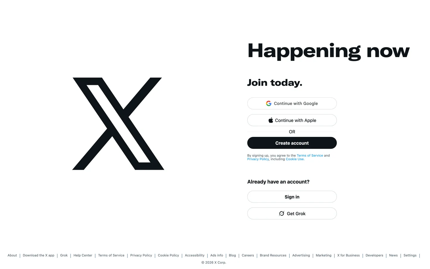
X's login page is the most opinionated single-viewport design in the social-platform category — a stark white canvas bisected into left and right panels, the left half containing nothing but the black X logotype at approximately 300px, and the right half containing a stacked sign-up form. No carousel, no product screenshots, no user-generated content preview. No photography. The 64px "Happening now" headline in TwitterChirpExtendedHeavy sits above the form; below it, two social-login pills (Continue with Google, Continue with Apple), a dividing "OR" label, and three more pills: Create account, Sign in, Get Grok. Every interactive element is a pill — 9999px border-radius across the entire component set. The one color decision is that the "Create account" primary CTA has a black fill with white text, which is the X brand mark color-inverted into a button. Where Instagram's login page shows a phone carousel and Facebook's shows a product description, X shows only the mark.
The DESIGN.md file packages the system as a machine-readable spec for React and AI tools. Inside: 8 colors tokens centered on pure black (#000000) and the near-black page-text tone (#0f1419), two blue-gray muted-text tones (#536471, #829aab), the legacy Twitter blue (#1d9bf0) appearing only on hyperlinks in legal text, and white (#ffffff) as the form panel background. Seven typography tokens span TwitterChirpExtendedHeavy at two display sizes and system-UI at six body-and-label sizes. A single radius token (9999px pill) and 12 components definitions cover the split hero, the stacked sign-up form, the pill buttons, and the footer navigation.
Feed this file to Claude or Cursor and it reproduces X's specific moves: split-screen layout with the logotype occupying the full left panel, pill geometry for every interactive element, black-on-white CTA as an inverted-mark button, and complete chromatic reduction — no accent color in the UI chrome. The system is worth studying because it demonstrates how far chromatic elimination can go: a network with 500 million users has reduced its public-facing login surface to two colors, one typeface, one radius value. The restraint is not timidity — it is the post-rebrand identity asserting that the mark alone is enough.
What makes it distinct
5
- Black X mark as the left halfthe logotype occupies the full left panel of the split-screen layout at ~300px, serving as both brand mark and visual anchor
- Zero brand accent colorthe entire UI chrome is black, white, and blue-gray; no Twitter-blue #1da1f2 or X-specific accent in any interactive element
- System-UI for all body textonly TwitterChirpExtendedHeavy appears at display scale; navigation, labels, and body copy run the browser's default system-UI stack
- Pill-only radius9999px is the sole border-radius value in the system; every button, every social-login option, every input is fully pill-rounded
- Primary CTA is an inverted brand markthe 'Create account' button is black fill on white canvas with white label text, the same tonal flip as the X mark itself
x.com
Live at x.com
A snapshot of the brand in production. Scroll the frame to see the whole page.
Colors
8 colors
X's system runs on #0f1419 as its primary voltage, used in 5 of 12 components. Type is set in -apple-system across 7 tokens from 11px to 64px, weights 400–700. Shape language is soft — components average 9999px corner radius, with no sharp interactive edges.
Surface
Page and card backgrounds · 1
Text
Headlines, body, captions · 6
Borders & Hairlines
Dividers, outlines, rules · 1
Typography
7 type tokens
Set in -apple-system across 7 tokens, from 11px to 64px, weights 400–700. Shown in its own stack: where the font isn't installed, the fallback the file names stands in.
- display-xl64px · weight 700 · lh 84px · tracking -1.2pxThe quick brown fox jumps over the lazy dog
- display-md31px · weight 700 · lh 36px · tracking 0The quick brown fox jumps over the lazy dog
- heading-sm17px · weight 700 · lh 20px · tracking 0The quick brown fox jumps over the lazy dog
- body-md15px · weight 700 · lh 20px · tracking 0The quick brown fox jumps over the lazy dog
- body-sm15px · weight 500 · lh 20px · tracking 0The quick brown fox jumps over the lazy dog
- body-xs15px · weight 400 · lh 20px · tracking 0The quick brown fox jumps over the lazy dog
- caption11px · weight 400 · lh 12px · tracking 0The quick brown fox jumps over the lazy dog
Layout
Radii and spacing
1 corner radii and 6 spacing values. Shape language: soft.
Radii
- pill9999px
Spacing
- xs4px
- sm8px
- base16px
- lg20px
- xl32px
- 2xl48px
Components
12 components
Each rendered from its tokens (color, type, radius, padding) on X's own canvas.
- Button Primarybutton-primaryButton Primary
- Button Secondarybutton-secondaryButton Secondary
- Button Socialbutton-socialButton Social
- Top Navtop-navTop Nav
- Hero Headinghero-headingHero Heading
- Section Headingsection-headingSection Heading
- Body Paragraphbody-paragraphBody Paragraph
- Body Mutedbody-mutedBody Muted
- CardcardCard
- Link Textlink-textLink Text
- Logotype Panellogotype-panelLogotype Panel
- FooterfooterFooter
In use
The system, in use
X's tokens on the kind of product it builds.
Build something people actually use.
A short paragraph of marketing copy that previews how the brand's display tier and body tier read together. Two sentences is usually enough.
FAQ
X design system FAQ
Common questions about X's tokens, components, and how to use this DESIGN.md in your project.
Read next
Related reading
Specs, directories, and component libraries that pair with this design system.
- Browse all design systemsThe full directory of DESIGN.md files on shadcn.io, with live mockups for each.shadcn.io
- X — official siteX's public homepage — the source of truth for the live tokens captured in this file.x.com (opens in a new tab)
- The DESIGN.md specificationGoogle Labs' open spec for machine-readable design system files — the format this page is built on.github.com (opens in a new tab)
Use it
Use X in your project
One machine-readable file. Drop it into Claude, Cursor, or any AI tool that reads DESIGN.md.
Download the DESIGN.md
One machine-readable file: every color, type, radius, spacing, and component token of X.
Feed it to your AI tool
Drop it into Claude, Cursor, or GitHub Copilot. The agent writes React components and Tailwind classes that match X's visual language.
Reference the tokens directly
Or paste the values into your Tailwind config, CSS variables, or component library: every color, size and radius is a quoted, ready-to-copy value.
Read the full DESIGN.md: overview, rationale, do’s and don’ts
Overview
X's login page is a chromatic elimination exercise taken further than any platform at comparable scale. Mark as argument. The left half of the viewport contains only the X logotype — no tagline, no product description, no social proof — at a size (approximately 300px) that treats it as an argument rather than an identifier. The right half contains four pill buttons stacked in a form. No photography, no carousel, no testimonials, no animated hero. Where Instagram's login page shows a phone with app screenshots and Facebook's leads with a product description, X leads with the mark alone and trusts it to carry the page.
The palette is a total reduction: black (#000000, #0f1419), white (#ffffff), and two blue-gray muted tones (#536471, #829aab). The legacy Twitter blue (#1d9bf0) appears only in legal link text — six times, all as hyperlink color in the fine print. It is not used for any button, label, or border in the interactive layer. Unlike the Twitter era's brand-blue pill CTA, the "Create account" button is black fill with white text — the mark's own tonal value inverted into an action shape.
Typography follows the same logic: TwitterChirpExtendedHeavy at 64px for the "Happening now" display headline, and then the browser's system-UI stack for every other text element. There is no brand body face. The system trusts the operating system's default sans for everything below the display tier.
Key Characteristics:
- Split-screen layout: logotype occupies the full left half of the viewport, sign-up form occupies the full right half.
- Zero brand accent color in any interactive element — the only chromatic moment in the UI is the legacy Twitter blue in hyperlinked legal text.
- Single radius token: 9999px pill, applied uniformly to every button, social-login option, and form control.
- TwitterChirpExtendedHeavy at 64px and 31px only — the display-only brand typeface used at exactly two sizes.
- System-UI stack for all body, label, and caption text — no proprietary type at body scale.
- Primary CTA ("Create account") is a black pill with white label — the same tonal relationship as the X mark itself.
- Muted footer nav in blue-gray (#536471) at 11px — the smallest text tier, almost invisible, echoing a legal disclaimer register.
Colors
Ink
- Ink (
{colors.ink}— #000000): frequency 177 — 45 as text, 132 as border. The dominant border color across the pill-button set (the outlined "Sign in," "Continue with Google," "Continue with Apple," "Get Grok" buttons all have black or dark-tone border). Also the fill for the "Create account" primary CTA. - Ink Text (
{colors.ink-text}— #0f1419): frequency 22 — 21 as text, 1 as background. The near-black used for all body text — a very dark blue-gray rather than pure black, which softens long-form reading without stepping away from the monochrome register. - Ink Muted (
{colors.ink-muted}— #536471): frequency 39 as text. The footer nav link color and metadata label tone — a medium blue-gray carrying 39 instances across footer links and legal captions. - Ink Subtle (
{colors.ink-subtle}— #829aab): frequency 18 as text. A lighter blue-gray used for secondary metadata and form field sub-labels.
Surface
- Canvas (
{colors.canvas}— #ffffff): frequency 6 as text/background. Pure white — the page floor, the form panel background, and the "Sign in" / social-login button fill. No warm tint, no off-white.
Structural
- Hairline (
{colors.hairline}— #cfd9de): frequency 3 as border. Used on the outlined pill buttons (Continue with Google, Sign in, Get Grok) — a soft blue-gray that reads as a hairline on white without the harshness of a pure-black border.
Legacy
- Link Blue (
{colors.link-blue}— #1d9bf0): frequency 6 as text. The legacy Twitter-blue used only for hyperlinks in the legal fine print — "Terms of Service," "Privacy Policy," "Cookie Use." Not wired as a CSS variable, not used in interactive buttons or labels. - Legacy Link (
{colors.legacy-link}— #0000ee): frequency 3 as text. Browser-default link blue appearing on a small subset of legal links that have not been overridden by the X stylesheet — a sign of the minimalist approach extending even to link styling.
Typography
Font Families
TwitterChirpExtendedHeavy is the only proprietary type face — appearing at 64px and 31px, both in weight 700. Fallback stack: Verdana, -apple-system, "system-ui", Roboto, Helvetica, Arial, sans-serif. The extended-width proportion and heavy optical weight are the face's defining characteristics.
System-UI (-apple-system, "system-ui", "Segoe UI", Roboto, Helvetica, Arial, sans-serif) handles every other text tier — headings below 31px, button labels, nav links, legal captions. X does not ship a brand body typeface. This is deliberate: the system-UI stack renders the platform in the user's native type environment, which reinforces X's claim to be infrastructure rather than a designed product experience.
Hierarchy
| Token | Size | Weight | Line Height | Use |
|---|---|---|---|---|
{typography.display-xl} | 64px | 700 | 84px | "Happening now" display headline |
{typography.display-md} | 31px | 700 | 36px | "Join today." section heading |
{typography.heading-sm} | 17px | 700 | 20px | Secondary bold labels |
{typography.body-md} | 15px | 700 | 20px | Button labels and bold inline text |
{typography.body-sm} | 15px | 500 | 20px | Medium-weight body text |
{typography.body-xs} | 15px | 400 | 20px | Default running text |
{typography.caption} | 11px | 400 | 12px | Footer nav links, legal fine print |
Note on Font Substitutes
TwitterChirpExtendedHeavy → GT Walsheim Ultra Bold or Inter Black (weight 900) with font-stretch: expanded where supported. The extended width is the character — a standard-width heavy sans will not reproduce the same display identity. For the system-UI body tier, no substitute is needed; the browser renders it natively.
Layout
Spacing System
- Base unit: 4px.
- Tokens:
{spacing.xs}4px ·{spacing.sm}8px ·{spacing.base}16px ·{spacing.lg}20px ·{spacing.xl}32px ·{spacing.2xl}48px. - Form column padding: 16px horizontal on the right panel.
- Inter-button gap: 16px vertical between each pill button in the sign-up stack.
Grid & Container
- Desktop: two-column split, equal halves. Left: logotype centered in the column. Right: form centered vertically at approximately 600px wide.
- Max form width: approximately 400px for the button group.
- Mobile: single column, logotype above form, sized down to approximately 60–80px mark.
Rhythm
The right-panel form reads as a tightly spaced vertical stack with consistent 16px gaps between buttons. Above the form, the 64px display headline and 31px sub-heading sit with minimal spacing — no decorative interstitial elements. The logotype panel has no internal structure; the mark is centered in the available space and that is the entire layout decision.
Elevation
The system has no shadows. Elevation is not a concept in this surface — the white canvas is flat, the pills are outline-only or black-fill, and there are no lifted cards, no dropdown overlays, no modal-style surfaces. The two-column split creates visual hierarchy through spatial allocation, not elevation.
- Flat: 100% of surfaces.
- Button depth: conveyed through fill (black CTA vs. outline secondary) rather than shadow.
- No tonal surface ladder: unlike dark-canvas systems, there are no intermediate surface tones.
Shapes
The radius scale has a single entry:
{rounded.pill}9999px — applied uniformly to every button (Create account, Continue with Google, Continue with Apple, Sign in, Get Grok) and to every outlined form element.
There are no cards with independent rounding, no chip variants, no input fields at a tighter radius. The absence of any radius below pill is the most decisive shape choice in the system: X uses pill geometry as the only shape signal, which means the shape alone differentiates interactive elements from content text without any color accent doing the work.
Components
button-primary — "Create account." Black {colors.ink} fill, white label text, {rounded.pill} 9999px, 0×16 padding, 40px height. System-UI at 15px / weight 700. The mark's tonal values applied to a button.
button-secondary — "Sign in" and "Get Grok." White {colors.canvas} fill, near-black ink text, 1px {colors.hairline} border, same pill rounding and height. The outlined state is the secondary action across the form.
button-social — "Continue with Google" and "Continue with Apple." White fill, near-black ink text, 1px {colors.hairline} border, pill rounding. Carries a third-party logo icon at left (Google rainbow mark, Apple mark). Same structural shape as button-secondary but the icon changes the visual weight.
hero-heading — "Happening now." Near-black ink in {typography.display-xl} (64px / TwitterChirpExtendedHeavy / -1.2px tracking). No background, no padding.
section-heading — "Join today." Near-black ink in {typography.display-md} (31px / TwitterChirpExtendedHeavy). Placed below the hero-heading with minimal vertical spacing.
body-paragraph — Fine-print text below the Create account button. Near-black {colors.ink-text} at {typography.body-xs} (15px / 400).
body-muted — Footer nav links and metadata. {colors.ink-muted} (#536471) at {typography.caption} (11px / 400).
link-text — Legal hyperlinks in the fine print. {colors.link-blue} (#1d9bf0) at {typography.caption}.
card — The sign-up form's outlined container is structured as a pill-rounded card — white fill, {colors.hairline} border, 12×16 padding. Wraps the social login options at a component level.
logotype-panel — The left viewport half. White canvas, black X mark, no other content. Treated as a component because its behavior (responsive collapse, padding, minimum width) is the core layout decision of the entire page.
footer — White canvas floor, {colors.ink-muted} text at {typography.caption} (11px / 400), 20×16 padding. Lists legal and contextual links (About, Download, Help, Terms, Privacy, Cookie, Ads info, Blog, Careers, Brand Resources, Advertising, Marketing, X for Business, Developers, News, Settings).
top-nav — Minimal — the X mark at left, no links in the captured state (the nav only shows the mark as a home-link).
Do's and Don'ts
Do use the black-fill primary button ({colors.ink}) for the single primary action. The black CTA on white is the only fill-based interactive element in the system — reserving it for one action per surface preserves its weight.
Do apply {rounded.pill} 9999px to every interactive element. The pill geometry is the system's only shape differentiator — removing it from even one button (by using 8px or 16px) would introduce a radius inconsistency that the system does not have vocabulary to explain.
Do use {colors.hairline} (#cfd9de) for outlined button borders, not {colors.ink} (#000000). The hairline blue-gray is softer than pure black on white — it reads as an outline without the visual heaviness of a 1px black border.
Do use {colors.ink-muted} (#536471) for footer and metadata text. The blue-gray muted tone at caption scale is the system's sub-label register — using {colors.ink-text} (#0f1419) at the same size would make footer items compete with body text.
Don't use the link blue (#1d9bf0) as a CTA or button fill. It appears only in legal hyperlinks in the captured surface — wiring it into button backgrounds would reintroduce the Twitter-blue brand color that the rebrand deliberately removed from the interactive layer.
Don't introduce any radius below 9999px. The single-radius system is what makes the pill geometry feel like a design decision rather than a default. Adding an 8px card radius or a 12px input radius would create a two-tier radius system that the visual language cannot sustain without additional context.
Don't add background-color sections to the page structure. The entire page is white canvas — no gray alternating bands, no dark hero panels, no colored feature strips. The logotype's visual mass and the form's centered stack are sufficient hierarchy signals without background variation.
Don't use TwitterChirpExtendedHeavy below 31px. The extended-width and heavy weight of the face reads as display at 64px and 31px; at body sizes (15–17px) it would appear as oversized and compressed rather than intentional. The system draws a hard line: brand typeface at display, system-UI everywhere below.
Known Gaps
- Dark mode: X's in-app interface has a prominent dark mode, but the captured marketing/login page is light-only. The dark surface token set is not represented here.
- Authenticated timeline: the in-app interface (post feed, DM panel, navigation sidebar) carries a far richer token set — colors, spacing, icon sizing — that this marketing-surface capture does not include.
- Mobile and responsive: at mobile widths the split-screen collapses to a single column with the logotype at reduced size; breakpoint values are not captured.
- Hover and focus states: no hover or focus ring styles are captured from the login page; the interactive component set only documents resting state.
- Grok identity tokens: the Grok AI product has its own visual identity (circular animated logo, distinct interaction states) that appears as a single "Get Grok" button on this page without further token documentation.
- API and developer surface: X's developer portal and API docs carry separate design conventions not represented here.
- Animation: X's login page may include subtle animations on button hover or form focus — the spec captures static values only.
Social & Community
More systems like this
More DESIGN.md files in Social & Community.
Pricing
Build it with Pro
The DESIGN.md files are free. Pro adds 6,000+ blocks, premium templates and the MCP server, so your AI editor builds in your system for you.
4.9/5 out of 5 · 150+ reviewsfrom 150+ founders and developers.
Billing
Billed once a year in USD. Cancel anytime.
- How many people can use the license.
- Client work, SaaS products and anything you charge for.
- Production-ready React sections: hero, pricing, features, dashboards and more.
- Complete multi-page sites you can ship as they are.
- React icons from every major library, installable with one command.
- Presets that restyle every block, in light and dark.
- Lets your AI editor search, preview and install blocks for you.
- Priority requests are answered first.
Individual
For personal projects & open source
$32instead of $49/mo
$389 billed yearly
- Seats: 1 seat
- Commercial use: Personal & open source only
- Pro blocks: 6,000+ blocks
- Templates: All 14 templates
- React icons: 294k+ icons
- Themes: All 59 themes
- MCP server: Basic usage
- Support: Standard
Team
Most popularFor freelancers, agencies & startups
$66instead of $99/mo
$789 billed yearly · ≈ $13/dev/mo
- Seats: Up to 5 seats
- Commercial use: Included
- Pro blocks: 6,000+ blocks
- Templates: All 14 templates
- React icons: 294k+ icons
- Themes: All 59 themes
- MCP server: High usage
- Support: Priority
Organization
For companies with larger teams
$132instead of $199/mo
$1,589 billed yearly
- Seats: Unlimited seats
- Commercial use: Included
- Pro blocks: 6,000+ blocks
- Templates: All 14 templates
- React icons: 294k+ icons
- Themes: All 59 themes
- MCP server: Unlimited usage
- Support: Priority
Billed once a year in USD. Cancel anytime.
Individual
For personal projects & open source
$32instead of $49/mo
$389 billed yearly
- How many people can use the license.Seats: 1 seat
- Client work, SaaS products and anything you charge for.Commercial use: Personal & open source only
- Production-ready React sections: hero, pricing, features, dashboards and more.Pro blocks: 6,000+ blocks
- Complete multi-page sites you can ship as they are.Templates: All 14 templates
- React icons from every major library, installable with one command.React icons: 294k+ icons
- Presets that restyle every block, in light and dark.Themes: All 59 themes
- Lets your AI editor search, preview and install blocks for you.MCP server: Basic usage
- Priority requests are answered first.Support: Standard
Team
Most popularFor freelancers, agencies & startups
$66instead of $99/mo
$789 billed yearly · ≈ $13/dev/mo
Everything in Individual, plus
- How many people can use the license.Seats: Up to 5 seats
- Client work, SaaS products and anything you charge for.Commercial use: Included
- Lets your AI editor search, preview and install blocks for you.MCP server: High usage
- Priority requests are answered first.Support: Priority
Organization
For companies with larger teams
$132instead of $199/mo
$1,589 billed yearly
Everything in Team, plus
- How many people can use the license.Seats: Unlimited seats
- Lets your AI editor search, preview and install blocks for you.MCP server: Unlimited usage
- Secure checkout via Stripe
- Code lives in your repo
- Keep what you've shipped if you cancel
- License terms
Your system, built for you
Every block, template and icon, installed by your AI agent in your design system. The DESIGN.md files stay free.