Letterboxd Design System
Letterboxd's design system as a DESIGN.md file. Green #00e054, TiemposHeadlineWeb, 29 colors, 20 components. For React, Next.js, and AI tools.
Add shadcn.io to your AI agent. · Pro It installs blocks, icons and templates in your design system from a prompt, with Pro.
Set up MCP- Primary
- #00e054
- Typeface
- GraphikWeb
- Shape
- Mixed
- Base radius
- 0px
- Colors
- 29
- Type tokens
- 12
- Components
- 20
- Spacing values
- 9
About
About Letterboxd DESIGN.md
Curated by Dov Azencot · Updated May 13, 2026 · Source letterboxd.com (opens in a new tab)
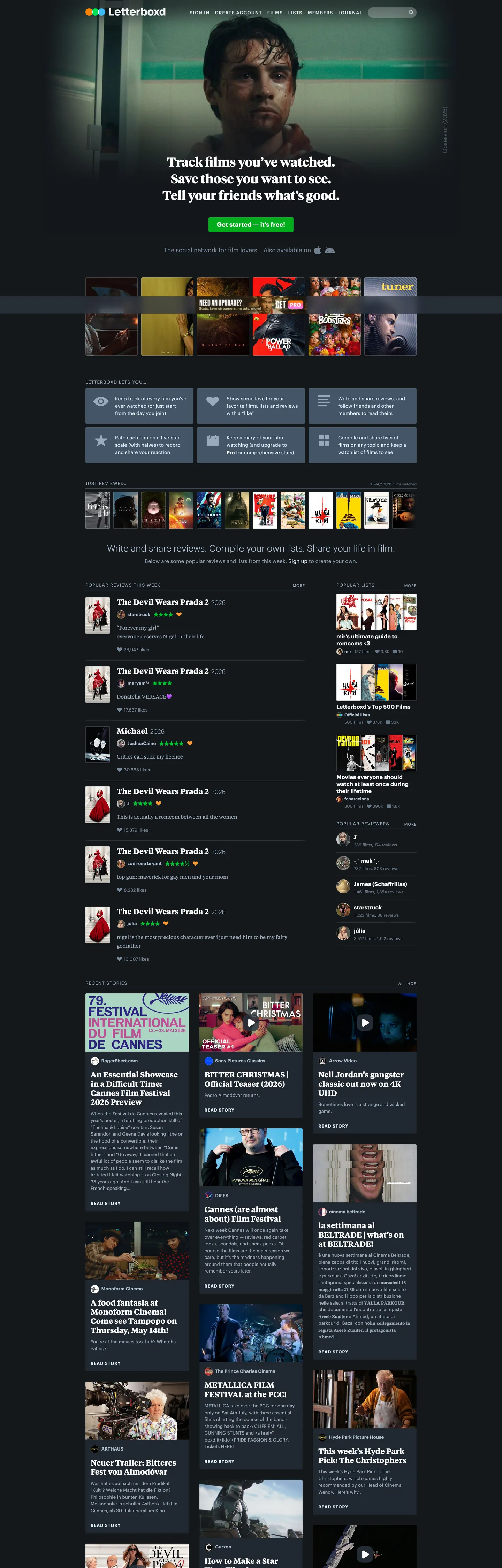
Letterboxd's homepage is a film-diary built on a near-black canvas: the page background renders at "#14181c" and individual poster wells drop one stop further to "#12161a" so the only object on screen carrying real chroma is the theatrical poster artwork itself. Letterboxd Green is a three-step ladder rather than a single hex — "#00e054" tags the rating dots and the green outline that appears on the focused-poster overlay, "#00ac1c" fills the resting "Get started — it's free!" CTA pill, "#00c030" is the hover state, and "#009926" the pressed state. Where a streaming competitor would crowd the homepage with feature shelves, Letterboxd treats the page as a horizontal stack of poster rails, member-review cards, and a journal/news strip — the chrome itself recedes so the social diary becomes the foreground.
This page packages the Letterboxd homepage chrome into a single DESIGN.md file built on the Google Labs spec. Inside: 29 colors tokens grouped into brand-green, link-blue, semantic, surface, ink, and hairline roles; 11 typography levels covering three font families (TiemposHeadlineWeb display serif, TiemposTextWeb review serif, GraphikWeb chrome sans, with PitchSansWeb monospace held in reserve); 8 corner radii anchored on the "3px" control radius and the "0.5rem" panel default; an 8-step spacing scale built around the "10px" / "15px" core measurements; and 20 components recipes covering the green CTA pill, the rounded search input, dark poster cards with green focus outlines, member-review rows with serif body, the uppercase nav strip, and the journal/news card grid.
Feed the file to Claude, Cursor, or GitHub Copilot and the agent writes social-diary components that match Letterboxd's voice — three-green ladder on charcoal, serif-display over sans-chrome, uppercase nav, "3px" controls — rather than a generic dark dashboard theme. Or reference the tokens directly: every hex, font-stack, radius, and component recipe is a quoted DESIGN.md value ready for Tailwind config, CSS variables, or your own library. The system is worth studying for its three-typeface discipline — a display serif, a chrome sans, and a body serif each scoped to one job — and for the way a single accent color subdivides into a four-step interaction ladder rather than collapsing into one flat brand token.
What makes it distinct
6
- Near-black film canvasbase '#14181c' with even deeper '#12161a' poster wells so theatrical artwork carries all chroma
- Three-green ladder'#00e054' for rating dots and poster outlines, '#00ac1c' for the resting CTA fill, '#00c030' on hover, '#009926' on press
- Serif-display, sans-chrome, serif-bodyTiemposHeadlineWeb for hero ('36px' / weight '700'), GraphikWeb for nav and CTAs, TiemposTextWeb for member reviews
- Uppercase nav voice'11–13px' GraphikWeb at weight '700' with '1px' (8% em) letter-spacing distinguishes top-bar links from running content
- Pill-and-radius mix'15px' search-input pill against '4px' button rounding, '3px' control radius, and a flat '0.5rem' panel corner; no full-pill geometry
- Link blue, not greenbody links resolve to '#ddeeff' at rest, hover to '#40bcf4', active to '#209ce4', preserving green as a brand-and-rating signal
letterboxd.com
Live at letterboxd.com
A snapshot of the brand in production. Scroll the frame to see the whole page.
Colors
29 colors
Letterboxd's system anchors on #00e054 (brand-green) as its primary color. Type is set in GraphikWeb across 12 tokens from 11px to 36px, weights 300–700. Shape language is mixed across 20 components, blending pills, soft rounds, and squarer corners.
Brand & Accent
Sparing, CTA-only voltage · 7
Surface
Page and card backgrounds · 6
Text
Headlines, body, captions · 12
Other
Specialty colors · 4
Typography
12 type tokens
Set in GraphikWeb across 12 tokens, from 11px to 36px, weights 300–700. Shown in its own stack: where the font isn't installed, the fallback the file names stands in.
- hero-display36px · weight 700 · lh 48px · tracking normalThe quick brown fox jumps over the lazy dog
- section-title22px · weight 700 · lh 27.5px · tracking normalThe quick brown fox jumps over the lazy dog
- review-body15px · weight 400 · lh 25px · tracking normalThe quick brown fox jumps over the lazy dog
- display-light24px · weight 300 · lh 24px · tracking normalThe quick brown fox jumps over the lazy dog
- display-regular24px · weight 400 · lh 24px · tracking normalThe quick brown fox jumps over the lazy dog
- button-primary18px · weight 700 · lh 18px · tracking normalThe quick brown fox jumps over the lazy dog
- body-strong15px · weight 700 · lh 22.5px · tracking normalThe quick brown fox jumps over the lazy dog
- body13px · weight 400 · lh 19.5px · tracking normalThe quick brown fox jumps over the lazy dog
- meta12px · weight 400 · lh 18px · tracking normalThe quick brown fox jumps over the lazy dog
- nav-link-uppercase13px · weight 700 · lh 17px · tracking 1pxThe quick brown fox jumps over the lazy dog
- section-cap-uppercase11px · weight 400 · lh 13.75px · tracking 0.825pxThe quick brown fox jumps over the lazy dog
- code13px · weight 400 · lh 19.5px · tracking normalThe quick brown fox jumps over the lazy dog
Layout
Radii and spacing
8 corner radii and 9 spacing values. Shape language: mixed.
Radii
- none0px
- poster-meta2px
- control3px
- button4px
- panel-default8px
- panel-large16px
- search-pill15px
- circle100%
Spacing
- xxs4px
- xs5px
- sm6px
- md10px
- base11px
- lg15px
- xl20px
- xxl24px
- jumbo32px
Components
20 components
Each rendered from its tokens (color, type, radius, padding) on Letterboxd's own canvas.
- Button Primarybutton-primaryButton Primary
- Button Primary Hoverbutton-primary-hoverButton Primary Hover
- Button Primary Activebutton-primary-activeButton Primary Active
- Button Defaultbutton-defaultButton Default
- Button Default Hoverbutton-default-hoverButton Default Hover
- Search Inputsearch-inputSearch Input
- Type here…text-inputText Input
- Top Navtop-navTop Nav
- Nav Linknav-linkNav Link
- Poster Cardposter-cardPoster Card
- Poster Card Focusedposter-card-focusedPoster Card Focused
- Hero Headinghero-headingHero Heading
- Review Cardreview-cardReview Card
- Panel Surfacepanel-surfacePanel Surface
- Panel Low Contrastpanel-low-contrastPanel Low Contrast
- DividerdividerDivider
- Rating Dotrating-dotRating Dot
- Body Linkbody-linkBody Link
- Body Link Hoverbody-link-hoverBody Link Hover
- AvataravatarAvatar
In use
The system, in use
Letterboxd's tokens on the kind of product it builds.
Build something people actually use.
A short paragraph of marketing copy that previews how the brand's display tier and body tier read together. Two sentences is usually enough.
FAQ
Letterboxd design system FAQ
Common questions about Letterboxd's tokens, components, and how to use this DESIGN.md in your project.
Read next
Related reading
Specs, directories, and component libraries that pair with this design system.
- Browse all design systemsThe full directory of DESIGN.md files on shadcn.io, with live mockups for each.shadcn.io
- Letterboxd — official siteThe social film-diary platform this DESIGN.md was extracted from.letterboxd.com (opens in a new tab)
- The DESIGN.md specificationGoogle Labs' open spec for machine-readable design system files — the format this page is built on.github.com (opens in a new tab)
Use it
Use Letterboxd in your project
One machine-readable file. Drop it into Claude, Cursor, or any AI tool that reads DESIGN.md.
Download the DESIGN.md
One machine-readable file: every color, type, radius, spacing, and component token of Letterboxd.
Feed it to your AI tool
Drop it into Claude, Cursor, or GitHub Copilot. The agent writes React components and Tailwind classes that match Letterboxd's visual language.
Reference the tokens directly
Or paste the values into your Tailwind config, CSS variables, or component library: every color, size and radius is a quoted, ready-to-copy value.
Read the full DESIGN.md: overview, rationale, do’s and don’ts
Overview
Letterboxd's homepage is a cinema-dark social diary — a "#14181c" canvas with even deeper "#12161a" poster wells stacking horizontally as rails of theatrical artwork, member-review rows, and a journal-and-news strip across the bottom. Where most social platforms run a single brand accent flat across every interactive surface, Letterboxd splits its green into a four-step interaction ladder: "#00e054" tags the rating glyph and the poster-overlay focus outline (24 occurrences), "#00ac1c" fills the resting "Get started" CTA pill, "#00c030" carries the hover state (also the rating-icon stroke at 13 occurrences), and "#009926" the pressed surface. Each step is a discrete CSS variable on :root — --theme-brand-green-content-color, --theme-button-primary-surface-color, --theme-brand-green-hover-surface-color, --theme-brand-green-active-surface-color — rather than a JS-computed darken.
Type runs a three-family ladder that maps function to typeface. TiemposHeadlineWeb (Klim's serif display family) carries the hero at "36px" / weight "700" / "48px" line-height — the single weight-700 serif in the system. TiemposTextWeb (the body serif from the same family) renders member-review prose at "15px" / weight "400" / "25px" line-height, treating user reviews as editorial body rather than UI text. GraphikWeb (Commercial Type's neutral sans) covers every piece of chrome: nav at "13px" / weight "700" with "1px" letter-spacing uppercase, primary CTAs at "18px" / weight "700", metadata at "12px" / weight "400", and the lightest weight-300 token at "24px" for the hero supporting line. PitchSansWeb monospace is declared but never renders on the homepage.
The shape language is scoped, not unified. There is no single rounded vocabulary; instead, each component family carries its own radius. The global search input renders as a "15px" pill (the input is "30px" tall, so the radius equals full-pill), while the primary CTA softens to "4px" — the input is freeform, the action is rectangular. Interactive controls sit at "3px" ("--control-legacy-border-radius"), poster meta tags at "2px", avatars at "100%", and content panels at "0.5rem" / "8px". The mix reads intentionally: pills for search, gentle rectangles for action, circles only for avatars. Where most film and streaming systems collapse to a single radius for visual unity, Letterboxd lets each family signal its own role.
Key Characteristics:
- Three-tier dark canvas: "#14181c" page background, "#12161a" poster wells one stop deeper, "#283038" elevated panel surface. Poster artwork carries chroma; the chrome never does.
- Four-step green ladder: rest fill "#00ac1c", hover "#00c030", active "#009926", brand tag "#00e054". Rating glyphs use the lighter "#00e054" and "#00c030"; CTA surfaces use the darker pair.
- Cool-blue gray ladder: every neutral sits at OKLCH hue 248° — "#99aabb" body text (780 occurrences), "#8899aa", "#778899", "#667788" metadata (660), "#556677", "#445566" low-contrast panel. There is no true neutral gray anywhere.
- Three-family typographic ladder: TiemposHeadlineWeb (hero), TiemposTextWeb (review body), GraphikWeb (chrome). Each scoped to one job.
- Link voice in blue, not green: "#ddeeff" link-rest, "#40bcf4" link-hover, "#209ce4" link-active. Green stays reserved for brand and rating semantics.
- Uppercase nav voice: 11–13px GraphikWeb at weight 700 with 1px (≈8% em) letter-spacing transforms the top bar into a "label" register distinct from body text.
- Mixed radius vocabulary: "15px" pill inputs, "4px" CTA buttons, "3px" legacy controls, "2px" poster-meta tags, "0.5rem" panels, "100%" avatars. No full-pill buttons exist.
- Heavy black-25% shadow under poster overlays: "rgba(0,0,0,.25)" via
--theme-control-shadow-color, plus a "rgba(20,24,28,.125)" canvas-tinted shadow on default poster overlays.
Colors
Brand & Accent
- Letterboxd Green (
{colors.brand-green}— "#00e054") — frequency 24. Used as border (24). The vivid brand tag on the poster-overlay focus outline and the rating-icon glyph color. Reserved for brand-identity moments, not interactive surfaces. - Green Hover (
{colors.brand-green-hover}— "#00c030") — frequency 13. Used as text (6), border (6), bg (1). The CTA hover surface, and the resting stroke on the rating-icon glyph. The middle voltage in the green ladder. - Green Surface (
{colors.brand-green-surface}— "#00ac1c") — frequency 1. Used as bg (1). The resting fill on the "Get started — it's free!" primary CTA pill — the only place this hex appears as a background fill. - Green Active (
{colors.brand-green-active}— "#009926") — declared in--theme-button-primary-active-surface-colorand--theme-brand-green-active-surface-color. The pressed-state CTA fill; doesn't render at rest. - Green Shadow (
{colors.brand-green-shadow}— "#007403") — declared in--theme-button-primary-content-shadow-color. A 1px text-shadow under the white CTA label to give the green pill a slight pressed-letterpress quality. - Brand Orange (
{colors.brand-orange-content}— "#ff8000") — declared in--theme-brand-orange-content-color. Reserved for promotional / Pro-tier accents; doesn't render on the public homepage. - Like Orange (
{colors.like-orange}— "#ff9933") — declared in--theme-like-icon-color. The heart-glyph fill on liked reviews; absent from the homepage above the fold.
Link Blue
- Link Rest (
{colors.link-rest}— "#ddeeff") — frequency 83. Used as text (22), border (22), shadow (39). The resting color for body links, declared as--theme-body-link-content-colorand--panel-content-link. - Link Hover (
{colors.link-hover}— "#40bcf4") — declared in--link-interaction-colorand--theme-body-link-hover-content-color. The cyan body-link hover state. - Link Active (
{colors.link-active}— "#209ce4") — declared in--link-interaction-active-colorand--theme-heading-active-content-color. The pressed/active link surface; also the focus-outline color atmax(2px, .125rem) solid rgba(32,156,228, .9).
Surface
- Canvas (
{colors.canvas}— "#14181c") — frequency 75 (clustered with "#12161a"). Used as bg (40), shadow (25), gradient (10). The base page background, declared in--theme-background-color. - Poster Well (
{colors.surface-poster}— "#12161a") — Part of the same cluster. Used in--poster-background-colorand--poster-placeholder-background— the recessed well behind every theatrical poster. - Elevated (
{colors.surface-elevated}— "#283038") — frequency 24. Used as text (12), border (12). The--theme-surface-colorfor elevated panel containers and dialog surfaces. - Panel (
{colors.surface-panel}— "#445566") — frequency 6. Used as bg (6). The--panel-backgroundfor low-contrast secondary panels, default-button fills, and the rest surface for the--theme-fill-colortoken. - Divider (
{colors.surface-divider}— "#2c3440") — frequency 4. Used as bg (3), gradient (1). The 1px rule between sections, declared in--panel-dividerand--theme-separator-secondary-color. - Inset (
{colors.surface-inset}— "#202830") — frequency 12. Used as bg (12). The recessed poster-inset background ("--poster-inset-background") and no-image poster placeholder.
Ink (cool-blue gray ladder)
- Heading White (
{colors.ink-heading}— "#ffffff") — frequency 266. Used as text (129), border (129), shadow (7). The--theme-heading-content-colorand--panel-heading— every section heading, the CTA label, the hover state for default buttons and interactable elements. - High-Contrast Ink (
{colors.ink-high-contrast}— "#d8e0e8") — frequency 24. Used as text (12), border (12). The--panel-content-high-contrastand--theme-interactable-active-content-color— slightly off-white for active interactable text where pure "#ffffff" would feel harsh. - Strong Ink (
{colors.ink-strong}— "#aabbcc") — frequency 82. Used as text (41), border (41). The--theme-body-high-contrast-content-colorand--panel-content— the workhorse body text on elevated panels. - Body Ink (
{colors.ink-body}— "#99aabb") — frequency 780. Used as text (390), border (390). The dominant body text color, declared as--theme-body-content-color— every body paragraph and review byline on the page resolves to this hex. - Medium Ink (
{colors.ink-medium}— "#8899aa") — frequency 22. Used as text (11), border (11). The--theme-body-low-contrast-content-colorand--panel-outlined-border-color— outlined-card borders and low-contrast body text. - Metadata Strong (
{colors.ink-metadata-strong}— "#778899") — frequency 38. Used as text (19), border (19). The--theme-metadata-high-contrast-content-colorand--theme-fill-hover-color— metadata captions where the standard body color feels too prominent. - Metadata (
{colors.ink-metadata}— "#667788") — frequency 660. Used as text (342), border (318). The--theme-metadata-content-color— the second-most-frequent color on the page after body ink. Carries every minor caption, timestamp, and credit line. - Low-Contrast (
{colors.ink-low-contrast}— "#556677") — frequency 16. Used as text (8), border (8). The--theme-metadata-active-content-color— pressed-state metadata, and the search-input placeholder color.
Semantic & Misc
- Destructive Hover (
{colors.destructive-hover}— "#ec1200") — declared in--theme-button-destructive-hover-surface-color. The destructive-button hover surface; doesn't render on the public homepage. - Destructive Active (
{colors.destructive-active}— "#c40f00") — declared in--theme-button-destructive-active-surface-color. The pressed destructive state. - Control Shadow (
{colors.control-shadow}— "#000000") — frequency 73. Used as shadow (69), text (2), border (2). The--theme-control-shadow-colorat "rgba(0,0,0, .25)" — every poster overlay and dialog drop-shadow on the canvas.
Typography
Font Family
The system runs three families scoped to discrete jobs. TiemposHeadlineWeb (Klim Type Foundry serif display) is declared as --font-stack-tiempos-headline: TiemposHeadlineWeb, Georgia, serif, ColorEmoji and carries the hero heading exclusively. TiemposTextWeb (the body serif from the same family) is declared as --font-stack-tiempos-text: TiemposTextWeb, Georgia, serif, ColorEmoji and renders member-review prose. GraphikWeb (Commercial Type sans) is declared as --font-stack-graphik: GraphikWeb, -apple-system, BlinkMacSystemFont, "Segoe UI", "Hiragino Sans", Meiryo, sans-serif, ColorEmoji and covers every piece of chrome — nav, CTAs, metadata, body sans, section heads. PitchSansWeb monospace is declared but never renders on the homepage.
The three-family separation is the most distinctive typographic move in the system: a serif display for the brand voice, a serif body for editorial review content, and a sans for application chrome. Most film and streaming sites collapse to one or two families; Letterboxd treats reviews as magazine copy.
Hierarchy
| Token | Family | Size | Weight | Line Height | Letter Spacing | Use |
|---|---|---|---|---|---|---|
{typography.hero-display} | TiemposHeadlineWeb | "36px" | 700 | "48px" | normal | The "Track films you've watched" hero heading |
{typography.section-title} | TiemposTextWeb | "22px" | 700 | "27.5px" | normal | Section heads in review and journal rails |
{typography.review-body} | TiemposTextWeb | "15px" | 400 | "25px" | normal | Member-review prose body |
{typography.display-light} | GraphikWeb | "24px" | 300 | "24px" | normal | Hero supporting line — the only weight-300 token |
{typography.display-regular} | GraphikWeb | "24px" | 400 | "24px" | normal | Display labels and counts |
{typography.button-primary} | GraphikWeb | "18px" | 700 | "18px" | normal | "Get started" CTA pill label |
{typography.body-strong} | GraphikWeb | "15px" | 700 | "22.5px" | normal | Bold sans body — review-card titles |
{typography.body} | GraphikWeb | "13px" | 400 | "19.5px" | normal | Standard sans body — workhorse running text |
{typography.meta} | GraphikWeb | "12px" | 400 | "18px" | normal | Metadata captions — credits, timestamps |
{typography.nav-link-uppercase} | GraphikWeb | "13px" | 700 | "17px" | "1px" (uppercase) | Top-bar nav links — "Sign in", "Create account" |
{typography.section-cap-uppercase} | GraphikWeb | "11px" | 400 | "13.75px" | "0.825px" (uppercase) | Section caps and small all-caps labels |
{typography.code} | PitchSansWeb | "13px" | 400 | "19.5px" | normal | Monospace code — declared, unused on homepage |
Principles
Display sits at weight 700 for the serif hero; chrome sits at weight 700 for CTAs, nav, and body emphasis; review prose sits at weight 400. The single weight-300 token is the GraphikWeb "24px" supporting line under the hero — used once per page, never elsewhere.
The uppercase nav voice is the system's most distinctive typographic gesture. Top-bar nav links render at "13px" / weight "700" / "1px" letter-spacing in all caps — roughly 8% em of tracking, generous for a sans, transforming the chrome from "labels" into a register that reads as architectural. Inline body text never uses uppercase.
Note on Font Substitutes
If TiemposHeadlineWeb and TiemposTextWeb are unavailable, Georgia is the licensed fallback already in the stack; Source Serif 4 is the closest open-source substitute that preserves the Klim character. If GraphikWeb is unavailable, Inter at the same weights preserves the chrome voice — tighten letter-spacing on the uppercase nav token from "1px" to "0.8px" to compensate for Inter's slightly wider glyphs.
Layout
Spacing System
- Base unit: 5px, with "10px" and "15px" as the two most-frequent core measurements (28 and 24 occurrences respectively).
- Tokens:
{spacing.xxs}"4px" ·{spacing.xs}"5px" ·{spacing.sm}"6px" ·{spacing.md}"10px" ·{spacing.base}"11px" ·{spacing.lg}"15px" ·{spacing.xl}"20px" ·{spacing.xxl}"24px" ·{spacing.jumbo}"32px". - Review-card padding: "16px 20px 18px" — the dominant card padding (6 occurrences), with extra bottom space for the review-meta strip.
- Button padding: "6.5px 13px" for default secondary buttons; "0px 24px" with a fixed "42px" height for the primary CTA pill.
- Section gutters: "20px" between major rails ("--spacing-xlarge"), "15px" between cards inside a rail ("--spacing-large"), "10px" between dense list rows ("--spacing-medium").
Grid & Container
- Site header height: "72px" fixed at the top, carrying the wordmark, nav, search pill, and Sign In.
- Bottom rail height: "50px" reserved for the mobile bottom-navigation strip ("--layout-bottom-rail-height").
- Page gutter:
min(3.125%, 1.5rem)— the page inline gutter scales with viewport width, capped at "1.5rem" / 24px. - Layout content gutter: "20px" between content blocks.
- Poster aspect: "2 / 3" — the standard theatrical-poster ratio carried by every poster card on the page.
- Backdrop aspect: "16 / 9" — for hero and feature backdrops.
Whitespace Philosophy
The system favors rail compression over vertical breathing room. Poster rails sit tightly against each other with "20px" gutters; the dark "#14181c" canvas provides visual rest between rails without large gaps. Where a streaming competitor stacks sections with 80–120px breathing room, Letterboxd treats the page as a continuous diary — every rail butts against the next.
Elevation
| Level | Treatment | Use |
|---|---|---|
| Base (Level 0) | Flat {colors.canvas} ("#14181c") fill | Page background |
| Surface (Level 1) | Flat {colors.surface-elevated} ("#283038") fill | Elevated panels, dialog surfaces |
| Inset | Flat {colors.surface-inset} ("#202830") or {colors.surface-poster} ("#12161a") | Poster wells, no-image placeholders |
| Overlay (poster) | "rgba(20,24,28,.125)" box-shadow on poster overlay | The faint canvas-tinted shadow under hovered poster overlays |
| Control | "rgba(0,0,0, .25)" control shadow | Poster overlays, dialog elevation |
| Skeleton | Blur "0.125rem" with "calc(1/3)" opacity pulse | Loading skeleton fade-in |
Shadow Philosophy: Letterboxd uses a two-tier shadow system: a faint canvas-tinted shadow ("rgba(20,24,28,.125)") for default poster overlays so they feel "set into" the canvas, and a stronger black-25% shadow ("rgba(0,0,0, .25)") for control elevation and dialog lift. The canvas-tinted shadow is the distinctive move — most dark systems use pure-black shadows; Letterboxd reuses the page background hue at 12.5% opacity so the shadow vanishes into the canvas itself rather than reading as a separate object.
The focus outline runs max(2px, .125rem) solid rgba(32,156,228, .9) — the same --link-interaction-active-color blue used for pressed body links, applied as a 2px focus ring on every keyboard-focused control.
Shapes
The system uses six distinct radii, each scoped to a component family:
{rounded.none}("0px") — hero heading and structural surfaces with no rounding.{rounded.poster-meta}("2px") — poster meta tags and very small badges (--poster-meta-border-radius).{rounded.control}("3px") — legacy controls and most secondary buttons (--control-legacy-border-radius).{rounded.button}("4px") — the primary CTA pill and contemporary form controls.{rounded.panel-default}("8px" / "0.5rem") — content panels, dialog surfaces, review cards (--panel-border-radius-default).{rounded.panel-large}("16px" / "1rem") — large dialog panels (--panel-border-radius-large).{rounded.search-pill}("15px") — the global search input, which equals full-pill at "30px" tall.{rounded.circle}("100%") — avatars and circular play-button glyphs.
The mix reads intentionally: pills for freeform search input, gentle rectangles for action, circles only for avatars. There is no full-round button anywhere in the chrome.
Components
Buttons
button-primary — {colors.brand-green-surface} ("#00ac1c") fill, white text, GraphikWeb "18px" / weight "700" label, "4px" radius, "0×24px" padding, fixed "42px" height. The "Get started — it's free!" CTA. Carries a 1px text-shadow in {colors.brand-green-shadow} ("#007403") under the white label for a slight letterpress quality.
button-primary-hover — Same geometry, fill flips to {colors.brand-green-hover} ("#00c030"). The middle step in the green ladder.
button-primary-active — Same geometry, fill flips to {colors.brand-green-active} ("#009926"). The pressed state.
button-default — {colors.surface-panel} ("#445566") fill, {colors.ink-strong} ("#aabbcc") text, GraphikWeb "15px" / weight "700" label, "3px" radius, "6.5×13px" padding. Used for secondary actions and inline list controls.
button-default-hover — Same geometry, fill flips to {colors.ink-metadata} ("#667788"), text flips to {colors.ink-heading} ("#ffffff"). The hover lift on secondary buttons.
Inputs
search-input — White fill ("#ffffff"), {colors.ink-low-contrast} ("#556677") placeholder text, GraphikWeb "12px" / weight "400", "15px" radius (full-pill at "30px" height), "6×30×6×10px" asymmetric padding (extra right padding for the magnifying-glass icon). The signature global search at the top-right of the site header.
text-input — {colors.surface-elevated} ("#283038") fill, white text, GraphikWeb "13px" / weight "400", "3px" radius, "6.5×13px" padding, "32px" height. Used for inline forms in account and review-entry surfaces.
Navigation
top-nav — {colors.canvas} ("#14181c") fill, {colors.ink-high-contrast} ("#d8e0e8") text, "72px" fixed height. Houses the wordmark left, primary nav links center, search pill and Sign In right. No bottom border at rest — the green-tinted divider appears only when scrolled.
nav-link — Transparent fill, {colors.ink-high-contrast} ("#d8e0e8") text, GraphikWeb "13px" / weight "700" / "1px" letter-spacing uppercase, "6×0×0px" padding (extra top padding to align the cap height with the wordmark baseline). Hover flips text to white via --theme-interactable-hover-content-color.
Cards & Surfaces
poster-card — {colors.surface-poster} ("#12161a") fill, "2px" radius ({rounded.poster-meta}), 1px self-fill border (so the card edge is invisible at rest). Holds theatrical poster artwork at a "2 / 3" aspect ratio.
poster-card-focused — Same geometry, but the 1px border is replaced by a 3px {colors.brand-green} ("#00e054") border (--poster-overlay-interaction-border-width: 3px). The most distinctive interaction state in the system — the green outline reads as a tag rather than a hover lift.
hero-heading — Transparent fill, white text, TiemposHeadlineWeb "36px" / weight "700" / "48px" line-height. The hero "Track films you've watched. Save those you want to see. Tell your friends what's good." Renders without any padding or border — the type itself is the surface.
review-card — {colors.canvas} ("#14181c") fill, {colors.ink-body} ("#99aabb") body in TiemposTextWeb "15px" / weight "400" / "25px" line-height, "8px" radius ({rounded.panel-default}), "16×20×18px" padding (the dominant card-padding measurement, 6 occurrences). Each member-review row carries an avatar, member name (sans), review title (serif weight 700), star rating, and serif body.
panel-surface — {colors.surface-elevated} ("#283038") fill, {colors.ink-strong} ("#aabbcc") text, "8px" radius, "16×20×18px" padding. The default elevated panel for dialogs and content containers.
panel-low-contrast — {colors.surface-panel} ("#445566") fill, "8px" radius. Used for low-contrast secondary panels — outlined cards on dense pages.
Misc
divider — {colors.surface-divider} ("#2c3440") fill, 1px height. Section separator used inside dialogs and detail pages.
rating-dot — Transparent fill, {colors.brand-green-hover} ("#00c030") stroke, 1px solid {colors.brand-green} border, "100%" radius. The 5-star rating glyph element — the green outline is the signature rating cue.
body-link — Transparent fill, {colors.link-rest} ("#ddeeff") text, GraphikWeb "13px" / weight "400". The resting body-link color — pale blue rather than the brand green, which keeps green reserved for ratings and CTAs.
body-link-hover — Same geometry, text flips to {colors.link-hover} ("#40bcf4"). The cyan link hover, distinct from the brand-green ladder.
avatar — {colors.surface-poster} ("#12161a") fill, "100%" radius, "0" border at rest. Holds member-profile artwork on every review and activity row.
Do's and Don'ts
Do
- Reserve
{colors.brand-green}("#00e054") for rating glyphs and the poster-focus outline only. Use{colors.brand-green-surface}("#00ac1c") for resting CTA fills — the lighter green never appears as a button background on the homepage. - Use the four-step green ladder for any green interaction surface: rest "#00ac1c", hover "#00c030", active "#009926", brand-tag "#00e054". Don't collapse to a single green.
- Use
{colors.link-rest}("#ddeeff") for body links — Letterboxd's link color is pale blue, not green. Keeping green reserved for rating and CTA semantics is core to the visual system. - Match the three-family typographic split: TiemposHeadlineWeb for hero, TiemposTextWeb for review prose, GraphikWeb for chrome. If you only have one family, use a serif for editorial body and a sans for chrome — the split itself is the move.
- Pad review cards at "16×20×18px" — the asymmetric extra "2px" on the bottom is the dominant card-padding measurement on the homepage and gives the review-meta strip room to breathe under the prose.
Don't
- Don't use
{colors.brand-green}("#00e054") as a button background fill — it only renders as a 24-occurrence border tint on poster overlays and as the rating-icon glyph color. Use{colors.brand-green-surface}("#00ac1c") for CTA fills instead. - Don't apply the GraphikWeb uppercase nav voice (weight 700, "1px" letter-spacing) to body text — it's scoped to top-bar nav and small all-caps section caps only. Using it on running content breaks the chrome / content register.
- Don't use a true neutral gray (e.g., a flat 60% or 40% gray with zero chroma) anywhere — every neutral in the system shifts to OKLCH hue 248°. The grays you want are
{colors.ink-body}("#99aabb"),{colors.ink-metadata}("#667788"), and the rest of the cool-blue ladder. A neutral gray reads off-brand because the surrounding chrome is uniformly cool-blue tinted. - Don't use a "15px" radius on buttons — it's the global search-input pill ("30px" tall, so "15px" equals full-pill), not a generic rounding. CTAs use "4px"; secondary controls use "3px"; panels use "8px". Mixing the search-pill radius into the button family flattens the scoped radius vocabulary.
- Don't collapse the canvas-tinted shadow ("rgba(20,24,28,.125)") into pure black ("rgba(0,0,0,.25)"). The two-tier shadow system is deliberate — canvas-tinted for poster overlays so the shadow vanishes into the page, pure-black for control elevation where the shadow needs to read as a lift.
Known Gaps
- Rating widget interaction states: the 5-star rating glyph has hover, half-star, and locked states not captured here — only the resting outline is extracted.
- Like and watchlist glyphs: the heart "like" button (
{colors.like-orange}— "#ff9933") and the watch-list bookmark glyph appear in the CSS variable surface but don't render above the fold on the public homepage. - Activity-feed types: the homepage shows member-review rows only; full activity-feed item types (list creation, member-follow, tag-add) live on profile pages.
- Profile and friends pages: the denser two-column layout for member profiles isn't represented in this homepage extraction.
- Motion timings: two easings are captured in
:root—cubic-bezier(.19, 1, .22, 1)(ease-out-expo, the default) andcubic-bezier(.175, .885, .32, 1.275)(ease-out-back) — but per-component transition durations beyond the global "0.15s" dropdown fade and "0.33s" / "0.5s" timing-duration-in / timing-duration-out aren't itemized. - Mobile bottom rail: the "50px" bottom-navigation strip (
--layout-bottom-rail-height) lives in a separate component shell and isn't extracted as a recipe here. - Destructive-action ladder:
{colors.destructive-hover}("#ec1200") and{colors.destructive-active}("#c40f00") are declared in CSS variables but never render on the public homepage; the resting destructive surface is{colors.surface-panel}("#445566") borrowed from the default-button stack. - PitchSansWeb monospace: declared as
--font-stack-pitch-sansbut unused on the homepage; would surface in API documentation and embed-code blocks.
Social & Community
More systems like this
More DESIGN.md files in Social & Community.
Pricing
Build it with Pro
The DESIGN.md files are free. Pro adds 6,000+ blocks, premium templates and the MCP server, so your AI editor builds in your system for you.
4.9/5 out of 5 · 150+ reviewsfrom 150+ founders and developers.
Billing
Billed once a year in USD. Cancel anytime.
- How many people can use the license.
- Client work, SaaS products and anything you charge for.
- Production-ready React sections: hero, pricing, features, dashboards and more.
- Complete multi-page sites you can ship as they are.
- React icons from every major library, installable with one command.
- Presets that restyle every block, in light and dark.
- Lets your AI editor search, preview and install blocks for you.
- Priority requests are answered first.
Individual
For personal projects & open source
$32instead of $49/mo
$389 billed yearly
- Seats: 1 seat
- Commercial use: Personal & open source only
- Pro blocks: 6,000+ blocks
- Templates: All 14 templates
- React icons: 294k+ icons
- Themes: All 59 themes
- MCP server: Basic usage
- Support: Standard
Team
Most popularFor freelancers, agencies & startups
$66instead of $99/mo
$789 billed yearly · ≈ $13/dev/mo
- Seats: Up to 5 seats
- Commercial use: Included
- Pro blocks: 6,000+ blocks
- Templates: All 14 templates
- React icons: 294k+ icons
- Themes: All 59 themes
- MCP server: High usage
- Support: Priority
Organization
For companies with larger teams
$132instead of $199/mo
$1,589 billed yearly
- Seats: Unlimited seats
- Commercial use: Included
- Pro blocks: 6,000+ blocks
- Templates: All 14 templates
- React icons: 294k+ icons
- Themes: All 59 themes
- MCP server: Unlimited usage
- Support: Priority
Billed once a year in USD. Cancel anytime.
Individual
For personal projects & open source
$32instead of $49/mo
$389 billed yearly
- How many people can use the license.Seats: 1 seat
- Client work, SaaS products and anything you charge for.Commercial use: Personal & open source only
- Production-ready React sections: hero, pricing, features, dashboards and more.Pro blocks: 6,000+ blocks
- Complete multi-page sites you can ship as they are.Templates: All 14 templates
- React icons from every major library, installable with one command.React icons: 294k+ icons
- Presets that restyle every block, in light and dark.Themes: All 59 themes
- Lets your AI editor search, preview and install blocks for you.MCP server: Basic usage
- Priority requests are answered first.Support: Standard
Team
Most popularFor freelancers, agencies & startups
$66instead of $99/mo
$789 billed yearly · ≈ $13/dev/mo
Everything in Individual, plus
- How many people can use the license.Seats: Up to 5 seats
- Client work, SaaS products and anything you charge for.Commercial use: Included
- Lets your AI editor search, preview and install blocks for you.MCP server: High usage
- Priority requests are answered first.Support: Priority
Organization
For companies with larger teams
$132instead of $199/mo
$1,589 billed yearly
Everything in Team, plus
- How many people can use the license.Seats: Unlimited seats
- Lets your AI editor search, preview and install blocks for you.MCP server: Unlimited usage
- Secure checkout via Stripe
- Code lives in your repo
- Keep what you've shipped if you cancel
- License terms
Your system, built for you
Every block, template and icon, installed by your AI agent in your design system. The DESIGN.md files stay free.