Skip to content

Patreon Design System

Patreon's redesigned marketing site runs ultra-thin Oracle at 187.5px / weight 250 across full-bleed creator portraits, with sky-blue washes painting entire vertical bands. Tokens for React, Next.js, and AI coding tools.

Add shadcn.io to your AI agent. · Pro It installs blocks, icons and templates in your design system from a prompt, with Pro.

Set up MCP
Primary
#5fc1f1
Typeface
Oracle
Shape
Soft
Base radius
30px
Colors
18
Type tokens
11
Components
18
Spacing values
7

About

About Patreon DESIGN.md

Curated by Dov Azencot · Updated May 19, 2026 · Source patreon.com (opens in a new tab)

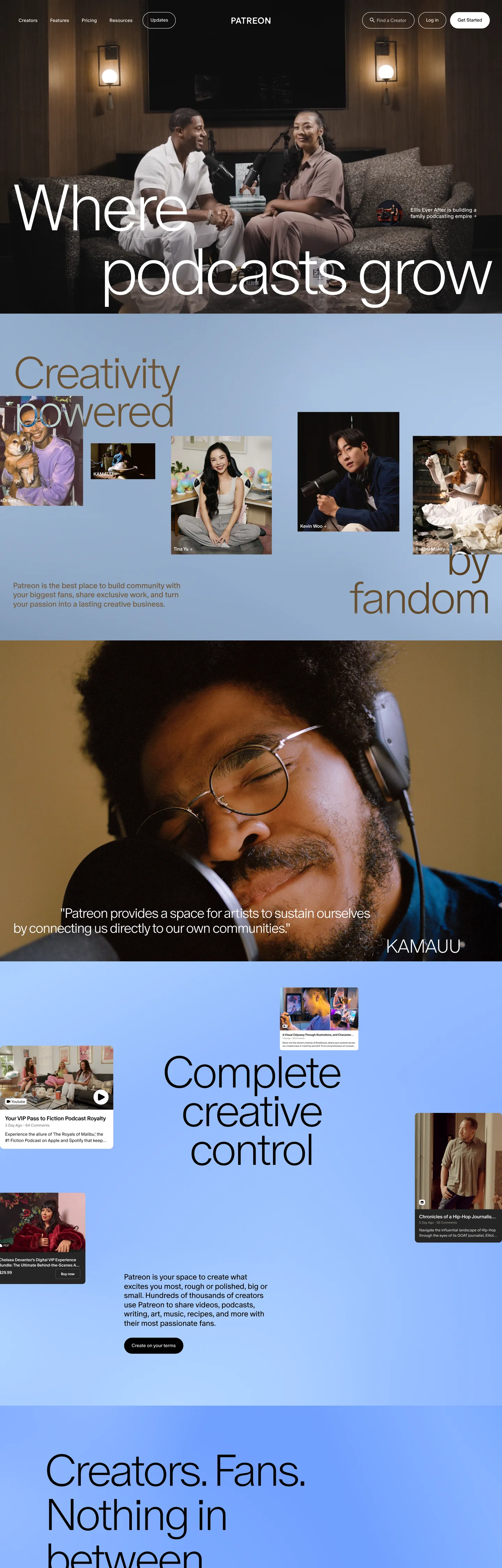
Patreon's redesigned marketing site reads like the cover of a print magazine. The above-fold hero is a full-bleed photograph of two creators in a podcast studio — recording booth, soft warm-toned lighting, gear visible in the frame — with the headline "Where podcasts grow" overlaid across the lower third at 187.5px / weight 250 in pure white. The letter-spacing is set at -11.25px so the characters almost touch; the line height (183.75px) sits below the size to lock the headline as a single visual block. Below the fold, the page alternates between four more full-bleed creator portraits (musicians, podcasters, illustrators in their studios) and chromatic interstitial bands — pale cream "Creativity / Powered by fandom" at editorial display size, a sky-blue "Complete creative control" band on #5fc1f1, a desaturated brown landscape-photograph band, and a closing "Creators. Fans. Nothing in between" black band. The historic Patreon coral does not appear anywhere on this captured page.

The DESIGN.md file packages the redesigned system into a machine-readable spec for React tooling. Inside: 18 colors tokens — a structural binary of pure black `#000000` (wired as `--color-action`, `--color-neutral-0`, `--color-black`) and pure white `#ffffff` (the dominant text color at 257 occurrences, plus the canvas background), a sky-blue voltage `#5fc1f1` wired as `--color-primary`, a deeper highlight blue `#0e87eb` wired as `--color-highlight`, a quartet of pastel sky-blues that populate band backgrounds, and a small set of semantic tones (`#dc362e` red error, `#00bda5` green success, `#ffca30` yellow warning, `#f6668b` nprogress pink). 12 typography tokens running Oracle (a contemporary geometric grotesk) at weights 250-500, with 187.5px at the top of the display ladder and 13.5px / 350 at the bottom of the body tier. A 30px-default radius scale with no 8px or 12px middle, and 18 components covering the editorial-thin hero heading, the band-fill section headings, the black-fill primary CTA, the photo-overlay caption card, and the avatar-chip creator credit.

Feed this file to an AI coding tool and it reproduces Patreon's specific moves: full-bleed creator photography as canvas, ultra-thin Oracle display at 187.5px with -11.25px tracking, sky-blue band fills replacing the legacy single-accent voltage, black-as-CTA rather than brand-color-as-CTA, 30px default radius with no middle tier, and a 250-500 weight ladder that never reaches 600+. The one move worth borrowing for any creator-economy or membership product: the editorial-thin display treatment. The 187.5px / 250 / -11.25px headline reads like a Vogue cover, which is precisely the point — Patreon is positioning creators as the talent, the marketing surface as the magazine.

What makes it distinct

5

  1. Editorial-thin displayOracle at 187.5px / weight 250 with -11.25px negative tracking ('Where podcasts grow') is the loudest typographic moment, closer to a fashion magazine than a SaaS hero
  2. Sky-blue voltage as band#5fc1f1 paints the entire 'Complete creative control' band edge-to-edge, replacing the legacy coral as the chromatic brand moment
  3. Black as action color--color-action #000000 carries primary CTAs; the brand-blue voltage stays at the band level and never doubles as a button fill
  4. Single typeface across every tierOracle does display, heading, body, button, and caption work, with weight 250 / 350 / 400 / 500 as the entire weight ladder
  5. 30px default radiusbuttons, cards, and panel-bands all round at 30px; the next step up is full circle for avatar chips

patreon.com

Live at patreon.com

A snapshot of the brand in production. Scroll the frame to see the whole page.

Patreon's website at patreon.com

Colors

18 colors

Patreon's system runs on #5fc1f1 as its primary voltage, used in 2 of 18 components. Type is set in Oracle across 11 tokens from 13.5px to 187.5px, weights 250–500. Shape language is soft — components average 15px corner radius, with no sharp interactive edges.

Brand & Accent

Sparing, CTA-only voltage · 2

Surface

Page and card backgrounds · 1

Text

Headlines, body, captions · 5

Semantic

Status, errors, success, links · 3

Other

Specialty colors · 7

Typography

11 type tokens

Set in Oracle across 11 tokens, from 13.5px to 187.5px, weights 250–500. Shown in its own stack: where the font isn't installed, the fallback the file names stands in.

  • display-xl187.5px · weight 250 · lh 183.75px · tracking -11.25pxThe quick brown fox jumps over the lazy dog
  • display-lg127.5px · weight 250 · lh 110.925px · tracking -7.65pxThe quick brown fox jumps over the lazy dog
  • display-md54px · weight 250 · lh 59.4px · tracking -2.16pxThe quick brown fox jumps over the lazy dog
  • display-sm39px · weight 300 · lh 42.9px · tracking -2.16pxThe quick brown fox jumps over the lazy dog
  • heading-md27px · weight 400 · lh 27px · tracking -0.54pxThe quick brown fox jumps over the lazy dog
  • heading-sm25.5px · weight 400 · lh 30.6px · tracking -1.02pxThe quick brown fox jumps over the lazy dog
  • body-lg22px · weight 350 · lh 26.4px · tracking -0.44pxThe quick brown fox jumps over the lazy dog
  • body-md15px · weight 400 · lh 18px · tracking -0.3pxThe quick brown fox jumps over the lazy dog
  • body-sm13.5px · weight 350 · lh 14.85px · tracking -0.27pxThe quick brown fox jumps over the lazy dog
  • button-md13.5px · weight 500 · lh 16.2px · tracking -0.27pxThe quick brown fox jumps over the lazy dog
  • nav-link13.5px · weight 350 · lh 14.85px · tracking 0.27pxThe quick brown fox jumps over the lazy dog

Layout

Radii and spacing

5 corner radii and 7 spacing values. Shape language: soft.

Radii

  • none0px
  • md30px
  • lg37.5px
  • xl45px
  • full9999px

Spacing

  • xs6.75px
  • sm8.25px
  • md14.25px
  • lg19.5px
  • xl22.5px
  • 2xl27px
  • 3xl28.6px

Components

18 components

Each rendered from its tokens (color, type, radius, padding) on Patreon's own canvas.

  • Hero Section
    hero-sectionHero Section
  • Hero Heading
    hero-headingHero Heading
  • Section Heading On Blue
    section-heading-on-blueSection Heading On Blue
  • Section Heading On Cream
    section-heading-on-creamSection Heading On Cream
  • Section Heading On Black
    section-heading-on-blackSection Heading On Black
  • Body Paragraph
    body-paragraphBody Paragraph
  • Body Paragraph Muted
    body-paragraph-mutedBody Paragraph Muted
  • Button Primary
    button-primaryButton Primary
  • Button Secondary
    button-secondaryButton Secondary
  • Button On Image
    button-on-imageButton On Image
  • Top Nav
    top-navTop Nav
  • Nav Link
    nav-linkNav Link
  • Band Blue
    band-blueBand Blue
  • Band Cream
    band-creamBand Cream
  • Band Photograph
    band-photographBand Photograph
  • Caption Overlay Card
    caption-overlay-cardCaption Overlay Card
  • Creator Credit Chip
    creator-credit-chipCreator Credit Chip
  • Type here…
    text-inputText Input

In use

The system, in use

Patreon's tokens on the kind of product it builds.

Build something people actually use.

A short paragraph of marketing copy that previews how the brand's display tier and body tier read together. Two sentences is usually enough.

Get startedLearn more
Marketing heroHeadline, sub-copy, primary CTA — the universal homepage opener.
Reporting · 14 min read

The quiet collapse of an old idea

For decades the consensus held that the system would correct itself. Then it didn't. This is the inside story of what changed, told by the people who watched it unravel.

"Nobody noticed because the failure was indistinguishable from progress."

By Sam Reporter · Updated 2 hours ago

Editorial articleMagazine-style longform with display headline.

FAQ

Patreon design system FAQ

Common questions about Patreon's tokens, components, and how to use this DESIGN.md in your project.

Read next

Specs, directories, and component libraries that pair with this design system.

Use it

Use Patreon in your project

One machine-readable file. Drop it into Claude, Cursor, or any AI tool that reads DESIGN.md.

Download DESIGN.md
  1. Download the DESIGN.md

    One machine-readable file: every color, type, radius, spacing, and component token of Patreon.

  2. Feed it to your AI tool

    Drop it into Claude, Cursor, or GitHub Copilot. The agent writes React components and Tailwind classes that match Patreon's visual language.

  3. Reference the tokens directly

    Or paste the values into your Tailwind config, CSS variables, or component library: every color, size and radius is a quoted, ready-to-copy value.

Read the full DESIGN.md: overview, rationale, do’s and don’ts

Overview

Patreon's redesigned marketing site abandons the SaaS hero convention. Magazine spread as section: where Substack still leans on cobalt-on-white columns and Kickstarter holds a single brand-green CTA in reserve against a white canvas, Patreon paints each section of the page as its own full-bleed spread — a creator portrait, then a sky-blue chromatic band, then a cream typographic spread, then another portrait. The above-fold hero is a photographic frame of two creators in a podcast studio, with "Where podcasts grow" overlaid in pure white at 187.5px / weight 250 / -11.25px tracking. The headline reads like the cover of a magazine, which is the point — Patreon is positioning the creator as the talent and the marketing surface as the publication that features them.

Editorial-thin display: where most SaaS brands sit display at weight 500-700 and Stripe's restraint stops at weight 300, Patreon goes thinner still — Oracle at weight 250 across every display tier, with negative tracking pushed to -11.25px on the 187px hero and -7.65px on the 127px section headings. The combination of very thin weight, very large size, and very aggressive negative tracking is the system's signature typographic move. The h2 ("Complete creative control") at 127.5px / 250 / -7.65px sits on a sky-blue band fill ({colors.primary} — #5fc1f1, wired as --color-primary), and the contrast between the fragile letterforms and the saturated band is the system's main chromatic tension.

The CTA is wired as --color-action with value #000000 — black, not brand-blue. Where Stripe binds its indigo voltage to the primary button and Linear binds its violet to the same role, Patreon's primary action button is pure black with white text. The brand-blue stays at the band-fill level and never doubles as a CTA color; the system is deliberate about keeping the chromatic identity at the architecture tier rather than the affordance tier. The single sky-blue stays one move ahead of the buttons that sit inside its bands.

Key Characteristics:

  • Magazine-spread architecture: 5 full-bleed bands per page — creator portrait, sky-blue chromatic band, cream typographic spread, brown-photograph band, closing black band — each carrying its own ground color and headline.
  • Single typeface: Oracle (geometric grotesk) across display, heading, body, button, and caption. Weights 250 / 350 / 400 / 500 — no 600 or 700 anywhere.
  • Ultra-thin display: 187.5px / weight 250 / -11.25px tracking on the hero h1; 127.5px / 250 / -7.65px on the h2; the negative tracking is the signature.
  • Sky-blue voltage at band level: {colors.primary} (#5fc1f1, wired as --color-primary) paints whole vertical sections rather than appearing as a held-in-reserve accent.
  • Black as CTA color: wired as --color-action #000000. Primary buttons are black-fill with white text; brand-blue never doubles as a button.
  • 30px default radius across cards, buttons, panel bands. No 4 / 8 / 12 / 16px middle tier; the only other radius value is 50% for avatar circles.
  • Pure white canvas ({colors.canvas} — #ffffff, frequency 257) and pure black ink ({colors.ink} — #000000, frequency 136). The structural binary is absolute — no grays in between except a single neutral {colors.ink-muted} (#959595).
  • The legacy Patreon coral does not appear in the captured page. Even the historic warning / nprogress accents are pink (#f6668b) rather than the old wordmark coral.

Colors

Brand

  • Sky Primary ({colors.primary} — #5fc1f1): wired as --color-primary. The single brand-blue voltage — fills the "Complete creative control" band edge-to-edge, populates the chromatic interstitial spreads between portrait bands. Not held in reserve as an accent; used at architecture scale.
  • Sky Highlight ({colors.primary-highlight} — #0e87eb): wired as --color-highlight and --color-action-highlight. A deeper, more saturated blue reserved for inline link hover states and emphasis tokens inside the blue band.
  • Blue 200 ({colors.blue-200} — #b4d7ff): frequency 8. A pale tint used inside secondary panel washes and avatar background fills.
  • Blue 300 ({colors.blue-300} — #94bbff): frequency 5 — 1 as background, 4 as text. The mid-pastel that carries floating-panel headings on dark imagery.
  • Blue 400 ({colors.blue-400} — #71a0ff): frequency 5 — 2 as background. The action-overlay tone on creator-portrait cards.
  • Blue 500 ({colors.blue-500} — #4a87ff): frequency 6. The most saturated pastel — used as a wash inside informational footer panels.
  • Blue Soft ({colors.blue-soft} — #cce4ff): frequency 3. The lightest tint, used as a chip background.
  • Blue Pale ({colors.blue-pale} — #d4f3ff): frequency 3. A near-white pale-blue used as a hover state on the sky-band CTAs.

Surface

  • Canvas ({colors.canvas} — #ffffff): frequency 257 (236 as text, 13 as border, 7 as background). Wired as --color-white, --color-viewport-background, --color-neutral-100, --color-action-contrast. The page floor and the dominant text color on every dark band.
  • Paper ({colors.paper} — #f7f3f5): frequency 1, used as the cream wash on the "Creativity / Powered by fandom" interstitial band. Warm-pink-tinted off-white.
  • Ink Warm ({colors.ink-warm} — #90867a): frequency 1. A muted warm brown used as the photographic-band ground beneath the headphone-portrait section.

Text

  • Ink ({colors.ink} — #000000): frequency 136 (122 as text, 10 as background, 4 as border). Wired as --color-action, --color-action-default, --color-neutral-0, --color-black. The dominant text color on light bands and the structural action fill — primary CTAs are black-fill.
  • Ink Soft ({colors.ink-soft} — #0f0c13): frequency 1. A near-black with a faint violet undertone used inside the closing black band where pure black would feel too cold against the warm photography above.
  • Ink Muted ({colors.ink-muted} — #959595): wired as --color-text-body-secondary, --color-lightGrey. The single secondary-text neutral — used in caption rows beneath images and in disabled-state CTAs.

Semantic

  • Success ({colors.success} — #00bda5): wired as --color-success and --color-green. The teal-green semantic confirmation tone.
  • Warning ({colors.warning} — #ffca30): wired as --color-warning and --color-yellow. The saturated-yellow caution tone — distinct from any brand identity.
  • Error ({colors.error} — #dc362e): wired as --color-error and --color-red. The Material-style red error tone.
  • Nprogress Pink ({colors.nprogress-pink} — #f6668b): wired as --color-nprogress. The single chromatic pink in the system — used by the top-of-page loading indicator. This is the closest the redesigned system comes to the legacy Patreon coral, but it sits at semantic / utility tier rather than at brand tier.

Typography

Font Family

The system runs Oracle as the sole typeface across every tier — display, heading, body, button, caption, and nav. The CSS declaration walks a long CJK fallback chain (Noto Sans JP, KR, SC, TC, Regular) before reaching Helvetica Neue / Helvetica / Arial — Patreon's international audience needs the CJK fallbacks to render headlines without character substitution. Oracle is a contemporary geometric grotesk with very large height variation across its weight axis; the weight-250 cuts feel almost hairline at large sizes, while the weight-500 cut at 13.5px holds enough density to function as a button label.

Hierarchy

TokenSizeWeightLine HeightLetter SpacingUse
{typography.display-xl}187.5px250183.75px-11.25pxHero h1 ("Where podcasts grow")
{typography.display-lg}127.5px250110.925px-7.65pxSection h2 ("Complete creative control", "Where podcasts grow", "Powered by fandom")
{typography.display-md}54px25059.4px-2.16pxSmaller chromatic-band displays
{typography.display-sm}39px30042.9px-2.16pxCard titles on dark photography
{typography.heading-md}27px40027px-0.54pxSub-section heads, large body leads
{typography.heading-sm}25.5px40030.6px-1.02pxCard and panel headlines
{typography.body-lg}22px35026.4px-0.44pxLead paragraphs ("Patreon is your space to create…")
{typography.body-md}15px40018px-0.3pxDefault running text
{typography.body-sm}13.5px35014.85px-0.27pxCaptions, metadata rows
{typography.button-md}13.5px50016.2px-0.27pxPrimary and secondary button labels
{typography.nav-link}13.5px35014.85px0.27pxTop-nav link labels (positive tracking flips the negative-tracking ladder)

Principles

The weight ladder runs 250 / 350 / 400 / 500 — strictly. There is no semibold, no bold, no black weight on the marketing surface. The "emphasis" treatment is weight 500 at small sizes (button, nav) rather than at display sizes; the display tier paradoxically carries the lightest weight on the page. The negative-tracking ladder is even more aggressive than the weight ladder — -11.25px / -7.65px / -2.16px at the display sizes is far past what typical SaaS marketing will commit to. Where Stripe at weight 300 makes the inverse of fintech's weight-700 convention, Patreon at weight 250 makes the inverse of editorial's weight-300 convention.

The single positive-tracking exception is the top-nav ({typography.nav-link} at +0.27px). The nav tracks open, the body tracks closed; the page feels architecturally tight while the navigation reads as airy.

Note on Font Substitutes

Oracle is a licensed display family. Inter at weights 200-500 is the closest open-source substitute; tighten display tracking to -0.06em on the 187px tier and -0.06em on the 127px tier to match Oracle's geometric grotesk feel. General Sans is closer in proportion but not free. GT Walsheim (also licensed) is the closest weight-axis equivalent. The aggressive negative tracking transfers cleanly to any of these substitutes; it is the headline geometry that defines the brand, not the specific typeface.

Layout

Spacing System

  • Base unit: 6.75px is the dominant captured gap value (frequency 28) — Patreon's design tokens run on a sub-pixel multiplier that resolves to 13.5px at the body tier and 27px at the section spacing tier.
  • Tokens: {spacing.xs} 6.75px · {spacing.sm} 8.25px · {spacing.md} 14.25px · {spacing.lg} 19.5px · {spacing.xl} 22.5px · {spacing.2xl} 27px · {spacing.3xl} 28.6px.
  • Section padding (vertical): each chromatic band runs ~27px vertical inside the band content; the bands themselves span 600-900px tall to give the display headlines room to breathe.
  • Card internal padding: caption-overlay cards carry {spacing.lg} (19.5px) of inner padding; floating creator-credit chips run {spacing.sm} (8.25px) vertical and {spacing.md} (14.25px) horizontal.
  • Top-nav padding: {spacing.xl} (15×21px) — wider horizontal than vertical to align the wordmark with the band-content centerlines below.

Grid & Container

  • Max content width: ~1125px on display headlines (the h2 width in the capture); ~413px on body lead-paragraph blocks centered inside chromatic bands.
  • Hero band: full-bleed creator photograph spanning 1440×900px+, with the headline overlaid at the lower third in white.
  • Chromatic interstitial bands: edge-to-edge color fills with type centered horizontally and floating "caption-overlay" cards positioned absolute in the lower corners (creator credits, attribution chips).
  • Closing CTA band: full-bleed black with the "Creators. Fans. Nothing in between" display, mirroring the hero composition with inverted ground.

Rhythm

The page does not alternate between dense and generous — every band is generous. Each chromatic spread carries a single display sentence, optionally a 22px lead paragraph, and optionally one or two floating creator-credit chips. The density is set by the headline size alone — at 127.5px the band fills with a 6-word title, and the rest of the band is breathing room. The rhythm is one-spread-per-headline, with photography between every typographic spread to keep the eye anchored on human subjects rather than on type.

Elevation

The system has essentially no shadow tier. The captured page reports zero shadow occurrences in its structural color set; depth comes from band-color contrast (sky-blue against white, white against black-ink, brown-photograph against sky-blue) rather than from layered elevation. The few elevated elements — caption-overlay cards floating over photography, creator-credit chips floating over chromatic bands — sit flat at white-on-image without any drop shadow.

  • Flat (no shadow): every band on the page — hero, chromatic interstitials, photography spreads, footer.
  • Tonal lift: caption-overlay cards sit at pure white {colors.canvas} (#ffffff) on top of photographic ground; the lift comes from value contrast alone (white reads as foreground against any image).
  • Hairline borders: no border tone in the system. Buttons render at black-fill or white-fill with a 1px black outline on the secondary variant; cards are border-less.

Shapes

The radius scale is a three-step jump: 0px for photography, 30px for every UI surface, 50% for avatars.

  • {rounded.none} 0px — full-bleed creator photographs, chromatic band edges. Imagery and chromatic architecture never round.
  • {rounded.md} 30px (frequency 15) — buttons, caption-overlay cards, panel-band fills, text inputs. The default rounding for every UI element.
  • {rounded.lg} 37.5px (frequency 3) — larger photo-overlay cards.
  • {rounded.xl} 45px (frequency 2) — the rare extra-soft container.
  • {rounded.full} 9999px / 50% (frequency 6) — avatar chips, creator-credit chips, circular badges.

There is no 4px / 8px / 12px / 16px middle tier. The jump from 0px to 30px is the contrast between architecture (sharp) and affordance (soft). A button at 8px radius would look like a card, and a card at 8px radius would look like a sub-divider — the system chooses 30px to keep every interactive surface unambiguously affordant.

Components

hero-section — Full-bleed black-or-photograph canvas, no radius, no padding. Holds the photographic ground and the hero heading overlaid at the lower third.

hero-heading — White {colors.canvas} text on the photographic hero ground, Oracle 187.5px / weight 250 / -11.25px tracking. The single loudest typographic moment in the system.

section-heading-on-blue — Black {colors.ink} text on the sky-blue {colors.primary} band, Oracle 127.5px / weight 250 / -7.65px tracking. The "Complete creative control" treatment.

section-heading-on-cream — Black text on the cream {colors.paper} band. Same 127.5px / 250 / -7.65px display.

section-heading-on-black — White text on the black {colors.ink} band. The closing-CTA composition ("Creators. Fans. Nothing in between").

body-paragraph — Default black text at {typography.body-lg} (22px / 350) on light bands. The lead-paragraph style; the negative tracking gives it editorial body texture.

body-paragraph-muted — Ink-muted {colors.ink-muted} variant at {typography.body-md} (15px / 400) for secondary copy and caption metadata.

button-primary — Black {colors.ink} fill, white text, 30px {rounded.md} pill-card, 11.25×18px padding, 40px height, weight 500. The signature CTA — "Get started" is the canonical instance. Not brand-blue; the page deliberately reserves brand-blue for bands and binds the action color to black.

button-secondary — White fill, black text, 1px black outline, same 30px radius and dimensions. Used inside the sky-blue band where a black-on-white CTA reads against the chromatic ground.

button-on-image — White fill, black text, 30px radius, 10.5×21px padding. The narrow variant used inside chromatic bands and over photography; same as {component.button-secondary} but without an outline.

top-nav — White {colors.canvas} surface, 15×21px padding, 56px height. Patreon wordmark flush left, sign-in flush right, with hamburger entry point on mobile.

nav-link — Transparent background, black text at {typography.nav-link} (13.5px / 350 with +0.27px positive tracking — the only positive-tracking value in the system). The airier nav contrasts with the architectural-tight body.

band-blue — Sky-blue {colors.primary} full-bleed fill, 27×22.5px padding inside the band, 0 radius (architecture). Holds the centered 127.5px display headline and any floating overlay cards.

band-cream — Cream {colors.paper} (#f7f3f5) full-bleed fill, same internal padding, same display type. The "Powered by fandom" treatment.

band-photograph — A photographic ground with {colors.ink-warm} (#90867a) as the tonal average. Holds floating caption-overlay cards and a smaller display headline in white.

caption-overlay-card — White {colors.canvas} fill, black text, 30px {rounded.md} radius, 19.5px internal padding. The floating quote / creator-credit card that overlays photography. No shadow — sits flat on the image.

creator-credit-chip — White fill, black text in {typography.body-sm} (13.5px / 350), 50% radius ({rounded.full}), 8.25×14.25px padding, 32px height. The creator-attribution chip that floats over photographic bands ("Mary Halvorson" / "KAMAUU").

text-input — White fill, black text, 30px {rounded.md} radius, 11.25×18px padding, 44px height, 1px black outline. Used in the email-signup form at the page bottom.

Do's and Don'ts

Do commit fully to the editorial-thin display ladder. Oracle at weight 250 with -11.25px tracking on the 187px tier is the signature typographic move; lifting the weight to 400 or relaxing the tracking to -2px erases the magazine-cover effect and reverts the page to a standard SaaS hero.

Do paint sections as full-bleed bands rather than holding the brand-blue as an accent. The page architecture is one-spread-per-headline; tucking {colors.primary} into a button or a link underline reverses the chromatic architecture and confuses the magazine metaphor.

Do bind the primary action color to black {colors.ink} (#000000), wired as --color-action. The brand-blue lives at band-fill scale; black handles every CTA so the chromatic identity doesn't compete with the affordance signal.

Do preserve the negative-tracking ladder — -11.25px / -7.65px / -2.16px at the display sizes. The tightness is what makes the editorial-thin weight readable; loosening the tracking to 0 leaves the letterforms feeling fragile and stretched.

Don't use the legacy Patreon coral. The redesigned system removes it entirely from the marketing chrome — the closest pink is {colors.nprogress-pink} (#f6668b) wired as the page-loading indicator, which sits at utility tier, not brand tier. Reintroducing the historic coral as a CTA fill would clash with the sky-blue band identity.

Don't use {colors.primary} (#5fc1f1) as a button or link color. The brand-blue is reserved for band fills and overlay washes; binding it to a CTA reverses the architecture-vs-affordance split and dilutes the band identity.

Don't introduce a middle radius tier (8 / 12 / 16px). The system jumps from 0px (architecture / photography) to 30px (every UI surface) to 50% (avatars). Adding an 8px card radius would make cards read as sub-elements of the architecture rather than as elements floating on top.

Don't render display headlines at weight 400 or above. The "editorial-thin" identity collapses the moment a 187px headline hits weight 500 — at that point the page reads as a portfolio site, not a magazine cover. The thin weight is the brand.

Known Gaps

  • Legacy coral: the historic Patreon coral identity does not appear anywhere in the captured page. A long-running brand exists but the current marketing surface has rebranded entirely; any DESIGN.md output should not reintroduce the coral.
  • Hover and focus states: the captured marketing surfaces show resting states only; the full state matrix (focus rings, active press, disabled tints) is not exposed in the static render.
  • Form input error states: {component.text-input} carries the resting state; error and validation styling lives behind the login wall in the creator dashboard and is not represented here.
  • Motion: the chromatic bands transition with a paint-down animation on scroll, and the creator-portrait band carries a subtle Ken Burns zoom; the spec captures end-state values only. Easing curves, timing, and stagger live in the live runtime.
  • Product surfaces: this DESIGN.md captures patreon.com (the public marketing site) only. The creator dashboard, the patron-feed app, and the mobile clients carry their own token sets that are not represented.
  • Dark mode: the captured page runs as a sequence of light-and-dark bands rather than as a switchable theme; there is no dark-mode mirror of the marketing chrome.
  • Brand-color alternates: the CSS exposes a --color-secondary magenta variable which does not appear on the rendered page. The redesigned system may be in transition; treat the magenta as a non-canonical declaration outside the captured marketing chrome.

Social & Community

More systems like this

More DESIGN.md files in Social & Community.

Pricing

Build it with Pro

The DESIGN.md files are free. Pro adds 6,000+ blocks, premium templates and the MCP server, so your AI editor builds in your system for you.

4.9/5 out of 5 · 150+ reviewsfrom 150+ founders and developers.

Billed once a year in USD. Cancel anytime.

Individual

For personal projects & open source

$32instead of $49/mo

$389 billed yearly

  • How many people can use the license.Seats: 1 seat
  • Client work, SaaS products and anything you charge for.Commercial use: Personal & open source only
  • Production-ready React sections: hero, pricing, features, dashboards and more.Pro blocks: 6,000+ blocks
  • Complete multi-page sites you can ship as they are.Templates: All 14 templates
  • React icons from every major library, installable with one command.React icons: 294k+ icons
  • Presets that restyle every block, in light and dark.Themes: All 59 themes
  • Lets your AI editor search, preview and install blocks for you.MCP server: Basic usage
  • Priority requests are answered first.Support: Standard

Team

Most popular

For freelancers, agencies & startups

$66instead of $99/mo

$789 billed yearly · ≈ $13/dev/mo

Everything in Individual, plus

  • How many people can use the license.Seats: Up to 5 seats
  • Client work, SaaS products and anything you charge for.Commercial use: Included
  • Lets your AI editor search, preview and install blocks for you.MCP server: High usage
  • Priority requests are answered first.Support: Priority

Organization

For companies with larger teams

$132instead of $199/mo

$1,589 billed yearly

Everything in Team, plus

  • How many people can use the license.Seats: Unlimited seats
  • Lets your AI editor search, preview and install blocks for you.MCP server: Unlimited usage
  • Secure checkout via Stripe
  • Code lives in your repo
  • Keep what you've shipped if you cancel
  • License terms

Your system, built for you

Every block, template and icon, installed by your AI agent in your design system. The DESIGN.md files stay free.

Get Pro