Bluesky Design System
Bluesky's design system as a DESIGN.md file. Bluesky Blue #006aff, InterVariable, 19 colors, 18 components. For React, Next.js, and AI tools.
Add shadcn.io to your AI agent. · Pro It installs blocks, icons and templates in your design system from a prompt, with Pro.
Set up MCP- Primary
- #006aff
- Typeface
- InterVariable
- Shape
- Pill
- Base radius
- 12px
- Colors
- 19
- Type tokens
- 11
- Components
- 18
- Spacing values
- 8
About
About Bluesky DESIGN.md
Curated by Dov Azencot · Updated May 13, 2026 · Source bsky.app (opens in a new tab)
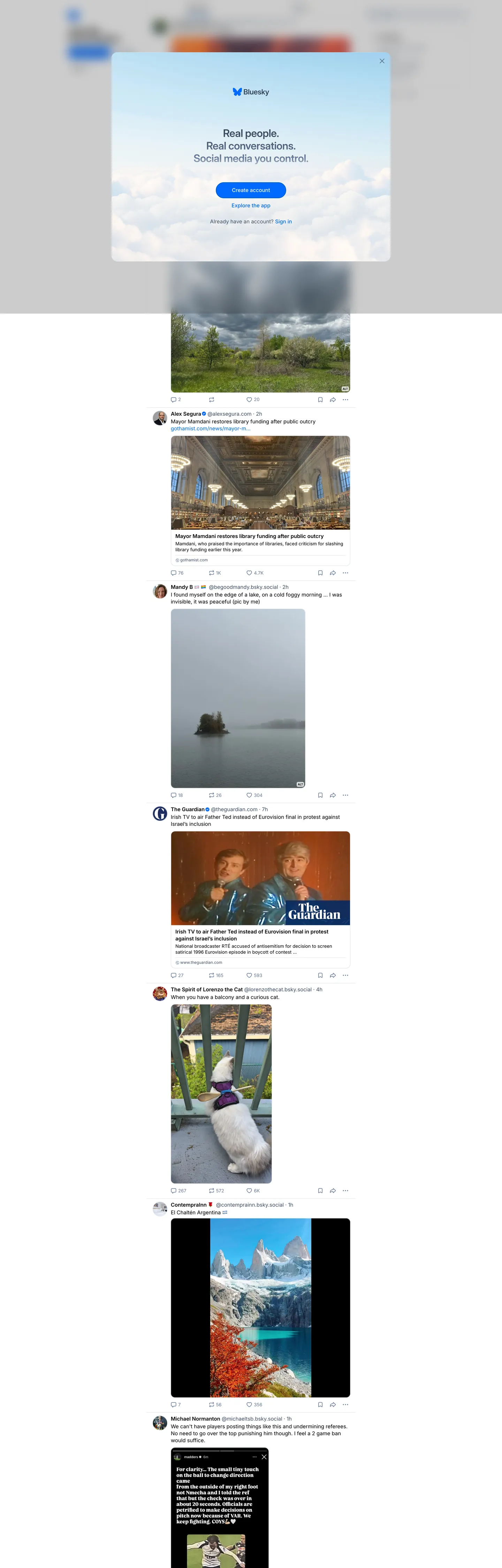
Bluesky's signed-out home is a darkened photo collage with a single auth modal floating over it. The chrome inside the modal is restrained to the point of severity: a near-white "#f9fafb" surface, an InterVariable 30px weight 600 headline reading "Real people. Real conversations. Social media as it should be.", three stacked full-pill buttons where the only saturated one carries the singular Bluesky Blue "#006aff" "Create account" CTA, and a faint sky-tinted "#c0dcf0" wordmark logo that's the only place the brand color softens. Beyond the modal, the page proper is a blurred social feed — mountain photographs, a darkened theater, a lone boat on the ocean — that the modal dims with a translucent scrim. There is no marketing hero, no feature grid, no testimonial wall. The chrome IS the auth surface.
This file packages the home-and-modal system as a single Google Labs DESIGN.md spec. Inside: 19 colors tokens covering the singular Bluesky Blue, the three-step structural ink ladder ("#000000" → "#405168" → "#667b99"), two off-whites ("#f9fafb" page wash, "#dce2ea" hairline border), the soft sky-tint "#c0dcf0" reserved for the wordmark, and a deep navy "#354358" used inside the gradient header strip; 11 InterVariable typography roles from 30px hero display down to 8px micro-label, all sharing one font stack with weight variation from 400-700; a four-step radius scale where "999px" full-pills dominate at 321 page occurrences against "12px" cards and "21px" modal corners; and 18 components recipes covering the floating modal, the three CTA pill variants, the post composer, the photo-attachment frame, and the feed card.
Feed this file to Claude, Cursor, or GitHub Copilot and the agent reproduces Bluesky's restraint — the singular blue pill, the InterVariable monotone, the modal-over-photograph composition — instead of inventing a generic social-app theme. Or reference the tokens directly when wiring a federated-network UI: every hex is quoted, every component recipe ready to paste into Tailwind config or CSS custom properties. The system is worth studying because it argues that a social network's marketing surface can be a single auth modal — that the whole brand expression on first load can collapse to one pill on one card, and trust the photographs behind to do the storytelling.
What makes it distinct
5
- Singular CTA voltageBluesky Blue '#006aff' is the only saturated chrome color and lives on one full-pill button per screen
- Pill-monopoly geometry'999px' radius hits 321 occurrences while the only other live radii are '12px' and '21px', leaving no square edges on interactive chrome
- Slate-on-white ink ladder'#000000' headlines step down through '#405168' slate to '#667b99' steel, three structural greys carry every text layer
- InterVariable at one faceevery typography role from the 30px hero down to the 8px micro-label runs the same InterVariable stack with no editorial serif and no display-tier swap
- Photo-feed canvas, modal chromethe home page is a darkened photograph wash with a single floating auth card, the design moves all branding into one centered '21px'-radius modal
bsky.app
Live at bsky.app
A snapshot of the brand in production. Scroll the frame to see the whole page.
Colors
19 colors
Bluesky's system runs on #006aff as its primary voltage, used in 2 of 18 components. Type is set in InterVariable across 11 tokens from 8px to 30px, weights 400–700. Shape language leans on pill geometry — fully rounded surfaces dominate the component library.
Brand & Accent
Sparing, CTA-only voltage · 1
Surface
Page and card backgrounds · 2
Text
Headlines, body, captions · 6
Borders & Hairlines
Dividers, outlines, rules · 3
Other
Specialty colors · 7
Typography
11 type tokens
Set in InterVariable across 11 tokens, from 8px to 30px, weights 400–700. Shown in its own stack: where the font isn't installed, the fallback the file names stands in.
- display-xl30px · weight 600 · lh 36px · tracking -0.5pxThe quick brown fox jumps over the lazy dog
- display-lg24.3px · weight 700 · lh 24.3px · tracking normalThe quick brown fox jumps over the lazy dog
- display-md20.6px · weight 600 · lh 20.6px · tracking -0.5pxThe quick brown fox jumps over the lazy dog
- body-lg15px · weight 400 · lh 24px · tracking normalThe quick brown fox jumps over the lazy dog
- body-md15px · weight 400 · lh 20px · tracking normalThe quick brown fox jumps over the lazy dog
- body-md-strong15px · weight 600 · lh 17px · tracking normalThe quick brown fox jumps over the lazy dog
- body-md-tight15px · weight 400 · lh 17px · tracking normalThe quick brown fox jumps over the lazy dog
- body-sm13.1px · weight 400 · lh 17px · tracking normalThe quick brown fox jumps over the lazy dog
- label-md13.1px · weight 500 · lh 17px · tracking normalThe quick brown fox jumps over the lazy dog
- caption11.3px · weight 400 · lh 15px · tracking normalThe quick brown fox jumps over the lazy dog
- micro8px · weight 700 · lh 8px · tracking normalThe quick brown fox jumps over the lazy dog
Layout
Radii and spacing
5 corner radii and 8 spacing values. Shape language: pill.
Radii
- none0px
- sm4px
- md12px
- lg21px
- full999px
Spacing
- xxs2px
- xs4px
- sm5px
- base8px
- md10px
- lg12px
- xl16px
- xxl24px
Components
18 components
Each rendered from its tokens (color, type, radius, padding) on Bluesky's own canvas.
- Button Primarybutton-primaryButton Primary
- Button Primary Hoverbutton-primary-hoverButton Primary Hover
- Button Secondarybutton-secondaryButton Secondary
- Button Ghostbutton-ghostButton Ghost
- Language Chiplanguage-chipLanguage Chip
- Auth Modalauth-modalAuth Modal
- Modal Scrimmodal-scrimModal Scrim
- Hero Headinghero-headingHero Heading
- Hero Taglinehero-taglineHero Tagline
- WordmarkwordmarkWordmark
- Type here…text-inputText Input
- Type here…text-input-focusText Input Focus
- Feed Cardfeed-cardFeed Card
- Post Attachment Imagepost-attachment-imagePost Attachment Image
- Post Meta Labelpost-meta-labelPost Meta Label
- Inline Linkinline-linkInline Link
- Footer Linkfooter-linkFooter Link
- DividerdividerDivider
In use
The system, in use
Bluesky's tokens on the kind of product it builds.
Build something people actually use.
A short paragraph of marketing copy that previews how the brand's display tier and body tier read together. Two sentences is usually enough.
FAQ
Bluesky design system FAQ
Common questions about Bluesky's tokens, components, and how to use this DESIGN.md in your project.
Read next
Related reading
Specs, directories, and component libraries that pair with this design system.
- Browse all design systemsThe full directory of DESIGN.md files on shadcn.io, with live mockups for each.shadcn.io
- Bluesky — official siteA federated social network built on the AT Protocol — choose your moderation, own your following graph.bsky.app (opens in a new tab)
- The DESIGN.md specificationGoogle Labs' open spec for machine-readable design system files — the format this page is built on.github.com (opens in a new tab)
Use it
Use Bluesky in your project
One machine-readable file. Drop it into Claude, Cursor, or any AI tool that reads DESIGN.md.
Download the DESIGN.md
One machine-readable file: every color, type, radius, spacing, and component token of Bluesky.
Feed it to your AI tool
Drop it into Claude, Cursor, or GitHub Copilot. The agent writes React components and Tailwind classes that match Bluesky's visual language.
Reference the tokens directly
Or paste the values into your Tailwind config, CSS variables, or component library: every color, size and radius is a quoted, ready-to-copy value.
Read the full DESIGN.md: overview, rationale, do’s and don’ts
Overview
Bluesky's signed-out home is a single auth modal floating over a darkened photo-feed wash. The outer page background is a translucent scrim {colors.modal-overlay} over a blurred social timeline — mountain photographs, a theater interior, a lone boat on the ocean, indoor dinner scenes — and the only chrome on screen is one centered {components.auth-modal} card at {rounded.lg} ("21px") corner radius. Inside the modal, an InterVariable 30px weight 600 headline reads "Real people. Real conversations. Social media as it should be." with -0.5px tracking, three stacked full-pill buttons sit beneath it, and a sky-tinted {colors.sky-tint} ("#c0dcf0") wordmark glyph anchors the header. The Bluesky Blue voltage {colors.primary} ("#006aff") lives in exactly one place: the topmost "Create account" pill.
Modal-as-marketing: where most social networks lead with a marketing hero — a feature grid, a testimonial wall, a pricing band, a screenshot mockup — Bluesky collapses the entire signed-out experience to one auth card. The page IS the modal; the rest of the viewport is a darkened photograph showing what the network actually contains. The decision argues that a federated social platform's strongest first impression is the work itself, dimmed just enough that the chrome reads cleanly. Unlike the convention of pairing a saturated marketing band with a separate sign-in button in the top right, Bluesky has no marketing band — the saturation budget is a single #006aff pill carrying both the brand and the conversion in one rectangle.
The typography is the second discipline. Single-face monotone: every text role on the page renders in InterVariable, from the 30px hero headline down to the 8px micro-label inside post-meta tags. No editorial serif, no monospace, no display-tier swap. The variation comes from weight (400 / 500 / 600 / 700) and size (8 / 11.3 / 13.1 / 15 / 20.6 / 24.3 / 30px) only. Tracking is normal across nine of the eleven roles; only the 30px hero and the 20.6px display-md carry -0.5px negative letter-spacing. Where Discord runs two faces (Ginto Discord + Ginto Discord Nord) for a shouted / spoken binary, Bluesky runs one face and lets weight do the entire register-distinction work — a posture closer to early Twitter than to a 2024-vintage fintech.
Key Characteristics:
- Singular CTA voltage — Bluesky Blue
{colors.primary}("#006aff") appears only on the "Create account" full-pill, 65 page occurrences against the 5270 of black{colors.ink}("#000000") - Pill-monopoly geometry —
{rounded.full}("999px") radius hits 321 page occurrences, dominating against{rounded.md}("12px") at 100 and{rounded.lg}("21px") at 90 - Slate-on-white ink ladder — three structural greys (
{colors.ink-slate}"#405168",{colors.ink-steel}"#667b99",{colors.ink-mute}"#8798b0") step down from black for secondary text - InterVariable at every tier — no display-tier serif swap, no monospace, weight 400-700 carries the entire 11-role typography scale
- Photo-feed canvas — the signed-out home is a blurred timeline of actual user posts behind a
{colors.modal-overlay}scrim, not an illustrated hero band - Sky-tint wordmark — the soft
{colors.sky-tint}("#c0dcf0") is reserved for the brand glyph alone, never a button, never a chrome fill - Three-button auth stack — "Create account", "Sign in", and one ghost variant all share the 33px-tall, 999px-radius pill geometry inside the modal
Colors
The palette splits along function lines: one saturated brand voltage (Bluesky Blue), a three-step structural ink ladder for text, two off-whites for surfaces, a hairline grey for borders, a soft sky-tint reserved for the wordmark, and one deep-navy used inside the gradient header strip behind the modal.
- Bluesky Blue (
#006aff) — frequency 65. Used as text (63), background (2). The singular brand voltage on the chrome; carries the "Create account" pill and the inline-link text color. Lives in--text-link/--focus-coloranalog roles. Two background renders is its entire fill budget on the page. - Ink (
#000000) — frequency 5270. Used as text (2533), border (2734), background (3). The dominant ink color for headlines, button labels inside the auth modal, and every hairline boundary; carries the load-bearing structural role through the--textCSS variable. - Ink-slate (
#405168) — frequency 162. Used as text (161), border (1). The secondary text color for body paragraphs and footer links; lifts black just enough to read as "less load-bearing label" without breaking the monochrome ladder. - Ink-steel (
#667b99) — frequency 119. Used as text (117), gradient (2). The tertiary text color for post-meta timestamps, attribution lines, and caption text. Sits roughly halfway between slate and the lifted ash. - Ink-mute (
#8798b0) — frequency 8. Used as text (8). The lifted ash for placeholder text and disabled-state labels; the lightest readable text on the white surface. - Navy-deep (
#354358) — frequency 2. Used as text (1), gradient (1). The deep navy that anchors the gradient header strip behind the modal; clustered from two near-duplicate dark-slate variants in the extraction. Reads as the warm-dark tone the page resolves into above the photo wash. - Sky-tint (
#c0dcf0) — frequency 1. Used as background (1). The soft sky-blue reserved exclusively for the wordmark glyph. Brand-layer hex from the extraction; never used as a chrome fill, never used as a button. Single on-page render is its entire budget. - Page wash (
#f9fafb) — frequency 100. Used as text (2), background (98). The off-white surface for the auth modal interior; clustered from four near-duplicate near-white variants in the extraction. Lives in--backgroundand--rc-border-colorCSS variables. The page's default light surface. - Hairline (
#dce2ea) — frequency 150. Used as border (150). The hairline border color across every chrome boundary — modal edge, input border, feed-card outline. Declared as--backgroundLight. Pure border-only token; never used as a fill, never used as text. - Canvas (
#ffffff) — declared throughout the page wash cluster. The true white reserved for elevated surfaces (the ghost-button fill, the post-attachment background under photo content, the in-feed card surface) when it needs to read as one step brighter than#f9fafb. - Modal overlay (
rgba(0,0,0,0.55)) — declared on the scrim that dims the photo-feed behind the modal. The translucent black wash that turns the timeline into a darkened canvas without fully obscuring it. - Hairline-soft (
#e5e5e0) — declared as the secondary border tier for nested cards inside the feed. Sits one step lighter than the primary#dce2eahairline. - Focus ring (
#006aff) — declared as the same Bluesky Blue, exposed as a 2px focus outline on text inputs and pill buttons. Shares the brand voltage with the primary CTA; the focus ring is therefore always blue, never a separate focus-only color. - Link (
#006aff) — declared as the inline-link text color, identical to the brand voltage. There is no separate link color in the system; clicking a link IS clicking Bluesky Blue. - Scrim (
rgba(0,0,0,0.6)) — the darker scrim variant for the underlying photo-feed wash when the modal sits on top. Slightly heavier than the modal overlay to push the photo backdrop further into the background. - Divider (
#dce2ea) — identical to the hairline color, exposed under a separate token name for the 1px horizontal rules inside the auth modal between the button stack. - Surface-elevated (
#ffffff) — the canvas-white surface for the secondary-button fill and the feed-card background, one step above the#f9fafbpage wash. - Shadow-color (
rgba(0,51,0,0.2)) — reserved for the rare modal-edge shadow if a shadow is introduced; not present on the captured chrome but available as a low-saturation green-tinted black for legacy themes. - On-primary (
#ffffff) — the canvas-white text color on top of the Bluesky Blue pill. The only place white text appears on chrome is on the primary CTA.
Typography
Every text role on the page sits inside one face: InterVariable, declared with a full system-ui fallback stack (-apple-system, Segoe UI, Roboto, Helvetica, Arial, plus the two Apple/Segoe color emoji families). There is no editorial serif, no monospace face, and no proprietary display-tier swap. The variation is weight (400 / 500 / 600 / 700) and size (8 / 11.3 / 13.1 / 15 / 20.6 / 24.3 / 30px) only — a one-face monotone where the register-distinction work is carried by weight and size alone.
The display tier runs three sizes: 30px (display-xl, the hero headline "Real people. Real conversations. Social media as it should be.") at weight 600 with -0.5px tracking and 36px line-height; 24.3px (display-lg, the wordmark glyph register) at weight 700 with normal tracking; 20.6px (display-md, a rare secondary heading) at weight 600 with -0.5px tracking. The tracking pattern is unusual — only the two largest display tiers carry negative letter-spacing, and the gap to body sizes is normal across every other role.
Body and UI run six roles inside InterVariable: 15px weight 400 with 20px or 24px line-height (body-md / body-lg), 15px weight 600 with 17px line-height (body-md-strong, the button-label voice), 15px weight 400 with 17px line-height (body-md-tight, the nav-link variant), 13.1px weight 400 / 500 (body-sm / label-md), 11.3px weight 400 (caption, used in post-meta), and 8px weight 700 (micro, used in counts and badge labels). Line-heights run tight relative to size — 17px on 15px text is the workhorse rhythm, which keeps post bodies dense without crowding.
Layout
The page is a single full-viewport surface with one centered auth modal pinned at roughly viewport center. There is no marketing column, no grid system, no testimonial band. The outer surface is a darkened photo-feed wash — the actual Bluesky timeline blurred and dimmed behind a translucent scrim — and the modal sits as the only chrome element with structure.
Inside the modal, the layout is a vertical stack: wordmark glyph at the top in {colors.sky-tint} ("#c0dcf0"), 30px hero headline at {typography.display-xl} immediately beneath, a one-line body-md tagline at {colors.ink-slate} underneath, then three stacked full-pill buttons separated by 8px gaps — "Create account" at {colors.primary} ("#006aff"), "Sign in" as the ghost variant, and a language-selector chip at the bottom. Modal padding is roughly 24px on all four sides, modal width caps at roughly 380-420px, and the corner radius is {rounded.lg} ("21px") — chosen one step shy of full-pill to read as "card" rather than "button."
Spacing tokens lean on a tight 2-4-5-8-10-12-16-24 ladder. The 4px and 5px steps dominate (327 + 272 occurrences in the extraction) for UI-internal gaps, while the 8-10-12px range carries button padding and modal internal spacing, and 24px is the largest single spacing step on the captured chrome. There is no 32px or 48px section spacing because the page has no section structure — one modal, one canvas, no rhythm to set.
Elevation & Depth
Bluesky's signed-out chrome doesn't use drop shadows. The modal floats on the dimmed photo-feed wash through scrim-over-photograph layering: a {colors.modal-overlay} ("rgba(0,0,0,0.55)") translucent black wash dims the photo backdrop until the modal's #f9fafb page-wash surface reads as "lifted above" the canvas — no cast shadow needed because the light surface against a dimmed dark surface produces the elevation contrast on its own.
Inside the modal, every chrome element is flat: opaque single-fill pills on the off-white surface, a 1px {colors.hairline} border outlining the modal edge, and no inset shadows or focus-ring shadows. The blue pill is one flat #006aff fill with no gradient and no shadow, the ghost pill is one flat #ffffff fill with a hairline border, and the language-selector chip is the same canvas-white pill with the hairline outline. Depth comes from color step (modal-page-vs-darkened-canvas) and from the corner radius gap (21px outer modal vs 999px inner pills) — never from cast shadow.
The translucent scrim is the only opacity-based effect on the page. Even the modal itself is fully opaque against the scrim, so the photo-feed shows through only at the edges of the viewport, not under the modal. This is the inverse of the more common pattern where a dialog adds its own shadow on top of a transparent overlay; here the overlay does the entire elevation work.
Shapes
The radius scale is dominated by 999px full-pills — 321 occurrences in the extracted CSS against 100 for 12px cards, 90 for 21px modal corners, and 10 for a rare 4px (likely the language-selector dropdown caret). Every interactive element on the chrome — primary CTA, ghost button, language chip, text input, post-attachment image frame — collapses to a full-pill geometry. The chrome avoids the 6-10-16px middle radius tier almost entirely; nothing on this page sits in the 5-15px range outside of the singular 12px and 21px card surfaces.
The two load-bearing radii are 21px and 999px. Modal-at-21, pill-at-999 is the entire system: the outer auth modal gets the 21px corner (reads as "card"), every interactive inside the modal gets the 999px full-pill (reads as "tap target"), and nested feed cards drop to 12px (reads as "content frame"). The 4px step exists for one element — the language-selector caret-and-divider — and the 0px step appears nowhere on chrome.
Components
- button-primary — Bluesky Blue
{colors.primary}("#006aff") fill, canvas-white text, InterVariable 15px weight 600 body-md-strong, 999px full-pill radius, 8px × 14px padding, 33px tall, no border. The single primary CTA shape; "Create account" is the only on-page render. - button-primary-hover — Same Bluesky Blue fill, lifted to opacity 0.92 on hover rather than a separate hover-blue. Same geometry; the brand voltage stays exactly
#006affand the hover signal is one-step transparency. - button-secondary — Canvas-white
{colors.canvas}("#ffffff") fill, ink text, body-md-strong typography, 999px full-pill radius, 8px × 14px padding, 33px tall, 1px hairline border. The "Sign in" variant beneath the primary CTA. - button-ghost — Transparent fill, ink-slate
{colors.ink-slate}("#405168") text, body-md typography, 999px full-pill radius, 8px × 14px padding, 33px tall, no border. Used for tertiary actions inside the modal footer. - language-chip — Canvas-white fill, ink-slate text at body-sm 13.1px, 999px full-pill radius, 5px × 12px padding, 29px tall, 1px hairline border. The language-selector pill at the modal footer ("English" with a caret affordance).
- auth-modal — Page-wash
{colors.page}("#f9fafb") fill, ink text, body-md typography, 21px corner radius, 24px padding on all four sides, 1px hairline border. The single chrome element on the signed-out home; everything else is either inside it or on the scrim behind it. - modal-scrim — Translucent black
{colors.modal-overlay}("rgba(0,0,0,0.55)") full-viewport overlay, no padding, no border. Sits between the photo-feed canvas and the modal to dim the backdrop without fully obscuring it. - hero-heading — Transparent fill, ink text at
{typography.display-xl}30px weight 600 with -0.5px tracking, 36px line-height. The "Real people. Real conversations. Social media as it should be." headline inside the modal. - hero-tagline — Transparent fill, ink-slate text at body-md 15px weight 400, 20px line-height. The one-line subhead beneath the hero headline ("Find your community...").
- wordmark — Transparent fill, sky-tint
{colors.sky-tint}("#c0dcf0") text/glyph color at display-lg 24.3px weight 700. The brand glyph at the top of the modal; the only place the soft sky-tint appears on the page. - text-input — Canvas-white fill, ink text at body-md, 999px full-pill radius, 11px × 16px padding, 40px tall, 1px hairline border. The login email/handle input inside the sign-in variant.
- text-input-focus — Same surface, focus signaled by a 1px
{colors.focus-ring}("#006aff") border replacing the hairline border. No separate focus-ring shadow. - feed-card — Canvas-white fill, ink text at body-md, 12px corner radius, 12px padding, 1px hairline border. The wrapper for post-content cards in the feed-wash backdrop.
- post-attachment-image — Hairline-grey placeholder fill, full-pill 999px radius (rare for an image frame), no padding, no border. Photographs attached to feed posts render inside a fully-rounded frame, a signature shape move.
- post-meta-label — Transparent fill, ink-steel
{colors.ink-steel}("#667b99") text at caption 11.3px weight 400, 15px line-height. Timestamps, repost counts, and attribution lines inside feed cards. - inline-link — Transparent fill, link
{colors.link}("#006aff") text at body-md weight 400. Identical to the brand voltage; hyperlink runs are always Bluesky Blue. - footer-link — Transparent fill, ink-slate text at body-sm 13.1px weight 400. The legal/footer link rail at the very bottom of the modal scrim.
- divider — Hairline fill
{colors.divider}("#dce2ea"), 1px tall, no padding. The 1px horizontal rule between modal sections (rare; used inside expanded sign-in variants).
Do's and Don'ts
Do keep Bluesky Blue #006aff to the single primary CTA pill. The captured page renders it as a background fill on exactly 2 elements (against 5270 black renders for chrome ink) — three or more blue surfaces on chrome breaks the singular-voltage discipline and lifts the page into a generic-saas-marketing register the brand explicitly avoids.
Do stack every interactive control as a 999px full-pill at 33px tall with 8px × 14px padding. The three-button auth stack is the system's chrome rhythm; introducing a square-cornered control inside the modal would visually shatter the pill-monopoly geometry that gives the page its consistency.
Do render every text role in InterVariable. The single-face monotone is load-bearing — a serif display tier or a monospace inline-code register would break the "weight does the work" register-distinction the system depends on.
Don't introduce a third radius between 12px and 21px. The modal sits at 21px (outer card), nested feed cards at 12px (inner content frame), and pills at 999px (interactive). Adding 16px in the middle erases the chrome-vs-content boundary the radius gap is encoding.
Don't use #c0dcf0 ("sky-tint") as a button fill or chrome background. It's a wordmark-only token, with exactly one on-page render. Promoting it to chrome creates a second blue voltage on the page, which collapses the singular-Bluesky-Blue discipline into a two-blue gradient that reads as a generic tech-brand pastel.
Don't add a drop shadow to the auth modal. The elevation effect comes from the rgba(0,0,0,0.55) scrim dimming the photo backdrop; introducing a 0-8px shadow on the modal itself doubles the elevation cue and visually detaches the modal from the scrim it's anchored to.
Don't sub InterVariable for a geometric display face like Manrope or Geist on the 30px hero. The brand reads as a familiar federated social network precisely because the hero tier IS the same Inter as the body — swapping the hero to a separate display register pushes the chrome toward a "marketing landing page" voice that the home page is explicitly avoiding.
Don't use #000000 as a button background on chrome. Black appears as the dominant text and border color (5270 occurrences) but never as a button fill — the primary action is always Bluesky Blue, the secondary is canvas-white-with-hairline, and a black pill would read as a system-error state or as an unintended "dark mode preview."
Known Gaps
- Signed-in feed shell (column rail, post composer, timeline algorithm switcher, notifications) is out of scope — the captured surface is the signed-out auth home only. The component recipes here cover the modal, the three auth pills, and the feed-wash backdrop, not the in-product chat or timeline shells.
- Mobile breakpoint behavior is not captured. The modal-over-photo composition is known to collapse to a full-bleed page on small screens with the three pills filling the viewport, but the exact responsive pixel values aren't in the extracted tokens.
- Dark mode for the in-product surface is real on iOS and Android, but the signed-out home renders only the light-canvas variant. The dark-mode ink ladder (white-on-black-on-deep-slate) is not in this DESIGN.md.
- Motion — the photo-feed wash behind the modal cycles through different blurred timeline samples on each load with a subtle fade transition; the exact timing function and the in-product post-attachment / repost animations are not in the captured tokens.
- Form validation — error-state borders, helper-text styles, and inline form-validation messaging on the sign-in input are not captured beyond the default focus-ring color.
- Moderation and labeling surfaces — the content-warning overlays, the label-applied badges, and the moderation-list management chrome are unique to Bluesky's federated AT Protocol design but live entirely inside the signed-in app, outside this DESIGN.md.
Social & Community
More systems like this
More DESIGN.md files in Social & Community.
Pricing
Build it with Pro
The DESIGN.md files are free. Pro adds 6,000+ blocks, premium templates and the MCP server, so your AI editor builds in your system for you.
4.9/5 out of 5 · 150+ reviewsfrom 150+ founders and developers.
Billing
Billed once a year in USD. Cancel anytime.
- How many people can use the license.
- Client work, SaaS products and anything you charge for.
- Production-ready React sections: hero, pricing, features, dashboards and more.
- Complete multi-page sites you can ship as they are.
- React icons from every major library, installable with one command.
- Presets that restyle every block, in light and dark.
- Lets your AI editor search, preview and install blocks for you.
- Priority requests are answered first.
Individual
For personal projects & open source
$32instead of $49/mo
$389 billed yearly
- Seats: 1 seat
- Commercial use: Personal & open source only
- Pro blocks: 6,000+ blocks
- Templates: All 14 templates
- React icons: 294k+ icons
- Themes: All 59 themes
- MCP server: Basic usage
- Support: Standard
Team
Most popularFor freelancers, agencies & startups
$66instead of $99/mo
$789 billed yearly · ≈ $13/dev/mo
- Seats: Up to 5 seats
- Commercial use: Included
- Pro blocks: 6,000+ blocks
- Templates: All 14 templates
- React icons: 294k+ icons
- Themes: All 59 themes
- MCP server: High usage
- Support: Priority
Organization
For companies with larger teams
$132instead of $199/mo
$1,589 billed yearly
- Seats: Unlimited seats
- Commercial use: Included
- Pro blocks: 6,000+ blocks
- Templates: All 14 templates
- React icons: 294k+ icons
- Themes: All 59 themes
- MCP server: Unlimited usage
- Support: Priority
Billed once a year in USD. Cancel anytime.
Individual
For personal projects & open source
$32instead of $49/mo
$389 billed yearly
- How many people can use the license.Seats: 1 seat
- Client work, SaaS products and anything you charge for.Commercial use: Personal & open source only
- Production-ready React sections: hero, pricing, features, dashboards and more.Pro blocks: 6,000+ blocks
- Complete multi-page sites you can ship as they are.Templates: All 14 templates
- React icons from every major library, installable with one command.React icons: 294k+ icons
- Presets that restyle every block, in light and dark.Themes: All 59 themes
- Lets your AI editor search, preview and install blocks for you.MCP server: Basic usage
- Priority requests are answered first.Support: Standard
Team
Most popularFor freelancers, agencies & startups
$66instead of $99/mo
$789 billed yearly · ≈ $13/dev/mo
Everything in Individual, plus
- How many people can use the license.Seats: Up to 5 seats
- Client work, SaaS products and anything you charge for.Commercial use: Included
- Lets your AI editor search, preview and install blocks for you.MCP server: High usage
- Priority requests are answered first.Support: Priority
Organization
For companies with larger teams
$132instead of $199/mo
$1,589 billed yearly
Everything in Team, plus
- How many people can use the license.Seats: Unlimited seats
- Lets your AI editor search, preview and install blocks for you.MCP server: Unlimited usage
- Secure checkout via Stripe
- Code lives in your repo
- Keep what you've shipped if you cancel
- License terms
Your system, built for you
Every block, template and icon, installed by your AI agent in your design system. The DESIGN.md files stay free.