Nextdoor Design System
Nextdoor's marketing design system as a DESIGN.md file. Forest green on white, Saans proprietary sans, photo-over-card hero, 7 colors, 15 components. For React, Next.js, and AI tools.
Add shadcn.io to your AI agent. · Pro It installs blocks, icons and templates in your design system from a prompt, with Pro.
Set up MCP- Primary
- #1b8751
- Typeface
- Saans
- Shape
- Mixed
- Base radius
- 12px
- Colors
- 7
- Type tokens
- 8
- Components
- 15
- Spacing values
- 8
About
About Nextdoor DESIGN.md
Curated by Dov Azencot · Updated May 19, 2026 · Source nextdoor.com (opens in a new tab)
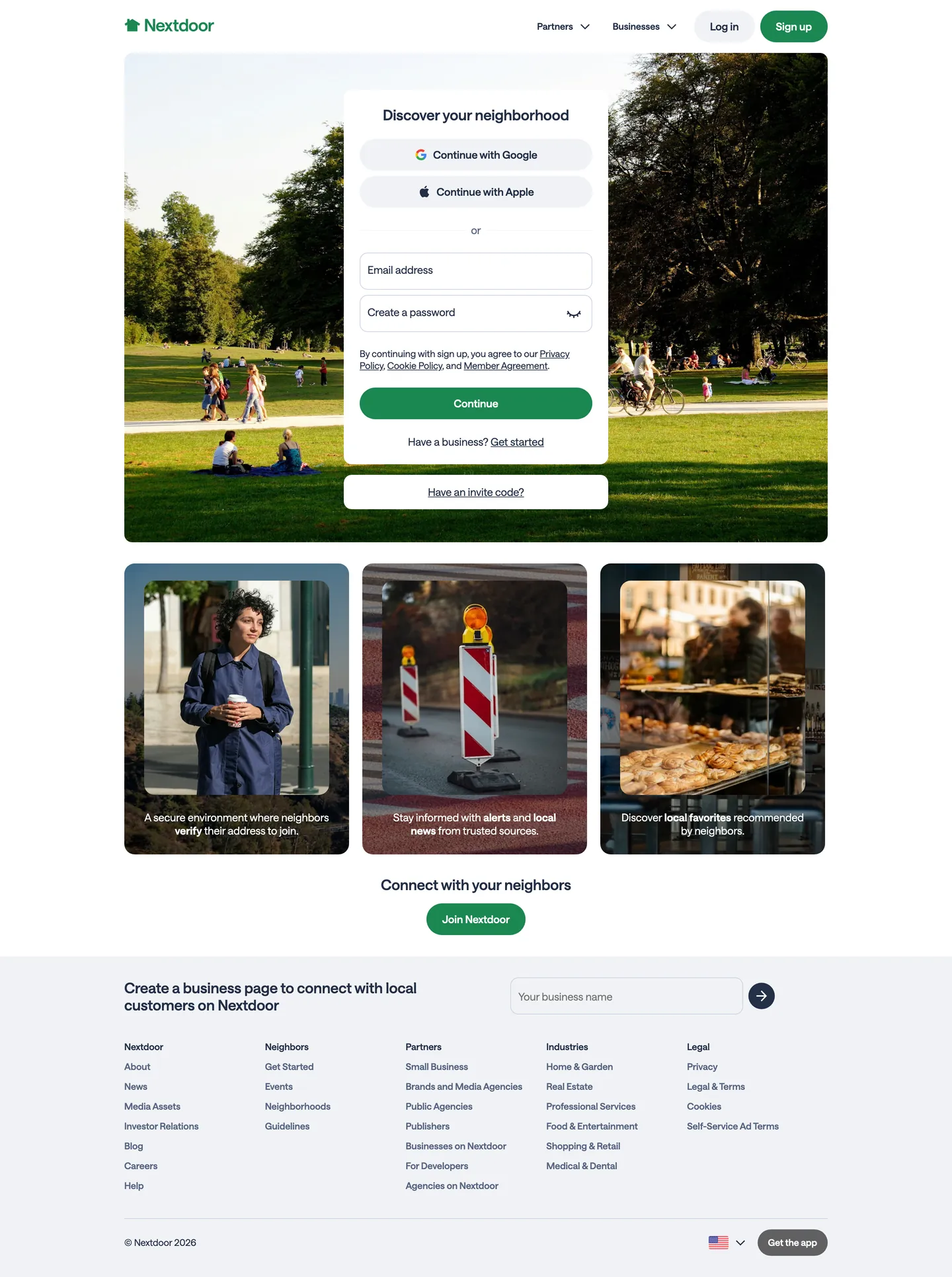
Nextdoor's homepage makes a move that few social products attempt: it puts a full-bleed photograph of an actual park in the hero slot, and places the sign-up form over it as a floating white card. The headline reads "Discover your neighborhood" in a 22px semi-condensed weight of the brand's proprietary Saans typeface. There is no gradient, no illustrated scene, no abstract shape. The implication is that the neighborhood is already there, and the product is the window. Where Facebook's marketing surface uses studio photography of product UI and Instagram leans on a gradient-branded icon wall, Nextdoor bets on documentary photography of public outdoor space.
The brand voltage is a single forest green — saturated and unmistakably outdoorsy — wired into every interactive surface: the logo mark, the primary CTA button in the hero card, and the "Join Nextdoor" pill in the mid-page feature row. Every other surface on the page is white or a blue-gray near-ink. The typography runs on Saans, a custom variable sans, at fractional weights that don't correspond to the CSS standard steps — 420 for body, 620 for headlines and labels, 700 for bold emphasis. The weight names suggest a variable font axis, and the result is a type hierarchy that feels calibrated rather than pulled from a preset.
Feed this file to an AI coding tool and it reproduces Nextdoor's moves: forest-green single-voltage on white, floating card over photograph for the hero, Saans-equivalent variable weight typography, and full-pill rounding reserved for CTAs while cards use the 12px contained tier. The one distinctive bet worth noting: the photo-as-hero strategy only reads as "neighborhood authenticity" when the photography itself is warm, outdoor, and non-staged — substitute a studio shot of a phone screen and the visual argument evaporates entirely.
What makes it distinct
5
- Photo-as-hero canvasa full-bleed park photograph replaces the typical gradient or flat color, with the sign-up card centered over it as a floating white panel
- Single forest-green voltagethe brand green appears exactly on the logo, the primary CTA button, and the 'Join Nextdoor' pill below the fold; every other surface is white or near-ink
- Saans variable weight systemthe custom proprietary sans runs at fractional weights (420 for body, 620 for labels/headings) rather than the standard 400/600 steps
- Blue-gray ink stackthe primary text tone is a blue-gray near-ink rather than pure black, giving the typography a slightly cooler, editorial feel
- Pill-dominant radius scale10000px (full pill) is the most-used border-radius value, appearing on CTA buttons and form elements; 12px carries inputs and cards
nextdoor.com
Live at nextdoor.com
A snapshot of the brand in production. Scroll the frame to see the whole page.
Colors
7 colors
Nextdoor's system runs on #1b8751 as its primary voltage, used in 1 of 15 components. Type is set in Saans across 8 tokens from 14px to 22px, weights 420–700. Shape language is mixed across 15 components, blending pills, soft rounds, and squarer corners.
Brand & Accent
Sparing, CTA-only voltage · 1
Surface
Page and card backgrounds · 3
Text
Headlines, body, captions · 2
Borders & Hairlines
Dividers, outlines, rules · 1
Typography
8 type tokens
Set in Saans across 8 tokens, from 14px to 22px, weights 420–700. Shown in its own stack: where the font isn't installed, the fallback the file names stands in.
- display-md22px · weight 620 · lh 26pxThe quick brown fox jumps over the lazy dog
- heading-md16px · weight 620 · lh 20pxThe quick brown fox jumps over the lazy dog
- body-md16px · weight 420 · lh 20pxThe quick brown fox jumps over the lazy dog
- body-sm14px · weight 420 · lh 18pxThe quick brown fox jumps over the lazy dog
- label-md14px · weight 620 · lh 18pxThe quick brown fox jumps over the lazy dog
- body-strong16px · weight 700 · lh 20pxThe quick brown fox jumps over the lazy dog
- button-md16px · weight 620 · lh 20pxThe quick brown fox jumps over the lazy dog
- nav-link14px · weight 620 · lh 18pxThe quick brown fox jumps over the lazy dog
Layout
Radii and spacing
5 corner radii and 8 spacing values. Shape language: mixed.
Radii
- none0px
- sm8px
- md12px
- lg16px
- full10000px
Spacing
- xs4px
- sm8px
- md12px
- base16px
- lg20px
- xl24px
- 2xl32px
- 3xl64px
Components
15 components
Each rendered from its tokens (color, type, radius, padding) on Nextdoor's own canvas.
- Button Primarybutton-primaryButton Primary
- Button Secondarybutton-secondaryButton Secondary
- Button Oauthbutton-oauthButton Oauth
- Top Navtop-navTop Nav
- Nav Linknav-linkNav Link
- Hero Headinghero-headingHero Heading
- Hero Cardhero-cardHero Card
- Body Paragraphbody-paragraphBody Paragraph
- Body Paragraph Mutedbody-paragraph-mutedBody Paragraph Muted
- CardcardCard
- Type here…text-inputText Input
- Photo Tilephoto-tilePhoto Tile
- FooterfooterFooter
- Footer Headingfooter-headingFooter Heading
- Business Inputbusiness-inputBusiness Input
In use
The system, in use
Nextdoor's tokens on the kind of product it builds.
Build something people actually use.
A short paragraph of marketing copy that previews how the brand's display tier and body tier read together. Two sentences is usually enough.
- · 1 project
- · Community support
- · 10k req/mo
- · 10 projects
- · Priority support
- · 1M req/mo
- · Custom domains
- · Unlimited
- · SLA
- · Audit log
- · SSO
FAQ
Nextdoor design system FAQ
Common questions about Nextdoor's tokens, components, and how to use this DESIGN.md in your project.
Read next
Related reading
Specs, directories, and component libraries that pair with this design system.
- Browse all design systemsThe full directory of DESIGN.md files on shadcn.io, with live mockups for each.shadcn.io
- Nextdoor — official siteNextdoor's public marketing site — the source of truth for the live tokens captured in this file.nextdoor.com (opens in a new tab)
- The DESIGN.md specificationGoogle Labs' open spec for machine-readable design system files — the format this page is built on.github.com (opens in a new tab)
Use it
Use Nextdoor in your project
One machine-readable file. Drop it into Claude, Cursor, or any AI tool that reads DESIGN.md.
Download the DESIGN.md
One machine-readable file: every color, type, radius, spacing, and component token of Nextdoor.
Feed it to your AI tool
Drop it into Claude, Cursor, or GitHub Copilot. The agent writes React components and Tailwind classes that match Nextdoor's visual language.
Reference the tokens directly
Or paste the values into your Tailwind config, CSS variables, or component library: every color, size and radius is a quoted, ready-to-copy value.
Read the full DESIGN.md: overview, rationale, do’s and don’ts
Overview
Nextdoor's marketing site makes a structural argument about what a neighborhood social network is. Photography as brand medium. The hero is a full-bleed park photograph — warm sunlight, people on grass, mature trees — and the sign-up form appears as a floating white card centered over it. No gradient, no illustration, no product UI mock. Where Facebook uses studio-quality social imagery and Instagram leans on a rainbow gradient, Nextdoor bets that showing the actual outdoors is more persuasive for a product about physical communities than any brand-designed visual could be.
The chromatic system underneath that photograph is minimal by necessity. One forest-green voltage ({colors.primary}) carries every interactive surface — the logo wordmark in the nav, the "Continue" CTA button inside the hero card, and the "Join Nextdoor" pill in the feature band below the fold. The page's text sits in a blue-gray near-ink ({colors.ink}) rather than pure black, giving the typography a slightly cooler register that reads as trustworthy-municipal rather than tech-product. The canvas is white throughout; there is no tinted surface or dark mode.
Key Characteristics:
- Single forest-green voltage (
{colors.primary}) used exclusively on the logo, primary CTA fills, and the community-join pill — three occurrences above the fold, two below. - Blue-gray near-ink text (
{colors.ink}) rather than pure black — wired as --nd-color-fgStrong and --nd-color-blueGray70; the cool tint distinguishes body text from a pure-neutral typography system. - Proprietary Saans variable sans running at fractional weights 420 (body), 620 (headings/labels), 700 (bold) — not the CSS standard 400/600/700 steps.
- Full-pill rounding (
{rounded.full}— 10000px) on every CTA button; 12px contained rounding on inputs and cards. - Photo-over-card hero: the sign-up card is a white panel with soft shadow, positioned over but not obscuring the photography; the park scene remains visible around and behind it.
- Three editorial photography tiles below the hero carry inline captions on dark overlay, showing neighborhood scenes (community members, street alerts, local food).
- Footer resolves to a dense multi-column link grid in ink on white — no background surface, no brand chrome.
Colors
Brand
- Primary Green (
{colors.primary}— #1b8751): frequency 4. Used as background — the logo mark, the primary CTA button in the hero card, the "Join Nextdoor" pill. Wired in CSS as --theme-ui-colors-greens-core, --brand-logo, --nd-color-staticLogo, --nd-color-green40. The sole chromatic brand signal on the page; every other interactive surface is white.
Surface
- Canvas (
{colors.canvas}— #ffffff): frequency 174. The dominant surface — the page background, the hero card, the nav, every content band below the fold. Wired as --nd-color-bgPrimary and --nd-color-bgElevated. - Surface-1 (
{colors.surface-1}— #f0f2f5): frequency 4. The page base tone — used for the outer page background, the inset field background inside the hero card. Wired as --nd-color-bgBase and --nd-color-bgInlay. - Surface-2 (
{colors.surface-2}— #cad3e5): frequency 6. A soft blue-gray used for card background fill and for the shadow on the floating hero card. Wired as --nd-color-bgUnderlay and --nd-color-blueGray10.
Text
- Ink (
{colors.ink}— #232f46): frequency 223. The primary text tone — used for headlines, body paragraphs, nav labels, and link text. Wired as --nd-color-fgPrimary, --nd-color-fgStrong, --nd-color-blueGray70. Noticeably blue-gray rather than neutral black. - Ink Muted (
{colors.ink-muted}— #576580): frequency 58. Secondary text — footer sub-labels, form helper text, secondary nav items. Wired as --nd-color-fgSecondary and --nd-color-blueGray50.
Hairline
- Hairline (
{colors.hairline}— #cad3e5): used for input borders, card outlines, and the footer top rule. Shares value with surface-2; the same blue-gray handles both light surface fills and 1px divider lines.
Typography
Font Family
The system runs Saans across every tier — a proprietary custom variable sans that Nextdoor ships with their marketing site. Fallbacks walk to system-ui, -apple-system, HelveticaNeue, Helvetica, Roboto, "Segoe UI", Arial, sans-serif. There is no separate display family, serif tier, or mono voice; one variable-weight sans handles everything. The weight axis operates at fractional steps: 420 is the body register, 620 is the heading and label register, 700 is the bold/strong tier.
Hierarchy
| Token | Size | Weight | Line Height | Use |
|---|---|---|---|---|
{typography.display-md} | 22px | 620 | 26px | Hero h1 ("Discover your neighborhood") |
{typography.heading-md} | 16px | 620 | 20px | Feature-tile headings, section sub-titles |
{typography.body-md} | 16px | 420 | 20px | Default body text, form field text, footer columns |
{typography.body-sm} | 14px | 420 | 18px | Sub-labels, photo-tile captions, helper text |
{typography.label-md} | 14px | 620 | 18px | Footer column headings, nav link labels, active states |
{typography.body-strong} | 16px | 700 | 20px | Bold emphasis within body copy |
{typography.button-md} | 16px | 620 | 20px | CTA button labels, OAuth button labels |
{typography.nav-link} | 14px | 620 | 18px | Top-nav link labels |
Principles
The display tier is modest — 22px at weight 620. The headline sits over a full-bleed photograph and competes with photography; making it larger would fight the image. Saans at 620 is the system's one emphasis step. Body runs at 420, which reads like a custom light-medium between standard 400 and 500. There is no ultra-light or heavy tier; the weight range is deliberately compressed.
Note on Font Substitutes
Saans is proprietary. Inter with variable font support is the closest open-source substitute — set weight 420 to font-weight: 400 and weight 620 to font-weight: 575 (using font-weight-adjust or the variable axis directly). For the 700 tier, standard Inter bold transfers cleanly.
Layout
Spacing System
- Base unit: 8px.
- Tokens:
{spacing.xs}4px ·{spacing.sm}8px ·{spacing.md}12px ·{spacing.base}16px ·{spacing.lg}20px ·{spacing.xl}24px ·{spacing.2xl}32px ·{spacing.3xl}64px. - Hero card internal padding: 24px on all sides; the card holds the headline, two OAuth buttons, the email/password fields, and the primary CTA button.
- Feature-tile padding: implicit — each tile is an edge-to-edge photograph with an overlay caption strip at 24px internal left/bottom padding.
Grid & Container
- Max content width: ~1280px on the nav and footer; the hero photograph is full-bleed behind the centered 360px card.
- Hero: full-bleed photograph, white card centered horizontally and positioned in the upper-center third.
- Feature band (mid-page): 3-column photography tile grid at desktop, each tile carrying an overlay text label.
- "Connect with your neighbors" band: centered headline + single green pill CTA on white canvas.
- Business CTA band: two-column layout, left side a headline and sub-paragraph, right side an inline email-capture input.
- Footer: 5-column link grid (Nextdoor, Neighbors, Partners, Industries, Legal) at desktop.
Rhythm
The page alternates between full-bleed photograph (hero), contained white editorial (feature tiles), and pure-white typography bands. There is no tinted background surface shift — every non-photo band is white canvas. Depth comes from the hero card's shadow rather than surface-color stacking.
Elevation
The system uses a single elevation tier — the hero sign-up card. A soft drop shadow ({colors.surface-2} at low opacity) lifts the white card off the photograph. No other surface on the page uses a shadow; cards in the content bands below the fold sit flat on white canvas with hairline borders.
- Flat (no shadow): every content surface below the hero — feature tiles, editorial bands, footer.
- Card elevation: the hero sign-up card carries the only shadow, distinguishing it from the photograph behind it.
Shapes
The radius scale is binary with a dominant pill tier:
{rounded.none}0px — the full-bleed photo tiles; photography tiles are edge-to-edge flush with no rounding.{rounded.sm}8px — minor UI surfaces; small chips.{rounded.md}12px — text inputs (email, password), the business CTA input, secondary content cards.{rounded.lg}16px — the hero card's container, larger content tiles.{rounded.full}10000px — primary and secondary CTA buttons, OAuth buttons, the "Join Nextdoor" community pill. The most-used radius value on the page.
The full-pill treatment on every button is Nextdoor's single shape statement. The rest of the system is contained-card; the pill is reserved for every call to action.
Components
button-primary — Forest-green {colors.primary} fill, white text, full-pill {rounded.full} radius, 8×24px padding, 40px height. "Continue" inside the hero sign-up card is the canonical instance; "Join Nextdoor" in the feature band is the same component.
button-secondary — White {colors.canvas} fill, ink text, 1px ink border, full-pill {rounded.full} radius, 8×16px padding. Used for "Have a business? Get started" and "Have an invite code?" below the primary CTA.
button-oauth — White fill, ink text, hairline border, full-pill {rounded.full} radius, 44px height. Used for "Continue with Google" and "Continue with Apple" with inline brand icons.
top-nav — White canvas, 56px height, hairline bottom rule. Carries the Nextdoor wordmark flush left, the Partners / Businesses dropdowns and Log In link in the center-right, and the green "Sign up" pill button flush right.
nav-link — Transparent background, ink text in {typography.nav-link} (14px / 620), 8×12px padding.
hero-heading — Ink {colors.ink} text, Saans 22px / 620. The "Discover your neighborhood" headline sits inside the white hero card, not over the photograph directly.
hero-card — White {colors.canvas} fill, {rounded.lg} 16px radius, 24px padding. Floats over the hero photograph with a soft shadow; contains the headline, OAuth buttons, form fields, and primary CTA.
body-paragraph — Ink text at {typography.body-md} — the footer columns and the mid-page editorial paragraphs.
body-paragraph-muted — Muted {colors.ink-muted} at {typography.body-sm} — helper text under form fields, secondary sub-labels.
card — White fill, {rounded.md} 12px radius, 16px padding, 1px hairline border. The default content card in feature and business sections.
text-input — White fill, ink text, {rounded.md} 12px radius, 22px top / 12px side / 8px bottom padding (floating-label pattern), 56px height, hairline border. The email and password fields in the hero card use a floating-label interaction pattern where the placeholder lifts on focus.
photo-tile — Edge-to-edge photography with no rounding ({rounded.none}), ink overlay at reduced opacity, white overlay-caption text in {typography.body-sm}. Used in the 3-column feature band below the hero.
footer — White canvas, muted-gray text, 32×24px padding, hairline top rule. Five-column link grid.
footer-heading — Ink text at {typography.label-md} (14px / 620) — the column headings (Nextdoor, Neighbors, Partners, Industries, Legal).
business-input — White fill, ink text, {rounded.md} 12px radius, 48px height, hairline border. The "Your business name" inline capture field in the business CTA band.
Do's and Don'ts
Do use documentary outdoor photography for any hero background — the entire visual argument of the Nextdoor system is that real neighborhoods are more compelling than brand-designed visuals. Replace the photography with abstract shapes or gradients and the brand position dissolves.
Do reserve {colors.primary} (forest green) for the logo, primary CTAs, and community-action pills only. The system has three to four green occurrences above the fold; multiplying them into section headers or icon accents destroys the signal-scarcity that makes each green moment read as action.
Do use {colors.ink} (#232f46) — never pure black — for all text. The blue-gray tint is load-bearing; switching to neutral black makes the type look like it belongs to a different system.
Do apply {rounded.full} (10000px) to every interactive button. The pill shape is the single consistent shape signature in the system; cards use 12-16px, buttons are always full-pill.
Don't set display typography above 22px on this system. The hero headline is 22px because it competes with a full-bleed photograph; bumping to 36px or 48px turns the headline into the visual protagonist and undercuts the "photo-as-medium" strategy.
Don't introduce a tinted or dark background surface below the hero fold. The system is white throughout; surface-1 ({colors.surface-1} — #f0f2f5) appears only for inset field backgrounds, not section fills.
Don't use weight 700 (bold) for headings. That weight is reserved for <strong> emphasis within body paragraphs only; headings and labels use weight 620.
Don't place hairline borders ({colors.hairline} — #cad3e5) on photo tiles or CTA buttons. The hairline is a field-and-card token; photo tiles are borderless, buttons are either pill-filled or ink-outlined.
Known Gaps
- Sign-up form complete state: the hero card captures only the unauthenticated empty state; the form's error states, field validation, and success redirect are not visible on the marketing surface.
- Hover and focus states: only the resting state is captured; focus rings, hover fills on nav links, and button active-press states are not represented.
- Mobile layout: the screenshot captures a desktop breakpoint; the hero card at mobile likely fills the viewport edge-to-edge, and the 3-column photo grid collapses to single column.
- Dark mode: no dark-mode marketing surface exists at the captured URL; the declared CSS variables include --nd-color-bgTint and overlay tokens but no rendered dark canvas.
- Authenticated product surfaces: the Nextdoor feed, maps, events, and Faves interfaces carry a substantially richer component set (reaction chips, map markers, feed cards, neighborhood badges) not represented here.
- Motion: the page has no visible transition animations above the fold; scroll-in animations on the feature tiles below are not captured.
Social & Community
More systems like this
More DESIGN.md files in Social & Community.
Pricing
Build it with Pro
The DESIGN.md files are free. Pro adds 6,000+ blocks, premium templates and the MCP server, so your AI editor builds in your system for you.
4.9/5 out of 5 · 150+ reviewsfrom 150+ founders and developers.
Billing
Billed once a year in USD. Cancel anytime.
- How many people can use the license.
- Client work, SaaS products and anything you charge for.
- Production-ready React sections: hero, pricing, features, dashboards and more.
- Complete multi-page sites you can ship as they are.
- React icons from every major library, installable with one command.
- Presets that restyle every block, in light and dark.
- Lets your AI editor search, preview and install blocks for you.
- Priority requests are answered first.
Individual
For personal projects & open source
$32instead of $49/mo
$389 billed yearly
- Seats: 1 seat
- Commercial use: Personal & open source only
- Pro blocks: 6,000+ blocks
- Templates: All 14 templates
- React icons: 294k+ icons
- Themes: All 59 themes
- MCP server: Basic usage
- Support: Standard
Team
Most popularFor freelancers, agencies & startups
$66instead of $99/mo
$789 billed yearly · ≈ $13/dev/mo
- Seats: Up to 5 seats
- Commercial use: Included
- Pro blocks: 6,000+ blocks
- Templates: All 14 templates
- React icons: 294k+ icons
- Themes: All 59 themes
- MCP server: High usage
- Support: Priority
Organization
For companies with larger teams
$132instead of $199/mo
$1,589 billed yearly
- Seats: Unlimited seats
- Commercial use: Included
- Pro blocks: 6,000+ blocks
- Templates: All 14 templates
- React icons: 294k+ icons
- Themes: All 59 themes
- MCP server: Unlimited usage
- Support: Priority
Billed once a year in USD. Cancel anytime.
Individual
For personal projects & open source
$32instead of $49/mo
$389 billed yearly
- How many people can use the license.Seats: 1 seat
- Client work, SaaS products and anything you charge for.Commercial use: Personal & open source only
- Production-ready React sections: hero, pricing, features, dashboards and more.Pro blocks: 6,000+ blocks
- Complete multi-page sites you can ship as they are.Templates: All 14 templates
- React icons from every major library, installable with one command.React icons: 294k+ icons
- Presets that restyle every block, in light and dark.Themes: All 59 themes
- Lets your AI editor search, preview and install blocks for you.MCP server: Basic usage
- Priority requests are answered first.Support: Standard
Team
Most popularFor freelancers, agencies & startups
$66instead of $99/mo
$789 billed yearly · ≈ $13/dev/mo
Everything in Individual, plus
- How many people can use the license.Seats: Up to 5 seats
- Client work, SaaS products and anything you charge for.Commercial use: Included
- Lets your AI editor search, preview and install blocks for you.MCP server: High usage
- Priority requests are answered first.Support: Priority
Organization
For companies with larger teams
$132instead of $199/mo
$1,589 billed yearly
Everything in Team, plus
- How many people can use the license.Seats: Unlimited seats
- Lets your AI editor search, preview and install blocks for you.MCP server: Unlimited usage
- Secure checkout via Stripe
- Code lives in your repo
- Keep what you've shipped if you cancel
- License terms
Your system, built for you
Every block, template and icon, installed by your AI agent in your design system. The DESIGN.md files stay free.